Yesterday was a big day for alternate NFL jerseys, beginning in Jacksonville, where the Jaguars wore their teal alternates. According to the Gridiron Uniform Database, it was the first time since 2013 that they wore teal, and the first time since 2006 that they wore teal over black (additional photos here).
In other news from around the league yesterday:
• The Eagles wore their mono-black alternates (additional photos here):
• The Titans wore navy blue over powder blue. According to the GUD, they hadn’t worn that combo since 2007 (additional photos here):
• The Panthers wore their blue alternates (additional photos here):
• What is it about the Sunday-night slot that makes some teams lose their minds? This time around it was the Dolphins, who went mono-aqua:
• The Saints went mono-black.
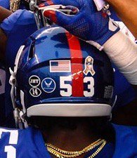
• A few weeks ago the Giants added a “14” memorial decal for former quarterback Y.A. Tittle. Now they’ve also added a “JHT” decal for Joan Tisch, the widow of former co-owner Bob Tisch, who died last week. When you throw in the military decals that the Jints wore for G.I. Joevember yesterday, it made for a very crowded helmet:
• Washington players apparently changed their facemask clips from clear to yellow:
.@PhilHecken @UniWatch Kirk Cousins (& many other 'Skins) switched from clear facemask hardware to gold hardware. Old on left, new on right. pic.twitter.com/CIjGvlByYK
— The Tao of Steve B. (@SteveBCreations) November 6, 2017
• Giants defensive back Landon Collins wore a camouflage New York Rangers shirt during pregame warm-ups.
• Only one team wore white at home: the Cowboys.
• Here’s a list of players who protested during the national anthem.
(My thanks to Matt DeMazza for the Ladon Collins item.)
NBA Uni Tracking
By Collin Wright
Three weeks into the NBA season, the percentage of color-vs.-color games has remained low. One reason for this: the prevalence of blue uniforms across the league. Fifteen teams use blue as their primary colored uniform (I am including the Hornets’ teal), and those teams obviously cannot go color-vs.-color against each other. Things may change, however, when teams unveil their second alternate uniforms, which is expected to happen after Thanksgiving.
One note: When the Lakers wear yellow at home, we had been treating that as white. But as several readers pointed out, that created problems when the road team wore white against the Lakers. So if the Lakers wear yellow at home, we’re now treating that as a colored uniform, even though it was their primary home design in the past. The numbers in this week’s chart have been recalibrated to reflect that change:
[table id=34 /]
Two additional observations that I’m continuing to keep track of:
• The Kings still have only worn their purple uniform. They are the only team to wear only one uniform for every game this season.
• The Cavaliers have alternated their uniform choice in every game. They are the only team that has not yet worn the same uniform in consecutive games.
(Collin Wright’s NBA tracking updates appear each Monday.)

Gift Guide reminder: I’ll soon begin work on my annual Uni Watch Holiday Gift Guide. If you have any suggestions for items or companies that should be featured, I’m all ears. Thanks.
The Ticker
By Jamie Rathjen

Baseball News: In this week’s Saturday Night Live Weekend Update, SNL cast member Leslie Jones appeared in a segment about the World Series with Astros players George Springer, Alex Bregman, and José Altuve. The three players’ jerseys all had the World Series and Houston Strong patches, but the one they gave Jones had neither (good spot from John Chapman). Jones’s jersey had “Player” and No. 17 on it (from John Dorfman).

Football News: NFL Films recently made a video on the stories behind several current and retired players’ numbers (from William Yurasko). … Oklahoma wore a helmet decal recognizing the opioid crisis on Saturday (from John Fitzgerald). … Army QB Ahmad Bradshaw was missing the “A” in his last name on the front of his jersey (from Arthur Savokinas). … The New York Times has a good piece on the paint jobs of college football equipment trucks (from Tommy Turner).

Hockey News: The Kamloops Blazers (WHL) wore camouflage jerseys and helmets and a poppy for good measure on Saturday (from Wade Heidt). Wade says that the jerseys were announced beforehand, but not the helmets. … From the NWHL: A shot by the Boston Pride’s Meagan Mangene broke the skate boot of the Connecticut Whale’s Elena Orlando. … Ray Hund sent us some vintage hockey YouTube videos, including 10 minutes of footage from the 1966-67 NHL season.

Basketball News: Kevin Love of the Cavs tore his jersey in frustration after checking out of last night’s game (from Robert Hayes). … UNC Wilmington center Trey Kalina has FNOB, but it’s spelled wrong (from Kenneth Watlington).

Soccer News: In the NCAA, Columbia and Harvard’s goalies were wearing the same color shirt; goalie kits have to contrast with both teams and each other (from Alexander Ganias). … Crystal Palace players were wearing both solid blue socks and blue with a red stripe yesterday (from Derek Linn). … The Remembrance Day poppies have returned once more, as next week is an international break. Six teams, four of which are outfitted by Macron, joined the trend of placing the decal close to their maker’s mark: England’s Stoke City and Scotland’s Ross County, Motherwell and Hibernian. The other two were Manchester United and the outfield players for Heart of Midlothian. Hearts seem to be the only example of a genuine lack of other space in the upper shirt area. … Premier League Bournemouth did not wear a decal this week, but some players wore a black armband, not to be confused with the PL captain’s armband, which also featured a poppy. … Besides Ross County, the Scottish teams to wear poppies did so with a four- rather than two-petaled version. … Juventus had announced throwbacks for this week, but it turned out that the shirts had the Serie A sleeve patch and sneaky black-on-black Adidas and Jeep logos. … With Scotland’s new kit having just been revealed, Scottish fans talked about their favorite Scottish kits (from @jhardest).

Grab Bag: The designs for the medals of the 2018 Commonwealth Games, to be held in the Gold Coast, Australia, have been released (from Graham Clayton).
The Orlando Magic has worn blue for some home games, incl. last night vs. a green-clad Celtics squad, but I’m surprised that it hasn’t worn its black Statement uniforms yet. I hope those will show up soon.
No teams have worn their third uniform yet. Those are expected to make their on-court debut the weekend after Thanksgiving.
Collin –
I’m curious what the color v. color match-ups were – saw Celtics(green) v. Thunder(blue) and Nets(black) v. Lakers(yellow), just in passing, flipping channels. But sadly missed the others.
I would be super interested in more about the color v. color match-ups, if you included in your tracker. Presumably there will be more and more, so may not be practical to list each color v. color. But I would definitely be interested in any unique/different combos that arise.
Great work!
Cole – thanks for the feedback! I am tracking specific color match-ups and would be happy to submit some details about those next week if Paul is okay with that. For now, I can tell you the most common color v. color match-up is red/blue. That’s happened eight times, with home team wearing red in six of those.
Interesting! I guess I never realized how common blue is as a league color.
Thank you for the additional info.
That might explain why we’ve still had so many white-on-color matchups. I understand now.
Week 7 2016, Eagles went black shirts/black pants for a 1 PM kickoff against the Vikings. So not the first time yesterday.
Thanks for that. I’ll update the text accordingly.
It looks like a different facemask. Look at the double bar across the top – it extends further in the right hand shot than the left hand shot.
The Jaguars got it right the first time — in their inaugural season. It’s been a rapid descent since they changed.
I thought the rapid descent started when it debuted those uniforms that didn’t have one stitch of gold on them. I like the designs they wore prior to that atrocity.
Two overlooked things about that first Jags’ uniform: 1. The three-color lettering of the player names always looked great. It managed to be clear and detailed at the same time. 2. When they went to black pants, I thought they were fine, owing to the colorful stripe.
That was a modern classic and I didn’t like the Jaguars going away from it.
The lettering worked okay on the teal jersey, but it was the opposite on the white jersey; an absolute disaster and completely opposite of what you described.
The teal on black for Jacksonville looks relatively decent for them, then again in that photo you don’t see the awful gold back of the helmet.
Titans with white helmet, navy jersey, and powder blue pants, BRUTAL. At least they went with navy socks instead of powder blue.
Dolphins all “aqua”. Is it just me or does that look like blue and not aqua?
For the Dolphins, the new uniforms have been described as having a lighter shade of aqua. Which to me makes it look more like a light blue.
I prefer the darker shade of aqua in the past uniforms. It had more of a hint of green in it. It was a signature Dolphins colour.
link
a lighter shade of aqua
I love that song!
Yeah. Weird that they couldn’t make it lighter, but keep the same blue/green ratio in the aqua. I definitely prefer the older, darker shade. It almost looks like the Carolina electric blue now.
I thought the Titans looked great actually. The Jaguars looked better than normal, though that’s not saying much.
To me, when it comes to football, having the helmet, jersey, and pants each being a different color gets dicey. Different color helmet and jersey, and white pants can work (thinking classic 90’s Broncos or Bills). When you go color helmet, white jersey, and different color pants its a not a particularly good look (for example, Saints’ gold/white/black combo). White helmet teams going mono-color jersey and pants is bad enough, this is the first time I can recall a white helmet team wearing two different colors with the jersey and pants. It is just too much for me.
I get what you are saying about the helmet and I do agree. I just really like the jersey, pants, socks look. Definitely looks better than mono navy or mono powder IMO.
One butt ugly day uniform wise for the NFL – Eagles – Yuck, Dolphins – beyond Yuck, Titans – OK’ish Saints – always ugly and sloppy looking when they go mono black. Jaguars – I’ll echo – got it right the first time.
Ditto this. All of it.
They briefly went with a fat gold stripe on the Saints’ black pants that I didn’t care for. For some reason two stripes has more… poise? Presence? Tradition? It seems to reflect the two black stripes on the helmet.
I agree. Teams with white helmets should never wear a dark jersey and pants. It looks off. One of the two, jersey or pants should also be white. Really all light colored helmet teams should remember this.
In that Twitter photo of Kirk Cousins, the facemask itself looks to be a different color. Is that just the lighting or an actual change?
Lighting.
Looking at the navy blue over Columbia look for the Titans, I kinda like it.
Does anyone else thing the “Stop Opioids” decal and even the one for the wife of a former owner on the Giants helmets are a little too much? It used to be that if a former player or a coach or an owner died, there might be a decal. Now, anything goes.
*think
Except if you’re in Dallas trying to honor 5 dead police officers
I do.
I would love to see the Jaguars return to white and teal as their primary jersey colors. Get rid of the black (and the hideous mustard color rash atrocities)
With the new Nike jerseys, anyone can be Hulk Hogan.
Ahmad Bradshaw huh…must’ve gone back in time 20 years
Blake Bortles still undefeated in teal
Yes! Insane.
That is the keeper uniform rules for FIFA. Not quite as strict in NCAAs as I can’t find a rule stating the keepers have to be in different colors, although rare.
The rule for goalkeepers:
4.2.2 Goalkeepers shall wear jerseys that distinguish them from all field players and stockings that distinguish them from their opponents.
The rule doesn’t explicitly forbid jerseys in the same color, but the stockings do have to be different colors, as was the case with the Columbia-Harvard game.
I should specify that that’s the NCAA rule regarding goalkeeper equipment.
The Scottish football (soccer) teams wear the logo of Poppy Scotland (link )which is a four leaf poppy whereas the English teams wear the emblem of the Royal British Legion ( link ) which is a two leaf poppy.
The Lakers haven’t even worn their purple uniforms once this season. That’s just flat-out wrong. Paul might disagree, given his stance on the color, but considering it’s been a part of their identity for more than 50 years (and certainly all of my lifetime), it just feels off.
We all picked on Adidas with their sleeves and trying to make basketball into soccer, but Lakers are almost exclusively wearing one color (and white on Sundays) like many soccer clubs.
Also, that pic of Crystal Palace looking like they’re wearing two different styles of socks is a little deceiving in my opinion. It looks to me that Wilfried Zaha (the player with the mono socks) has just covered his red bands with blue tape to hold his socks and shinpads in place. Like many players today Zaha wears footless socks over a shorter pair (like TruSox) and then tapes them at the lower leg so as to prevent them from riding up. FA and Premier League rules dictate that sock tape must be the same colour as the main colour of the sock.
Clearer pics of Zaha’s socks and also Andros Townsend’s socks can be seen here: link
Technically if a goalkeeper has a jersey that distinguish themselves from the other field players that is ok for the keepers (and the officials) to match. The NCAA does not always cosplay exactly with FIFA.
Yeah, if you watch enough of the older videos of the English first division, most goalies wore green kits for the majority of the season.
IMO, dark pants on NFL uniforms looks bad. Light colors are fine [yellow, gold, silver] but they will never surpass a crisp, white. I get it, fans get accustomed to certain looks especially if they harken back to a winning era. Tons of Redskins fans wanted them to start wearing the burgundy bottoms with white tops again because they won 3 super bowls with that look… but I really loved the white over white and the white over yellow looks myself. I think Seattle looks better with white or gray bottoms on both of their uniforms.
I agree. I think dark pants only work with white jerseys, and if they match the helmet. For example, the Bears’ navy/white/navy road look, or the Chiefs going red/white/red.
The light-colored Seahawks’ pants will never look good until they add the pistachio green to the insides of the squares on the pants’ stripe. It simply looks incomplete, as of now.
On Super Bowl Sunday whatever network broadcast the game had on in studio – I think at 9am in the morning, a kids’ team wearing the Lime Green over Lime Green Seahawks uniform with the older SILVER helmet and logo.
\
It was actually a pretty awesome look. I’m no fan of monotone unis or really the Lime Green unis, but it actually looked pretty damn good with the Silver helmet as opposed to the Blue helmet.
Huh, I actually think there are too many teams who rely on white pants.
I can’t stand the monochrome with leotard look but I also think teams aren’t being creative enough.
Teams can really get it right like the Bears, Chiefs, Washington, Panthers, even the Bucs.
I just don’t like the dark bottoms with white tops. We’re all entitled to our likes/dislikes. I think the Bears look great with the white tops with (old school) white bottoms. They have plenty of color in the leg stripes to make it a good look. Same with the Redskins. Those dark bottoms just don’t do it for me. That’s why teams like the Colts figured it out when they tried the blue pants back in the mid-nineties… did it only a couple of games and scrapped it. They just look better with white pants, even on the road.
Fun fact: The Bears white over navy look predates their white over white look by two decades.
link
Here is a pic of Marshall Faulk wearing those blue pants, now granted, Marshall can make any uniform look good. But the Colts said, nah, not for us when it came to the dark bottom look.
link
As a Panthers fan, I’m pretty conflicted about the blue alternate jerseys. On one hand, I think the black primaries look a little better, but on the other, I’d love to see the blue jerseys become the primary because that shade of blue is unique to the league and thus helps with the team’s overall identity.
Saints uniforms involving Black leotard pants are a Jackas Junior College – non-NFL-worthy look. Cheap, silly, stupid – looks like an 8 yr old team that plays underneath an Interstate exit. The Black pants with either White or Black jerseys are a Bottom 5 NFL uniform.
Saints Black jerseys with Gold pants are a Top 5 NFL uniform. White jerseys with Gold pants are a better than average NFL uniform. Particularly since NIKE has finally, FINALLY matched the Gold color pantone of the pants, numerals and trim to the helmet – after over 25 years of inept failure.
Why the Saints insist upon the Black leotard pants abominations are beyond me. Stripe or No Strip – they absolutely SUCK. The look does not belong in the NFL.
The Rams should simply have kept their St. Louis uniforms – Gold included – until a fully approved NFL transition to the Blue/White uniform was able to be worn. They look like a mismatched post-Hurricane Junior Varsity team wearing whatever they could throw together. How the NFL would allow THAT, instead of simply being flexible on throwbacks or early switching, is ridiculous. NFL Marketing notwithstanding. Stupid Rigidity being the enemy of the common good. And our eyes.
The Jacko Jags two-tone helmet simply has to go. Black or Gold – pick one, and be done with it.
Monotone uniforms – other than White over White – should be banned from the NFL. They look like children’s playground uniforms. They look like SHIT.
I LOVE the last sentence of the above!!!
When the Saints played in the Superbowl several years ago I believe the NFL asked them to wear their gold pants instead of the black ones.
I have never heard that.
No saying you’re wrong. But do you have a source?
That was good looking game.
Did not know that. I was relieved that they did not wear White over Black in our one Super Bowl appearance – I call it their Restaurant Bus Boy waiting at the bus stop “look”. It is truly disgusting.
I do not know for certain, or have ANY evidence to support it, but I suspect the White jersey over Black leotards is somehow favored by Drew Brees. (as it really, really took hold with him at QB, though “Players’ Coach” Jim Haslett also favored us with that crap during his QB Aaron Brooks Devotion era) Brees, who played 4 years at Purdue with that same White jersey over Black pants look, I in the back of my mind theorizing that perhaps Brees prefers the Black pants contrasting with the other team in finding receivers.
Nonetheless, the Black pants are horrible looking and not NFL-worthy. We have worn Black pants with both White and Black jerseys in the playoffs – let’s hope NEVER in a Super Bowl. The look is simply embarrassing.
Agreed re jags, though I’m partial to fully gold helmet/teal jersey.
The Reuben Meyes/Bobby Hebert/Jim Mora unis of 1986 through the Steve Walsh interregnum – gold black gold – were the best.
That New York rangers jersey Landon Collins was wearing is part of their GI jokevember campaign. All the teams will be wearing these at some point for warm ups.
At least the NHL restricts all of its ridiculous jersey promos to pregame, where they belong.
Oddly enough the Saints black pants go back a long way. They first wore black pants (complete with leotard look) in 1976.
Not quite the full leotard look. The socks were black-topped, but they were also striped:
link
Right, they went to full leotard in 1983. Still a little odd they didn’t opt for white socks matching the sleeves on the road jersey.
I was always a big fan of Archie’s helmet and that facemask. Thought it looked good.
Manning had a *lot* of facemasks over the years:
link
Wow!! I’m guessing Archie owned stock in a face mask manufacturer.
Back when NFL teams actually wore striped or contrasting socks. During the Dennis Erickson- “THE U” Miami Thug-era (25 penalties in one Cotton Bowl, a dozen asshole “Canes wearing plain Black knee socks with White pants …) the Leotard/Matching plain socks “look” got first to Asshole “The U”, then as their thugs got into the NFL, coincidentally now the “look” now infests the NFL.
Too much “pleasing” of the players. For $1-$22 Million per year, the players could wear decent uniforms decided by those with better judgment.
I’m a little perplexed by your timeline. I can’t find any images of early ’90s Miami teams wearing the leotard look apart from a couple shots of Randal Hill (who was out of the NFL long before the leotard look began to spread).
The leotard look really began to spread post 2001 and the type of sock issued by the team has much more to do with team staff. The leotard look didn’t start from players but with teams opting to wear same color socks with dark pants.
If you want a “patient zero” look to the Tennessee Titans.
Here’s a rare game show example of a “memorial patch”: Jeopardy’s Tournament of Champions started today, and all the contestants are wearing dark blue ribbons. They’re in honor of Cindy Stowell, who won 6 games on the show but died of colon cancer a few days before her first episode aired. (Dark blue is the color for colon cancer awareness.)
link
Since it doesn’t happen too often, the Dolphins always wear the superior aqua jerseys for home night games. The aqua pants are usually worn with them, but not always. I like it, but don’t like the current lighter shade of blue. Bring back the old stuff.