Click to enlarge
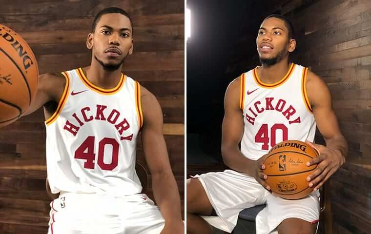
Two more NBA teams unveiled retro uniforms yesterday. First up are the Pacers, who revealed a new version of their Hoosiers-inspired Hickory fauxbacks. It’s a very handsome uniform, although it doesn’t have the goofy charm of the two-tone version that they’ve worn for the past two seasons.
The Pacers will wear this new white design for eight games, including four on the road, beginning on Nov. 17. Additional info here.
Next in line are the Heat, who marked their 30th season by unveiling a black throwback based on their inaugural 1988 road uniform (click to enlarge):
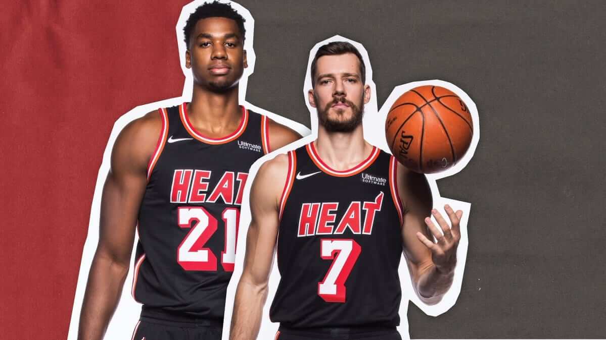
They wore the white version of this throwback two seasons ago. No schedule yet for when this one will be worn. Too bad about the lame-o ad patch.
The Pacers and Heat are the sixth and seventh NBA teams to have revealed their throwbacks for this season. (The first five were the Bucks, Suns, Lakers, Warriors, and Hornets.) That leaves the Hawks as the only team whose throwback has yet to be unveiled.
New mailing list: For years I’ve kept a mailing list, which I use mainly to notify people when new ESPN columns have been published. The company that maintained the list has stopped offering that service, so I’m starting a new list on MailChimp.
If you read the blog every day, you already know when I have new ESPN pieces, so the mailing list may be redundant for you folks. But if you want to sign up for it anyway, you can do so here:
The Ticker
By Alex Hider

Baseball News: Kareem Abdul-Jabbar was spotted at last night’s World Series game wearing a Brooklyn Dodgers cap with an LA Dodgers No. 42 jersey (from @MetsTilDeath2). … Houston is home to some of the wildest haircuts in baseball. This piece delves into who is cutting them … (Tommy Turner). … When Frank Robinson was managing the Nationals, he apparently once left RFK Stadium in full uniform. He said, “I’ve got to be back so early tomorrow, why even bother changing?” (From David Goodfriend.) … Speaking of the Nationals, this will apparently be the game ball for the 2018 All-Star Game in Washington (from Steve Hemsath). … Cool find by Bill Henderson: Apparently, a baseball team in Caledonia, Ohio, wore Cleveland Indians hand-me-downs in 1933. … The National Bobblehead Hall of Fame and Museum released a new doll commemorating the Reds’ five World Series titles. But Brice Wallace points out that the trophies that Mr. Redlegs are holding are wrong — note the flags. … Mitchell & Ness staged this cool photo of classic jerseys that spell out the 2017 World Series matchup (from Jamie Burditt). … Houston police officers will be permitted to wear Astros caps from now through Nov. 6 (from Corey Buck). … It’s a little hard to see, but the Astros have apparently been keeping a jar of Suavecito pomade in their dugout. “Do the players really need to coif their hair midgame?” asks Michael Ortman. “When I see a pomade in a dugout, I can’t help but think of doctoring pitches with Vaseline.”

NFL News: The Bills will be wearing white facemasks on Thursday as part of Color Rash (from Michael). … Jets QB Josh McCown and RB Matt Forte have been missing their chest logo patches for the past few games (from Michael Forde and Panda). … Ray Hund sends along a lot of nuggets from a 1967 Browns/Bears game program . … Garrett mocked up some Los Angeles Dodgers and Houston Astros football uni based on the Rams and Texans unis.

Canadian Football News: The CFL mocked up Halloween uniforms for all of its teams (from Wade Heidt). … It’s fairly common these days to see players’ undershirts poking out of their jerseys. But Calgary OL Randy Richards appears to have intentionally cropped his jersey and worn a color-contrasting undershirt (from B.Q. G.).
College Football News: Kent State went mono-gold last night (from Kyle Good). … Kansas will wear new alternate unis based on Civil War imagery on Saturday. More here. … These Iowa podcasters are not happy with the Hawkeyes’ alternate unis (from Kary Klismet). … UNLV and Hawaii have a new rivalry trophy (from James Gilbert). … The ACC Tracker has been updated for week nine.

Hockey News: Steve Mason unveiled a new zombie mask yesterday just in time for Halloween (from Ted Arnold). … Also from Ted: Speaking of Halloween, graphic designer Mark Avery-Kenny reimagined some NHL logos to include iconic horror characters. … Maple Leafs F Patrick Marleau played his first game back in San Jose Monday, and he received the mold that helped make the stick with which he scored his 500th goal last season (from The Goal Net). … Former Canadien Johnny Gagnon is wearing an upside-down and backwards chest logo in this photo (from Kevin Vautour). … The Vancouver Giants of the Western League will wear jerseys honoring Canadian soldiers who fought in the Battle of Vimy Ridge in World War I on Friday (from Wade Heidt). … Staying in the Western League, the Kamloops Blazers will wear military appreciation uniforms on Saturday. … More Western League: The Victoria Royals will wear throwbacks on Saturday (from Mark). … The Tulsa Oilers of the ECHL will wear denim jerseys on Saturday (from Mike Iles).

NBA News: Timberwolves C Karl-Anthony Towns wore Jason from Friday the 13th shoes on Monday (from Mike Chamernik). … Rockets G James Harden, who has an endorsement deal with Adidas, appears to have cut the Nike logo off his socks on Monday (from Sawyer). … Warriors F Draymond Green wore a colorful wrap on his banged up shoulder Monday night (from Zachary Loesl). … One more note from last week’s Bucks game at the MECCA: The lettering on the floor from last Thursday was a few shades lighter than the original floor (from Andrew Beckman). … Here’s a good history of players who have worn black facemasks. … The Wisconsin Herd, the Bucks DG League team, was supposed to open their season at a new arena in Oshkosh. However, the building won’t be ready in time, meaning the team will open the season in Milwaukee’s Bradley Center (from Brian Kerhin).

Grab Bag: New logo for Oral Roberts University. … NASCAR drivers for Hendrick Motorsports were supposed to drive cars with a Justice League paint scheme this weekend. However, the cars have a half-and-half design that is apparently outlawed by NASCAR (from Clark Ruhland). … A couple of NHRA drivers dressed up their cars for Halloween recently: Bo Butner’s car dressed as the Trans Am from Smokey and the Bandit and Deric Kramer’s car dressed as Cole Trickle’s Mello Yello Lumina (from David Firestone). … Speaking of dressing up for Halloween: Deadspin thinks that athletes playing on Halloween should play in costume. … The Australian Rugby Union has rebranded as Rugby Australia and unveiled a new logo (from Tom Konecny. … Ohio State has won a trademark infringement lawsuit against a former OSU athlete who was selling T-shirts with designs similar to the school’s logos (from Jason Hillyer).
Proofreading:
‘Meanwhile, doesn’t the “A” in the chest lettering look a bit off? Here’s a comparison of’ That’s the entire graf.
The first two links in the Reds bobblehead item are the same; the one with the bobblehead is missing.
The rugby and curling items run together.
Ah, crap. Thought I removed that. Will revisit it tomorrow.
Fixed.
Proofreading:
– Meanwhile, doesn’t the “A” in the chest lettering look a bit off? Here’s a comparison of
– (from Tom Konecny wanted to make sure that Paul saw this Toledo Blade
A post of mine that includes those is in moderation.
Great job Vancouver Giants, not so good Kamloops. Someone at the CFL office must have too much time on their hands.
I think whoever did that for the CFL missed a huge opportunity. The RedBlacks could easily have been the RedGreens! They could’ve even had duct tape for helmet stripes!
Ha!!
Also, I agree with the assessment on the Giants and Blazers jerseys. Vancouver’s unis look classy, while Kamloops are just a G.I. Joke.
are NFL jersey sales down or something?
link
That’s from two years ago. I didn’t realize it at first, until I realized it was saying Friday, November 6 (11/6 is a Monday this year).
you’re right. It is the first I had heard of it and I saw it on an NFL player’s Instagram account. I just searched it and grabbed the first link I came across without looking at the date.
Still, seems like a ploy to sell jerseys by the NFL in order to make it look like it is being done to support a cause.
The military probably paid the NFL to do this. It’s amazing how much they pay pro sports for these appreciation moments/days, etc… They probably pay them to wear military jerseys also.
This country is so weird how everyone genuflects to the military. Then doesn’t care when they have mental issues or are homeless.
Now, excuse me, while I take a leak during the 7th inning “God Bless America” bullshit. Just showing what I think of that song.
So much in the Bears/Browns program….
Crazy “NFL shield” on the cover.
Falcons logo facing left (no “F” there!)
The kid in the Higbee’s ad looking through his facemask like goggles.
Alitalia Airlines seems an odd sponsor of Browns football to me. ??
I would be in support of the Miami Heat going back to their original uniforms on a full-time basis. Loves these throwbacks compared to the present Heat uniforms.
It took a couple years before the Heat could accurately render their wordmark on the front of their jersey.
Re: the NHRA.
Sad that a Chevrolet is being dressed up in a Dodge Dart, and that a Pontiac is being dressed up in a Chevrolet.
Yeah, the Chevy logo on the front of a “Trans Am” is jarring to say the least.
Bandit’s name wasn’t “Bo Bandit” either… It was Bo Darville. Bandit was his CB handle.
Kent State went mono-gold last night (from Kyle Good)
So how is “Golden Flashes” a better nickname than “Thunderbolts”?
Kansas will wear new alternate unis based on Civil War imagery on Saturday.
Cool numeral font!
Jets uniforms look so much better without the logo patch on the chest. Much like with the Steelers, they’d be better off with a small wordmark logo center chest under the collar than with the logo patches.
I heartily disagree. The small collar wordmark logos make me think of the jerseys that used to be able to order out of the Sears Catalog that always had the team name printed on them.
The Tulsa Oilers of the ECHL will wear denim flag desecration jerseys on Saturday
Fixed.
And that is just one ugly-ass jersey design.
Unicorn sighting in the Bears/Browns program:
The never seen on field, Browns “CB” helmet logo.
link
Rumored to have been worn for only one preseason game in 1964(5?) how is it appearing in a program for 1967?
Good question.
My only guess is the May Company didn’t want to sell a random plain brown helmet as part of the uniform. With the CB logo, junior looks like a real pro.
The Browns should have a “throwback” game where they wear the phantom logo.
If they do it against the Ravens, the Ravens could “throwback” to their phantom Baltimore Bombers unis. The uniforms their NFL team would have worn if they had won the expansion bid over Jacksonville.
The National Bobblehead Hall of Fame and Museum released a new doll commemorating the Reds’ five World Series titles. But Brice Wallace points out that the trophies that Mr. Redlegs are holding are wrong — note the flags.
Not so much “wrong”, per se, as “simplified”. Besides, those two trophies could easily be representing the Reds’ first two Series wins, in 1919 and 1940 – long before the first World Series Trophy (now the Commissioner’s Trophy) was awarded in 1967.
I believe the comment about the trophy being wrong is because the real trophy has all the flags pointing the same direction (to the right), while the ones on the bobble head rotate to face different directions.
Hey, everyone. In need of a little help: I’m looking for an authentic University of Maine road (navy) hockey jersey. I live in Orono, walking distance to Alfond Arena and the bookstore, but everything they sell at either have a TM on the logo, which the on-ice ones don’t have. I’ve got a custom lettering outfit in Illinois… Anyone have any leads? Email me at erik(dot)schwab(at)gmail(dot)com. Thanks so much!
I think the issue with the MECCA court colors not matching is a combination of age of photos and multiple layers of polyurethane.
The Bucks video (link) states they used “Exact colors”.
I wonder if Robert Indiana accounted for color change with polyurethane coatings. Also, newer coatings can be applied that don’t have a yellow-orange tint.
Is it just me? Or is the whole “throwing back to a fictional high school team” thing wearing thin with anybody else?
I mean, the Pacers have some decent throwback options within their actual team history. This just seems bizarre to me.
I agree. Why not throwback to an actual highschool that has a historically significant program in Indiana.
But if we are doing fictional throwbacks I certainly would enjoy the Mets showing up as the New York Knights for a game.
Mets dressed as the Knights playing the Yankees dressed as the Mammoths would make my decade.
The Mets would more appropriately wear this jersey…though it is actually based on a jersey modeled by Babe Ruth
link
Heck, my old high school, Franklin had the “Wonder Five” which might be the first true basketball dynasty. from 1919 through 1922 they went to 4 straight state finals, winning the last 3 in a row, then they all went to Franklin College and won (what was considered at the time) a National Collegiate title. They even played and defeated professional teams of the era. Fuzzy Vandiver is in the Naismith Basketball Hall of Fame
link
and there was even a book written about them.
link
They’re more historically significant than a fake movie school and I still wouldn’t consider them worthy of a modern day pro basketball homage.
I live in Franklin as well, too funny. I’ve heard many stories of the wonder 5. The jerseys worn in the movie Hoosiers were made in Franklin as well.
Agree. Would rather see this is for a throwback:
link
I agree. I am from Indianapolis and am a Pacers fan. I never thought that they would still be wearing these “Hickory” uniforms.
Attucks High School (Oscar Robertson) A historically significant High School is truly worthy of the honor… not a fictional high school based on Milan.
The “Milan Miracle” loses its “miracle” cache when you discover they were in the state finals the year before too! Small school yes… but still loaded from top to bottom.
Also, if memory serves, Hickory didn’t even have white jerseys in the movie. They either had the two-tone that that Pacers have been wearing or all gold.
Well, I clearly didn’t read down far enough today. And my memory was wrong. Oh well.
(This thing has still more than run it’s course. And yes, I’m from Indiana.)
I love how the Jason themed shoes have the Nike logo as a bloody machete. It also reminds me of the logo used by Nike protesters some time ago
link
Can whoever compiles the Ticker note when link is from the New York Times? Non-subscribers only get access to a fixed number of articles per month, so we’d appreciate getting a head’s up when we’re about to burn one of those freebies.
Agreed. A little (from the NYT) would suffice.
Maybe the same thing with the Washington Post?
Lee
I wouldn’t call a little (NYT) or (WaPo) designation mandatory, but it would be a welcome courtesy. I sort of feel the same way about links to Twitter, Facebook, eBay, and YouTube as well, since depending on where I read UW, such links can open in separate apps rather than in a new browser tab.
Understood. Will try to do that.
(Of course, given the need state of the industry, it would be nice if more people paid for the NYT and WaPo.)
The workaround is to not store cookies, or delete your browser history and reopen your browser, and then you can start viewing NYT articles again.
Or to, you know, pay for professional journalism instead of treating it like an entitlement and looking for ways to circumvent the very reasonable paywall.
A point that I don’t think most people realize about the Pacers uniforms: both “Hickory” uniform fauxbacks are based off of the jerseys worn in the movie Hoosiers. The red and yellow combo is widely known, but the white uniform that the Pacers will be wearing this year is also worn in the movie.
link:
I’m from Indianapolis… I get it. I still hate it.
The Atlanta Journal-Constitution may have accidentally leaked the new name of the Gwinnett Braves (Atlanta’s AAA affiliate).
link
The Buttons is a reference to Gwinnett County’s namesake and signatory of the Declaration of Independence. A lot of the other names in the contest were pretty terrible, in my opinion, so I’ll be very happy if this is in fact the new name.
A lot of the other names in the contest were pretty terrible, in my opinion, so I’ll be very happy if this is in fact the new name.
That’s how the modern Name The Team contest works: owners propose the name they want along with three very bad alternatives. They get their way and you feel as if you’ve advanced the cause of democracy.
From a different article…
link
…on why they’re changing their name:
we’re in our ninth season, and our reality is a lot of confusion in the market with which team is which. It’s more for us…we’ve had folks, on multiple occasions, who had tickets for a Gwinnett Braves game and showed up at Turner Field. It’s more to clean up confusion on the marketing side, mostly from our end.
Seriously? One can’t tell the difference between Gwinnett and Atlanta?
Can’t tell ya how many times I went to Citi Field expecting to see a Binghamton Mets game. So glad they’re the Dunder Bumbles now, really clears things up for me.
That’s how the modern Name The Team contest works: owners propose the name they want along with three very bad alternatives. They get their way and you feel as if you’ve advanced the cause of democracy.
I was hoping that would be the case, but I was fearful.
Seriously? One can’t tell the difference between Gwinnett and Atlanta?
Agreed. That just blew my mind back when I first read it. I mean, how often do places like movie theaters run into this issue? And it’s a lot easier to buy tickets to the wrong Regal Theater (for example) than to the wrong Braves team, I would think. I question if that is a lame, made-up excuse or based on a VERY small minority, but maybe I’m over estimating suburban Atlantans.
I find it to be a huge misstep that the horror/NHL mashups pair Michael Myers with the Wild logo and not Jason Voorhees, given that the Wild’s logo could be definitely be seen as Camp Crystal Lake.
Not a fan of the “Hickory” crap my Pacers keep subjecting us to. No wonder Indianapolis has a hard time escaping that “podunk” reputation, one of our two “big league” teams wants to portray itself as a fictional HIGH SCHOOL!!! Really, those ABA championship uniforms are so much cooler it baffles me they’re doing this.
Well, Hoosiers is one of the coolest movies ever made.
I like Hoosiers too, that’s not the point.
The reason Kareem gave for picking UCLA was that Jackie Robinson played for them.
Not sure why the Dodgers NFL uniform still has the Rams horns, where as the Astros has the orange star with the “H” on the helmet. The “LA” interlocking logo the Dodgers have on their hats would look great on a helmet.
Yeah I don’t know why I didn’t do that. Bad on my part.
Haven’t the Knicks also revealed their throwbacks?
No. The Knicks do not have throwbacks this season.
Their white alternate uniform has some retro elements to it, but it is not classified as a throwback.
RE: Mitchell & Ness jersey thing…..
I notice the Astros “r” is used to spell World Series.
Are there no other r’s they could have chosen?
The new Heat throwback is exactly why they always wore the NBA patch abd/or logos on the left chest instead of right. It looks like they had to move the wordmark down to make room for the ad patch.
If NYT and WP hadn’t become shells of their former selves, maybe more people would pay for their content.
Strident drivel with a cultural agenda that is so transparent and overbearing that it warps their reporting. Both are beyond terrible.
I guess rigidly pushing a politcal perspective in a way that alienates a large percentage of potential readers isn’t such a great business model after all.
I guess rigidly pushing a politcal perspective in a way that alienates a large percentage of potential readers isn’t such a great business model after all.
Um….
link
Aside from not having your facts straight, you’re also just trolling. No more of that, please. Thanks.
Check your DVRs — is someone at the Dodgers-Astros game wearing a gray Dodgers jersey made to look like one of the generic minor-league uniforms with a red “S” on the front?
(thought I saw a snippet during the bottom of the 8th inning).
Did you know that the white hickory uniforms are one of the few Time period inaccuracies about the movie Hoosiers… teams only had one color uniform during that time period in high school basketball. The other is during the final at hinkle field house on butlers campus, the backboards where still wooden, not glass yet, when Milan high school won with Bobby Plump’s shot heard around the state (Aka..Jimmy Chitwood).