For all photos, click to enlarge
Back in June I did an ESPN column about Riddell’s Precision-Fit helmet program. As you may recall, the Riddell people showed me how the program works by scanning my head to create a series of 3-D digital images.
Normally, the next step would be to use those scans to create a helmet with custom-fitted interior padding. But as I noted in that ESPN piece, Riddell had a limited Precision-Fit capacity this year, so there were no plans to make a sample helmet based on my head scans, because that would have used up one of their available helmets for this year.
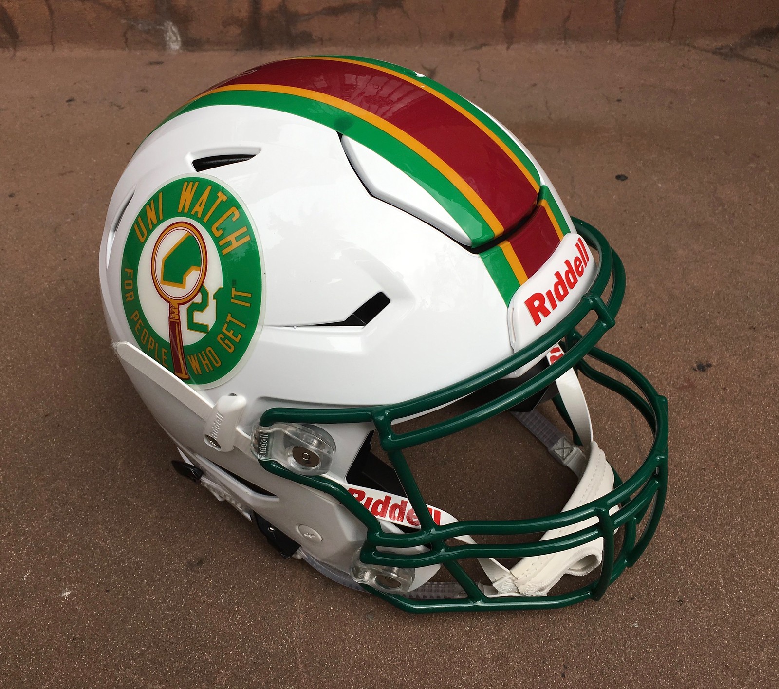
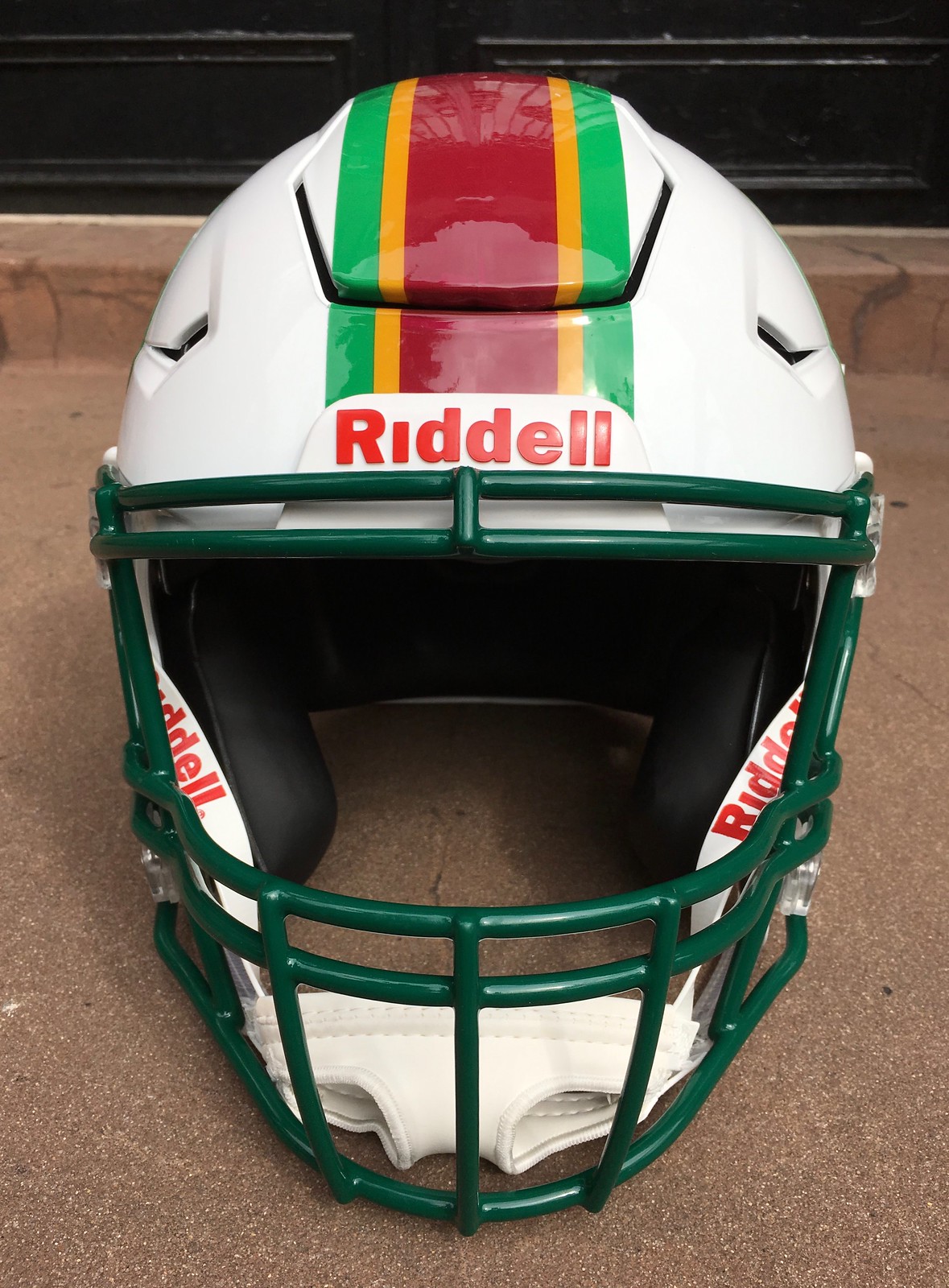
Later on, however, the Riddell people said they could produce a helmet for me after all, so I could feel for myself how good the fit is. They even offered to make it a Uni Watch helmet. It recently arrived here at Uni Watch HQ.
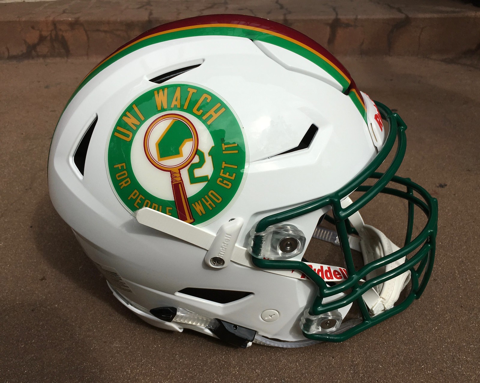
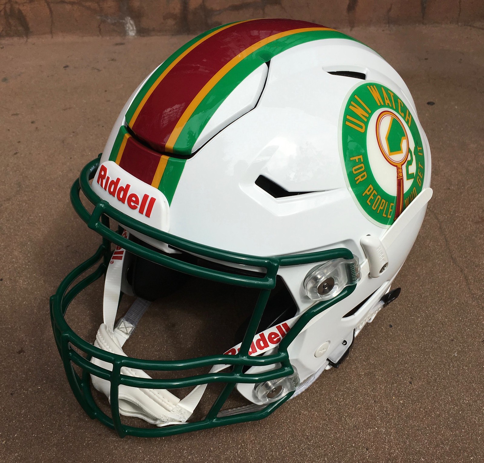
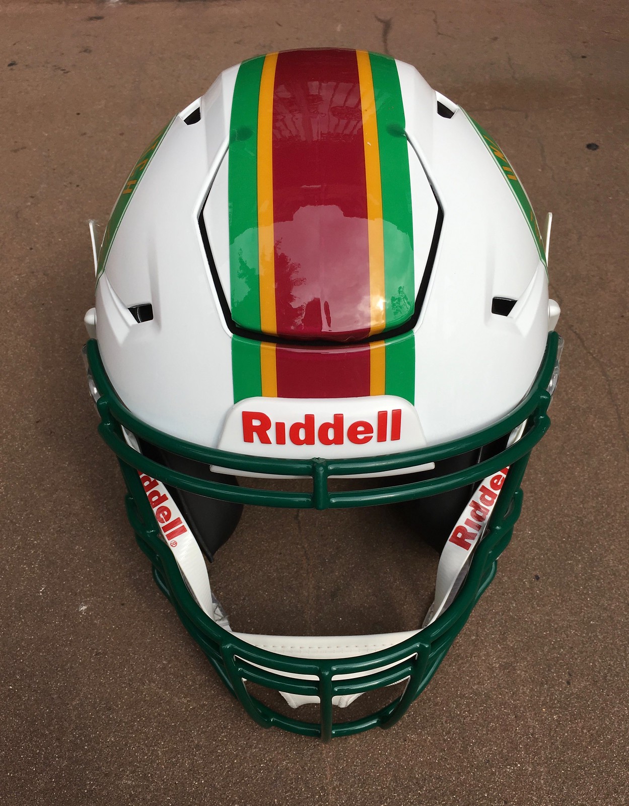
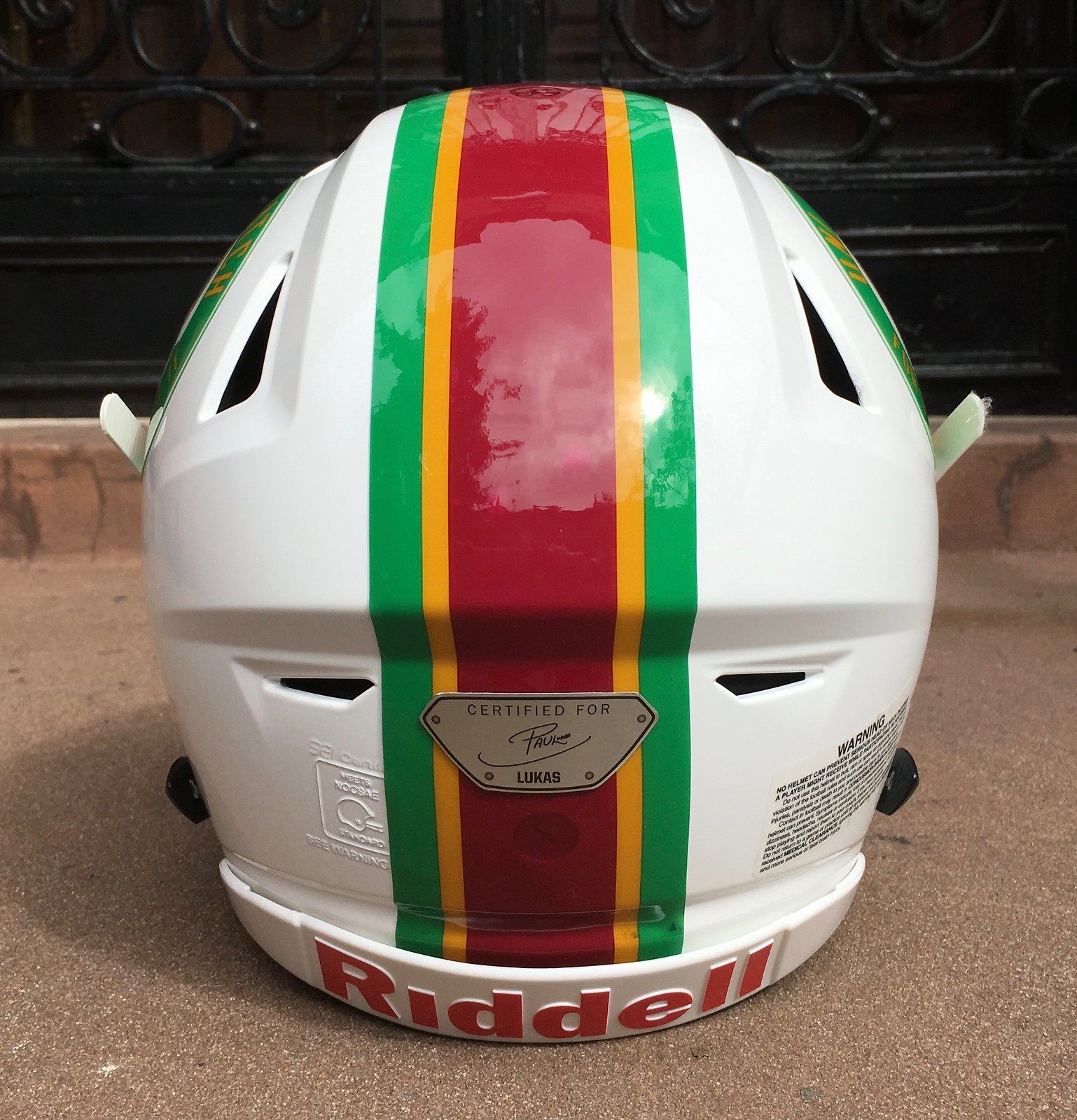
As you can see in the photo at the top of the page, we kept the design simple. Center striping matches the striping we use here on the website, and the side logo is one of the logos that Scott M.X. Turner designed several years ago.
Here are some additional views:
I’m sure everyone will be glad to see that they cut the striping tape as it crossed the helmet’s flex panel:
Precision-Fit helmets all come with a little plate on the back featuring the player’s name and signature. Equipment managers typically remove it, but I’ll be leaving mine in place, at least for now.

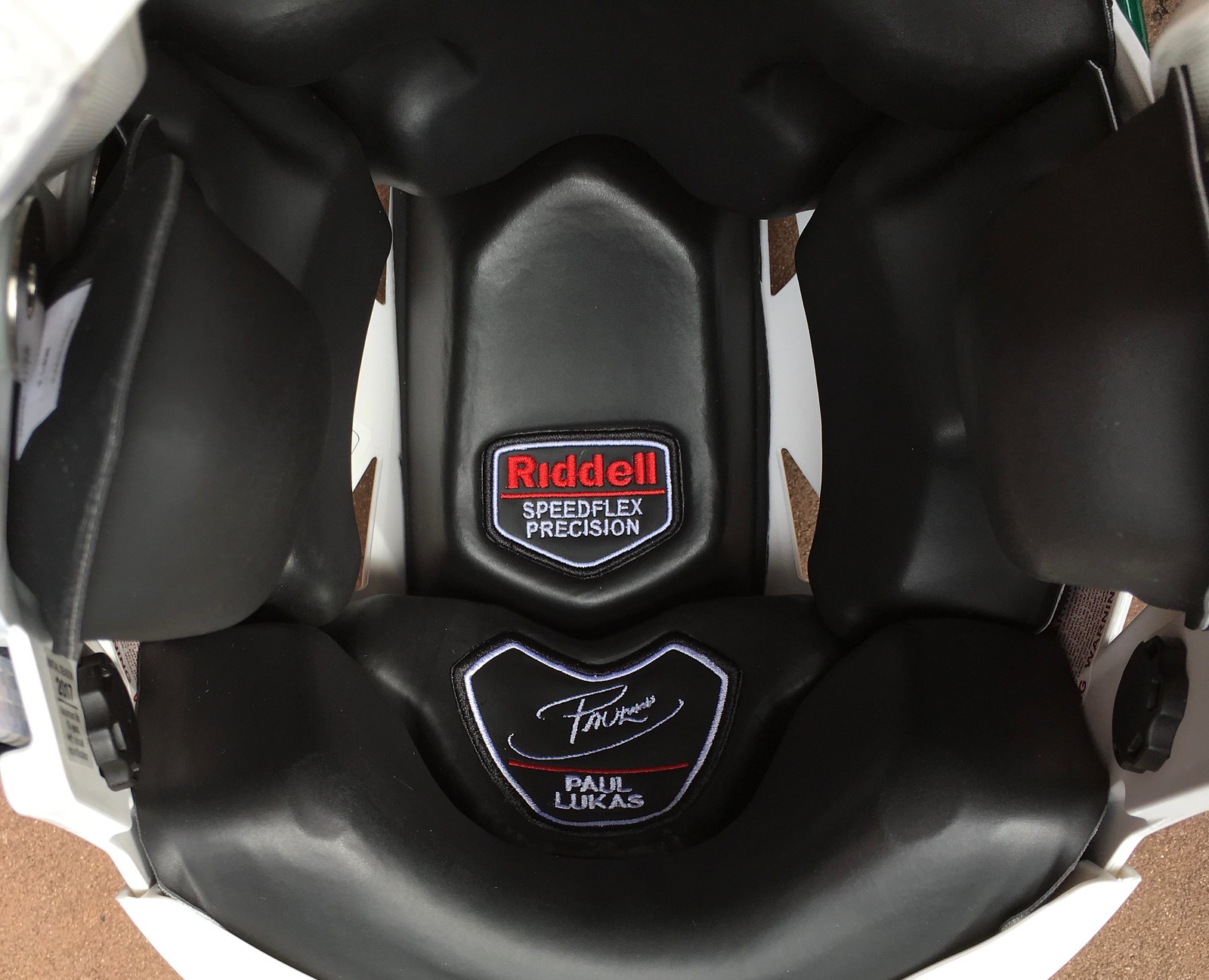
There’s also a personalized tag woven into the interior padding, which is pretty cool:

And how does it fit? Granted, I haven’t spent all that much time wearing football helmets in recent decades, so I don’t have much baseline experience to compare it to, but it does seem like a pretty good fit. Interesting to see how it turned out after doing those head scans earlier in the year. Big thanks to Riddell for following through on that.
Now then: What am I going to do with it? For now, I think I’ll just leave it on my desk — a fun and informative souvenir.

Click to enlarge
Friday Morning Uni Watch: Last year, the Raiders’ Thursday-night pants had a black stripe. But last night, as you can see above, they went with a grey/silver stripe. A small upgrade, although I think the best solution would be to go with no striping at all (additional pics here).
As you can also see in that photo, the Raiders added a jersey patch for this game. It was to commemorate the 50th anniversary of Oakland’s 1967 AFL championship team. Here’s a closer look:
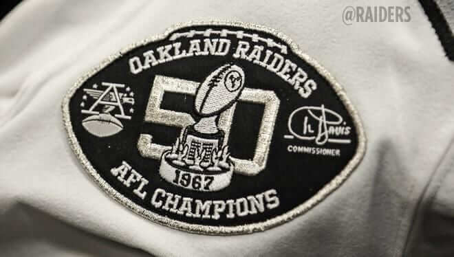
There’s some interesting info about the patch design here. Also, as you can see, the patch includes the AFL logo, which the Chiefs wear as part of their Lamar Hunt perma-memorial patch. So both teams in last night’s NFL game were wearing the AFL logo.
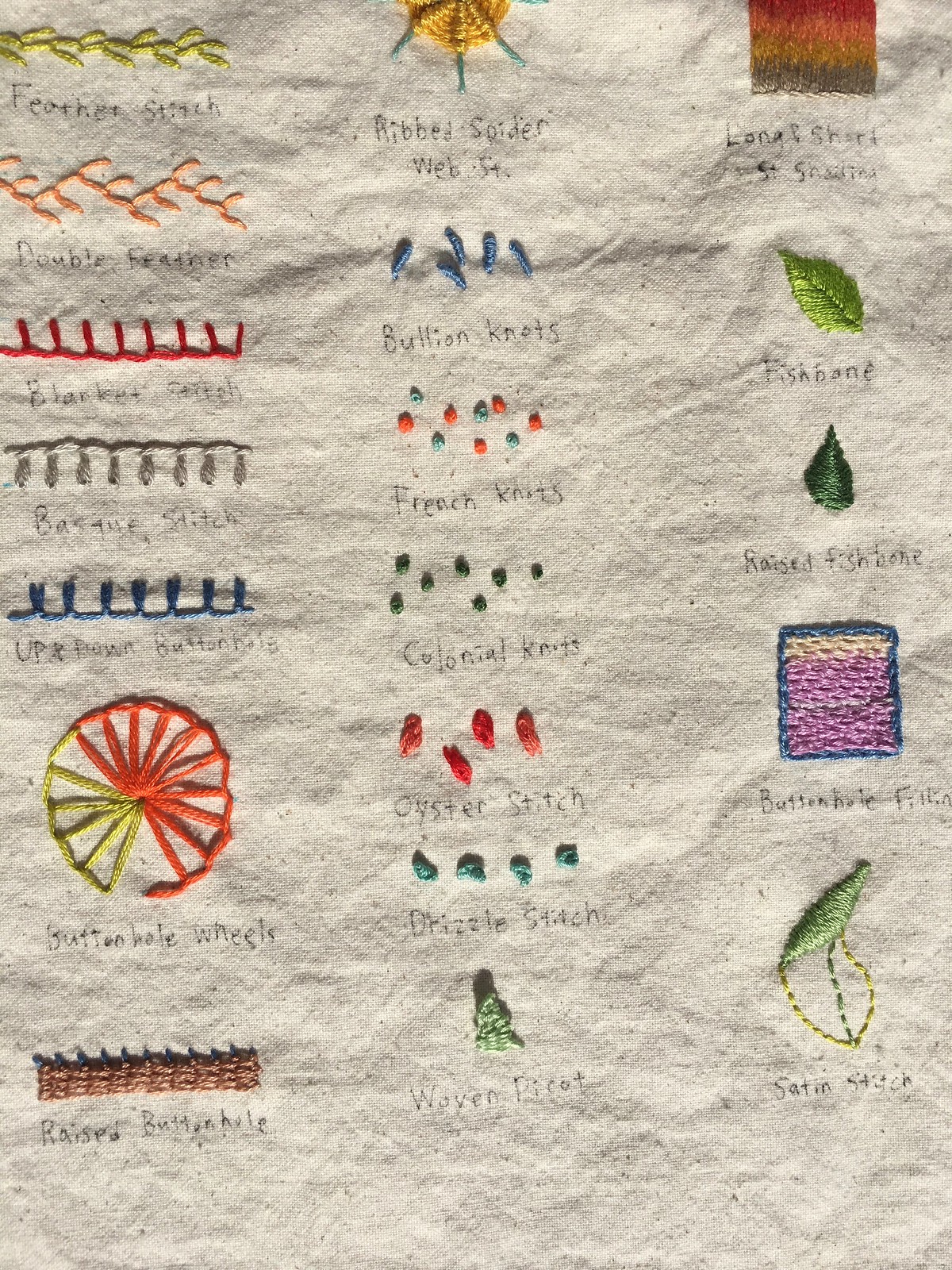
Uni Watch Show & Tell: Earlier this week I wrote about how I spent last Saturday, including a tour of artists’ studios at the Brooklyn Army Terminal, where I fell in love with an piece by the artist Jung Eun Park — a guide to various types of embroidery stitching. It reminded me of the vintage salesman sample catalogs that I like to collect and also made me think of the chain-stitching that I love to see on old uniforms. She said the stitch guide wasn’t intended as art and wasn’t for sale (it was just a reference guide that she’d made for herself), but I emailed her the next day and convinced her to sell the piece to me.
As it turns out, Jung Eun and I live about a 10-minute walk from each other, so yesterday afternoon she came over to Uni Watch HQ and delivered the stitch guide to me in person. I showed her some of my vintage catalogs and also pulled some vintage jerseys with chain-stitched embroidery out of my closet, so she could get a sense of how the stitch guide fits into my aesthetic/obsessions/etc. As she looked around my apartment and saw some of my other collections on display, she said, “Oh, now I’m starting to see why you were interested in this piece!” It was a really nice visit. (I should have gotten a photo of her holding the stitch guide but didn’t think of it at the time. Dang.)
Here’s a much better photo of the piece than the one I provided earlier this week (for all of these pics, you can click to enlarge):
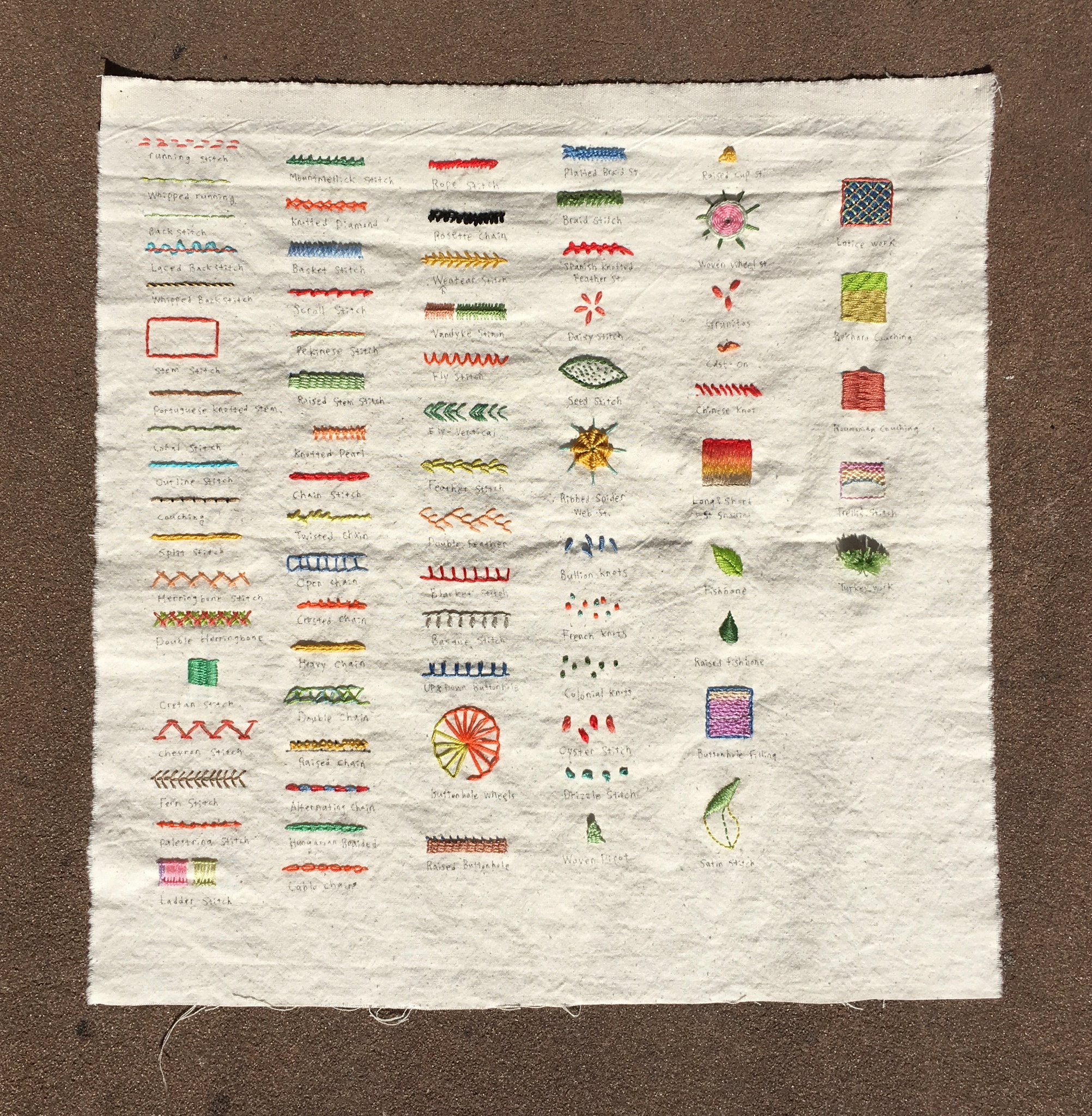
The piece is about 16″ square. The fabric is cotton, which Jung Eun says she got in Korea, where she grew up. She may not have intended it to be art, but she instinctively did lots of things to make it visually appealing. Look at how she organized everything in neat rows, changed the thread colors, meticulously hand-annotated everything, etc. I love it!
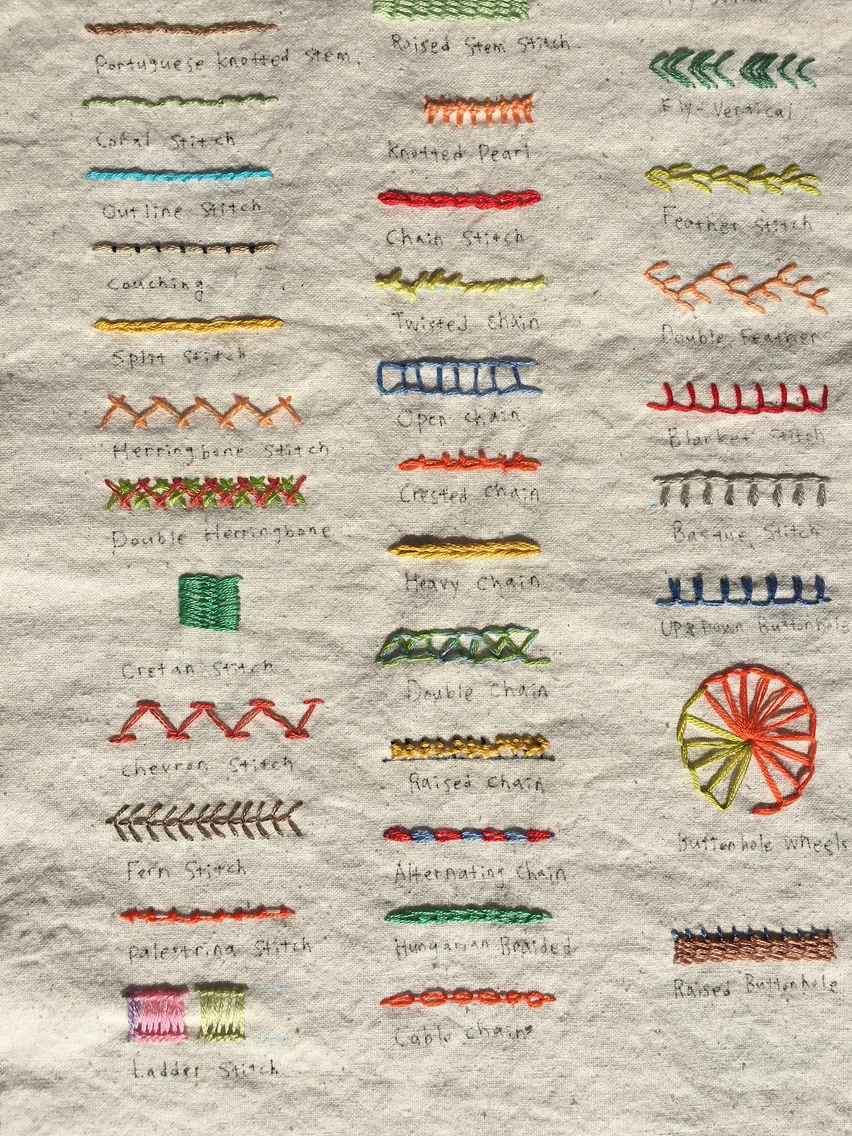
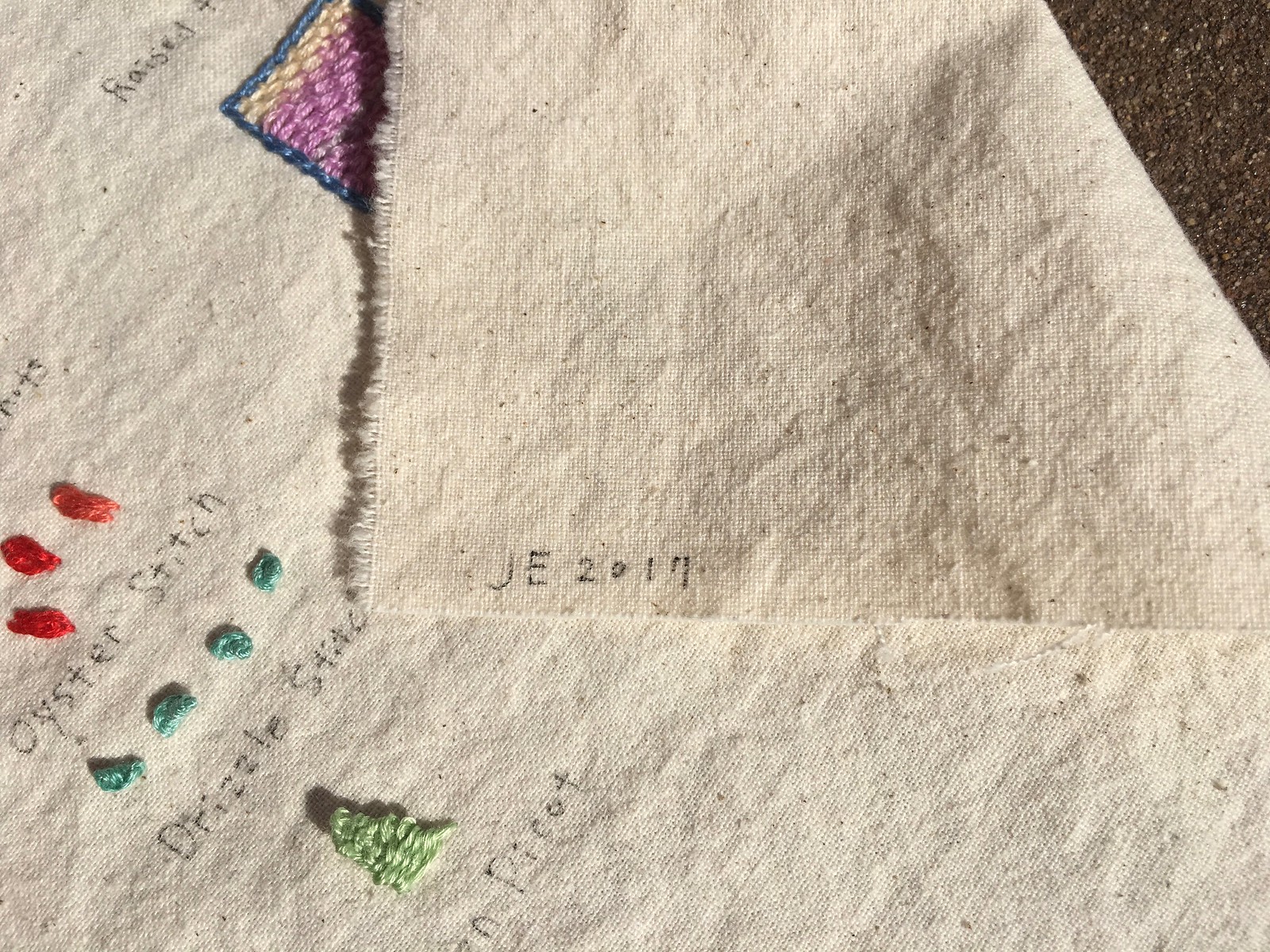
If you look at the middle row of this next photo, you can see that she included 10 different kinds of chain-stitching. I had no idea there were so many variations:
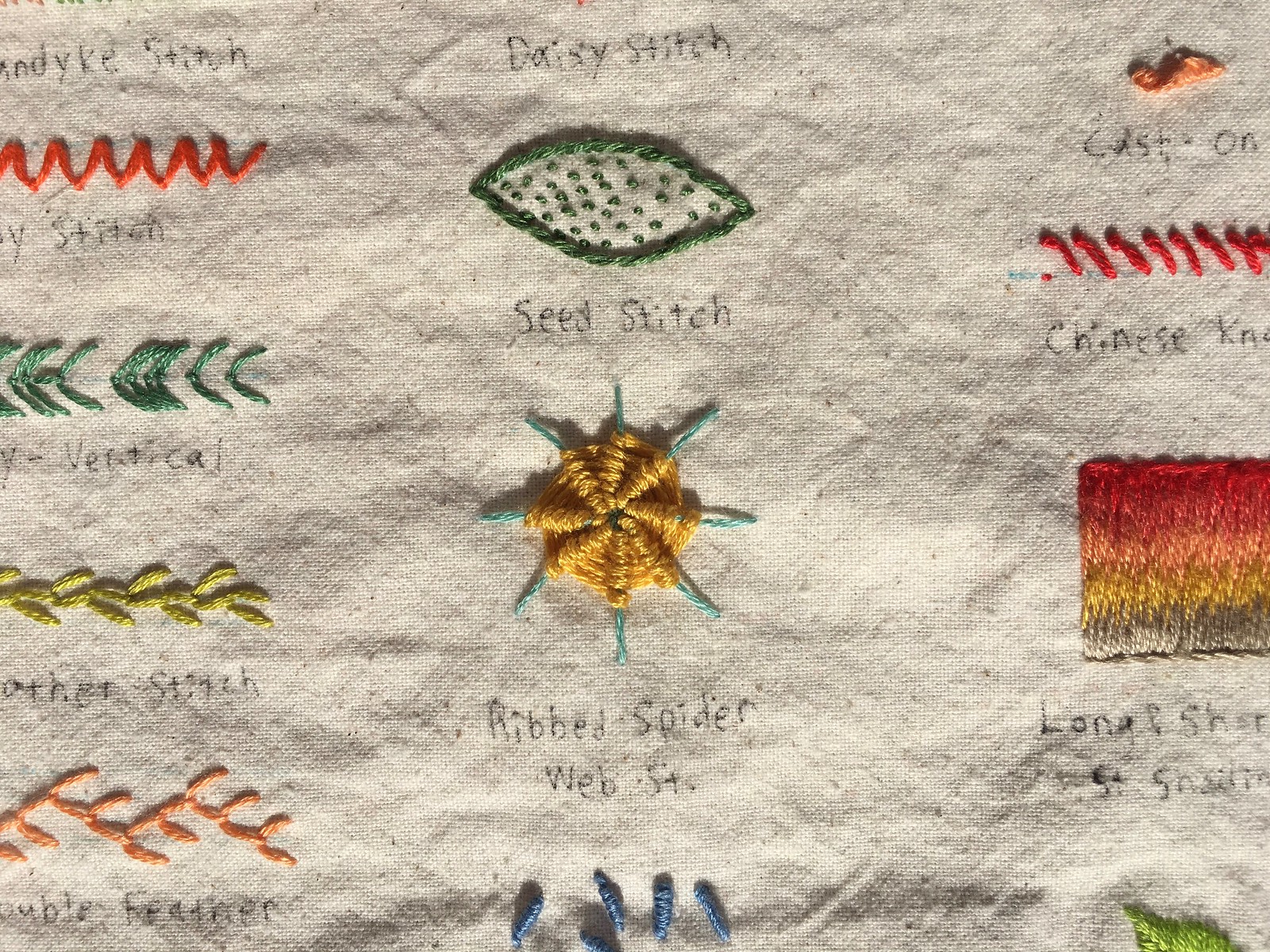
Check out the amazing ribbed spider web stitch, and the very appealing seed stitch just above it:
For the knots in the center of this next shot, I love how she sequenced the knots in seemingly random patterns, creating happy little jumbles of color:
Jung Eun said she made the piece early this year over the course of about two weeks, although she wasn’t working on it full-time during that period. More like a few hours here, a few hours there. I asked her to sign it, which she did on the back:
I plan to get the piece framed. Jung Eun asked me to send her a photo when the framing is done.
The Ticker
By Paul

’Skins Watch: Twenty years ago Miami of Ohio changed its team names from “Redskins” to “RedHawks” at the urging of the Miami “Myaamia” Tribe, which Miami is named after. Now the university is adding a new logo that embraces the culture of that tribe (from K.C. Kless).

Baseball News: A Chicago barber shop called Hatillo’s uses the Astros’ logo on its storefront (from Adam Foxman). … Dodgers 2B Enrique Hernández, who had a historic night in yesterday’s NLCS clincher, is still having his jersey sewn shut, something I first wrote about last year.

NFL News: More and more teams are going without a huddle. … Packers LB Vince Biegle has been trying out the Schutt F7 helmet in practice. … Nike has taken the leather from some Super Bowl LI game balls and turned it into a pair of shoes. Additional photos here (from Brad Tatum and Brett Baker). … Furniture.com now has a collection of NFL product. … New Era apparently has a series of limited-edition Bills caps. Here’s this week’s design (from Eric Juergens).
College Football News: Here’s this week’s uni combos for UNC and Iowa State. … My ESPN pal/colleague Dave Wilson has written a fantastic piece about college football’s relationship with Waffle House. Of particular interest is this diagram showing WH’s byzantine plating system. … New black jersey for Harvard (from María Canales). … P Oscar Bradburn will wear No. 25 for Virginia Tech this week (from Andrew Cosentino). … Arkansas State and Houston both went with new helmets last night. … White helmets apparently on top tomorrow for CMU.

Hockey News: The ice rink at the U. of Michigan’s Yost Arena has named after former coach Red Berenson (from Tien Mao). … As we’ve noted here before, Pens star Sidney Crosby had his jersey altered last year to create a straight hemline. He’s still doing it this year with the new Adidas jerseys (from Denny LeeM).

NBA News: The Warriors’ throwback for this season, as had widely been expected, will be the white 1980s design with the California outline. The corporate and the maker’s mark look even worse on the throwback, eh? The jersey will make its on-court debut tonight and will then be worn 12 more times during the season. … The Raptors and Thunder both wore color at home last night, with the Bulls and Knicks wearing white on the road (from @HitTheGlass). … Speaking of the Thunder, they will continue to wear blue for nationally televised home games (from Joel Reagan). … The Hornets have released their uniform schedule for the new season. Wish more teams would do this (thanks, Phil). … The Knicks’ roster includes a large number of unusually tall players. … “The Mavs have a logo for Dirk Nowitzki’s 20th season and will be rolling out a series of bobbleheads throughout the year to commemorate his accomplishments,” says Gary Bates. “So far I’ve only seen the logo on video boards.” … Very cool visual moment in Wednesday night’s Suns/Blazers game, as all five Suns players began running at the exact same moment after a turnover. … The Kings have a cool historical jersey display in their arena (from Jason Gutierrez).

Soccer News: The women’s team at Baldwin Wallace, a D-III school, is wearing warm-up shirts with a heart-shaped “15” chest mark. That’s for teammate Alex Elliott, who suffered a career-ending torn ACL (from Tony Bruno). … New kits for the San Diego Sockers (from Jim Vilk).

Grab Bag: This is so awesome: A French photographer goes to museums and takes photos of people whose clothing matches the artwork they’re looking at. The same photographer has lots of other cool projects. (from my pal/neighbor Carrie Klein). … Also awesome: An artist has turned assorted corporate logos, including Nike’s, into weapons. Seems about right (from my pal Rob Walker). … New logo and can design for Hi Sign Brewing. … New home rugby kit for Wales (from @SerrinneWoW). … New wrestling singlets for Virginia Tech (from Andrew Cosentino). … New athletics logo for Southern Connecticut State. … Daytona International Speedway is letting fans vote for the tri-oval grass design that will be used in 2018 (from Kyle Speicher). … Ever wonder how the color “British racing green” came about? Find out the answer in this short video clip (from R. Scott Rogers). .,. New logo for the Saskatchewan Abilities Council. … Interesting detail on the new Wales rugby jerseys: Every single one — on-field and retail — will have a distinct pattern on the shoulders (from Josh Gordner).
So if Charlotte has already released the schedule for their road games, does this mean every team has already scheduled what jerseys they will wear for all games this season? Have to figure that’s the case since Charlotte would’ve had to know in order to avoid jersey clashing.
I’m guessing that when the Hornets go to Orlando on April 6, the Magic won’t wear its light royal blue uniforms that night due to a lack of contrast.
That’s a great sig, Paul.
NBA ticker correction. The Raptors wore red at home. Bulls wore white on the road.
Fixed.
Although the Raiders looked fine in their unis, the better color match up would have been the Raiders in their black unis vs the Chiefs in red.
Agreed, unless you’re color blind – then it’s black versus black…
how about all silver with black numbers and stripes
An even better matchup would be if both teams wore their regular uniforms, both of which are excellent.
Amen Paul! Only so many Oakland games in the Coliseum left, they should just wear the traditional uniforms.
Amen to that
link
Well yeah! But that doesn’t sell enough merchandise, apparently. So we’re subjected to blood clots and minor trim changes to pants that nobody buys or wears in public. Because, Color Rash!
My first instinct was to anticipate the Raiders in solid black, but then I remembered how much I revile the Saints in the same getup (more or less). A silver stripe on black pants would help a little, I guess.
I’m still hoping for some black pants with silver stripe one day, mainly for road games
The Raiders should always wear black at home. Period.
Anyway, I did like the design of the commemorative patch. Also, I am glad it was a traditional patch rather than the EmbossTech patches that MLB is using in the postseason.
That helmet is pretty sweet. Being personalized is a nice touch too.
Where is the head shot of it on Sir Paul?!?
Proofreading:
“combo sfor”
And there should be another open quote after “Gary Bates”.
Fixed.
I also think there’s a word missing in the Daytona item. “Vote,” I’d guess.
Fixed.
College Football correction: Oscar Bradburn is the Virginia Tech punter wearing the #25 this week. Justin Fuente is the head coach.
Fixed.
FYI, I looked it up, and that barber shop is in Chicago, specifically on Cicero Avenue (IL 50) in the Northwest side. The Google Street View images of that location, dated September of last year, don’t show that Astros deco, so it’s a recent change.
Imagine if we’d ended up with a Cubs/Astros World Series.
Now that you have the helmet, shouldn’t there be a Uni-Watch football uniform design contest?
Rule 1: No flywire.
Proofread: “Daytona International Speedway is letting fans for for the…”
Fixed.
Paul, that helmet is incredible! Truthfully, it is a nicer design than 90% of NFL and NCAAF teams. I agree with Mr. Gilbert – time for a UW design contest.
Corporate logos as weapons section: turning the facebook logo into a tire iron as a break-in weapon is pure genius!
Now you need to get Nike to make you a uniform.
What a awesome & cool souvenir Paul! Love it!
Regarding Vince Biegle and the F7 helmet, this is why the NFL’s one shell rule makes no sense. Players change helmet styles all the time throughout the season. I read somewhere that some players go through as many as 8 helmets during the season.
1) For the kajillionth time: The rule is not intended to eliminate helmet changes. It is intended to *minimize* helmet changes.
2) Trading up for a newer/safer model has always been fine.
3) “I read somewhere” is not the best underpinning for an argument.
link
Link to article from the Eagles proposal that actually quotes them as saying some players go through up to 20 helmets per season. Sorry I thought I had read 8.
To sum up: the rule is to prevent teams from forcing players to change helmet models mid-season. It has nothing to do with individual players choosing to change helmets on their own. In short, it’s so the league and teams are covering their collective asses and putting the responsibility on the individual players in the event of injury incurred in the new helmet.
In the soccer news, the DIII school is Baldwin-Wallace. You can see the ‘Jackets B-W logo in the pic.
Fixed.
Paul-First time, long time! Love the site. Proofreading re: Va Tech #25-Justin Fuente is the HC, player wearing Beamer jersey this week is Oscar Bradbury, Punter. Love how the site strives for accuracy even though it must be irritating to have mistakes pointed out on a daily basis. Keep doing what you guys do!
Already pointed out by another reader and fixed.
Sorry, realized the fix too late. I will go back to enjoying the site and refrain from commenting. Anyway, really appreciate all the work!
The logo on your helmet is quite small. I want to see it with a YUGE logo bleeding over the edges!!
On a serious note, your stripes are VERY complete (wrapping under the edges of the flap/panel. Many stripes are cut before the edge.
link
One of the advantages of having the manufacturer make the stripes for you as a custom job, rather than the team’s equipment staff having to put 53 of them them together themselves (especially if they have to take them off and apply new stripes later, e.g. when the Packers go throwback and remove all their decals).
Looks like Kevin beat me to it.
The Bulls-Raptors game was in Toronto, not Chicago.
Never mind, that is what you said. I could have sworn it said the Bulls were at home when i first read it.
Can’t wait to see that helmet in the annual holiday raffle at the end of the year.
I hope not! I hope that one day, many years from now, the helmet will be a valuable part of the CUNY Paul Lucas Archives.
I also hope that the Paul Lucas Archives will be spelled Paul Lukas!
;)
Argh! I blame my increasingly random, and, I suspect, self-aware spellcheck. On the other hand, I have thought it would be fun for a J-school to deliberately misspell its name on signs, with red editor’s marks correcting the error.
The striping around the armholes on the Warriors throwback goes all the way around and is not truncated by the seams in the back panel. Is this the only jersey with complete armhole striping? How did they get away with that? How can other teams follow suit?
It’s a shame they didn’t maintain the 8-inch gap between the name and number. :-)
I noticed that as well. It’ll be interesting to see how it looks during a game as it stretches and moves. If the trim falls back into place, there’s no reason this shouldn’t be the norm going forward.
Seeing the Uni Watch football helmet sparked my memory about a football team that wore the colour scheme. The CFL one-year-wonder Memphis Mad Dogs sported the Uni Watch colours back in 1995:
link
One, I always wondered how the cooks can read some of the servers’ writing on Waffle House checks. Now I know that they don’t always have to because of this system!
Two, I think what Miami has done, forming a relationship with its namesake tribe and partnering with them to educate others about the culture and provide educational assistance to tribe members, is the best approach to the issue I’ve seen thus far. I suggested nearly the exact same thing for Washington’s NFL team after Dan Snyder doubled down on his public defense of the name in the news a few years back.
Getting the Washington NFL Squad and the local Indian tribe to kiss and make up would be a great outcome; how disposed they are to such an entente is the bone of contention. You can’t claim the ‘Skins have engendered much good will from indigenous Americans.
Crosby’s straight hemline looks weird with the bent stripes.
Really, I’ve never seen the benefit of the droopy hemlines anyway. Just make them straight for everybody again!
Paul, have you ever dined at a Waffle House? If so, what were your impressions?
There are only two chain eateries that I like (and I like them a *lot*): White Castle and Waffle House.
You should have that plating guide framed and hung next to your stitching guide then!
For me, Waffle House and House of Pies always scream “early morning/late night”
Those corporate logo weapons remind me of my link from back in June.
Minus the ad patch I LOVE those Warriors throwbacks. Much better than the garbage they currently wear.
Oh, I don’t know. Delete the maker’s mark and ad patch, and the Warriors have one of the best looks in the league. The tiny but very visible number in the chest logo sends it over the top. Plus the bridge details in the side stripe are very clever. About the only change I’d advocate is yellow home uniforms, like in the Rick Barry days.
Typo in ‘Skins Watch: “whicih”
Fixed.
Paul, seeing the uni-watch helmet made me wonder what sport has your favorite uniforms? As in, which sport has the uniform template that allows for the best designs and are therefore more enjoyable to discuss, etc?
I like baseball uniforms the best, but that’s mainly because baseball is my favorite sport.
The sport with the most interesting possibilities is clearly hockey. The untucked jerseys, the long sleeves, the long socks, the lack of numbers of the front — there’s a lot more canvas to work with.
A great day at Uni Watch. The helmet is beautiful, and the embroidery piece is amazing.
The Uni Watch helmet is incredible. Man would I love a mini-helmet version of that on my shelf.
Already having discussions with a mini-helmet maker. This will happen. More details soon (or at least soon-ish).
Count me in on the Uni Watch mini helmet!
That’s great news, count me in.
Interesting that you refer to the Dodgers 2B by his given name, Enrique. A quick look around shows that other websites, including ESPN, do the same. The LA Times, however, uses his nickname, which is far more familiar to people here in LA.
That helmet is absolutely gorgeous. Can we get Paul in on the Titans redesign?
Do love that helmet.
Yes, I do.
I stopped reading the Waffle House article when I realized it was pretty much just a long advertisement
Save your outrage for real advertisements, not for laudatory pieces of journalism.
I’m not sure that white pants with no stripes would look any better than black pants with no stripes.
Also, looking at that AFL patch reminds me, for some reason, that only three of the eight original AFL franchises have won Super Bowls in the 47 years since the merger, two of those only within the last 20 years. Which kind of sucks, if you think about it.
The Uniwatch Schutt F7 helmet cart is next! Be on the lookout, Paul. You’ll have to sign for it. Otherwise, I’ve instructed them to send it to Phil. ;)
That’s a gorgeous-looking helmet stripe. Interesting that they didn’t cut where the tape overlaps the end of the “flex” portion on top of the helmet.
The jersey ad really does kill that Warriors jersey. It makes it look like a cheap giveaway jersey they’d distribute on a promo night.
Good observation. Sort of like the 1986 replica Mets jerseys given out last season that had a Dunkin’ Donuts ad on the sleeve.
Does anyone besides me think the new logo for Miami (OH) would look great as a center helmet stripe?
A Uni Watch mini helmet? Yes please.
I’ll have more info on this early next week.
In their history, the Raiders wore their white jerseys with silver numbers outlined in black. Always thought that was a great look.
The ribbon board at Barclays Center is still showing an ad for the Anthony Joshua-Kubrat Pulev fight, even though Pulev pulled out with an injury.
Perhaps we have the makings of an NBA Uni Ad curse?
link
Have you/are you going to pay Riddell for the helmet?
Curious. As nearly every newspaper reporter I know won’t even let you pay for their lunch, for its potential conflict of interest.