Time for a trip down another rabbit hole today, people. This one involves a four-season stretch in Reds history, from 1968 through 1971.
Let’s start by consulting Dressed to the Nines. If you look at Marc Okkonen’s renderings for those four seasons, you’ll see that the “Cincinnati” lettering and front numbers on the road jerseys has white outlining. It’s a little hard to see on those thumbnail images, but it’s more apparent if you click on one of the individual years. I asked Hall of Fame curator Tom Shieber, who administers Dressed to the Nines, if he could check Okkonen’s original renderings, and he confirmed to me that Okkonen included white outlining on the road typography for all four of those seasons.
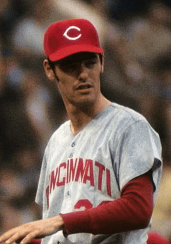
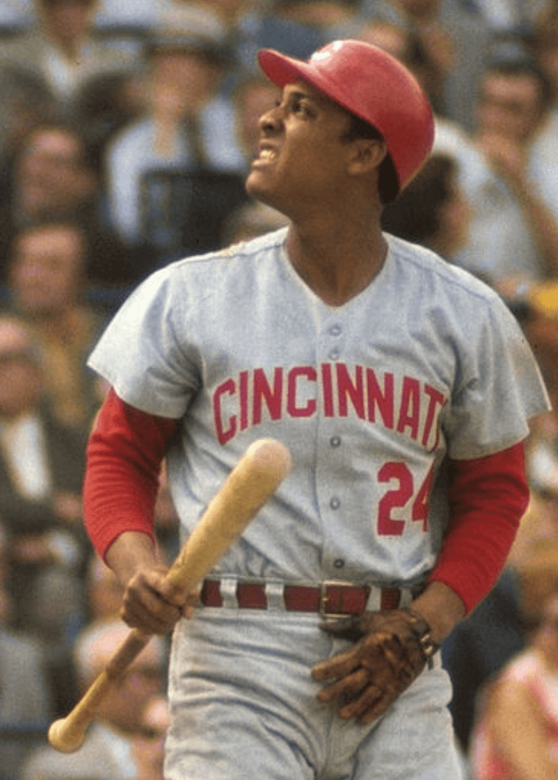
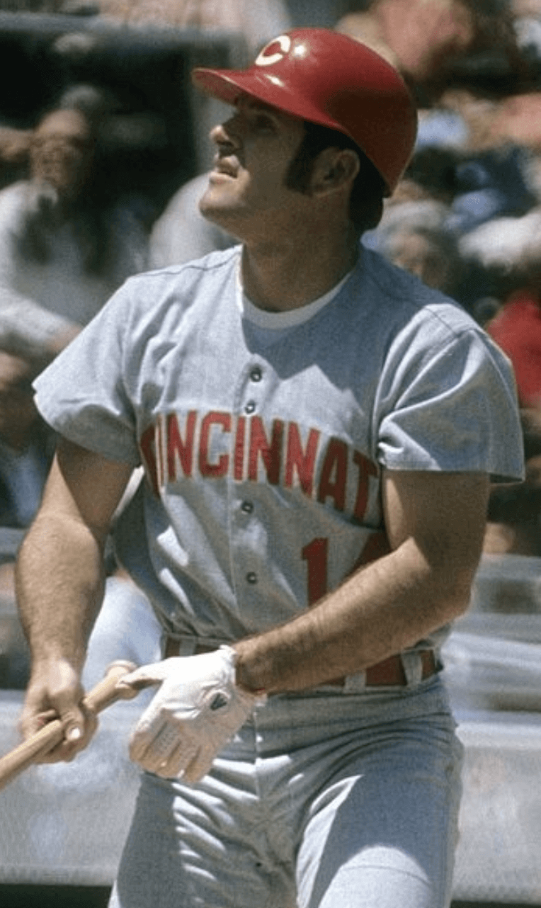
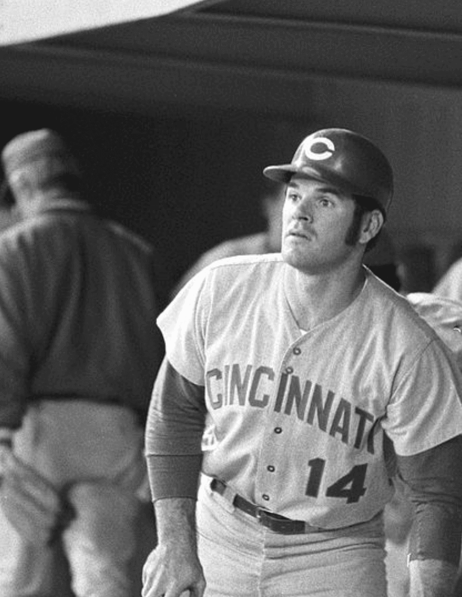
Here’s a photo of Pete Rose from that period, with the white outlining plainly visible:
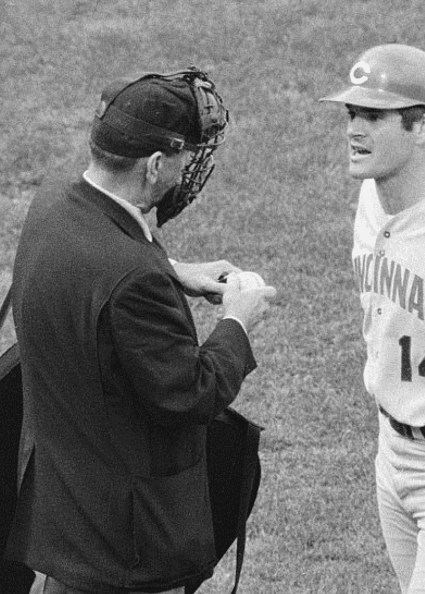
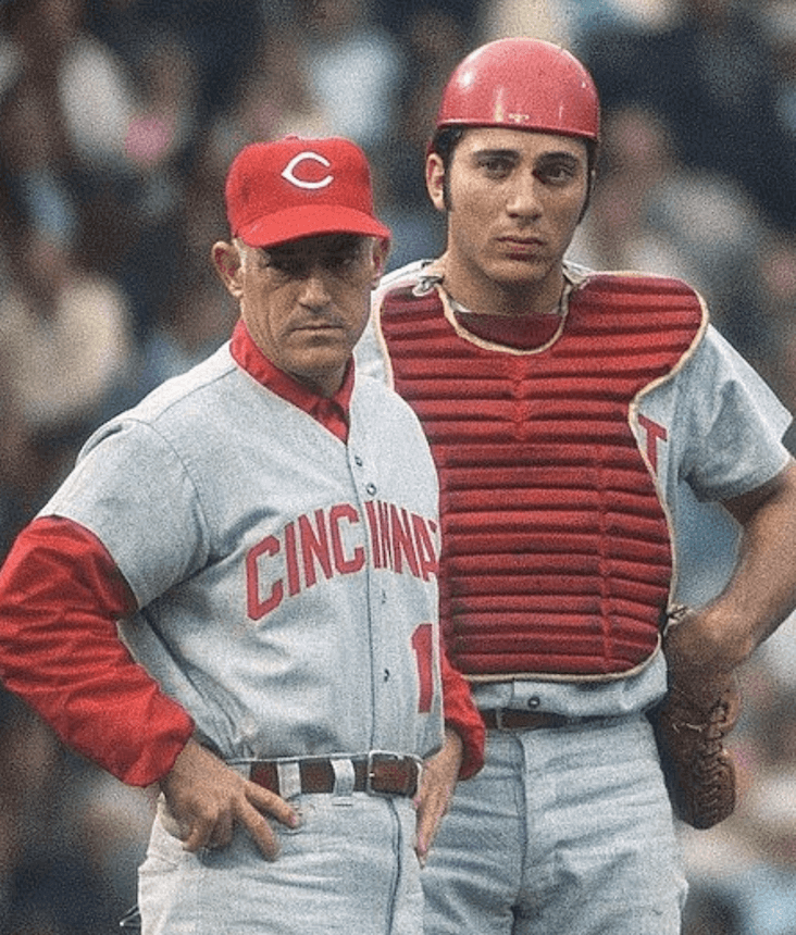
But reader Brice Wallace recently pointed out something I hadn’t been aware of: When the Reds made it to the 1970 World Series, they wore road jerseys without the white outlining. Here are some photos from that Series:
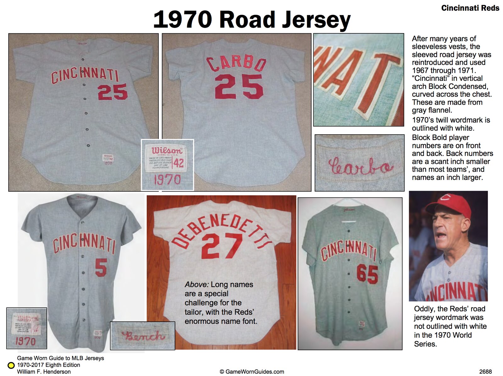
At first I thought Brice had come up with a major historical find. But then I checked Bill Henderson’s guide and found that he had already documented this anomaly and I just hadn’t noticed (click to enlarge and look in the lower-right corner):
The Reds aren’t the only team to have changed their uniforms for the World Series, of course. Off the top of my head, I can think of these:
• The 1917 White Sox wore star-spangled World Series uniforms to support America’s entry into World War I.
• The 1959 White Sox wore white stirrups, instead of their usual black, in the World Series (although, as we discussed earlier this year, they only did it for part of the Series).
• The 1969 Mets wore the MLB centennial patch on the left sleeve. But when they got to the World Series, they moved the patch to the right sleeve.
Did I miss anyone?
(And as a footnote, we know that the 1951 Dodgers were planning to add red numbers to their jerseys for the ’51 Series, but Bobby Thomson had other ideas about that.)
Okay, so that could have been that — but there’s more. As I looked for photos for this entry, I found some additional shots of the 1968-71 Reds wearing road jerseys without the white outlining — shots that were clearly not from the 1970 World Series.
Here are a bunch that were obviously taken at Wrigley Field. Getty, whose dates are notoriously unreliable, lists some of them as being from the “late 1960s” and others from “circa 1971.” But given the camera vantage point, it’s a near-certainty that they’re all from the same game (click to enlarge):
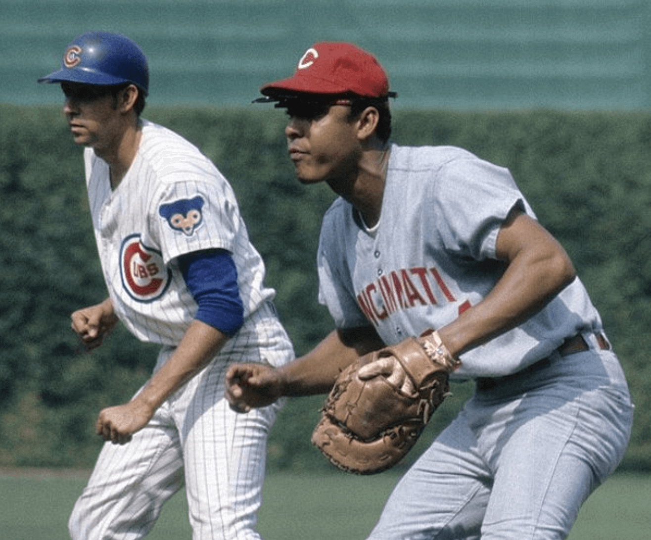
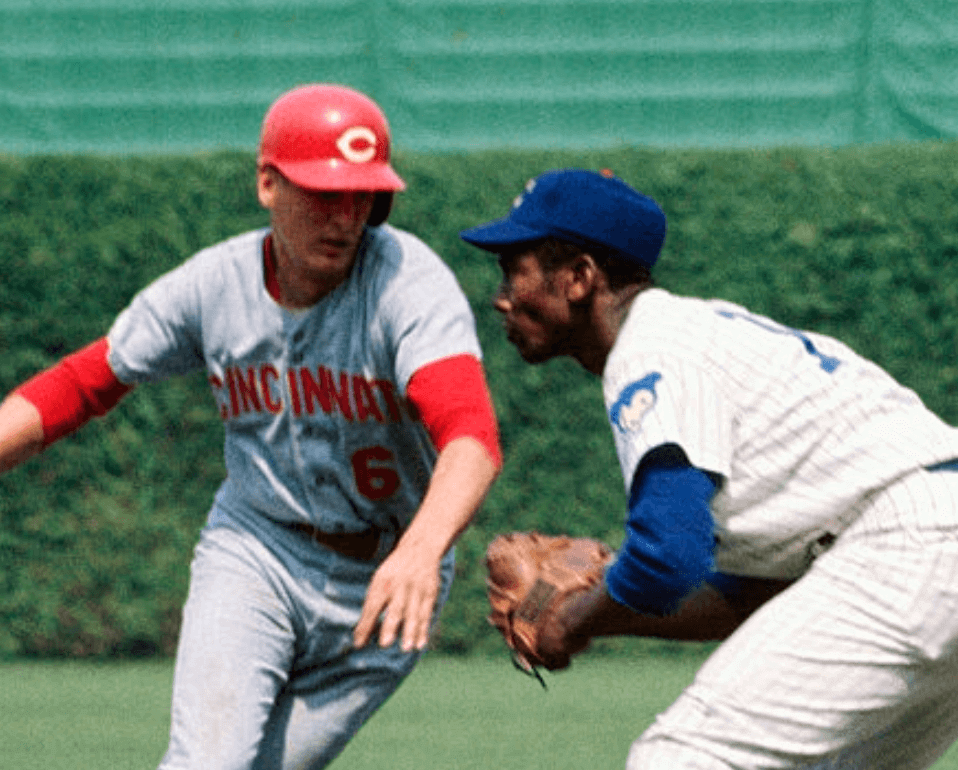
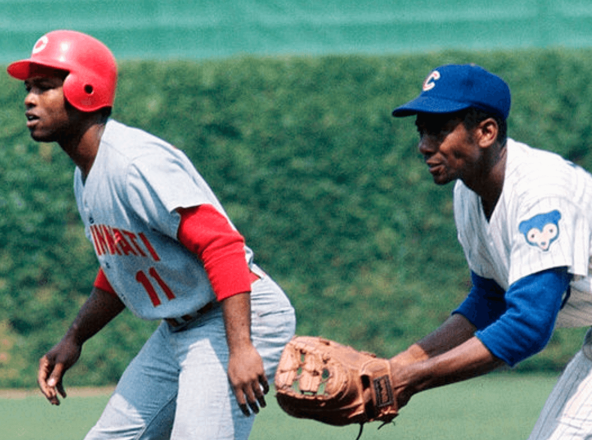
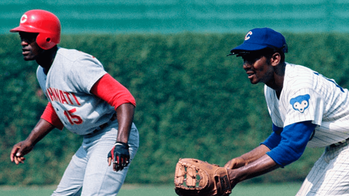
The baserunner in that last photo is a young George Foster. He didn’t join the Reds until 1971, and the Reds changed to polyester pullovers in 1972, so these photos have to be from ’71. So I think we can definitively say that the Reds wore road jerseys without the white outlining for at least part of the 1971 season.
Next, here’s a shot of Pete Rose. The date and location are unspecified. Does anyone recognize that screen in the background?
According to Getty, these next two shots were all taken on May 26, 1971, at Three Rivers Stadium in Pittsburgh. All you Pirates fans out there, do you recognize the dugout?
This next one is also supposedly from Three Rivers, from the following day — May 27, 1971. And in this case, the backdrop makes it pretty clear that this was indeed taken at Three Rivers (click to enlarge):
The Reds did indeed play in Pittsburgh on May 26 and 27, 1971. So this is further evidence that they went without white outlining for at least part of the ’71 season. Makes me wonder if they did it all season long, but I’ve so far been unable to find any other game photos from that season. Anyone..?
Getty says this next one is from Vets Stadium in Philly “during the 1970s.” Does anyone recognize the dugout bench?
Finally, there’s this shot of Johnny Bench — no date or location indicated:
So for now we can say that the Reds went without the white outlining in the 1970 World Series and for at least part of the following season. Hmmmm.
Update: Right after I published this entry this morning, I noticed something. Let’s look again at that page from Bill Henderson’s guide:
As you can see, those jerseys all have white outlining on the letters, but not on the numbers. But Okkonen shows the outlining on the letters and the numbers. And if we look again at that Pete Rose photo from the beginning of the entry, the outlining was clearly on the numbers:
Now, the jerseys in the Henderson guide could have gone through several cycles of use. They could have been worn by multiple players, repurposed for the minor leagues, and so on. And in those cases, the front numbers could have been replaced, which could lead to inconsistencies.
All in all, I’d say this period in Reds history merits further study.
(Big thanks to reader Brice Wallace for getting the ball rolling on this one.)
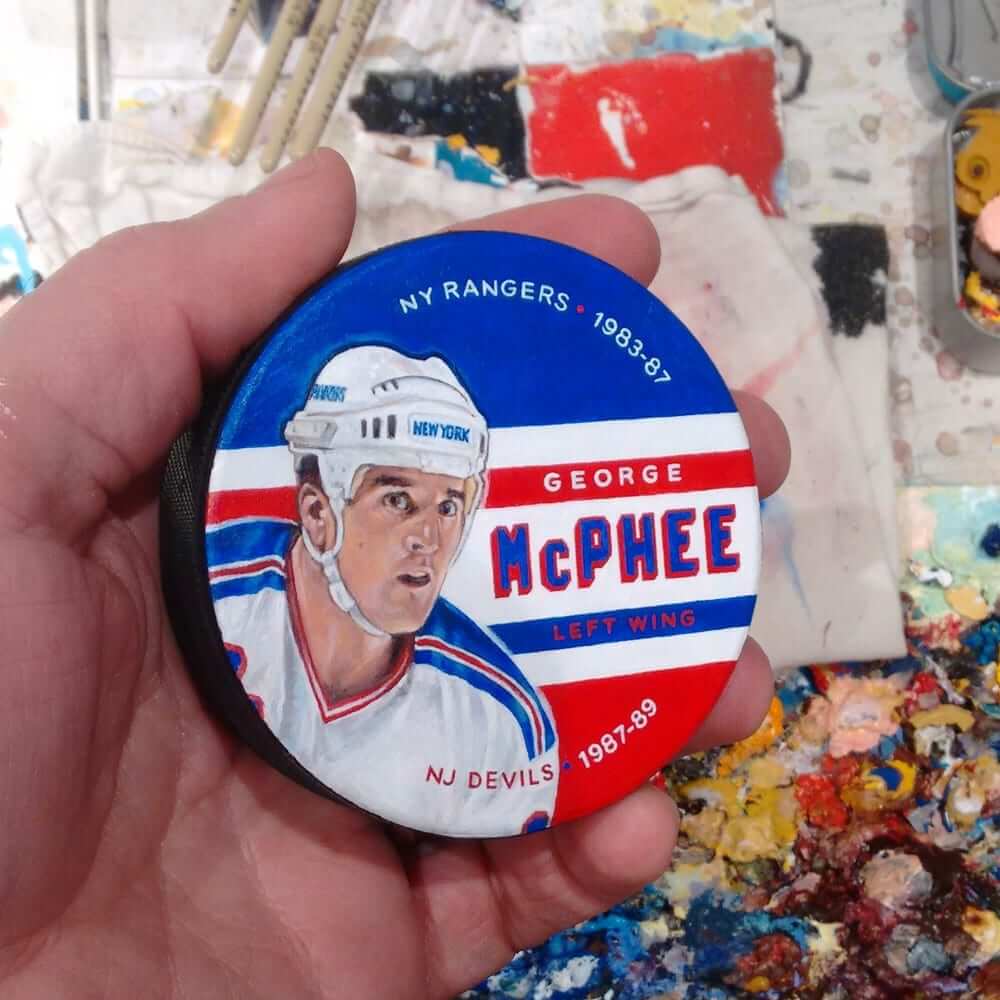
Rubber biscuit: Sean Kane, who’s best known for his sensational custom-painted baseball gloves (and secondarily for designing our latest limited-edition Uni Watch T-shirt), is branching out with a new offering: painted hockey pucks. As you can see above, the results are spectacular. They should make great gifts for hockey fans.
To learn more about Sean’s painted pucks, look here.
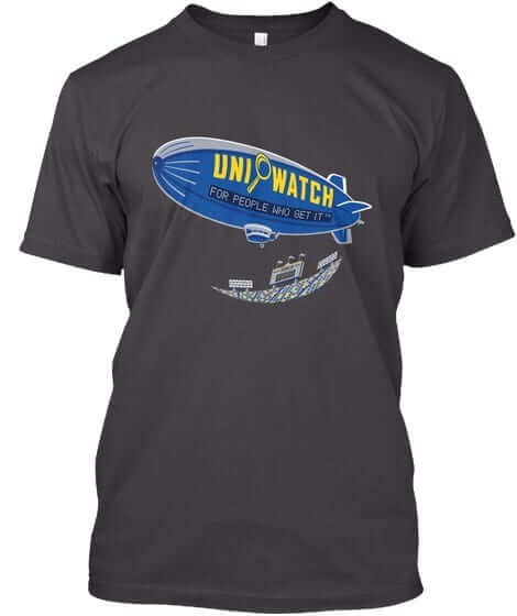
T-shirt reminders: Just a few days left to get our latest limited-edition shirt from the Uni Watch Artist’s Series, designed by the great Sean Kane (shown at right; click to enlarge). It’s available here through next Monday, Oct. 9. Additional info here.
We also have a bunch of new Naming Wrongs designs. Check those out here.
The Ticker
By Kris Gross

Baseball News: Red Sox P Joe Kelly’s postseason cap patch was peeling off last night (from Sean). … Nationals OF Bryce Harper, a Las Vegas native, will wear #VegasStrong cleats for tonight’s NLDS game against the Cubs. … The on-field NLDS logo at Nationals Park is being prepared. … Speaking of the Nats, here’s a great story on those who sell knock-off gear outside Nationals Park, and how they get away with it (from William F. Yurasko). … Diamondbacks coach Ariel Prieto caused a stir by wearing an Apple Watch during the NL Wild Card Game on Wednesday night. The watch could conceivably be used to steal signs, but Prieto said it was on airplane mode during the game. … New jerseys for University of Maine (from Matt Aber).

NFL News: Here is your Color Rash matchup from last night between the Pats and Bucs. Additional photos here. … Anyone else annoyed by the differing stripe width on the Patriots unis? (from @jeffisrael25). … Riddell created a “Franken-helmet” for Peyton Manning, with elements from the Colts, Broncos, and Tennessee.
College Football News: For the first time ever, Oklahoma will go mono-red on Saturday. You can see more in this video (from Darrell Hatfield, Kevin C. Burns). … Akron will wear 1986 throwback unis this weekend. Here is a side-by-side of this week’s helmet and the 1986 version. … We have uni combos for TCU, North Carolina, and Miami (from James Gilbert, Adam Apatoff). … Cross-listed from the NFL section: Riddell created a “Franken-helmet” for Peyton Manning, with elements from the Colts, Broncos and Tennessee. … Maryland and Rutgers will play a football/wrestling doubleheader at Yankee Stadium next month. It’s called the “Battle in the Bronx” and has its own logo (from Matt Shevin). … For the third time this season, Virginia Tech CB Greg Stroman will wear the honorary Frank Beamer No. 25 (from Andrew Cosentino). … Paul Friedmann passed along this look at the Williams College equipment room from 1963.

Hockey News: The Hurricanes shared a photo of the “C” being stitched on their red jerseys, before announcing their captains for this season (from @OlegKvasha). … The Senators and Capitals wore Bryan Murray memorial helmet decals to honor the former coach and GM (thanks Phil). … The Tucson Roadrunners of the AHL will wear Darth Vader-themed jerseys on Dec. 23.

Basketball News: Xavier unveiled their first road throwback uniforms. More details here (from Mike Vulanich). … New home uniforms for Monmouth (from Brandon). … Suspended Louisville coach Rick Pitino reportedly received 98% of the cash from the school’s last deal with Adidas.

Soccer News: Scotland wore their pink kits yesterday to avoid clashing with Slovakia’s white shirts (from Taylor Ericson). … Oh boy. German amateur team SV Oberwürzbach has a new jersey advertiser: porn star Lena Nitro (from Tim Elmore). … Minneapolis City SC of the NPSL have a new kit provider (from Ed Zelaski).

Grab Bag: Here’s an inside look at stadium workers and the sometimes unseen jobs they perform (thanks Brinke).
The change to the Bucs’ CR jerseys was actually last year. The pewter wedges were there for the game against the Rams 2 years ago (Ketchup vs Mustard) but were removed for last year’s game – against the Falcons, I believe.
Ah, right you are. Will adjust text.
Proofreading:
“by wearing an wearing an Apple”
The Pittsburgh newspapers were on strike for both Cincinnati series in 1971.
Fixed.
I want a Don Rickles hockey puck!
close?
link
In the Baseball section of the Ticker…
Harper and the Nationals will be hosting the Cubs, not the D-Backs.
Right. Fixed.
“Anyone else annoyed by the differing stripe width?”
Annoyed? Yes
Surprised? No
The Patriots jersey and pants stripe width has never lined up. I can’t figure out a logical design explanation for that.
link
They’ve always been just a bad uniform set and if the Pats hadn’t enjoyed such phenomenal success wearing them over the last 15+ years, that fact would be more apparent and I suspect the uniforms might even have been replaced by now.
That differing stripe width has been annoying for a generation.
Going further on the Reds uniform issues:
1. In the very first picture of Pete Rose with the white outline visible, the “1” on his jersey is a “stick 1”, without the triangular notch seen on every other “1” in every picture in the series. Wondering why?
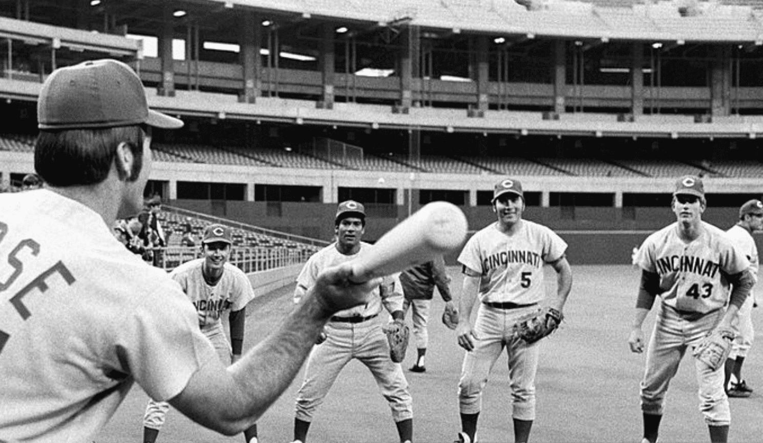
2. In the group shot from Three Rivers Stadium, #43’s “CINCINNATI” is radially-arched, not vertically-arched.
Good eye! Lots of inconsistencies.
The Reds wore that radial style in 1967:
link
That’s a long time for an old uniform to be recycled back into use!
Additionally, some 1970 road jerseys are shown with a button in the middle on the word Cincinnati (the Henderson guide), while in other photos the buttons are above and below the word.
It also looks like the letters are much taller for “Cincinnati” on number 43’s jersey in that same shot from Three Rivers.
Could be that those letters were the ones used for the NOBs and they were switched? It kind of looks like that.
The Cincinnati player wearing #43 is Milt Wilcox, who pitched 16 seasons (1970-75, 77-86) for the Reds, Indians, Cubs, Tigers, and Mariners, winning a World Series title with Detroit in 1984.
More proofreading: there’s a greengrocer’s apostrophe in the first instance of “Dressed to the Nines.”
Also, Phil found a much better picture of the Bryan Murray sticker than I did: link
there’s a greengrocer’s apostrophe in the first instance of “Dressed to the Nines.”
Never heard that term before! But I see it’s a thing:
link
Anyway, very sloppy work on my part there. Now fixed.
Paul- The Baltimore Orioles wore different road jerseys in the 1971 postseason than they had worn all year… and these were also different than the knit jerseys they wore at the start on the 1972 season… so they were “1971 Postseason Only” jerseys. I’ll share the images of these pages with Paul and perhaps he can post them, since I don’t know how to attach images here.
Bill Henderson
Here’s what Bill is referring to:
link
link
To add another weird wrinkle:
That top shot of Rose with the white trim on the lettering also shows it on the numbers, but the jerseys in Bill’s guide have white trim only on the letters, as if they started renumbering jerseys at some point with the solid red numbers, then followed up with solid red lettering when they replaced entire jerseys or something.
Yes, today’s entry includes an update with precisely that observation.
Also, looking at those four shots from the game against the Cubs, I’m thinking the top and bottom photos may have white trim on the lettering. You can see a little halo around the letters, but more telling, you can tell by the weight of the letters. The lettering with the white trim is much finer than the solid red lettering, and you can see the weight difference between the the players in the top and bottom photos and the two middle photos.
The white trim is so fine that it may just be getting lost due to focus and/or color issues in the photos. You may have uncovered evidence of both styles being used in the same game.
Andrew, you’re referring to the shot of Tony Perez playing first base and the one of George Foster (No. 15) taking a lead?
Did you click to enlarge? I don’t see any hint of white there.
Yes. It doesn’t look crisp and white, but the photo also isn’t particularly sharp. You can see a halo around the letters that’s lighter than the jersey color (particularly around the I), and of course, the lighter weight of the letters, which I think is even more telling.
The top photo of Tony Perez is obviously taken on a different roll, but the letters look much finer than the next two photos. The bottom three photos are more comparable as they look to be from the same roll, and in particular, the bottom two show the lettering from the exact same angle. The lettering on George Foster’s jersey looks much finer in weight than the lettering on Hal McRae (#11) in the photo above.
Even looking at the photos in Bill’s guide, you can see how the white begins to blend into the light grey as it gets older and dirtier, which is another reason it might not show up crisp and bright on in-game photos that are a bit out-of-focus and oversaturated. That close up photo in the top right of Bill’s page is particularly telling, as you can clearly see the trim in the foreground, but it begins to blur out of focus and blend into the grey background as the field deepens and the focus softens (looking very much like the halo around the lettering on Tony Perez and George Foster).
Impressive analysis!
But I’m not completely convinced. Here’s why: Look at the Cubs players in those photos. The white outlining on their sleeve patches and headwear logos is plainly discernible. In the first photo, even the little white uni number handwritten *inside* the helmet logo is visible. If we can see all of that, we should be able to see the Reds’ outlining too. (And yes, I realize there are differences in the weight of the outlining, the materials, etc. But still.)
I think it’s just the stitching on the edges of the numbers that looks like it could be a white layer. As uniforms get washed over and over, that stitching tends to weaken and can fade in color faster than the material that it’s sewn into.
Can we accept that something important was lost when grey baseball uniforms switched to polyester? What I wouldn’t give to make sure Under Armor adds the heather crosshatching to baseball’s road uniforms when their time comes.
As long as it’s done with actual blended fabric (as opposed to a repeating sublimated print, I’d be in favor of that).
Agreed – that’s an awesome little detail
Paul – a while back, you did an exploratory trip to Rhode Island- next month, I am going to Pawtucket for a birthday party, which I believe is going to be at one of the places you visited. Can you please give a link to that day’s post? The place I am going to is Breaktime Bowl, the place with the four duckpin bowling lanes….
Thanks!
Here you go, Lou:
link
Thanks!
I’m happy that Xavier brought those royal blue uniforms back. That was one of my favorite basketball uniforms when I was a kid. I also loved that Runningman logo.
I know I sound nit-picky here, but I’m so tired of college football teams calling all white uniforms “stormtrooper” or “ICY WHITES *snowflake emojis*”. It’s tacky, played out, and just flat out doesn’t sound as cool as the school might think it does. Also worth nothing – TCU hasn’t worn purple tops once this season (although I’m sure Paul is happier about that than me).
About the 1986 Akron throwback uniforms: While the helmet and pants are accurate, the jersey is not! I was a student at Akron in 1986. The 1986 jersey had the wordmark AKRON (not Zips) in white (not gold). The Zips also wore a mesh jersey during that time.
Are you Still Calling It Akron U?
Yeah, there’s nothing throwback-y about that jersey at all. They’re just wearing throwback helmets, which is what the their tweet says.
link
Here’s how the Faust-era jerseys looked.
link
To answer your question, Jim, I have never called it Akron U. I worked as a reporter for the student newspaper at that time, and Akron U was against our style.
Yeah, I worked for WAUP/WZIP and it was against their style too. But off the air I still called it Akron U.
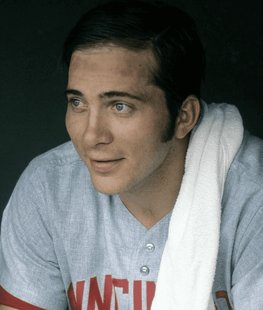
Those Reds roads in the Series are just beautiful.
I am also annoyed with the Pats pant striping not in unison with the side panel striping, but also the red outlining the blue stripe makes for a purple look from a distance
I’m not bothered by the Patriots all-white uni, but that Tampa Bay color rash set is one of the ugliest uniforms I’ve ever seen.
“Color Rash” looks like Diaper Rash.
“Anyone else annoyed by the differing stripe width on the Patriots unis?”
YES. Incredibly.
link
These uniforms are far from my favorite, but they would be helped immeasurably by making a solid red stripe (of consistent width) down the sides.
Late west-coast entry…the New York Giants wore special all-black uniforms in both the 1905 and 1911 World Series. The legend is that pugnacious Giants manager John McGraw was trying to get demure Athletics manager Connie Mack’s goat. It worked in ’05 but the encore in ’11 fell flat.
link
link
Ah, yes. Of course. Thanks for filling in that blank!
Another from the same era: the link added a pinstriped uniform for the World Series that year — their first time every wearing pinstripes, I think. This uniform would them morph into the similar one with the C-and-bear logo, then the famous one with “CHICAGO” written vertically down the placket.
Also, in 1908, they seem to have gotten new all-navy blue caps for the World Series.
Good one!
In 1953 the Yankees got new uniforms for the World Series. They featured a more angular NY logo reminicent of the 1930s style.
link is the regular-season uniform, as worn by Johnny Mize on April 26, 1953. And link is the uniform that was worn in the World Series.
In 1954, they returned to the normal uniform, as seen link.
Good one. Thank you!
I’m curious about that 1963 photo of the Williams College equipment room. The football helmet, which appears to feature a Continental soldier, doesn’t seem to jibe with Williams’ nickname (the Ephs). I took a quick look at Williams’ yearbook from 1963 and the football helmets pictured are white with a dark number on each side. I suspect either the equipment room belongs to another school or the Williams locker room happened to have a football helmet from a competitor.
Nope, that’s an Ephs helmet.
link
It’s actually the second time this season–third time in his career–that Greg Stroman wears #25. He wore it in once 2016 and twice in 2017, bringing his career total to three. Additionally, “This weekend’s game will mark the first time any player has been awarded the No. 25 twice in one season.”
link
I always thought the Mets wanted to have nice new uniforms for the 1969 WS, so they basically pre-ordered their 1970 uniforms with the logo patch and added the 1969 MLB patch to the opposite side. In 1970, they simply removed the MLB patch and wore those unis. Perhaps the Reds did something similar.
This reminds me that during their run of Stanley Cups, the Islanders always got new uniforms for the playoffs. I know this, because they never used the same number font two years in a row.
There’s a greengrocer’s apostrophe in the first instance of “Dressed to the Nines.”