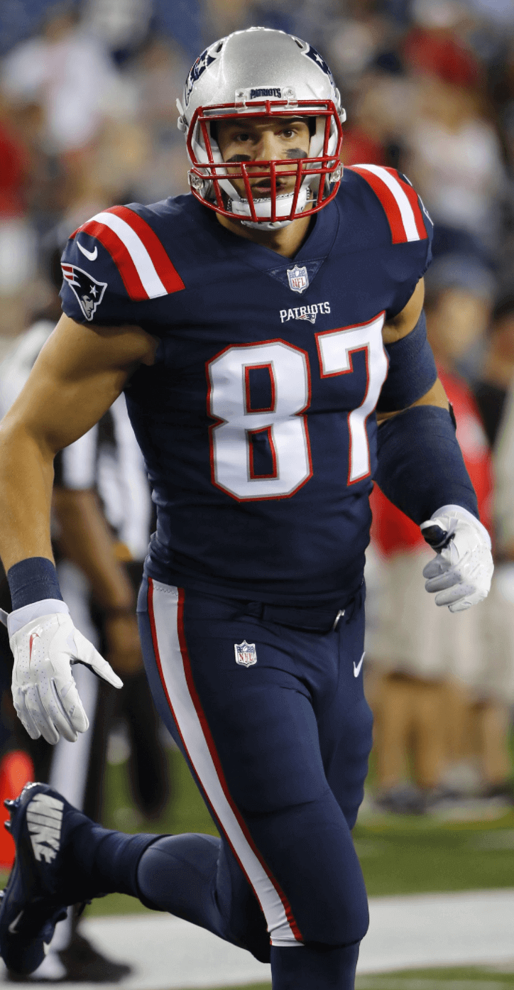
Yesterday’s Ticker included the news that the Pats will be wearing mono-white with a new set of white pants for tonight’s game against the Bucs. But as several readers pointed out to me, the Pats also announced something that wasn’t in the Ticker: They’ll be wearing their mono-navy Color Rash uni — the same one they wore last season for a Thursday-night game against the Texans (shown at right; click to enlarge) — when they host the Falcons on Oct. 22.
That’s a Sunday.
You know, up until now I’ve been able to deal with Color Rash by mentally slotting it in its own little Thursday-night box and then ignoring it. Sure, most of the uniforms suck, but I live in New York City, where there’s almost always something more interesting to do on a Thursday night than sit on my ass watching a football game. So I’ve made it a point to find other things to do with my Thursday evenings. (Tonight, for example, I’m going to the movies.)
But if the Rash is going to start spreading to Sundays, that’s gonna be a problem. It’s like a virus that was safely locked away in a lab, but now there’s been a security breach and we could end up with a pandemic. If teams start treating the Rash designs as just another alternate look that they can trot out whenever they please, that’s seriously bad news. Do you really want to see the Seahawks in mono-neon on a Sunday? Or the Bills in mono-red? Or the Vikings in mono-purple? Keep that on Thursdays where it belongs.
(Some of you may be thinking, “This isn’t news, because the Lions are wearing their new mono-grey Rash design on Dec. 16, which is a Saturday.” But those Saturday games are actually considered to be part of the NFL Network’s Thursday-night schedule, so they’ll feature the Rash.)
Two additional thoughts: First, the Pats’ navy Rash jersey has no TV numbers. When’s the last time that happened for a non-throwback, non-Thursday game?
Also, it’s worth noting that if the Pats were dying to go mono-navy on a Sunday for some reason, they didn’t need to spread the Rash. They could’ve just worn their navy home jerseys with their navy road pants. There’s even precedent for it — they went mono-navy for a 2002 game against the Broncos:

That’s an awful look, of course. But so is the Rash version. So why bother to spread the Rash when they could just wear their navy primaries? I’m sure jer$ey $ale$ have nothing to do with it, right?
T-shirt reminders: In case you missed it last week, our latest limited-edition shirt from the Uni Watch Artist’s Series is by the great Sean Kane (shown at right; click to enlarge). It’s available here through next Monday, Oct. 9. Additional info here.
We also have a bunch of new Naming Wrongs designs. Check those out here.
The Ticker
By Paul

’Skins Watch: The official village seal of Whitesboro, N.Y., which appeared to show a white man assaulting an Indian, has been revised. … An Oregon high school has changed the name of its sports teams from Indians to Mustangs, but its new mascot logo includes some Native American elements (from Dylan Darling).

Baseball News: Yankee Stadium has lots of extended netting during batting practice, but not during games. That will change next year, when they install permanent extended netting. … Here’s a write-up of the recent Army/Navy 1917 throwback game. Additional photos here (from @vossbrink). … New Era is doing a bunch of MLB caps with menswear designer Todd Snyder (from Tommy Turner). … Reader Tim Arzaga is conducting an online poll about the Padres’ team colors. … Here’s something I didn’t know: When the Indians make it to the postseason, they add extra seats in the aisles. “Season ticket holders in aisle seats aren’t happy,” says Robert Hayes.

NFL News: According to this story, the Colts had initially prepared a No. 16 jersey for Peyton Manning during the lead-up to the 1998 NFL Draft, because that’s the number he wore at Tennessee. But Manning wanted to wear No. 18, because his father had worn it in college and his brother Cooper had worn it in high school, so the Colts had to get an 18 jersey made at the last minute and have it flown to the draft (from Andrew Walker). … Check out this old shot of Lions TE Charlie Sanders. See how his front numbers had white outlining on the outside but not on the inner borders. The TV numbers have the full outlining, however. Also, the sleeve striping is two-color — white for the thin stripes and silver/grey for the center stripe. The photo is from a 1972 preseason game, and sure enough, the Gridiron Uniform Database says that was a preseason-only jersey design (from Gene Sanny).
College and High School Football News: Yesterday’s TIcker reported that UNLV and SDSU would be wearing red ribbon helmet decals for the victims of this week’s Las Vegas massacre. I had assumed that this would be a small ribbon on the back of the helmet, but it turns out that the ribbon will be the main helmet logo, at least for UNLV. There’s also talk of having a ribbon on the jerseys (from @MarkJar07). … Here are this week’s uni combos for Vanderbilt, Texas State, and Virginia Tech (from Phil, Michael George, and Andrew Cosentino). … Here’s a good piece about Iowa State’s assorted logos, including the new cyclone/Bugle logo they debuted last week. Good stuff. .. Purdue will honor former coach Joe Tiller, who died last weekend, by wearing throwback helmets and a memorial decal (thanks, Phil). … New navy jerseys for Stony Brook (from Patrick Muffley). … Here’s a weird one: A high school team in Texas is using the NHL’s Buffalo Sabres’ old “Buffaslug” logo on their helmets (from Tris Wykes). … Blake Gillikin punts for Penn State and brother Tyler is the long snapper at Northwestern. With those two schools playing each other this weekend, Blake and Tyler’s mother will be wearing a PSU/NU Frankenjersey (from Blake Fox). … Georgia Southern has been dealing with some NOB font inconsistencies.

Hockey News: With the NHL season opening last night, we finally got our first on-ice look at the Oilers’ new orange home uni, which they had avoided wearing during the preseason. … Speaking of the Oilers, they’ve also changed their home chinstrap color. … The Blues are adding a memorial helmet decal for former player Noel Picard, an original Blue who died last month (from Brendan Mongey). … One of the people killed in the Las Vegas massacre earlier this week was a Kings employee. She’s being honored with a memorial helmet decal (from @j_foreigner). … Blackhawks LW Bryan Bickell, who signed a one-day contract with the Chicago so he could retire as a member of the team, wore a Reebok jersey to his retirement presser. … The Milwaukee Admirals will go G.I. Joke on Nov. 11 (from @NicholasOfMKE). … Vietnam War-themed jerseys upcoming for the Bakersfield Condors. … New third jersey for the Clarkson women’s team (from Cap Carey). … LGBT pride jerseys this weekend for Miami of Ohio (from James Hoppe). … The menswear label Joseph Abboud will provide custom suits for 20 NHL coaches (from Tommy Turner). … Cross-listed from the football section: The Sabres’ old “Buffaslug” logo is being used as the helmet logo for a high school football team in Texas (from Tris Wykes).

Basketball News: Here’s a piece on how the Mavs’ infamous “trash bag” uniform became a collector’s item (from Phillip Foose). … A Knicks blogger has gone into considerable detail trying to prove that the team is using a new shade of orange. I initially didn’t buy it, but Robert Silverman has convinced me. … The WNBA’s Los Angeles Sparks, who had declined to be on the court for the playing of the national anthem during the first four games of their championship series against the Minnesota Lynx, stood on the court for the anthem prior to last night’s decisive Game Five. … I haven’t had time to fact-check this, but Quentin Medeiros says every NBA team participating in the first four days’ worth of preseason games wore white socks, except for the Magic. … Duquesne, which had been outfitted by Adidas, is now with Nike.

Soccer News: France’s pre-match World Cup jersey has leaked (from Stephen Santangelo). … Interesting note from our own Jamie Rathjen: “Washington Spirit (NWSL) midfielder Joanna Lohman posted a picture of her Spirit change shirt from this past season on Twitter. The catch is that she suffered a torn ACL 20 minutes into the first game of the season in April, so this is a shirt that she never wore on the field. Don’t know how often we get to see something like that.”

Grab Bag: A female Iranian chess champion who was shunned in her homeland for refusing to wear a hijab while playing will play in the United States instead. … Really interesting piece on a conceptual artist who uses sports jerseys and balls in his artwork. … A Pittsburgh columnist says things were better before fans started wearing jerseys, and I couldn’t agree more (from Adam Greenberg). … This is pretty awesome: About 150 people tried to draw famous brand logos from memory (from the Tugboat Captain).
I’m pretty sure that the ticker mention of Orlando being the only NBA team not to wear white socks is accurate. I think they’re also the only team to wear compression tights in a color other than white, again going with blue.
Paul the Charlie Sanders photo item is in the baseball ticker section.
Thank you. Fixed.
I think the 49ers 1994 NFL 75th Anniversary throwbacks didn’t have TV numbers…and they wore those in the Super Bowl!
Right. But I specifically said non-throwback.
Ugh…l knew that l should’ve had some coffee before l posted…thanks Paul.
Can we agree that the color rush is probably the dumbest league-wide uniform concept in history? The one shell rule dooms the whole idea to begin with, and then there are the natural color clashes and the color blindness issues. The end result is maybe 2 of these games actually resulting in both teams wearing non-white mono-color uniforms. And save for a Denver-“LA” Chargers game, they’re nothing worth viewing. At least the oddball things that MLB and NBA have done in the past at least had a little charm. This is just a total dud, to the point where I’m shocked the NFL even got behind it in the first place.
I can’t get on board with this one. It neither picks my pocket nor breaks my leg that some teams opt to wear uniforms that in some cases improve on their everyday wear (Rams, Bengals, Broncos, Dolphins, Ravens, Vikes) I have bigger fish to fry, like the one-helmet rule.
Not only is the idea dumb, but it’s unbelievable how sloppy the execution is. Several years in, and it still comes across as incredibly half-assed.
“Here’s a weird one: A high school team in Texas is using the NHL’s Buffalo Sabres’ old “Buffaslug” logo on their helmets”
“Tris, why is this weird?”, I thought to myself. Just another school pinching a pro logo. Right?
Weird #1 maybe(?): It’s a hockey logo on a football helmet? Not weird if the school’s logo/mascot is the Buffaslug.
Weird #2: The Buffaslug is NOT the *school* logo. It isn’t found anywhere else in their world, website, gym floor, school book covers, banners, etc. Nothing.
Tris is correct. It’s a weird one.
Actually, it would be weird for a Texas high school to use a defunct and widely ridiculed Buffalo hockey logo as its own logo. (It would also be unethical, but that’s a separate argument.)
But since the mark doesn’t reference hockey or any other sport, it’s not inappropriate for a football helmet.
I didn’t say it was “inappropriate.” I said it was weird for a Texas high school to use a defunct and widely ridiculed logo from a Buffalo hockey team. And it is, by any objective measure.
A school we play against, the Hazen Bison, in ND uses the same logo on their helmets. They have for several years, I think shortly after it began being used by the Sabres.
At least they use the logo for the entire school–not just ONE thing.
link
True, the Patriots could have worn pieces of their regular set to go mono-navy. But I’d argue they should adopt the alt blue jerseys and the alt blue pants on a full-time basis to replace the monstrosities they wear on a regular basis. I wouldn’t have them in mono-navy, but the alt jersey is better than the regular navy, and the alt pants are better than the regular navy pants.
They can’t adopt the Rash jersey as their primary — no TV numbers.
They should tweak the design to include TV numbers and make that the primary. Their current navy jersey (and the white one, too) is a mess.
Agree, the tops are so much better than what they currently wear. I think they are one of the most aesthetically pleasing ones in the league.
Just get tv numbers on there.
I’d rather the Patriots wear last years blue Color Rush jerseys with this years white pants and make that the full time uni. Just get white helmets too. (NFL really needs to get rid of the one helmet rule).
Why? Those are straight up Houston Texans pants. I mean, they’re better than the normal blue pants, but this team needs a full scale cleanup, not just a square peg forced into a round hole to make them look slightly better and more generic.
“But Manning wanted to wear No. 18, because his father had worn it in the NFL and his brother Cooper had worn it in high school, so the Colts had to get an 18 jersey made at the last minute and have it flown to the draft (from Andrew Walker)”
Incorrect. Archie Manning did not wear 18 in the NFL. He wore 18 at Ole Miss. He wore 8 with the Saints and Oliers and 4 with the Vikings.
Fixed.
Speaking of Archie, did you ever get ahold of him to ask about all his different facemasks?
Re: Edmonton Oilers new home uniform. Is the orange the same shade (pantome? – not sure I’ve spelt that correctly) of orange as the Flyers?
Don’t know about the shade of orange, but noticed something when watching a bit of the game on the tube.
Some of the fans in the stands were wearing better Oilers jerseys than the ones on the ice. Those jerseys looked like this:
link
Close: it’s Pantone, not Pantome. My understanding is that yes, the orange in the new sweaters is slightly lighter than what the Oil wore last year.
For my money, I preferred last year’s sweaters, specifically because of the TV numbers high up in the shoulder yoke. They could have owned that for years.
how do they compare with the Orange the Oilers wore in the WHA?
Not sure why such so strong on the dislike of the mono uniforms. I think the jersey itself for the Patriots is quite an improvement (mostly due to removing the clutter). The pants could have been better, but I still put this combination above or at least equal to their normal set. Other teams have varying levels of success, sure, but its not like its for all games, all season
the $$ comment almost leads me to believe part of the dislike for the color rush is due to anti-corporation views, instead of the design itself. I hope I am wrong, and please forgive me if I reading too much into things.
Sure it makes more money for the league, but as long as its only a few games each year, it seems like something ‘fun’ the league is doing. A change in pace. Regardless of the cause ($$), I like the outcome, a spice to the mono uniforms of the past (mono meaning the same uniform day-in & day-out for years)
the $$ comment almost leads me to believe part of the dislike for the color rush is due to anti-corporation views, instead of the design itself.
Hate the awful designs, and also hate that the awful designs only exist as a vehicle for sales.
as long as its only a few games each year, it seems like something ‘fun’ the league is doing.
The entire point of today’s entry is that it’s not just sticking to a few games each year. It’s spreading. And really, why have awful designs for ANY games? It’s all shit. Much like MLB’s Players Weekend, I’ve never understood the point of view that says, “Sure, it sucks, but it’s only for a few minutes.” Why EVER have something that sucks?
Your UniWatch t-shirt designs only exist as a vehicle for $ale$…what’s the difference
1) Go back and read my previous comment.
2) Read the link I provided in that comment.
Thanks.
The Uni Watch Tees are well designed and look great. If the NFL want to do a set of alternate jerseys, no matter what they are influenced by, at least make them look good.
Many NFL teams are only adding a matching colored pant to a jersey already in their uniform set. A few go a bit further with a facemask color change or helmet decal change, but these are elements 99.9% of the public are not seeking to purchase. (Who’s buying NFL pants?) So if it’s only to sell more jerseys, why aren’t all teams required to wear an entirely new uniform?
Matt, there are a oouple of differences between most “mono” of recent generations and the Color Rush.
1) The Color Rush jersey tops do not have TV numbers.
2) The Color Rush pants have stripes that truncate partway down instead of going all the way down the side
3) In Color Rush (for the most part) the socks are long and match the pants and jersey.
3a) Color Rush uniforms are meant to evoke some throwback elements of teams (except for tonight). Take the shade of blue chosen for Color Rush for the Chargers. It is the cornflower blue of Air Coryell, not the navy or the powder blues.
The Color Rush jersey tops do not have TV numbers.
That is incorrect. Most of them do have TV numbers. The Pats’ navy design is an exception.
Color Rush uniforms are meant to evoke some throwback elements of teams (except for tonight).
That is basically marketing bullshit that was presented when the program was launched but has turned out to have little relation to what we’ve actually seen on the field. Where are the “throwback elements” on the Jags’ Thurs-night uni? Or the Vikings’? Or the Ravens’? Or the 49ers’? I could go on.
I couldn’t agree more with this, Matt C. Why not discuss each jersey on its own merits, instead of just taking a position on that they are all “Rashes” just for $$ (you know, bc everything else in pro sports is pure and not for $$???) and thus bad regardless of what they look like.
This Pats jersey is nice, actually. The red on the shoulders is sharp, and the jersey is clean. Like it.
In the Hockey ticker, Joseph “Aboud” should be Joseph “Abboud”
Fixed.
In regards to calling the Milwaukee Admirals promo jersey “G.I. Joke”, why doesn’t the “Vietnam-themed” promo from Bakersfield fall into that criticism? They both are being touted on “Military appreciation nights”, so I don’t understand why you are more harsher on one than the other (do they both qualify as “GI Jokes” in your eyes?).
“G.I. Joke” has always been a term I reserve for camouflage designs.
Proofreading:
“had white outlining on outside but not on the inner borders” the outside
“The Sabers’ old” in Hockey; it’s OK in Football
“A Pittsburgh sportswriter” actually a columnist on the news side
Fixed.
I find it very comical some of your takes against what’s going on in the sports world as money grabs, yet you continue to trot out your own endless line of limited edition shirts, t-shirt clubs, and naming wrongs merchandise.
Actually, I have never once used the term “money grab.” In fact, I dislike that term.
In any case, you’re missing the point. My gripe with jersey sales, at least in the context of today’s entry, is not the sales themselves but that the sales DRIVE WHAT WE SEE ON THE FIELD. It’s the tail wagging the dog.
My T-shirt sales don’t drive anything but the shirts themselves. There’s no tail, no dog — just fun creative projects (and, in the case of Naming Wrongs, commentary). We’ve actually been through this before. Here, read this: link
Back in 2002 the players asked belichek to go mono navy for that game against the Broncos. They lost that game pretty badly. Apparently the first meeting after the game belichek ripped into the players, saying they were more interested in looking good then playing good.
Except it’s not a good look at all!
When I heard the Patriots were going mono-white on Thursday, first visual that automatically crossed my mind was this:
link
Then I had to come back to my senses and reality. Realized they are just adding white pants.
I’d love to see the Pats try to get Nike to replicate those shoulder stripes! Can’t do that with those rote 3-stripe panels.
Paul:
Believe the Bengals were the last team to go without TV numbers for non-throwback/non-Thursday games – they didn’t have TV numbers for the first 12 years of their history (1968-79). They added TV numbers and black facemasks in 1980, then did their complete makeover in ’81.
As for the debate over fans wearing team jerseys…the Post-Gazette columnist misses the mark. There’s definitely “ample evidence” that Steelers fans were wearing jerseys to games – check the NFL Films highlights for Super Bowls IX and X, both of which clearly show Steelers jerseys at the game site. And I’m pretty sure that the P-G has photos in its archives which run contrary to Brian O’Neill’s contention. It would be more accurate to say that *player-specific jerseys* are the recent phenomenon; team gear has been worn more and more at games since the late ’70s and early ’80s.
I get his general point – after all, as the saying goes, we’re just rooting for laundry, which is why my 49ers jersey is not player-specific (as a third-generation fan, I wear No. 3). But one writer’s experience should not be taken as overarching gospel.
one writer’s experience should not be taken as overarching gospel.
Classic straw man argument. Nobody claimed his point of view to be “overarching gospel.” It was just another item in the Ticker.
Meanwhile: Good call on the Bengals being the last team without TV numbers. Kind of amazing that they went without them, since sleeves were plenty long in those days:
link
link
There were 2 equipment-related infractions committed by the Maple Leafs last night.
Leo Komarov received an “illegal equipment” minor penalty for his visor being too high and not covering his eyes.
Frederik Andersen started the game with blue tape on the end of his goal stick, but was instructed to change it to white tape during the first intermission.
link
I did not know that was a penalty but I am interested to see how common (or not) this infraction becomes, and if it is actually called, who will get more whistles: Carl Hagelin or Niklas Kronwall!
Day late and a dollar short on this topic, but somebody asked for an explanation of the Hornets’ colorful jersey-only pinstripes. I’m of the mind Alexander Julian took inspiration from cricket sweaters and khaki shorts (witness the pleats). The stripes’ outside-of-the-box colors upset me about as much as the extra colors of the Chicago Blackhawks’ crest; which is to say, not at all.
My understanding is that the stripes were in keeping with the colours inside the arena.
Couple quick thoughts. Great entry today Paul and thanks for Uni-Watch. Always a pleasant part of my day. I’m not watching the NFL for a while but I should mention that I hate everything about Thursday Night football. Football for me has always been Sunday’s and Monday night. No interest in football on Thursdays.
Paul mentioned he lives in New York City. While technically correct Paul lives in Brooklyn. Most folks who live in the outer boroughs say they live specifically in that Borough. For example if you asked someone who lives in Staten Island where they live they would tell you Staten Island. They’d never say they live in NYC. NYC as a home is generally reserved for those who live in Manhattan. Perhaps Paul was just trying to simplify it for his readers that live all over the country and don’t understand how we do things here in the NYC metro area.
Most folks who live in the outer boroughs say they live specifically in that Borough.
No offense, but I don’t think you can speak for literally millions of people, and you certainly don’t speak for me. Yes, I live in Brooklyn, but Brooklyn is part of New York City. I vote for NYC’s mayor, I pay NYC taxes, etc. I identify strongly as a Brooklynite *and* as a New Yorker.
In any case, you’re missing the point, which is that NYC (not just Brooklyn) offers me a lot to do on a Thursday night. Case in point: I’ll be in Manhattan tonight, not Brooklyn.
No offense taken Paul. Try a test next time your out. Ask folks where they’re from. I’d say more than 3/4 will tell you what borough they live in. I’ve never lived in any of the five boroughs so I’m only going with a lifetime of experience in speaking with city dwellers. Yes of course the 5 boroughs make up up NYC and you all vote and pay NYC taxes. Each borough has an individual character and I’ve merely found that the residents of those boroughs identify with them as their homes by name
If Paul calls 911, the NYPD and/or FDNY will show up. That’s good enough for me.
Staten Island resident here. I always identify my place of residence as New York City.
I live in LA, so I have very few acquaintances from NYC. But I do know some people from Queens, and a few from Brooklyn. In both cases they always say they live in New York (they omit “City”).
My $0.02 (I’m from Long Island).
If you ask someone from the 5 boroughs where they are from while within the 5 boroughs, the response will be which borough they live in.
If you ask someone from the 5 boroughs where they are from while outside the 5 boroughs, the response will be New York (Typically omitting ‘City’).
I was going to weigh in with the same assumption. That’s probably true for a lot of locales.
If you ask a Minnesotan where they’re from while in MN – they’ll give a city name. If you ask them the same question outside the state, they’ll say they live in MN.
Actually for unexplainable reasons Minnesotans will usually state the city, followed by the state. Where you from? Edina, Minnesota. As if there is another Edina of interest to us. :-)
I don’t come to the comments often, but do most folks not think the Pats Color Rush is an improvement? I’d rather see them in those mono-navies that are at least sorta a faux-back look than the weird 90s CFL unis they currently sport.
Yes. Agreed.
The white over white look is attractive. Nicer than white over blue or white over silver. Silver helmet should be white, too, but it’s pretty well washed out in the lights.
Noel Picard was a solid defenseman for the Blues for several years, and in the right place at the wrong time for one of the iconic photos in hockey history. It was Picard and his stick that sent Bobby Orr flying after scoring the series-winner in Game 4 of the 1970 finals.
Those extra seats in Cleveland are ridiculous. Aren’t aisles made for getting in and out of rows with some ease? And let’s not mention the safety aspect. Why don’t they just add some seats on the field. Oh wait, they do that already.
I agree with you, I believe adding those seats in the aisles is a violation of the building/fire codes. Ridiculous.
Will, if it was really a violation of municipal codes, do you think they’d get away with doing it? And promoting it on their Twitter feed? They’ve been doing this for every postseason appearance since 2007. Do you really think the building inspectors didn’t notice?
Not defending the extra seats, but leaping to “It’s a code violation!” is a stretch.
Come on, people — let’s think a bit harder.
“Come on, people — let’s think a bit harder.” Can only think I’ve never heard of a stadium/arena doing this before. A new revenue stream creation has been born …
I’ve never heard of anyone doing it either. That wasn’t the point being addressed.
Many teams/stadiums add seats for large events or post season games. The Cowboys and Colts added seats for the Super Bowl. The Yankees used to add a row onto the infield seats during the post season at the old stadium.
Right. But do they add them *in the aisles*? That’s what’s unusual about the Cleveland situation.
If I had Tribe season tickets on an aisle, and they boxed me in like that, they’d never see another dime of my money.
And, you’re right, it’s a safety issue. It’s kind of surprising to me that the local codes allow it.
I personally think the new white Rash pants paired with the navy Rash jersey would be a better look for the Pats than what they have now. But that’s the only Rash unis that I like.
We should be encouraging the Pats to wear their Rash jerseys, because their official jerseys are a ridiculous turn-of-the-millennium mess of colors, slashes, patches, and outlines, and the Rash jerseys are a step toward eliminating silver from their color scheme.
Actually their regular unis fit nicely with yesterday’s topic of the NBA in the 90s.
For those of you who care about these things, the Rock & Roll Hall of Fame announced its 2018 nominees. Link Wray, who a while back got a Uni Watch mention in a post about Native American musicians, is nominated for only the second time. Wray was one of the pioneers of R&R, way ahead of his time, sonically innovative and a big influence on lots of guitar players, including Pete Townshend, Neil Young and Jimmy Page. In addition to his own body of work, his playing on Robert Gordon’s first two albums is amazing. In my humble opinion he is worthy of induction so if you want to rectify a small injustice, go to link and cast your vote. Thanks.
Twenty-five years ago I was really excited about the idea of a Rock & Roll Hall of Fame, and I was a charter member up until a couple years ago. Then it sort of became a joke, where every band who had a minor hit got inducted. Don’t get me wrong, I got no quarrel with Link Wray. I just think that, generally speaking, getting into the R&RHoF is like if they let everybody who hit above the Mendoza Line get into Cooperstown.
They’ve been dead to me ever since they inducted ABBA.
I am still baffled as to why I get worked up every year because 95% of the artists I listen to are not nor ever will get into the R&R HOF. I agree that there are way too many who are not HOF-of-any-kind worthy. I guess I have a soft spot for Wray and want to see him recognized by a wider audience. I think of him as less of a Mendoza Line guy and more like a solid player who got inducted by the Old-timers Committee.
It feels like the pro football hall is getting that bad as well
Interesting that New Era logo on side of the Todd Snyder MLB caps is the same color as the cap so it doesn’t ruin the look of the cap. That’s how the logo should appear on the standard MLB caps (or better yet, get rid of it altogether).
While I hate the spread of the rash (love that turn of phrase BTW Paul) i’m Slightly torn on my Pats here. As others have said, the navy color rush jerseys are superior to the current home jerseys, and IMO are a great mix of the B/B dynasty era look while being slightly reminiscent of the Pat Patriot unis thanks to the sleeve stripes. Personally, I would love it if they added TV numbers and made them the new home jerseys (which a matching white set for the road), obviously without the mono element. Hence my being torn, I HATE the idea of, to quote Paul, the uniform tail wagging the dog. But if Pats were driven by sales to make that change, I wouldn’t be upset about aesthetically.
Also, quick note on the fans wearing jerseys thing. I self-admittedly am a jersey wearer (wearing a Pats jersey and Yankees cap on the office today) but in all honesty I’ve come to agree with Paul’s stance on the negative impact selling “authentic” “gear” has had on in-field/court/ice uniforms. However, that said, there’s always a prevailing notion that team stuff was never sold before the 70s, which is inaccurate. Obviously not to the authentic lengths we see now, but rudimentary baseball caps and replica uniforms were on sale as far back as the 1920s at least (according to books I’ve read on the 1923 Yankees).
I loved the contrast of the white ear-loops and chin straps on the Oilers helmets. I’m sad to see them change with the darker helmets.
I haven’t been able to keep up with the blog the last few weeks, so maybe someone already noticed this, but it seems the Lakers’ yellow looks more neon-ish on TV with the new NIKE threads? I am wondering if this could be the same case as the NY Knicks jerseys. Here are a few links showing what I mean…
2017-18: Neon – link
2016-17: Normal – link
Nike can’t get greens in the NFL right. I wouldn’t be surprised if they prove to have other color difficulties.
Pats mono-white is a beautiful look… in PAT PATRIOT form! And no, no, no, red pants!!!!
Love the site and have since its inception but so much lost perspective and elitism being peddled on topics like Color Rush and alternate jerseys. Yes some of the uniforms look ridiculous or are “stupid”. But some like the Pats or Cowboys look pretty sharp.
Regardless, the fact that teams are doing this is a WIN for those of us that are interested in uniforms. Sometimes it seems that only traditional uniforms with striped socks will be acceptable here, no alternates, no variations, no creativity. Meanwhile, this site ironically exists because teams and fans have branched out and tried new things in the NFL and other sports. Not all these attempts are good things mind you but some of are. If every team wore the same uniforms every week, there would be nothing to write about. Embrace the times. Now, more than ever, folks are interested in sports uniforms and teams are hearing that and trying new and old things.
so much lost perspective and elitism being peddled on topics like Color Rush and alternate jerseys.
Rupert, could you please explain what perspective is being lost and what type of elitism is being peddled? Please be specific.
To be clear:
1) I’m interested in quality, not quantity. The mere multiplicity of designs is not a good thing if the designs are not *good* designs.
2) I like what I like, and I dislike what I dislike. My opinions are honest and straightforward. Would you prefer that I pretend to like something, just to please you? Should I be dishonest and insincere, just to provide an opinion that more closes matches your own?
3) I have no specific gripe against alternates or “variations,” and I certainly have no gripe with “creativity.” I like good design; I dislike bad design. Simple. If you see a pattern in my tastes, you are essentially accusing me of being consistent, which I take as a compliment. Thank you.
4) If every team wore the same thing every day, I assure you there’d still be plenty to discuss, and we’d be able to discuss it in much greater depth because we wouldn’t be bogged down in corporate-marketing nonsense like the Rash.
In short: You appear to have different tastes than I do. Nothing wrong with that. We’ll have to agree to disagree. It would be nice if we could do so without you accusing me of things that you don’t even explain or specify.
I really don’t understand how elitism fits into this discussion at all.
In any case, I tire of the accusation of elitism as somehow bad. I want the elite, not the mediocre. I call it having standards.
“Elitism” is a common insult hurled at cultural critics. It’s basically a way of saying, “I don’t like that you think your taste is better than mine, and I *really* don’t like that you have a bigger platform from which to express your tastes than I do.”
Accusing somebody of elitism reminds me of an old school yard taunt that was used a lot when I was a kid, “You think you’re so great.” And I’m fully on board with Winter in that I don’t understand how elitism is bad.
I also think the working definition of “taste” has changed. Taste is not preference, but I see it constantly spoken of as if it is.
Rupert – not sure about “elitism” but otherwise your comment is exactly what I’ve been thinking. I don’t understand this idea that pro sports uniforms (which exist solely to make money, mind you) must be “pure” and that any change is out of the gate a “costume” or a “rash.” Actually, some of them are cool and interesting. Which is kinda why we are here and have been reading this blog for a decade. Uh, all pro uniforms are made to be sold. Period. Sold as merchandise, or “sold” in the sense of making the team a product that you want to buy a ticket to see. And I don’t understand complaining that it’s “bad design” and the “tail wagging the dog.” Uh, apparently a not insignificant portion of people disagree, as evidenced by the fact that these jerseys sell and (per comments here) at least some people like the jerseys.
Cool that some people don’t like the design – fine, not everyone has the same taste. But this idea that the standard uniforms are somehow “pure” and the alts are the “tail wagging the dog” – I don’t follow that.
Sligo, you apparently think it’s OK for a team’s retail program to drive its on-field program.
I happen to think it should be the other way around.
Simple as that.
As for this:
[this site always says that] any change is out of the gate a “costume” or a “rash.”
This is a gross misrepresentation of the truth, and I suspect you know it. There are plenty of new designs that I like.
For the gazillionth time: If I think a design is good, I say, “That’s good!” If I think it sucks, I say, “That sucks!” Simple. If you’ve detected a pattern in my tastes, you are accusing me of being consistent, which is a compliment. Thank you. If your tastes don’t align with mine, that’s a pity, for both our sakes, but I fail to see what either of us can do about that. My tastes are what they are. And this is my website, so it will reflect, you know, *my* tastes.
Not sure what else I can tell ya. You’re basically complaining about water being wet. Yeah, it is, but whaddaya gonna do.
Actually what I said (and what a lot of other people said above) is – when you like something, you say “good.” But when you don’t like it, you say “it’s the tail wagging the dog!” What you fail to see is that you’re just not always the dog.
Actually what I said (and what a lot of other people said above) is – when you like something, you say “good.” But when you don’t like it, you say “it’s the tail wagging the dog!”
In other words, when possible, I try to explain WHY something is bad. Which is basically the whole point of cultural critique.
What you fail to see is that you’re just not always the dog.
I don’t understand what you mean by that. Feel free to explain it.
Sure. When you like something, it’s “good,” and you conclude that the “on field program” (whatever that means) is driving the uniform design and all is good and pure in professional sports uniforms. But when you don’t like something, then it’s because the “retail program” (whatever that means) is driving the design and thus the “tail is wagging the dog” and everything is bad. But what you don’t see is that the entire thing is based on appealing to fans – including the classic jerseys you prefer. What is “wagging the dog” is always the dog, and the “dog” is always fan appeal and $$$$. Just sometimes the particular uniform (or uniform theme) doesn’t appeal to you. Fine, dude. Just say that. But don’t try to make everything you dislike to be some giant marketing conspiracy and bastardization of sports. You just don’t like that uniform. Cool.
One thing at a time:
you conclude that the “on field program” (whatever that means) is driving the uniform design and all is good and pure in professional sports uniforms.
Do you honestly not understand what that term means? If you don’t, then I don’t know how you can even conduct this discussion. And no, I have never suggested anything about goodness and/or purity. I just have this crazy idea that the most important function of a uniform is for it to be worn by the players. That’s neither good nor pure. It’s just common sense.
But when you don’t like something, then it’s because the “retail program” (whatever that means) is driving the design and thus the “tail is wagging the dog” and everything is bad.
Again, do you honestly not understand what that term means? Here, I’ll spell it out for you: The retail program IS THE SHIT THAT THEY SELL. And I happen to think that the shit that they sell should be dictated by what they wear on the field, rather than the other way around. You’re free to disagree, but I’ve yet to hear you explain why. And pretending that you don’t understand what I’m saying isn’t helping.
As for “fan appeal”: You are conflating popularity with quality. Those two things sometimes correlate, but often they don’t. It’s not my job to worry about popularity; my job is to assess quality. Whether you realize it or not, what you’re really objecting to here is the very notion of cultural criticism, which is my job. We’ve covered that before. Here, read this: link
Moreover you are conflating retail sales with overall “fan appeal,” which is bullshit, because only a certain subset of fans — specifically, younger fans — buy jerseys. So you’re letting a certain subset of the fan base get to define what “fan appeal” is.
As for “marketing conspiracies,” do you honestly believe that what’s worn on the field these days is NOT driven by flavor-of-the-month marketing bullshit? Do you honestly believe BFBS, GFGS, GI Joke, Pinktober, the Rash, and all the rest are NOT driven by retailing? You know they are. You just don’t have a problem with it. But I do.
One more time: What this really comes down to is that your tastes and mine — and perhaps your worldview and mine — don’t align. But I can only express the tastes that I happen to have and offer the analysis that makes sense to me. And that’s what I’ll keep doing.
We’ve hit a dead end. Let’s please move on. Thanks.
Sure. When you like something, it’s “good,” and you conclude that the “on field program” (whatever that means) is driving the uniform design and all is good and pure in professional sports uniforms. But when you don’t like something, then it’s because the “retail program” (whatever that means) is driving the design and thus the “tail is wagging the dog” and everything is bad. But what you don’t see is that the entire thing is based on appealing to fans – including the classic jerseys you prefer. What is “wagging the dog” is always the dog, and the “dog” is always fan appeal and $$$$. Just sometimes the particular uniform (or uniform theme) doesn’t appeal to you. Fine, dude. Just say that. But don’t try to make everything you dislike to be some giant marketing conspiracy. You just don’t like that uniform. Cool.
The Gophers are doing something to honor Tiller. What is is, we don’t know
The next tweet…
Continued: “We will wear a logo that we designed on Saturday to support Purdue football.”
The Russell Wilson color rash photo reminded me of that I saw him with his mouthguard tucked into his face mask during the Seahawks game on Sunday. Apologies if this is something that’s been discussed in the past, but does Wilson always wear his mouthguard like that?
Latest on sponsors on uniforms:
At what point does a team draw the line?
Alcohol?
Drug manufactures?
Adult films stars?
link
Should have been no uniform advertisements in the first place. If you cross that bridge, it already looks comically rinky-dink (seriously, I can’t even name WNBA teams anymore because ads are in the way) so what’s an extra 0.69 ounces of silliness?
link
It’s kinda hard to make out in the pic in the link, but it looks like the Bills will wear their all red color rush uniforms Sunday 12/10 vs. Indianapolis.
Ah, shit — you’re right.
The contagion has spread, the rash is growing, the patient is dying. Sigh.
I thought the ribbon for mourning was black not metallic red…cant knock the effort but just saying its a uniform based site and the ribbon isnt uniform with the occasion
Blackhawks are looking really good tonight…except for those stupid collars. They are distracting to a point where that’s the first thing I see on their uniform. Not good.
I just can’t stand the color rush (rash) looks. It is as though someone did a bad video game mod. I will say I didn’t mind the mono-white look from the Patriots tonight. But that Bucs red look is just bad.
As has been eluded to in other posts the one shell rule is something that needs to go. The NFL could easily capitalize on Thursday nights by picking up on the familiar #TBT trend we see online… Throwback Thursday. Tonight we would have had Bucco Bruce vs. Pat Patriot, a sweet look. Bucs would be in their creamsicles and the Pats in the classics with Pat on the helmet. Bears/Packers, an easy throwback just pick a decade. 49ers/Rams, it would have been the same deal. Next week the Eagles would be in their popular kelly green look. (they should bring it back and ditch the current look anyway) Instead we get the rash. Okay, enough of the ranting.
Re: The Buffaslug logo being used in high school football
That’s Milby High School in Houston. Their mascot is the Buffalo, but they’re more commonly (and locally) known as the Buffs. HISD schools rarely use any college or pro logos so that’s a big surprise to me seeing one show up.