Click to enlarge
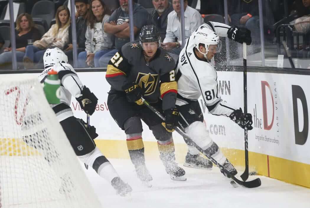
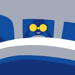
The NHL’s regular season begins next Wednesday, which means it’s time for my annual Uni Watch NHL Season Preview over on ESPN. With the league changing over from Reebok to Adidas, I’ve gone over each team’s changes, plus we have a new uniform set in the league this year — the Golden Knights (shown above). Check it out here.
Very official: We rarely see good compendiums of officiating uniforms, so I was happy yesterday when a source at the NBA provided me with this diagram of NBA refs’ uniforms, going all the way back to the league’s founding in 1946 (click to enlarge):
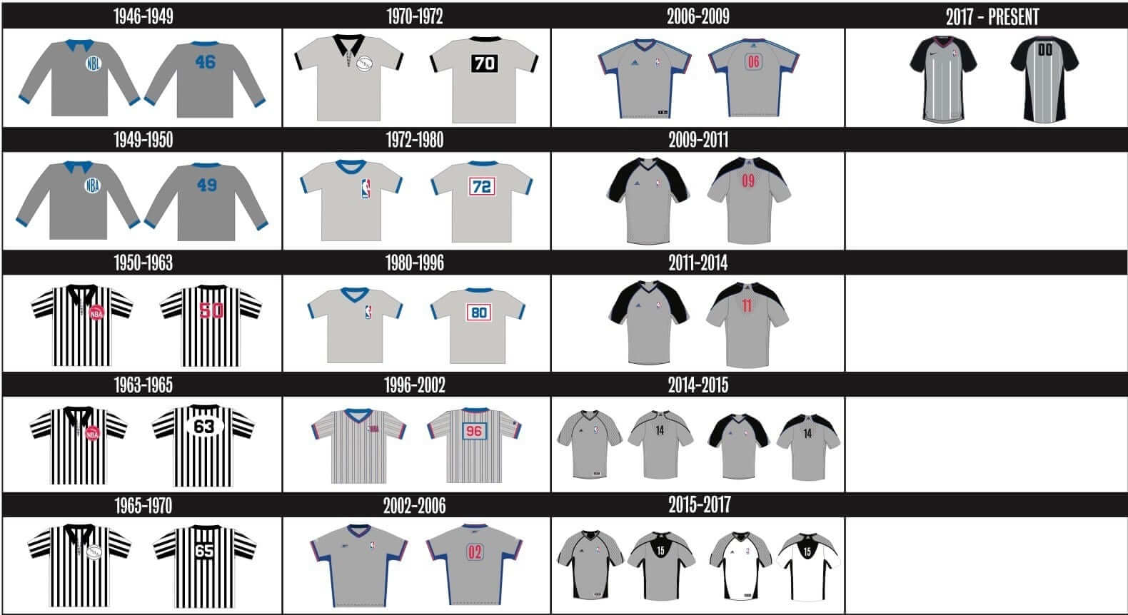
Some interesting stuff there, most notably the use of zebra stripes for two full decades. Also, note that the manufacturers’ logo creep began appearing in 2002. Prior to that, according to my source, the manufacturers were Champion (1990-2002), Sand-Knit/MacGregor (1982-1990), and a hodgepodge of other suppliers (pre-1982).
As for the new jerseys being produced by Nike, let’s zoom in for a closer look (click to enlarge):
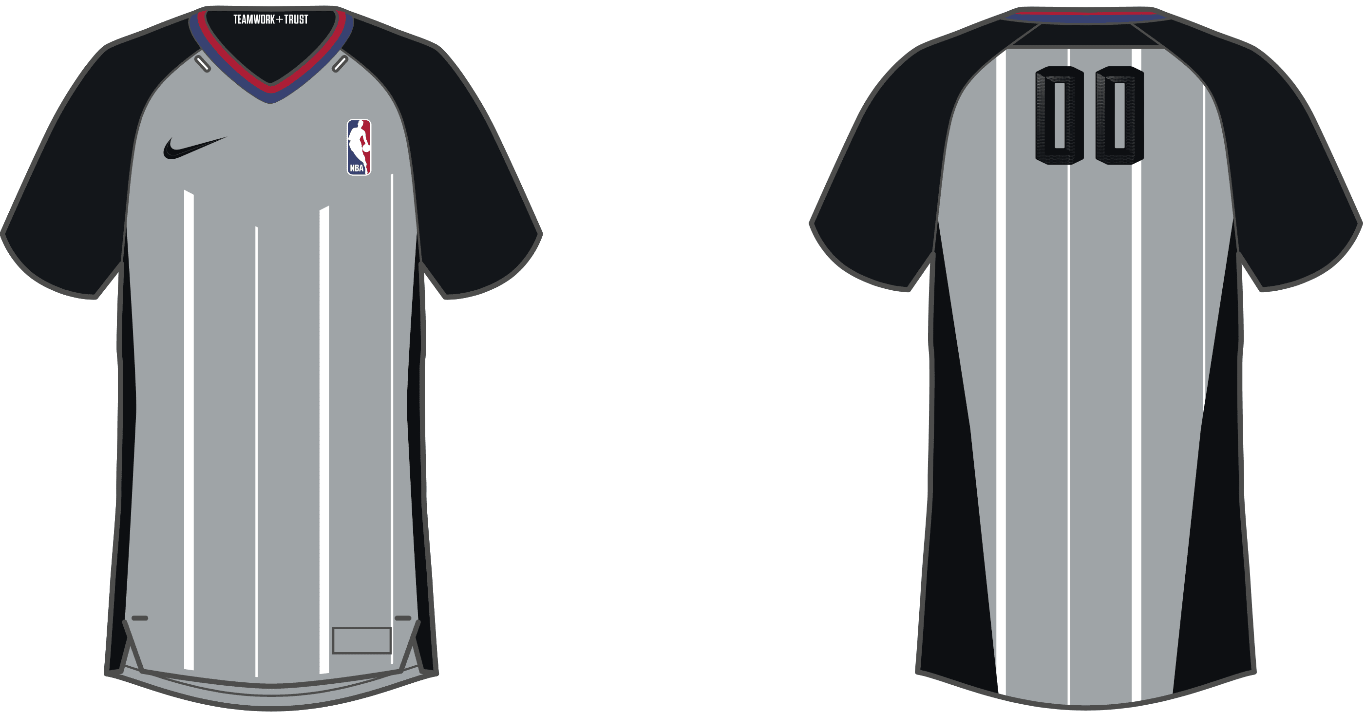
That’s right — the inner-collar slogan has now made its way to officiating attire. Also of note: It appears that they’re scrapping the white alternate jerseys, which had been worn in recent years when one team was wearing grey, to avoid confusion.
And how will these jerseys look on the court? Here’s a hint, from a video game screen shot that someone recently sent me (click to enlarge):

NBA preseason games begin this weekend, so we’ll get to see the full view of the new uniforms then.
Speaking of officials’ uniforms, the mighty Gridiron Uniform Database shows what pro football officials wore going all the way back to 1920. Aside from that, I’m not aware of any other sites with good documentation of refs and umps.
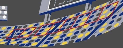
Artist’s Series update: I’m very excited to show you our latest T-shirt from the Uni Watch Artist’s Series. This one is by the great Sean Kane. If his name sounds familiar, it’s because I’ve often written about his awesome painted baseball gloves. I figured he was probably a solid graphic designer in addition to being a fine artist, and I was right. Here’s the T-shirt design he came up with (click to enlarge):
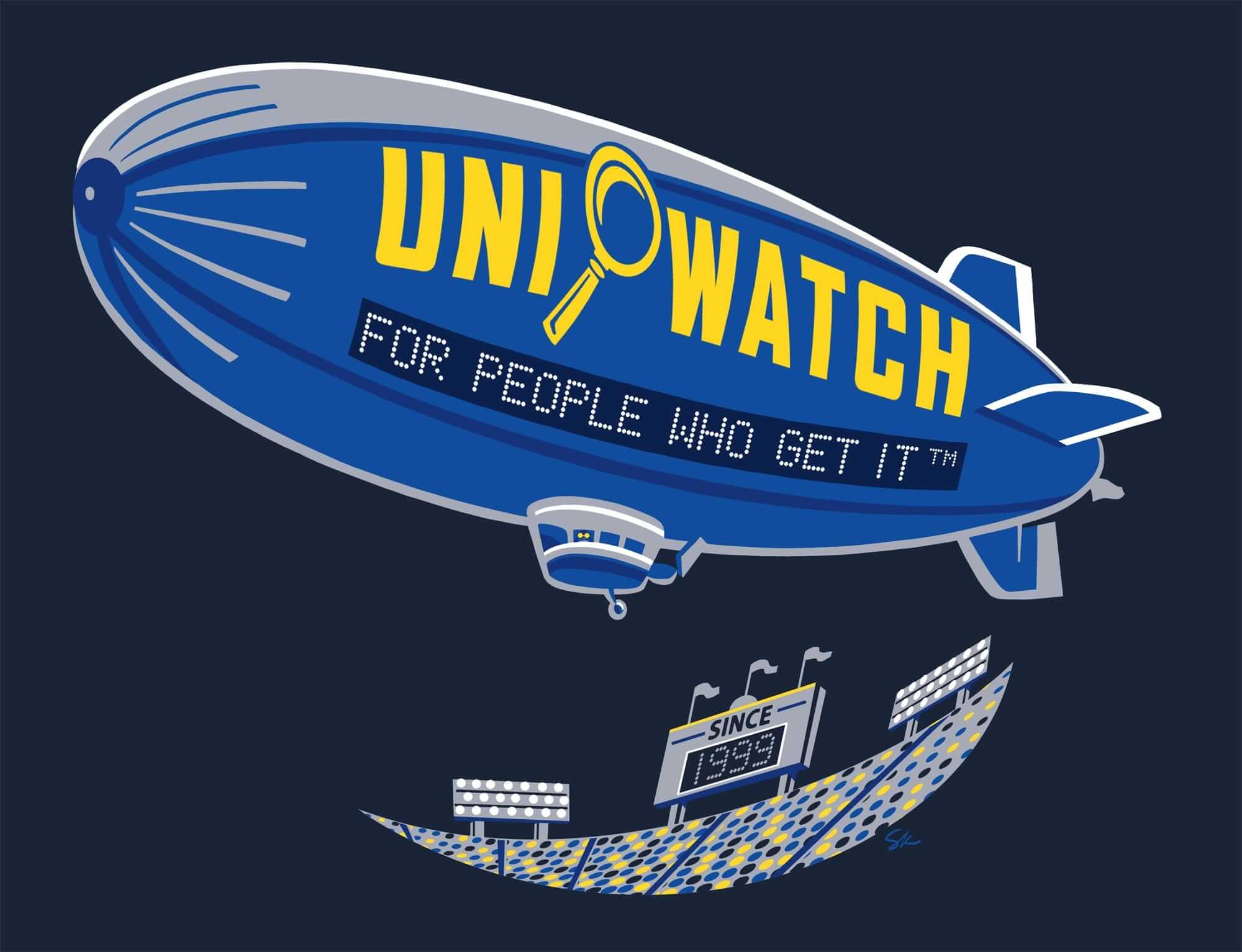
Pretty cool, right? I’ve been a fan of Sean’s work for many years, so it was a treat to work with him on this. The design is pretty self-explanatory, but there are some small details worth noting. First, see those two little yellow dots on the gondola? That’s a little guy looking out with binoculars. Here’s a closer look:
Also, see the dots that represent the crowd? Sean has arranged some of them to spell out “No Purple” in Braille:
We’re offering this one in a variety of colors, most of which are dark (click to enlarge):
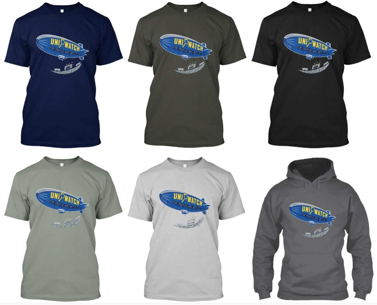
If you want the shirt in another color, I can do that for you. Just ask.
The shirt is available here through the end of Monday, Oct. 9. My thanks, as always, for your consideration (and doubleplusthanks to Sean for coming up with such a great design).
Naming Wrongs update: We also have a bunch of new Naming Wrongs shirts. One at a time:
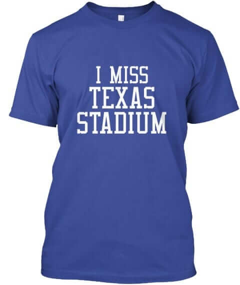
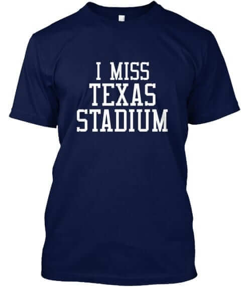
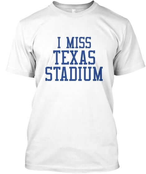
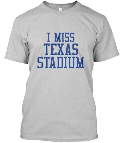
1. Texas Stadium. Got a lot of requests for this one. It’s available in royal, navy, white, and grey (for all images, you can click to enlarge):
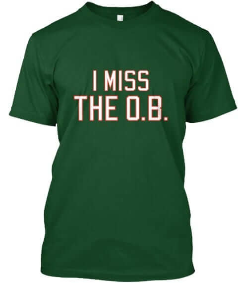
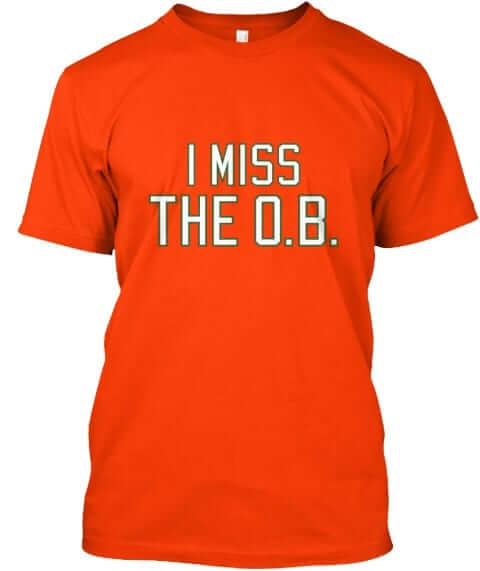
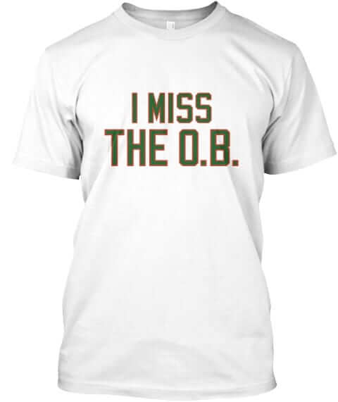
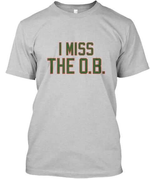
2. The O.B. At one point we had some “I Still Call It Joe Robbie” in Miami Hurricanes colors. But as several people pointed out, the ’Canes never played in that stadium when it had that name, so we’ve scrapped those shirts and replaced them with these, which are available in green, orange, white, and grey:
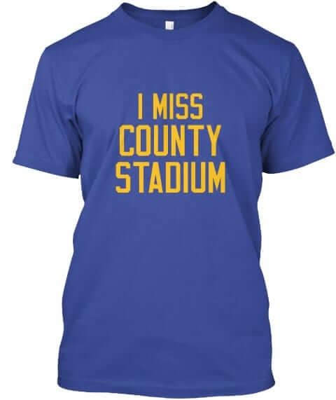
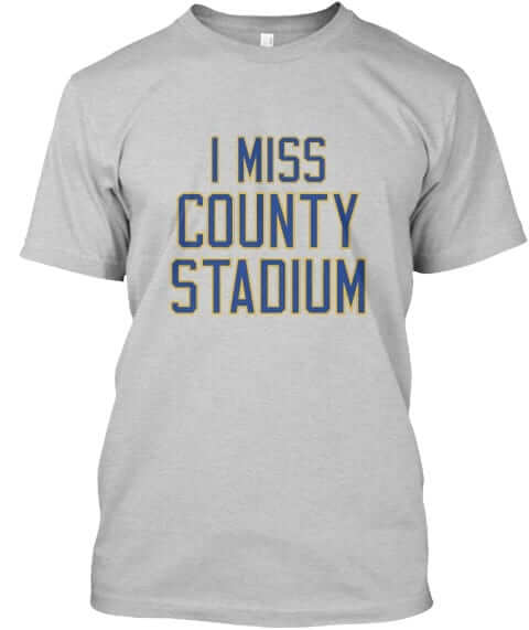
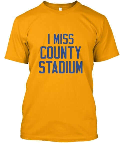
3. County Stadium. Got a groundswell of requests for this one, which is available in blue, grey, and gold:
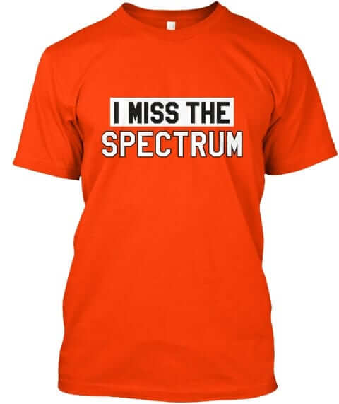
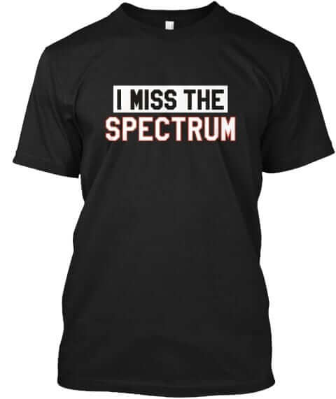
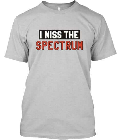
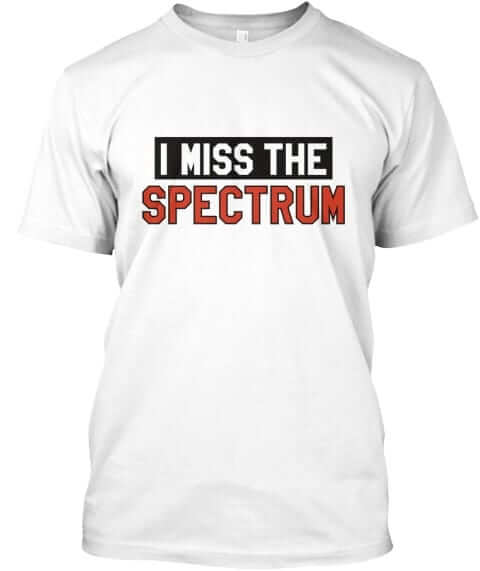
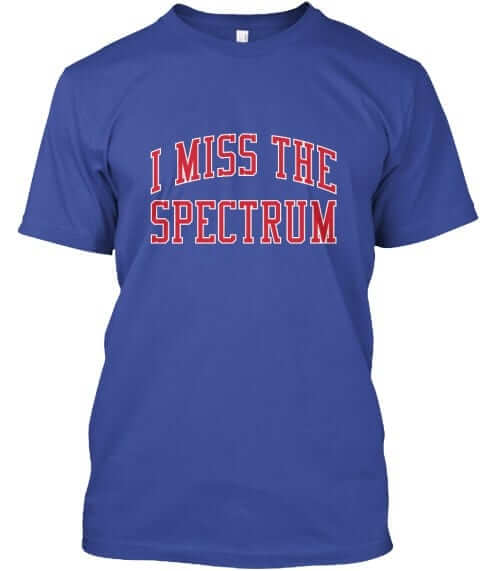
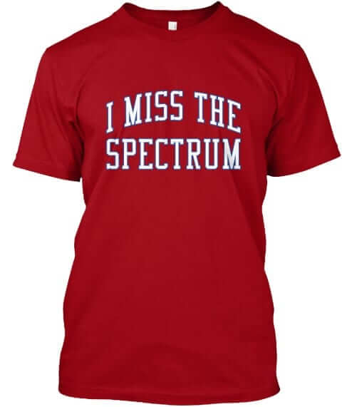
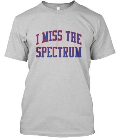
4. The Spectrum. Philly fans, this one’s for you. It’s available in orange, black, grey with black/orange type, white, blue, red, and grey with blue/red type):
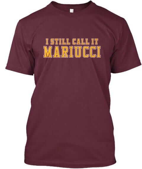
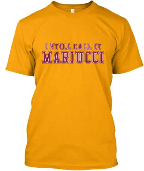
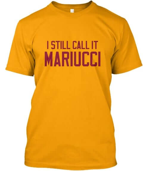
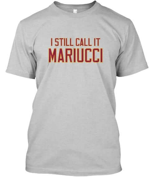
5. Mariucci. This one’s for Minnesota hockey fans, available in maroon with gold/white lettering, maroon with gold lettering, gold with maroon/white lettering, gold with maroon lettering, and grey:

All of these designs are now available in the Naming Wrongs shop. They’re also cross-listed in the Uni Watch shop, where card-carrying members can get 15% off. (If you’re a member and need the discount code, send me a note and I’ll hook you up.) Again, my thanks for your consideration.
The Ticker
By Kris Gross

Baseball News: Officials broke ground on the new Rangers’ stadium yesterday. … Celtics F Gordon Hayward wore a personalized Red Sox jersey at Fenway last night (from Paul Friedmann). … Here is a look at all of the uniforms for the newly created Macon Bacon team (from Jim Vilk). … The US Naval War College will celebrate 100 years of baseball in the military by hosting a game that will pit Army versus Navy. They will play by century-old rules, and wear historically accurate uniforms (from Matthew Algeo). … Comedian Sarah Silverman shared this throwback photo of herself wearing a full 1980s-style White Sox uniform, stirrups included! (From Lucas Stoller.) … It’s a little hard to see, but Peter Parker was apparently a Mets fan in Spider-Man: Homecoming (from Shasta). … BSmile passed along this ”Go Yankees Go Pabst” beer sign from the 1950s. … Also from BSmile, check out Jay Johnstone’s ”Budweiser Brockabrella” on his 1984 Fleer card. … Ebbets Field Flannels has a new line of college baseball jerseys and caps.

NFL News: Here was your Thursday-night uniform matchup between the Packers and Bears. Additional photos here. … Also from last night, both teams locked arms during the National Anthem. … Bears head coach John Fox had a oversized bear-head logo on his jacket. Will every coach be wearing something like that this weekend? (From Blake Fox.) … The Jets are going all-white on Sunday (from WB Young). … The Bucs will also wear white. They’ll be at home, which means their opponents, the Giants, will wear their seldom-used uni combo of blue jerseys with the grey road pants (from Kenny Saidah). … A Missouri bar used Colin Kaepernick and Marshawn Lynch jerseys as doormats, and he originally had them positioned so that the NOBs read “Lynch Kaepernick.” The owner, who says “there was no ill intent,” later reversed the positioning (thanks Brinke). … Christian Homay came across a Reggie White wall display. Except, this isn’t Reggie White. … A funny note pointed out by Scott Mason: Every player active in the Lions/Falcons matchup with a single-digit number was named Matt.
College Football News: Iowa State unveiled their new cyclone helmet logo yesterday. They debuted the new helmets and wore grey pants against Texas last night. … Minnesota will have an American-flag themed helmet stripe this weekend (from @siebc1). … Did merit stickers start at Rutgers, not Ohio State? This article says yes (from Steve Woj). … North Carolina will go mono-blue on Saturday. As James Gilbert points out, the Tar Heels first went all-blue in 1988. … Here are this week’s uniform combos for LSU (a rare sighting of the purple jersey) and NC State. … UMass will honor the 1972 Boardwalk Bowl team with throwback helmets this weekend (from Timothy Silvernail). … In light of the current college basketball scandal, Georgia Tech coach Paul Johnson finally appreciates being with Russell Athletic (from James Gilbert). … Virginia Tech S Terrell Edmunds will wear the No. 25 jersey to honor Frank Beamer this weekend (from Andrew Cosentino). … Great look for Georgetown marketing (from Josh Pate). … Western Michigan coach Tim Lester’s son, Quinn Lester, is on the Ball State volleyball team. When WMU hosts Ball State this weekend, Quinn and the rest of the Ball State volleyball team will be in attendance — but they’ll be wearing WMU colors. The elder Lester provided free tickets, but only if the volleyballers wore the home team’s colors (from Jim Vilk). … If you go to the 55:25 mark of this podcast, you’ll hear a lengthy discussion of the GFGS uniforms that Duke will be wearing this weekend (from Justo Gutierrez).

Hockey News: The fashion label Versace appears to have poached the old Canucks’s spaghetti-skate logo. … The Huntsville Havoc of the SPHL unveiled their jersey designs for the 2017-18 season (from Mike Campos). … New jerseys for Robert Morris and Quinnipiac this season (from Alan Saunders, Josh). … Chris Mizzoni passed along these mugs for the 45th anniversary of the 1972 Summit Series between Canada and the USSR. … The Northeastern University hockey team will wear ”JPG” patches this season to honor their former athletic director, Jack Grinold, who passed away in April (from Danny). … The logo for the 2018 AHL All-Star Game has been released. … New uniforms for the U. of Arizona club team (from Dane Drutis).

Basketball News: Cross-listed from the MLB section: Celtics forward Gordon Hayward wore a personalized Red Sox jersey at Fenway last night (from Paul Friedmann). … New home uniforms for Xavier this season. Here are the details for the new threads (from Kevin). … VCU has new home whites as well. … Nike’s Elite Youth Basketball League is now part of the FBI investigation (thanks Paul). … The Baltimore Sun posted images from the Baltimore Playboy Club in the 1960s and ’70s in remembrance of Hugh Hefner. One of the images was of then-Baltimore Bullets coach Buddy Jeannette, who is wearing a sweater with an old Bullets logo (from Will Shoken).

Soccer News: Hertha BSC had their advertising patch covered for their UEFA Europa League match. Teams aren’t allowed to advertise betting or alcohol during UEFA tournaments, which conflicts with their current deal (from Ed Zelaski). … Here is a list of the best crests in North American soccer (from Ryan Keberly).

Grab Bag: Russell Athletic is getting out of the uniform business. … Dale Earnhardt Jr. had a black stripe under his left headlight at Richmond in 2002 in remembrance of R&B star Lisa “Left Eye” Lopes. Junior shared this article yesterday, which offers more information (from Scott). … Golfer Emiliano Grillo wore a Yankees cap as part of his Presidents Cup uniform (from Andy Garms). … I still call it PIR (from Mark Murray). … The James City County Police will wear pink badges for Breast Cancer Awareness Month (from Stephen Campbell).
County Stadium. Attaboy.
That Versace knock-off of the Canucks logo isn’t even a very good one! It looks like something some high-schooler came up with in an attempt to avoid exactly copying the flying skate.
The NHL Season Preview is up:
link
Just go back to the straight waistline already! We don’t need jerseys covering players’ asses!
The collar design is also pretty hideous overall. A few teams managed do do them about as right as you can under the circumstances by having one single color on the entirety of the collar, and some of the 2-color designs managed to look somewhat okay, but so many others just look bad from the poor choice of combinations.
The Flyers are a case of having good (marginally) and bad collars. The collars on the orange home jerseys are acceptable, but the fauxlo collars on the road whites look even worse because of the shoulder striping. What were they thinking?
Nothing new under the sun, probably, but isn’t it odd that a hockey arena named for ScotiaBank used to be in Ottawa (ScotiaBank Place, 2006-13 per wikipedia) and now the ScotiaBank Arena will be in Toronto?
Well, we already have Rogers Place (Vancouver) and Rogers Centre (Edmonton) in the same division at the same time.
Different sport but there is also Rogers Centre in Toronto.
Rogers Communications must spend a fortune annually on naming rights.
Well, Rogers owns the Blue Jays, and the company holds the exclusive TV rights to the Oilers and Canucks, so…
For a long time, I was still calling it GM Place.
If I may provide some editing. Rogers Place is in Edmonton. Rogers Arena is in Vancouver. It is easy to get them mixed up when they have the same name.
Sp. ‘Tar Heels’
That ’80-’96 NBA refs jersey is my frame of reference for all others.
I wonder if any Halls of Fame have info on official’s attire, but it’s just not in a handy graphic yet.
Fixed.
The one oddity I noticed on that referee uniform graphic is that the 1946 uniform shows “NBL”. Yet, the NBA generally considers the BAA (1946-49) as its immediate predecessor, not the NBL (which existed from 1937 until its merger with the BAA in 1949 to form the NBA).
So much in one post…
– The Pack look awful in all-white
– The shoes that the Army and Navy baseball players are wearing are nowhere near period authentic. Couldn’t they get plain black?
Army/Navy…
They could but then they wouldn’t be showing a shoe logo!
And cleats aren’t always considered “part of the uniform”.
Once again, the Pack trying to look like the Edmonton Eskimos from the early aughts again :).
link
The Packers might look good in a different Color Rash look. Maybe mono-yellow? Another Edmonton-based team, U. of Alberta Golden Bears, rock an alternate mono-yellow in the same colour scheme. A look to get an idea for comparison:
link
Mono-yellow for the Packers wouldn’t be the worst Color Rash look. It is Color Rash – better than going all white.
Betting and alcohol shirt advertisements are indeed allowed in UEFA competitions. Everton link and previously wore its Chang shirts in Europa League. I don’t know the details on why teams sometimes don’t wear them, but I think it has to do with the rules of the host country for a game.
The cyclone on the Iowa State helmet looks more like some sort of modern nacho cheese Bugle snack.
Mmmmm,…. Bugles.
not sure it gets more cowardly than using individual’s uniforms as a doormat then saying there was “nothing personal” about it.
if you’re going to take a stand, take a stand. i think the idea is gross and pathetic, but at least have the courage of your misguided convictions.
One of the most astonishing things about the color rash games is that teams create these one-off pants and don’t bother to match them to the jersey. I get the Bears mismatched look, because those jerseys and pants weren’t designed to be worn together, though that still could be fixed. But there is no reason that the Packers couldn’t make the uniforms 30 times better by matching the pants striping to the “sleeve” striping.
And just a reminder: color over color is for high-school teams.
Or, you know, the Packers and Bears several times throughout their early histories.
Sucks that LSU is wearning white pants/helmets with purple jerseys. LSU should wear gold helmets and gold pants for every game. Period. That’s been pretty constant for most of the last 60-something years. If players are choosing LSU for uniform reasons, go somewhere else.
I’m a lifelong hometown fan who is also an alum. I don’t really like the white jerseys at home, but it’s tradition. But we’ve also worn purple at home when the NCAA dictated, and it was good enough for 2 SEC titles and a Sugar Bowl berth in another season (1984) when Florida was ineligible to represent the SEC. The purple jerseys with gold helmets and gold pants were good enough for those teams. We’re not Oregon, Oklahoma State or whatever Johnny-come-lately program that has to have a different uniform every week.
Burn the white helmets and white pants.
While I’m commenting: Nice upgrade by Quinnipiac, which seems to have ditched its hideous old wordmark. The puzzling part is the decision to keep the Bobcat arm, when it seems to generally have been dropped from the link (and is stupid).
RMU looks good too, but I think I see some bling (dazzle) in those jerseys, which is odd.
RIP, Grinold, wonderful guy and friend to college athletics in Boston. The patch is perfect and a fitting tribute.
I have no allegiance to Philadelphia sports, but holy cow that Flyers treatment for the Spectrum is the best. I’m not a fan of the contrasting nameplate, but it’s THEIR thing and it looks great in this context.
Thanks, Mike. All credit to Scott Turner for that one. Totally his idea!
I said as much on Twitter yesterday, but it bears repeating! It looks fantastic on a shirt that as a Pittsburgh fan, I’d never, EVER wear!
The Flyers never wore a black nameplate at the Spectrum. When they had the white nameplates on the orange jerseys in the 70s, it was because they were using the same nameplates that they used on the white jerseys.
So, yeah, the version with the black nameplate comes off as wrong to me.
Yeah, we discussed that during the design process. Decided to do it anyway!
Guess it doesn’t matter that much to me anyway, since like Mr. Ullman, I’d never wear that one anyway!
But if UniWatch had a real blimp, they surely wouldn’t put such a big ad on it, right? ;)
Re: Oversized Bears logo, in the video you can see the Oversized Green Bay Packers logo. Seams cut off a portion of the oval. Can see it better on some of the players than other. Seems like new “sideline” march
Came here to comment on that. Mhm, it is the new sideline jacket for 2017. I’ve seen some of the Broncos wearing them the past few weeks. This is Denver’s look: link
I’m retired now but I served proudly as a police officer for 25 years. I’m not supportive of the the James City Police Department (or any LE agency) altering their badges. No, I’m not against supporting breast cancer! I simply feel that an officers badge is the most basic symbol of their authority and to tweak it for any cause cheapens it. The lone exception is the generally common practice of temporarily wearing a black stripe over the badge as a sign of mourning. The black mourning stripe has been used for generations and I feel like it’s both classy and proper. I’d much prefer that the officers buy the pink badges for themselves than to allow them to be worn while on duty. Perhaps let them make a badge display to be hung in City Hall to help further their cause?
I suspect some will call me old fashioned or cold hearted for not supporting a cause but that isn’t the case. I merely support the dignity of the uniform.
Completely agree. A police officer’s uniform, and especially the badge, is not the place for extracurricular messaging.
Very well put.
Re: Hertha’s jersey for their Europa League match, it seems that the ad wasn’t technically covered, but rather replaced with one that has a question mark in place of the betting site’s URL. The green swoosh under the site name is still there.
Clever.
I don’t have any inherent problem with the Packers/Bears color rash uniforms. They aren’t overly garish or strange to look at. Certainly not nearly as bad as most of the monochrome looks and it is relaxing to finally see the Bears in proper dark cleats.
But, in my humble opinion, the classic Bears/Packers game as played in Lambeau with Green Bay in green over gold and Chicago in white over navy is hands down the most aesthetically pleasing game played in the entire NFL in any given year.
It’s perfect. The sharp color balances. The classic striping. The fact that both uniforms are still distinct. The natural grass. It’s beautiful, particularly under the lights of a night game.
Denying fans a chance to see NFL uniform perfection just to do a Nike promotion is just wrong and hopefully this is the last time we have to see it.
I agree with everything you wrote.
Lee
That Iowa State logo looks like a bugle chip…
Here’s a strange fact. The Bears and Packers have not held a noon kickoff game at Lambeau since 2008 and that’s the only noon kickoff since 2004.
LOVE the blimp design. Great work, all!
Thanks!
still cannot believe Rangers getting a new place for the 2020 season. That means they will have used current place 1995-2019, or 24 years!
The Braves only used their last field for 20 years. Welcome to the age of disposable venues.
Bleh.
Not disagreeing with the sentiment, but the Rangers moved into the Ballpark in Arlington in 1994, not ’95.
The Adidas collars on the new NHL jerseys are the 2017 equivalent to the Reebok Bettman stripes. Except now they’ve been hoisted on the entire league. Tragic.
I’d say they’re the equivalent of the Nikelace.
Exactly my thoughts, Paul.
One can only hope that at least some of these teams will fix the visual issues with these collars over the next few seasons, like some NFL teams did with the Nikelace. But I’m not holding my breath.
At least the Red Wings kept theirs simple with solid red collars all the way around.
Yeah, fair assessment. I was speaking strictly in terms of the NHL though. But overall, yes, that is pretty spot-on.
I’m never gonna unsee the Buffalo fish-skeleton. Can’t decide whether it’s worse than the Islanders’ pendant on chain. Thanks a lot. But it’s my favorite article of the ESPN year because it means that hockey is coming!
That Georgetown Marketing mock-up is a joke right?? I mean, a walkie-talkie part of the “uni”?
I second the earlier comment on not caring for the Flyers contrast color nameplates but absolutely LOVING the Spectrum shirt. Brilliant design!
I’m still waiting on an “I’m Calling It The Dome” (i.e. Georgia Dome) shirt, perhaps black lettering with gold and red outlines?
;)
The striping on that new green Minnesota Wild uniform is just amazing. The color and unique off centered red stripe is really doing it for me.
-The Wild uniform looks better on ice than I expected. An upgrade to last year’s red uniforms.
-I really like they grey helmets for the Golden Knights. A pleasant surprise. Unique to the league and helps to make that uni look great. I had just assumed the helmets would be black. Glad I assumed wrong.
That Iowa State wears that dark gray color at all is eye-rolling enough, but wearing those pants last night presents an even more decidedly awful overall look.
*woof*
I may be only only one who doesn’t hate that Cyclone logo though.
Lee
Boy am I confused. Thought the Baltimore Bullets’ name came from Bata Bullets sneakers (Bata being a Baltimore company).Then I see their old logo with an actual bullet …
Interesting cross postings about Russell Athletic in the Basketball and Grab Bag sections. Wonder if Georgia Tech and other schools (if any) need to find a new uni supplier for this school year?
I love the dark monochrome Navy unis. I wish some MLB team had the balls to go there.
Jon, I’m sure you meant no offense, but I’d appreciate it if you didn’t use “balls” (or “cojones,” or anything else testicular) in this context.
I’m not asking this because it’s vulgar (I don’t think it is), but because it promotes the false notion that courage, character, fortitude, and so on are masculine traits. It’s one of those subtle, insidious bits of sexism that I’d prefer not to have on my website.
Thanks.
The Oilers new orange homes are now one of the best in the NHL as well as the Predators, very nice tweaks.
Flames still haven’t ditched the black flaming C though, booo.
I preferred the Blues number in yellow…
I like the Univ. of Arizona hockey jerseys, but as soon as I saw the red one, I immediately thought “Alvin & The Chipmunks!”…
Oh, and am I the ONLY one who liked the Packers in all white last night?
I also like the Packers (and the Colts, Jets and Roman Gabriel-era Rams) in white. Maybe it’s the simplicity but when done well, all white is OK with me.
link
Today Vice Sports featured a blurb which dedicated a paragraph to the “obscure” Lee Fogolin, and linked to a YouTube video featuring a Sabres-Flyers brawl from April 22, 1978.
link
What makes this uni-significant is the fact that the Sabres’ horizontal sweater stripes are blue/gold/blue, matching the sleeve stripes pattern. They’d always been gold/blue/gold and even the NHL uniform database does not display these unis:
link
I’m guessing if anyone cared, you guys would. Was this a one-off for the playoffs that year? I’ve been a Sabres fan since the latter-day Perreault era and had never seen those unis before.
Actually, the odd uniforms are referenced on the NHL Uniform Database, just in the 1977-78 Sabres page: link
Thank you!
Formula 1 will join Pinktober for the Austin race weekend.
link
Not sure if anyone saw this.
link
Tracking the process of bringing SEC alternate football uniforms to the field.
the russell athletic news makes me sad…