Click to enlarge
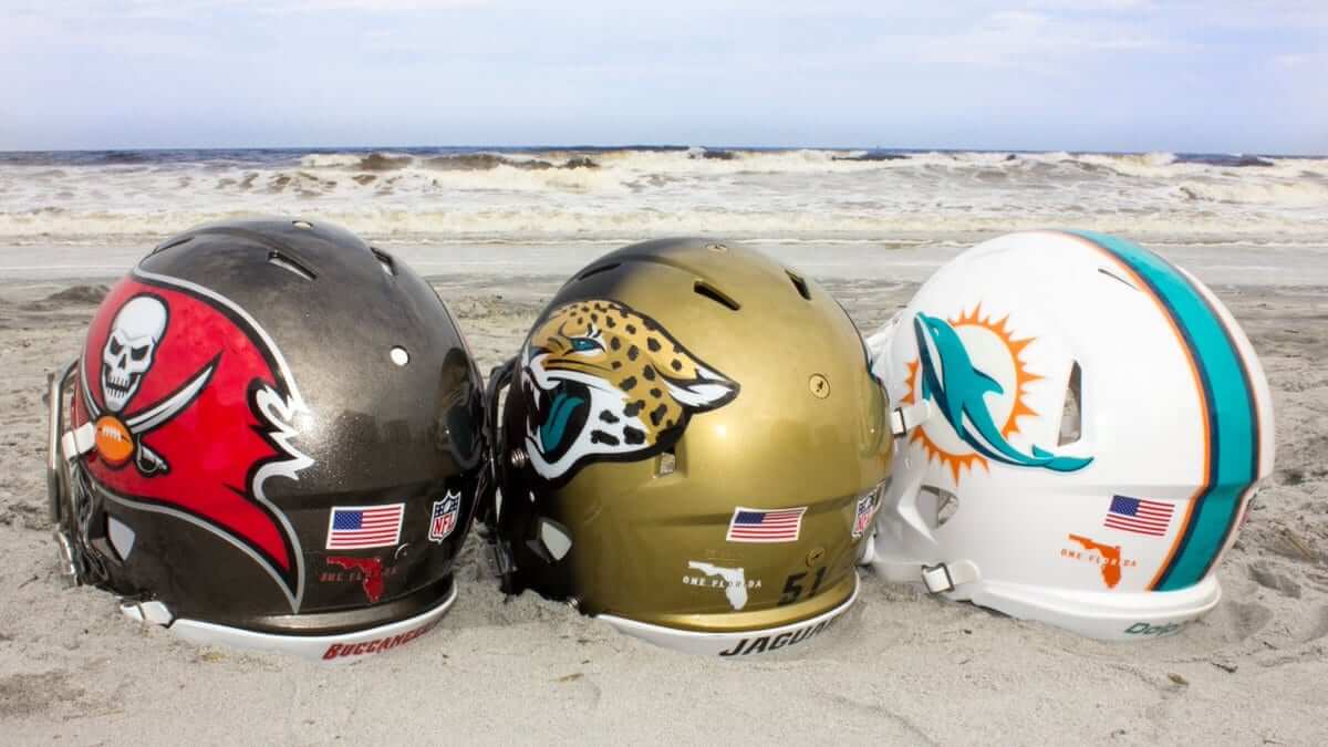
As you can see above, all three of the NFL’s Florida-based teams — the Buccaneers, Jaguars, and Dolphins — saluted the state’s resilience in the wake of Hurricane Irma by adding a “One Florida” helmet decal for yesterday’s games. You can get a closer look at the decal in this video clip that was posted by the Dolphins:
Playing for the state of Florida.#MIAvsLAC pic.twitter.com/S6LdlsYGDZ
— Miami Dolphins (@MiamiDolphins) September 17, 2017
It’s not clear, at least to me, whether this was a one-week thing or if the decals will remain in place for the rest of the season. (By contrast, the Texans have said that their “Houston Strong” decal, which was added in response to Hurricane Harvey, will be worn all season long.)
In other news from around the league yesterday:
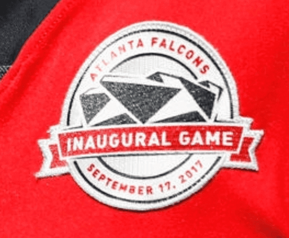
• The Falcons played their first regular season game in their new stadium and marked the occasion with a commemorative patch:
• Speaking of the Falcons, the logo on the left side of quarterback Matt Ryan’s helmet appeared to be rotated a bit more counterclockwise than usual:
@UniWatch Does this decal look right? @PhilHecken pic.twitter.com/Ge52ltURwr
— Pro Football Journal (@NFL_Journal) September 18, 2017
• The Saints wore mono-black. I really wish they’d stop doing that.
• This is weird: Last week Colts tight end Jack Doyle was missing the maker’s mark on his left sleeve. This week he had a backwards maker’s mark on his right sleeve:
@PhilHecken @UniWatch wrong way Swoosh pic.twitter.com/b8u9z8lwTB
— dan medina (@iloveinterwebz) September 17, 2017
• Eagles quarterback Carson Wentz’s nameplate was peeling off:
@PhilHecken Wentz having some NOB issues. @UniWatch pic.twitter.com/MIUvMWFWNE
— Curtis Galvin (@CurtisGalvin) September 17, 2017
They must have sewn it back on during halftime, because his nameplate was fine during the second half.
• The Steelers, like most NFL teams, cut their striping tape as it crosses the gap on the crown of a SpeedFlex helmet — except for quarterback Ben Roethlisberger:
. @UniWatch @PhilHecken It looks like the stripe and number on Ben Roethlisberger's Riddell Speed helmet are not cut, while teammates are. pic.twitter.com/lSofJvmBNV
— The Tao of Steve B. (@SteveBCreations) September 17, 2017
• Speaking of Big Ben: You may recall that last week he wore a weird hybrid jersey that had the old template’s seams but the new template’s collar style. This week he wore a standard jersey with the old template, without the new collar. (He also carried a flag featuring the team’s Dan Rooney memorial patch design and later wore a T-shirt with the patch design to his postgame news conference.)
• In a related item, several Bills offensive linemen were once again wearing the old jersey template with the full collar striping, including tackle John Miller, guard Cordy Glenn, and guard Richie Incognito.
• 49ers running back Carlos Hyde began the game wearing gloves but later went bare-handed for a major chunk of the game.
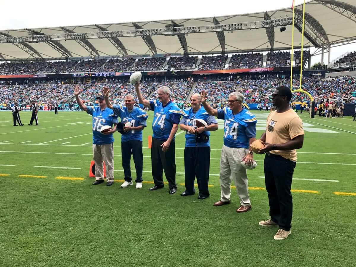
• The Chargers, who were having their home opener in L.A., welcomed back five players from their inaugural 1960 Los Angeles Chargers team. Would’ve been nice if they’d given them period-appropriate jerseys, complete with blue shoulder bolts and the old font, but instead they gave them current powder blue alternates (click to enlarge):
• Out of 14 games, five teams wore white at home: the Panthers, Jags, Bucs, Rams, and Chargers.
• Here’s a list of players who protested during the national anthem.
(My thanks to Jerry Wolper and Lendel Martin for their contributions.)
Click to enlarge
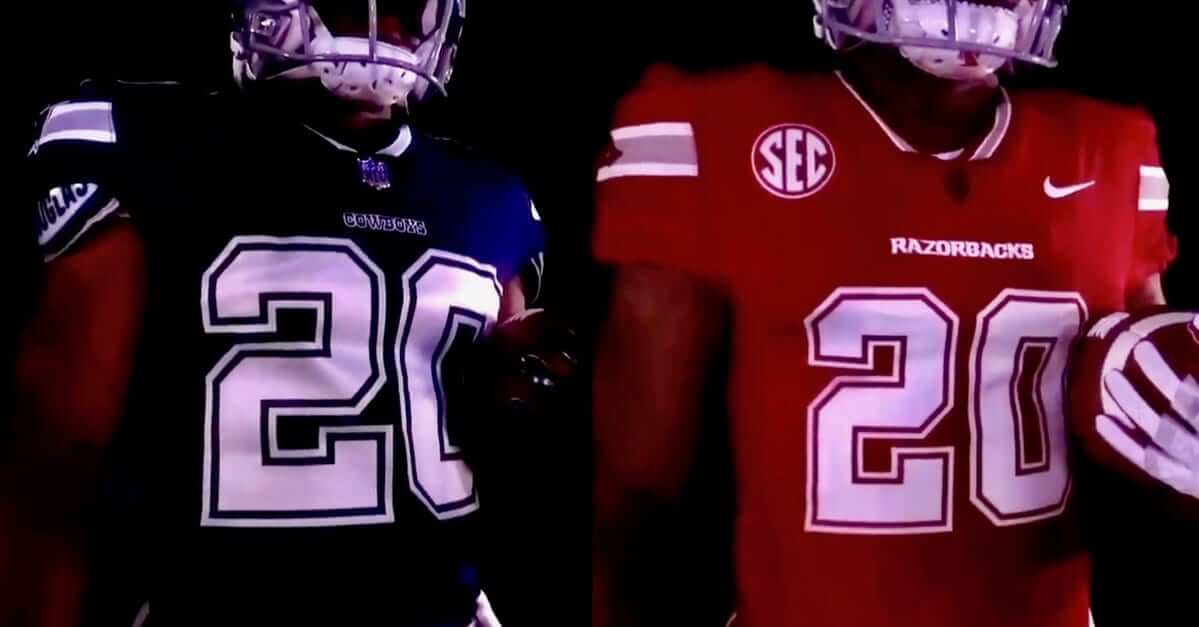
Sincerest form of flattery: Interesting development in college football, where the schedule calls for Arkansas to play Texas A&M at the Dallas Cowboys’ stadium this Saturday evening. As it happens, Cowboys owner Jerry Jones went to college at Arkansas, where he was co-captain of the football team. So with the Razorbacks playing in their famous alum’s house, they’ve decided to honor him by wearing red uniforms based on the Cowboys’ blue-jersey uni. You can see the jersey above, and here’s a video clip with some additional views:
Cowboys replica unis.
In Razorback red.
In the house he built. pic.twitter.com/p1UAu1Hqm9— Razorback Football (@RazorbackFB) September 17, 2017
There’s additional info, lots of photos, and a longer video here.
The best detail, clearly, is that they’re including a red Dymo tape label on the back of the helmet, mimicking the blue label that’s been on the back of Cowboys helmets for half a century — a really nice touch.
I’m a lifelong Cowboys hater, and I’m certainly no fan of Jerry Jones. But I love this uniform move — it’s fun, it’s clever, it’s well-executed, and it makes sense given the unusual confluence of team, stadium, and alum. Nice job all around.
And yes, I’m aware that this isn’t the first time a college uniform has been inspired by an NFL uniform. Look at Iowa and the Steelers, for example. But that’s just a straight copy, while this is a color-shifted variation, which seems more interesting, at least to me.
One additional note: If you look again at the side-by-side jerseys at the top of this section, you’ll see that the Dallas jersey is rendered in Nike’s new template — complete with truncated collar striping, just like the Bills and Pats have). That’s a change from the preseason, when they wore the old version. So it looks like they’ll be updating to the new version of the blue jersey for the regular season.
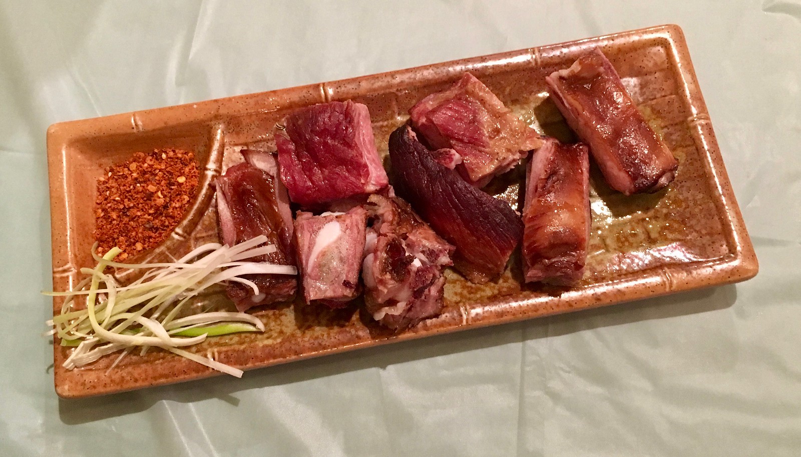
Click to enlarge
Where there’s smoke…: One of my favorite Chinese dishes is tea-smoked duck. But on Friday night I had dinner at a Sichuan place in Bensonhurst called Bamboo Pavilion, and they had something on the menu that I’d never seen before: tea-smoked spareribs (listed as an appetizer for $8).
They were good. Like, really good. Very smoky, agreeably succulent. They didn’t have the hoisin glaze that Chinese spareribs often have, but they came with some crushed red chili powder, which worked well when sprinkled on top. The one-two punch of smokiness and spicy chili was sensational. I don’t think it’s going too far to say that this is some of the best barbecue in New York.
Google reveals that tea-smoked spareribs occasionally show up in other restaurants, including Myers and Chang in Boston and Buddakan in Philadelphia. But to me they’re a revelation. I’ll definitely be back.
(Bamboo Pavilion, 6920 18th Ave, Brooklyn; 718-236-8088)
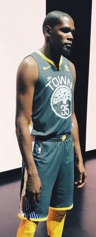
NBA/ESPN update: As you’re probably aware by now, all 30 NBA teams released alternate uniforms on Friday night (including Golden State’s awesome “The Town” design, shown at right). Phil showed all of the designs in his Saturday post, and I’ve weighed in with my picks for the best and worst designs over on ESPN.
Going, going…: Today is the next-to-last day to enter the raffle for some cool Hartford Whalers memorabilia. Full details here.
The Ticker
By Jamie Rathjen

Baseball News: The Braves wore Los Bravos jerseys for yesterday’s game against the Mets. … Dodgers SS Chris Taylor wore a cap with the New Era maker’s mark on the right side instead of the customary left side. Must have been one of the Sept. 11 caps, but it didn’t have the American flag on the other side (from @goldburgia).

Football News: Reader Jim Fletcher found an episode of the HGTV show Fixer Upper featuring the Baylor equipment manager’s house. Host Chip Gaines was duly equipped with a helmet and shoulder pads, with which he proceeded to run at a small brick panel. For good measure, his helmet decal started to come off. … Division II Wayne State wore U.S. flag-themed uniforms on Saturday to mark the 100th anniversary of the school’s athletics program. More info here (from J. Coleman). … New uniforms for Division III Wheaton (Ill.) College (from Philip Barbar). Cardinals DB Patrick Peterson’s Twitter avatar covers the Nike logo on his uniform with a small football. Peterson has an endorsement deal with Under Armour (from Tanner Liby). … Quick, what does the Oregon offensive line have in common with the NHL’s Pittsburgh Penguins? Answer: They both have a Crosby and a Lemieux (from Moe Khan).

Hockey News: Reader John Keleman sent along a Facebook gallery of the Flyers in Cooperalls, including these two shots. Full gallery here. … Wade Heidt noticed that the Canucks’ sock stripes now match their sleeve stripes. The central green part was previously much thinner. … The Golden Knights’ helmet stickers are very reflective (from Ryan Wetstein). … Cross-listed from the football section: Penguins fans might want to start rooting for the University of Oregon’s football team, whose offensive line includes a Crosby and a Lemieux (from Moe Khan).

Soccer News: Scottish Premiership side Heart of Midlothian revealed a dark blue third kit on Saturday. … And so it has come to this: Everton’s new sleeve advertiser is Angry Birds. Additional info here (from multiple readers). … Speaking of Premier League sleeve advertisements, they’re always placed on the left arm. However, Chelsea midfielder Tiémoué Bakayoko had his on his right arm yesterday (good spot from Josh Carson). … Iain Landon sent us this set of vintage Soviet soccer posters. Two observations: While there are few identifying marks on the shirts, the player in the red shirt in the fourth poster has Spartak Moscow’s crest in a white chest band, which continued to be a distinctive feature of Spartak’s shirts up to now — until this season, apparently. Additionally, the goalkeeper in black in the first poster is reminiscent of the famously black-clad Dynamo Moscow and Soviet national team keeper Lev Yashin.

Grab Bag: The National Lacrosse League has awarded an expansion franchise to Philadelphia to begin play in the 2018-19 season, notes Wade Heidt, who hopes for the return of the Philadelphia Wings. … United Nations tour guides had their own fashion show featuring new uniforms the other day (thanks, Paul). … This is brilliant: a guide to the spider logo that has appeared on every version of Spider-Man’s costume (from @OlegKvasha).
There’s no link for the guide to “Spider-Man’s custume [sic]”.
Also the first soccer link goes to the Angry Birds story, not the Hearts uni.
Fixed.
Fixed.
THe first of the links in the Flyers Cooperalls item goes to the Oregon pic; meanwhile, neither Ducks link in the football and hockey sections are working (coding error).
It’s also worth noting that the gallery features a shot of a faceoff with the Whalers from when they were also wearing Cooperalls.
In addition, it’s an interesting gallery since it shows both the original and the second-generation Flyers jerseys, as they happened to make that transition at that time, as well as the differences in the pants. The Gen 1 jerseys were paired with pants with stripes down the sides, while the Gen 2 jerseys were paired with plain black pants with a Flyers logo at the ankles.
Fixed.
Mississippi State did the color swap thing a year or two ago, wearing a jersey in the Pats template for a game “at” UMass (at Gillette).
I don’t think there was any connection between the Pats and State, though.
What’s the occasion for Los Bravoes jersey, were the regular ones in the wash?
It was “Los Bravos” Day, hence the jerseys. As we’ve seen, there doesn’t have to be special occasion other than an opportunity to sell merch.
It was simply the day they designated for that particular promotion.
Mariners did it a couple weeks back “Los Marineros”. Associated a Robinson Cano’ bobblehead with it and had special jerseys with the names of Latin countries sublimated in text/numbers.
Whats up with the ticker lately, the links seem to be all out of wack.
WordPress has been behaving oddly. Most of the bad links in today’s Ticker were coded correctly but didn’t work correctly. I figured out a fix, but I don’t know why it played out that way.
As is often the case with old-time soccer jerseys, posters, etc. there often is no need for a logo on the jersey; the colors and/or striping are sufficient. In this case, I’d guess the red/blue players represent CSKA (pronounced “sess-ka”, as it’s a Russian acronym), while the royal blue and white might be Dynamo.
Shane Lemieux could, in theory, switch numbers with fellow sophomore lineman Brady Aiello, and his number would match Mario’s. As a tackle, though, Tyrell Crosby is limited to the 70s for his uniform number, so he wouldn’t be able to match Sidney if he wanted to.
College football doesn’t restrict numbers by position. That’s just the NFL.
Okay, I just looked up the rules, and it does say “strongly recommended” for the offensive player position numbers. I didn’t know that was just a recommendation.
link
Is the picture of Jim Kelly supposed to be from yesterday’s game? Because that’s from the Broncos/Panthers Super Bowl.
So it is. I was looking at Bills/Panthers photos and mistakenly thought that one was from yesterday. Now removed.
Happy to see that the sock stripes and jersey stripes match now on the Vancouver Canucks uniforms. It was a bit of an irritant with the Reebok Edge unis when they striping widths did not match. At least one thing fixed.
The present-day uniform now emulates the 1970’s Canucks uniform better, as it is supposed to:
link
Especially better on the road uniform. The Canucks are no longer wearing retread Hartford Whalers home socks like they did with Reebok Edge:
link
Definitely an improvement. Now, if only the Canucks would change their front logo!
So incredibly glad Hockey is back. Gives me something other than football to watch.
“The Saints wore mono-black. I really wish they’d stop doing that.”
I do, too. I also wish Mickey Loomis, Sean Payton and Dennis Allen would find new lines of employment elsewhere.
I can fix that: Two gold stripes down the pants, high gold stockings inside the low white socks. Make it so, NFL!
Or, just wear the freaking gold pants!
According to Gridiron Uniform Database, the Saints only wore the standard gold pants four times last year. They wore throwback golds once.
I hate when people put on football gear just to crash into stuff.
Wait, I hate when people put on football gear to do anything other that play football.
I agree. Hopefully with the CTE awareness such stunts will disappear over time which is good since they are such a stereotype and quite embarrassing.
It is nice to see Chip happy though especially after all they have done to strengthen their marriage after Joanna’s alleged infidelity.
Y’know, there was something that was bothering me as I watched some of the football yesterday…
If players are all about getting their uniforms as tight as possible to avoid having anything to grab on to, then why does it seem like nobody bothers tucking them into their pants anymore?
I think the Steelers back up QB is also uncut–in his helmet stripe. #3. might be a single digit thing?
“Host Chip Gaines was duly equipped with a helmet and shoulder pads”
Link goes to an article about Wayne State uniforms.
Sigh. That coding was correct. I don’t understand what WordPress is doing. I figured out a fix, but I’m still puzzled.
Camping World Becomes sponsor of MLB league championships:
link
Groan.
In the pic of the Philadelphia Wings indoor lacrosse player, in the background you can see people in the stands wearing Flyers and Phantoms hockey jerseys…
-Jet
“That” instead of “than” right above pic of Matt Ryan.
Fixed.
2nd time the Fixer Upper/Baylor item makes the ticker! Not complaining, love that show!
After an 0-3 start the Baylor coaching staff might contact Chip to see if he has any eligibility left.
Of if he can help them sell their houses
I find “one florida” better than *city*strong, and it’s for a weird reason. I’m in Boston so I obviously see those boston strong shirts all the time, and I think whenever that term is used it’s meant to imply that a region is particularly stronger or more resilient than others, but I find it a little odd, because is there really a city or region that isn’t resilient or is any less resilient than others? It’s human to be resilient. I get it’s nice to have a rallying thing, but the city strong thing seems to set aside solidarity to insert some element of superiority.
I dislike the spread of the “[city] Strong” format for a different reason: In Boston, they used the Red Sox logo as part of the slogan, so it was “B Strong,” which reads/communicates as “Be Strong.” That’s a smart, integrated message — instead of just saying, “We are strong,” it also provides support and encouragement to stay strong.
The Astros have used a version with their logo, so you end up with “H Strong,” which doesn’t make sense.
I dislike all of the X Strong things because it all started with Lance Armstrong’s Livestrong organization and their yellow bracelets. While serving as an inspiration to those facing cancer, he was revealed to be a liar, a cheater, and a fraud who betrayed their trust in him. The “strong” portion of Boston Strong literally comes from his name. Why would you want to be reminded of him as your rallying point?
Never mind the fact that it has been so overused as to become cliche.
I believe I saw confirmation the One Florida decals would be worn all season, but I can’t find it now, naturally.
Did anyone else notice the honeycomb brim sideline hats in the Packers/Falcons game? And how the black and red pattern on the Falcons’ brims made them look hideously maroon from a distance?
Here’s a pic of the hat in a retail setting:
link
You know, I caught a quick glimpse of that in a different game — can’t recall which one — and thought to myself, “Hmmm, that brim almost looks quilted.”
I think it’s a fun design and seems to work well with high contrast colors (like the Packers Green and Yellow.) However, I wonder how many other teams ended up with clashing brims due to optical color blending?
My ESPN column on the new NBA alternates is up:
link
Looking at the Steelers picture, it looks like the Vikings player in frame may have a symmetry problem with the Viking horns on his helmet.
I did see one player yesterday on the Vikings whose horns looked much lower than everyone else’s; just couldn’t get a screen grab.
Question for Paul or anyone else who might know:
What’s the story behind the GSW’s “The Town” jerseys? Why would they not use “The City” like their regular jerseys back in the day did?
I’ve never heard San Francisco referred to as “The Town”…also it’s a little odd that the team is named for the entire Golden State and not just for San Francisco, no?
Oops, never mind…as per tradition, I’ve asked Paul a question that he’s already answered, I just hadn’t read his ESPN piece yet.
Traditionally, San Francisco is “The City” and Oakland is “The Town”. Hence the stylized oak tree. “The Town” is not a term I hear much in my travels to the Bay Area, so it seems to have fallen off in popularity. I do hear people in outlying areas like Marin County talking about “going to the city,” meaning San Francisco.
The Knicks new alternate has similar collar striping to what they used on the 1969-70 home jersey they won their first title in.
link
I think that striping was only at home…on the road it was a simpler two color stripe, which also replaced the home striping for 1970-71. I’m sure this similarity is accidental…why bother going back to such a perfect uni?
Mississippi State did the NFL uniform thing last year for their game in New England. It seems like they downplayed it a bit, though.
link
a guide to the spider logo that has appeared on every version of Spider-Man’s costume
I can’t believe the best Spider-Man (1967 TV show) is the only one who wore…what, a tick logo? I also can’t believe I never noticed there were only six legs.