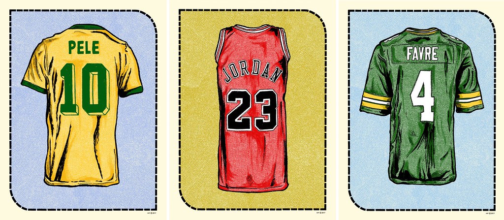
Click to enlarge
[Editor’s Note: Paul is on his annual August break from site (although he’s still on the clock over at ESPN and may be popping up here occasionally), and Phil is off this week. Today’s content was written and coordinated by assistant editor Mike Chamernik. Paul will return to take over the site this Friday, Sept. 1.]
By Mike Chamernik
In this case, the name on the back of the jersey is more important than the name on the front.
A new sports art gallery called All Star Press, headed by local artist Zissou Tasseff-Elenkoff, opened this summer in the Logan Square neighborhood of Chicago. Colorful prints of the reverse sides of popular jerseys, like those shown above, are the hallmark of the shop.

As Tasseff-Elenkoff explained to me when I went over to his Humboldt Park house for an interview a few weeks ago, jerseys are universally recognized. They are an easy and effective way for fans to connect with a team or athlete.
“It sums up teams, it sums up the fans, it sums up a lot of things about sports,” Tasseff-Elenkoff said.
Tasseff-Elenkoff launched All Star Press in early June with 28 jersey prints of famous athletes from the four major sports and international soccer. The prints are a mix of classic and contemporary, from Jim Brown’s long-sleeved Cleveland Browns jersey to Stephen Curry’s current Golden State Warriors top. Chicago stars including Walter Payton and Frank Thomas are also represented.
Tasseff-Elenkoff hand-draws the jerseys on a piece of paper the size of a postcard, scans the illustrations in high-res, blows them up to 18 by 24 inches, and colors them digitally. It takes about three days to produce a set of 50 prints for each drawing.
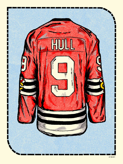
Thus far, Tasseff-Elenkoff’s favorite jersey prints include Roberto Clemente, Michael Jordan, and Dan Marino, his favorite athlete. He’s also particularly fond of his Bobby Hull print (shown at right). “I think it achieves what it’s supposed to achieve,” he says. “The color is great, it just looks good.”
Tasseff-Elenkoff, a big sports fan who grew up in London and Paris, has been in Chicago for nearly 15 years, graduating from School of the Art Institute of Chicago with a degree in printmaking. In 2006 he launched FugScreens Studios, where he specialized in designing gig posters, and in 2012 he co-founded Logan Square’s Galerie F, a gig poster and street art gallery.
He has produced posters for artists such as Chance The Rapper, Phish and Iggy Pop, and for shows including Lollapalooza and Riot Fest. Several of his gig posters were jersey-themed, and in 2015, he was commissioned by Jordan Brand to create screen prints of the first 29 Air Jordan sneakers in the lead-up to the 30th edition of the shoe.
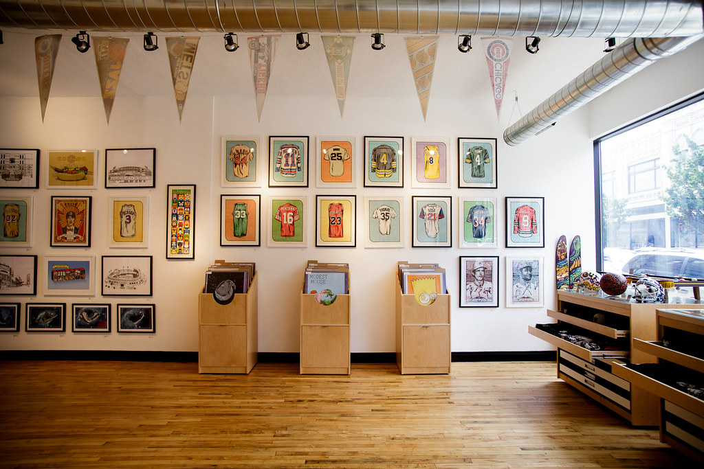
All Star Press has art from more than a dozen other contributors, and the additional pieces follow the same flavor of the jersey prints: There are some trading card illustrations, drawings of Chicago sports and entertainment venues, tributes to ballpark food, and avant garde sports equipment. But, the growing selection of jersey prints will be the backbone of the shop.
“It will be heavily slanted toward the jerseys, always,” Tasseff-Elenkoff said. “That’s what it needs to be.”
In addition to the already-made prints, All Star Press offers two custom options: One-offs for particular athletes (Drew Brees, Shaq, or Tony Gwynn, for example) and completely personalized editions (think, your high school football jersey). Customers can order in the shop or online.
Jerseys, as Tasseff-Elenkoff discovered, can be used to tell a non-sports story. He produced a rainbow-colored soccer/baseball jersey for Harvey Milk, the first openly gay elected official in San Francisco. The number on the back is 78, which coincides with the year Milk was assassinated.
“I do want,” Tasseff-Elenkoff said, “to get into other things that are not just sports, but the message is told through the jersey.”

Mike’s Question of the Week
I’ve asked some fairly convoluted questions in this space since the Question of the Week debuted in the spring of 2014, but I don’t believe I asked the most obvious one. Maybe it was too on the nose.
Quite simply, what is your favorite sports uniform?
You can pick just one overall, or one for each sport. But, you have to pick one specific uniform, and note the year (or year range) and whether it’s the home, away, or alternate uni. Don’t just say that the Chicago Bulls unis are your favorite; instead, choose the Bulls 1995-96 home uniform, for example.
Also, I’m asking for your favorite uniform, not one that is necessarily regarded as the best. It’s a subjective choice with no right or wrong answer. If you have any reason or a story behind why a uniform is your favorite, please elaborate.
My overall favorite is the mid-1990s Orlando Magic blue uniform. I love the vibrant shade of blue, the pinstripes, the wordmark, and the memories of Shaq, Penny, and Horace Grant’s goggles. I used the blue Magic uniform as the template of my Uni Watch Membership card. My favorite NFL uniform is the white and pewter Buccaneers set from the mid-2000s. I like how the Bucs own pewter, and how the pewter pants, white uni, pewter helmet combo just looked really clean and unique. As for baseball, give me the early 2000s Montreal Expos pinstriped white uniform. I consider this a modern classic, a look that screams baseball. Plus, the semi-abstract Expos logo is a gem. My hockey pick is an obscure one, the Cleveland Barons late 1970s red uniform. I dig the Olde English logo, and red-and-black is always a winning color combo.
As always, leave your answer in the comments section. If you’re shy, join in, and if you share, make it count. This is my final QOTW!

And now a few notes from Paul: Hi there. A few quick reminders and updates:
• In case you missed it earlier this week, I’m currently in the market for a new Ticker intern. full details here.
• Also from this week, there’s a new batch of Naming Wrongs shirts. Check them out here.
• Some of you have been asking about my annual NFL season preview column. I’m putting the finishing touches on it as we speak, and it should run on ESPN.com next Tuesday, Sept. 5.
• People have also been asking about the Titans-redesign contest results. Due to a variety of factors, that’s been pushed back a bit. I should have the results either next week or, at the latest, the week after. Sorry for the delay, and thanks for your patience.
• Some of you have been getting a “Security Warning” notice when accessing the site this week. The short version is that we migrated the site to a new server. You should be able to eliminate the problem by clearing your browser’s cache. (There’s also a long version, which involves a bunch of tech jargon that I don’t understand, but the bottom line is that the site is fine and is not a security risk.)

Discount news: Paul here (again). As you may have noticed in the right-hand sidebar, our friends at the Pillbox Bat Company are once again advertising on the site, and they’re offering a new promotion: 20% off if you use the checkout code UNIWATCH. Their product is wonderful, so I hope you’ll give them a look.
Also: Today is the final day to get 15% off of StripeRite sock orders by using the checkout code uniwatch. This offer applies to the first, second, and third batches of the socks.
And of course you can also get 15% off of everything in the Uni Watch online shop (which also includes all of our Naming Wrongs shirts) by signing up for a Uni Watch membership.
Okay, that’s it from me today. Handing the baton back to Mike. But I’ll be back for real tomorrow, when I reclaim the site after my August break. See you then.
The Ticker
By Mike Chamernik

Baseball News: Here’s a really good story on the history of the Blue Jays’ black uniforms, which they wore from 2004 to 2011. The team adopted the color and stressed the “Jays” part of their name to sell more merchandise and better appeal to younger fans. For what it’s worth, a certain Little League team in Waukegan, Ill., chose to be the Blue Jays in 2004 in part because of the hot new design. What can I say, we were only 14. … A few weeks after Bryce Harper suffered a bone bruise due to slipping on a wet base, the Nationals’ grounds crew has been more diligent about swapping out bases in rainy weather (from Tommy Turner). … Matt Bristow says that Nats P Tanner Roark wears a pair of Nike Cooperstown cleats from 1990s, the same kind that Mariano Rivera used to favor. “I had several pairs of these and they were the most comfortable cleats of the day,” he says. “These used to only be available to the pros and I still don’t believe they were ever sold at retail.” … The Astros will donate all 10,000 giveaway jerseys for Saturday’s game to Hurricane Harvey victims (from @igTXSalazar). … The Mets’ Jose Reyes made his first career appearance in left field on Tuesday night, and he may have been wearing teammate Juan Lagares’s glove. Reyes used Lagares’s glove for a brief appearance in center field back in May (from Ryan Bower). … The Padres’ Yangervis Solarte is still using his bat from Players Weekend (from Tim Arzaga). … Scott Schebler is the only clean-shaven starter on the Reds, a team that famously banned facial hair for more than three decades (from Brice Wallace). … Single-digit pitcher Mike Leake was traded to the Mariners yesterday. Unclear if he’ll still wear No. 8, though the number is currently unclaimed. … Ryan Feuerstein spotted home plate ump Phil Cuzzi wearing an elbow guard during yesterday’s Phillies game. … On Friday, all on-field personnel will wear gold ribbons to raise awareness for childhood cancer (from Michael Baron).

NFL News: Since 1995, Chiefs players have worn red jerseys over white mock turtlenecks, usually with a team logo or wordmark on them, for their media headshots. I asked the Chiefs media people why this was so, and they said that team founder Lamar Hunt liked the look. Hunt’s son Clark, the team’s current chairman and CEO, decided to carry on the tradition after Hunt died. … The Bears revealed their uniform schedule. They will only wear white five times this season. … The Panthers use a transparent outdoor press conference background. Gotta get those logos in. … Rep The Squad, a subscription service that rents jerseys to fans on monthly basis, launched yesterday. It costs about $20 a month, and currently only jerseys for the 49ers, Seahawks, and Lions are available, though the company intends to spread to all major pro sports teams. … The Colts, Titans, and Vikings debated over the use of the word “forge.” … Princess Diana formed a connection to the Eagles during the early 1980s. She met the team’s statistician at the funeral for Grace Kelly, a Philadelphia native who became Princess Grace of Monaco (from Kurt Esposito). … I can’t tell who it is, but it looks like a Patriots backup was wearing an Indians cap during a Patriots-Cowboys game in 1978 (from Kristian Nicosia).
College Football News: Texas A&M will have a helmet decal for Hurricane Harvey for Sunday night’s game against UCLA (from Al Gruwell). … Also, Ohio State and Indiana will have Houston Strong decals on their helmets for tonight’s game (from Mark Kunz). … Virginia Tech will wear mono-maroon on Sunday against West Virginia, who will wear all-white (from Andrew Cosentino). … Students at the U.S. Naval Academy, including those on the football team, are forbidden from wearing sneakers and must wear hard-soled shoes in public. After a wave of foot injuries last season, Navy’s football staff surmises that the shoe rule is to blame. The team is now fitting players for orthotics and encouraging guys to replace their Oxfords more frequently (from Tommy Turner). … North Carolina’s longtime equipment manager talked about his job. He said the biggest difference between now and 20 years ago is that equipment, apparel, and even cleats are significantly lighter. … UConn has a raised bumper with the old C logo on its helmets (from Justin Paluch). … This will be the 50th anniversary for Ralphie, Colorado’s live buffalo mascot (from Christopher Grey). … UNLV will have retro helmets for their season opener (from Jeffrey Seals). … Here’s a look at how Arizona State made its Pat Tillman statue (from Cole Streeper).

Hockey News: Rangers goalie Henrik Lundqvist discussed his innovative logo-clad pads (from @TheGoalNet45). … Cambria County War Memorial, the home of several Pennsylvania-based minor league hockey teams and the venue where Slap Shot was filmed, will have a new corporate name. … The Atlanta Thrashers had a bunch of prototype logos back when the launched in 1999 (from Moe Khan). … Penguins RW Josh Archibald had his baby daughter baptized in the Stanley Cup.

NBA News: The Bulls have updated their black alternates (from Conrad Burry). … The Nuggets will put their 50th anniversary logo at center court this season (from @denverstiffs, via Conrad Burry). … The Phoenix SunJets? The Suns revealed some of the names and designs they passed over when they were founded in the late 1960s.

Grab Bag: Drivers will have throwback paint schemes for this weekend’s NASCAR race. I’ve always liked the black-and-gold MGD scheme. … Here are the liveries for this weekend’s IndyCar race (from Tim Dunn). … New logo for Concordia Texas’s athletics program. … The National Lacrosse League will add a team in San Diego for next season (from Wade Heidt). … E-sports are becoming more popular and leagues are now securing specialized arenas. … The logo for Leica Camera has remained virtually unchanged for the last 100 years.
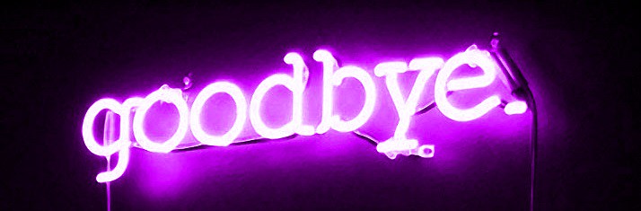
Lately I’ve started to appreciate the simple elegance of the word “goodbye.” It has more gravitas than informal farewells and it stands out in the digital age, where conversations via text or email never truly end.
I am saying goodbye to Uni Watch. This has been my final Ticker.
It’s been an absolute pleasure to write for my favorite website. I’ve read Paul’s ESPN column since 2006 and the daily blog since 2008, and I joined the site in October 2013. Since then I’ve literally had dozens of moments where I realized, “Oh man, I write for Uni Watch!” It’s almost felt surreal.
I want to thank every reader, especially those of you who contribute to the Ticker and answer my Questions of the Week. All of you make this place a real community. Thank you to fellow interns Alex Hider and Garrett McGrath, both of whom have been very easy to work with, and thank you to Phil, who has the most tremendous work ethic I’ve ever encountered.
Most of all, thank you to Paul. He’s a wonderful editor, but more importantly, a valuable friend and mentor. He’s offered me so much guidance, most of which went beyond journalism. I can’t say enough how much I admire him, his work, and his passion for the inconspicuous.
Uni Watch is too special to leave completely, so I’ll still write comments and contribute items for the Ticker. I may even write some ledes in the future.
Until then, this is goodbye.
— Mike
Thank you, Mike! I’ve always enjoyed your work.
Me too – Mike, I’ve really enjoyed the voice and perspective you brought to Uni Watch.
All the best Mike in your future endeavors and thanks for all the Uni Work… much appreciated.
Best wishes, Mike. You did a great job.
Re: Grab Bag note in ticker. The new San Diego team is in the box lacrosse league (NLL), not outdoor MLL. The team is to start in time for 2018-2019 season. Logo and team name to be unveiled this fall.
-Really appreciated all your work and contributions to the site, Mike! You contributions will be missed.
Ah dang. Fixed!
Paintings are nice, but some of the jerseys aren’t accurate, and so it ruins it for me and I suspect others on this blog.
Yeah, I’m pretty unimpressed with these. You can tell he just used the same images of cheap modern replicas you see on all those corporate chain sites like Fanatics.
Yeah, Roberto Clemente never wore a NOB and his number was bigger. Doesn’t exactly ruin it for me, but if i were in the market to buy a painting it would influence my decision.
Great job and good luck Mike.
I notice the Bobby Hull jersey at All Star Press has his name on the back. That’s not historically accurate. He never wore his name on the back as a Blackhawks player.
Same thing with the Jim Brown jersey! Also, he never wore those kinds of sleeves. UGH
I find it funny that he got the other elements right (logo on sleeve, no black trim on the numbers) but put NOB!
I had the same critique; players that never wore their name on a jersey/sweater with the name shown. The Gordie Howe sweater is especially egregious, with the current style, vertically arched name on the back.
In those cases, the name shouldn’t be on there, and for most, need not be shown in the first place. I mean, if you don’t recognize #21 in Pirates togs, or #4 on a Bruins sweater, you’re probably not the market sector that this guy is looking at.
Good luck Mike! Good work here.
In your honor, my favorite uniforms:
NFL: Chicago Bears (current) navy over white
MLB: St Louis Cardinals (1990s) road gray with navy STL cap and high-cuffed pants
NHL: Chicago Blackhawks (current) red sweater
NBA: Denver Nuggets (1980s) rainbow guts
———————
Re: the Bucks logo – not putting Original Bango Buck on these fauxbacks is a crime.
Great job, Mike. Best of luck.
NFL: early 1980s Seattle Seahawks home (blue)
MLB: 1977 Seattle Mariners home
NHL: 1997 Montreal Canadiens home (white) – those three color numbers
NBA: 1985 Seattle Supersonics road (green)
Disagree regarding the Bucks’ logo on the shorts; the link provided yesterday clearly shows a monochromatic logo on the shorts that Bob Dandridge is wearing, albeit a green outline on a white background. Haven’t found a decent photo of it yet, though.
bye, Mike. I always thought you did a great job around here.
The best uniform of all time is the Denver Nuggets rainbow skyline jersey. It’s iconic.
Toronto Maple Leafs jersey.
I understand the Bears wearing blue in week 2 against Tampa Bay, who will wear white at home early in the season. And the Bears are wearing their blue Color Rash uniforms at Green Bay who has decided to use white for CR. But why would the Bears be wearing blue at Detroit on December 16?
link
Okay, thanks! That could be interesting, since I assume that the Bears are wearing their normal blue jersey and white pants while the Lions wear the all gray Color Rash uniforms. Will that the first instance of a CR vs. non-CR game?
All the best Mike!
My favorite ever uniform: 1996-2002 Florida Marlins alternate. White vest, teal pinstripes, black sleeves, black cap. Despite being easily the best Marlins uni ever, it’s emblazoned in my memory from the greatest moment of my sports-fandom life – the 1997 Marlins World Series win. The ball juuuuust squeaking by the glove of Charles Nagy and dropping in to shallow center field. Renteria’s helmet flying off on his way to first. Counsell’s arms raised as he scored the winning run. The close up of Leyland pointing into the crowd and celebrating. 65,000 people going nuts at JRS. Magical. Can’t believe it’s been 20 years.
NFL: Steve Largent era Seahawks
NHL: Devils original Christmas Tree jerseys
MLB: Mariners with the Trident M design
NBA: New Orleans Jazz Pistol Pete era
Good call on the Largent era Seahawks. Totally underrated uni, IMO.
Mike,
I hope you’re moving onward and upward. Thanks for your contributions, and we’ll see you around the cabbage patch.
Best of luck Mike. You will be missed!
Quebec Nordiques away jersey. The red of the lower case “n” with the hockey stick and puck provides the perfect contrast to the light blue background. Plus the white flure-de-lis accents on the bottom of the jersey and shoulders were very unique.
Great pick. That was almost my NHL selection.
Hard to answer the QOTW since my tastes are always changing (I didn’t realize how much I loved the early 90s Oriole bird logo until way after it was gone), but at the moment I think my favorite uniforms are the 2000s Penn State jerseys. The contrasting colored collars were just enough of a color splash on both the home and road jerseys to prevent them from looking boring. When they switched to same-colored collars in 2011, something felt off. Adding the lion logo to the collar in 2013 helped a little (the blue jersey moreso than the white), but I still think it would be an improvement if they went back to at least a blue collar on the white jersey, if not a white collar on the blue jersey as well.
Exactly. I remember thinking PSU’s uniforms were my favorite college football uniforms until I saw them recently. I was wondering if I was remembering them wrong. It is amazing that a small detail like contrasting collars completely makes a uniform.
I feel the same way, those were so beautiful and I was very disappointed in 2011 when the change was made. That turned out to be a trivial disappointment.
Favourite uniform? The Milwaukee Bucks’ 1981-85 set, with the Irish Rainbow side panels. As nice as the later all-green version was, I much prefer having a little red in the mix.
And speaking of the Bucks, that shorts logo was used on their original uniforms (I think it was removed around 1975), so it’s not some new creation.
Classy way to go out, Mike. I don’t even mind the purple neon sign.
Mike’s been a tremendous asset to Uni Watch. He will be sorely missed!
Thank you!
Ha! I picked the images because I love neon. There were white versions of it but they were blurry.
My favorite uniform of all time has to be the Detroit Tigers home uni. This of course; has a bit of bias to it, because I am in fact a Tiger fan, but there is no other uniform that is cleaner, classier, or simply more beautiful than that of Detroit. The old English D is a staple of the city, and team, and it damn sure is cool looking. I’ve always loved that the D on the hat and jersey are different. Adds a charm to the uniforms. Each D has their own identity and are equally great logos in my eyes. Go Tigers.
Thank you for your time at The Ticker, Mike; good luck to you. Glad to hear you’ll still be around the Uni Watch community.
Not amused by many of the proposed nicknames for what became the Phoenix Suns (singular nouns were not yet in vogue), but I liked seeing the nickname submissions sent by mail, especially the uniform prototype!
My favorite uniform is the 1965 Astros home set. Love the shooting star and the navy cap.
Best of luck to you, Mike! We’ll miss you.
The Texas Rangers throwback baby blue jerseys are my absolute favorite.
Rangers 1975 road uniform to be specific
With “TEXAS” in all caps? Yeah, that one’s a keeper!
Hi Mike.
Great QOTW. My all-time favourite uniform is the Montreal Expos from their inaugural 1969 season – link and link.
I was 8 years old when the Expos first appeared and being from Toronto I had previously been a Cubs and Tigers fan. Now I had a Canadian team to cheer for. Although I never got to go a game at Jarry Park I have fond memories of watching the team in their early years with Rusty Staub (Le Grand Orange) becoming my favourite player.
I loved the starkness of the all white uniform combined with the wonderful ‘expos’ font and great logo. And, the tricolour cap was the first of its kind. The thin blue and red stripes on the sleeve and the pants were a terrific touch too. The elements also worked well with their road light blue uniform as well.
In my mind, these were classic looks.
Hey, you misspelled ‘favorite’… ;-)
You’re absolutely right about the uni, though; growing up in the Detroit area, the Tigers were always the favorite uniform in baseball (and in our household, it was always baseball first, the Wings second, Lions a distant third – like, third-party national election third – and the Pistons an afterthought. But when the Expos came along, they were just different enough, like a shot of cherry in a Coke. And the pinwheel caps were wonderful as well. One of the all-time great uniforms.
QotW: 1952-56 Brooklyn Dodgers.
Runners up: Burgundy Philadelphia Phillies; 1980s San Francisco 49ers; West Ham United; Montreal Canadiens pretty much whenever.
Favorite uniform, military division: 1898 US Volunteers khaki.
Hate to nitpick, but Harvey Milk was not the mayor of SF. He was the city supervisor.
That is correct. Fixed.
The Blue Jays black uniform was misguided, but at least that logo was still better than the muscular Blue Jay around the T.
link
Best of luck to you Mike – I always enjoyed your contributions to the site!
Best uniforms:
MLB: 1975 Red Sox (link)
NBA: 1993 Pheonix Suns (link)
NFL: Green Bay Packers (link)
(Skipping the NHL since I don’t really pay a lot of attention to it.)
Soccer: Tottenham Hotspur 16/17 (link) – the white jersey is classic, but I really like all three uniforms. I wish they had worn the blue more, and I’m a little sad that they didn’t keep the navy shoulders this year.
NHL:Hartford Whalers green jersey
MLB: 1951 NY Giants home
NFL: Eddie George era Titans blue jersey
NBA: mid-60’s Baltimore Bullets
NHL (and overall greatest): Montreal Canadiens, road (i.e., Red). They’ve worn this basic look since the 1930s, and it is perfect.
MLB: Detroit Tigers home. Same as Montreal, it’s been their look since the 30s.
NBA: Cleveland Cavaliers, 1970-1974. The yellow one with the feather coming down from the C.
NFL: 1973-1999 Rams blue.
I get your subtle point, but FWIW, the Habs have worn red jerseys at home for far more years than not.
Thanks, Mike. Great job.
Thanks for all you have done Mike! Good luck!
(checkin’ in from vacation…)
Mike — hey buddy, thanks for everything you do (and have done) and all the best as you migrate towards bigger and better things. You’ve been a pleasure to work with and any and all future vocation destinations will be better for your presence.
Cheers & Salut.
Thank you Phil! It’s been a joy to work with you and Paul. Keep on making this site great!
MLB – Tie – 1951 N.Y. Giants Gray and ’62 – ’64 New York Mets Grays
NFL – Tie – 80’s 49ers Red and 80’s Dallas Blue
NHL -80’s Oilers Blue
NBA – 90’s Chicago Bulls White
Thanks everyone for the best wishes! And thank you for the thoughtful QOTW responses. Keep em coming!
My hockey pick is an obscure one, the Cleveland Barons late 1970s red uniform. I dig the Olde English logo, and red-and-black is always a winning color combo.
You have good taste. I’m certain the New Jersey Devils cribbed this appealing uniform when they made the green black.
I’m not a big hockey buff, so I had to think a bit about a favorite uniform. The Devils certainly crossed my mind. I like how they really haven’t changed it since arriving in New Jersey, except for the green part.
My favorite uniform of all time is either the Bengals Orange jerseys with Black pants or the Bengals Color Rush uniforms. The Color Rush uniforms would be the greatest thing in existence if the Bengals wore reverse helmets with the (orange on black)
Thanks Mike. All the best. Favorite unis:
All-time, all sports – Clemson football all orange 1987 or current model
Great reading your outpourings every week, Mike. You’ve been an MVP in an undertaking that brings me pleasure (nearly) every day of my life.
QoTW:
Baseball- 1977 Houston Astros
Football- 1984 Jacksonville Bulls (USFL)
Hockey- 1982 Vancouver Canucks
Basketball- 1977 Cleveland Cavaliers
Soccer- Fort Lauderdale Strikers (NASL) Evidently, there is a current edition of this team, that uses the colors and symbols of the 1970s-era squad.
It’s obvious I’m a soft touch for any team that uses both yellow and orange.
Regarding Navy’s shoe rule: Not that I would advocate wearing shoes that would injure your feet, especially when so doing would jeopardize the mission of our nation’s sailors in the defense of our country, but one doesn’t go to the U.S.N.A. for the purpose of playing football.
Unpopular opinion of the day (I’m really good at having those): while the modern update of the Blue Jays unis is my favorite set of theirs I LOVED the black set. The alternate T cap was is one of my favorites ever.
But what the hell do I know? I also despise any of the Padres uniforms that include brown so….
You are EXCELLENT at having unpopular opinions! ;)
It’s a dirty job but somebody has to do it.
Favorite uniform of all time: the 1996 Baltimore Ravens home uniform. Aside from the nostalgia factor (it was their inaugural season and I was 6 years old, so I was definitely swept up in it all), it’s a fascinating uniform.
First, it was unique. The font, while a bit bold, is totally unlike anything seen in the league before or since; the dark jersey paired with dark pants was (to the best of my knowledge) an NFL first; the two logos on the jerseys and helmet, as well as the wordmark, were all distinct but still cohesive, following the same “winged” theme.
Second, the uniform itself is definitely a product of its time. It was the 90s, so of course the new team’s colors included purple, and of course the font chosen for the jerseys was big, garish, and a bit cartoony.
But most importantly, it gave a new team its identity. The Ravens could have easily come into Baltimore and tried to be the Colts 2.0 or to retain some of their Browns heritage. But they didn’t. They scrapped all that and embraced their identity as the second “bird” team of Baltimore, taking the black along with their Oriole neighbors, and started life in their new home with an identity that was totally their own, thanks in part to their uniform and logos.
link
Note: We all know the primary logo was plagiarized. It still doesn’t take away from the uniforms and overall look.
I like that winged B shield. Yep it’s a shame they can’t use it
My favorite uniforms
Early Joe Morgan era Astros
link
49ers during the Montana/Lott era
link
90s Red Wings
link
Alex English era Nuggets
link
Favorite uniforms
NHL: Montreal Canadiens white jersey from 40s (blue stripe in middle)
NFL: Packers home
NBA: Charlotte hornets 90s people and Lakers home yellow
MLB: blue Jays blue current jersey
Soccer: Manchester City home, Orlando City SC home
Hawaii white rainbow throwback worn in 2015.
link
Great uniform!
That’s a good look
Scott Schebler is the only clean-shaven starter on the Reds, a team that famously banned facial hair for more than three decades (from Brice Wallace).
Depressing, isn’t it, that the Big Red Machine represented the apex of this august franchise, amid its stark stadium, dull uniforms, sociopathic owner (the Marge Schott years), and Stalinist dress code; maybe they should have called them the Stakhanovite Reds. The harsh aesthetic tainted a remarkable confluence of astute baseball people and great players. I always resented the squares telling me, “now that’s what a baseball team should look like!”
As one of the self-admitted “squares,” that is EXACTLY what a baseball team should look like. Not depressing at all.
BTW it was the “sociopathic owner” who lifted the facial hair ban:
link
Best of luck Chamernik in your future endeavors and thank you for your energy and efforts here at Uni Watch. I think of you when I see my DePaul Law School t-shirt in my dresser. Thanks for that too by the way.
Ok let’s go out in style. QOTW!
NHL I’ll take the Habs Winter Classic 1-1-2016 in Foxboro. The Habs *are* the torso stripe and I always wondered as a kid why the whites don’t do it. They tried in 2005-07 with an alternate that looked great on fans, but never quite right on the ice with numbers. Turn down the blue and don’t try to shoehorn blue into the numbers: it finally worked. The best.
NBA Kevin Durant’s rookie Sonics jersey but in white. Green and gold. Fun typography in the team word mark. Once again, the Sonics owned the arch and this was a good rendition. The shorts played along too, and together it made a great look. Add a fun S logo and a good crisp clean bold readable number font and you have my pick.
NFL Chicago Bears navy jerseys over white pants with the striped socks. Hardly matters what year, but let’s say Walter Payton and be done with it. Because that’s the point. Color photo, black and white photo, through the generations, those are the Bears and everybody knows it. The stripes, that special font before everybody got a special font, the color contrast…hell yeah.
MLB Phillies, Mike Schmidt’s powder blue. Somebody needs to reclaim maroon, and the Phillies did it great. Good logo, Helvetica numbers, VAL NOB’s, simple clean lines. Powder blue is a trickier backdrop than is gray for road uniforms but I loved how it looked in that context.
NFL: Dallas Cowboys current white
MLB: Seattle Pilots home
NBA: Nuggets rainbows, obviously.
NHL: Quebec Nords white sweaters.
Favorite (hockey) uniform of all-time:
CSKA Moscow ca. 1990-91 Super Series
link
Red CCM air-knit jerseys, red (NY Rangers style) pants and red socks with just the right amount of blue and white striping. The contrasting shoulder yoke and surrounding stripe is perfectly proportional, unlike most jerseys today which have a thin stripe, or a yoke with the same color as the jersey body. A very unusual but cool single-color chest logo, and a cool shoulder patch too (star with hammer and sickle). I attended a few of these Super Series games at MSG, it’s too bad the pro leagues don’t do exhibitions like this anymore.
Baseball:
Detroit Tigers home uniforms
NY Mets 1960s away wool uniforms
For me it is a tie between the Oakland Athletics home uniform, the Oakland Raiders home uniform, and the Penn State football road uniform.
My favorite uniform is one of the first I remember seeing….from a early-mid 70s game. Rams @ Dolphins. Definitely the most beautiful uniform game I have ever seen. Ever since, that Rams road uniform from that era (nearly perfectly symmetrical with the home other than the very cool use of the white NOB of the home jersey) has been my favorite of all time.
Never rooted for the Rams a day in my life, but that’s my favorite (and the Fins aqua a close second).
Mike, us readers know that you’ll be successful and thank you for your contributions. Personally, reading your work, as well as that of the rest of the Uni Watch team, brightens my day every day.
NBA: lakers yellow home
NFL: San Diego powder blues
NHL: blackhawks white away
MLB: cubs blue alternates
EPL: man city blue home
MLB: Yanks road jerseys 1931-1973
NFL: Giants Home 2005-2011
NHL: Islanders current road but white jerseys will always be the home jersey for me in hockey
NBA: Knicks home 1987-1988
Good luck Mike!!
Absolute favourite is probably the original Kariya/Selanne era Mighty Ducks burgundy/teal uniforms. A close second would be the Nashville Predators “mustard” third jerseys, circa 2001-07.
QotW:
NFL has to be a tie:
1967 New Orleans Saints with link
1985 Chicago Bears with link
MLB: New York Yankees home (link)
Best wishes Mike and hope you’re not a stranger to Uni-Watch in the years ahead
Favorite NFL uniform: Green Bay Packers Home Uni Present Day (link). Classic look that hasn’t changed much in years, green as the primary color, my second favorite NFL team.
Favorite NBA uniform: 1986 era Boston Celtics Road Uni (link). Kills me to say this as a Raptors fan, but those are classic and associated with that 1986 team which is one my favorite in history. I also think I really like green.
Favorite MLB uniform: 1989 – 1993 Toronto Blue Jays Home uni (link). Home uniform of two world series winning teams, my favorite team, classic look, can’t go wrong here. A close second are all the unis of the Jays present day, but for favorite I had to give a nod to this era of the team.
Favorite NHL uniform: Toronto Maple Leafs Home uni present day (link). The early 90s Leafs had some great unis as well, but I love the new logo and the simplicity of the most current version of the home unis. Favorite hockey team as well, obviously.
To answer Mike’s QOTW, my favourite jersey is from the New England Revolution (MLS). 2008-2009 home kit, especially the longsleeved edition. The no-button collar was my introduction to classic soccer kit design (how I long for this look to come back!) Here’s a visual link with credit to Victor Decolongon/Getty.
link
Thanks so much Mike and best of luck as you move on to bigger things.
QOTW:
MLB Mets road grey
NHL Rangers blue home
NFL Bears navy with the round numbers
NBA Nets blue ABA stars and stripes on the side
1999 Arizona Diamondbacks Alt – goo.gl/8axJBL
1996 NBA All Star – goo.gl/XxThzA
1991 San Jose Sharks – goo.gl/qKfv4E
1995 Carolina Panthers – goo.gl/6eogpb
long live purple & teal
Good job Mike! Enjoyed reading your stuff and you’ll definitely be missed!
Now the news: apparently Prince’s favorite color wasn’t purple, it was orange.
link
Best wishes Mike in all of your future endeavors, loved your contributions to Uni-Watch!
Favorite uniform:
MLB: 1988-89 Milwaukee Brewers road jersey
NFL: Any era Oakland/Los Angeles Raiders road jersey
NBA: Denver Nuggets blue rainbow skyline jersey
NHL: Late 1980’s Minnesota North Stars home jersey
Mike – I always looked forward to your ticker compilations. Best of luck.
MLB: 69-88 Cincinnati Reds Home Jersey
NFL: 85-95 Cleveland Browns Home Jersey
NBA: 84-85 Chicago Bulls Road Jersey
NHL 90-98 New York Rangers Road/Blue Jersey
Cleveland Browns usually wore both jerseys at home…gotta specify! ;)
Best of luck, Mike. I enjoyed your contributions.
Didn’t have to think twice about my favorite sports uniform: Yankees pinstripes! As far as I’m concerned nothing else comes close.
Best of luck Mike.
QOTW:
MLB: Yankees home pinstripes, 1930s version.
NFL: San Francisco 49ers Home Red, 1980s version.
NHL: Pittsburgh Penguins, 2008 Winter Classic versions of the baby blue uniforms.
NBA: Lakers Purple, 1980s Showtime version.
Favorite MLB Jersey – 2001 San Fran Giants Black Alternative Jersey
Houston Astros 60s shooting star home jerseys
NBA: expansion-era Miami heat black uniform
NFL: Stabler-era Oakland Raiders black uniform
NHL: Mikita-era Chicago Blackhawks red uniform
MLB: tie between 1940s Detroit Tigers home white and late-80s Astros white (not the tequila sunrise, but the later one with the stripes going down the arms)
Thank you for all your hard work Mike!
My favorite jersey is the 1998 – 1999 Celtic football top.
link
QOTW:
Stanford Cardinal football uniforms, home or away.
Mike – best of luck, enjoyed your work.
My favorite uniform has been and always will be the Yankee pinstripes. I’m biased, I admit it, grew up watching the Mick. In particular, I like the early 1960’s version, with the smaller numbers like the Mets, Cardinals, Dodgers still wear. I don’t like the large block numbers that George put on them in the 70’s.
My favorite HAS to be the 1969-71 Oakland A’s road unis.
1) Vest tops are an iconic baseball style.
2) Gold & green can’t be beat.
3) The McAuliffe (Red Sox style) number font is perfection.
QOTW:
The very first autograph I ever got, and I believe my first piece of sports memorabilia – was a copy of this photo:
link
Jurgensen is still my #1 sports hero, so my favorite uni is this:
link
The Patriots player was likely Tim Fox, #48, who went to Ohio State. He was a first round draft pick in 1976. Also, not a backup;) link
Goodbye & best of luck, Mike. I always thought you did an excellent job of adding a unique voice/perspective to this site while remaining true to its established focus and tone. Not an easy accomplishment, but you nailed it. I hope your future pursuits are successful & satisfying, and I look forward to seeing you pop up again here from time to time.
Thanks! That means a lot to me. I’ve always felt that Paul’s (and Phil’s) voice is part of what makes Uni Watch what it is. Ironically, back in 2013, Paul ran a poll on whether he should have interns write the Ticker, and I voted “no”. Haha. I was afraid that a certain something might be lost from the site, even in a small sense.
As previously noted, the Bucks logo can be seen here on the Alcindor shorts: link
My favs:
NBA: Theus-era Kings (link)
MLB: Mid-70’s Twins (link)
NFL: 60’s Chargers (link)
NHL: 80’s North Stars (link)
MLB 1966 Orioles home white
NFL Giants 2007 home blue with the gray pants with blue-red-blue
NHL Blackhawks road white (current)
NBA 1996 Lakers yellow home
MLS 2013 NE Revolution Navy shirt, white shorts with red adidas stripes, and striped blue socks
World Cup Brazil yellow/blue/white
Honorable mention Zidane-era France blue/white/red and NFL Bears Navy, Niners white road, even with the truncated sleeve striping. All great.
Is there no mobile version for this site anymore?
Got to link (without the “www”) — see if that works for you.
I tried just like that and it does NOT work on my iPhone 7 running Safari. Hasn’t worked ever since Tucker’s memorial article. (No blame or insinuation of causation lol, just my frame of reference as to when my mobile troubles started.)
OK. Let me check.
Yeah, I can’t get the mobile version on either the iPhone or iPad. Same time frame that Mike said. But no other issues.
I’m having similar issues.
For what it’s worth I have the same issue using opera mobile in Android.
QOTW:
Tastes change and my memory isn’t the best – picks off the top of my head:
football: Hamilton Tiger-Cats 1972 (on any around that era)
link
link
baseball: 1975 Astros (though I’m sure some days century old ones or something more tradition looking would supplant this one)
link
basketball: Warriors original era ‘The City’
link
hockey: tough one – today I’ll go with the original 1972/73 WHA Nordiques
link
ones I own:
likely the Hamilton Steelheads (tv show worn) one:
link
Favorite college football uni:
The Boomer Esiason-era Maryland Terrapins:
link
My favorite uniforms:
NFL-Los Angeles Rams 1980’s white uniforms
MLB- Tony Gwynn era brown and orange Padres
I had a hard time deciding between the Rams proper uniforms and the Oilers unis they wore before they were stolen.
Best of luck, Mike! You’ve always done a great job here.
Favorites for me:
MLB – 1969 Montreal Expos home white
NFL – 1966 Falcons throwback
NBA – New Orleans Jazz home whites (Pistol Pete)
NHL – Chicago Blackhawks (red jerseys)
NCAAF – Tie LSU when they wear purple/Colorado home pre 2016
NCAAB – 1985 Memphis State road blues
Favorite uniforms…
Football: 1969-72 Boston / New England Patriots road, mono white, Pat Patriot emblem.
Baseball: 1977 White Sox road, mono navy, wonderful “Chicago” lettering.
Basketball: 1970-71 Seattle Sonics home, yellow with white lettering and green trim.
Hockey: Early 1960s Toronto Maple Leafs blue.
Goodbye and best wishes, Mike. I will miss your exceptional contributions to Uni Watch as a writer and Ticker compiler. I’m thrilled to know you’ll still be around in the comments section and as a guest writer.
I would be remiss if I didn’t answer your final QOTW, so here goes:
Favorite NFL uniform: Denver Broncos home uniforms circa 1991 (I love the orange jerseys and the contrasting royal blue helmets with the classic “D” logo).
Favorite MLB uniform: A tough one for me to narrow down, but I’ll go with the 1970 California Angles home uniform, with the halo stitched into the crown of the cap and the state of California patch on the sleeve.
Favorite NBA uniform: I’ll join with a few others who have posted here in the comments section to select the Denver Nuggets’ classic uniforms with the rainbow skyline (the version worn from 1985 to 1993), with a slight preference for the home whites over the road blues because it helps the logo pop a bit more.
Favorite NHL uniform: Pittsburgh Penguins home uniforms, circa 1991-1992 (featuring one of my favorite sports logos ever on the chest).
Favorite soccer uniform: Colorado Rapids home uniforms, link. Burgundy is a criminally underutilized color in American sports, and it goes great with white and light blue. I love the contrasting white sleeves, the lack of a jersey advertiser, and the sublimated “C” from the Colorado state flag on the chest.
Favorite college football uniform: UCLA home uniforms, circa 1987-88. The powder blue jerseys with full shoulder stripes and the metallic gold helmets with the script “Ucla” logo are close to perfection, in my opinion.
Favorite college basketball uniform: Iowa Sate road uniforms, link. I admit this is a bit of a homer pick since I went to school there, but hey, this is a list of MY favorites, right? Personally, I love the way the athletic gold (some may say “yellow”) lettering and numbers stand out against the cardinal uniform body without any white trim.
*Angels, not “Angles.” :-\
Why quibble when you can have both?
link
I agree with you about the Broncos D (an absolute classic) and about burgundy. Need more teams to use that color
NFL: Oakland Raiders home
MLB: Early 1970’s A’s Yellow over White
NBA: well, actually its the Pacers ABA one with the stripes going down the side. The road blue.
NHL: NY Islanders (cup era)
College Football: Notre Dame home
This changes from time to time, but my favorite uniform now is the current home set for the Auburn Tigers football team. I’m not even a fan, but I think the simple look with classic stripes and a great color set come together to form a great uniform.
QotW:
Not trying to go in to specific years, but overall…
MLB: Cardinals (I’m a homer, what can I say?)
NFL: Niners (not so much now with the truncated sleeve stripes), Bears, Packers, & Raiders
NBA: Bulls
NHL: It’s a shame the North Stars aren’t around any more.
Fav uni – Oak A’s white pullover jersey 1970’s
NBA: 1976 Philadelphia 76ers home whites.
MLB: 1954 Orioles set.
NFL: Raiders black unis.
NHL: Toronto Maple Leafs blue jersey.
Bucks logo is not a fauxback & its on sportslogos.net
That’s exactly right. My fault for not digging deeper with that one. It’s been removed from the Ticker.
That aside – Always loved your knowledge of Wisconsin sports unis Mike!
The Bucks and Brewers are my teams!
NFL: Cowboys whites
MLB: Yankees road grays
NHL: Canadiens whites
NBA: Mid-to-late ’70s Hawks, after they ditched the blue and green
Those Hawks unis are underrated. Good choice!
Best of luck Mike!
Favorite Unis:
NFL: Raiders Black
NBA: Celtics White
NHL: Whalers Green
MLB: Astros Tequila Sunrise
I’ll keep it simple as well. Farewell, Mike.
Favorite uniforms:
MLB: 1977-82 Pittsburgh Pirates yellow jersey/black pants.
NFL: 1983-2001 Seattle Seahawks home.
NHL: Current Chicago Blackhawks home.
NBA: Late 1970s Portland Trail Blazers home.
Question of the Week:
MLB: Current road grays for the Dodgers. The Los Angeles ones with the blue sleeve piping. Not the “alternate” that reads Dodgers minus the blue piping. (Runner up = Athletics 2001-2013 green alternate. I miss it. Hate that other green alternate they later used and the yellow one they use now.)
NHL: 92-95 Kings white set. Something so beautiful about that white, black and silver combo. Might have been the fact number 99 was wearing them. (Runner up = 95/96-02/03 Burgundy and blue Colorado Avalanche)
NFL: 93 Dallas Cowboys White with the “green-silver” pants everyone seems to hate. I love that uniform. The one difference between then and now was the white stripes on the blue portion of the socks. They should bring that back. Other than that, never change it. (Runner up = 99 Jacksonville Jaguars Home dark teal. Such a beautiful uniform. With the white pants and black cleats. The tiny amount of gold on it just pops so nice. The golden years before they went BFBS and then the atrocities they have now.)
NBA: 99-00 Home gold jersey. I really prefer it over the “showtime” era jersey. So much cleaner and the numbers really pop. Before they started using alternate white and black and all the other junk they’ve done now. (Runner up = 95/96 Vancouver Grizzlies road teal jerseys. A lot of people hate it, I love it. The colors, logos and artwork of that era are a millions times better than the boring and simplistic crud they use nowadays in Memphis.)
*NBA was Lakers home gold
So long, Mike Chamernik. It was great meeting you at the gathering in 2014.
Yes sir, that was a good night. That bar has since closed, sadly.
The Oakland Raiders home blacks. Nothing compares to the beautifully simple design that hasn’t changed since they traded yellow for the silver. The helmet has changed a little but not since the AFL days. Gotta love this uniform if you are a sports fan.
Look at these comments… MANY AGREE
Mike, I’m really going to miss your Questions of the Week (along with your other work). And wow…you’re going out with a bang!
I’ve been thinking about this way too much today, so it’s time to just commit to an answer.
NBA: 1981 KC Kings road blues
link
NCAAB: 1990 Loyola Marymount road maroons
link
MLB: 1971 Pirates home whites
link
Briefly thought of the ’93 Marlins, but you can’t beat those properly sized numbers and NNOB.
Ski jumping (the bib, not the suit): 2010 Olympics
link
Cricket: 2015-16 Kent Spitfires T20 kit
link
Soccer: 1987 Tacoma Stars road blues
link
Hockey:
Cleveland Barons mid 70s home whites
link
Nordiques ’80s road blues were a close second.
All-time favorite? Guess I have to go with my first love, the ’71 Bucs.
Goodbye, Mike. Come back and visit soon.
Thank you Jim. I appreciate the effort! And I’m glad we agree on the Barons.
Mike – Will miss your contributions to the site. Good luck!
Favorite uniforms:
2016 Winnepeg Jets White Heritage Uniforms
Current Buffalo Bills (not color rash)
Saints throwback white unis with Gold numbers and black trim
NHL:90’s Mighty Ducks Away
NBA:90’s Phoenix Suns Home
MLB:Atlanta Braves White
NFL:Marino era Miami Dolphins
Thanks for all your effort Mike! Good luck!
Great work, Mike!
My Favorite Jersey: Red and Green 80’s New Jersey Devils. The first/only pro team I got in on the ground floor with.
Thanks again for all the kind words and well wishes.
Lots of people here like the Nordiques and Nuggets unis from the 1980s. I can see why!
mike- good luck in your new adventures!!!
Blood red Detroit Red Wings. Clean, iconic. The best!