@UniWatch @PhilHecken Celebrating '82 tonight. The year Schmidt didn't have his jersey on baseball card picture day. pic.twitter.com/4zLZdBgZLL
— Frank McGuigan (@FrankMcGuigan) July 15, 2017
[Editor’s Note: Paul is on his annual August break from site. Deputy editor Phil Hecken is in charge from now through Aug. 25, although Paul is still on the clock over at ESPN and may be popping up here occasionally.]
By Phil Hecken, with Frank McGuigan
Follow @PhilHecken
“Why is today’s splash photo a tweet?” you may ask. The answer lies below.
Back on July 14th, when the Phillies were about to play a throwback game against the Brewers (wearing their powder blue road uniforms from 1982), Frank McGuigan (a Uni Watch reader and ticker contributor) tweeted to Paul and me a 1983 Donruss baseball card featuring Mike Schmidt, only Schmidt wasn’t wearing his regular #20, but instead was photographed in what appears to be uniform number 37. Frank’s text accompanying the baseball card said, “Celebrating ’82 tonight. The year Schmidt didn’t have his jersey on baseball card picture day.”
Intrigued at this potential “uni mystery” I asked Frank if he knew more and if so, would he be able to elaborate. He didn’t let me down! Below, then, is the story of how Michael Jack Schmidt came to wear the “wrong” jersey on his 1983 Donruss card. Here’s Frank:
Mike Schmidt? Hammerin’ Hank? The Homerun King?
by Frank McGuigan

In 1986, at the end of sixth grade, I had a new neighbor move in across the street from me. His name was, and still is, Rob Tola. My baseball card collecting had been very light up until that point in my life. I had a small box of various cards that I kept in my closet. Rob, on the other hand, had been collecting for quite some time. His welcome-himself-to-the-neighborhood gift to me was ripping me off of my Wade Boggs and Tony Fernandez 1984 Fleer cards. He salivated once he got a gander of what I had in the box. He gave me seven crappy cards that included an unmint 1984 Topps Pete Rose and a 1986 Topps Don Baylor. He sold Baylor to me by telling me he was going to break the Major League HBP record; also that he was trading me SEVEN cards for just two. No, I’m not still bitter.
Anyway, for Christmas that year my parents bought me a complete set of 1986 Topps cards, which Rob repeatedly asked me to break up to trade him Don Mattingly and Eric Davis. I didn’t fall for it. But, that is the year that my card collecting got off the ground. I wised-up a bit and hit the ground running. Of course, this was also about the time baseball cards flooded the market and started to ruin the hobby. Give me a 1987 Topps name and I can tell you what the card looks like.
Mike Schmidt was my favorite player as a kid. So, I made it a quest to obtain every Mike Schmidt baseball card I could get my hands on. Rob and I went to baseball card shows, collectibles stores”¦ any place we could get our hands on some cards. It was during one of those trips to a baseball card show that I obtained the 1983 Donruss Mike Schmidt.
That night, armed with new cards, Rob and I began reorganizing our card books in my room, as we had done quite frequently. We took a closer look at the Donruss card and wondered whose jersey Schmidt was wearing on this card. This being 1987, we did not have the luxury of the internet. I had an electronic paperweight called the Commodore 64. And we sure as hell weren’t stepping foot in a library. But as it turned out, I had all the information in my room that would allow us to make an educated guess.
I attended a few Phillies games each year and I always made it a point to, at the very least, get a yearbook every year. Most all card collectors knew back then that anything on a particular year’s card had all of the previous year’s info on it, including the picture. Many times, the pictures appeared to be from the previous year’s Spring Training. If my memory serves me correctly, the Phils wore their regular uniforms during Spring Training games back in the 80s. So, we went to the 1982 yearbook. All we knew was the jersey appeared to be number 37 and the name on the back was short and ended with a G.
From here it was a rather simple process. We went straight to the team picture looking for anyone with those credentials. Only one guy popped up. It was Batting Practice Pitcher, Hank King. We had no idea who he was. He appeared nowhere else in any publication. However, we only had a short name that ended with a G. Because for some reason, the Phillies weirdly wore their team jackets for that year’s team picture and King had his zippered all the way to the top. Thanks, Hank.


We did not know if King even had a jersey. Did they give one to a Batting Practice Pitcher who made $15 a day? They are not officially recorded in team number history in the media guide for the Phillies. So, we took a shot and went to the 1983 yearbook.
Thankfully, in the 1983 team picture, the Phils ditched the jackets. And there was King again in the picture, clearly wearing a jersey. However, the number on the jersey is blocked by Alejandro Sanches sitting in front of him. But that is a good thing, because as I recently discovered, Stan Bahnsen was issued number 37 when he came up to the Phils on September 1, 1982 and King probably had a different jersey by then. It does prove though, that King was issued a jersey and was most likely wearing one under that jacket in the 1982 team photo.


There are a few people out there who believe, or want to believe, that Schmidt is wearing a Ryne Sandberg jersey on the card. Sandberg had a cup of coffee with the Phils in 1981 and wore number 37, before Dallas Green fleeced the Phils that winter as General Manager of the Cubs . However, the G in Sandberg would have come much farther past the 7 on the back of the jersey. Plus, why would the Phils carry around a Sandberg jersey on the road with them the next season? It’s not a Sandberg jersey.

For close to 30 years, there had been no official confirmation that this is Hank King’s jersey, or why Schmidt was even wearing it. It was just a very educated, common sense guess on our part. Was he just taking BP in a t-shirt when the Donruss people showed up for a picture? I could hear them asking him to get his jersey on and him saying, “I’m Mike Schmidt. I’m hitting right now. I’m not going back to the locker room and getting my jersey. Hank, give me your jersey.” Or maybe he wanted to pay homage to the man who was his long-time BP pitcher since 1975?
After tweeting the card on July 14th, I began to re-research the card to see if I could come to any definitive conclusion. I found a couple other people who appear to have done the same detective work Rob and I did. Again though, no story as to why he’s wearing it.


Additionally, we believe back in those days, jerseys were recycled and not kept by players when they left the team. So I checked the heights and weights of Sandberg, King and Bahnsen,on Baseball Reference to see if they’d all potentially fit the same jersey: Sandberg 6’1”, 175; King 6’2”, 195; Bahnsen 6”2, 185. Certainly seems plausible. And the timeline of when it’s believed the picture was taken indicates that number 37 was available for King (January 27, 1982 to September 1, 1982).
I was able to find Hank King on Facebook, and I did reach out to him for confirmation and the story. However, my message has not been read yet. It does not appear Hank has been active on Facebook for quite some time, so it may not come to fruition.
Rob and I also reached out to Phillies broadcaster, Tom McCarthy. On home weekends, McCarthy and Mike Schmidt work the television broadcasts for the Phillies. I have gotten responses from McCarthy before. But at the time, the Phillies were on the road. We figured we’d probably have to wait until they were back home for any chance at a response. We decided reminding him while he was broadcasting with Schmidt was the best course of action. McCarthy is a uniform nut like us, so he could be on top of it.
And then it happened. At 9:56 PM on July 22, 2017, we got confirmation from the man himself, via Tom McCarthy.

The jersey Mike Schmidt was wearing was in fact Hank King’s. The Phillies went on the road and forgot to take Schmidt’s jersey with them. What? Now, if I were a real reporter, and not just a fan tweeting a broadcaster during a game, I would have had a ton of follow-up questions. For instance, of all the people’s jersey’s to forget, how could it be the one of the reigning two-time MVP and future Hall of Famer? Seems to me King’s jersey would be the more acceptable one to forget. Also, why of all days, did Donruss choose to use the picture from that day for his baseball card? Was this a regular season game? The list goes on.
However, even without all the additional answers, there are three major developments that were resolved here. First, Mike Schmidt is wearing Hank King’s jersey on the card. Second, He was wearing it because the Phillies simply forgot to bring his to a road game. Finally, and most importantly, I did reobtain the Wade Boggs and Tony Fernandez 1984 Fleer cards in a trade for a 1987 Topps Jose Canseco. They remain in my card book to this day.


From the Phils 2004 Media Guide:

You can follow Frank on Twitter @FrankMcGuigan; Additional articles on Hank King can be found here, here, and here.
Great research, Frank! And thanks for solving another “uni mystery” out there. Well done, sir.


New NBA Uni Update
On Friday, several teams unveiled new uniforms for the 2017-18 NBA Season. Johnny Ek showed you two of them (Lakers & Spurs) on Saturday, but in case you missed it, here’s who unveiled on Friday:
Clippers
The Icon » Redefining the Future. pic.twitter.com/Ip31qXqQC1
— LA Clippers (@LAClippers) August 11, 2017
New Wave uniform, ready to go Clipper Nation pic.twitter.com/KICrRbAHch
— Blake Griffin (@blakegriffin32) August 11, 2017
Fans first. #ClipperNation pic.twitter.com/89ckgBGyoG
— LA Clippers (@LAClippers) August 11, 2017
Side-by-side comparison of Clippers' old and new white uniforms. pic.twitter.com/gqi2AFczPm
— Paul Lukas (@UniWatch) August 11, 2017
Clippers' primary colored uniform (formerly road) changing from red to blue. pic.twitter.com/9KuX6BB04l
— Paul Lukas (@UniWatch) August 11, 2017
Leaks of Clippers design proposal in 2015 included a blue uniform that was never used (left). Similar to new blue uniform (right). pic.twitter.com/yDblx3ySHL
— Paul Lukas (@UniWatch) August 11, 2017
Spurs
A classic, evolved.
@BP3 & @Dwhite921 showcase our new Spurs x Nike threads » https://t.co/3nlKoaxTne pic.twitter.com/x7hzdokqyE— San Antonio Spurs (@spurs) August 11, 2017
Wow the @spurs went crazy with their new look. (Also I'm not sure if these guys are real.) pic.twitter.com/IMqkVowIIV
— Taco Trey Kerby (@treykerby) August 11, 2017
The Icon. pic.twitter.com/HWXA6WNKpu
— San Antonio Spurs (@spurs) August 11, 2017
Side-by-side comparison of Spurs' old and new white uniforms. pic.twitter.com/VoTTzFpnES
— Paul Lukas (@UniWatch) August 11, 2017
Side-by-side comparison of Spurs' old and new black uniforms. pic.twitter.com/5mDQraoiex
— Paul Lukas (@UniWatch) August 11, 2017
Nets
New beginnings. #WeGoHard pic.twitter.com/HG6648ARrA
— Brooklyn Nets (@BrooklynNets) August 11, 2017
Breaking down the elements
⚪ï¸âš«ï¸ » https://t.co/tnGAGiKUXN pic.twitter.com/p1v9w5SIL6
— Brooklyn Nets (@BrooklynNets) August 11, 2017
Side-by-side comparison of Nets' old and new white uniforms. pic.twitter.com/LIl1RNt61k
— Paul Lukas (@UniWatch) August 11, 2017
Side-by-side comparison of Nets' old and new black uniforms. pic.twitter.com/gnBfKXe49O
— Paul Lukas (@UniWatch) August 11, 2017
Dallas Mavericks uniform for 2017-18 compared with last year pic.twitter.com/iYd8yC3Gl5
— Chris Creamer (@sportslogosnet) August 11, 2017
Side-by-side comparison of Mavericks' old and new white uniforms. pic.twitter.com/yw4jt3bNYT
— Paul Lukas (@UniWatch) August 11, 2017
Side-by-side comparison of Mavericks' old and new blue uniforms. pic.twitter.com/upR2zla30O
— Paul Lukas (@UniWatch) August 11, 2017
Lakers
Updating a timeless look: https://t.co/3XscgG4lzu
— Los Angeles Lakers (@Lakers) August 11, 2017
@UniWatch #Lakers releasing three jersey reveals as opposed to all teams showing only two. pic.twitter.com/81ZxmsNYHT
— Mandy Lopezâ„¢ (@2EP0L) August 11, 2017
Griffins Jersey Contest Reminder – TWO Days Left

In case you missed it, I’m again hosting a jersey design contest in conjunction with the Grand Rapids Griffins (an AHL affiliate of the Detroit Red Wings). All the details are contained in this post.
The deadline for getting your submission in to me is this TUESDAY August 15 (at 6:00 pm Eastern Time), and we’ll have reader voting on the concept jerseys beginning on August 17th! Last year we had 85 entries and I’d expect we’ll equal or surpass that this year. Prizes include a custom jersey based on your design and tickets to the game that the Griffins will be playing in the jerseys you designed!
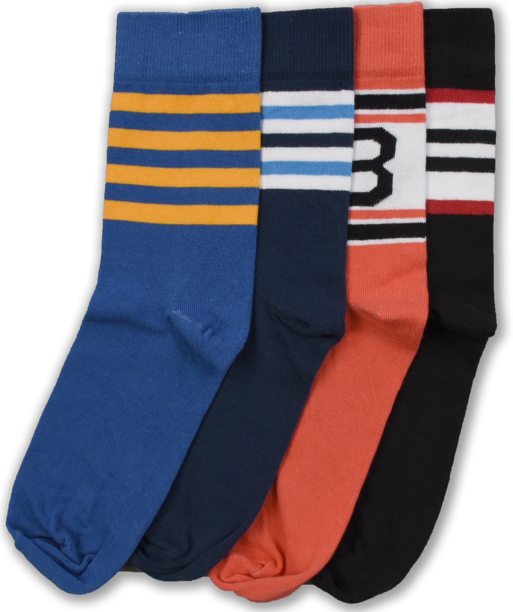
NEW StripeRite discount: Paul here. From now through the end of the month, you can use the discount code uniwatch to get a 15% discount on any orders from the first, second, and third batches of StripeRite socks. The code is good through Aug. 31.
Word to the wise: We have low stock on most of the designs from the first two batches. Once those are gone, they are likely gone for good.
Titans redesign reminder: Paul here (again). Today is the next-to-last day to submit entries for my Titans-redesign contest. Full details here.
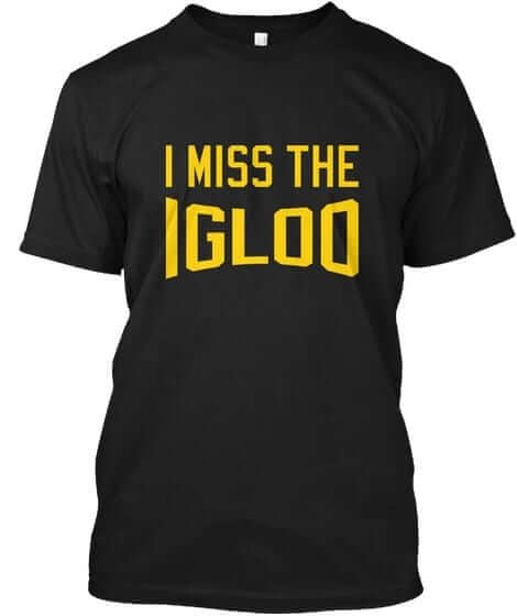
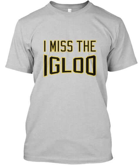
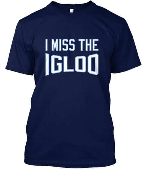
Naming Wrongs update: Paul here (still). Last week I told you about some new Naming Wrongs designs for Boston Garden, the Metrodome, the Aud, and Foxboro. Today I have a new batch to tell you about. One at a time:
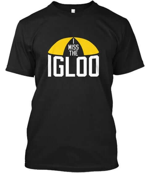
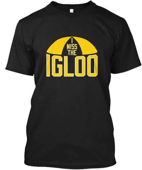
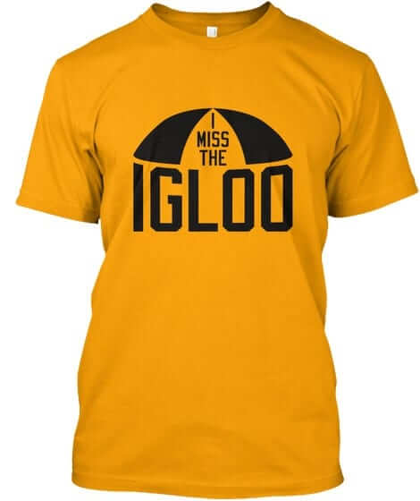
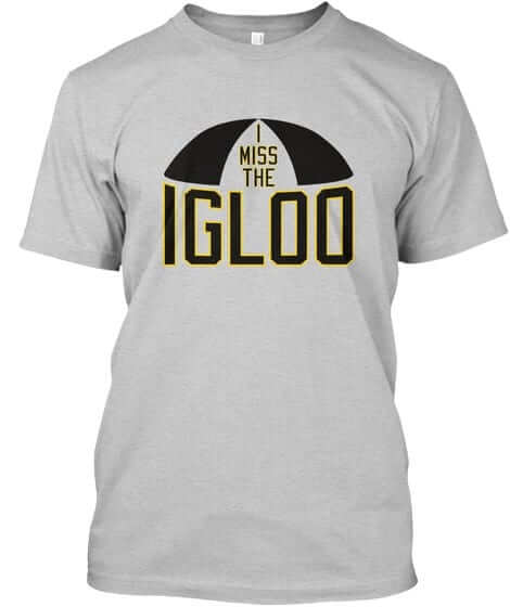
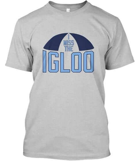
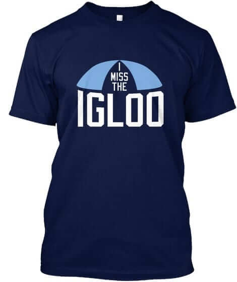
Igloo: I was excited to do some designs for the Igloo, in part because “igloo” is such a fun, playful word. Scott Turner did a nice job of capturing that in the shirts that we’re offering. First we have a basic type version, available in four designs: black with gold type, black with gold/white type, grey, and — my favorite — navy:

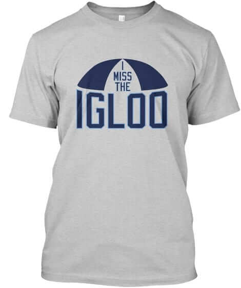
Then we have an illustrated version, available in seven treatments: black with white type, black with gold type, gold, navy, grey with black type, grey with light blue type, and grey with navy type:
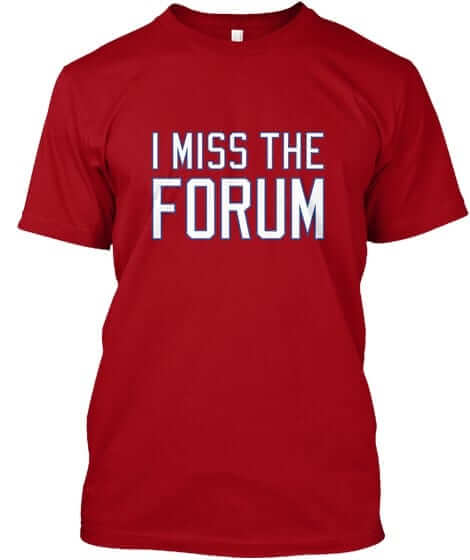
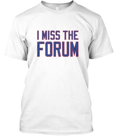
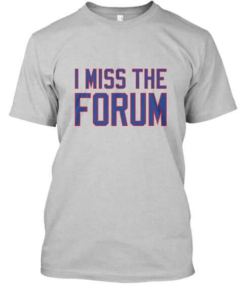
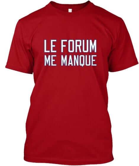
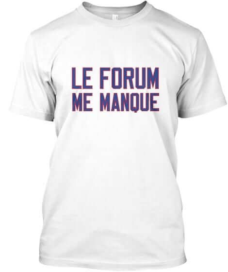
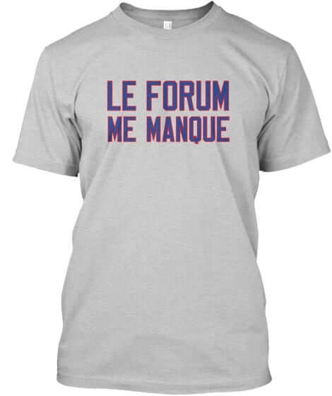
Forum: We wanted to do a series of shirts for the Forum. They’re available in English (red, white, and grey) and French (once again in red, white, and grey):
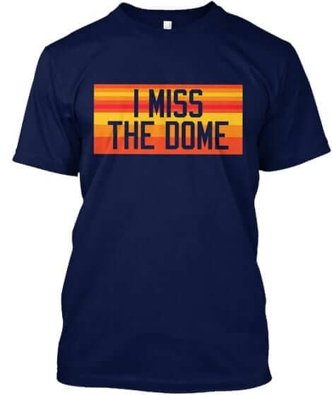
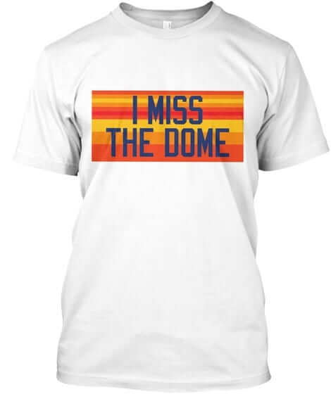
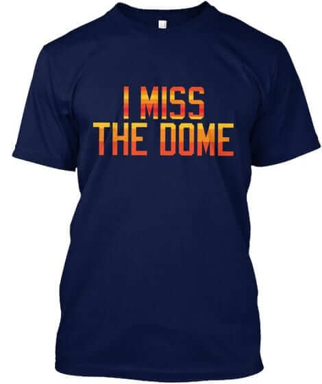
Rainbow Dome: I had previously announced the launch of a bunch of designs for the Astrodome. At some point we added some designs with rainbow striping, which I don’t think I ever formally announced, so here they are, in navy, white, and navy with striped lettering:
All of these designs are now available in the Naming Wrongs shop. They’re also cross-listed in the Uni Watch shop, where card-carrying members can get 15% off. (If you’re a member and need the discount code, send me a note and I’ll hook you up.) Major, major thanks to my collaborator, Scott M.X. Turner, who’s been working really hard on these.
The Ticker
By Alex Hider

Baseball News: ICYMI: The Reds and Brewers wore Negro League throwbacks on Saturday. … Sounds like Indians players enjoyed wearing blood-clot throwbacks this weekend almost as much as we enjoyed looking at them (from Jason Hillyer). … Unfortunately, the Tribe and Rays played a much more drab blue-on-blue game yesterday (from Robert Hayes). … Matt Garza must have missed a button yesterday (from David Hartman). … The Cubs and Diamondbacks went color-on-color last night (from Scott Criscuolo). … Speaking of, the Orioles and A’s went color-on-color on Saturday night (from Andrew Cosentino). … Pro Football Journal found this shot of Rangers pitcher David Clyde wearing painted blue cleats in 1973-74. Anyone know if this was commonplace for the 1970s Rangers? (From Alex Melendez). … The Jacksonville Jumbo Shrimp wore jerseys designed by artist Guy Harvey yesterday (from Vincent Wong). … Check out these Perfect Game USA helmets (from Megan Brown).

Pro Football News: The Seahawks took the field yesterday wearing a memorial decal for Hall-of-Famer Cortez Kennedy, who died in May (from Big Ed). … This piece breaks down why some members of the Washington Redskins chose not to wear Nike cleats (from Tom Turner). … Color-on-color last night between the Edmonton Wildcats and the Calgary Colts of the Canadian Junior Football League (from Wade Heidt).
College/High School Football News: Looks like Western Michigan may be taking a more traditional approach to their jerseys this season (from The Beer Baron). … The Citadel will have updated jerseys this season (from Will Chitty). … New jerseys this season for Valdosta State University (from Chris Chao). … Texas has the old NFL logo displayed in its new football facility (from Alex). … New uniforms for Chaparral High School in Arizona (from John Germinaro”).

NBA News: ICYMI: The NBA has updated the championship collar tab on the back of jerseys. … A towing company in Orlando is poaching the Magic’s logo (from Jon Solomonson). … The Minnesota Lynx unveiled a new logo on Saturday, and it takes inspiration from the Timberwolves’ new logo (from Kevin Brown). … Lots of good stuff in this old Knicks/Celtics photos: Taped ankles in Chuck Taylors, and an old-school knee brace. But the best part? Tom “Satch” Sanders tattered Celtics shorts. “Back in the day when team ownership announced to its players that they were going to get “new” uniforms, they actually meant new uniforms,” said Ray Hund.

Soccer News: In an El Clasico matchup yesterday, Barcelona wore their traditional blues while Real Madrid wore teal change kits. It’s almost like two teams going blue-on-blue in Game 7 of the World Series (from Rip Van Whiskey). … Speaking of El Clasico, one fan had the audacity to take both sides (from Kieran Canning). … The keeper for Lille OSC was red-carded yesterday, so one of the players already on the pitch had to take over in net. Because he had to wear the keeper’s jersey and didn’t have time to change shorts, he had mismatching numbers (from Robert Porch). … Loja CD, a fourth-tier team in Spain, wore jerseys with shrimp on them yesterday (from George Rafael).

Grab Bag: I think Paul would agree with this article from an August 8th, 1903, issue of The Afro-American: “For purple is the most dangerous color there is.” (From Jim Nedelka). … It’s not often you see numbers featured so prominently on the front of a hockey jersey. These shots of the Boston Bruins were taken in either the late 1930s for early 1940s (from Back Afta This).
The Blackhawks also wore giant front numbers on their away sweaters for a few years during the 40s.
link
blues while Real Madrid wore teal change kits. It’s almost like two teams going blue-on-blue in Game 7 of the World Series
The Spanish Super Cup is a preseason event; hardly Game 7 of the World Series.
The Clippers new set is an upgrade, only because what they had was the worst set imaginable. But it’s a little disappointing that they didn’t render some of the naval flags in their proper yellow – the flags for “L” and “I” come to mind. If you’re going to go to the trouble of making these little Easter eggs, at least do it right for those of us how Get It. Would a little yellow thread have been too much to ask?
Exactly! Signal flags are symbols that convey meaning with three variables: Color, pattern, and shape. And the third is only there to emphasize the second, so color is really half of the deal. Not using yellow is equivalent to stitching a message using Morse code but only using dots, or spelling it out in English but only using vertical strokes. In which case, “Clipper Nation” would look like:
” IIIIII II II II”
Speaking of, the first team in any sport to make this naval signal part of their logo, or put it anywhere on their uniform, gets me as a fan for life: link But it has to use the correct colors. Your move, Clippers.
As a Clipper fan I am pretty happy with the new uniforms. I was hoping and praying for a little more though, I was really hoping for the nautical flags on the shorts. That would have taken them over the top, I mean at the very least the equivalent of LAC with flags would have made a huge difference. I think that small addition would have added some badly needed flavor to the design. It wasn’t to be so I guess Ill take what we got, huge improvement.
I know I’m replying to myself here, but I thought about after I posted the prior message, LAC in nautical flags on the waisband would’ve worked.
Thanks for the terrific story, Frank! 1981-83 was when I had friends who got me into baseball cards, and I lived in Philly and Schmidt was my favorite player, but I’d never heard of that card. We weren’t serious collectors or anything; not only did we not go to shows or conventions, we only bought our cards from the one convenience store we could bike to through the woods. I suspect that little shop only carried Topps, since I didn’t know until years later that there were companies other than Topps making cards.
Yes, great work, Frank!
Are the Spurs the first team in the new Nike sets not to have a design on the front of the shorts?
It was the Timberwolves:
link
Those shrimp kids are terrifying
*Kits.
Although “shrimp kids” might be even more terrifying.
IMO, Nets uniforms seem plain. Nets would benefit from returning to the Dr. J years template with the stars full time, just done up in the black and white colour scheme. When you have a uniform template like that in your past arsenal, it needs to be used. A white set and a black set.
We did see the template recently done up in black and white on an alternate, but unfortunately with the sleeves.
The nets also had a black jersey (technically a very dark grey, I think) sans sleeves, in the old ABA template. They wore it last season.
The Clippers’ Association and Icon uniforms are a huge upgrade over their predecessors (especially the black one), but remember that 2 more uniforms are coming and one of them will probably be black. Even that one has to be better than the version they just retired.
Good upgrade for the Clips, not just damning them with faint praise. Getting rid of the ugly zig-zags with the triangles is a plus, and replacing them with marks of opposite color reminds me of their San Diego-era uniforms that had stripes of opposite color on the front and back of the shorts. I wish they’d applied the double outline at the upper left of the team name to the counters of the “P’s” and “R”, but that’s nitpicking.
The Clippers’
Association and Iconuniforms are a huge upgrade over their predecessorsFixed.
I seriously thought only people paid to do so would use those terms. Everyone has a price but I can’t imagine the astronomical sum needed to get me to say anything other than “white and dark uniforms.”
Speaking of sums, I want to know how much money was
spentwasted on that new NBA logo. Talk about change for the sake of change.Um…no need to “fix” anything. If you disagree with what I said, please just offer your own opinion and leave it at that, not be my editor.
The “fix” was him offering his opinion.
At least that’s how I read it.
It’s the way he went about it (effectively editing what I typed with that strikethrough mess) that took issue with. All he had to do was simply state his opinion and leave it at that. If he did that, I would’ve felt differently. I type well enough. I don’t need an editor.
It’s the way he went about it (effectively editing what I typed with that strikethrough mess) that took issue with.
…that *I* took issue with.
;)
That was an edit. The first one was just an opinion. Many people here including Phil “fix” others’ comments for fun. That was the spirit in which I did it. Didn’t mean to upset you, so I’m sorry if I did.
Sounds like Indians players enjoyed wearing blood-clot throwbacks
Looks like Western Michigan may be taking a more traditional approach to their jerseys this season
*as if
Do you have any idea how long I stared at the 2 NBA logos to see the difference not realizing the only difference was a slight change in shade? It probably doesnt help that I am colorblind.
Lettering is different too.
Re StripeRite socks: Over the past several weeks I have tried to order a single pair of the socks from their site. No matter which color you choose, when you select “add to basket” the pair that always gets added are the black (Go-Go Sox) style. I have emailed and called American Trench to try to rectify this and place an order, all to no avail. Has anyone here has success ordering a single pair other than the black ones that the basket defaults to?
I don’t recall seeing the uni update for the Knicks — unless it hasn’t been made official yet.
I did, however, find it on the Knicks’ blog, Posting & Toasting:
link
Seems to be modest improvements, particularly a fuller shoulder trim. Also like the little bit of trim they’ve added to the shorts. Also agree with the poster that the previous “New York” wordmark was superior to the newer one and wish they’d gone back to it: Better yet, they could have used “Knicks” on the white (which I presume is still the home) jersey.
Is it just me, or is the kerning in SP U RS just all wrong? Just too much space between the P and R to sell the spur as a letter.
Although the ticker has the Citadel and Valdosta State listed with new uniforms, both teams wore their respective jerseys last season.
“Pro Football Journal found this shot of Rangers pitcher David Clyde wearing painted blue cleats in 1973-74. Anyone know if this was commonplace for the 1970s Rangers?”
Not sure if painted cleats were commonplace; what I want to know is why does the sleeve on his pitching arm go on forever?
probably reported already, but ESPN is still using the old Lions logo on the team page and drop down options
link
The color-on-color photo you show of the Orioles-A’s game was from Friday’s game, not Saturday. The Orioles typically wear black on Fridays and orange on Saturdays. Saturday’s color-on-color game had the Orioles wearing orange and the A’s wearing green.
Several NFL uni-related items I haven’t seen covered-
The Buccaneers are still wearing flywire. I hadn’t noticed but they aren’t selling their retail jerseys in the Vapor template either so they must be sticking with the Elite template. Not sure why, as I don’t think their new design is contingent on that template like Cleveland’s is.
Also, the Cowboys wore their blue jerseys against the Rams and while the Cowboys are selling the blue jerseys in the vapor template on Saturday they wore the elite 51 template from last year (no flywire). I also noticed the NFL shield was “plain” and not chrome. Literally every other NFL team now has a chrome shield on their jerseys and pants, including the 2 who stuck with flywire (Browns and Bucs) and the 2 who stuck with the Reebok template (Packers and Panthers). Oddly, the Cowboys had the chrome shield on their pants but not their jerseys. My guess is that the blue jerseys are so seldomly worn (they won’t wear them again until Thanksgiving) that it was much cheaper to use last year’s jerseys (the Cowboys also had to wear blue in the preseason against the Rams last year) and we will see the updated jersey with the truncated collar and chrome shield in the regular season. If I am wrong then the Cowboys would be the only team selling a jersey retail wise in a newer template than what they will wear on the field.
I’m bored as Hell.
“I’m bored as hell” would make a great name for this site if paul forgets to renew the URL one day.
Is that some sweet vertical arching on the Spurs new uniforms?
I am amazed that a batting practice pitcher would be wearing a number as “normal” as 37, though Hank King did pitch as a young man in the minor leagues so maybe he was able to keep his “old” number.
I’ve always been fascinated by the numbers given to batting practice pitchers, bullpen catchers, and other staff members who wear jerseys. In Japan, where numbers are not repeated between the big club and the junior varsity-like minor league team, they have to go link Sometimes link.
lids is selling Minor League baseball vintage hats made by Ebbets Field link
At quite the premium, too…
I’m thinking that classic photo of Satch Sanders in the tattered Celtics uniform is probably against the 76ers rather than the Knicks. I’m thinking Matt Guokas, who wore #14 for the ’66-67 champs.
I concur, That is Matt Guokas.
The 86 Topps set was one of the worst looking ones back then… I traded one 86 Dwight Gooden on the school bus for 6 or 7 Willie McCovey cards including a mint 69, the year he won MVP.
“Electronic paperweight?” Dude, you were doing it wrong.
(I probably spent 100 hours in 1987 playing MicroLeague Baseball alone. Nevermind Maniac Mansion, Superstar Ice Hockey, the Street Sports series…)
@Frank This piece is UW Hall of Fame material in my book. Eighties baseball cards? An unsolved uni-mystery? Those amazing Phillies roadies? Childhood friends that still watch a ballgame together?
And well written with all the ingredients that keep us coming back to the ‘Watch on a daily basis…
Huge upgrade for the Clippers. Another win for Nike, who, despite the swoosh on the jerseys, are generally making the NBA as a whole a lot better looking.
Someone’s slipped you a bad translation for the Montreal Forum shirts. What’s shown above actually translates to “The Forum misses me”. I think what you’re looking for is “Je manque le Forum”.
Hey guys I love the Naming Wrongs tees and as the Washington Wizards are going through an arena name change. It was originally the MCI Center from ’97-’06 and was referred to as “The Phone Booth”. Seeing as how Capital One will be the first non communications company with naming rights the nickname wont be applicable 😔 “I Still Call It The Phone Booth”
or UMD “I Miss Cole Field House” 🙂
Nice !
link
link
link