Click to enlarge
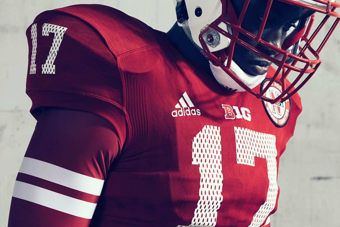
As had been expected, Nebraska unveiled a new mesh-themed throwback yesterday. The design, which will be worn on Oct. 7 against Wisconsin (aka the Red and White Bowl), is a 20th-anniversary salute to the Cornhuskers’ undefeated 1997 team.
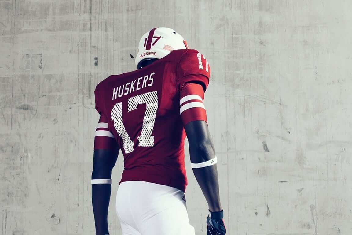
Here’s a rear view (click to enlarge):
I like the idea behind the mesh pattern (it’s simple and clever, right?), but there’s a really basic, obvious element that they got wrong: the TV numbers. While it’s true that the ’97 Huskers used mesh fabric for the front and back of their jerseys, the shoulder yokes and sleeves were made from solid, non-mesh fabric. So it wouldn’t make sense for the throwbacks to have mesh-patterned TV numbers — but that’s what they have anyway (click to enlarge):
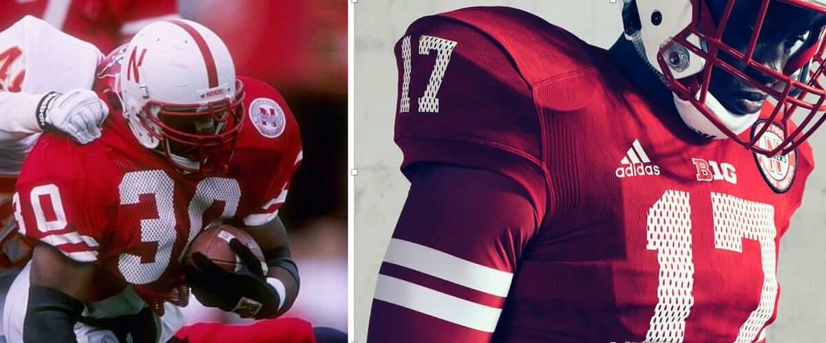
Come on, man — how could you screw that up? Even weirder, one of the photos Adidas released yesterday shows three guys wearing jersey with no TV numbers, so who knows how this is going to play out. The only thing I’m sure of is that it shouldn’t be so hard to get this right.
Naming Wrongs update: In case you missed it earlier this week, we have a new batch of Naming Wrongs designs. Full details here, or just go straight to the Naming Wrongs shop.
The Ticker
By Paul


’Skins Watch: The teams at Centerville High School in Iowa are called the Big Reds, and their baseball team uses a Native American chest logo and headdress-themed batting helmets (from Jay Wright and @tKCyclone).
Baseball News: The Mariners will wear a cap patch for Edgar Martinez’s number retirement on Aug. 12. They’ll also have a matching sleeve patch (from Ben Matukewicz). … Here’s a weird one: As the Yankees celebrated last night’s walk-off win, rookie phenom Aaron Judge had a tooth knocked out by a stray helmet (from Kary Klismet). … Jesse Gavin, covering the Iowa High School State Baseball Tournament, reports that many of the schools are wearing stirrups. Among his other observations: Carroll Kuemper — a Catholic school — has a large cross in the NOB spot; Iowa City Regina wears a comically bold jersey design; Dyersville Beckman wears a “21” sleeve patch, which references one of the team’s slogans, “21 outs,” which is how many outs there are in a seven-inning high school game; and Mason City has an odd stripe on the back of the jersey. It doesn’t wrap around to the front. … The new minor league team in Rosemont, Ill., a Chicago suburb, will be called the Chicago Dogs (from C.D. Tatak).

NFL News: The Ravens’ stadium is getting a new, larger sign (from Andrew Cosentino). … The Lions posted a Bobby Layne highlight clip yesterday. Watch closely and you’ll see a Lions/Steelers game that’s blue vs. black, as well as a Lions/Bears game that’s blue vs. navy (good eye by Bill Schaefer). … According to this interview with the Bills’ equipment manager, the team is switching to white cleats this year (from Josh Elia).
College Football News: Oregon will cut back on uniform options this season and will no longer have a different uni combo for each game. Further evidence that the whole “dress like a clown” thing only works if the team is winning (thanks, Phil). … New shoes for Florida State (from VictoryCB). … New game balls this year for Notre Dame. The old version had the leprechaun (from Warren Junium). … Looks like the NOB font from Indiana’s candystripe jersey is now being used on the regular red jersey. They had previously used this font (from Ryan Cotter). … Michigan has upgraded to a new Nike template. … New midfield logo for Samford (from Robert Hayes).

Hockey News: Here’s a rare mid-1960s shot of the Bruins’ Murray Oliver wearing a yellow helmet (from Kevin Vautour). … Very word-heavy new look for Colorado College (from Greg Enkers). … Adidas is selling off the CCM brand (from @CaneMiami).

Soccer News: FC Viktoria Plzeň now has dugouts that look like giant beer cans. Bonus cringeworthiness points for the term “unique sponsor activation”! (From Brett Baker.)

Grab Bag: Our latest step on the road to Idiocracy: NYC subway stations may soon have corporate-sponsored advertised names. Unacceptable, disgraceful, shameful. I’ll be calling my elected representatives to oppose it. … With the Trump administration reviewing the status of over two dozen national monuments, outdoor apparel manufacturers are pushing back by becoming more activism-minded. … Can tattoos affect your workout? Yes! … Interesting observation in this review of the new movie Detroit, which is opening today: “Nearly every white character with a speaking role wears a uniform of some kind.” … The Indoor Football League, a struggling arena league, is down to five teams (from Brian Kerhin). … Someone out there has mocked up NASCAR cars with Uni Watch and SportsLogos.net paint jobs. … Speaking of NASCAR, one of Dale Earnhardt Jr.’s last paint schemes will include 100,000 fans’ names (from Zach Loesl).
Weekend update: Phil has this weekend off, so I’ll be back here tomorrow and Sunday. And also on Monday. And then I’m off for my annual August break from the site, so let’s make these last few days good ones, yes? Yes!
That’s Bernie Parent playing goal (or not; looks like he was just scored on) for the Bruins in the Murray Oliver picture.
Yup. That’s Bernie.
Typo: “100,00 fans’ names”
Had to check if the indoor football item actually referred to the Arena Football League, which also has five teams, but the item is correct. One of the former teams is the Salt Lake Screaming Eagles, the team that relied on interaction with fans to determine its actions on the field and elsewhere.
Fixed.
At least 2 subway stations in Philadelphia already fell prey to naming (Jefferson Hospital, AT&T). Ugh.
We dodged a bullet in 2009, when Citibank decided not to pay the MTA to put their name on the Willets Point station.
Of course, the station still has link, just one not paid for.
The “Jefferson Station” name doesn’t bother me as much as “AT&T Station” does. Jefferson Hospital is right there at 11th st. “AT&T Station” is the last stop on the Broad Street Line where the stadiums are. I wonder if it would bother me less if the advertiser matched one of the stadiums? Like, “Citizens Bank Station” or even better “Citizens Bank Park Station”
“The only thing I’m sure of is that it shouldn’t be so hard to get this right.”
That’s what gets me. Obviously, they have to study photos – and perhaps even an intact sample – of the original. How could something as painfully obvious as solid TV numbers slip past the designers? It’s not like the design is going direct from the designer to the machine used to make the shirt. I’m guessing it has to go past Art Directors, Creative Directors, client point-of-contact, etc. before it even gets to the physical product stage.
Any chance it’s intentional? I get that it’s a throwback, but perhaps they simply did so to emphasize the mesh of the prior unis. Or, they may have mocked it up with the solid TV number and thought it didn’t look right. Just my speculation, of course.
That’s my thought too – intentional because it looks better?
My guess would be that deliberately textured front and back numbers looked wrong with solid tv numbers, so they decided to replicate the texture on the small numbers as well. Feels like a deliberate choice in any case.
Is it possible they have to pay for these fonts, and instead of paying for both they decided to pay for one and leave it at that? Or possibly have designers come up with these fonts and didn’t want to pay to have two designed?
Overthinking it.
U Houston wore that white helmet in their bowl game last season. Also, they wore the red version a few weeks earlier. I imagine both will be worked in again this season.
Thanks. I’ll remove that from the Ticker.
Would have been cool if Nebraska introduced a jersey for Oct 7 that was more true to their throwback. Would have tipped my hat to them if they wore actual mesh fabric for the torso like back then. It is just for a game, why not?
Second. Also I wish they would have used the throwback patch. Still the best of all NU’s alternates IMO.
So … Why is Iowa’s state baseball tourney in July?
Iowa High School Baseball has been a summer tradition since the 40’s link
To me this is a no brainer… back in 1997 the general public didn’t know or care that the jersey wasn’t mesh on the sleeves… they knew it had to be “holy” when numbers were printed across mesh, it’s the only way. Fast forward to today… no mesh jerseys… so if it’s mesh patterned on front and back, and solid on the sleeves, every single person out there that isn’t uni-obsessed like we are looks at these and says ” why isn’t the pattern on the sleeves too? That looks terrible. ” I know we like to knit – pick here on throwbacks, but in this instance it works… mesh jerseys are a thing of the past, and doing what you’re talking about above would simply confuse those too young to remember mesh, and remember, first and foremost, it’s not about what looks good anymore, it’s about what makes a 17 year old sign with your college, or buy your jersey off the rack.
So do you think they the NOB lettering should also be mesh-patterned? Will every single person out there who isn’t uni-obsessed like we are” look at the NOB lettering and say, “Why isn’t the pattern being used for the names too”?
Maybe, but I think enough of the non uni-obsessed (and don’t take that wrong… I’m a proud card carrying member), are used to nameplates on uniforms, that they may just assume that names were that way on mesh uniforms, which they were in some instances. Look at it from the standpoint of that, when mesh jerseys were used, I understood the why of the sleeve numbers not being mesh, but that didn’t mean I didn’t find it a bit odd looking. Now, it would be VERY strange looking to your average observer who would look and say “not one bit of this jersey is mesh, but they made it look mesh on front and back, but for some reason didn’t do the sleeve numbers too… I don’t get it.”
Maybe I’m just jaded… I do stuff like this at work when doing designs for people. They ask for something vintage or retro looking, I look up a specific era and make something based on it… true to the era. And the people decide “um, it’s not what I pictured… I meant like Old Navy vintage” … your average ordinary person doesn’t see things like we do.
Maybe. But I think you’re being very selective about what you think people will or won’t object to.
Gene, what I hear you saying is that Adidas probably approached this throwback project like so:
“In order to sell as many overpriced nostalgic polyester t-shirts to the consuming public, who don’t tend to be particularly discerning on historic detail, we’ll design them in such a way that evokes nostalgia (faux mesh screen-printed numbers) without dissuading purchases (unsightly mesh as a not-so-fashion-friendly fabric). Because what’s more important is people buying products they think are ‘what the players wear’ rather than the players on the field actually wearing something that accurately reflects the uniform that are supposedly being honored.”
Is that accurate? Because it seems like the best way to recreate the 1997 jerseys would be to render the torsos in mesh. But those probably wouldn’t sell as well at retail.
My thoughts were really just more about the sleeve numbers not being mesh like the originals… I just think most people would notice the sleeve numbers not being mesh, and the torso numbers being mesh, and then being confused by it. Then I made a blanket statement about how jerseys and uniforms are aimed at 17 year Olds rather than making them beautiful like they did in the old days :)
Need “I Miss Texas Stadium” for the Dallas Cowboy fans.
Reading the line about the U of Notre Dame getting a new style footballs made me think. The previous game balls had an image of the leprechaun mascot. Notre Dame are called “The Fighting Irish” and use a leprechaun as a mascot. Why aren’t the people who are offended by Native American imagery bothered by this? Some Irish feel that leprechauns are offensive and represent negative Irish stereotypes. Calling a race of people “Fighting Irish” could reasonably be called offensive by some yet we never hear anyone clamor for Norte Dame to change their name. No Facebook pages. No serious op/ed pieces from left leaning media outlets. No marches by people who aren’t even a part of the Native Ameeican community. No high brow looking down at their noses on those of us who enjoy the logos or names of teams that bear Native American imagery. No city city council telling a team they have to change their name if they want to ever return to the city they’re named after. Nothing. Zero. Zilch. It’s awful quiet out there. All we hear is faux outrage.
Just some food for thought for the Uni-verse. Have a great day folks.
As we’ve discussed approximately 37,219 times, the ND situation is markedly different than the ’Skins situation. Let’s please not go down that road today. Thanks.
I’m kinda with the couple of other posters who don’t seem to mind the tv numbers. It looks like they’re going more fauxback than throwback to me, capturing the essence of a previous look, not trying to exactly mimic it. (Stripes move from actual sleeve to compression shirt sleeve, mesh effect becomes part of overall motif.) As such, it’s a more internally-consistent design that evokes an era, rather than slavishly trying to match a specific uniform using a modern template & materials that will always be close-but-no-cigar. Then again, I’m not the biggest college ball fan, so perhaps I’m too much of an outsider on this one.
My favorite part about link for the new Chicago Dogs minor league baseball team? The rather pleasant surprise that it’s NOT a Brandiose-style snarling anthropomorphic hot dog.
Yeah, that’s a refreshing change of pace.
I love the logo, although it’s a touch ironic that the “Chicago Dogs” logo doesn’t actually show a link.
The logo would have to have 47 different colors to depict a Chicago style dog. At least they got the awful yellow mustard correct. ;)
Even a couple tomatoes would have been an improvement. And within their color scheme.
“Minor” nitpick: the Chicago Dogs are an independent league team, not minor league.
Also, their logo is FANTASTIC. I see Dogs merch in my future.
Hmmmm… I see that they’re part of the American Association of Independent Professional Baseball, which I concede is not part of Minor League Baseball (note the capitalization). But is it really wrong to refer to (this particular iteration of) the American Association as a minor league (without capitalization)?
Exactly. The idea that MiLB owns the term/concept “minor league” (lowercase) is absurd. By any reasonable vernacular standard, independent professional teams are minor league teams.
Yeah, I think it is wrong.
Mere capitalization isn’t enough to avoid any confusion between teams inside organized baseball and those who are independent.
What exactly is the confusion, Chance?
What status in your mind is conferred by MiLB affiliation?
Do you honestly believe that teams like, say, the St. Paul Saints and Long Island Ducks are not minor league teams simply because they’re not MiLB teams? What sort of “confusion” is caused by referring to them as such?
This seems like some sort of weird authentic vs. replica parallel….
“Minor League Baseball” is an actual organization. Players are signed to development contracts and play on teams affiliated with Major League clubs.
Teams like the Ducks operate under an entirely different model. Not better or worse, necessarily, but different. And there’s already a perfectly good word to describe their model – “independent”.
“Minor League Baseball” is an actual organization.
That’s a relatively recent development, isn’t it?
As far as I’m concerned, a professional league that isn’t the big leagues is, by definition, a minor league. Trying to “own” that term feels like just another annoying exercise in corporate branding, frankly.
A history of the term, in both its lowercase and capitalized forms, would be interesting. Chance, wanna tackle that?
There was minor league baseball long before there was Minor League Baseball.
wanna tackle that?
Very tempting…. Don’t know if I can make this August recess, but perhaps the next one.
Paul basically made the same point I was trying to make, he with more substance, me with (perhaps) more pith. He must have hit the “Submit Comment” button mere seconds before I did.
Capitalization is irrelevant. If I start my own league and call it major league baseball (lowercase), I’ll get sued into oblivion by MLB.
But in my mind it’s not about ownership or trademarks, it’s about accuracy. Independent league is a more accurate term, so that’s what I use.
Your mileage may vary. I’m someone who gets annoyed when someone refers to the Tampa Bay Rays as “Tampa”. ;)
Chance is correct
But in my mind it’s not about ownership or trademarks, it’s about accuracy. Independent league is a more accurate term, so that’s what I use.
That you. That’s kind of what I was going for, even if I stumbled around inelegantly.
I understand it’s a distinction most people don’t make. But then most people don’t distinguish “advertiser” from “sponsor”, either.
I understand it’s a distinction most people don’t make. But then most people don’t distinguish “advertiser” from “sponsor”, either.
Yeah, except one of those is (to my mind) a distinction without a substantive difference, while the other is (again, to my mind) a symptom of a growing problem in our culture.
Capitalization is irrelevant. If I start my own league and call it major league baseball (lowercase), I’ll get sued into oblivion by MLB.
Capitalization is not irrelevant. It’s the difference between a proper noun – a name for a specific person or thing – and a common descriptive. Yes, there are occasional stylistic exceptions – see e e cummings and k.d. lang, for example, but the rule-breaking in those instances is done for effect.
Which leads to your hypothetical of “major league baseball.” If you call your new league by the proper name “major league baseball” (a la “k.d. lang”), yes, you’d get sued and lose, because you were simply styling your proper noun in an unconventional format. But if you call your new league the “Super Baseball League,” operate it as a top-level competitor to MLB, and people, in describing it, refer to it as a “major league,” MLB really wouldn’t have a trademark basis to sue you.
For what it’s worth, Wikipedia discusses independent baseball leagues in its articles on minor league sports and minor league baseball. Why? Because “minor league” is an accurate description of these leagues, a descriptive that existed long before professional baseball’s established power structure turned the term “Minor League Baseball” into a proper noun.
For what it’s worth, Wikipedia discusses independent baseball leagues in its articles on minor league sports and minor league baseball.
Yes, but largely to illustrate the difference between independent and minor leagues, and a quick overview of historical leagues which operated outside the system.
How about we call them “independent minor leagues”? Because while they may be independent, they’re still definitely minor.
CC hockey. Letter heavy.
Random question came to me just now. Did any MLB team before the 1978 Brewers wear a cap logo mainly the same color as the cap fabric? (See also 2005-present Angels.)
Brain fart: 2002-present Angels, with their red A on a red cap.
I can’t think of one.
As a kid, I wondered if that was why the Brewers’ batting helmets link.
Also just remembered – for a while in the 1980s the Brewers used link. Presumably to make their blue logo more visible against the blue cap. You can see this thick outline was sometimes rendered as link.
The Brewers had a similar color issue with link, where the gold outline would blend into the gold panel. I always appreciated that they didn’t feel the need to add an extraneous blue or white outline on the road caps.
I’ve suspected, without any basis in factual knowledge, that the white-panel Brewers helmets were just trendy, as were the similar Twins helmets.
Thanks for the info and pix of the extra-thickened outline caps. Does the ball-in-glove even need the yellow outlines? Seems to me it might actually be stronger with the M and B contrasting with the cap color and the ball rendered in white, again with no outlines. Gold M and B on blue, or blue M and B on gold, each with a pair of white semicircles inside the B.
Quick-n-dirty proof of concept:
link
I think it works without the outline.
I didn’t think that the AFL and the IFL would be down to the same number of clubs, but that’s what we have. I’m not sure how long either league can sustain that.
Would make sense for the 2 leagues to figure out a way to merge. Feels like arena football is on life support.
Way too much greediness. See: USL, NASL
Any chance of a Nassau Coliseum shirt for the Isles?