Photo by Chris Creamer
Good morning! I’ll still be asleep when some of you see this entry, and then I’ll be on an airplane for a big chunk of the day, but let’s not let that get in the way of a good entry, shall we?
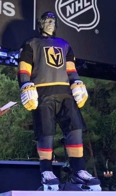
So: The most surprising moment of last night’s NHL/Adidas unveiling event in Las Vegas was when the Golden Knights’ home uniform was revealed and you could sort of feel everyone mentally processing the fact that the team will be wearing white gloves. Bizarre, right?
I was never in love with that Golden Knights logo, and I still don’t much care for it. I do like the uniform’s color scheme, however (grey, black, gold, and red work really well together). But ugh — those gloves. That’s not gonna work.
I interviewed several Adidas and NHL execs, all of which was interesting. I hope to be able to tell you more about that later on, but one takeaway was that NHL branding czar Brian Jennings told me flat-out that uniform advertising is not on the table for the NHL. That doesn’t mean it’ll never happen, but he seemed pretty serious about it as we discussed it. (Yes, I’m aware that Deadspin more or less declared NHL jersey ads to be a done deal yesterday afternoon. But if you read the piece, you’ll find that the writer’s entire evidence for this is that “it seems inevitable.” He also asserts that NHL jersey leaks were pre-orchestrated inside jobs, again with no evidence. Draw your own conclusions.)
One major frustration is that the league and Adidas did not provide a summary of all the design changes by the various teams. When I asked about this, they said, “We need to let the teams tell their own stories.” It’s nice that they’re deferring to the teams, but come on — you can’t unveil 31 new uniforms without giving us some kind of road map. It’s just too much information for reporters and fans to process on the fly. I did my best to summarize some of the more significant changes, and also gave an overview of the new Adidas template, in this ESPN news piece, which I wrote right there at the event. It was published as I took a cab back to my hotel.
If you want more detailed team-by-team information, I recommend the following:
• Most of the information and photos floating around out there are only about the jerseys, not about the full uniforms. But I took full-body photos of all of the uniformed mannequins at the event. You can see those by scrolling through my Twitter feed.
• SportsLogos.net’s Chris Creamer managed to get access to the designs in advance and therefore had time to put together an excellent overview of the team-by-team changes. He also has some good photos on his Twitter feed.
• There’s also lots of good info and imagery (mostly retweets, but still) on the Icethetics Twitter feed.
So what did I think? Here are some very quick reactions:
1. The new hemline format is a big improvement.
2. I hate the new collars with that pentagon of fabric to showcase the NHL logo. When the pentagon is contrast-colored, as it is on many of the jerseys, it’s as bad as the old Ree-box. (This is sort of like the NFL’s changeover from Reebok to Nike in 2012, when the most visible aspect of the new outfitter was the annoying new collar format.)
3. Not a fan of the dimpled fabric on the shoulders. Here’s hoping it isn’t visible on TV.
4. I love the Wild’s new home uni, hate the Devils’ new sleeve stripes (waaaaay too wide — it’s like one of those Stadium Series designs where they make everything oversized so the guy sitting in the upper deck can see it), and am agnostic about the Bruins new black socks (which don’t look bad in a vacuum but seem kinda silly because now the Bruins look too much like the Penguins).
5. Last week I mentioned that the Red Wings appeared to be moving away from direct-sewn lettering for their NOBs and were using a nameplate instead. But the mannequin at last night’s event had direct-sewn letters — no nameplate! I asked an Adidas exec about this and he confirmed that teaser photo was wrong and that the team would not be using a ’plate. A nice surprise.
There’s more, but I have to pack and get ready for my flight home. See you tomorrow!
Click to enlarge
Two new NBA uni advertisers: The Magic announced yesterday that their uniform advertiser for next season will be Disney. Given that the team’s name was inspired by Disney’s nearby Magic Kingdom, and that there’s actually a cruise ship called the Disney Magic, this one makes a certain amount of sense, even though it’s still disappointing and unacceptable.
Meanwhile, the Timberwolves have announced that their uni advertiser will be Fitbit. The patch design won’t be revealed until the unveiling of the T-Wolves’ new uniform set later this summer (no specific date yet on that), but you can see various iterations of the Fitbit logo here, so the patch will presumably look something like one of those designs. The patch will also appear on the uniforms of the Timberwolves’ D-League G-League affiliate, the Iowa Wolves.
I had expected most of the NBA advertisers to be lifestyle brands like Disney, but the Fitbit deal continues the trend of teams partnering with advertisers who specialize in data and analytics. Other teams going that route have included the Nets (whose jersey advertiser will be Infor), Celtics (GE), and Jazz (Qualtrics).
The press release, straining for a local tie-in, notes that “Minnesota is home to many like-minded companies, clients and partners of Fitbit, including UnitedHealth Group, providing additional opportunities for collaboration in the future.” That’s nice, but Fitbit itself is headquartered in San Francisco, so there’s no local connection here for the Timberwolves.
Brand-new opportunity: Yesterday I received a very nice note from a representative of the Brooklyn Cyclones, as follows:
Good morning, Paul. My name is [redacted] and I work for the Brooklyn Cyclones. Our home season is starting tonight, 6/20/17 and wanted to reach out to you to see if you would be interested in bringing the Uni Watch brand out here to MCU Park to co-brand with the Cyclones via ballpark signage and website inclusion. I have just a few signs left for the taking and can cut you an unbelievable discount to get this done. Please call me today at [redacted] to discuss. I can turn-key this for you and make it happen on a very quick turnaround.
Being a huge fan of your site, and bringing the brand out here to MCU Park in Coney Island would be a fantastic way to get our fan base acclimated to Uni Watch and your “U-Watchers”. Thank you, in advance, for your time and consideration.
Now, I’m not gonna lie and pretend that it wouldn’t be fun to have some sort of Uni Watch sign out at the ballpark. And the guy sounds polite and sincere. But man, that’s a whole lot of “brand”-speak, eh?
A few hours later, at the NHL unveiling, I bumped into a writer whose work I’ve long admired. We’d emailed many times over the years but had never met in person, so it was a treat to shake his hand and get better acquainted. Things were going really well, and then he said, “So has ESPN been good for your brand?”
I realize there’s an increasing tendency for all of us to be in our own little bubbles. And my bubble is probably worse, because I work by myself at home (well, except when I travel to the desert for a hockey event). But still, all this chatter about branding, always with a straight face — is that really how people talk these days?
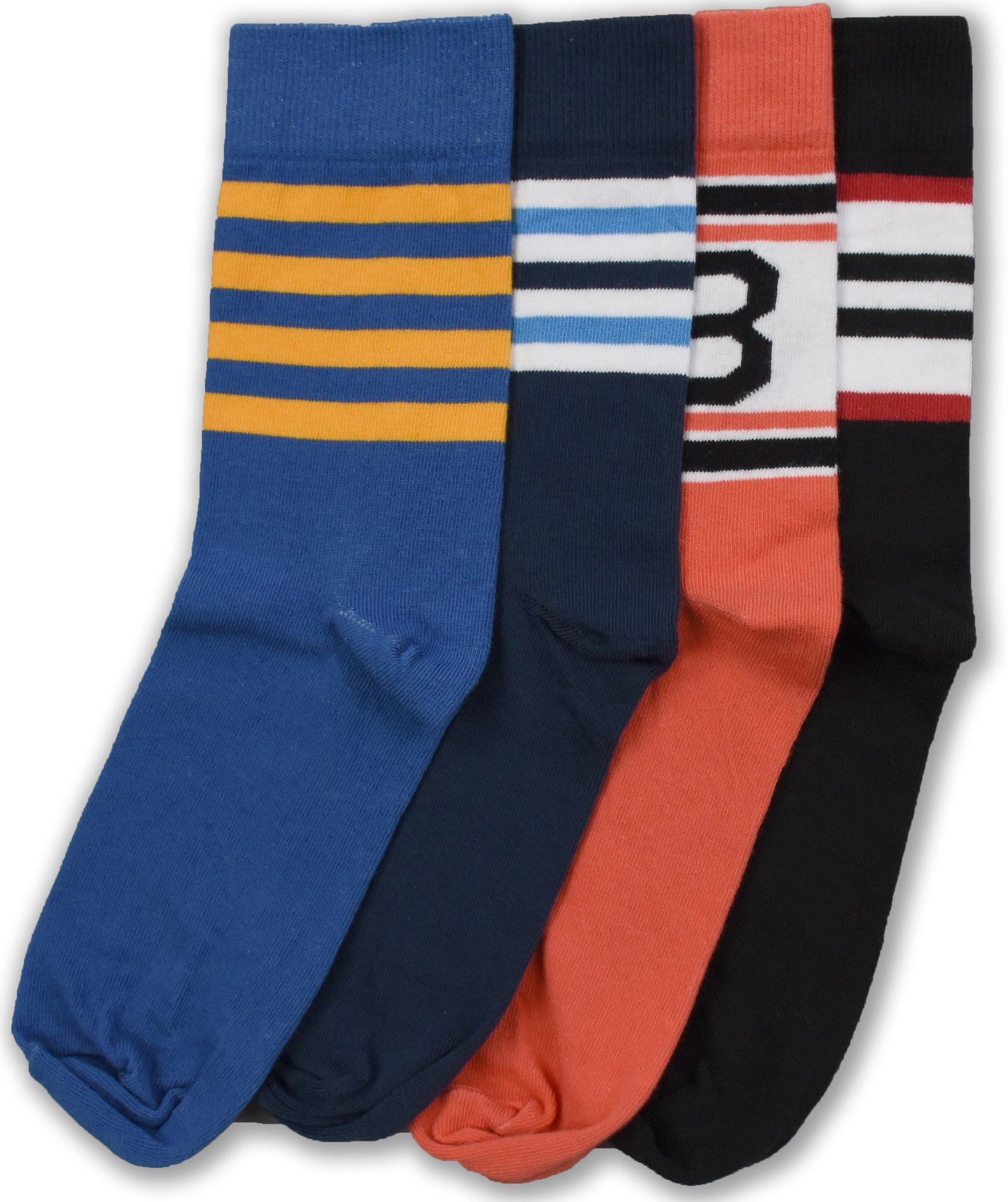
StripeRite update: I’m extremely happy to announce that the latest batch of StripeRite socks (shown at right; click to enlarge) is now available from American Trench. I really like these designs, and I hope you will too. Supplies are limited — seriously, they are, that’s not just a sales pitch — so move fast if you want to get in on these.
And remember, most of the designs from the first and second StripeRite batches are still available as well.
The Ticker
By Alex Hider

Baseball News: Rangers announcers made note of P Nick Martinez’s stirrups last night. … Speaking of the Rangers, OF Carlos Gomez was wearing Superman cleats (from Todd Oliver). … ESPN’s Tim Kurkjan wrote a piece hypothesizing what baseball will look like in 20 years, and he included this passage: “… long before 2037, all that space on a player’s uniform will be used for free marketing and advertising purposes, Ã la NASCAR.” (From Kary Klismet). … Tigers fans: Jason Werth needs your help in tracking down one of these Michigan/Old English D shirts. … This artist has a number of famous fans ”” namely, the Toronto Blue Jays (from Ted Arnold). … Cool photo of the Reds’ Johnny Temple testing out an early batting helmet in 1959 (from Sports Paper). … Speaking of batting helmets, Ben Matukewicz” found this old photo of a Red Sox player wearing a batting helmet with the team’s “hanging sox” logo. … We may have shared this before, but there is a statue of the Padres’ Swingin’ Friar made out of Lego at Legoland in California (from Sean L.). … The Hartford Yard Goats wore green caps last night, but at least one player was wearing a blue cap in the dugout (from Ricky Schumaker). … Looks like the Staten Island Yankees have some number font inconsistencies (from Jeremy Posner). … A player for the Mahoning Valley Scrappers was missing his Chief Wahoo patch on his sleeve last night. This is what the jerseys is supposed to look like (from Collin Kelly). … Some TCU players are wearing an “M” patch on their caps during the College World Series. Anyone know what it means? (From Jonathan Hall). … Louisville wore tequila sunrise jerseys last night, but the red numbers on red stripes really ruined what could have been good jersey (from Dave Cohen). … No photo, but the Brewers will wear their gold “Cerveceros” jerseys on July 1 (from Kurt Krowley).

NFL/CFL News: The Ravens have worn “Arm & Hammer” merit patches on their practice jerseys for years to signify that they’ve attended 85 percent of OTAs in the offseason. But according to Bryan Duklewski, they’ve added more patches this season: Stars apparently signify how many seasons they’ve been awarded “Arm & Hammer,” AFC logos to signify AFC North Championships and a Lombardi Trophy to signify a Super Bowl. But does anyone know what the final row of patches mean? … Actor Ashton Kutcher wears an Ottawa Redblacks shirt on his Netflix show, The Ranch (from Ted Arnold).

Hockey News: Here’s a good Q&A with the Canadiens’ equipment manager. He discusses assigning numbers and the weirdest piece of equipment he’s ever seen (from Moe Khan). … Marian Hossa of the Blackhawks may have to retire due to a “serious allergy” to his equipment (from Mike Chamernik).

NBA News: The Bucks’ new D-League G-League team, the Wisconsin Herd, will be officially unveiling their logo tomorrow, but it has apparently leaked.

College/High School Hoops News: KJ Smith, son of former North Carolina standout Kenny Smith, is transferring to his dad’s alma mater, and donned his old jersey to mark the occasion (from James Gilbert). … New floor for Fargo South High School in North Dakota (from Greg Enkers).

Soccer News: The NBA may be adding ad patches next season, but we in America are still light years ahead of the state of unis in South America. Thom Gibbs shared a photo of a jersey for Bolivian team The Strongest that his sister brought back for him from South America ”” 14 different ads!
I took a career class sponsored by a local jobs ministry and creating “a personal branding statement” was one of the five major components.
For the past 13 years I’ve been a member of a professional organization for healthcare finance. It’s astounding how often, especially for such a stodgy industry, speakers at conferences blather on about an individual’s brand. Fie on that!
All this talk about branding has me singing the Weird Al Yankovic song “Mission Statement” out loud this morning.
Proofreading:
“We need to let the team tell their own stories.” teams
“Jason Werth” If we’re talking about the ballplayer, it’s Jayson.
Happy solstice, fellow “U-Watchers”!
I don’t think that’s the case. I’d be surprised if Jayson Werth the ballplayer was watching an episode of Counting Cars, saw that Detroit/Michigan shirt and said “I just gotta have that…I’ll contact UniWatch and see if anyone can find on for me!”
My apologies to Jason. (I’m guessing this isn’t the first time someone’s made that mistake.) At least I included the “if”.
It’s actually a rarity that anyone makes the connection. Only in sports related contexts. When it does happen, I kinda like it.
Jason, I don’t really know what I’m looking at, but I think this is a digital download of the design you want for purchase on Etsy. link
I see that Old English/Michigan logo here…link
Those lack the vertical interior stroke, but perhaps they are close enough…
Thanks!
With your help, Josh, I found it, here:
href=’http://ludingtontshirtfactory.com/products?keywords=michigan+d’
Fixed.
Oh, no!
I am a regular guy looking for a unique t-shirt, not an all-star outfielder with a ‘y’ in his first name!
Changed back. (Just woke up here — still getting my bearings.)
link
That is Carlos Gomez, not Martinez, in the Superman cleats.
Fixed.
I certainly would call UniWatch a brand.
I would too. That said I think the context here is much more marketing speak than the strict definition of brand.
I like the Vegas uni, but I didn’t notice the gloves until now. Maybe they’ll come to their senses before hitting the ice.
You are going to take the Cyclones up on that, right?
The white gloves appear to be as much as a design faux pas as the expansion Washington Capitals short-lived WHITE breezer pants!!!! Let’s hope the gloves are as short-lived…
-Jet
Supposedly, they will wear gold gloves; but CCM wasn’t able to get a pair ready for display last night.
Notre Dame’s men’s lacrosse team wears metallic gold-colored gloves, so I suppose it is possible to make hockey gloves such a color.
Deadspin is the sports media equivalent of fake news. I generally dismiss whatever they “report”.
I frequent deadspin (don’t tell my parents) and to this regular reader, that piece was obviously one of their bits of pessimistic speculation, not some attempt at breaking news regarding NHL uni ads. A few years ago, the same writer called NBA uni ads as imminent when the league moved its logo to the back of the jerseys, and got the same treatment around these parts.
David, as I’ve already explained in another comment thread, the two situations — NBA and NHL — aren’t even vaguely similar.
NHL jerseys have always been my biggest interest in the uni-verse, so please bear with my extended ramblings regarding the changes unveiled last night. I’m pretty excited :-P
Sabres’ jerseys are basically perfect now. I always loved the navy and the gray highlights – just didn’t understand the silly “pit stains” and piping. Now it’s 10/10.
Interesting that the Flames kept the funky side stripes on the road jersey but not on the home. I’ll miss them on the home jersey, but I won’t miss the silly curved piping. So overall I’d say this is an upgrade.
Hurricanes’ change is awesome. Good to see both the black and the storm-flag pattern back. Now is someone gonna complain that a true hurricane flag only has two squares instead of however many it takes to wrap around the jersey? :-P
Fun fact: This is the first time the Avs have ever had gray stripes on their dark primary jersey. Their old design was awful, so pretty much anything was bound to be an upgrade, but this still doesn’t look right to me. It needs some black or something. Just feels bland.
Love the Oilers’ new look. It’s a new identity for a franchise that finally is worth having an identity after so many years of futility. I also like that they changed the stripes to match what’s been on their white and blue jerseys for so long.
This might be the best jersey Minnesota has ever worn. I absolutely love it. I’m really glad to see they went with an actual logo on the front instead of their old 3rd-jersey wordmark, and I’m also happy to see they put some red striping on the jersey. The old 3rd looked kind of dull without it.
As much as I dislike piping in general, I feel like it had become part of the Preds’ identity. This is the first of the new changes that I think is a downgrade. They kind of just look like a banana now.
The Devils’ design isn’t the greatest, but I’m going to call it an upgrade just because they did SOMETHING. No team should wear the exact same uniforms for 25 straight seasons. Gotta keep things fresh!
Can’t really say I have an opinion about the Islanders adding another trim color to their logo.
The Sharks missed an opportunity to fix their stupid striping pattern with the one random orange stripe. I was hoping they’d add more orange, though I knew it was a longshot. I’m not a fan of either of the shoulder logos either. The new angry shark is too cartoony, and the “SJ” logo just looks unbalanced and weird.
As for Vegas… I love that they went with a totally new color scheme that’s never been seen before in the NHL. I’m not sure if I like it yet, but I will at least give them props for going bold. And regardless of the colors themselves, I like the overall design of the jersey. It looks modern and fresh without being weird for weird’s sake.
I still think the Sabres should switch the stripe colors on the white jersey – make the thicker stripes navy and the outer stripes gold.
Also, don’t know what you’re talking about with the Flames. The side stripes are still very much present on both jerseys.
Looks to me like the home jersey just has the simple black panel, whereas the road jersey has all the extra vertical striping as well.
link
link
link
Well, that’s weird. I wonder why it’s not visible in the official pic. Must be folded more than it looks.
The Devils “fresh” new jersey is a horrific downgrade. What were they thinking???
I’m surprised there’s so much love for the Devils’ old uniforms. They were the first NHL team to go BFBS in the early ’90s, and if Uni Watch had been around then, I’m sure it would have been almost universally hated. But I guess time heals all wounds.
I’d toss it up to the fact that red and black is such a sensical color scheme for s team named the Devils.
Isles white jersey corrects a lazy oversight by Adidas. It looks much better now.
My son, who is not what I would call a uni watcher, felt that at first glance, the Vegas uniforms looked like it would be the German National team. I am not thrilled by it but you never really know what any of these uniforms will look like until they are on the ice.
I like a lot about the new Wild home jersey, but the chest stripe is all kinds of terrible. Yay to the switch to green at home, and yay to the return of the beautiful primary logo on the chest. But the stripe would work better as a yoke or as a wide bottom hem – and if it has to be a center-of-the-jersey stripe, it should at least be a hoop that continues on the back. I know that the team has retconned some obscure historical precedent for the stripe, but that’s ex post facto marketing storytelling BS. If pro hockey in Minnesota has any established visual language, it would consist of the color green, shoulder yokes, and/or bold stripes near the waist and sleeve hems.
The thing that annoys me about the Wild jersey is that the back number is two colors, but the sleeves are just one.
Which one would look better for both though, I’m not sure.
My only complaint about the Wild’s jersey is that they didn’t wrap the chest stripe around the back. If you’re not going to do that, why bother with the chest stripe at all? Basically, it’s the same issue I had with the Panthers’ redesign from last year.
If you want to have a green jersey, you almost have to have a center stripe because the logo is primarily green. There’s really no way to make a reversed-color version of that logo (like, say, Vancouver) without it looking really stupid. So your options are basically either a red jersey or a green jersey with a paler belt across the middle.
The Wild have often* worn the primary logo, in its standard colors, on green with no center stripe. The low contrast makes for a subtle look, yes, but it works.
*Half of the seasons the team has existed.
Wait…. the chest stripe doesn’t extend around to the back?!?!
Here I was all ready to praise the new jersey to the skies and now I have to kick it down a few rating points.
Well, it looks good from the front, at least…
-Jet
For whatever reason, I’m OK with the half-hoop on the Panthers jersey but not on the Wild. I feel like the front stripe complements the Panthers logo in a way that makes it look like a natural extension of the crest, whereas the Wild stripe just looks like a stripe. I hate to say it, but I think the circle logo of the old home jersey would work better with the center stripe than the primary logo.
I think it’s instructive to compare the link with their link. I’m prepared to call the subtler red sleeve stripe an upgrade, but to my eye the primary logo actually pops more vividly on green than on the ivory stripe. I’d rather see the shoulder yoke of the Stadium Series jersey retained, or perhaps the sleeve striping carried over to the bottom hem.
The Wild, apart from a spiffy bear-head logo, strike me as the most lazily-styled hockey team in recent history, including the Dallas Stars. Every uniform is an utter rejection of the style that came before. I like the home uniform to have a family resemblance to the road uniform; is that too much to ask? I’ll mention it one more time: An old North Stars’ uniform, with the “N” reworked to make it a “W”, would automatically be the best uniform this team ever had!
Great call Walter, I like that idea! (W-styled after N-stars)
-Jet
Thanks, Jet. It came to me in a rare flash of clarity, one day. Contemplate the first stroke pointing at the star, rather than the last one; it always bugged me that Minnesota’s emblem literally depicted a *northeast* star, but anyway, that’s italics for you.
My Blue Jackets did some made some subtle but worthwhile improvements. The piping not going all the way up onto the shoulders, the lack of white on the collar, and of course, the new font. I prefer the cannon logo to the star and flag, but I didn’t have expectations of that. Solid, if unremarkable, upgrade.
Vegas — its different in a good way. Proper metallic gold, the subtle design in the sleeve stripe, its all very nice. Some folks on Twitter are up in arms about the red, but I think it takes a C- uniform to a solid B. Without it, its very drab and dull. This is also a case where I prefer the secondary logo to the primary, though. That would make an awesome crest.
*did make some
Not sure what I done did there.
Agreed on the red, the gold, and the primary and secondary crests. I think I really like the white road uniform; I’d call it a B-plus or even A-minus. The home uniform I don’t like at all. Since the only meaningful difference between the home and road is the extensive use of gray, it must be the gray that turns me off. It’s just so dark; a lighter gray or a gray with more visible slate-blue leanings would work much better in my eye. And aside from the darkness, the home uniform is just too similar to the Kings home jersey in themes and application. Which was always going to be a problem, so why beg for the comparison with such a dark home uni? The bright metallic gold looks like it pops nicely against white, especially with those red stripes.
The new collar treatment is pretty disappointing. I am glad that the Red Wings, though, went with solid-color collars all the way, and I wish a few other teams (Pittsburgh) had gone that route. The funky collar mutilations detract from a number of teams that otherwise made minor improvements or straight-up lateral moves.
Overall, I’m pretty happy, though. Compared to the Edge uniforms, were fully half the league downgraded their uniforms (in my eyes, anyway) in favor of funky and ugly-ass templates, the Adizero unveiling gave us, in my opinion, only two straight-up downgrades from last year – New Jersey and Edmonton. And the Oilers’ new unis are only mildly disappointing (compared to the total fuck-up they did when they went to the Edge unis in 2007). The Devils, though, just butchered their look.
The big winners as far as changes go are Colorado and Carolina. I am greatly pleased that the Avs brought back the mountain-ridge stripes, and simplifying them to the gray color actually works nicely. Carolina makes a huge upgrade by bringing black trim back to the red uniform, and the subtle warning-flag waist striping is a nice callback.
The most disappointing unis for me are Calgary and Ottawa. The Flames did improve their unis slightly by getting rid of the extraneous piping, but that’s just polishing a turd. The uniform is still ugly as hell and the flag patches and black C still need to go. Ottawa flat-out shocked me by porting over that terrible-looking Edge template that Pittsburgh and Tampa Bay also used to have.
Speaking of collars, no issue with me except the lace-up collar.
The lace-up collar is not handled properly on the AdiZero jersey. The lace was meant to fasten the neck of the jersey. Still did have that appearance of fastening the neck on the Edge jersey, even though it is superficial for jerseys today. On the AdiZero jersey, the laces are attached below the neckline. They just seem to be hanging there with no purpose and looks silly in my eyes.
Yep, the vestigial laces are pretty dumb.
Never cared much for the laces to begin with. I always felt the Rangers made a big mistake bringing them back in 1997. That, and regressing to the c.1949-1976 look in general. I prefer the more spaced-out stripes of the 1978-1997 unis.
Not to mention, in some of the closeups I saw, the “laces” were actually tacked to the jersey! You can’t do anything with them except cut off the loose ends.
I would like to see these on an actual person; sitting on a mannequin, in full or in part, the neck on these jerseys look much too tight.
On the Good/ Bad/ Stupid scale, the Devils new sweater ranks a “Stupid,” especially the “justification” for the change to the waist striping.
Further, I simply don’t “get” the nod to team history in the new design. The Devils have made their history as a franchise in the previous (some would say “iconic”) design. It’s almost like the Yankees doing a redesign to honor their years as the Highlanders and Orioles.
The Devils ruined their uniform, wtf were they thinking? Why take the waste stripes off, the sweater looks like an actual sweater.
Also the Bruins look like they are wearing stripe leotards, bring back the yellow socks.
The switch from yellow to black socks by the Bruins on their primary dark uniform is just plain wrong. A spit in the face to their tradition. Here is hoping this will not last long once they realize the mistake they made.
I didn’t see link last night, so I didn’t find out about the details until just now.
The most bizarre part is claiming that the single stripe at the bottom is a tribute to the Newark Bulldogs (a team from the pre-AHL days), but then use a jersey with FIVE waistline stripes to illustrate their point.
In any case, this is the kind of thing you’d expect to see for a Stadium Series jersey, which would be fine. As a full-time uniform, though? It’s still really damn disappointing.
Vulgaria has an NHL franchise?
“Louisville wore tequila sunrise jerseys last night, but the red numbers on red stripes really ruined what could have been good jersey (from Dave Cohen)”
No, the number split between the white top and the stripes ruins the look first. The red number is just piling on to the mess. If you can’t accurately replicate the rainbow guts look, DON’T PRODUCE IT!!
It’s not hard to look at historical photos and properly produce the jersey so that the number rests comfortably and exclusively in the stripes.
How hard was it to find these two photos? As hard as an ordinary Google search.
link
link
Loo-a-ville is just the repository of stoopid baseball uniforms (as in, wearing all black in 100-degree heat, and an old English L running down one leg), so it makes sense that they would botch the numbers. And black is one of their primary colors! Black letters with white outline would improve those 100%.
(P.S. I was really hoping to see the first year of the Astros’ tequila sunrise jerseys, with the big white circle and the funny numbers.)
Two subtle changes to Philadelphia Flyers jersey (Adidas mods):
1) the arm stripe is has a sharp angle toward the wrist rather than a smooth curve
link
VS:
link
2) the orange “puck” in the middle of the crest is smaller (akin to the 1967-1979 crest)
link
VS:
link
link
Small differences, but the “vintage” crest looks better IMHO.
I wonder if they Sabres didn’t make the switch to Royal blue because they’re in the Winter Classic as the designated home team; giving them a reason to roll out the Royal blue for that game.
Golden Knights = gray
Blackhawks = red
Blue Jackets = navy blue
Red Wings = red
Well, I guess 2 out of 4 isn’t bad?
Crest on Flyers jersey looks different. Orange center dot is smaller.
I’m so disappointed with Adidas. I’ve never liked their style or products to begin with, but now they’ve ruined the NHL… it’s personal.
Some of the jerseys look decent, mostly the Original Six teams that don’t have much variation anyway. Sadly, though, they’ve ruined Nashville, which now looks like a cheap high school team. Minnesota and Edmonton have also been trashed for similar reasons.
Finally, my poor Lightning. For quite some time, many of us here in the Tampa area have been hoping for a bit of color to return to our uniforms. Blue is fine, but accent it with the black and silver of our past. Remember the blue “BOLTS” third jersey of a few years ago? Something like that, without the lame word mark.
But no… we’re still the same #TorontoBayMapleWings now made worse by deleting our laces. Such a shocking lack of creativity on Adidas part. Why the hell should I waste 200 bucks on this??
I have a similar point of view with you DRS. Hoping this was the opportunity to make a small fix to improve my team’s jersey but they stayed with the status quo.
This was the perfect opportunity for the Canucks. It took some time for management to figure out the core of the team was stale before starting rebuild mode. The look of the jersey is stale and updates would have coincided with a fresh start.
The uniform is attractive, but small parts of it drive me crazy (especially Vancouver script above crest and no green in the logo). Like when you dress nice for photo day but you have a big zit on your face. Owners made the right decision to bring back blue and green, but have been stubborn to change any of the uniform since despite the preference of many local fans.
I will take a moment to mourn the death of their 3rd uniform today (with stick-in-rink as primary crest and Johnny Canuck-V as shoulder patch). This should have been the opportunity to switch to that uniform as the primary, with small updates to it tolerated (like the addition of 3-coloured gloves similar to what they wore in the 1970s).
I concur on the Canucks unis. Never was a fan of the “VANCOUVER” on the front of the jersey over the logo. Wordmark OR logo, PICK ONLY ONE, PLEASE.
It just seems like there were a lot of missed opportunities here. Some teams are iconic enough that they didn’t need to make changes, so moving laterally made sense, but then there are the teams that really needed an update that opted not to do so.
If they ever wanted to use previous colours (or change the red/yellow on the crest to blue/green) how about this 1960s Canucks crest that was up on Ebay earlier this year (was out of my price range but saved an image of it).
link
I respectfully disagree on the Canucks’ 3rd. The stick-in-rink is a tremendously boring logo, and the “modernized” version of it looked even sillier than the original. Plus, Johnny Canuck is a fine idea in theory, but the poor guy looked like he had a broken neck. Why was his head angled so far back like that? On top of all that, the jersey as a whole was almost identical in design to their regular home jersey, so it seemed kind of pointless.
I agree that link lacks something. But that’s a very easy fix; rotate him fifteen degrees clockwise, and his upward stare becomes link. Perfect.
Canucks did do a minor change. The striping width on the socks now matches the sleeve stripes and hem stripes on the jersey. Before, the white striping on the socks was wider than on the jerseys.
Though I loved that 3rd, maybe an improved version will come back in 2018-19. I do not mind the orca logo either. Would have liked it fixed much better with a bigger orca logo and no “Vancouver” script. Put green in the orca where the red used to be when it was used in the prior colour scheme. Easy as that. Improved and we would have all been happy here in the Lower Mainland.
Frankly, I’m glad to see the laces go away for the Lightning. The laces, to me, are useless and pointless on a modern jersey, and just plain ugly. However, I do agree that the Lightning are just too plain. They’re not a timeless team with decades of tradition that can get away with a plainer design. Moreover, their greatest success actually came with their original design – a look they should never have strayed from, in my opinion. Update the logo, sure, but the overall look was just fine.
Also… BRING BACK TAMPA’S VICTORY STRIPES UNDER THE ARMS!!
Those white gloves will not look good in March on the ice. Long season, puck marks, sweat, wear and tear…maybe they’ll last about as long as white Capitals breezers.
But what’s up with the yellows? It’s supposed to be metallic on the jersey, but that one yellow stripe at the hem looks like Steeler gold and the yellow on the gloves appears to match that.
I need some time to do a full breakdown of these new jerseys, but my gut reaction is wow, those collars are a tragedy. Across the board.
Don’t know if it’s the way they’re setting on the mannequins or what, but yes, they look too constricting around the neck. “Sure, they can’t breathe because of the neckline, but hey, they’re 20% lighter!”
that Wisconsin Herd logo is just the lovechild of the current Milwaukee Bucks and old Columbus Crew.
The M on TCU’s hats refer to Micah Ahern, who was a 7-year old boy who lost his life to a terminal illness in 2016. He had become a “superhero” & developed a close relationship to the TCU program.
Words on which I would place a 10 year moratorium:
– brand/branding (outside of the agricultural context)
– narrative
– swag/swagger
– woke (as an adjective)
– hearken
– feels (as a noun)
-fail (as a noun)
– literally (used interchangeably with figuratively)
There’s already a noun for “fail” – it’s called “failure”.
According to some on HFBoards who were asking around, the white gloves are not accurate to what Vegas will be wearing on the ice. Someone had confirmation that they’ll actually be wearing gold gloves, and they didn’t get it right last night. If that’s the case, the look is much better.
I have to say the single biggest improvement with this is with Carolina. That’s not to say that the Avs, Wild, or Buffalo improvements weren’t great, they were, but Carolina fixed one of the worst uniform sets and got themselves back to where they needed to be. They completely lost their way with that last set, and this fixes that with what should have been the update to their old look from the start. Its the old uniforms, with the silver stripes replaced by black, the black trim in the flag pattern muted while still keeping it there, and a red stripe added to the sleeves to maintain consistency with the waist. Massive improvement, and it makes them look like the Hurricanes again. I’m hearing a similar update for their whites will be unveiled at the Draft party on Friday.
I do agree that Carolina made a huge improvement, but I still consider Colorado to be the best overall improvement, if by the thinnest of margins.
My reasoning is that while the Hurricanes’ 2013 change was a significant downgrade, and made the red unis far too plain, they weren’t horrible uniforms with God-awful piping – which is what the Avs have had since the Edge switch in 2007.
I agree its by the thinnest of margins, but my rationale there is that the biggest problem with the Canes in the 2013 redesign was that they completely and utterly neutered themselves and completely lost their identity. Colorado, while going nutso, at least kept somewhat true to who they are with the blue and maroon while the Canes gutted themselves of black (at least on the homes) and the flag pattern, which they had actively marketed in the area as a main identifying marker of the franchise. Heck, even the red line stripe in Carolina was the flag pattern up til the redesign. Both are back to where they need to be, but I just felt like Carolina had a little further to go, simply because of how they tried to purge themselves of what made them who they were.
Fair enough.
Agreed, the Canes look good but I didn’t think their previous one was awful. I did like the double white stripes at the waist and sleeve.
This is the closest the Canes have come to looking like the short-lived NHL CLEVELAND BARONS!!
link
-Jet
Well, you could do worse than to put your team in Barons’ uniforms. They were run like a dumpster fire, but they always *looked* good.
As an Avs fan, I am very pleased they’ve dropped those apron stripes!
The mountain ridge motif is also a big plus.
Old CFL logo on Ashton Kutcher’s Ottawa shirt.
IMO the Vegas uniform is just brutal. From the group picture on the ESPN blog I would easily have them in the bottom 7. Maybe it will look better in game action.
Ugly colors combined in an ugly fashion. Hopefully their road uni looks a little better but I would doubt it. You can probably just swap out white for that ugly shade of gray/silver. If they keep the same pants that will look horrible.
Someone at Deadspin made conclusions without facts? I’m shocked, I tell you – SHOCKED!
Round up the usual suspects!
The Bruins socks do not make them “look like the Penguins”. The Penguins decided to look like the Bruins when they changed their colors to black and gold.
Have the Bruins ever had gold-colored sleeves on primarily black or white unis? No?
Then neither team really looks like the other; they just have the same colors. Which, as I’ve pointed out in the past, is not as big a deal as the Bruins made it out to be when the Pens first made the change back in 1980, because MANY TEAMS HAVE HAD THE SAME COLOR SCHEMES AS OTHER TEAMS.
A-member, the first iteration of the Pens’ yellow & black set had yellow socks just like the Bruins.
The “M” on the TCU baseball hats is a tribute to Micah Ahern, a child inFort Worth, TX that died from neuroblastoma (a rare form of childhood cancer) at age 7 last summer. He was a huge TCU baseball fan and signed a letter of intent to become a full member of the team in 2013. He attended games whenever he could and would visit the team in the dugout or locker room before each game he went to. His story became a huge phenomenon in the DFW area and he was a great source of inspiration to both TCU and the community. He underwent over 10 operations and was in almost constant pain, but he always had a smile on his face and fought extremely hard. Between that and his love of superheroes, the team adopted the nickname “Superhero Micah” for him. The “M” is stylized to look like a superhero crest, and the team has worn this logo on their hats, helmets, etc. ever since he joined the team. Micah’s signature phrase was “Never Ever Give Up”, and the team has adopted it as their motto. Micah will always be a teammate of each and every TCU baseball player, and they will continue to honor him on their uniforms and in life each day.
Woulda thought there would be lots of new NHL designs to get people to buy the latest jersey?
Vegas logo just doesn’t look like a pro league logo to me.
Why oh why didn’t the Canucks take this opportunity to get a better look?
I’ll be in the minority on this one – I think the new Devils design will look good on the ice.
Habs article – hate it when management get involved in what number players wear, let them pick their own number.
Dimpled shoulders look like golf balls to me – perfect for teams like the Canucks, unfortunately.
Paul,
Wanted to post this yesterday but work kept me away from my computer. I’m flattered by your kind words in yesterday’s entry. Discussing the Uni-verse over a nice steak was truly a pleasure. Sincerely: thank you.
Re the Knight’s uniforms: My gut reaction is that they simply look *weird*. I know that’s not the most complex, thoughtful analysis, however it’s a feeling I just can’t shake. Perhaps it’s the white gloves, or maybe the dark upper-arm, but there’s something unsettling about it. Though, as it goes, we’ll of course have to see them in action to give a fully-informed opinion.
What’s the deal with the small Adidas logo on the new NHL “sweaters” where Reebok’s jock tag used to be? Is it going to be on the authentics as well as the replicas? I don’t want to see more logo creep on the on-ice product but am ok with it replacing the eye-sore of a jock tag on the replicas. Although if memory serves, aren’t the replicas going to have some different manufacturer logo on them anyway? Guess we’ll wait and see
Man, the lace-up collars are link on the new template. Really stupid looking.
Overall, I don’t have strong feelings about much of what we saw from Adidas. Nothing Earth-shattering, but nothing terrible either. On a personal fandom level, I’m very happy to see the blue outline back on the Isles road jersey.
Although I haven’t cared about the Islanders in ~15 years or so, I’m glad to see that too.
Referring to your brand instead of your product, your company, or yourself is just an easy way to sound smart. It started in the late ’90s and has only gotten worse. On the series “I’m Dying Up Here,” which is set in the 1970s, Goldie told a comic returning from a stint in Vegas, “I’m sure being in Vegas was good for your brand.” I don’t think anyone would have understood, as something in relation to an individual, that back then.
Working as a writer, I constantly get lectured about working on my brand, which is always strange to me.
Yeah, they apparently teach that at journalism school now, which I find depressing beyond words.
Can confirm, I experienced lots of brand talk there (and this was in the early days of social media)
In olden times (last millenium) we didn’t use the word “branding” to describe ourselves or our work, only clients work, their brands and styles. As an artist/logo man you work hard to develop your own style, instantly recognizable and in theory, marketable.
Whether a fine artist, graphic, digital what have you… your work is a representation of your personal style and if it resonates with an audience you are on your way.
To paraphrase the late great Wally Boag…
“I’ve earned quite a name for myself in this business… and I don’t like it.
What type of writer are you? If you are a journalist the idea of having a brand seems to be everything wrong with journalism now, in that it is narrative based instead of fact based.
If you are a fictional author or deal with specific type of non-fiction novels I would think branding makes sense, rooting yourself in a specific genre and writing style that people are receptive to.
Vegas looks like they could be the German hockey team.
Die Hockeyshafft if you will. :)
More like Belgium given the order of die drei Farben.
I am very hopeful about the Adidas makeover. I am a Rangers fan, so I am very grateful that they didn’t mess up our iconic look. A lot of the changes are good. I love the Av’s mountain range theme, it seems like a very 90’s callback. I do wish that the Oilers stuck with the royal blue and orange. It just doesn’t feel right to change a jersey that elicits such iconic images of Wayne Gretzky. The Sabres should have also lightened up their blue to harken back the Pat Lafontaine days. My biggest issue however, is the decision to let Fanatics be the logo on the replica jerseys. Why wouldn’t Adidas put their own logo on it. This seems like a really bad clause in a contract. I don’t want my new Rangers jersey to have their logo on it.
It took 0.00157th of a second for me to be repulsed by that Las Vegas uniform.
Worst I have ever seen, a total mess from top to bottom.
But still, all this chatter about branding, always with a straight face – is that really how people talk these days?
I wonder how much of this is just industry jargon entering the mainstream? It seems to be happening all over – when I was a kid, only people in the industry called previews “trailers” – presumably thanks to the reach of the internet.
I will vote an overall thumbs up to Vegas. Yep colors are a little dull, but it is unique, and the red helps. Can’t help but think one the All-Star jersey worn in Nashville version of that game, was one of the influences
The orange that Edmonton is using, is it the same shade as the Flyers?
Calgary/Anaheim did not get the memo that goofy striping is out.
One other comment, Nashville’s new jersey, I wonder how much it’s going to look like Team Sweden. The Swedes wear a rather minimalist yellow look as well (essentially devoid of sleeve striping), it gives that jersey a real “sweater look” – although I would have a hard time articulating what that means
If Vegas was going to go with gray, it would have helped if they weren’t in the same division as the only other team with a gray uni!! (Kings)
-Jet
Huh? Kings are black with silver accent.
sorry, I meant that the Kings have a gray alternate
-Jet
Hmm, I had forgotten about the Kings gray alternative (it is kind of forgettable), not to be cheeky, but with the suspension of 3rd’s this year, it won’t be present (it’s also a lighter shade I believe)
I wouldn’t want my home team wearing grey, my home baseball team the Blue Jays flirted with it a few years ago, it was horrible, it’s a color that just doesn’t inspire passion, i.e. like say green or orange. But in this era of McDonald workers wearing anthracite, and every seond car appearing to be some shade of grey, maybe the NHL is tapping into something.
Sigh. Did you even read that entry? It’s nothing at all like the Deadspin piece, since it has (a) lots of reporting and (b) lots of transparency about the reporting and (c) exactly zero conspiracy-minded assertions.
Come on, man. You’re not even trying, and you’re wasting everyone’s time.
WTF? I wasn’t commenting on deadspin
My bad, Oakville. My comment somehow got posted in the wrong thread. Mea culpa — carry on.
Thanks for clarifying, I thought that was the case.
I’m assuming there were some Charles O. Finley references made when those white gloves made their appearance.
As somebody who doesn’t follow the NHL or pay much attention to the uniforms, I’m looking at those updates and thinking that they all look pretty much the same as what I remember the old ones looking like.
The M Patch on the TCU hat is Micah Ahern, a child from the Fort Worth area that was a big TCU fan. Micah was suffering from cancer and the team adopted him as a teammate.
Sadly, Micah passed away last year. Here is a story form the Fort Worth Star Telegram
link
Not to go there or anything, but last year we elected a brand President of the United States.
I remember a lot of talk about one’s “brand,” even the phrase “Brand You”, at some of the introductory seminars we had at my former law firm. Talking about or referring to one’s “brand” is most definitely a thing.
Paul,
When did you move away from calling hockey uniforms sweaters to now calling them jerseys?
I love the tradition and will always call them sweaters, but with the mesh and new materials, does the term jersey seem more appropriate by 21st-century standards than sweater?
I can’t speak for Paul, but for me, the moment scooped hemlines became acceptable, I stopped seeing them as “true” sweaters.
I’ve always called them jerseys.
But I have no problem with people who prefer to call them sweaters (I’ve occasionally done it myself).
#Istillcallitasweater
The Vegas uniforms remind me of the early 90s Canucks.
I think we’re gonna need a new section on UniWatch next season – “The Snag”…. i.e. every time one of those perforated numbers gets caught on something and tears, we’ll be posting screen caps…
-Jet
What’s the over/under on how many years before that Vegas Knights head logo switches to 3/4 view or side view, a la the Ottawa Senators???
-Jet
Then it wouldn’t make a “V”.
It looks more Spartanesque than knighty anyway.
So the Bruins wisely switched their number colors to match the old 70’s look… but not the “B” logo?! Arrgghh. Looks schizophrenic now. Bring back the old “B”!!
link
-Jet
Something along the lines of link I based it off the current B, with some tweaking.
Super!
-Jet
Wow…. there are now more RED jerseys in the NHL than BLUE!!!
9 reds (10 if you want to count the Coyotes burgundy), nearly 1/3 of the league!!
Only 8 blue jerseys!!!
My how the tide has turned…
-Jet
If you’re going to count the Coyotes, the Avalanche’s shade of burgundy might as well count as well, which would make 11.
Blue/navy is still 9, though – Sabres, Blue Jackets, Islanders, Rangers, Blues, Lightning, Maple Leafs, Canucks, Jets.
The height of blue over red peaked in the first half of the 1979-80 season, when there were 10 blue teams to 5 red. Red used to be dominant, though, in the later Original Six era – there were 3 red teams to 2 blue from 1955 to 1967.
1. It’s going to take a while to get used to the new sweater template where the shoulder yokes used to end in semicircles for teams like the Penguins and Canadiens. The sleeves of the Red Wings’ white jersey look particularly odd.
2. The unduly complicated collar trim is a jagged pill, even worse than the Reebok Edge collars; it seems jerry-rigged to show off that awful NHL insignia.
3. My pet peeve is any sweater with a thin contrasting braid hemmed to the tail. Waist stripes were meant to be fat!
4. Poorly-conceived changes to the Devils, Oilers, and Bruins will be rectified in a season or two, a la the Islanders.
Walter said: “3. My pet peeve is any sweater with a thin contrasting braid hemmed to the tail. Waist stripes were meant to be fat!”
AMEN! Those thin braids look so weak! Looks like a practice jersey!
-Jet
From a distance, the rounded shoulders don’t appear to be any different than how they got treated on the Edge jerseys. Close up, though, the rounded part is actually a separate panel now.
The Devils ditched their long-time waist stripe. Now looks like a practice jersey. FAIL.
The Oilers orange jersey, a copy of their original WHA design, was PERFECT. Now it looks like garbage. FAIL
Isn’t it time for the Capitals and Blue Jackets to ditch the “futuristic” arm trim and return to some semblance of a traditional-looking jersey?
The Sabres return to more traditional striping… but revert to navy blue?! One step forward, two steps backward…
If the Lightning are going to be in the same division as the Leafs, shouldn’t they be forced to change their jersey look? I mean, c’mon…
The best part of the Knights jersey for me is the gold-trimmed white numbers on the black section of the sleeve. Rest of the jersey, eh…
-Jet
Paul… man, am I dense. Can someone identify for me the four teams represented in the new StripeRite sock offerings? I see the Seattle Pilots but am drawing a blank on the others. Devil Rays? I poked around on the website but I can’t seem to find the answer there for any of the three sock offerings…
– Jet
The black/white/red is the Go Go White Sox of the 1950s.
Correct.
Pilots is also correct.
And Rays is also correct.
As for the one with the B: It’s tricky. Anyone..?
Didn’t someone say those were the old Baltimore Bullets’ socks?
That too is correct.
The Avs new look is miles high better than the previous one.
(see what I did there?)
I’ll be the contrarian here and say that I don’t get all the hand-wringing about people developing their own “brand”.
It seems to me that one’s “brand” is simply creating a way to create an instantly recognizable way to distinguish yourself in a competitive and often crowded marketplace.
For creative types, you’re going to have a “brand” even if you’re not consciously “developing” it. For example, fans of Stephen King are going to pick up his latest book even if they have no idea if it’s any good because the King “brand” tells them that the product it represents will be something they are probably going to like.
Certainly Paul Lukas here has done a good job developing his brand as perhaps the country’s foremost expert in all things regarding sports uniforms. If I see that Paul has written a piece somewhere or is going to appear on an ESPN segment, his brand recognition tells me that I should check it out because I’ll probably enjoy it.
Not sure what’s wrong with any of this.
What’s wrong with it is that it frames more and more of the world as a function of marketing, corporate culture, and business-driven metrics. Which is a sad and unhealthy way of looking at the world (and an even sadder and more unhealthy way of looking at oneself).
This. Precisely.
Well, I assume that all of us keep a separation between our personal and professional lives. One could simply say that your “brand” is a symbol or idea that represents what you offer to the world of commerce. In other words, if you enjoy writing stories for fun, there is no reason to establish a “brand” for your writing. If you are writing stories to earn a living, it makes sense to establish a “brand” so people who have liked your past work will recognize new work as something they might also like.
Now, I guess Paul’s complaint is that more and more of our culture is being exploited for business purposes, which I sympathize with. But if you’re a free-lance writer or artist or musician then you’re already in the business sector and are competing for brand recognition, whether you like it or not.
if you’re a free-lance writer or artist or musician then you’re already in the business sector and are competing for brand recognition, whether you like it or not.
Having been a freelancer for more than 20 years now, I can assure you that this is utter nonsense. I am not a brand, nor have I ever been one. I’ve always been just a guy pursuing stuff that I find interesting. That’s always been enough.
Meanwhile, about this:
I guess Paul’s complaint is that more and more of our culture is being exploited for business purposes…
Why do you need to “guess” what my complaint is, Dan, and why do you then mischaracterize it? If you look upthread, you’ll find that I stated my complaint very plainly, and it had nothing to do with anyone being exploited.
Come on, Paul…even if you want to deny that “Paul Lukas” is a brand, there is no doubt that Uni-Watch is…I mean, you sell t-shirts with it.
I think, at the end of the day, there is nothing wrong with people trying to make money, as long as it’s done in a legal, honest, and ethical way. We all need it.
Incredibly enough, Dan, the mere placement of something on a T-shirt does not make it a “brand.” And here’s a thought: Maybe — just maybe — I know more about my life and work than you do. So maybe — just maybe — I have a better idea than you do as to whether my life and my work equate to branding.
Just maybe.
As for this:
I think, at the end of the day, there is nothing wrong with people trying to make money, as long as it’s done in a legal, honest, and ethical way.
Sigh. Dan, almost all of your arguments on Uni Watch reduce the above-quoted statement. When in doubt, you tend to ignore much of what’s been said (and/or, as you and I have discussed, often mischaracterize what I have said, as you did earlier in this thread) and then simply say, “Hey, it’s just making money, it’s fine.” But here’s the thing, Dan: The discussion we’re having about branding here HAS NOTHING TO DO WITH THAT.
Debating with you is exhausting, because you almost never engage with the actual topic at hand. Instead you ignore, mischaracterize and then default to defending capitalism. But that’s not what this discussion is about. It’s about the increasing tendency for people to frame EVERYTHING — not just business-related matters, but NON-business matters — in terms of branding. I’ve heard people say that *Jesus* had a good brand. I’ve heard parents say that their kids need to develop their personal styles like brands. Politicians routinely talk about their (and their parties’) brands.
All of that beyond disgusting. It’s the symptom of a cultural illness. It’s the illness of viewing everything through a business- and market-related filter. It’s an illness I’ve written about before: our slow but steady transformation from a market economy to a market *society.*
I get that my particular browsing history means I’m probably the only one who sees the rapidly-flashing Brooklyn Cyclones ad, but link.
How are Disney ads on the Magic not a MAJOR conflict of interest? Wouldn’t ABC and ESPN choose to put the team sporting the ad of their parent company on TV, leading to more exposure, fan familiarity with the team, more income for said team because fans see them all the time, more money to spend on team operations, more successful franchise, and then Disney gets their ad prime and center for playoff runs, etc. Wouldn’t this be like Bose (a huge NFL partner) advertising on an individual football team?
Actually it’d be even worse than the Bose thing because Bose has no control over who gets exposure, ESPN and ABC does.
You’re assuming that there’s an ethical standard to provide equal exposure to all teams. But there is no such standard, nor has there ever been one. Decisions regarding which teams to feature on game broadcasts have always been simple business decisions. That’s why the Yankees and Red Sox are always on Sunday Night Baseball and the Twins never are.
The whole concept of a “conflict of interest” assumes the existence of certain ethical standards that are being violated. Which ethical standards do you feel are being violated here?
For example, *I* might have a conflict of interest when I’m writing about the Magic/Disney partnership, because Disney pays my salary and I, as a journalist, am held to an ethical standard of objective reporting.
But which ethical standard do you feel comes into play regarding the ad patch itself?
(By the way: Disney *owned* the mighty Ducks.)
They also owned the Angels for a few years… which gave us those cartoony unis for five seasons.
Wouldn’t the fact that one team has a Disney ad patch mean ESPN has an ulterior motive to show Magic games that goes beyond just ratings? The NBA is telling ESPN “show our product, draw in fans”. That’s the whole point of games being on TV. ESPN may now choose to show (for example) Magic/Lakers over Knicks/Blazers (two matchups featuring a larger and a smaller market) BECAUSE of the ad patch. It doesn’t matter that it has yet to/might not/probably won’t happen in this particular case, it’s the fact that it COULD.
Let’s say, for the sake of argument, that yes, ESPN has “an ulterior motive to show Magic games.”
I ask again: What ethical standard is being violated by that?
The whole point of a conflict of interest is that there has to be a CONFLICT. You haven’t identified one yet.
Would you be viewing the issue (or potential) issue the same way if it was simply an ESPN patch?
One more time, Will: Please identify the ethical standard that you feel is being violated.
Until you do that, there’s really nothing to discuss.
Right as mentioned in the article (link) regarding the TV deal: “Increased team appearances to showcase the most popular teams and most compelling matchups more times throughout the season”
Wouldn’t choosing to show the Magic be a “conflict” with that part of the deal? It’s not that they’re popular, compelling, or a good team, its that they have the Disney patch.
Is it just me or does the Isles new sweater look like a t-shirt over a long-sleeved undershirt? (I guess it could just be a trick of the photo)
I -almost- wish the Wings were going with nameplates only because it really ticks me off when I go into a store and find that everyone sells jerseys with nameplates. Wouldn’t that be more expensive to make all replica jerseys with more fabric?
I was getting déjà vu here, because I remember Deadspin published a very similar piece in 2014, when the NBA tweaked their jerseys to clear up some of the same front-facing real estate. The Deadspin article was called “NBA Logo Moved To Back Of Jerseys To Make Room For Ads,” which prompted the same (perhaps even sharper) criticism by Paul on this site.
I don’t recall either that Deadspin article or my “even sharper criticism” of same. But in any case, it’s apples and oranges. Moving the NBA logo to the back of the jersey really did open up a new zone of space on every single NBA uniform. There is nothing similar that has taken place on NHL jerseys, most of which are essentially unchanged. And even for those that have undergone changes, for the most part those changes have not opened up a new zone of space.
Moreover, when the NBA moved its logo, we *already knew* that they WANTED to start having uniform ads. That was Adam Silver’s stated goal even before he became commissioner. By contrast, the NHL has shown no appetite for uniform advertising.
If you choose to think the Deadspin writer is right, be my guest. Hell, he might be right! But he has provided exactly zero evidence to support his assertions. And as I’ve just explained, the situation this time around is very different from the NBA situation.
As I said in a comment higher up, I don’t think the deadspin writer was trying to break news as much as speculate in their particular style. As a longtime reader of both your site and theirs, I was genuinely just pointing out how similar the 1-2 punch was back then and today. That said, you were still very skeptical in 2014 of the NBA moving forward on uni ads when you responded to the same writer’s piece back then:
link
Thanks for finding and providing that link.
But if you actually *read* the link, you’ll find that my analysis and critique were very different. We might summarize the differences like so:
– NBA in 2014: “Yes, we know they want to do this, and now they’ve built a mechanism with which to do so, but let’s not jump to rash conclusions.”
– NHL in 2017: “There is simply no basis for these assertions.”
Moreover, in the NBA/2014 situation, the Deadspin writer was basing his analysis on solid reporting that had been done by Sports Business Journal. Now, he was really stretching (and, I would say, misrepresenting) the SportsBizJournal reporting, but at least there was some grounding for the argument he was making. But in the NHL/2017 situation, the Deadspin writer is basing his assertions on — nothing. In his own words: “It seems inevitable.” That’s sum total of his evidence.
He also asserted that the NHL purposely orchestrated its own leaks yesterday — again with no evidence. I was having lunch yesterday with some Adidas publicists, and I can assure you that they were NOT happy about the leaks. I know, I know — that just proves the conspiracy, right? Sure.
I have no idea about Adidas’ marketing, but I will say — I misremembered your response to the NBA logo moving and linked to the wrong article. Your actual response was which was more in line with the Deadspin writer:
link
Sigh. David, did you even read that entry? It’s nothing at all like the Deadspin piece, since it has (a) lots of reporting and (b) lots of transparency about the reporting and (c) exactly zero conspiracy-minded assertions.
Come on, man. You’re not even trying, and you’re wasting everyone’s time.
Jesus Christ, Paul. That was me genuinely saying I apologize, because while I remember your resisting the idea that U.S. sports leagues would indulge themselves of the short-term profiteering of uni-ads, I also remembered Deadspin’s ticking off of signs of the impending uni-apocalypse; somewhere along the line, I was mistaken regarding specific moments in time when you’d chosen to condescend to a fellow professional writer the way you routinely do your site’s commenters.
Thanks for clarifying. Sorry that I misinterpreted what you were trying to say. When you said you misremembered and gave the wrong link, I thought you were basically rebooting your original argument with the second link.
So I have been digesting the new red jersey for my beloved Devils and somehow l both love it and hate it. I am very happy that the changes to the collar and hem striping moves the jersey away from looking like a Blackhawks knock off design, but those sleeve stripes, ugh!
This is where the need to tell a story with a design messes up the design itself. The collar, the shoulder yolks and the single black stripe as trim all point to a design going for a sleeker, cleaner look, but then, because and only because the design is borrowing elements from past incarnations of the team and hockey in New Jersey, the design gets thick, clunky sleeve stripes.
This is the worst element added to a uniform design strictly for the sake a narrative that I can think of. Surely one could either find another way to incorporate the Rockies into the design, or just not be so locked into a narrative that one would have to incorporate the Rockies at all.
Still, this jersey gives the Devils their most unique visual look since they went from red and green to red and black, I am for that.