Click to enlarge
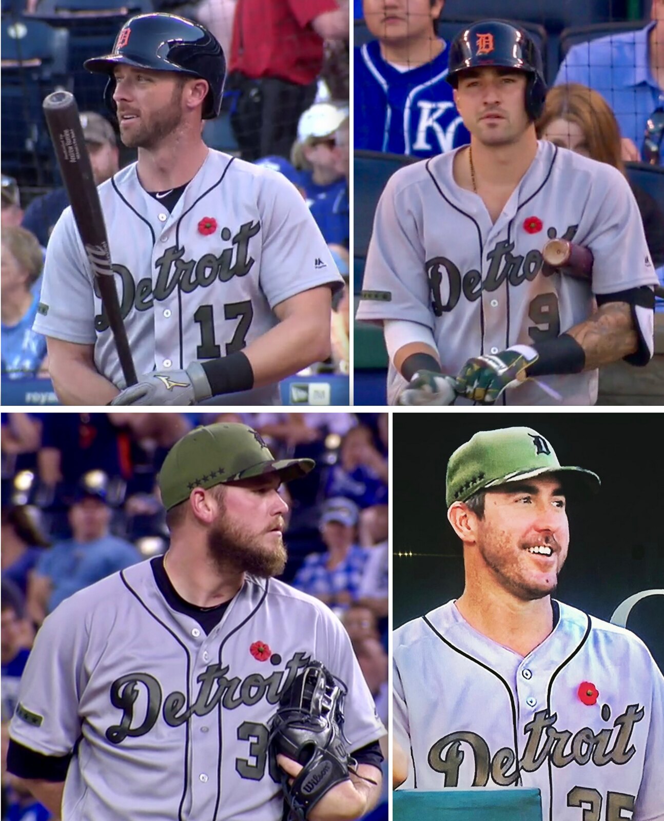
Major League Baseball’s annual Memorial Day camouflage-fest got a bit of pushback yesterday in Kansas City, where at least four Tigers players (shown above, clockwise from top left) — second baseman Andrew Romine, third baseman Nicholas Castellanos, and pitchers Justin Verlander and Alex Wilson — wore red poppies on their jerseys. It was a far more eloquent and tasteful way to observe and respect the holiday than MLB’s kneejerk use of military symbolism. Kudos to all of them, and here’s hoping this approach catches on in years to come.
The Detroit players aren’t the only MLBers who think MLB’s approach to Memorial Day could use some adjustment. Check out this tweet issued yesterday by Dodgers pitcher Brandon McCarthy:
generations of soldiers died protecting our country and its freedoms- don't forget to buy an official baseball hat to say thank you
— Brandon McCarthy (@BMcCarthy32) May 29, 2017
But the most bizarre commentary on the holiday uniforms involved that brawl yesterday between the Giants and Nats. As you’ve probably heard by now, the benches-clearing scuffle started when Giants pitcher Hunter Strickland plunked Nats outfielder Bryce Harper with a pitch. That led to this tweet from longtime LA Times columnist Bill Plaschke:
That Strickland threw idiot pitch while wearing cap honoring those who fought for something real is sickening https://t.co/bK9JcNNGdE
— Bill Plaschke (@BillPlaschke) May 29, 2017
When assessing a stupid act like plunking an opponent, I’m not sure how the presence of an ugly piece of apparel whose very existence is rooted in crass marketing, cheap emotional pandering, and bad civics somehow constitutes an aggravating factor. But when challenged on his comment, Plaschke doubled and then tripled down.
Only 19 days until the Father’s Day uniforms start appearing, whee!
(My thanks to Jason Bowman, Douglas Ford, Sean Gagnier, Jerry Nitzh, and Todd Pratt for their contributions to this section.)
Stanley Cup Final(s) Begin(s): The Penguins and Predators kicked off the final chapter in the NHL’s Reebok era last night. A few quick notes:
• As you can see above, the Pens moved their 50th-anniversary patch, which they’d been wearing on their chest, over to the left shoulder in order to make room for the Stanley Cup patch.
• Pens equipment manager Dana Heinze also juggled some of the patches on the coaches’ jackets:
I had the Finals patch put on all the Coaches and Staff jackets as well. Moved the 100 from the front to the arm. pic.twitter.com/p6ufSJ6auZ
— Dana Heinze (@RealDanaHeinze) May 27, 2017
• Heinze also removed the NHL centennial decals from his players’ helmets and replaced them with Stanley Cup decals:
Removing the NHL 100 years centennial helmet stickers on all our helmets first then I will put the Finals stickers on pic.twitter.com/YIG1RBnYUN
— Dana Heinze (@RealDanaHeinze) May 27, 2017
Stanley Cup Finals Logos going in the helmets pic.twitter.com/DS3smEilsZ
— Dana Heinze (@RealDanaHeinze) May 27, 2017
(My thanks to Derek Reynolds for his contribution to this section.)
A few notes from the weekend: I’ll let these Facebook embeds speak for themselves.
The Ticker
By Paul

Baseball News: The Indians retired Frank Robinson’s number and unveiled a statue of him on Sunday. They’re the third MLB team to retire his number, following the Orioles and Reds. That ties him with Nolan Ryan, whose number has been retired by the Angels, Astros, and Rangers (from Dave Feigenbaum). … Red Sox players went high-cuffed yesterday in honor of David Price’s first start of the season (from Steve McDermott). … Speaking of Price, he always prefers his caps to be squatchee-free, so I was wondering if that would be the case with yesterday’s one-off cap. Yup. … At least one Nats player was wearing the team’s regular striped pants yesterday, instead of the stripe-less Memorial Day pants (good spot by Patrick Thomas). … Here’s a look back at the history of the Mets’ road uniforms (thanks, Phil). … Interesting note toward the bottom of this item: “Just last week, [Giants] clubhouse manager Brad Grems was talking to a couple reporters who joked about [Eduardo] Nuñez’s helmet always flying off. For Grems, it was a serious matter. He was concerned that Nuñez was being put at injury risk of a thrown ball or contact with an infielder’s knee as he slid into bases. It wasn’t a sizing issue. Nuñez just has an odd-shaped head. So Grems was working on ways to alter the helmet to keep it secure. He added extra padding to it prior to the Braves series” (thanks, Brinke). … Eric Hosmer of the Royals hit a home run last night with teammate Mike Moustakas’s bat (from Lindsey Thomson). … Jake Hall says he found this unusual 1975 World Series cap in an abandoned house. I’ve never seen anything like it. Anyone..?

Pro and College Football News: New helmet striping for the Toronto Argonauts. Regarding the home blue helmets, Wade Heidt notes: “They switched from a white facemask to a blue one, and they added a single blue stripe down the center. The helmet did not have stripes before.” … Former Raiders DB Charles Woodson is happy to see newly acquired RB Marshawn Lynch wearing his No. 24 (thanks, Brinke)…. Bowling Green will wear military appreciation helmets on Sept. 30 (from @Friem13).

Hockey News: The NHL’s new Adidas uniforms, including the inaugural unis for the Vegas Golden Knights, will reportedly be unveiled in about three weeks. … Here are the inaugural uniforms for the AHL’s newest team, the Laval Rocket.

Basketball News: Belgium’s U16 team has no single-digit numbers. Instead, they have 05, 08, and so on. … Roger Bacon High School in Ohio uses reflective uni numbers. “In game film, the numbers are often obscured because of the light hitting them,” says school alum Glenn Riley, who helped design the uniforms. “So we asked the coach, ‘Is this a problem?’ His response: ‘Not at all, I know who our players are.”

Soccer News: The new uniform for Sampdoria — an Italian team based in Genoa — has the team badge on the sleeve, instead of the chest.

Grab Bag: The CEO of a leading business uniform company has died (from Tom Turner). … Coupla auto racing items from David Firestone: Ryan Blaney will run a Kyle Petty-inspired throwback at Darlington, Brad Keselowski will run a Rusty Wallace throwback at Darlington, and Nomex in auto racing turns 50 years old this year.
Proofreading:
“They’re the third MLB to retire his number” team
“for the Toronto Aronauts” Argonauts
Fixed.
Bill Plaschke, not Jim.
Fixed.
Re: Poppies
Three days of aggressive (marketing) military appreciation, even though the caps looked more aligned to duck hunting appreciation, vs. an understated symbol that reflects peace and rememberance.
Unfortunately Oakville, we can’t have the peace without the military. I do agree about the overdone nature of the green umiforms, and the poppies are a good addition.
Completely agree on the need of the military and it should be greatly appreciated. It may be a question of the “how”
I’m a seventeen-year military veteran and I dislike all the military-centric “tributes” that MLB and NFL do. If you want to do something like wear a special cap or jersey patch on Veteran’s Day and auction them off for charity, do it. I think the poppies are perfect for Memorial Day.
Unfortunately, the message of Memorial Day has been lost in the last few years. It’s not an acknowledgment of those who are currently serving (Armed Forces Day), or those who have served honorably (Veteran’s Day). It’s an acknowledgment and a humble salute to those who didn’t come home. The NHL and Premier League do the poppies and I think that’s a perfect way to do it.
Beautifully said Derek. I would add that many Americans think of it as a day to remember family members who have passed on, which while a nice gesture isn’t what the holiday is for.
Unfortunately, the message of Memorial Day has been lost in the last few years. It’s not an acknowledgment of those who are currently serving (Armed Forces Day), or those who have served honorably (Veteran’s Day). It’s an acknowledgment and a humble salute to those who didn’t come home.
Shouldn’t surprise anyone that Plaschke link.
I saw some “remember the actual meaning of this holiday” on social media over the weekend. Of course, there was the usual “shout out to all veterans and active duty this weekend” pandering, so it’s not as though common sense will be prevailing any time soon.
It does come off as a bit more Rambo than Eisenhower.
The poppies on the jerseys are a nice subtle touch, and much better than the military caps and jerseys, which seem so forced. It’s great that the proceeds of the cap and jersey sales go to veterans, but MLB could still donate the amount of money that they would make in sales to all these great foundations without having to force teams to wear special uniforms. This goes for all the special occasions that MLB recognize.
Agreed. It would have been nice to see all the teams in their normal unis but with a poppy on the jersey and maybe the cap too. MLB could still sell normal caps with a poppy if they wanted.
Proofreading: “Vegas Black Knights” in hockey section. They are the Golden Knights.
Fixed.
Funny how the Sampdoria goalkeeper still has the team crest on the chest. It adds to the long tradition of keepers having a completely different uniform program than the team.
Bill Plaschke has made a nice side living screaming in artificial debates on artificial topics on Around the Horn. So it’s not surprising he would have a “hot take” that makes no sense and then defend it while going down in flames. He gave up respectable journalism a long time ago.
Reminds me a little of Rick Petino trying to deflect questions about his affair by bringing up the death of Ted Kennedy, only Plaschke’s take here isn’t deflecting anything, it’s just nonsense.
Sampdoria have a long history of having a badge on their sleeve, it’s only really ever been on the chest recently, a trend that sporadically began in the late 90s
Get ready for two days of ‘Play Ball’ patches on uniforms this weekend, a promotion to be expanded more in years to come. The Odor/Bautista fight occurred last ‘Play Ball’ weekend, how dare they.
Also would not to be surprised to see MLB put a uniform patch out for Hall of Fame weekend and to dedicate other weekends down the road to honor women, families, LGBT, etc. An agenda each week, just like every other sport.
I’m digging those Laval Rocket jerseys quite a bit.
When Game 3 of the 1989 World Series got played after a 10-day delay, Jose Canseco got buzzed inside and the benches cleared briefly. Probably same thing that would had happened had their not been an earthquake.
A couple observations in regards to the Blue Jays unis last night:
1. The hats had four maple leafs on them. If I recall correctly, the five stars on the American team caps were to represent the five branches of the US Amred Forces. In Canada, we only have three branches of the armed forces, the Coast Guard is considered a civilian agency with out any naval or law enforcement abilities. Therefore, shouldn’t the caps feature THREE maple leafs instead?
2. The pattern used on the socks and cap beaks – It was only when CADPAT was introduced that the Canadian military started wearing something with a camouflage pattern. Until then, the uniforms were olive green (think MASH). I remember a few years ago for Memorial Day, the Jays logo was given the CADPAT treatment as a counterpart to the American patters on the US-based clubs. Couldn’t something similar have happened this year?
Little odd that the Indians decided to retire Frank Robinson’s number since he only played there for the final three years of his 20-year career.
But it was with Cleveland that he made history by becoming MLB’s first black manager.
I’m not saying that necessarily justifies the number retirement (nor am I saying that it *doesn’t* justify it). I’m just pointing out that his time in Cleveland involved more than just a three-year stint at the tail end of his career.
The first black manager thing is a big deal and I think the number retirement, or at least the statue, is appropriate to honor the achievement.
I knew that Frank didn’t play long in Cleveland but I swore his managerial career was longer there but it was only 3 years itself, two of which were as player/manager
I always found the idea of player/manager or player/coach interesting, especially in sports where coaches are normally not in uniform.
A fair point about Robinson being the first black manager with the Indians. It just seems to me that he is mostly known for being a member of the Reds and Orioles.
I don’t think anyone ever denied that he is “mostly known for being a member of the Reds and Orioles.” Perhaps the Indians think his historic role as the first black manager has not gotten enough attention, and that retiring his number and unveiling a statue will help remedy that.
Maybe the Indians realized they waited too long honoring Larry Doby for being the first black player in the AL & decided to honor the 81 year old Robinson while he was still alive. Plus he becomes the first Indian who wore the Caveman C to have a statue & retired number.
Just stop with the green, camo, digital camo and stars. I loved the simple poppy. My issue with the jerseys and caps is it’s really the fans making the donation thru their purchases- NOT MLB or its partners- if any substantial money makes it to the troops at all.
If MLB wants to honor the armed forces and show their appreciation, give active duty and veterans free tickets on Memorial Day weekend. I’m not talking about the shit upper deck seats either. Fill the joints up with service men, women and their families and the families of those fallen in service.
Paid attendance yesterday at Citi was 34,830. There were approximately 7,400 seats available for yesterday’s game. I don’t know HOW many tix they gave a away to the military- but it could have been more- Citi seats ~42,000.
In addition, anyone in uniform should get $1 dogs, popcorn, pretzels and soda.
I’m not saying that MLB should lose money- but they throw this military appreciation in our faces and say hey, “Look what we’re doing”. This is only my opinion and I’m presenting options- but MLB pushes this thing hard and it opens them up to criticism.
Absolutely agree. I appreciate wanting to recognize mothers, fathers, those who served, and national pride, but there must be a better way of doing it. A pink or blue ribbon, an olive drab ribbon, and a stars and stripes ribbon … or something like that.
Joe DiMaggio was quoted. “”There is always some kid who may be seeing me for the first or last time, I owe him my best.” There is also always some kid seeing his first MLB game – what if his hometown team is wearing camo, or pink, or blue? Does’t that kid deserve to see the Orioles in orange and black, the Cubs in red, white, and blue, et. al.?
I know this is venturing into ‘Get off my Lawn’ territory, but c’mon, MLB – you can do so much better.
Same argument could be made for wearing dark-colored jerseys. Doesn’t everyone who goes to a game deserve to see teams in their finest whites and grays, not spring training/ batting practice jerseys?
I think the Argonauts helmet bit is a bit off – they’ve switched from white to blue facemasks on the blue helmets, and blue to white facemasks on the white helmets.
Hi mike 2,
Paul’s got the wording ok. It notes prior to the quote, “Regarding the home blue helmets”. It is the switch to blue masks on the blue helmet.
That 1975 World Series hat was part of a collection American ‘Wesley released in 2002/2003. I know because at the time (I was about 14) I really wanted a Dodgers/Yankees one.
Thanks!
For anyone who reads this in the future, correcting my typo: should read “American Needle”
“In game film, the numbers are often obscured because of the light hitting them,” says school alum Glenn Riley, who helped design the uniforms. “So we asked the coach, ‘Is this a problem?’ His response: ‘Not at all, I know who our players are.'”
Yeah but the opposing coaches don’t know and I bet that’s the point. The numbers, therefore, should not be allowed.
Not to mention the referees and fans. The illegible number thing has gotten out of hand.
Isn’t John Travolta’s character from Saturday Night Fever supposed to be from Bay Ridge? Are you sure that your move there wasn’t predicated on all things disco?! JK
Haven’t seen this mentioned anywhere, so thought I’d add it here. At the ceremony Saturday at the Baseball HOF recognizing the Simpsons “softball” episode, Ozzie Smith was wearing a Cards jersey with the Busch Stadium 30th anniversary patch, which would have been 1996, Ozzie’s last year. It’s pretty obvious in the video posted here: link
Regarding the striping on the Argos’ helmets (I didn’t see this upthread, so apologies if it’s redundant):
The white helmet has had dark-light-dark blue stripes since it was introduced a few years ago. The A-shield logo has also been larger on the white helmet than the blue one. The blue helmet has never had stripes.
The new single light-blue stripe, IMO, is a downgrade.
It does look a bit strange to not have any of the Oxford (navy) blue on the white helmet, except in the logo.
I do not like that the logo sizes differ from the white helmet compared to the blue helmet. It is the same logo – make the A-shield the same size on both helmets.
However, I do like the addition of the Cambridge (powder) blue stripe on the blue helmet. That has a cool look to it for the Double Blue.
To fix the logo problem mentioned, I would be all in favour of the Argos replacing their present logo with an updated version of the “football with sails” logo we enjoyed in the ’70s and ’80s:
link
Great story on Nunez’s issue with the flying helmet. Jose Ramirez of the Indians has the same problem. The team is “honoring” him with a bobblehead sans helmet.
Easy fix, wear a helmet with 2 ear flaps like everyone else from little league to AAA. If that still falls off, wear the chin strap like little league. Because it’s all about player safety, right?
Got my first email today from MLB on the availability of the July 4th gear.
Bill Plaschke is a pandering hack