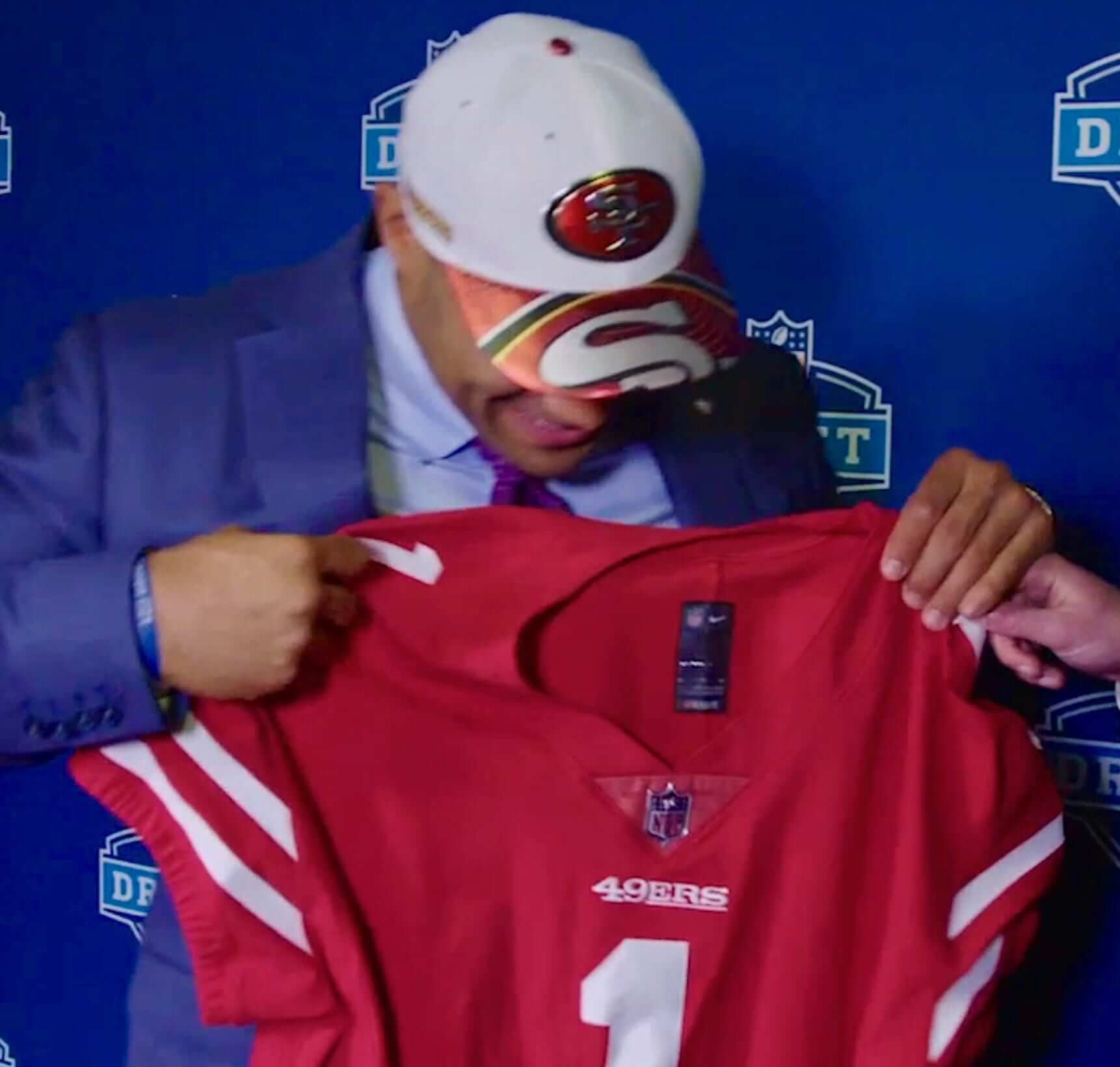
The one bit of significant uni-related news that emerged from last night’s NFL draft came when the 49ers selected defensive lineman Solomon Thomas with the third overall pick. As you can see above, Thomas was presented with a Niners jersey rendered in Nike’s new tailoring template (the one with the cringe-worthy name that I’ll do my best never to spell out on this website). While the collar is a big improvement over the Nikelace, the big news is over on the sleeves, which now have two stripes instead of the usual three.
Here’s another view:
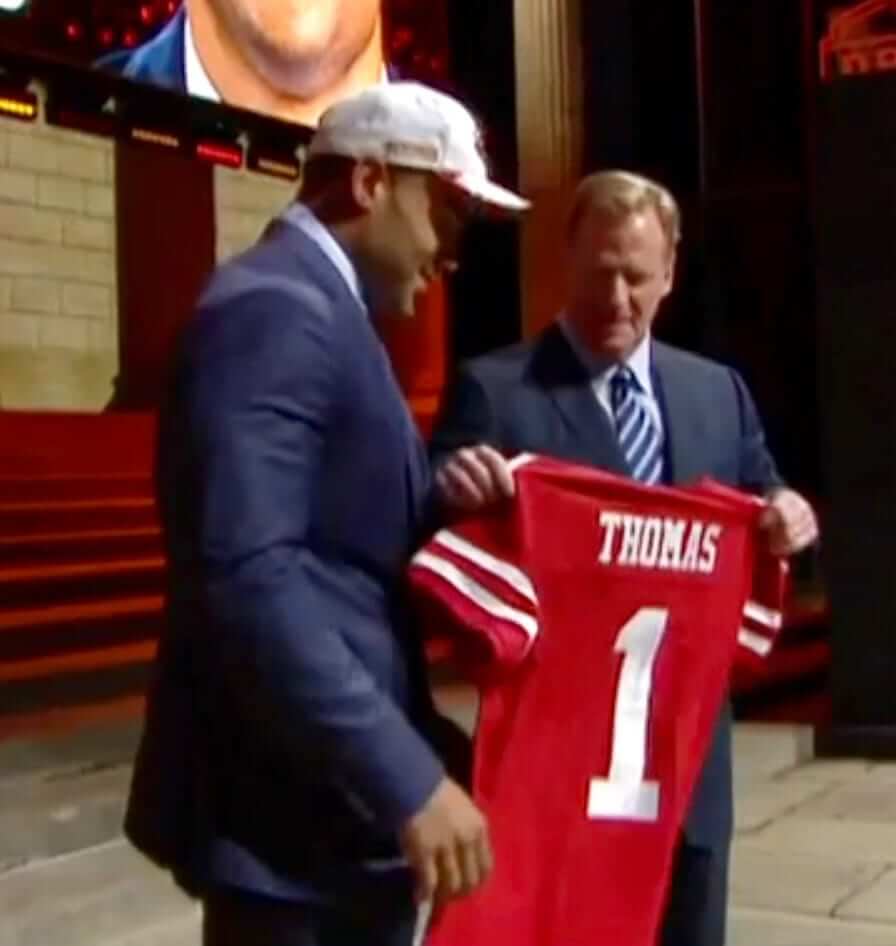
Sure enough, Niners retail jerseys with the new template show only two stripes. Retail jerseys in the old template have had two full stripes and one truncated stripes.
The reality, of course, is that almost nobody on the Niners has worn three stripes on the field in recent years, and many players haven’t even worn two full stripes (click to enlarge):
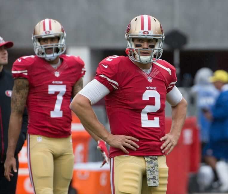
I still don’t understand why Nike can’t give the Niners three full stripes (they seem to manage it for the Bears without any problems), but whatever — it looks like they’ll only have two from now on.
Other notes from the draft:
• Following up on yesterday’s post, the Browns are indeed still using the old jersey template, as you can see in this photo of top overall pick Myles Garrett:
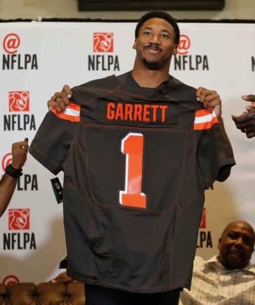
Note all the contrast-colored topstitching on the seams — the new template doesn’t have the seams in those areas. In yesterday’s comments section, reader Clint Richardson speculated that this may be the reason that the Browns are sticking with the old template: The contrasting stitching was billed as a major design element of this uniform set (it supposedly symbolizes Cleveland’s blue collar work ethic or some storytelling bullshit like that), but most of that stitching would disappear with the new template. So the Browns are stuck with the older template (including the Nikelace, ugh) because of nonsense design feature that nobody liked or cared about to begin with. Perfect!
• Steelers employees all wore green ribbon/pins and green neckties for Dan Rooney. Here’s a closer look at the ribbon/pin.
• Jaci Wilson, the granddaughter of Hall of Fame defensive back Larry Wilson, was at the draft, wearing her grandfather’s old Cardinals jersey.
ESPN reminder: In case you missed it yesterday, my latest ESPN column looks at the MLB uniform protocol of teams wearing their team name on their home whites and their city/state name on their road greys. Has that always been the rule? And which teams don’t follow it? Which teams should follow it? Get the full scoop here.
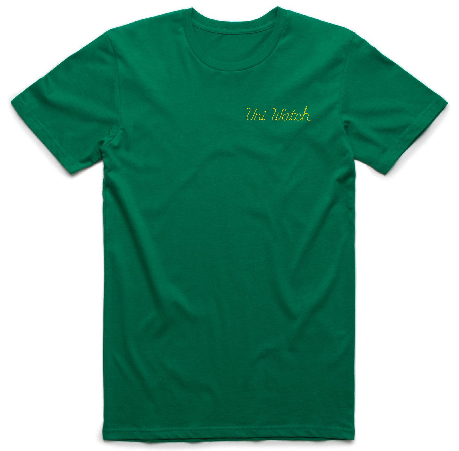
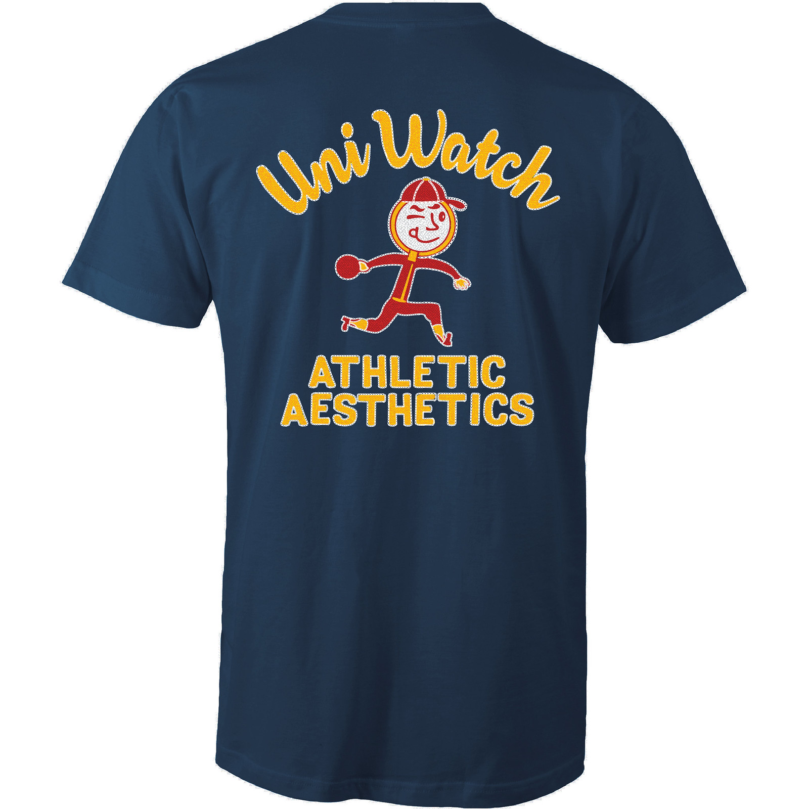
New T-shirt reminder: In case you missed it earlier this week, our latest T-shirt in the Uni Watch Artist’s Series, designed by the great Scott M.X. Turner, is now available, and it’s a doozy.
Here’s the concept: If Uni Watch had a bowling team, what would the team be called? The Athletic Aesthetics, of course! And what would the team wear? A classic bowling shirt with chain-stitched embroidery, of course!
Scott’s T-shirt is based on that idea, with a simple “Uni Watch” insignia faux-chain-stitched on the front-left chest and a spectacular design faux-chain-stitched on the back (for all of these images, you can click to enlarge):
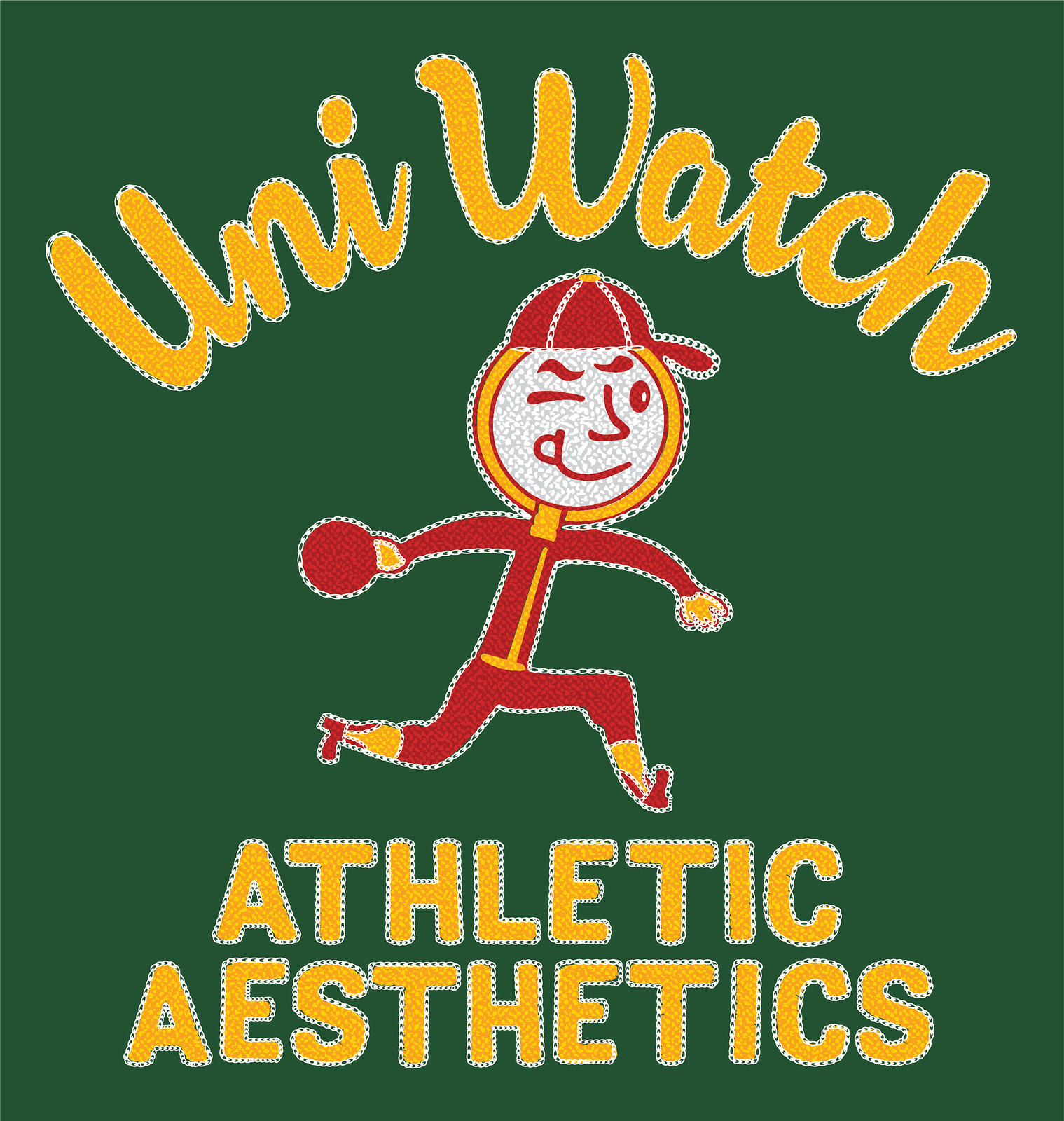
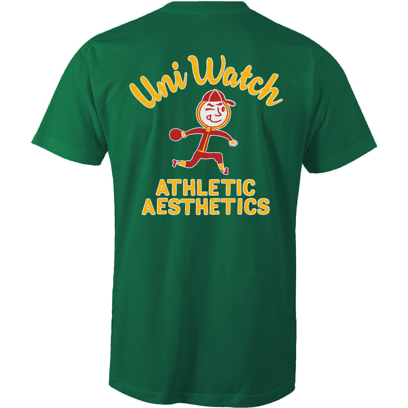
How great is that?! An anthropomorphized magnifying glass wearing a ballcap and stirrups — tremendous! The graphics really capture that old-school bowling shirt style, too. Even better, the design works well in a wide variety of shirt colors. Here are some of the ones we’re offering (there are several more on the sales listing page), just to show how flexible the design is:
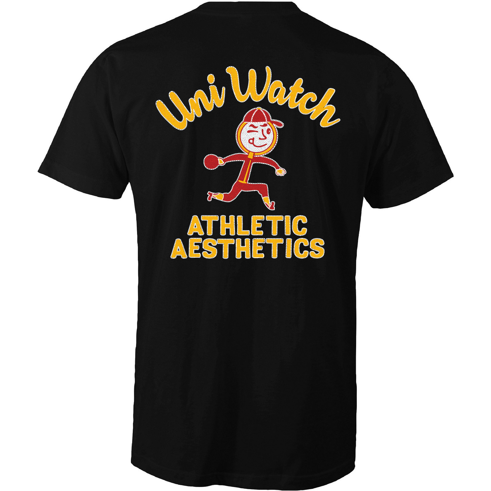
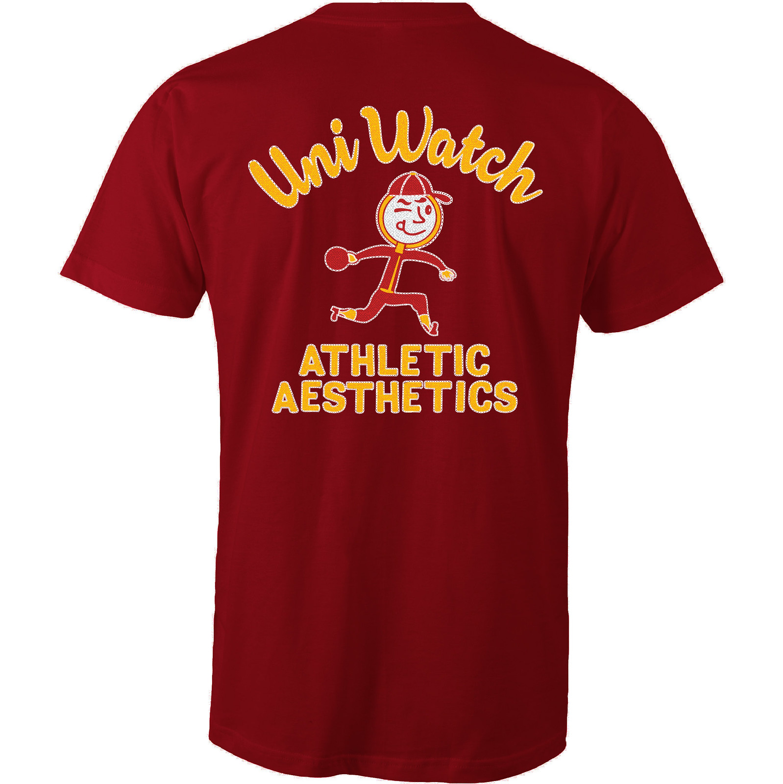
Like all of our Artist’s Series shirts, this one is a limited edition, available until late next week. You can order it here. My thanks, as always, for your consideration.
The Ticker
By Paul

Baseball News: Expect to see several more MLB teams switching to 3D helmet logos shortly. … The Mahoning Valley Scrappers will change their name to the Packards for one night in August (from Ryan McNaughton). … No photos, so I can’t confirm, but Matt Brown says the Double-A Erie Seawolves have not yet worn a white or grey jersey this season — just black and red softball tops. Not sure if that’s really so unusual in the minors, though. … Single-digit pitcher alert! Julio Urias made his season debut yesterday with the Dodgers, once again wearing No. 7 (from @LAUrbanLegend). … Oregon softball’s new uniforms have a punching Puddles (from Mark Johnson).

NFL News: The swimwear brand Schwimmer has come up with with a line of bathing trunks in NFL team-color pairings (from Nathan Haas). … Sports Illustrated ran a cover showing how NFL prospect Leonard Fournette would look in various NFL jerseys. The funny thing is, he’s wearing No. 7 in all of those shots — that’s his college number, but Fournette is a running back, which means he couldn’t wear that number in the NFL (from Chris Mycoskie).
College Football News: A recruit may have leaked a new Oregon helmet. … All the visting teams on SUNY-Albany’s 2017 home schedule have blue-centric color schemes (from Justin Berger).

Hockey News: Dunkin’ Donuts is selling a travel mug with the Penguins’ 50th-anniversary logo. But instead of the four Stanley Cups that normally appear on the logo, it shows four stars (from Mike, who didn’t give his last name).

Soccer News: Nashville Soccer Club has its first jersey sponsor advertiser (from Ed Å»elaski”). … Inaugural home and road kits for Asheville City. … New home kit for Japan (from Josh Hinton). … Also from Josh: AFC Bournemouth of the EPL has signed a kit deal with Umbro. … And one more from Josh: Man City’s new away kit has leaked. … So has Juventus’s new jersey (from Mikey Traynor). … New uniforms for Chattanooga FC (Ed Å»elaski” again). … New kits for Detroit City FC: home, road, and charity (from Ryan Keberly).

Grab Bag: Three new bridges with eye-catching designs are being built in NYC. … USA Curling is holding a design contest to create a new pin for the 2018 Olympics (from R. Scott Rogers). … Speaking of curling, there’s a team in Houston with tequila sunrise jerseys (from Garret Heinrich). … Here are the Indy car liveries for tomorrow’s Phoenix Grand Prix (from Tim Dunn). … First responder-themed jerseys tomorrow for the Iowa Barnstormers, an arena football team (from Luke Teeselink). … Speaking of arena football, the AFL has a new 30th-season logo. … The U.S. Open golf trophy has 12 hidden meanings (thanks, Phil). … Under Armour’s stock price spiked yesterday. Why? Because the company lost less money than had been expected, whee! Among the problems: Steph Curry’s shoes aren’t selling (thanks, Brinke).
That’s Man City, not Man U. And odd City would go with a shirt so reminiscent of Aston Villa, West Ham and Burnley.
Fixed.
Aston Villa? Never heard of them. What league are they in?
(I only kid because I cry)
You want to cry? I follow Portsmouth.
Myles Garrett with a forced smile look holding up that Browns jersey. Sort of looks like, I’m glad to be a pro so I get paid but why the Browns? Like going to football purgatory.
Re: Asheville City SC, Hi-Wire beer is the good stuff. And very Asheville, so a nice fit on a nice-looking shirt.
Proofreading:
There’s a “how” missing before “NFL prospect Leonard Fournette”.
If you leaf through a Penguin program, you’ll find both the cup and star versions of the 50 Years logo. Apparently, the stars are available if the cups are too complicated, and many advertisers use the stars.
Fixed.
I assumed it had to do with licensing the Stanley Cup vs. licensing just the Penguins.
Granted it’s the NHL, so anything’s possible, but the toques they gave away at one game have the logo with the stars. I’d think that the club itself could use the cups if they liked. Maybe using the stars is a bit cheaper to produce.
Those Schwimmer folks might need to look out.
I’m not convinced their “Titans”, “Eagles” etc. trunks are licensed at all by the NFL. They only have a few teams color combos (which happen to be part of their normal line already), and aside from pinching some NFL photos as backgrounds they never use the “NFL” or players’ full names. They are semi-cryptic in their approach. Seems shady in my book.
Cowboys West…sacrilege
This better be the next “One Day Helmet” fiasco
Can we trade a pick back to the Bears for one of their sleeve stripes?
Any chance that 2 stripe situation with the 49ers has anything to do with not wanting to look like an Adidas advertisement?
No.
Why do you say that, Paul?
1. As already stated in today’s lede, virtually no Niners player actually wore three full stripes. Many didn’t even wear two. Retail versions didn’t have three full stripes either. Hard to think anyone would ever associate this uniform element with Adidas.
2. If Nike had nonetheless really wanted to do get rid of the three stripes, why did they wait until now? Why didn’t they do it when the took over in 2012?
3. Bears’ sleeves have three stripes
4. Bears’ socks have three stripes.
5. Patriots’ road socks have three stripes.
And so on. I realize conspiracy theories are enticing (at least to some) and corporate theater is compelling (ditto). But in order to buy this conspiracy-theorized version of corporate theater, you have to ignore a lot of reality.
Sometimes three stripes are just three stripes.
Meaning: Is there some previous reporting (or new reporting, I guess) I’ve missed that indicates this isn’t the case?
Perhaps you’d like to present some reporting that indicates it IS the case?
Also, as I note below, the truncated stripes began happening in 2009, when the NFL was still with Reebok (which was, and still is at this time, owned by Adidas).
The three stripes never had anything to do with Reebok or Adidas. It was just a return to the Niners’ old look:
link
Exactly my point.
Paul, I’d hardly call speculating about a decision involving two parties (49ers, Nike) overtly involved in business together as a conspiracy theory. I don’t see this as far-fetched at all, particularly compared to the occasionally repeated notion on this site that the original Broncos spacesuits were meant to form a swoosh on the side of the player’s body. (There may be reporting to back up this idea, but the premise itself is far wilder than the Niners/Nike removing an adidas element.) And I couldn’t care less about “corporate theater.” You seem to think I’m talking about something far more sinister than what I see as a poor, wrongly motivated branding/uniform decision.
Your reasons 1 and 2 seem incongruous. Unless the stripes got dropped from the retail jerseys pre-2012 (no clue on this; I know the game stripes were truncated before then), it seems like they didn’t wait. And if those changes did happen on Reebok’s watch, it would have only lessened the urgency for an immediate further change. Regardless, the move to two stripes as an evolution from the truncated stripes is not mutually exclusive from the desire to look less Adidas-y.
The Bears feel like a different case to me. For one, their stripes are outlined, so they don’t look like Adidas. Unlike the Bears’ stripes, the Niners’ stripes were very similar to the stripes on the jerseys of Manchester United, Chelsea and Real Madrid and on Adidas s Regardless, Nike doesn’t have unilateral control, and the team would have to agree to any change. It’s pretty plausible that one team agreed and one team didn’t.
The point about the Patriots socks is a good one. It’s a pretty insignificant element that one wouldn’t think the team would resist all that hard if asked to change it.
Regarding presenting “reporting indicating that IS the case,” all I said was how things seemed to me. And I politely asked you if there was something I missed from a previous entry along the way.
And the fact that they never were Adidas stripes is irrelevant to the whole conversation, other than making it more stupid if the change was indeed made to look less Adidas-y.
I’d hardly call speculating about a decision involving two parties (49ers, Nike) overtly involved in business together as a conspiracy theory.
Actually, what you’re suggesting is covert, not overt, and they way you’re describing it is the very definition of a conspiracy theory. You’re suggesting that the team and outfitter secretly agreed to change the team’s design in order to look less evocative of the outfitter’s competitor.
Regarding presenting “reporting indicating that IS the case,” all I said was how things seemed to me. And I politely asked you if there was something I missed from a previous entry along the way.
You presented some unfounded speculation and then asked if I could disprove it.
That’s not how it works. If you have speculation, it’s up to you to prove it. It’s not my job to prove a negative.
Your own analysis works against your argument. You say the Bears’ stripes don’t count because they’re outlined. But the Niners’ stripes *did* count, even though they were truncated? Come on — there’s no universe in which that makes sense. You can’t have it both ways.
The reason my original response to the query on this point was simply “No” was specifically that I didn’t want the site to get bogged down in this silliness. If you want to speculate on conspiracy-theorized versions of corporate theater, that’s your prerogative. I don’t think it holds water, for reasons I’ve already spelled out. We can agree to disagree. Let’s move on. Thanks.
To further clarify: I posted my question about reporting on the lack of Adidas motivation to clarify my previous question, not having seen your answer at that point.
Understood. Our comments crossed in the ether.
I see the new Niner double stripes an immediately see “Nebraska Cornhuskers”. A shame they couldn’t figure a way to keep the inconic triple stripe (untruncated) look.
A reminder of when the truncated stripes link.
Looked through some pictures and it seems the Falcons are finally switching to the new Nike template instead of maintaining the old reebok one.
1st paragraph – “to spell” listed twice in a row
Fixed.
The Niners thing is obnoxious for a couple reasons.
1. It seems obviously driven by Nike wishing to strike the Adidas three-stripe look. (This doesn’t apply to the Bears’ outlined stripes, which don’t look as Adidas-y.) Nike is the dominant player, at least domestically, in the big-time-uniform field. Its attitude should be that it can’t be bothered to worry about less-and-less-relevant Adidas, not worrying about being mistaken for it.
2. If there’s one piece of uni philosophy I hold most strongly (besides that, in football, only poorly funded high-school teams should wear dark jerseys with dark pants), it’s that your striping should match, or at least be complementary. The three stripes and pant/helmet striping weren’t perfect in this regard, but they were distinct enough to stand separately and had tradition on their side. Now you have two sets of stripes that are similar but don’t match and don’t feel like they go together at all.
I think that’s a case of eisegesis happening there. I tend to go with the old maxim that the simplest explanation is usually the right one, and until I see evidence that is a corporate politics thing, I’ll go with the simpler answer, that sometimes stripes is stripes.
Cheap-looking and ugly; no attention to detail.
Your speculation was discussed — and properly dismissed IMO — above. I write to point out that the Bears white jerseys have three non-outlined stripes.
The Bears jerseys have three stripes because they insist on it. Nike complies with the wishes of the client. Had the 49ers insisted on three stripes, they’d still have them.
In regards to the ESPN article, the Nationals home uniform always looks off to me because of the numbers on the front of the jersey. Those numbers always look out of place.
This! Front numbers should always be level with the logo if placed on opposite sides of the placket. Reds have it right; Pirates alts and Nats have it wrong. Nats, of course, also have that brutal numeral typeface, which is a shame because they’re so close to really pretty looks at home and on the road. Would certainly put the Reds to shame if they got the numbers right.
No need for number on the front of the jersey. Less is more!
The Nats would get their numbers right if and only if they do both of these things:
1) Eliminate the front number on the home jersey. There is no good way to format the jersey-front number with a left-breast insignia. The number can be brutally ugly, as the Nats do it, or it can be just plain ugly, as the Reds do it.
2) Drop their current Cowboys number font for the original Expos number font. That old Expos number font would match the curly-W nicely.
The Mahoning Valley Scrappers will change their name to the Packards for one night in August (from Ryan McNaughton).
Link leads to the 404 (not found) message.
Fixed. Here’s the proper link, so you don’t have to scroll back up:
link
All of SUNY-Albany’s 2017 opponents have blue-centric color schemes (from Justin Berger)
All of UA’s *guests* will have blue-centric uniforms. No information is given regarding who they play on the road.
Good point. Fixed.
If I recall correctly, the justification on the Niners’ stripes is that they’re supposed to be horizontal when worn on the full uniform. However, you can see on that picture of Hoyer and Kaepernick, the top stripe on Kaep’s jersey is sloping downward a little bit, so the effect doesn’t really work the way it’s supposed to. And, of course, it looks like ass on retail jerseys that have actual stripes.
Oddly enough, when Alex Smith was with the 49ers, he link on his Nike jersey, a vast improvement from the link.
I think Smith and kicker David Akers were the only two Niners ever to have three full stripes. Here’s Akers:
link
There’s an x in there that got changed to a times sign. link.
And now that I’ve actually looked at it… it’s interesting to note that Akers still had elastic on the ends of his sleeves, just further down than the usual level, while Smith had loose sleeves.
It’s like the Niners either don’t want to move the stripes up to fit the current sleeve type or they are saying “hey, we left the stripes in the same place because we don’t want to keep up (pun not intended) with the sleeve length.” It’s like the sleeves were made long with stripes but trimmed to current length as an afterthought.
With the new sleeve striping on the 49ers jersey, they look like Wisconsin Badgers jerseys to me.
Plain and simple, they should have the 3 stripes visible on the sleeve. That is classic 49ers look reminiscent of Super Bowl glory days.
Cool article about the US Open trophy. Golf has some fantastic looking trophies.
I don’t follow golf closely, so I don’t know much about the trophies. Are there other specific tournaments you know of that have interesting trophies?
I’d say this one is pretty interesting. I will admit I never heard of this tournament. Qatar Masters Tournament trophy.
link
I come from an oystering town, so I really like that trophy!
I’d say the Claret Jug is a pretty good example of this.
It’s literally a wine decanter (or at least the original was).
The Claret Jug Robbie mentioned is a good one. Here’s one of the Robert Cox Cup, awarded to the winner of the US Women’s Amateur Championship: link
Nebraska Niners
Wisconsin 49ers
Hey Paul, this is a great website, that details the history of logos in the NBA,NHL,MLB, and NFL
link
Thanks, but I’ll stick with SportsLogos.net.
Can somebody….ANYbody…please put the CORRECT ‘Skins “Circle R” logo on their site??? I’m begging you all!!
From the site noted above:
link
Creamer has the same one.
Here is what it looked like:
link
Creamer has a fair number of inaccuracies, many coming directly from the teams themselves.
The inaccuracy that annoys me the most is the inaccurate lettering on the 1967-70 Maple Leafs logo, which inexplicably has a diagonal middle stroke for the letter S – when there’s a picture of an actual program from the 1968-69 season that has the logo with the correct lettering right on that site!
Pretty good website , but design seems a little clunky. If that makes any sense.
yep. hard to fly around in there.
Based on what I could see in the draft last night, at least the Falcons and Panthers are updating to the V$$or template away from the old Reebok template. You can tell based on the back of the jerseys. The new template has this long upside down peace sign stitching down the back that runs behind the nameplate. I couldn’t tell on the Packers. It also looks like the Bengals, in keeping with being hideous, are not only keeping the flywire collar but are keeping the two tone toilet bowl look.
Why, Bengals, why?? A white uniform with black tiger stripes would continue the branding and look great, to boot.
The leaked Oregon helmet is interesting. The length of the neck of the “duck” on the helmet graphic/logo seems abnormally long for a duck. Instead, the graphic looks more like a goose.
Yep looks like a goose or maybe even a loon.
OK, so I enjoy pain. Can anyone point me to something that shows the cringe-worthy name of the new Nike Fball template? Can’t seem to find it on line and I need a good laugh.
Vapor Untouchableâ„¢
It’s a very good story, so I’ll whisper my comment
(I don’t think that’s a game worn Larry Wilson jersey)
“Dunkin’ Donuts is selling a travel mug with the Penguins’ 50th-anniversary logo. But instead of the four Stanley Cups that normally appear on the logo, it shows four stars (from Mike, who didn’t give his last name).”
I would believe this is because the Cup and its likeness would have its own NHL copyright, and cannot be reproduced by Dunkin without permissions. Just speculation tho
Dunkin’ is in an official partnership with the league, though. The deal officially launched with this year’s Winter Classic.
I’m so glad to see the 49ers change their sleeves. Yes, three stripes (like Nike has been able to do on the Bears for years…) would be ideal, but no more truncated stripes is a decent compromise.
It’ll never happen, but I’d love it if teams only had their team name on Spring Training duds and not the city. That way you’re not a New York Yankee (substitute fav team city and name here) until you’ve made the big club.