Click to enlarge
Sports teams aren’t the only organizations that wear uniforms. And they’re apparently not the only ones who go BFBS, either.
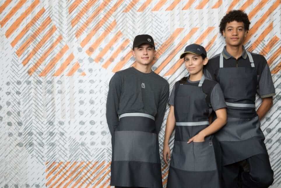
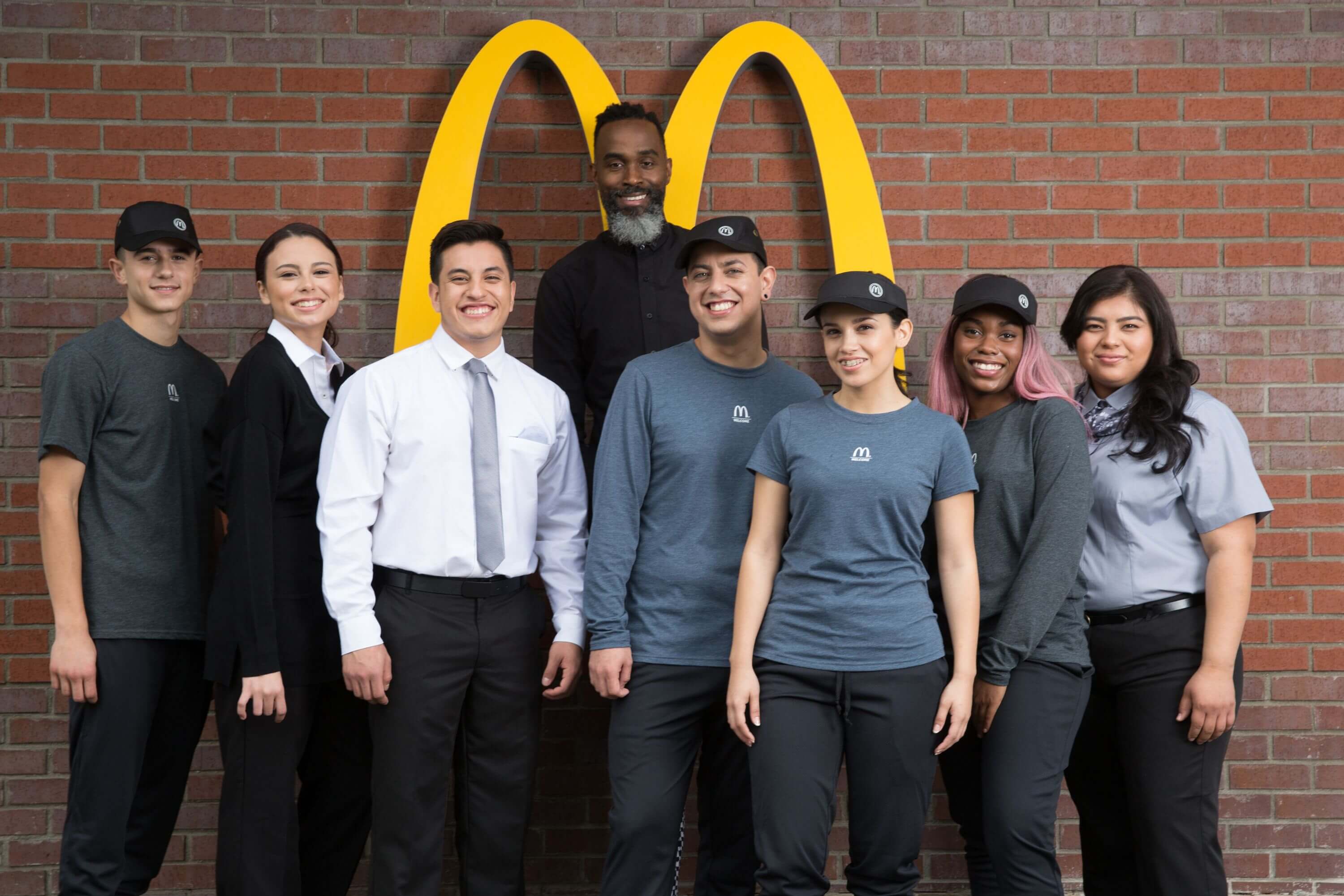
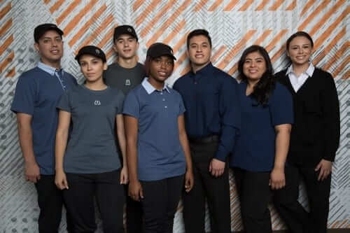
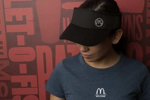
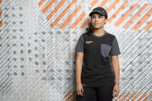
That’s the obvious conclusion to be drawn from the latest news out of McDonald’s HQ, where the burger chain recently announced two new sets of uniforms, both designed by high-profile fashion designers — an apparent fast-food first (additional info here). But if the idea of McDonald’s dipping its toe into the world of fashion is a head-scratcher, the resulting designs are even more surprising: They’re heavy on the black and grey, with nary a hint of the company’s signature red/yellow color scheme.
Here are a few more pics:
As word of the new designs spread around the web yesterday, there was lots of feedback from the uni-verse’s peanut gallery. Among the comments and tweets I saw:
• “Should allow McDonald’s to recruit at a whole new level. Kids love the anthracite look.”
• “Just waiting for Burger King to go for matte hats with 3D logos.”
• “Can’t wait for Thursday’s reveal of the weekend uniform combo.”
@PhilHecken Are they going to have throwbacks on Thursdays or Fridays? They're not as fierce or moisture-wicking as the new ones but they're still great pic.twitter.com/qCBgV7uv5v
— Jim Vilk (@JimVilk) April 17, 2017
@PhilHecken You mean they didn't go in this direction? 😳 pic.twitter.com/sXmXhi4X4n
— Jeff (@j_tasca) April 17, 2017
Snarkiness aside, I think these uniforms look pretty nice. They just don’t look like McDonald’s uniforms, at least to me. Then again, McD’s is doing all sorts of counterintuitive marketing these days, so maybe the uniforms are just part of that approach.
Of course, I haven’t been inside a McDonald’s in well over a decade, so what do I know? For those of you who interact with the golden arches more frequently than I do, what do you think?
(Big thanks to Phil for getting this ball rolling.)
Click to enlarge
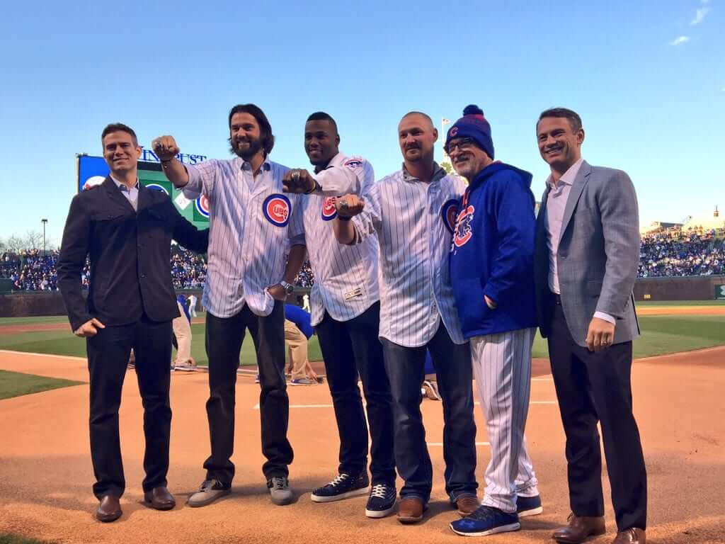
Cubs again, if only for a day: The Cubs had a home game last night and the Royals had an off day, so Jason Hammel, Jorge Soler, and Travis Wood, all of whom played for the Cubbies last season but now play for KC, showed up at Wrigley to receive their World Series rings. There’s nothing particularly unusual about that — similar scenes play out each season for players who’ve changed teams after being on the Series-winning squad. But as you can see, Hammel, Soler, and Wood all wore Cubs jerseys for the occasion (the gold-trimmed version), and I’m pretty sure that is unusual.
Or is it? Has this happened before, where a player who’s currently on Team A wears the jersey of Team B while receiving his Team B ring?
Update: Reader/commenter Jim Noble points out that Derek Lowe wore a Red Sox jersey when returning to Fenway to receive his World Series ring in 2005, even though he was with the Dodgers by that time:
(My thanks to Max Wagner, Bob Gassel, and our own Mike Chamernik for bringing this one to my attention.)
Click to enlarge
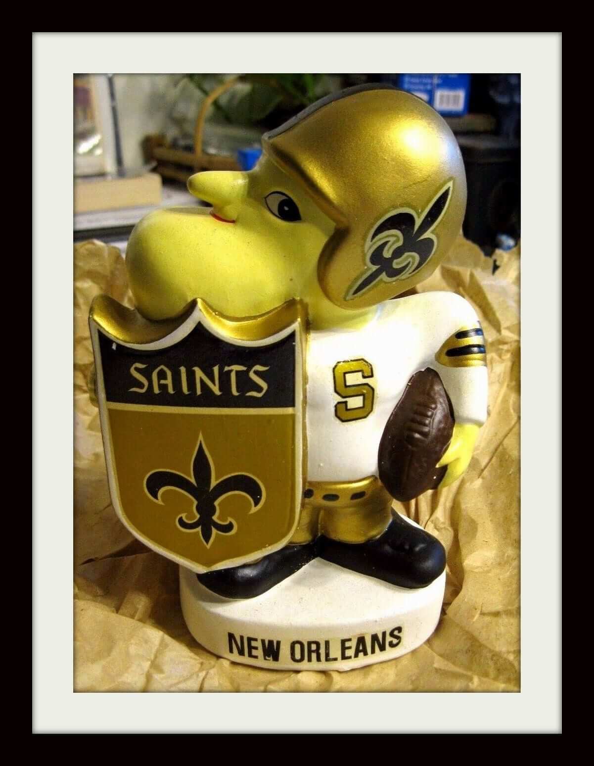
Collector’s Corner
By Brinke Guthrie
Here we have a Sir Saint bank, in very good condition, from NFL Licensee Quinco. Kinda has that Jay Leno look, no? And look — the uniform number is actually a letter. “S” for Saints!
Now for the rest of this week’s picks:
• From reader Will Scheibler, here’s a 1975-76 California Golden Seals schedule poster, their final year in Oakland. Rinkside tickets, just $8.50!
• Helmet buggy alert! Here’s the Buffalo Bills edition, still MOC (mint on card) after all these years.
• These 1970s Brow-Dri Pittsburgh Penguins sweatbands are still sealed in their package.
• Ah, look at that terrific logo on this repro Carolina Cougars T-shirt. (For you kids out there, they were a short-lived ABA franchise.)
• Twenty-five different NFL helmet plaques in one auction! (Thanks to @Helmet Addict twitter for this one.)
• This Herschel Walker beach towel is an NFLPA item, so no team logos on it, although that navy blue border looks suspiciously like it wants to be a Dallas star. And they did get his Adidas shoes right.
• This late-’60s/early=’70s San Francisco 49ers poster is in great shape! Perfect for framing at Uni Watch HQ.
• Your Imperial Esso Dealer was the spot to score one of these Toronto Maple Leafs “Hockey Talks” records. Edition #1 featured a fellow named George Armstrong.
• Here’s a Mets Starter wannabe jacket from Felco. The listing says 1970s-1980s, but I’m fairly certain they never used that font, am I right, PL? [Correct. ”” PL] And I would guess this was a licensed item, what with the MLB patch.
• It seems that St. Louis Blues season ticket holders in the 1970s got this pom-pom ski cap along with their seats.
More merch offerings: As I noted throughout last week, the Uni Watch social media avatar (a caricature of me, designed by Larry Torrez) is now available on assorted T-shirts, sweatshirts, coffee mugs, and more. But several of you responded to that by saying, “No offense, but I don’t want to wear your face on my chest. Ya got anything else?”
”¨Say no more. Our classic magnifying glass logo, designed by the great Scott M.X. Turner, is now available on a variety of goods. There are two versions of the logo — one with a gold outline, as shown at right, and one with a green outline. We have shirts and related products for both versions: gold here and green here.
I’ll be gathering all of these offerings, plus a few others, into a new Teespring storefront shortly. That will replace our old Zazzle store, which I’ve never spent much time curating or promoting. I hope to make the Teespring shop more focused than the Zazzle shop has been.
My thanks, as always, for your consideration.
The Ticker
By Mike Chamernik

Baseball News: The Red Sox wore their Boston Strong jerseys yesterday morning for Patriots Day. … Speaking of the Sox, Hanley Ramirez applied his eye black to to look like whiskers. He had also done that on Sunday, and many people assumed it was an Easter Bunny thing. No explanation for why he kept doing it yesterday. … While looking for something else, I found a 2015 pic of the Rangers’ Rougned Odor wearing teammate Yu Darvish’s elbow guard. … Lids is selling MLB team hats that have anniversary patches from past seasons (from Chris Fyfe). … There’s a good reason why this amateur baseball team in Texas wears Blue Jays-inspired uniforms. They were designed by Vernon Wells Jr., the father of Vernon Wells III, the longtime Blue Jay. Mark Rybczyk says that Wells Jr. has been playing amateur ball in Texas for more than a quarter-century, and that he has his own sports art studio. Wells Jr. has a logo that plays off of the MLB mark. … Good article on longtime A’s equipment manager Steve Vucinich, who’s been with the club in various capacities for 50 seasons — the second-longest tenure in franchise history, after Connie Mack (from Terry Mark).
College Football News: Oregon’s football equipment administrator said that the Ducks will “stick to more traditional colors this year” (from @duckitecture). … During the Oklahoma State spring game, the black team wore black OSU helmet decals, while the orange team wore traditional orange decals (from Brian Murphy). … Here’s how a Rutgers football helmet is made, from molding to painting to safety-testing (from Steven A. Knowlton).

Hockey News: Capitals owner Ted Leonsis wore a Alexander Ovechkin jersey to last night’s game (from Alan Kreit). … Baseball Hall of Famer and Oakland A’s legend Rickey Henderson wore a customized Sharks jersey to Game 3 against the Oilers the other night. … As for Game 4, here are the rally towels the Sharks will give their fans (from James Paterson). … The guy singing the national anthem last night in Calgary had a musical note instead of a sleeve number (from JP).

Basketball News: French comic book artist Asur Misoa created illustrations for each of the first-round playoff matchups. This is the third year she has made these drawings. Expect new illustrations as the playoffs continue (from Max Wagner). … The Sixers had a bunch of notable hairstyles this season. … Classic Kicks, a digital magazine dedicated to the evolution of sneakers and sportswear, has launched. The first edition has essays, travelogues, and interviews with notable sportswear execs, along with some neat artwork (from Nick Santora). … A YMCA in Paris has the world’s oldest surviving basketball court, from 1895.

Grab Bag: The Clermont Pin Company, a small shop in Iowa, has been refurbishing wooden bowling pins for around 50 years (from Aaron Telecky). … New unis for the West Coast Eagles, an Aussie rules football club. … Wichita State athletics is changing from Nike to Under Armour. The new deal goes into effect on July 1 (from Daniel Woods). … Check out the sweet uniforms for the Team USA sled hockey team, which is currently competing at the world championships in Korea. “They usually wear the same uniforms as the traditional Team USA hockey team,” says Steve Fidrych. “I hadn’t seen them wearing this design before.”
Red Sox fans will surely remember Derek Lowe getting his 2004 ring, returning to Fenway in ’05 with Dodgers, and wearing a Sox jersey for the ceremony! Much the kerfluffle about that at the time.
Indeed — good call:
link
I’ll add that to the text.
Those Sharks towels are neat – but inaccurate. Not a lot of offshore drilling in Oil Country….being on the prairies, and all
they should have incorporated Sharknados
Typo: Toronto Maple LEAFS “Hockey Talks” records Edition #1 featured a fellow named GEORGE Armstrong. (Not Garner Ted Armstrong.)
Fixed.
Pretty sure the Caps owner is wearing an Ovechkin jersey with just a red vest over it (hence why you can see the 8 on the sleeve)
Yes. I updated the text.
He usually rocks that Ovie jersey. Also the Flames routinely supply the music note jersey for anthem singers
The West Coast Eagles jersey is the indigenous designed jersey. All teams wear one for the indigenous round and so do the rugby teams of the Aussie NRL. Might make for an interesting story about how this came about and the aboriginal artists that design them.
I’m guessing it’s no big deal for a player to wear his former team’s jersey for a ring ceremony….as long as he’s not now with a big rival. I’ll be surprised if Dexter Fowler does the same thing.
I won’t say you’re wrong about Fowler (or any other specific player), but its funny how fans think players think of other teams as “big rivals” of their former teams.
Pretty sure that if the team is willing to cash their checks, players in almost all cases don’t consider rivalries at all. At least nowadays, maybe it used to be different.
Lee
Watched the US-Norway sled hockey game last night. Norway’s jerseys are pretty great as well.
The US one looks like it’s the same design as the Caps’ Winter Classic jersey from a few years back, but in white.
The McDonalds uniforms reminds me of an old job I used to work for, amc theaters, when I worked there the uniform was red polo shirts or navy, then after I left they switched to all black, despite that not being the company color. No hint of red.
Also just like mcdonald’s, another trend I don’t like alot of places doing, and that’s tshirts for the lower level employees, polo (or is it golf shirts?) Shirts were the norm 10 years ago, even the supermarket I worked at now wears just tshirts, to me it just says the companies are being more cheap, and getting too casual in my humble opinion.
Another clothing change I’ve notice is the area’s USPS delivery service. Instead of the light blue or white attire I’ve seen worn in different locations over the years, there is no uniform at all. Postal carriers in their vehicles simply dress like the neighbor across the street. Very unprofessional, IMO.
I had this in the Ticker a few days ago, but it’s worth repeating here in light of this discussion: Some police departments are beginning to think that plainclothes units tend to be more prone to abuses and rogue behavior because they’re not wearing uniforms. The uniform provides more accountability and leads to more professional behavior — or at least that’s the thinking. Really interesting article:
link
USPS has a ton of temp (1 yr) hires that don’t qualify for full benefits or retirement. Those personnel do not get to wear USPS unis but still deliver. Many of them are hired year to year for many years.
Is this basically a way to hire cheaper, non-union labor?
You can think of it that way. I think of it as substitute teachers.
When I was young, I knew a number of rural postal carriers, who drove their own vehicles, and just slapped a magnetic USPS sign on their car when on duty. I know they never wore uniforms, but I don’t know if that was because they were contractors, or if they were given special dispensation as rural carriers. I remember at the time, it just seemed kind of like grown-ups with paper routes.
Here in north central Wisconsin, all rural mail carriers drive their own cars, usually with a small orange flashing light mounted on the roof and a bumper sticker on the trunk.
Yep, sounds familiar here too. I work at Chipotle, who also do the “crew members get t-shirts, managers get polos” thing, also all black. They switched to the all-black look maybe 6 or 7 years ago, I think. I don’t mind the uniforms here, and I think they’re well designed (the Chipotle logo on the front is placed so that it’s centered above the neckline of our aprons, for example), but I do wish we had some colors other than black – the Diamondbacks-esque red that’s in the actual, official logo would look great. I’m sure there’s practical concerns such as cost and hiding stains, though.
If Hotdog-on-a-Stick ever goes BFBS, just shoot me!!
Sir Saint bank…..
Crazy logo on his helmet!
Now you’re making google “sled hockey”.
WOW!!
Typo in first line under the mcdonalds goalie tweet: “… I think these uniforms looks nice.” — should say “look.”
Fixed.
Fast food restaurants are likely trying to look more serious in order to stay relevant with the evolving tastes and opinions of the era. There simply aren’t as many people who will accept the “fun” marketing of unhealthy products, and likewise, there aren’t as many employees who want are willing to go to work dressed in a clown-inspired uniform.
McDonald’s restaurant designs have been moving this direction for years, so it’s natural that the uniforms follow suit. I really like the aprons, and I think it’s wise to give people options (long/short sleeve, polo, sweater, pocket t-shirt, etc.). The only thing I really dislike are the instances in which the logo is A. not gold, and B. locked up with “welcome” or the circles. The pocket tee looks much stronger with a simple gold M.
I’d be more impressed if McDonald’s got my order right, had a good attitude and didn’t lie about the shake machine being broken about every third time I try to order a shake. Start with that, and then worry about your clothes and your marketing.
The new McDonald’s uniforms seem designed to fit with the modern decor of the newer McDonald’s restaurants that are being built (or current locations that are being refurbished). You don’t see much, if any red or gold in the tables, chairs, exteriors, etc., but you see a lot of aluminum/steel, faux wood, tan brick, and the like.
The Mindy Kaling commercial referred to in the linked article is interesting. It doesn’t mention McDonald’s by name, but Ms. Kaling is wearing a yellow dress and standing in front of a red background. I’d almost think the ad agency is doing an experiment to see how much the general public associates those particular colors with McDonald’s.
My employer occasionally gives out promo t-shirts to employees. The most recent ones are black with gray pockets and sleeves, similar to one of the exemplars above. I think they look tacky as all get-out. Makes me glad they don’t issue the shirts big enough for me.
McDonalds would do better to bring back tallow in the fryers than to updoodle the costumes.
As someone who frequents Mcd’s once a month b/c I have 3 boys, BBFBS is just a lazy look & design but it wont matter soon b/c my McD already has four kiosks that dont require a person.
Exactly right.
The kiosks are sweet. If your order is the slightest bit complicated, all that really matters to me is that its correct.
Also – free unlimited refills.
McDonald’s,
What makes a man turn neutral?
Lust for Gold? Power?
Or were you just born with a heard full of neutrality?
Zapp Brannigan is surely a uni watcher. How else can we explain his deep appreciation for velour uniforms and proper upper-thigh-length tailoring?
” New unis for the West Coast Eagles”. No, those are Indigenous Game guernseys, those are one offs. That being said, those look amazing!
7-11 crew shirts are ready to take on the Golden Arches. Bring It.
link
The new McDonald’s uniforms are more practical. I would think that black and gray would be better at hiding grease and condiment stains than the white collared shirts (or whatever) that employees wear now.
These unis look like the ones the Simpsons school uses to bring down the energy levels on kids.
For those who doesn’t remember, the kids start to behave and are demoralized, they even march in time…until rain makes the uniforms wash out, turning them into colorful uniforms and the kids start being kids again.
I worked at McDonald’s in the early 90’s, back then I think individual stores were allowed to choose their own uniforms from a catalog. That may have been because we were an individually owned franchise, though? The managers would wear a shirt and tie, while the crew wore purple polos (sorry Paul) as it was the local High School’s color.
Looking back, while the Tshirts don’t look particularly professional, they actually would have been great, those polos could be very uncomfortable in a hot kitchen. But, I suppose a lightweight golf style collared shirt would work just as well.
Here’s what we wore, so 90’s with the Spurs-ish stripes behind the logo:
link
the crew wore purple polos (sorry Paul) as it was the local High School’s color.
That’s really interesting. Didn’t realize they could integrate the local colors into their uniforms.
Paul,
Speaking of purple… It is less than one month until Purple Amnesty Day. Any thoughts on the t-shirt for this year? Will it be designed by one of the esteemed artists? And will it be available early enough that I can have it to wear on May 17th?
1. Yes, there will be a 2017 Purp Walk t-shirt, just like we did in 2015 and ’16.
2. It is being designed by Bryan Molloy, who also did the 2015 and ’16 designs. (I’ve seen this year’s. It’s *really* nice. Well, aside from the fact that it’s purple.)
3. It will not be sold via Teespring. Instead, Bryan is setting up his own manufacturing/shipping operation for this one, which among other things will allow him to do a deluxe packaging job. More on that soon.
4. As in previous years, the shirt will be available for order on May 17, period. It will ship out shortly thereafter.
That is all.
I have lotsa great McDonald’s memories. Going to one of the white ones with the red pinstripes with my grandma..discovering something new on the menu (“Apple Pies!!!”) and pulling into a McDs in Fla to try their new breakfasts. (76 I think.) The University of Cincinnati’s Tangeman Student Center had one of the largest and busiest locations in the world at once time. PS- the movie “The Founder” starring Michael Keaton is now avail to rent on Google Play- the story of Ray Kroc. Can’t wait to watch it.
On the topic of Uni Watch merchandise, here is what I would love to see:
1. “Uni Watch Classics.” Straightforward designs like “Uni Watch 17” in block font. Big 17, think “Hawaii 77.”
2. Other classic styles. I think Uni Watch would be perfect rendered in a fancy/Tiffany old baseball font. And the 67 Pens sans serif font.
3. Other numbers. Year number is OK but how about great sports numbers from the past.
4. Other colours. Green is my fave colour too but I don’t want everything in green. Already have patch and sticker in the standard format/colours. Would love double blue, red white blue, or any of the other great sports colour schemes.
Thanks for letting me voice my suggestions.
I’d like to see a one-day complete “rebranding” of Uni-Watch, where Paul trades his classic, beloved style for some contemporary shiny designs. Paul can even take a crack at writing up a big-uni-style rebranding story that weaves the rebranding into the mythology of the site.
That would be awesome, but who’s going to be around to nurse Paul back to health after his head explodes?
We need a UniWatch HOCKEY JERSEY – perfect for me since it would be the same colors as my favorite team, the California Golden Seals! BUT… BUT… it has to be durene, cotton, wool, ANYTHING BUT POLYESTER!!
-Jet
a full button-front baseball jersey. White with green pinstripes . . .
I actually inquired about doing a baseball jersey a year or two ago. Very few people were interested.
Stupid question, but is “guernsey” pronounced the way it looks (gernsee), or does the “gu” become “j”, the “n” is silent and it ends up being “jersey”?
McDonald’s clearly hates themselves. They obliterated their own identity.
Why it’s the Maple “Leafs” and not the Maple “Leaves”
link
As one commneter asked….
Should it not be Minnesota Tinberwolfs?
I’m watching a video on Youtube of the Rangers game 7 loss to the Flyers in the 1974 semifinals in which NY’s Walt Tkaczuk wore a football-style helmet to protect a broken jaw. I could only find one picture online:
link
The video is hosted on the channel “Newton Minnow” if you want to watch it, great stuff (except for Dale Rolfe being pummeled like a rag doll by Dave Schultz)….
-Jet
Among the many snarky McDonald’s tweets I sent yesterday, this was not one of them:
Looks like McNike now.
Thanks to all-day breakfast (I’m still waiting for Taco Bell to follow suit), McDonald’s is somewhat back in my life. As for the thought of seeing those uniforms, I’m Not Lovin’ It. They look very uninspired. I also don’t get why they have to look and feel like regular shirts. You’re going to get food on them and they’re going to smell like grease. Why not just have roomy buttoned shirts that you put on as soon as you clock in and take off after you clock out? That’s what we had in my stadium vendor days and it worked very well.
Seeing those NBA Playoff matchup cartoons immediately made me think to head over to Robb Ullman’s golf to see if he’s done his annual NHL Playoff pinup previews. Alas, no luck.
blog, not golf…
I always wondered if the sled hockey team had shorter jerseys because if they were full length they would be sitting on them restricting arm movements.
The Flames have given their anthem singers jerseys with musical notes, instead of numbers, for a long long time. Here’s a picture from 1999 with their then anthem singer with them.
link
NOTE: The white at home should be brought back.
But not that style of jersey, the 80’s style of jerseys should be revived permanently and that white jersey would be worn at home.
Interesting tidbit about those MLB Hats w/ the Patches I noticed. I don’t know if you remember a few years ago, but because it was their Golden(50th) anniversary, all of the Halos on the Angels uniforms were switched to Gold(normally gray/silver). It looks like the hat sold currently at Lids is still the Gray halo, instead of the gold
Used to work at McDonald’s in high school. Uniform was black polo, black pants, black shoes. The only thing red and yellow were the golden arches on the front of the shirt.