[Editor’s Note: Today we have a guest entry from Omar Jalife, who has a rundown of the car designs for the upcoming Formula One season. ”” PL]
By Omar Jalife
The 2017 Formula One season begins this weekend, making this the perfect time to take a look at all the new shiny liveries we’ll be seeing during the year. Here’s a team-by-team rundown, with each team’s 2016 design shown after the team name.
McLaren Honda Formula 1 Team (2016)
They announced they’d be changing to their beloved orange livery, the one that gave the team its first win in 1968, and everyone was excited. They had used orange in the last decade, but only for preseason testing, and people were expecting a similar scheme, especially since the team lacks a title sponsor advertiser to dictate color on the car. However, this is how they decided to paint their car ”” the orange is darker, and the black trim only makes the car look like a Spyker from 2007 than a McLaren from the ’60s.
Scuderia Toro Rosso (2016)
Toro Rosso (owned by Red Bull) was the only team to feature a work of art. Since their inception they had sported the beautiful red bull by Jos Pirkner. Now, that has changed. Forget about the navy blue with red and gold trim that they have used for the last decade ”” the cars are now painted like a Red Bull Cola can in a silver/blue/white livery. The car looks awful, but, at least you won’t be confusing them with the Red Bull Racing cars.
Williams Racing (2016)
Williams has virtually no changes for this new season save for the full usage of the shark fin for commercial purposes. While other teams have painted the shark fin on a different color, some have maintained the scheme from the engine on it, but none has yet gone to the lengths of making it look like an ad.
Scuderia Ferrari (2016)
Ferrari doesn’t change that much year to year, but the challenge always is finding where the Italian flag will be painted. Last year you could see it in the air intake above the driver, on the sides of the front wing, and on the sidepod deflectors. This year you can find it on the shark fin. Ferrari continues to use the red/white/black livery, with small modifications like eliminating the white line on the bottom of the chassis and cleaning up the mess that was the engine cover when black and white were used. Also, the rear wing is now predominantly white.
Red Bull Racing (2016)
No major changes for one of the top teams on the grid, except for some color removal due to advertiser-related changes on both the front and rear wings. The shark fins seem like a lost opportunity to paint the full Red Bull logo, but at least it doesn’t clash heavily with the livery of the car like Sauber’s.
Sauber F1 Team (2016)
When the team decided that driver Felipe Nasr would not continue in 2017 due to his lack of sponsor/advertiser, it had a great impact on the car’s livery. You will notice the yellow is completely gone from the car, with white taking a more dominant place in the livery. Additionally, since this is Sauber’s 25th season in Formula One, there are gold accents all around the car. Also, the black shark fin is a total loss to the livery ”” looks like Sauber never figured out what to do with it. Maybe paint it blue, guys?
Sahara Force India F1 Team (2016)
When the team presented the VJM10 car for 2017, the only new thing about it was that the livery had more silver than in the previous year. This was the latest step in a long decline from their unique India-inspired livery from the first seasons. However, once the team struck a deal with an advertiser, the livery was quickly changed to pink. This is not the first time we’ll see a pink car in F1 ””Brabham did it in 1992 ”” but it won’t be as memorable as the coolest pink racing car in history. On the plus side, the Force India cars will be easily found on the track.
Renault Sport Formula One Team (2016)
They had a slick-looking design, based on the colors from their brand, but Renault somehow decided that more black was needed in their F1 livery. They basically split the car in two: the front is yellow while the back is black with yellow accents along the engine cover and rear wing. Although we’re not addressing fire suits in today’s entry, it’s worth mentioning in this case, as you may notice that the driver’s legs (which are in the front part of the car) are also painted yellow, while their upper body will sit where the black part of the car starts.
Haas F1 Team (2016)
The only American team on the grid made just one change in their livery for their second season, changing from white to dark grey. The other exception is in the shark fin, which has a nice pattern (at least they tried to integrate it to the car) and is the only place where white is present.
Mercedes AMG Motorsport (2016)
The silver arrows decided to avoid any drastic modification in their livery and kept things simple. The only real change is in how they incorporate the aqua color into the car: They used to have the sidepod completely in that color, but now the team is using lines, probably to give the sense of flow, from the front wing to the sidepod.
Click to enlarge
Lucky fella: Some people hate birthdays, some people love them. I’m in the “love” camp. I like that we each get a day that belongs to us, a day when the rest of the world owes us right of way. That feeling was instilled in me by my parents. We weren’t a particularly religious household, so we didn’t make much of a fuss over holidays, but we made a big fuss over birthdays. When I was little, my father taught me how his birthday, Jan. 23, reduced to “one-two-three,” while mine, March 21, was “three-two-one.” I always loved how our birthdays bookended each other like that. It seemed extra-birthday-special.
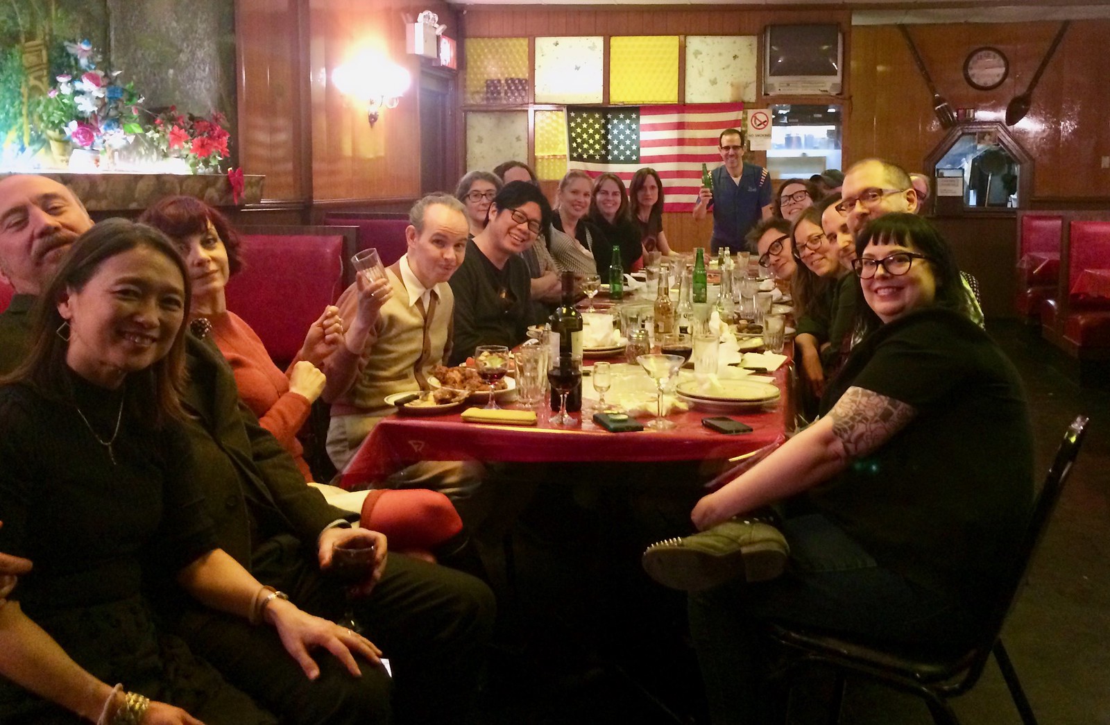
But why settle for one special day when you can stretch it out a bit? My birthday is today, but the place where I wanted to have my party this year isn’t open on Tuesdays, so we had the party last night instead, as more than 20 of my favorite people joined me for pizza and drinks (see above). A birthday eve party, as it were. At some point I looked around the room and realized how incredibly fortunate I am to have all these people in my life, which is a great feeling to have on your birthday (or the night before, or, really, anytime).
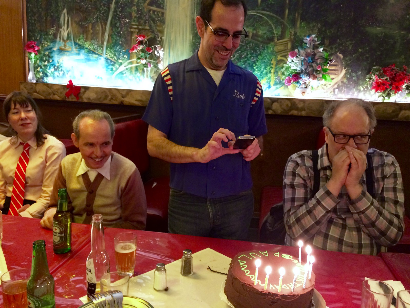
Things got even better when a cake appeared. And not just any cake, but a malted mocha cake, baked by the Tugboat Captain herself. It had five blue candles and three yellow ones, for 53.
The festivities will continue today. One of my best friends has the same birthday as mine (same year, even), and he’s having his party tonight, so I’ll be on board for that one, plus I’m hoping to carve out some time from my workday for some other birthday pursuits. Apologies in advance if I’m not very responsive to emails, tweets, or comments today.
I’m proud to share my birthday with two of the greatest bluesmen who ever lived, pianist Otis Spann and guitarist Son House. Here’s a track by each of them. (The harmonica player on the Spann track is James Cotton, who died last week. RIP.)
Collector’s Corner
By Brinke Guthrie
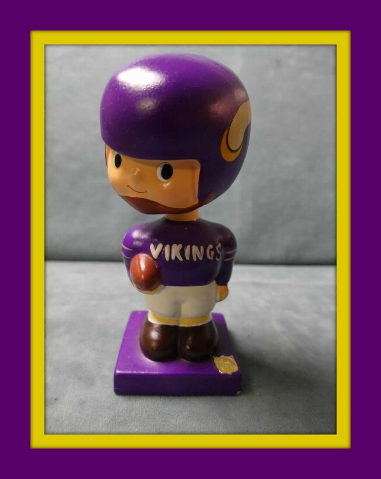
In honor of Paul’s birthday, today we’re leading off with a nice purple Vikings bobblehead from the 1960s. This little guy seems to be in great shape given his age! He’s from Japan with a square base and gold NFL logo on the corner.
Now for the rest of the week:
• Here’s a youth-sized Baltimore Colts three-quarter tee from Sears with some nice bold graphics.
• Got one of these right here — an early-1970s NFL thermal mug. A must for any retro NFL collection.
• Vikes quarterback Fran Tarkenton was “Frantastic” on this 1960s button.
• Falcons fans still might not be over their Super Bowl loss, but they can lick their wounds with a copy of this 1966 inaugural-season media guide.
• Speaking of the Falcons, here’s a 1969 Chase & Sanborn Falcons coffee mug. The seller has several other teams, too.
• Faultless marketed these San Diego Chargers golf balls in the 1970s.
• Here’s a Pat Patriot football-shaped water bottle from the 1970s.
• This 1970s Milwaukee Brewers seat cushion was sponsored by Koss (headphones) and promoted “Major League Baseball In Wisconsin.”
• Really nice-looking 1970s California Angels dugout jacket here. Looks like the classic satin Starter design, but the listing says it’s from Goodman & Sons of L.A.
• Phillies fans will want to add this “Phil” doll to their memorabilia collection.
The Ticker
By Mike Chamernik

Baseball News: The Norfolk Tides will wear a memorial patch for longtime team executive Dave Rosenfield, who died last month (from Phil). … David Ross and his partner wore bedazzled Cubs uniforms last night on Dancing With The Stars (from @ajenkinsCLE). … Majestic is readying a marketing campaign with the slogan “My Team, My Colors” (from Tommy Turner). … Puerto Rico’s WBC players have bonded over their blond hair dye jobs.

Pro Football News: Tom Brady’s missing Super Bowl LI jersey has been recovered. It was allegedly swiped by a member of the international media, who may have also taken Von Miller’s helmet after last year’s Super Bowl. … As you can see in this clip, the 1971 Jets had a jersey that didn’t have the thin green upper sleeve stripe. Also, in 1968, the Saints had inconsistent pants stripes. That screenshot comes from this video (from Chris Rocco). … Back in the late 1980s or early 1990s, the Ottawa Rough Riders held a new logo contest (a little more info here). Will Scheibler says that the design was never worn on the field, however. … The Saskatchewan Roughriders showed off the locker room and player facilities at their new stadium (from Wade Heidt). … Check out this late-’50s Colts/Packers shot. That’s Big Daddy Lipscomb chasing Bart Starr. The Colts’ uniforms have barely changed since then, while the Packers’ have obviously changed a lot (from Pro Football Journal).

Hockey News: The Grand Rapids Griffins will celebrate a ’90s Night on Friday (from Phil). … The Stars wore camo jerseys during warmups last night. … The Flames held a Design A Mask contest. … The Canadiens’ Tomas Plekanec explained why he wears No. 14.

Pro Basketball News: Omri Casspi signed with the Wolves yesterday. He will wear No. 18, his usual number. … New blue plush-back seats will be installed at the Jazz’s arena, replacing green plastic seats (from Jamie Homewood). … New logo and uniforms for the Adelaide 36ers. More info here.

College Hoops News: Lots of college teams are named the Wildcats, but there may be a connection between how Northwestern and Villanova got their names (from Michael Pantano). … New NC State coach Kevin Keatts was presented with an outdated jersey during Sunday’s press conference. The Wolfpack, who wore these red jerseys this year, last wore that style of jersey in 2011 (from Rex Henry).

Soccer News: New navy kit for England (from Conrad Burry). … New uniforms for North Carolina FC of the NASL (from David Grzybowski”).

Grab Bag: FBI director James Comey and NSA director Michael Rogers, testifying before the House Intelligence Committee yesterday, both had nameplate glitches yesterday. Both had an upside-down “W” instead of an “M,” and Rogers had an upside-down “S” (from @ptakers and Chris R.). … New York City is holding a design contest for a new “I Voted” sticker. The previous design was created by a 10-year-old and introduced in 2013. … Washington D.C. replaced the distinctive brown ribbon signs at the entrances of federal buildings (from William F. Yurasko). … Hungary is considering a ban of Heineken’s red star logo, due to the symbol’s association with communist rule in the country. … Women sitting in the Texas Senate Gallery yesterday wore Handmaid’s Tale-style red robes and white bonnets as a sign of opposition to new anti-abortion legislation.
Proofreading:
“Majestic is readying marketing campaign”
Happy birthday, Paul! Did you know that 321 is now the area code for the Space Coast in Florida?
Happy Birthday, buddy!
Happy birthday, Paul!
I second that! Happy Birthday and make it a great day!
Happy Birthday Paul!!!
Happy birthday, Paul! Brinke, you sneaky bastard… XD
Re: the Griffin’s 90s night… if those are the jerseys they plan on wearing, then what the hell? Those don’t look like 90s jerseys at all, they look more like 50s or 60s fauxbacks! Not that that’s bad in and of itself, but if you’re celebrating the 90s, why not wear a 90s jersey? Y’know, like your link?
Those jerseys are one of the winners of the UniWatch redesign contest. Really odd to be pairing that with a 90’s theme night.
The jerseys they are wearing were actually part of the UniWatch design contest that took place all the way back in August. While I agree a 90s era jersey or 90s themed uni would make sense, I love seeing something UniWatch-related in the public eye.
I remember the contest now… still, bizarre to pair that jersey up with that type of promotion.
Could not disagree more about Toro Rosso; their new livery is a huge upgrade: it’s simpler, cleaner, and as Omar mentioned, is finally clearly distinct from Red Bull.
100% agree that it’s a massive upgrade.
Seems like the general consensus here. Though I didn’t like that the Toro Rosso looked like the RBR for years, I did find their car design as really good looking car. I loved those red and gold accents which, in my opinion, made it look better than the RBR.
I welcome that now it is easy to differentiate one from the other, but I don’t like the new livery. Maybe it is the silver, maybe the big red blocks that seem randomly painted, not sure what exactly isn’t clicking.
Funny thing, if you notice, I tried to avoid evaluating the cars or commenting, but somehow, the “the car looks awful” line went undetected in my final draft.
*sees the self-inflicted apostrophe catastrophe above and facepalms*
Anyway… regarding those nameplates… with those plastic letters, I can understand if you run out of the plastic Ms and need a substitute quickly, but the upside-down S is just inexcusable.
I am amazed that people don’t see (or maybe care about) that stuff. Arrrggghh!
Happy birthday, Paul!
“father taught me how his birthday, Jan. 23, reduced to “one-two-three,” while mine, March 21, was “three-two-one.” I always loved how our birthdays bookended each other like that. It seemed extra-birthday-special”
It doesn’t involve me personally, but my sister’s bday is August 16, my father is August 17, and my daughter was born on August 18 and I love how we have a little “trilogy” of birthdays in our family-and I can knock out 3 birds with one stone in terms of getting gifts, etc.
Happy Birthday Paul. Here’s a past column by the great Mitch Albom that’s perfect for birthdays. link
Happy Birthday, “Bob.”
Happy Birthday, Paul!
Interesting birthday numbering in my family:
My Dad’s birthday is August 5, my Mom’s is July 6, and I’m June 7. So the months go “6-7-8” and the days go “7-6-5”.
My little sister would have had to have been born on May 8 or September 4 to keep it going. Alas, she arrived on April 22. Just missed it by a couple weeks!
Happy birthday!
I always enjoy hearing about different traditions people have for celebrating birthdays. Unlike many major holidays, which all seem to be moving to homogeneous, idealized versions of themselves, every person or family seems to have a different way of making birthdays special.
The author of that Villanova-Northwestern post buried the lead* in the final paragraph. She or he wants the Villanova teams to be called the Hippos. Hippos!
*I don’t believe in the word “lede.”
Well, it’d be more original than “Wildcats”.
Given the choices from that article, I say stick with Wildcats.
If you’re going to change after this many years you need a stellar alternative, and those, while thoughtful, were far from stellar.
Happy Birthday Paul!
Happy Birthday Paul!
birthday stuff…
My wife has 5 brothers and sisters. None or them, nor her mom and dad were born in the same month, and none in Dec. Feb. May or June (Xmas, Valentine, Mother’s day, Father’s day).
So at least one somebody was getting a gift every month of the year
Many happy returns, Paul!
I’m always thrilled to see vintage Atlanta Falcons ephemera. The “Puffa Puffa Rice” lettering they used to use makes my day!
Happy birthday Paul. I hope you have an excellent day with lots of rain.
Thanks for letting me contribute to your great site.
Thank YOU for filling us in on a sport that I’m not knowledgeable enough to cover myself. Great job!
Happy Birthday Paul. You also share a birthday with Tommy Davis, a solid hitter who was born in Brooklyn and played for many MLB teams in the 60s and 70s. Enjoy your day.
Happy Birthday, Paul. Enjoy your day!
Happy birthday, Paul.
The Premier League is updating the font for numbers and names next year. Nothing spectacular, kind of boring, IMO, but could be much worse.
link
Happy birfdee Paul.
May you have many more anniversaries of the day you were born!
Thanks Will for interesting bit about the Ottawa Rough Riders logo contest. I had seen that photo before and had no idea what it was about. Good thing that design never made the field.
The Eastern Riders did end up changing their logo shortly after that in 1992 when new ownership took control of the team. The classic single “R” was replaced by a flaming double “R”. The look not really bad, but questionable to some fans as to how well this served the traditional brand of the club. This look lasted 2 seasons.
Notable about this uniform was lack of a white jersey. The road light jersey was silver.
link
Nice.
The woman on the right in the original photo is Joanne Polak. The first and to my knowledge still the only woman to be named general manager of a pro sports team.
Frankly I’d forgotten about the double-flaming R logo. Maybe my memory is overwhelmed by the shitty cossack logo and the bizarre colour change that followed before the team mercifully folded.
link
Those are uniforms that deserved to die.
A buddy of mine was a junior sportswriter for the Ottawa Sun through the 1990s. Between covering the slow demise of the Rough Riders and the growing pains of the really bad Senators, it was a really tough gig.
Oh yes – the log driver with the spear sticking through his neck. Hated that colour change. They did switch back to the black and red with the cossack logo for that last season in 1996.
link
Another interesting oddity about Ottawa Rough Riders uniforms from 1989-93. Each and every player had their first initial in front of their last name on the nameplate. Normally, this is just done when you have teammates that share the same last name.
More recently we have Catherine Raiche as an assistant GM with the Alouettes:
link
I emailed the writer of the Ottawa Citizen article – we’ll see if he gets back to me or not with more information on the old contest.
Although I don’t see it at first glance when I look at it now, when I first saw the “cossack logo” what was supposed to be a human head looked to me like some weird form of a beaver head. It’s eyes where the cheekbones are, eyeballs where the eyes are, whiskers for the mustache and teeth where the chin is. Have to squint just right and concentrate to see it now.
Happy birthday Paul!
Happy Birthday Paul!
Happy Birthday!!!
Omar, the Torro Rosso look is among the best liveries of my lifetime (as far as I’m concerned). My jaw actually dropped when I saw it for the first time. I’m surprised you think it’s such a downgrade from their previous look, which was so obviously derivative.
But hey, if all of us agreed all the time, this wouldn’t be half as fun.
I really loved the old look even though I hated how close to RBR it looked.
Seems like everybody love the new livery here.
“Washington D.C. replaced the distinctive brown ribbon signs at the entrances of federal buildings”
Correction: The federal government is replacing the signs.
It’s a shame; the originals were distinctive. On many of the new ones with a long street name, the signs aren’t wide enough, and the name runs nearly to the right edge. Hurts my eyes every time I see one.
And by “more informative,” the GAO flack in the article really means, “so cluttered with type as to obscure all the information supposedly being presented.” The brown ribbons had their flaws, but their simple presentation made them anachronistically perfect for a twenty-first-century society in which the vast majority of citizens approach federal buildings with a geo-locating computer in their pockets. And the form of the brown ribbon made federal buildings distinct from other buildings, which is important in DC, as public and private buildings are mixed in jumbled checkerboard of block development. The new signs communicate federal vs non-federal identity much less clearly. I know of a restaurant downtown that’s had a sign for years very similar to the new federal monoliths out front with its name and menu posted. It’s bad design when an out-of-town visitor cannot distinguish at a glance between a federal building and a yuppie happy-hour joint.
from the story…. :
“And now they are gone, replaced by signs that are smaller but, I’m told, more informative.”
read, easier to print/make.
Happy B-day, Paul. If you don’t get rain today, beer is always a good substitute!
Happy Birthday, Paul. Enjoy your day! Make it special.
Happy B-day, Mr. Lukas! Don’t worry, it’s raining cats and dogs in LA. You still got your birthday rain, it’s just on the other side of the country!
Happy Birthday whipper-snapper!
Many happy returns of the day.
Happy birthday Paul! Enjoy your new age!
Happy Birthday Paul! Good to hear you’re still celebrating today; enjoy yourself!
Gold stipes for Sauber’s 25th anniversary…. why not silver?