St. Paddy’s Day came a bit early last night in New Jersey, as the Devils held to their annual tradition of wearing their green-trimmed throwbacks for the holiday. Lots of additional photos here.
The Devils aren’t the only NHL team to have celebrated the holiday a bit early (although they’re the only one to have done with their game uniforms). Several teams have worn green jerseys for pregame warm-ups over the past week:
The @NHLBlackhawks donned green St. Patrick’s Day jerseys in pre-game warmup at United Center. #MINvsCHI pic.twitter.com/D3RGpoR2iK
— NHL Public Relations (@PR_NHL) March 12, 2017
Only home game on St. Patrick's Day week? We celebrate early! ðŸ€ðŸ»ðŸ€
🎟- https://t.co/2QTDzYI4W1#WPGvsNSH pic.twitter.com/W0ounKBFYr
— Nashville Predators (@PredsNHL) March 13, 2017
#NHLBruins wearing their St. Patrick's Day green jerseys for warmups. 🀠pic.twitter.com/dbgsBZWI7a
— Boston Bruins (@NHLBruins) March 11, 2017
The holiday will be extended by a day in Toronto, where the Maple Leafs will wear Toronto St. Patricks throwbacks for Saturday night’s game against the Blackhawks:
The @MapleLeafs will pay tribute to one of the earliest eras of the club’s history by wearing St. Pats uniforms on March 18. #TMLtalk pic.twitter.com/2gpyUjhlj5
— Leafs PR (@LeafsPR) February 21, 2017
There’ll be a lot more green today, and not just on the ice. On the hardcourt, the Celtics and Bulls will both wear their St. Paddy’s Day uniforms. And on the baseball diamond, lots of teams will be wearing green caps (like the Pirates) and green jerseys (like the Royals).
But the most interesting bit of holiday accessorizing may have come from White House budget director Nick Mulvaney. If you watch the video clip below and click on the full-screen button, you’ll see that he appeared to have a pocket full of shamrocks — like, real shamrocks, plucked from the earth, not just plastic representations — during a press briefing yesterday
OMB Director on Pres. Trump's hopes for budget: "More money for defense, more money for border enforcement, more money for law enforcement." pic.twitter.com/h2Ci5JaS8X
— ABC News (@ABC) March 16, 2017
As for me, green has been my favorite color since I was a little kid, so there’s always lots of green here at Uni Watch HQ — green sofa, green sheets on the bed, green towels in the bathroom, green wall tiles in the kitchen, lots of green clothing, and a green car parked outside. Enjoy the holiday, and I’ll see you next week.
(Big thanks to our own Alex Hider for spotting the shamrocks in Mulvaney’s pocket.)
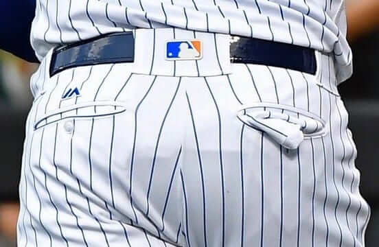
New ESPN column: Between assorted makers’ marks and the many iterations of the MLB logo (including the Majestic and MLB logos on the pants, as shown above), today’s ballplayers are wearing more logos than ever before. My latest ESPN examines how these logos have spread across the uniform over the past generation, and assesses which ones are relatively harmless and which are more odious. Check it out here.
Please do a rain dance for me: For one of my early birthdays ”” I think when I turned 8 or 9 ”” we had some sort of outdoor activity planned. But it rained, and I was inconsolable. My father, thinking quickly, made up a very sweet lie: “Don’t you know? Rain on your birthday is a sign of good luck in the year ahead.”
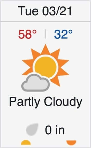
Since then, it has rained, snowed, hailed, or otherwise precipitated every single year on my birthday (which, when you think about it, isn’t so surprising when your birthday is March 21 and you’ve always lived in New York State). It’s something I’ve come to look forward to ”” my annual sign of good luck, and a nice reminder of my father.
As you can see at right, it appears that the streak may be broken this year. Makes me worry about what lies ahead for the next 12 months.
The Ticker
By Paul

Baseball News: Myrtle Beach High in S.C. uses the Brewers’ “mb” logo. … We’ve already seen the Mariners’ 40th-anniversary sleeve patch. Turns out they’ll also be marking the anniversary on their caps (from Ben Matukewicz). … Here’s a good team portrait of the Reds’ winter basketball team from the 1970s. … UCF’s outdoor party deck, which is not within the confines of the ballpark, bans non-Coke beverages. Douchebags (from @intheballparks). … Baseball and barbecue: The Charlotte Knights will become the Pitmasters for one night in July (from James Gilbert and David Perlberg). … Here’s a look back at the Brewers’ 1994 makeover, which was designed by longtime Uni Watch pal Todd Radom (from Nick Postorino). … Speaking of Todd, SportsLogos.net has posted an excellent article about his White Sox season ticket project. Recommended. … Awesome shot of Braves great Eddie Mathews and his young son both wearing No. 41 uniforms. I like the piping on the back pocket flaps, too. When were flap pockets replaced by welt pockets on baseball pants? (Photo from BSmile.) … Tigers 3B Nick Castellanos has his son’s name on his glove. … In addition to his much-publicized neon compression sleeve, Mets OF Yoenis Céspedes likes to wear a neon necklace with a “52” pendant. The Mets are featuring that accessory on a giveaway T-shirt this season.

NFL News: In the past, RB Latavius Murray has worn No. 28 in honor of Fred Taylor. But he just signed with the Vikings, so he’ll change numbers out of respect for Adrian Peterson, who wore 28 for the Vikes (thanks, Mike).

Hockey News: Check it out: Teemu Selanne wearing a Jets uni with a red helmet. “A bit of googling brought up this fascinating message board thread that seems to tell pretty much the whole story,” says Daniel Estabrooks. … During a recent Flyers game, Wayne Simmonds scored two goals and appeared to score a third, prompting fans who thought he’d scored a hat trick to throw nearly 400 caps onto the ice. But the goal had actually been scored by teammate Jakub Voracek. In a very cool move, Voracek has now purchased the same number of caps and donated them to a children’s hospital (from Tris Wykes). … The Oakley logo from Islanders C Anders Lee’s visor fell off and lodged on his jersey (from David Blum).

NBA News: The Knicks wore their blue “Nueava York” unis at home last night, with the visiting Nets wearing white on the road (from Zach Loesl). … Also from Zach: The Raptor and Thunder went black-vs.-blue in Toronto.

College and High School Hoops News: Back in 2013 I ran an entry about reader Nic Schultz’s interesting NCAA bracket, which he used to track his family’s picks. Here’s this year’s version. … Sign of the times: The NCAA tourney started out with a color-on-color game — Notre Dame and Princeton (from Andrew Cosentino). … Who’s that in the old Creighton uni? None other than future baseball legend Bob Gibson (from BSmile). … Ah, March Madness — so much fun (from Jerry Nitzh). … A ref barred a Maryland high school student from playing in her team’s regional final because the student, who’s a Muslim, was wearing a hijab (from James Gilbert). … Bucknell wore sleeves yesterday. … Here’s a short video clip showing the NCAA patches being applied to Wisconsin’s jerseys (from Blake Geschke). … Dalton State is an NAIA school in Georgia. Their team is called the Roadrunners. Check out their awesome NOB (from Kevin Rieger). … Nevada, playing in the NCAA tourney for the first time in a decade, wore their “Battle Born” alts (from Damon Hirschensohn).

Soccer News: Whoa, check out these old tobacco trading cards featuring British soccer mascots (at least one of which is rather unfortunate). They’re part of a set recently digitized by the NY Public Library (from Steve Andersen). … Vfl Wolfsburg will celebrate the 20th anniversary of being promoted to the Bundesliga by wearing a special kit against Darmstadt this weekend (from Anthony Zydzik).

Grab Bag: New charity jersey for Bath Rugby. “This one-off shirt replaces the club badge but not the club’s main advertiser — shows what’s more important,” says @Stumpy7780. … Interesting video report on what happens when two countries have the same flag design (from Will Shoken). … Here’s a pretty cool map of America comprised of regionally appropriate team logos. Yes, you could quibble with a few of the logo placements, but it’s still a pretty good job (map by Dan Boyer, brought to my attention by Andrew Greenblatt). … Brutal rugby kit clash in a NRL match, as the Panthers and Tigers wore nearly identical black/white gradient jerseys (from @fbjim_).
“Additionally, t-shirts with the iconic Pitmasters logo are available for pre-order at $20.”
And there we have it. A throwaway identity that was introduced less than 24 hours ago is now “iconic”.
Wow, looking at the Blackhawks photo, almost every fan seems to have a Blackhawk jersey on. Red clearly is the dominant choice, no doubt because that’s what they wear at home, but would agree with Paul, the white one pops more. Are jersey wearing fans more devoted and likely to show up earlier for games?
I’m going to my one and only Leafs game on Saturday, and was hoping to see the Hawks white jersey (their opponent) only to have those hopes dashed by the Leafs St Patty’s uniform.
The “United State of Sports” logo map is pretty cool … except for the Canadian logos. Why?
If you’re gonna include them, then call it “North America sports” or something.
They could also try including all of the states. Hawaii and Alaska always seem to get ignored.
A former girlfriend of mine grew up in Alaska. This was her (very legitimate) complaint about so many maps!
Their logos are there, even if their corresponding maps are not.
In keeping with the spirit of St. Patrick’s Day themed uniforms, a shout out to a team that wears a St. Patrick’s Day style uniform for every game they play. Top of the mornin’ to the Western Canadian senior lacrosse powerhouse Victoria Shamrocks for their green threads:
link
Looks like the Knicks’ blue jerseys at home last night were the “Nueva York” alts.
The “British soccer mascots” are just an artist’s interpretation of each of the teams.
Just?
I think he means that they’re not something teams themselves actually used.
not representative of a name or image that the team uses.
Today’s ESPN piece is up:
link
Kinda ironic. As you pointed out, younger fans see the logos and whatnot as signs of authenticity, but by putting the New Era logo on the MLB gamer caps, they’ve been relegated to looking just like every other NE cap, from gamer down to snapback.
Kudos for not referring to the back belt loop logo as the “tramp stamp” logo. BTW: it also screws up the looping patterns of a few teams, like Detroit, who now have a big dopey back belt loop instead of two elegant ones.
SB
One problem with the NE logo on the left side, as we’ve seen in the WBC, is that flag patches will have too go on the right side, and so will often be “reverse” flags.
Any manufacturer’s logo, be it Stance, Majestic, or Rawlings, is “odious.” If you want to argue that some are more odious than others, you can, but they’re all odious.
That statement from Stance is a dougebaggary all-timer: “Our logo is a circle so it’s classy. If it was a triangle or square or God-forbid, a trapezoid or something then maybe. But it’s a circle and fans don’t mind that.”
Right? if you really cared about how offensive your logo was, you wouldn’t put it in the most disruptive location on the product. The quote should read, “We understand that some people don’t like gaudy logos, so this is the best option we could muster without compromising our own interests. Buy our socks.”
If you have to make your product uglier and/or less desirable to “get your money’s worth” out of an advertising deal, maybe the deal wasn’t worth it to begin with.
Kinda notable, though, that generally the more recent innovations are received less positively. I think there has to be an aspect where these things simply become par for the course over time, unfortunately.
At the risk of attracting spitballs from all sides, I’m rather a fan of the Brewers’ 1998-99 “M” caps. Their current caps leave me cold, and the ball-in-glove logo’s just too big for the front of a cap. (Besides, something about lowercase letters in MLB scream “minor league” and “1970s” to me).
How do you think I feel? I prefer their early ’70s hats.
The Brewers evolved/tweaked the 1994 uniforms into my favorite Milwaukee unis by the end. The white M worked nicely with the excellent script (excellent once they got rid of the oversize first and last letters), echoed the old Braves block M caps, and broke from the team’s unfortunate use of an MB monogram. The colors were always a bit too dark, but otherwise the final iteration of the 1994 unis are my favorite regular Brewers set.
I always liked the way the color pattern of the Devils’ green-trimmed sweater was reversed on the waist from the order on the sleeves and stockings; good attention to detail. But one of these days I’d like to see the white uniforms.
What? No circle-R or TM on the UCF “Coke products only” sign.
Technically, I believe Diet Coke is the only Coca Cola product with the word “Coke” on it. So I guess only Diet Coke is allowed, right?
Coke Zero?
You’ve had a bumpy couple years. Maybe no rain is actually a good thing.
How come rainy days and Rick Monday always get me down?
“Rain makes corn
Corn makes whiskey
Whiskey makes my baby
Feel a little frisky”
…sounds as if the song is right and rain *is* a good thing…hope you get some, Paul.
link
A “Rain Dance” from your neighbours to the north:
link
I’m curious when professional teams started this wearing of the green on St Patrick’s Day? I’m wondering if the Dodgers were the first to do it? I remember as a kid, I’m 59, that the Dodgers would wear green caps in spring training during St Patrick’s Day. Maybe the uniform also had green, but I think it was only the cap. Walter O’Malley owned the team, and being Irish he had the team wear the green caps.
Here you go:
link
Thanks. I still wonder if the Dodgers wore the green caps before the Reds went all green in 1978. The only reference I could find was Bill Plaschke of the LA Times mentioning “the long tradition of wearing green caps on St Patrick’s day”. Amazing how before the internet these things aren’t that easy to reference.
Just went to link and current status is “site not found”.
Just wrote to them and hope to get a quick response.
Anyone know anything about this? Hopefully it’s just for updates and not permanently removed.
My copy of ‘Baseball Uniforms of The 20th Century’ only goes through 1990 season. Grrrr.
Huh — I was using it as recently as yesterday.
I’ve notified my people at the Hall. Hope to have it sorted out soon.
— P.
Thanks for contacting them. I know they know who you are (as opposed to some random person like me) so I’m sure your email will get some quick attention.
Fingers crossed it’s only temporary.
I love what Nic Schultz does with his family’s NCAA picks, and I wish I had the talent to do something similar. Instead I will be small-minded and mention that he got Dayton’s colors wrong.
The first time I saw the “United States of Sports Logos”, some time ago, UNLV was in Reno and the Wolf Pack logo was in Vegas. Now, they’ve dropped the UNR Wolfpack and put in the Golden Knight hockey team logo. UNLV is still in Reno. I am not pleased, especially since the Boise State logo is so large.
I just realized that the Brewers’ 98-99 alternate logo “very familiar” to the Milwaukee Bucks alternate logo.
Brewers: link
Bucks: link
Minor fix from the ticker. The ‘mb’ Brewers logo is being used by North Myrtle Beach high school. Myrtle Beach high school uses a variation of the Myrtle Beach Pelicans minor league team
I was watching the start of the Marquette/South Carolina game tonight and noticed right before the jump, a referee pointed and instructed a SC player to roll his waistband back to normal. I wish others would do the same. I see that rolled back waistband way too much, especially during our Wisconsin state girls & boys BB tournament. It just looks bad.
Shouldn’t the abbreviation for St Patrick’s Day be St Pattys not St Paddys? That makes me think we are celebrating someone named Paddington. Just curious.
Hey NFL, color at home, white away.