[Editor’s Note: Paul is on vacation. Today we have a guest entry from David Versel. He’s written for Uni Watch before, about his childhood uniform drawings. Today he’s taking a close look at a uniform that many of you may have forgotten about.]
By David Versel
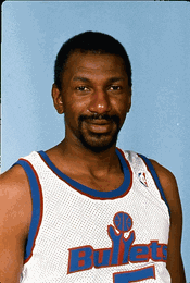
I am a lifelong fan of the Washington Bullets/Wizards franchise, and I’m also a longtime uniform enthusiast. Those two passions collided in 1987, when the Bullets debuted a new uniform design on the season’s opening night.
The team’s iconic red-and-white striped motif, which they had worn since moving into the Capital Centre in the mid-1970s, was gone. In its place was an unfamiliar design:
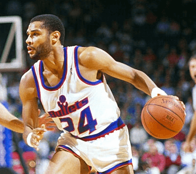
The the team’s name on the front of the jersey was all but illegible, thanks to that red background on the blue lettering. But things got even worse when I saw the backs of the jerseys. The players’ names were in italics (strike one), with the first letter capitalized and all other letters in lowercase (strike two), and rendered in that same blue-on-red color scheme (strike three — click to enlarge):
In those days, there was no fanfare about uniform changes ”” the team simply came out onto the floor in their new duds (and, boy were these duds). So I was unprepared for the sheer horror of watching my team wearing these embarrassing costumes. That very night, the 13-year-old me went to my room and drew up a new uniform set for the team, which dropped in the mail the next day along with an angry missive about the new look. Unfortunately, I didn’t keep a copy of my design.
The team’s road unis that year weren’t much better, although at least they were sort of legible.
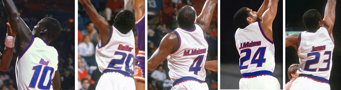
This uniform only lasted one year. The next season the team took away the red trim and lowercase NOB lettering but kept the silly italics. A couple of years later the italics went away and were replaced with standard block numbering and lettering — boring, but not embarrassing, which I guess was progress.
This tiny blip in the Bullets’ uniform history has essentially been forgotten. A recent review of the Bullets/Wizards uniform history showed the later, cleaned-up version of this set but failed to included any mention the awful first iteration of it from 1987-88. Maybe it was the team’s uninspiring performance, or the fact that its best known players (Moses Malone and Bernard King) tend to be associated with other teams, or that this team is mostly noted for featuring the tallest and shortest players in the sport’s history on the same roster.
Either way, these dreadful uniforms left a deep impression on me personally, and I felt obligated to drag them back into the spotlight, even if only for a day.
Rams Uni Update
By Alex Hider
The votes are in, and the Rams finally have a full uniform ready to go for the 2017 season:
As you can see, fans decisively voted for a white facemasks over navy. While many fans clamored for LA to bring back the gray facemasks the team wore during their Color Rash game with the Seahawks, the NFL put the kibosh on that plan.
For those who asked, the reason gray is not an option for Rams' face mask is because it isn't part of their NFL-designated "color palette."
— Alden Gonzalez (@Alden_Gonzalez) March 2, 2017
Not sure why this rule doesn’t apply to teams like the Bills and Cardinals, but I digress.
A quick perusal through the Gridiron Uniform Database confirms that 2017 will mark the first time in team history that the Rams will sport white facemasks. They wore gray up until 1980, and have used blue ever since.
In a much more narrow vote, fans picked wide single-striped pants over double-striped pants. As Paul pointed out on Tuesday, the Rams will avoid looking too much like the Colts below the waist. The solid navy-blue topped socks will remain unchanged.
The helmet looks great, but the lack of gold accents on the pants really makes the gold trim on jersey stand out more.
â„ï¸â„ï¸â„ï¸ pic.twitter.com/bpSUALjNYf
— Los Angeles Rams (@RamsNFL) March 3, 2017
The Rams plan on wearing the white jersey at home this season, so there are no shots of the new elements paired with the blue jersey. But the Rams would presumably have to break out the blues at least once this season, as a trip to Dallas looms on the schedule. Let’s just hope they wear their royal-and-yellow throwbacks that day.
LAST CALL for the Todd Radom T-shirt: Today is the final day to order our latest T-shirt, designed by the great Todd Radom. Check it out (click to enlarge):
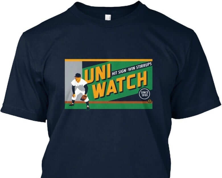
The design takes inspiration from the old Abe Stark sign at Ebbets Field, which read, “Hit Sign, Win Suit.” Please note that we’re using the shirt fabric color to fill in the dark portions of the design — the outfielder’s cap, sleeves, stirrups, and shoes, and also the dark part of the sign behind him. We think it looks best on Teespring’s dark navy shirt, which is the version shown above. But you can also order the shirt in black (yes, go ahead and make all your BFBS jokes), in which case the design will look like this:
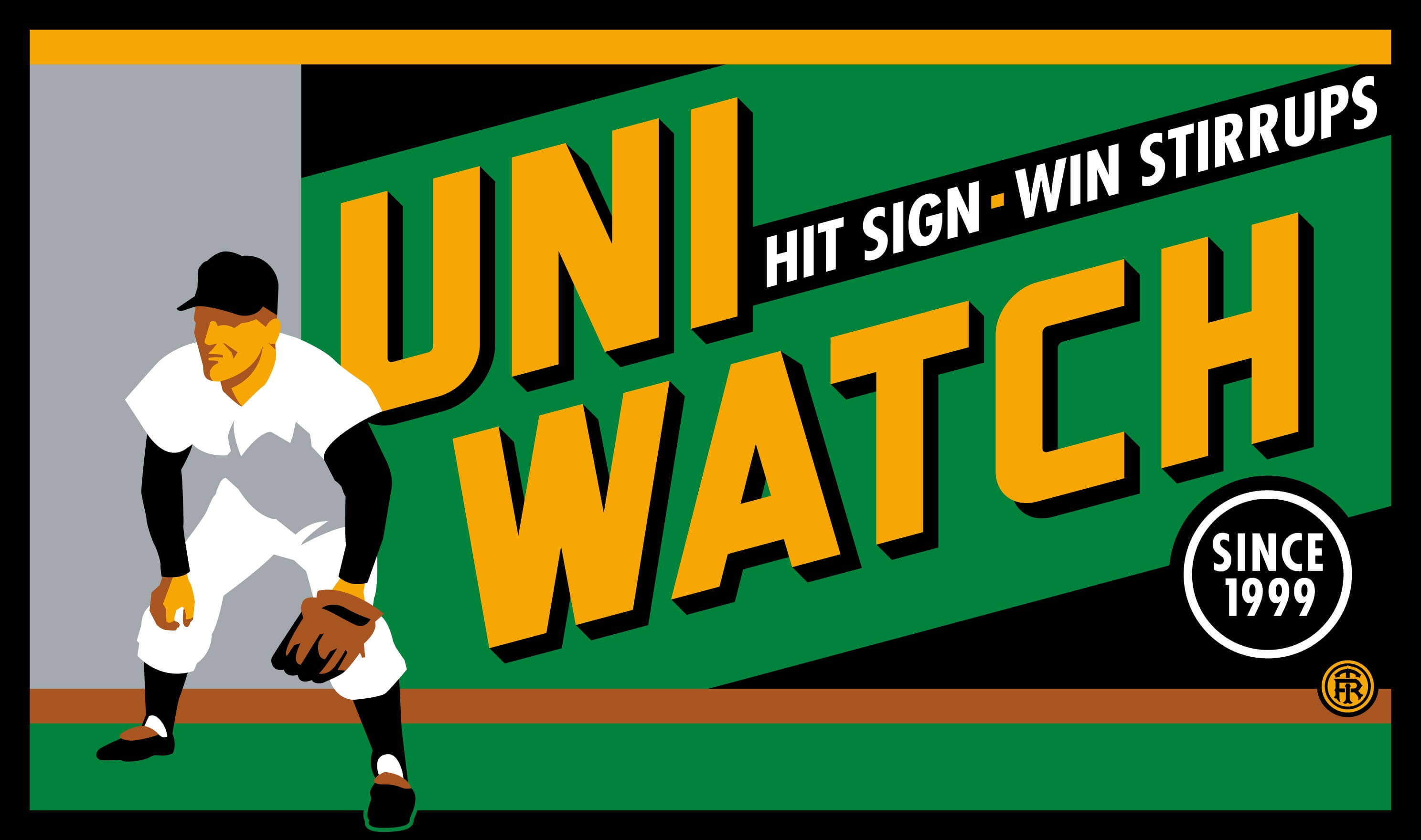
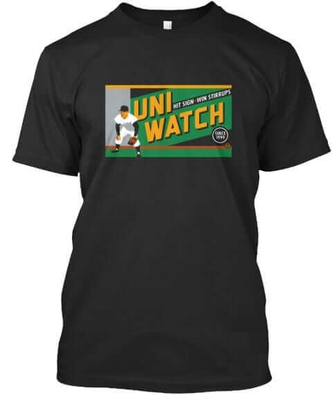
There’s also an American Apparel short-sleeved version and a long-sleeved version, both of which come in a slightly lighter shade of navy. You’ll be able to see all of this on the ordering page. Just make sure you choose the shirt and color you like best.
The shirt is available here through 11pm Eastern tonight. My thanks, as always, for your consideration.
Sorry, no Ticker today. Phil will have his usual weekend content on Saturday and Sunday, and we’ll get back to our regular lede/Ticker weekday format on Monday. Have a great weekend.
No ticker? Nooooooo. I stay up till midnight every night here in Aus to read it. Damn you all to hell.
But nah, first ever comment, So wanna say love your work Phil’s. :)
Paul***
Just glad to see the Rams fixed their collar and got rid of the toilet seat look.
Now if only the Saints will do the same thing. Bad enough the Saints don’t have a clue on how to rebuild their roster. Being the only team with the neck roll would only make matters worse. I need some hope.
From the looks of things with the white horn Rams promo pics, I’m under the assumption that most teams -if not all- will move to the Vapor Untouchable 2 template for 2017. At least, one can hope (please end the neck fauxll, Saints)
Wait… HOLY SHIT THEY FIXED THE COLLAR!
Now, if they could only do that on their throwback…
I agree with Alex on the “gold standing out more” on the Rams’ jerseys more because of the absence of it elsewhere. That being said, I love what LAR is doing otherwise. Some say the blue and white palette is “bland”, I think it is bold.
It doesn’t look as bad as I thought it would.
To me, it looks worse than I could have ever imagined.
Lee
No ticker?!! BUMMER!! This is my “go to” site first thing in the am at work.
I echo this statement – not to criticize the Ticker’s absence today, but to let everyone involved in putting it together day after day just how much I value their work!
Not a huge fan of what the Rams are doing here. The white horns on the helmet clash with the gold horns on the sleeve logos; I don’t like the white facemask with this helmet (though it may grow on me once I see it on the field, like the horns are connected to something), and the gold trim on the jerseys looks out of place by itself. It just looks like a mashup of at least two different uniforms.
I know everyone wants a return to the Anaheim-era design, which would be fine, and maybe they still will.
“It just looks like a mashup of at least two different uniforms.” Agreed. I also agree with diggerjohn’s comment above about straightforward blue and white being bold. It’s clean and classic.
I think they understand that this look isn’t optimal. They’ve described it as a slowly evolving uniform. In practice, though, I would have rather seen them just make the navy and gold uniform better for these last few seasons by using a nice set of pants with it rather than changing one piece at a time and going through two seasons with a terrible look.
Like that Bullets uniform, Washington’s hockey team was also noted for unusual lettering on a nameplate. Remember the first rendition of the third black jersey of the Capitals back in the late ’90s?
link
Loved that! Dare to be different! It’s too bad hardly anybody does VAL anymore. You’d think computers would make it a breeze, but I digress…
Gold on the jersey but nowhere else on the uniform.
That’s just dumb. If you eliminate a color, ELIMINATE IT. Sheesh.
Gee, Dave, you were pretty harsh on those Bullets’ uniforms. I rather liked them; everybody needed a breather from uniforms that looked like flags (which have since become fashionable again). The devil for me was in the details; the red outline needed to be trimmed a lot closer to the blue tackle twill, to match the numerals. I am always on board for unique treatment of player names. Two of my favorites were the ABA Memphis Sounds and the 1973 Baltimore Bullets.
I dunno… the blue on red is pretty terrible. Hard to read, especially in an era of (sub) standard-def TV.
I didn’t need a breather from the stars & stripes unis. They should still be wearing them!
That being said, I was surprisingly un-upset when the Bullets made the switch. The red roads helped, I suppose. The first homes were indeed bad with the blue on red lettering but I liked the second year look. The italics gave a little oomph to an otherwise plain jersey.
Probably the reason I have fond memories of them is that’s when the Bullets replaced the Sixers as my (then) favorite team. Dr. J was gone and Moses Malone was already with Washington, plus they had Manute Bol and Bermard King. I even bought a red & blue miniature Bullets basketball to consummate my new fandom.
I agree. As a guy who became a fan of this team around the tail end of the Bullets era, I thought these unis were clean, albeit a little boring. The iconic Bullets wordmark was well done. The home unis coulda used more trim (they looks like pajamas) but this wasn’t a bad look.
I wouldn’t be shocked if these unis show up a throwbacks sometime soon.
link
This tweet got me thinking, that maybe the Rams still plan to go royal blue-yellow in 2019.
Since they wanted to wear those colors now and were denied by the league, maybe the current navy-white look really only is the next best thing to A) get rid of as much gold as possible (St. Louis color) and B) pay hommage to a different era of the LA Rams.
I’m with others, gold on the Rams jersey just seems off since it’s nowhere else on the uniform or even the branding (i’m assuming the wordmark and twitter are the offical ones and they’re just blue and white). Just looks half-baked now
I agree. The Rams uni looks completely disjointed with just splashes of gold on only the jersey. They should have waited and redesigned the entire uniform when the new stadium opens.
The Cardinals probably have a grandfather clause allowing them to wear gray face masks, since they never changed the color of the face masks in the first place.
The Bills are a thornier question, since they switched to blue masks in ’77.
Those Bullets jerseys remind me of the original Winnipeg Jets WHA uniforms – blue inside red lettered logo, no contrast
link
At least those letters were large enough to be able to reasonably make them out.
Guys, did anyone else realize the matte navy on the helmets? Is that what the Rams will be wearing next year?
*Color Rash*
The ESPN article on the Rams’ changes says the team was allowed to change the helmets and pants, just not the jerseys by rule until the “rebranding” takes place. So, teams can change everything but the jerseys on the fly? Didn’t think that was the case.
We’ve actually known teams can change pants for a while now… see Washington switching to yellow or the Ravens’ one-game gold pants from a couple years ago. It does seem really effed up to allow a helmet change but not a jersey change… but it is still the same shell color, so…?
The NFL is stupid.
It’s simple. The NFL and Nike sell jerseys to the public fandom. They don’t really sell helmets or pants.
But they do sell lots and lots and lots of various items that have team helmets printed on them.
Clicking back to the May 2009 piece on David Versal’s youthful animation efforts, scroll down. I wonder if the Robert Marshall Old School Bobblehead store is still in business? 😀
Well, at least you can still put the Rams in a good uniform in Madden.
Hooooly crap, the Rams are going to look awful in 2017 (and 2018?).
Holy crap.
But thanks for the mock-ups to show us exactly how awful.
Lee
I just don’t get this. Sure, the Rams are going to look not-exactly-perfect. But awful? Like, historically ugly? Is there anyone who would rather spend three hours looking at, say, Jacksonville or Tampa Bay or any NFL team from Ohio than the 2017-18 Rams? I get it that the tiny hints of gold on the jersey will stand out a bit, having no echo elsewhere on the uniform. But the gold will still be nigh-invisible. Gold for the Rams has become a tiny, barely present accent color. Not the direction I’d have taken the team – and not, apparently, the direction the team wanted to go between now and 2019 – but the Rams are not going to look any worse than any other team with slightly off-kilter design details, like the Saints or the Vikings.
The Rams’ new getup reminds me of how the KC Chiefs have long had a helmet that didn’t match the rest of the uniform (black on the helmet but no yellow) and nobody seems to mind.
The all-white Rams look pretty good – the minor amount of gold trim isn’t that big a deal. Now, if they have to wear the blue/gold jersey at any point, THAT will look awful.
I would rather see the NBA Washington team wear hanes tshirts with BULLETS written in sharpie then anything with the word WIZARDS. It is still such an insult to think changing the name would help with murder and gun violence.
As much as i would prefer rams going to cheddar yellow, at least they are getting rid of the shytty gold colors.
PS I would prefer grey facemasks to blue or white but whatever.
It is indeed ironic that most teams, when they change nicknames, do so to better reflect their local city/culture.
The Bullets changed theirs because their nickname too accurately reflected their locale.
I think everyone knows the name change was about merchandising, not gun violence. The sham of a “contest” with renaming the squad (you could only vote at Boston Market!) was just cover for the focus grouped alliteration they’d already chosen. Bear in mind this was around the same time that expansion teams with zippier names (Raptors, Hornets, Grizzlies) was in vogue. Abe just made a money move, and Leonsis is too cautious about PC backlash to fix it.
I hate the team name, and find it hypocritical that the franchise still sells plenty of Bullets merch and even has throwback nights when they refer to the squad as the Bullets. If the name’s so awful and inspires violence, shouldn’t it be banished altogether? Leonsis wants to have it both ways.
Renaming the team would be wonders to stir up nonexistent local support. Even with a division leading squad in an allegedly basketball crazy town (which is debatable) they’re in the bottom 5 in attendance. That’s just insane.
@ David Versel
I am not a huge basketball fan, and barely remember the Bullets uniforms in your lede, but I agree with everything you said.
Horribly conceived and executed, and compared to what came right before them, embarrassing.
I like this “A Look Back at a Particularly Bad Uni” feature!
Lee
I’ve been on record to like the white and blue for the Rams. I just hope they switch back to royal blue come 2019. I voted for blue facemasks, but white might be good with the predominately white uniform. Weird that they couldn’t have gray according to the NFL, when other teams have it.
The explanation about not being able to use a gray facemask doesn’t hold water. Color pallette? Really? But the 49ers can trot out there in black? The Colts have gray facemasks. What about Tampa? Chrome facemasks? I’m all for making teams stay in their colors and I’m also not a fan of gray facemasks but it just seems like they are making stuff up as they go and for some reason are so very dead set on not letting the Rams play in the only uniform they should should be in. This is a clown show.
It’s not that complicated… when a team changes their uniform (or jersey, apparently) they have to specify what colors they use. The Colts/Bills/Cardinals all officially included gray with their most recent uniform changes, while the Rams currently don’t. It’s dumb, but it’s not inconsistent.
So how does Tampa get a chrome facemask? It doesn’t go.
San Francisco isn’t black. Not buying it. In the grand scheme of things, a gray facemask harms nothing. An unaltered facemask is actually gray.Furthermore, the team is dropping gold from their color palette but it’s still on the jersey.
I wonder if Rams first round pick poses with blue jersey like Jared Goff last year.
Put this as a ticker item, controversy on Islanders rookie wearing 66…
link
As a fan of the Anaheim/throwback/blue and yellow color scheme, I was thoroughly disappointed to see the Rams go back to blue/white.
That being said, I still took part in the pants and face mask vote. I believed one-stripe pants and blue face mask would have been the most aesthetically pleasing combo, however, looking at the image above, the white face mask doesn’t look to be completely awful.
Pairing these with the white, blue and gold accented jersey is an absolute joke. It looked terrible in their color rash game and looks terrible now.
This would, however, be a satisfactory set If they were to somehow get around the NFL’s current uniform parameters and remove the gold trim, Gold-accented numbers and Ram logo with a F#|~€&G gold horn on the sleeve!!!!
The only saving grace would be that this would be a temporary change for their remaining years at the colessium. In which case, this would make for a rather cool homage to their past (omitting the gold-trim, of course).
In regards for potential changes for the 2019 season, check out this throwback/color rash design:
link
They didn’t show what this will look like with the blue jersey which has more gold (and is more noticeable)
Looking at that font on those late-80s Bullets jerseys… I think I’m gonna refer to them as the “Lethal Weapon” jerseys from now on. The font reminds me of the movie’s logo…
That logo is awesome!
And in the Bay of Pigs in 1961,
Havana fought the playboy in the Cuban sun,
For Castro is a color,
Is a redder than red,
Those Washington bullets want Castro dead
For Castro is the color…
…That will earn you a spray of lead
I will say this: if the team is run on the field in the same manner it is making uniform decisions, the Rams are going to be a Charlie Foxtrot for a long time.
Like the white and blue Rams. Don’t mind the gold on the numbers. If they would remove the ram head on the the sleeve cap and move the TV number to that spot it would clean it up a bit. Sometimes less is more.
Two things:
1) I’m not expecting the Rams to be any good the next year or two, so they won’t be on national TV much to watch those horrible uniforms.
2) Sure glad I am a Packers fan and shouldn’t have to worry about any major changes to their classic look.
I don’t understand why the NFL has the one helmet rule, yet the NCAA allows schools like Oregon to wear 10 different lids in a season.
Here’s another idea: How about a look back at those particularly bad mid 00’s Wizards gold lame and black unis? I’d gladly write that. Email me if interested, Paul.
Those Gortat action figures were a giveaway from two seasons ago when he still had the mohawk. He had a notably bad game that night vs Toronto and cut the mohawk off for good afterward.