Reader Debbie Woodell works on the sports copy desk at The Philadelphia Daily News. While recently researching something in the paper’s archives, she came across an old piece by sports columnist Stan Hochman. Originally published on April 25, 1967, it was inspired by the controversy that had erupted that spring over Orioles slugger Frank Robinson’s stirrups. With Robinson embroiled in a fight with American League higher-ups over his stirrup height, Hochman decided to take a ruler into the Phillies’ clubhouse and see how high the various Phils players were wearing their stirrups.
The result was pure gold, with lots of great quotes, quips, and observations (along with the revelation that Robinson sometimes wore three pairs of sweat socks). I’m simply going to present it as today’s lede, because it deserves to stand on its own. Enjoy.
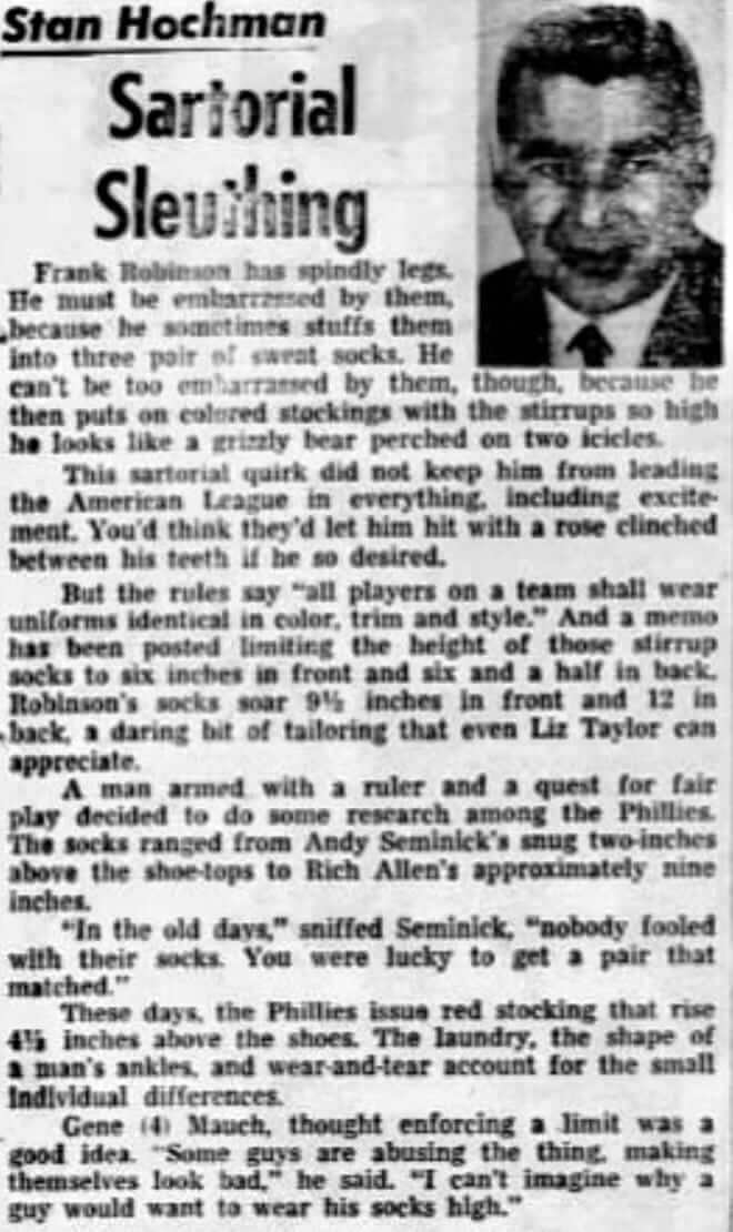
Good stuff, right? Too bad they didn’t have a photo of Hochman holding a ruler up to a player’s shin.
Hochman, who died in 2015, was a pro’s pro. He wrote for the News for 55 years and was also a frequent presence on Philly-area TV and radio. Here are some good photos of him that seem appropriate for Uni Watch:
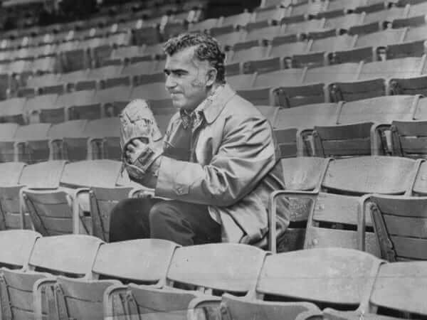
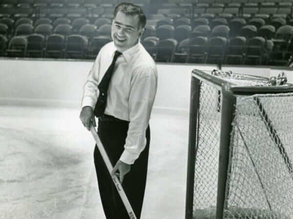
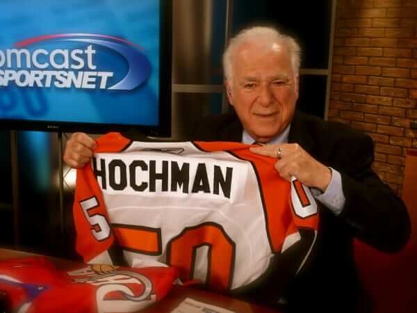
(Big thanks to Debbie Woodell for sharing this great early example of uni-watching.)
Click to enlarge
Collector’s Corner”¨
By Brinke Guthrie
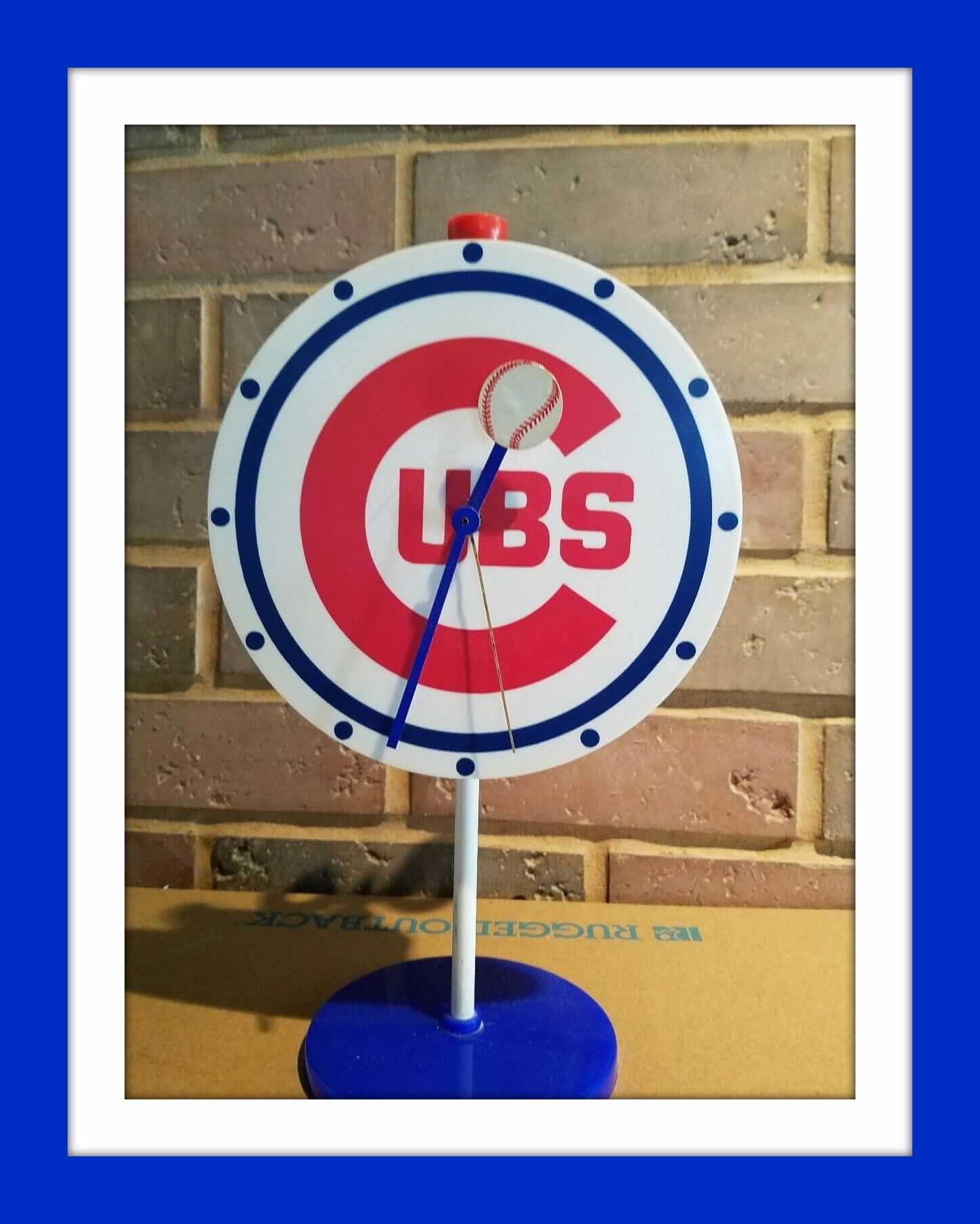
Had one of these! For the Reds, not the Cubs, but still. They were made by Westclox, and I woulda had mine in 1972 or so. They were called “Team-Mates,” and they looked and worked great. Don’t usually see ’em on eBay. Here’s a Cardinals model that sold on Etsy.
Now for the rest of this week’s picks:
• Speaking of keeping time, here’s a 1970s Milwaukee Brewers pocket watch also made by Westclox.
• Retro NFL art just doesn’t come any better than this 1970 Miami Dolphins poster.
• Never seen this before — an “NFL Booster Pack” on a huge NFL shield cardboard display backing. This is a Bengals edition, and while the bobble is common, the set itself is quite unique. It originally came with the bobble, the mini-helmet sharpener, a mini-football, and team pennant. All but the pennant are still present.
• Maybe one day Montreal will have another team, they’ll name ’em the Expos, and we can revel in their retro glory. Meanwhile, check out this 1980s Expos Starter jacket. A timeless logo, right up there with the Atlanta Flames, Hartford Whalers, and the Kentucky Colonels.
• Check out the depiction of Candlestick Park on this 1960s San Francisco Giants pennant.
• Gresh didn’t get the angle of the logo quite right on this Buffalo Bills helmet plaque, did they?
• Here’s a 1970s Stahl-Urban Dallas Cowboys vest with the rare helmet-facing-left design.
• Pretty basic-looking Bears helmet logo on this 1970s serving tray made by Couroc.
• Astros fans will hit cleanup (geddit?) with this 1970s Astros Soapy Slider.
• Cool Chiquita Banana-yellow foam football (think Nerf) from 1971!
• Primo retro ABA logos to be found on this vintage serving tray.
• Here’s a terrific-looking 1960s MLB coin bank from the Louisville Slugger folks.
That’s it for this week. Collector’s Corner will be taking next week off, but we’ll be back here on March 14. See you then.
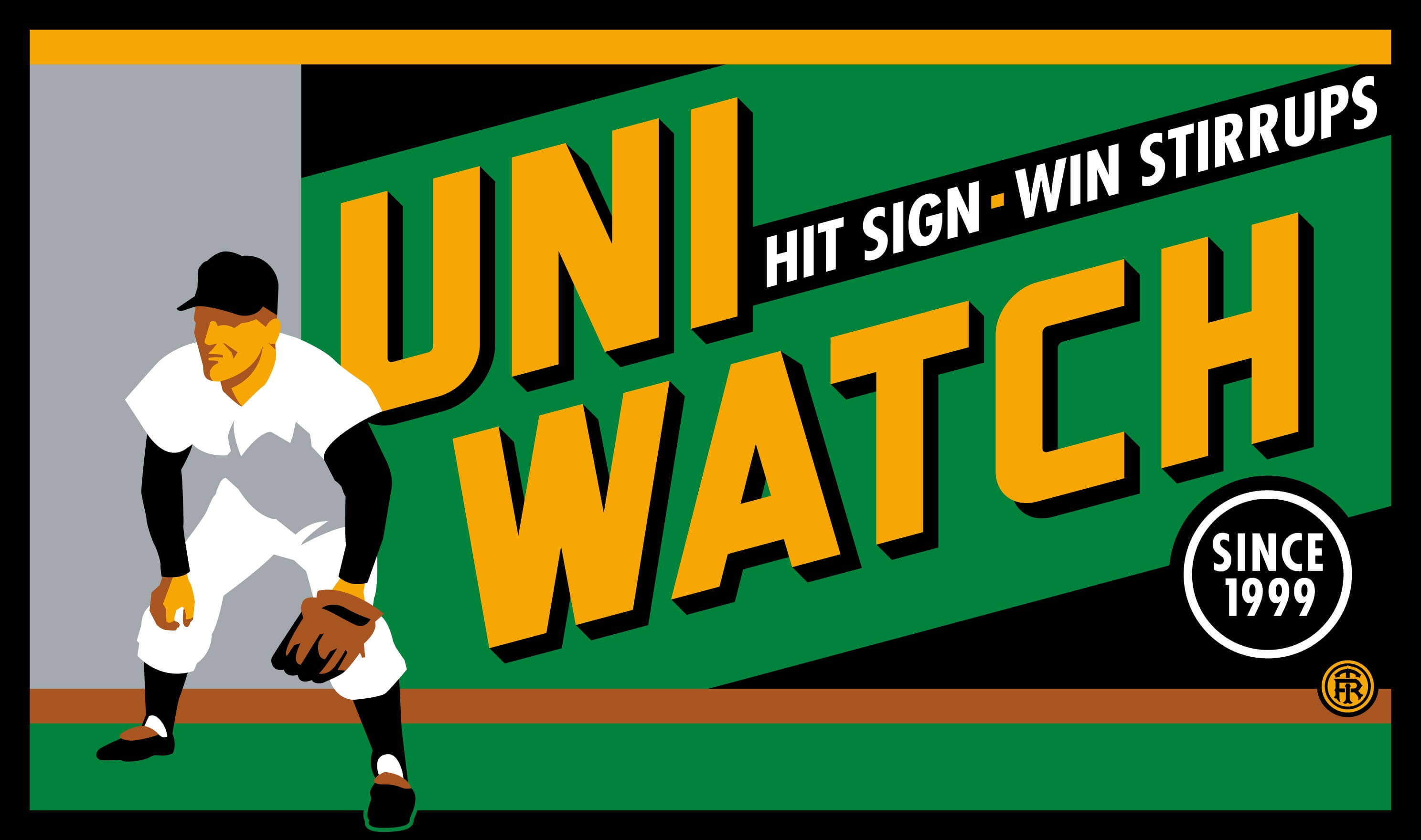
T-shirt reminder: In case you missed it last week, our latest T-shirt, designed by the great Todd Radom, is now available. Check it out (click to enlarge):
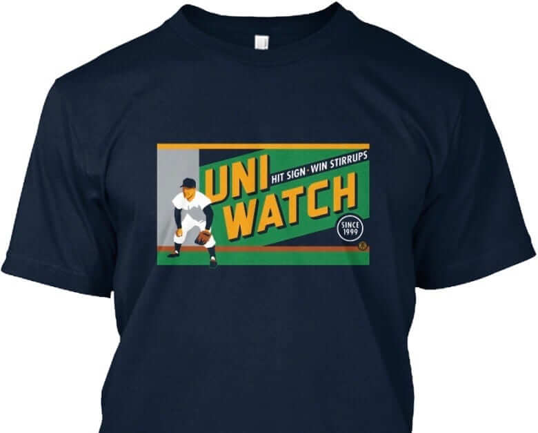
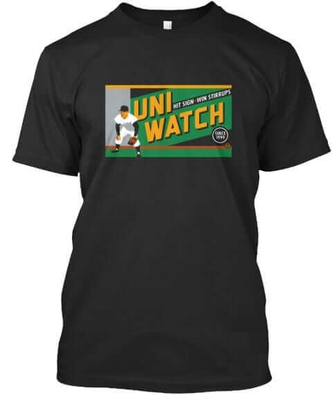
The design takes inspiration from the old Abe Stark sign at Ebbets Field, which read, “Hit Sign, Win Suit.” Please note that we’re using the shirt fabric color to fill in the dark portions of the design — the outfielder’s cap, sleeves, stirrups, and shoes, and the dark parts of the sign behind him. We think it looks best on Teespring’s dark navy shirt, which is the version shown above. But you can also order the shirt in black (yes, go ahead and make all your BFBS jokes), in which case the design will look like this:
There’s also an American Apparel short-sleeved version and a long-sleeved version, both of which come in a slightly lighter shade of navy. You’ll be able to see all of this on the ordering page. Just make sure you choose the shirt and color you like best.
The shirt is available here through next Friday, March 3. My thanks, as always, for your consideration.
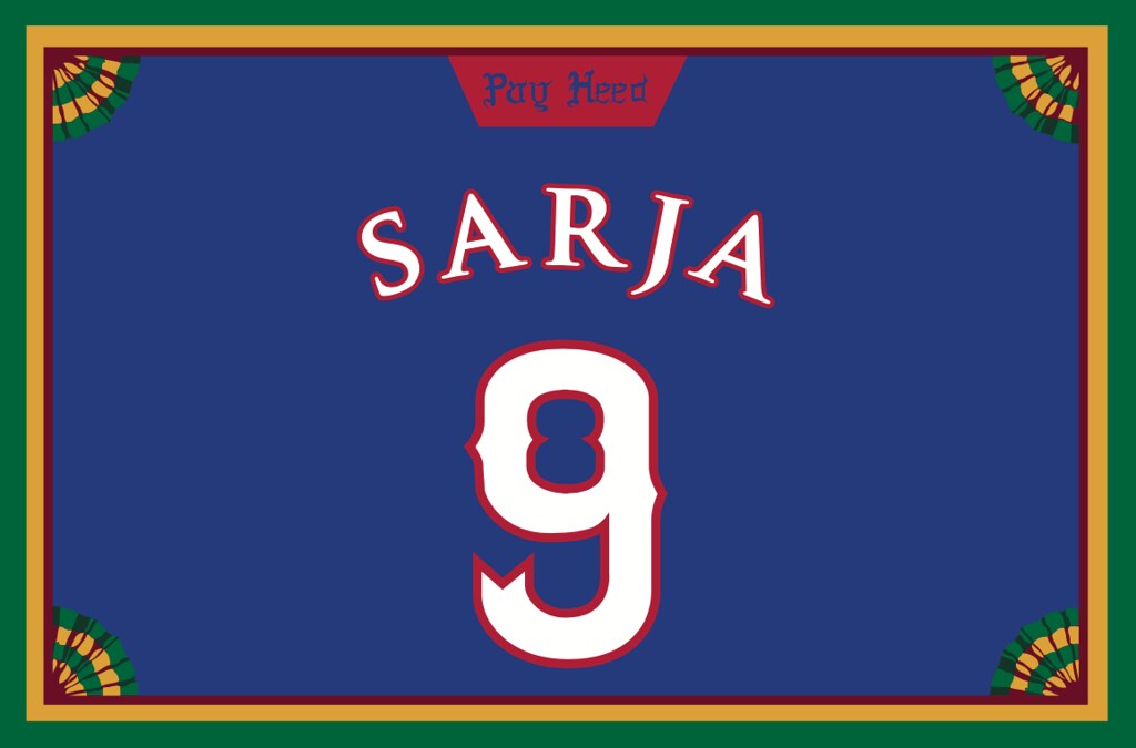
Membership update: A few new designs have been added to the membership card gallery, including Varun Sarja’s Kansas Jayhaws card, shown at right (which you can click to enlarge). The “Pay Heed” tab at the top is a nice touch, no?
As always, you can order your own custom-designed membership card here, you can see all the cards we’ve designed so far here, and you can see how we produce the cards here.
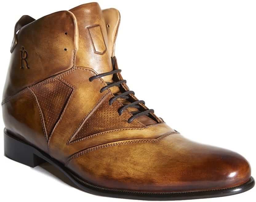
New advertiser shout-out: As you may have noticed in the right-hand sidebar, the site has a new advertiser: the Rafter Club, which sells fine Italian-made dress shoes based on the design of basketball sneakers — a really interesting combination. Their philosophy is spelled out here, and you can see their product line (only two shoe designs for now, but more to come) here.
The shoes are currently available for preorder and will start shipping this summer. But if you order now, you can get 20% off by using the discount code “uniwatch” at checkout.
I hope you’ll consider the Rafter Club for your footwear needs, and that you’ll continue to consider supporting all of our advertisers. Thanks.
The Ticker
By Mike Chamernik

Baseball News: The Red Sox and Cardinals went red-vs.-red yesterday (from Tim Britton). … The Reading Fightin Phils are holding a jersey design contest for local high schoolers (from Caleb Mezzy). … Due to limited space, Andrew Miller’s glove for the World Baseball Classic has a 30-star American flag on it (from James Gilbert). … Morehead State has some sharp powder blue jerseys (from an unnamed reader). … North Georgia softball is wearing Hank Aaron-era Braves-inspired uniforms this week. Here’s a clear shot of the jersey and cap. … New gold jerseys for Central Michigan softball (from Christian Taylor). … In 1965, Ray Oyler of the Tigers wore a Little League helmet, with earflaps and a chinstrap, at Spring Training (from @BSmile). … Here’s Goose Tatum and Satchel Paige in their Harlem Stars uniforms in 1962 (from @BSmile). … Tiger Woods wore an Indians cap when he was an up-and-coming golfer. That comes from this month’s issue of Fore magazine (from Andy Garms).

NFL News: Free agent coach Rex Ryan wore a Chargers shirt to the Daytona 500 this past weekend. The theory is that Ryan got the shirt from new Chargers coach Anthony Lynn, who worked under Ryan in both New York and Buffalo. … Speaking of Ryan, Rex Henry found this Jets-themed shirt at Goodwill. The slogan on the back is a reference to something Ryan said while addressing his team during an episode of Hard Knocks.

Hockey News: The USA Hockey National Team Development Program’s U18 team will wear excellent 1976 Canada Cup throwback uniforms this weekend (from Phil and several readers). … Goalie Ben Bishop was traded to the Kings on Sunday. He was still wearing his Lightning mask yesterday (from @GKG_77). … The Coyotes’ kachina jerseys are among the 10 worst uniforms in Arizona professional and college sports history (from Phil). … This NAHL team has some poorly designed numerals. That “1” can be mistaken for a “7” (from Shane Hartline). … The Team Michiana 16U team in Northern Indiana has a Whalers-esque logo and color scheme (from Patrick Thomas).

NBA News: The Pistons retired Richard Hamilton’s No. 32 on Sunday. The blocky numerals on the number retirement banner don’t match the number font the Pistons wore during Hamilton’s tenure. But, the banner does resemble the throwbacks that the Pistons wore in 2008 (from several readers). … A graphic designer imagined NBA teams as soccer clubs. The corporate ads are lame but at least there are relevant tie-ins (from Ryan Keberly).

College Hoops News: A Kentucky newscaster argues that Louisville should permanently switch to the 1980s throwbacks that the Cardinals have worn this season (from Josh Claywell).

Soccer News: The red-and-white striped “Waldo” jerseys could be the signature look of the U.S. men’s and women’s national teams (from Jason Hicks). … This was in the NBA section but we’ll put it here too: A graphic designer imagined NBA teams as soccer clubs (from Ryan Keberly). … Looks like Torbay Police FC re-purposed Georgia Tech’s yellow jacket logo (from @the_boot_room).

Grab Bag: This video explains why cartoon characters wear gloves. … Here’s a good collection of transit maps from across the world (from Jeff Ash). … A North Carolina bill would let parents put concussed kids back into games, instead of requiring medical clearance (from James Gilbert). … Bunch of auto racing items from David Firestone: New fire suit for Cruz Pedregon. … New paint scheme for Jack Beckman. … Matt Hagan’s helmet features a memorial to his deceased brother.

Great Escape, Part 1: Twenty-one years ago today (well, it was actually Feb. 29, but that date doesn’t exist this year), I walked out of my office at Billboard Books for the final time and began life as a full-time freelance writer. I’d been freelancing on the side for the previous two and a half years and had decided it was time to take the plunge. Giving up a secure job was a bit scary, but I had to at least give it a try, because I wasn’t happy with my life or career up to that point and knew I needed to make changes or else I wouldn’t be able to keep facing myself in the mirror each morning.
I haven’t had a regular job since then. (Also haven’t had employer-provided health insurance or most other job-related perks, but of course I knew what I was getting into in that regard.) As I like to remind people each year on this date — and also remind myself — the moral of the story is this: If you want to change your life or reinvent yourself, don’t just sit around fantasizing about it. Make it happen. Even if it doesn’t work out, at least you won’t spend the rest of your life wondering about what might have been.
When I’ve run this item in past years, some of you have gotten in touch with me and said something like, “That’s really inspiring. I’d like to reinvent myself too, but where do I start?” The biggest thing, I’d say, is to have a sense of direction. It’s one thing to know that you want to make changes to your life; it’s another to know what you want those changes to be. In my case, I had come to realize that I needed to be a writer. I wasn’t sure I could be successful at it, but I at least needed to try. Twenty-one years later, I’m still trying.
Of course, maybe you already like your life just fine the way it is, in which case more power to ya.
Great Escape, Part 2: I’m about to head off on a little vacation. I’ll be traveling in the Deep South (Georgia, Alabama, Mississippi, and Louisiana) from tomorrow through next Tuesday. The site will still be running while I’m away. I’ll post tomorrow’s content, as usual, and then Mike, Alex, and Phil will handle things while I’m away. Treat them nice — thanks.
Logo placement of Bills helmet plaque is FIERCE! Imagine if the Bills went with this orientation when they introduced this design in ’74.
Also, Chiquita football is not foam. EBay listing contains a photo that shows pin for inflation.
Stan Hochman. ’nuff said.
Exactly! An awesome article, from a legendary scribe.
Truth. RIP
Hope you write about your vacation when you get back. Always a fun read with the interesting places you visit. Enjoy!
I agree with the writer’s general conclusion that Louisville should go back to its throwbacks. What I disagree with is the common, lazy paragraph he wrote, which I’ve posted below. T
“But think about it. Green Bay Packers. Pittsburgh Steelers. Boston Celtics. New York Knicks. Los Angeles Lakers. New York Yankees. Chicago Cubs. Boston Red Sox.”
Here’s the thing: All of these teams have made some tweak to their uniforms in the last 20 years except the Yankees, and they’ve actually worn BP caps in full-time games so that counts, too. rue, not all of these teams haven’t made major changes, but some of them have.
Packers: Tweaked the sleeve stripes in 1997.
Steelers: Moved to the italicized number font in 1997.
Celtics: Added the black-trimmed uniforms, added gold-trimmed uniforms, added gray sleeved uniforms.
Knicks: Added black to the color scheme and just now got rid of it. Tweaked the “New York” wordmark. Doesn’t even account for the number over city name uniform in the late ’70s/early ’80s.
Lakers: Added side panels around the turn of the century. Added Sunday home white uniforms. Also have a BFBS alternate.
Yankees: Have worn BP caps in game action.
Cubs: Switched to the walking bear logo and introduced a blue alternate that they sometimes wear at home. And go back to the ’70s and ’80s to find pullovers, pinstriped road uniforms and blue softball pullovers.
Red Sox: Two color alternate jerseys, a back-and-forth on the color of the city name on the road jersey over the past 40 years.
While I appreciate the writer’s attempt at uniform analysis, I hate it when mainstream writers take the lazy way out when making a comparison.
Have a great trip! Can we look forward to a travel post when you get back?
Probably, yes. Thanks!
How far south in Alabama do you plan to go? Also, find some Conecuh sausage while in ‘Bama.
We’ll be making up the route as we go along, but probably pretty far south, toward the Gulf.
The beaches in Alabama are beautiful. Such a well kept secret. We have a photo of our family taken there, I think it was Orange Beach, from my childhood and people ask when we went to Fiji or the Bahamas. They don’t believe it’s Alabama.
I’m near the gulf coast of Alabama, drop us a line. Been with you and the site since the jump! link
Best USA hockey uniform I have seen in a long time. Should become the regular look, rather than just throwback.
Georgia Tech’s yellow jacket was not re-purposed, but the design elements are similar.
link
SO many other do too. Why so many with only 2 “arms”?
link
also on trend for today’s topics…. This one is wearing gloves!!
link
NFL Booster Pack.
“Booster” is a word *I* match with school sports–not pro. But I guess it was still apropos in the 60’s. (a quick google search shows lots of vintage NFL “booster” stuff)
Perhaps they mean this collection of items will “Boost” you collection.
The Coyotes’ kachina jerseys are among the 10 worst uniforms in Arizona professional and college sports history (from Phil).
The Arizona Wranglers had that heinous wide mesh that ruined a bunch of uniforms in the 1980s.
Point taken.
However, I love the use of copper. A third of a century ago metallics weren’t as adaptable to everything as now. And the copper / blue / red went nicely along with the state flag.
The kachina sweater is better than the current one, which looks like a practice bib over a T-shirt over thermal underwear.
I tweeted this at Phil last night, but that Coyotes jersey isn’t even the worst jersey in that photo
link
(I claim bonus points for using a photo of the same player, Joel Bouchard)
The look on the face of the player wearing the Tucson Toros “uniform” is priceless!
Seems apropos… Dick Allen “The reason the game takes so long to play is that there are so many rules to shorten it.”
Love that!
Great escape = Great advice.
The highlight of that article is identifying the players’ stirrup height in the parentheses. Gene (4) Mauch. Brilliant stuff.
I like the “NBA teams a la soccer jerseys”, especially for one reason:
The sleeves don’t look out of place like they do on the real NBA jerseys.
When did the stirrups like Frank Robinson wore become the norm in the 70s. As a kid playing little league during the early 70s, we always wore them this way. Only the stirrups showing, with the top part under the pants. We didn’t sew on extra material, they just stretched that far. I just looked at pictures of the 1978 Dodgers, and many had their stirrups like this.
Jim Bouton said in Ball Four (1969) that it was becoming fashionable. “Your legs look long and cool instead of dumpy and hot.”
“The reason the game takes so long to play, is there are so many rules to shorten it.” — Bill White
Ladies and gentlemen, your future National League president!
Apologies if this has already been asked…
Has anyone noticed the plain white letters and numbers on the backs of this year’s spring training tops? Looks like a fairly universal thing; in the case of the Mets, it doesn’t match the front very well. It feels that the numbers/letters are there as an afterthought. Compare it to what some of those teams had last year and the plainness becomes pretty stark.
Yes, every team is doing this. Although the typography appears white from a distance, the letters and numbers actually have lots of sublimated spring training graphics.
It’s all silly and mostly looks like shit, but whatever. It’s just spring training. Who cares? I mean, I care that spring training is taking place and that I can listen to a ballgame on the radio on a February afternoon — that’s nice. But who cares how they look? It’s just spring training.
I don’t generally care about spring training unis either, but it was something I noticed and I thought it looked like shit, too.
Then again, so do those FL and AZ patches, and I didn’t care about those last year when they debuted.
I’m like you, Paul… when I notice something weird and/or different like that, I start to question it, no matter how obscure. It’s why I’ve loved reading your stuff for the last god-knows-how-many years.
Ha! Fair enough, Joel. I should probably know better than to say, “Who cares,” whether about spring training or anything else, since one person’s “who cares” is another person’s (often mine) “Hmmmm, that’s interesting!”
Looks like QOTW material:
“one person’s “who cares?” Is another person’s “Hmmm, that’s interesting.”
What ends up happening to these spring training jerseys? Last year when they introduced them, I assumed it was a moneymaker and that we would soon be seeing game used originals all over eBay, but few seem to have appeared.
I also wonder why they added NOBs to several teams who don’t normally put NOBs on practice jerseys. Isn’t it a huge waste of effort to put names on when there’s so much moving around and roster shuffling in the spring? Teams also seem to have super-high-number (80s and 90s) NNOB jerseys around for sudden additions.
I’m just glad they didn’t mess with the “real” practice jerseys; the one worn by the Cubs — blue, walking bear logo, red numbers on the back and no names — is a great look for them.
Aww, I loved the original Coyotes’ logo. The crescent moon on his uniform would have been great as a regular logo in some form; I know that it appeared as a shoulder patch with the team name. I just don’t understand why a skater would wear a goalie’s mask–and half of one at that.
You had to lose it to appreciate it; as with many things in life.
To get the original Coyotes jerseys we had to lose this in order to appreciate it. Or something
link
Paul, will the t-shirt designs be available as a magnet, or a patch, or a print, or some other non-apparel item? I really like the design, but it doesn’t look right on a shirt. Maybe it’s just me … but I would happily buy a magnet with the same artwork. Thanks!
Hadn’t thought about that, David. Now that you’ve asked, I’ll discuss it with Todd.
I like this idea! That design would look great as a magnet.
This NAHL team has some poorly designed numerals. That “1” can be mistaken for a “7” (from Shane Hartline).
It looks like the Kings’ font.
Anyone know why all the eBay collector’s corner photos never show up for me? I’m talking everywhere: Three browsers on a fairly new MacBook at work (Chrome, Firefox, Safari) and on my iPhone 7 Plus. The links take me to the proper eBay page, but all the image spaces are just blank. Been like this for ages.
Is it like that for ALL eBay pages, or just for eBay pages linked from Collector’s Corner?
All. So weird, because it never used to be an issue. Did something change between Apple and eBay? Some setting we don’t know about?
Everything looks fine on my MacBook Pro.
How about your phone?
Works fine.
That NAHL jersey is for an All-Star game. The numerals are an exact copy of the LA Kings–they had the same extra-long flag on the ‘1’ until around 2002, when they changed it to the current version.
In the picture of rex ryan in the chargers golf shirt, how is his brother rob ryan in the cubs blue pinstripes not noticed or pointed out?
My favorite quote from the stirrup article – “The reason the game takes so long to play, is there are so many rules to shorten it.”