[Editor’s Note: With the Daytona 500 set for this Sunday, today we have a guest entry from Joseph Dawisha, who’s going to bring us up to date on the new paint schemes in this year’s race. ”” PL]
By Joseph Dawisha
A new era in NASCAR will begin this Sunday with the 59th running of the Daytona 500. NASCAR is looking to reach a younger audience, which explains why Monster Energy is taking over the premier series sponsorship and a new race format is being implemented. Many of the new paint schemes on the track this season reflect that goal as well. Today we’ll look at some of the new primary schemes set to run in the great American Race and throughout 2017.
• No. 1, Jamie McMurray ”” Cessna/McDonald’s Chevy. For the past two years, the 1 team has combined its two primary sponsors for the Daytona 500 scheme. They continue that trend this year with the Cessna/McDonald’s Chevrolet.
• No. 3, Austin Dillon ”” Dow Chevy. Austin Dillon’s 3 car no longer has the geometric style of previous years. It now has a more simple, mostly black scheme.
• No. 4, Kevin Harvick ”” Jimmy John’s Ford. With Stewart Haas Racing moving over from Chevy to Ford, the only change on Harvick’s Jimmy John’s scheme is to match the contour of the new body. The big change for Harvick comes in his Busch and Busch Light schemes, both of which match the new logo and can design for Busch Beer.
• No. 6, Trevor Bayne ”” Advocare Ford. In his fourth year under Advocare sponsorship, Trevor Bayne will run a colorful yet simple scheme. The colors and styling represent the various flavors and packaging of Advocare Spark.
• No. 10, Danica Patrick ”” Aspen Dental Ford. Just a couple weeks ago, Patrick’s primary sponsor, Nature’s Bakery, dropped out due to a breach-of-contract lawsuit. Aspen Dental has stepped in to fill some of the races originally scheduled for Nature’s Bakery. They bring a sleek, tooth fairy-themed scheme for the 500 and beyond.
• No.11, Denny Hamlin ”” FedEx Toyota. For the first time since 2005, black is no longer included in the 11 car’s main colorway. It has been replaced with an extra dose of Paul’s favorite color and a touch of orange.
• No. 14, Clint Bowyer ”” Mobil 1. The newest member of Stewart Haas Racing gets a clean and simple Mobil 1 scheme for 2017. Bowyer’s SHR teammates (Harvick, Busch) will all run the same scheme in different colors sometime this season.
• No. 19, Daniel Suarez ”” Arris. Following Carl Edwards’s unexpected retirement, 2016 Xfinity series champion Daniel Suarez will take the reins of the 19 car. His 2017 car is a watered-down version of Carl’s 2016 Arris “Surfboard” paint scheme.
• No. 20, Matt Kenseth ”” DeWalt. With DeWalt covering most of Kenseth’s 2017 races, the sponsor returns to a basic “standard” style paint scheme (unlike his 2016 FlexVolt and patriotic schemes).
• No. 24, Chase Elliott ”” NAPA. In his sophomore year, Chase Elliott will keep his 2016 scheme with an additional touch of yellow.
• No. 31, Ryan Newman ”” Caterpillar. Unlike any other CAT scheme in recent history, Ryan Newman’s 2017 ride will use white as its primary color and significantly reduce the once-primary yellow color.
• No. 48, Jimmie Johnson ”” Lowe’s. Despite ditching the iconic yellow door numbers that Jimmie used in 6/7 Championship seasons, the 48 car will once again have neon yellow highlights. The last time yellow was found on the primarily blue scheme was in 2008.
• No. 55, Michael Waltrip ”” Aaron’s. In his final Daytona 500, two-time winner Michael Waltrip will run a scheme that’s a tribute to his career in NASCAR. The car includes a photo collage of images from Michael and his brother Darrell’s NASCAR careers.
• No. 77, Erik Jones ”” 5-Hour Energy. Cup Series rookie Erik Jones will run a sleek 5-Hour energy paint scheme for most of the season.
• No. 78, Martin Truex Jr. ”” Bass Pro Shops. With only a few changes, the neon orange and camouflage return to Truex’s Bass Pro Shops scheme for 2017. In two years of sponsorship, this is the third different primary scheme for BPS on the 78 car.
• No. 88, Dale Earnhardt Jr. ”” Nationwide Chevy. Nationwide has had three paint schemes in as many years. For 2017 they ditch the primary silver color and go with a clean, retro white and blue look.
———
Thanks, Joseph. Everyone enjoy the race on Sunday.
ESPN reminder: In case you missed it yesterday (and you probably did, because it didn’t post until late in the afternoon), my latest ESPN column looks at five things we’ve learned so far from the NBA’s uniform ad program. Check it out here.
RSS update: For those of you who’ve been having trouble with the Uni Watch RSS feed, webmaster John Ekdahl says to try this or this, both of which appear to be working. Let me know if you have any further problems. Thanks.
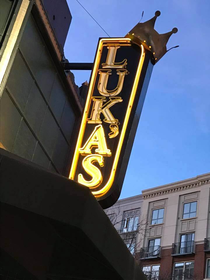
And the crown is a nice touch: My friend Tom Lupoff just told me about this sign for a bar called Luka’s (see above), which is in his hometown of Oakland. Not bad, right? It’s not often that I get to see my surname on display like that.
Okay, so there’s that pesky apostrophe, but it’s so badly placed that it’s easy to ignore it. All of which recalls a topic we explored in 2015: the eternal conundrum of where to put the apostrophe in a vertically lettered sign.
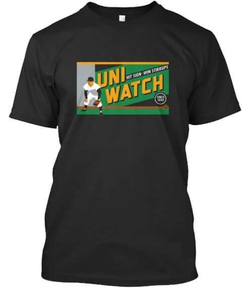
T-shirt reminder: Our latest T-shirt, designed by the great Todd Radom, is now available. Check it out (click to enlarge):
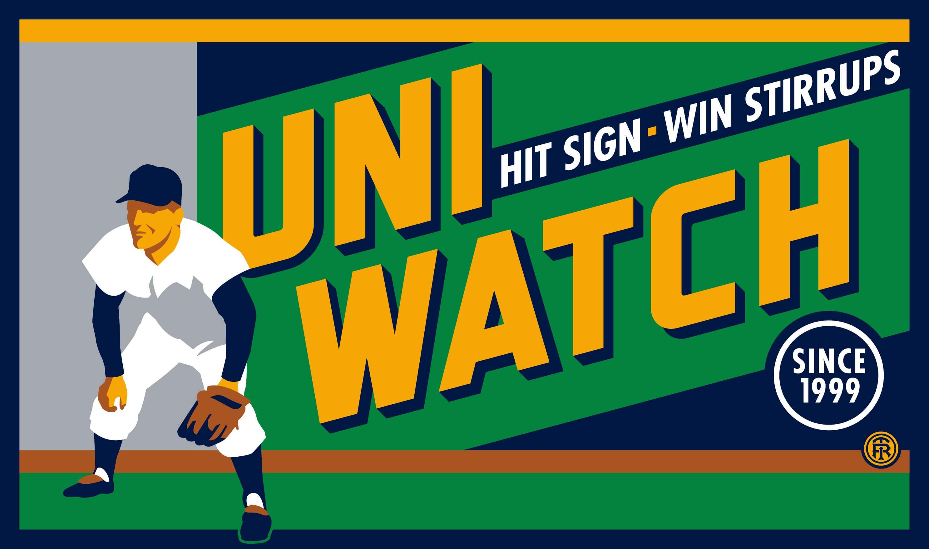
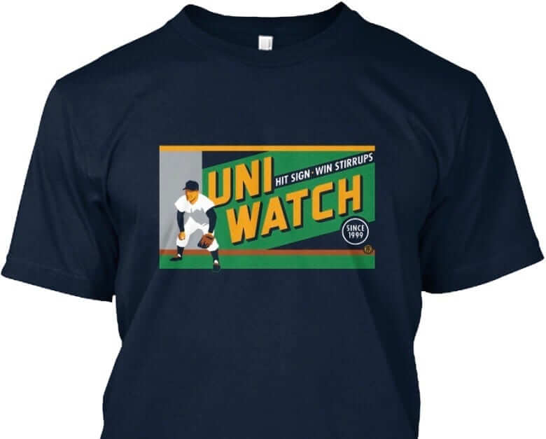
The design takes inspiration from the old Abe Stark sign at Ebbets Field, which read, “Hit Sign, Win Suit.” Please note that we’re using the shirt fabric color to fill in the dark portions of the design — the outfielder’s cap, sleeves, stirrups, and shoes, and the dark parts of the sign behind him. We think it looks best on Teespring’s dark navy shirt, which is the version shown above. But you can also order the shirt in black (yes, go ahead and make all your BFBS jokes), in which case the design will look like this:
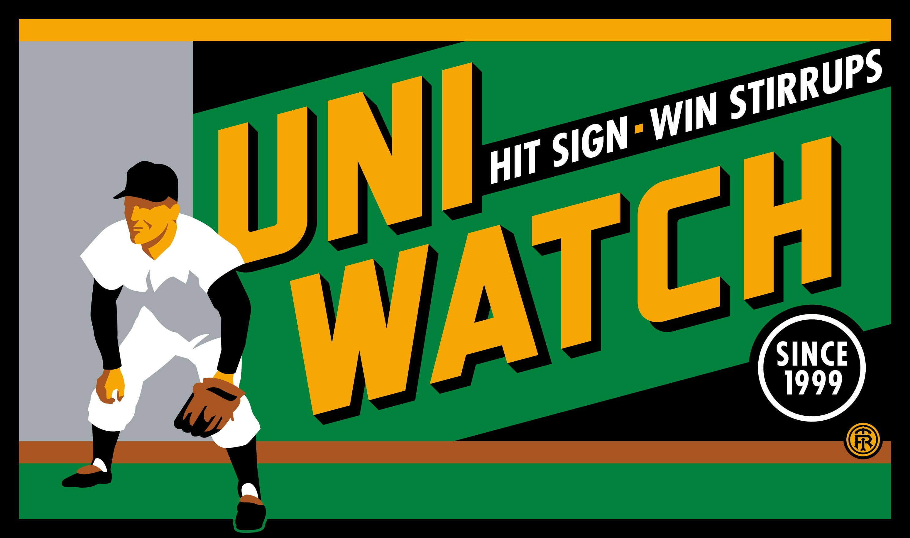
There’s also an American Apparel short-sleeved version and a long-sleeved version, both of which come in a slightly lighter shade of navy. You’ll be able to see all of this on the ordering page. Just make sure you choose the shirt and color you like best.
The shirt is available here through next Friday, March 3. My thanks, as always, for your consideration.
The Ticker
By Paul

Baseball News: The Pirates have changed the name of their spring training ballpark from McKechnie Field, named in 1962 after former manager Bill McKechnie, to LECOM Park, after the Lake Erie College of Osteopathic Medicine. Problem is, nobody told Bill McKechnie’s daughter, who was not happy about her father’s moniker being removed from the facility (thanks, Mike). … New name, but less drama, for the Mets’ spring ballpark as well. … Here’s a round-up of the latest Brandiose slop this season’s MiLB makeovers (thanks, Phil). … The White Sox will retire Mark Buehrle’s No. 56 on June 24. … Some Iowa players wore gorgeous striped stirrups, while others went with pajama pants, for the team’s home opener the other day (from Jesse Gavin). … The World Baseball Classic had advertising on players’ jerseys and helmets in 2013, and they’re doing it again this year (from Jesse Agler). … New Royals- and Monarchs-themed package design for the KC-based Boulevard Brewing Company’s KC pils beer (from Sean Patton). … Whoa, some players in Indians camp appear to have vertically arched NOBs (from Robert Hayes). … Here are the Bowie Baysox’s original logo specs from 1993 (from Blake Pass).

NFL News: Check out this 1973 footage of Broncos DL Pete Duranko. He appears to have had his tailbone pad attached to a belt or girdle. I always thought those pads snapped into the pants (good spot by Scott Mason). … We’ve all seen helmet carts before, but did they all come complete with the suspension webbing like this 49ers model? (From Bill Kellick.) … If you miss Giants Stadium, there’s a 20′ x 17′ replica of it in Blairstown, N.J. (from Jon Volpe).
College and High School Football News: A university in Wales has a football team whose helmets use Auburn’s logo (from Andrew McCain). … A beautiful 1909 Alabama letterman sweater is up for auction (from Mark McCollister). … Jerry Kulig recently visited the College Football Hall of Fame in Atlanta, where a few uni-related items caught his eye. “This is Willie Totten’s jersey from Mississippi Valley State,” says Jerry. “He threw a lot of passes that were caught by Jerry Rice. They probably chose those unique shoulder numbers due to no TV exposure. And this is a repro of a 1962 helmet that Navy wore against Army. It reads ‘Beat Army’ in Chinese, designed to mock the Army’s then-famous swarming defense, nicknamed ‘The Chinese Bandits.'” … The National Federation of State High School Associations has approved a bunch of football rules changes. Key passage: “[E]ffective with the 2021 season, ‘the jerseys of the home team shall be a dark color that clearly contrasts to white.'” A source quoted in the article explains, “The committee revised the rule to provide schools and manufacturers more clarification regarding the game’s current trend of utilizing lighter gray shades.” … There’s a new Virginia Tech uniform tracker on Twitter (from Andrew Cosentino).

Hockey News: NHL and AHL team logos reimagined as My Little Pony characters, and put on T-shirts? Sure, why not (blame Rob S.). … P.K. Subban of the Predators warmed up with rainbow-themed pride tape on his stick for the Preds’ “You Can Play” night (thanks, Alex). … The Flyers surprised two local youth teams by showing up at their rink and providing them with Stadium Series jerseys with the youth players’ NOBs (from John McMunn).

NBA News: The Pistons are announcing some sort of partnership with Ford this afternoon, but it will apparently not involve a jersey ad. … “Looks like the Celtics experimented with a new number font late in the Bird/McHale era,” says Matt Simpson. “Here’s the traditional font, here’s Bird with the traditional font while McHale has a different font, and here’s the whole team with the new style.” … Boogie Cousins apparently chose to wear No. 0 with the Pelicans to symbolize his “new life” with a new team (from Zach Loesl). … The Cavs wore burgundy at home last night, with the Knicks wearing white on the road (thanks, Mike). … The Pelicans wore their sleeved purple Mardi Gras jerseys last night, with the Rockets wearing white on the road.

College and High School Hoops News: Oh man, look at the awesome Idaho State jersey the defender is wearing in this photo (big thanks to Sean L). … Dustin Semore was watching footage of the old Bobby Knight chair-toss incident and noticed that someone at the scorer’s table appears to have been wearing a zebra-striped pinny. … Moorehead State has a very busy court design (from Justin Schmidt). … A guard on the Northwestern women’s team was bringing the ball up the court and stopped to tie her sneaker, leading to a steal for Rutgers (thanks, Mike). … According to a video report on this page, short shorts are becoming a trend for Iowa high school teams (from Jesse Gavin).

Soccer News: The Columbus Crew will announce a new jersey sponsor advertiser today at 11:30am Eastern (from Paul Zielinski). … New “heritage kit” for the Seattle Sounders. … Speaking of the Sounders, championship stars will now appear on their replica jerseys, not just on the authentics (thanks, Phil). … Also from Phil: Toronto FC’s home jerseys were briefly leaked.

Grab Bag: Interesting times in the newspaper biz: The Washington Post has a new motto, and The New York Times has a new marketing catchphrase. … The police department in Newtown, Conn., is changing its uniforms from grey to dark blue. … The Mirfield Stags, a rugby league club located in Patrick Stewart’s hometown, have been wearing Star Trek: The Next Generation-themed jerseys (from our resident rugby expert Eric Bangeman). … The city of Orlando has announced a contest to design a new city flag (from Tom V). … A United Arab Emirates figure skater competing at the Asian Winter Games wore a hijab on the ice.
I suspect those Celtic jerseys were when Champion was the NBA’s manufacturer; the number font is a standard Champion font.
I don’t remember that terrible font at all. It must have been short-lived or maybe a pre-season font?
I’m a Celtics fan, and I remember the font change. It was odd and very short lived, less than one season. Not even sure it made it to the regular season.
Here is another Celtic font that is not the one we saw almost always
link
Exactly, the Utah Jazz wore those. It was worn up until about December or so from what I’ve seen.
Here is a shot from the Jazz’s jersey when they played in Tokyo against the Suns.
link
Try this imagine.
link
The Celtics Kevin McHale jersey with the odd font is (or at least was)on display at the Basketball Hall of Fame.
how good were those photos!
thanks to Matt for sharing
Paul, the Willie Totten and the 1962 Navy repro helmet links are merged into each other.
That being said, I always appreciate what a great job you and the crew do in putting this together. If it were me, the amount of mistakes would be much higher!
Fixed. And thanks!
Tail pads don’t snap into pants much at all anymore. Back in the day it was only in Pop Warner and recreation leagues. In the 70s in HS, college, or the NFL the pads went into a girdle or the belt was woven through them. Today, the pads are integrated into the girdle. In in Pop Warner or rec leagues they are integrated into the pants.
That’s true. Hip and tailbone pads snapping into pants are very much a thing of the past. Otherwise, you wouldn’t be able to tuck your jersey all the way in without the pads being exposed above the waist line.
When I played in HS, the girdle had pockets for the pads to slip into. No snaps.
Looks like the Pistons are announcing a partnership with Henry Ford Healthsystem, as opposed to Ford Motor Company, the automaker. Not to be confused with THE Henry Ford, the museum. Basically everything in Detroit/Dearborn bears the Ford name in one form or another; not necessarily related, though.
I also think it has to do with Ford Healthsystem, and not Ford Motor Company.
I still find the shortening of the Henry Ford Museum and Greenfield Village to just “the Henry Ford” to sound strange to me. I just don’t recall ever hearing anyone refer to it as just “the Henry Ford” before they adopted that short name themselves.
You should remove the strikethrough on ‘the latest Brandiose slop’. Because it’s true. Their designs are glorified clip art with heavy black borders.
But it’s a shame Dan Simon’s brilliant Memphis Redbirds identity is lumped in there. That deserves its own link, especially the numbers.
Agreed.
Agreed with the Memphis Redbirds logo being leagues above the rest.
Some look like they were picked out of the bottom third of a children’s art project. For the Hillcats, someone stole all the crayons and pencil crayons and left the poor kid a pair of highlighters he couldn’t handle.
A few had potential – many are just poorly chosen names paired with logo of matching quality.
Not all of those team designs are slop. A few are slop, most are mediocre, and a couple are excellent. And there’s nothing “clip art” about any of them. In nearly every case, a minimally informed baseball fan can look at each and recognize it as work by the same designers as most of this decade’s minor-league rebrandings. By definition, clip art doesn’t resemble the work of any particular artist or designer. Brandiose work tends toward the generic, yes, but a different kind of generic than clip art. Brandiose work looks like Brandiose work, not like anything specific in style to a given team’s location or nickname. Clip art would look like nobody’s work; if a logo looked like clip art, we wouldn’t be able to look at it and say, “Oh, great, more Brandiose angry-mascot cartoonery.”
Pretty much every MiLB logo of the 1990s looked like clip art. Pretty much every MiLB logo of the 2010s looks like Brandiose. Very different phenomena.
Brandiose, ha! I’M STILL CALLING CLONED CRAP
Welcome to the world of modern design, where all the designers have taken the same types of classes and learned to do everything the same way with the same programs. Of course it all looks the same.
Why couldn’t the Pirates’ spring training ballpark be McKechnie Field AND LECOM Park? Or McKechnie Field AT LECOM Park?
Morehead State court: that’s just the half of it!
Ditto. “McKechnie Field at LECOM Park.” Why cover up that recessed concrete panel with a freakin’ billboard? Disgusting move by the Pirates all around.
Agreed. Poorly played.
“we continue to honor Bill’s legacy by naming the home clubhouse after him”
what a slap in the face, might as well rename a urinal after him too
I’m still calling it McKechnie Field. That’s it, nothing else added.
Being a huge fan of cars and the automotive industry, I would feel less upset if a team used logos from a car company, especially if the team is named after a part of the car (Piston). I wonder how that will play into this, if you like the advertiser or not?
It’s Ford Healthsystems, not Ford Motor Company, that they are striking a deal with.
When I played HS football in the mid-’80s, the hip and tailbone pads fit into the girdle, and the thigh and knee pads into the pants.
Everything was a separate piece; the pads were all mixed up in boxes and we had to fish through them to find ones that both fit, and matched.
I’d say Memphis Redbirds is the best of that lot. Actually ties to the city without being ridiculous.
Baby Cakes? I get that there are people who like goofy names — the Lugnuts are down the street from me — but there’s a line somewhere, right?
Coincidentally, the Redbirds was done by Studio Simon, not Brandiose.
Not actually a coincidence.
The Redbirds’ goal with their new logo was to put the emphasis on Memphis
They could call it the Memphasis.
Baby Cakes and Rumble Ponies crossed my line for sure. Jumbo Shrimp is fine…I just don’t like the toothed logo. Wood Ducks are OK.
Memphis’ design blows them all out of the water.
Seconded all all points.
Regarding the referee-striped penny in the Bobby Knight screen cap, it used to be very common for the official scorekeeper to wear a referee shirt or something similar. I can recall the official scorekeeper at my high school in the 1980’s would wear a ref’s shirt during games.
I’m linking an article about Burt Beagle, Baruch College scorekeeping legend. Of note is the photo of Beagle wearing a black and white uniform at the sideline table.
link
I also remember sometimes seeing a black-and-white striped banner with “SCORER” on it draped in front of the scorer’s table.
Sometimes it has to get personal before you take up a cause. That’s the case with me and the McKechnie Field renaming.
The corporate naming rights idea never set me off like uni ads and such have but I spent some fun days at McKechnie Field on my last Spring Training trip. Great little park tucked away in an older neighborhood and filled with friendly people. Only Joker Marchant in Lakeland exceeded it in old school charm.
As silly as it sounds the name is park of the charm. Bad move Pirates!
And it looks like the Tigers have part way gone the corporate sellout road in Lakeland. I see they’ve renamed their place Publix Field at Joker Marchant Stadium.
So the new National Federation of State High School Associations rule will change in 2021 so that for football home teams cannot wear white?
Kinda cool that the #77 car is sponsored by 5-hour Energy, with the premier series sponsor being Monster Energy. That’s a whole lot of energy drink going on. Bet that pit crew is extra sharp during the race.
Well done, Joseph. These things always flash me back to my model building days as a youth. Thank you.
It’s a little more complex than that Dave, the sponsorship was announced at the tail end of 2016, before the Monster sponsorship was signed. Since then, there is discussion over if 5-Hour Energy is an energy drink, or shot. If it is an energy drink, after their current contract ends, they have to leave the sport as a sponsor. If they are an energy shot, they may be able to stay.
But it’s not your surname.
Still, you better get that neon fixed.
link
Not uniform-related, but this felt very much like a Uni Watch investigation…
link
The analysis is pretty fascinating. The topic, though, is… disconcerting, and that’s all I’m going to say about that.
Those Mirfield Stags rugby jerseys are considerably more cluttered than the Star Trek TNG uniforms were. I understand changing the simple Starfleet logo to the Stags’ logo, but they’ve got like six logos on the front of the jersey, plus ones on the shoulders and sleeves. It’s hard to detect the Star Trek design under all that clutter.
Yep, the ads all over that kit are pretty heinous.
Though, given the short sleeves and the shorts, it wouldn’t take much to modify that design to look like the the infamous link.
You have a typo United Arab Emirates
Even though Iowa’s uniforms are basically the Pirates’, it’s beautifully detailed. I’ve noticed plenty of college and high school baseball uniforms nowadays have sublimated the titles and player numbers. Disappointing and cheap.
It’s kind of funny, you’ve got the Hawkeyes football team wearing what are basically pre-1997 Steelers uniforms, and the baseball team borrowing from the Pirates. What’s next, the hockey club’s sweaters being based on the Penguins?
Well, no, not yet anyway, if this Google image search is anything to go by. Yes, Iowa does have a hockey team; it’s club-level, in the ACHA. Who knows, though… maybe if they go varsity some day and get promoted to the B1G…
Whoops, forgot to close the link tag after “search”. At least the link works.
After seeing companies taking the Penguins’ logo for ther own use, it’s no stretch to imagine the Hawkeyes putting their mascot on skates. Would they put a triangle in the background, or use a circle instead, as a reference to the ANF (America Needs Farmers) that once appeared on their football helmets?
NCAA hockey programs aren’t a foregone conclusion. You stand a better chance of coming across a souvenir jersey to wear tailgating. That said, you could do worse than copy Pittsburgh sporting apparel across the board.
Whoa, some players in Indians camp appear to have vertically arched NOBs (from Robert Hayes).
Don’t get my hopes up only to crush them later on!
Why the “woah” ? Is this super rare or do we just enjoy that style?
Both, but the emphasis is on the latter.
What’s strange is that it’s vertically arched AND serifed! That’s something you’d usually only see for a name on the front, like on the Tigers’ 80s road jersey, rather than on an NOB.
Makes me think of the Red Wings’ straight, serifed NOBs in the preseason.
In a desktop publishing environment, putting text in a vertical arch isn’t hard to do. The rubber really hits the road when the letters are cut from tackle twill and stitched. If I could see a player name printed on a nameplate and sewn to a jersey, I could judge how “professional” it might look (and wear, in game conditions). But sit and think about the last time you saw a player name vertically arched in the NBA or baseball.
Luka’s? It is in Oakland, so LUK A’S? Just a thought.
Nothing on the “two years” link for Jamie McMurray.
Works fine for me.
this is so bad: “Following another caution period, which gives fans another natural break in the action”
So are the new mandatory cautions mandated or are they “natural breaks”
Oh wait, I know they are commercial slots.
It doesn’t seem like either new RSS link works in Feedly, at least. Feedly doesn’t find anything for those URLs.
Then you may have to use something other than Feedly.
This is the kind of Uni-Watch-style detail I’ve been waiting for with paint schemes. Great job, Joseph Dawisha!
Glad to hear you like it! Big thanks to Paul for letting me do this!
Can I just get it out on the record that the reason the Pelicans lost by 30 points last night was because of the hideous jerseys they wore? Yikes!
To one-up the Luka’s sign, there’s a place in East Rochester, NY I pass every day called PLUKAS. Not sure what it is, but here’s the street view of it.
link
It’s apparently a furniture shop: link
I use Feedly and it started working again today (and brought up the past week’s posts) without me changing anything.
Apparently, it is the showroom for James Plukas Furniture. link
… this is supposed to be in reply to Chris at 10:20. Second time I’ve goofed up a comment today… :P
Playing high school football in the late seventies we had tailbone pad and hip pads that snapped onto a belt. For similar pads check out pictures of Rick Leach when he was quarterbacking at Michigan.
That flag design contest is on 3×5 note cards – hand drawn only!
Michael Waltrip is #15 not #55
Regarding the tail and hip pads. When I was in college in the late ’80s, I started wearing the pads with a belt instead of the girdle option. I just used the same type of belt that we had for the football pants. It was a lot more comfortable than the girdle option.
Does anyone else find it funny that the one game all spring that the Yankees wear the pinstripes, they’re not wearing the pinstripe caps?
That Star Trek rugby team has too many captains.