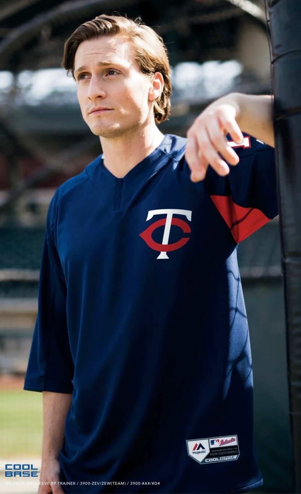
Major League Baseball will have new batting practice tops this season. I say “tops” instead of “jerseys,” because these really aren’t jerseys in any standard sense of the term. They’re pullovers with three-quarter-length sleeves. And as you can see at right (and can click to enlarge), they’re designed to be worn untucked.
Some additional notes:
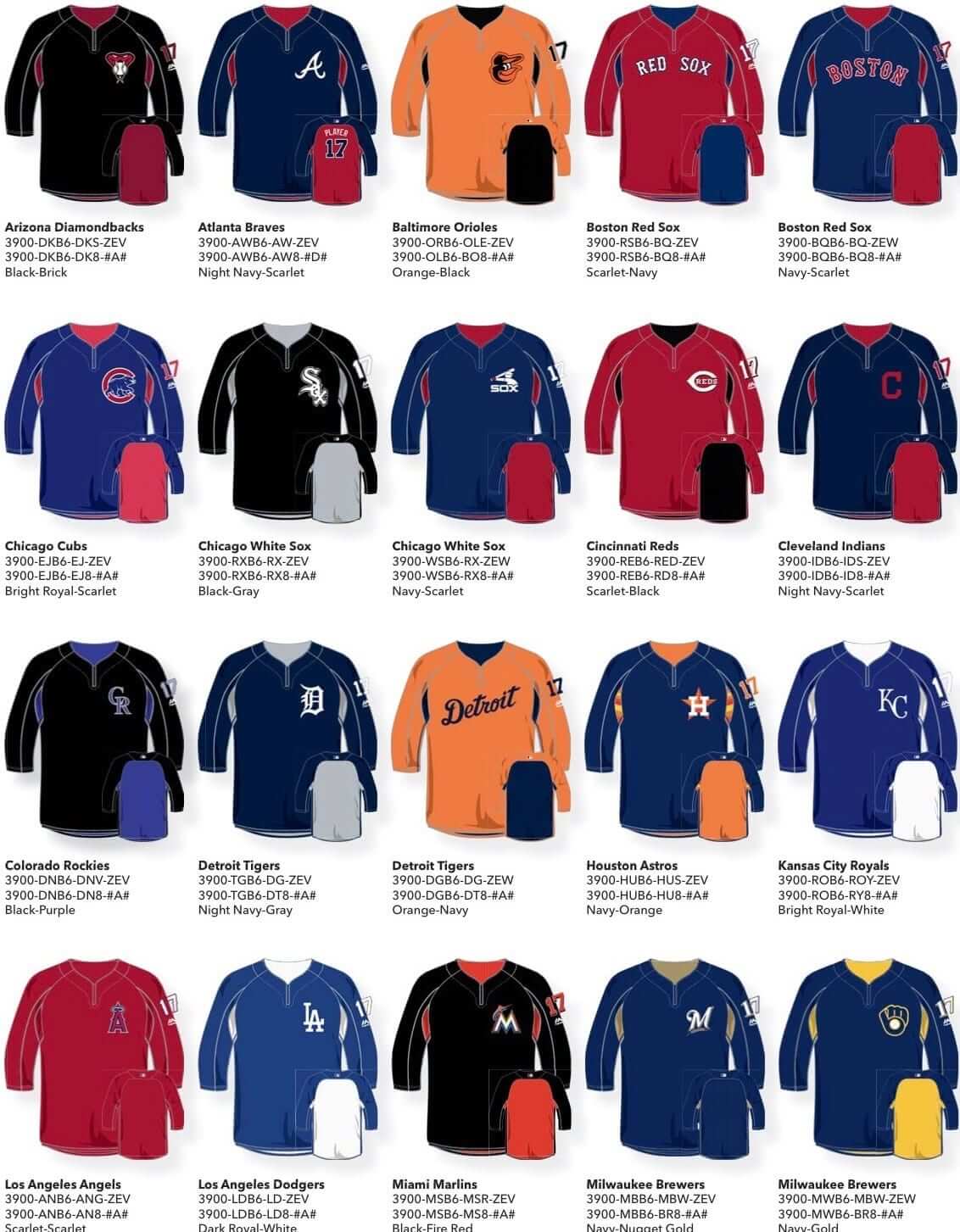
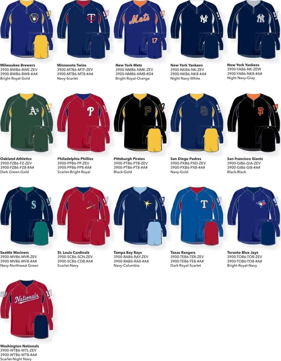
• All of these designs have a uniform number on the left sleeve, and most are blank on the back. The exceptions are the Mets, who are using back numbers, and the Red Sox and Braves, who are using a standard number/NOB combo.
• You see that little vertical strip in the center of the collar that kinda looks like a zipper? I’m not sure if it’s stretchy or ornamental or what, but it’s not a zipper. Check that — it is a zipper. But the pull tab is cleverly hidden:
@UniWatch pic.twitter.com/cyXTs2WdZt
— Seth Bernstein (@SethBernstein67) February 2, 2017
• Most teams have just one design, but the Red Sox, White Sox, Tigers, and Yankees have two, and the Brewers inexplicably have three.
• According to SportsLogos.net, these will only be worn for regular season BP, not for spring training games. Grapefruit and Cactus League games will apparently continue to feature the spring jerseys that were rolled out last year.
At present, only about half of the designs are available for sale, but you can see all of the designs, including the ones that aren’t yet available at retail, in the following two pages from a Majestic catalog. Note that although the catalog shows the Red Sox designs with blank backs, that is incorrect — the two Boston designs will have back numbers and NOBs. Also, the Padres design shown below is incorrect — the actual version will not include any yellow (click to enlarge).
.
Too bad about the pit stains, but otherwise I have no problem with these. BP is a loose, casual time, so the untucked approach seems fine. Overall, though, it’s hard to get too worked up about these one way or the other. I mean, jeez, they’re just for BP.
Lions update: Yesterday morning I reported that it looked like the Lions were getting ready to ditch their BFBS elements, plus they appeared to have a new wordmark with a new font.
In case you missed it, the team confirmed all of that in the afternoon, issuing the following statement (click to enlarge):
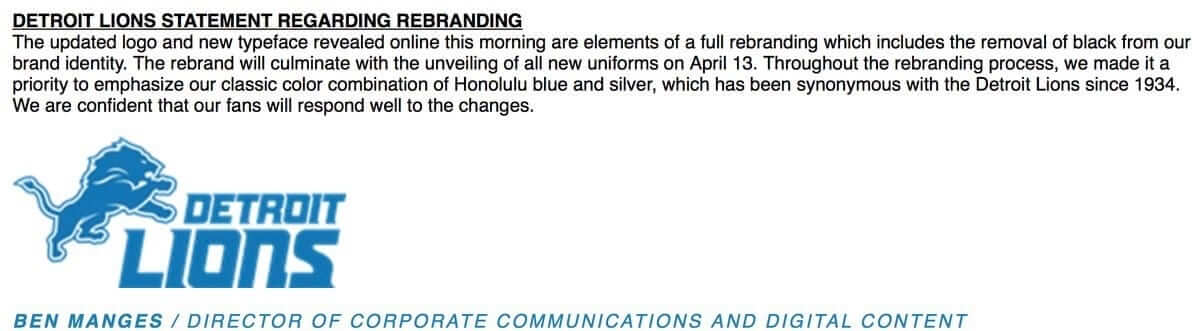
Now that we know for sure that this is happening, a few thoughts:
• Ditching the black should be a textbook case of addition by subtraction. A big win.
• That new wordmark font is brutal. Yeah, it’s nice how certain letters nest into each other (did the Vikings have a font sale or something?), but the letterforms themselves are terrible, especailly the “O” and the “S,” and the feel of the typography doesn’t mesh well at all with the feel of the leapin’ lion. Not good.
• The team’s statement notwithstanding, Uni Watch bylaws obligate me to mention that what the Lions are doing here is actually a redesign, not a rebranding.
• Although not mentioned in the team’s statement, I can confirm that the Lions’ new look will include an adjustment to their official shade of blue. They’re changing from Pantone 7462 to Pantone 2196. Here’s a side-by-side comparison — old version on the left, new on the right:

The Lions aren’t the only NFL team with an upcoming color tweak, incidentally. More on that soon, maybe tomorrow.
ESPN reminder: In case you missed it yesterday, my annual Super Bowl column is up now on ESPN. Check it out here.

ITEM! New NBA column: Over the last couple of weeks, you may have noticed that the NBA section of the Ticker has often concluded with a series of contributions from a reader named Zach Loesl (that’s him at right), who’s been keeping track of what’s going on in the NBA each night — who’s wearing white on the road, which games on color vs. color, that sort of thing. He tends to send me his Ticker-submission emails late at night, when I’m asleep, and then I’ve been adding them to the Ticker each morning when I wake up.
Since the NBA is becoming such a uniform free-for-all (“home” and “road” uniforms are beginning to lose any meaning), and since Zach appears to have his finger on the pulse of what’s going on, I recently asked him if he’d like to write a daily roundup instead of being buried in the Ticker, and he agreed to give it a shot. Before we get to his first report, Here’s a quick introduction to him:
I am currently a graduate student at the University of Wisconsin-Whitewater, where I work as a tutor. I became an NBA fan in 2001, when the Bucks were on the verge of making the NBA Finals. My interest in NBA uniforms began when all 30 teams switched to Adidas’s Revolution 30 uniforms. Since then, I have enjoyed reading about the various changes to NBA uniform designs here at Uni Watch.
My column will give NBA fans a more in-depth look at the uniforms worn each day, and I’ll also focus on equipment, accessories, and arena advertisements. I believe the visual aspect of NBA games is important, and an underrated element of the fan experience. My goal is for readers to get an up-close look at various NBA games, while providing context into what I feel are notable developments.
With all of that in mind, here’s Zach’s first column.
Zach’s NBA Report
By Zach Loesl
We’ll begin today’s report with an observation: Yesterday’s Ticker mentioned that Juancho Hernangómez of the Nuggets has an accent on his NOB. But his brother, Knicks center Willy Hernangómez, does not have an accent on his NOB. Interesting.
Some additional notes:
• Two more teams have advertisements placed on their scorer’s table: the Nets and the Celtics. This is a less objectionable way for teams to increase their ad revenue, since the ads themselves are not distracting to viewers.
• Speaking of ads, the Magic have an advertisement on the top of their backboard for the Marriott Vacation Club. The website address includes the word “Magic” in it, making it seem more team-related.
• Since yesterday was the beginning of February, players throughout the league wore Black History Month warm-up shirts. I think the stars and stripes pattern is an excellent way to fill the letters, and fits into the design of the shirt quite nicely. The trophy LeBron James is holding in that photo is the NAACP Jackie Robinson Sports Award.
• The Timberwolves wore white on the road against the Cavaliers last night.
———
Thanks, Zach. We’ll continue to run Zach’s report on most weekdays, so please join me in welcoming him to the Uni Watch team. Meanwhile, we’ll still have an NBA section of the Ticker, for things that don’t make it into Zach’s report.
ITEM! Uni Watch party announcement: It’s been way too long since our last Uni Watch gathering here in Brooklyn, so I’m convening a get-together on Sunday, Feb. 19, 3pm, in the back room of the Douglass. This is the same space we’ve been using for years — it used to be known as Sheep Station but was recently rebranded sold to a new owner, who gave the place a new moniker and a slight renovation. Hope to see you there.
ITEM! StripeRite update: We had been out of stock on some of the second batch of StripeRite designs, but everything has now been restocked, so we’re once again offering four-pack bundles. These socks are available here, and the first batch of StripeRites are also available. Enjoy.
The Ticker
By Mike Chamernik

Baseball News: New logo set for the Lowell Spinners. Additional info here. … A paint contractor in Virginia based its name and logo on Major League Baseball (from Brandon Clark). … Restroom signs at Minute Maid Park have silhouettes of Orbit, the Astros’ mascot. Unclear if that bathroom is for men, women, or furries (from Joe Giza). … @HighSockSundays used some colored tape to give his pens a high sock stripe pattern. Very fitting. … One of the Brewers promotions in 2017 is a Jonathan Villar bobblehead with a protective face guard. Villar started wearing that style of helmet in August. … New pinstriped uniforms for SF State.

NFL News: Bill Belichick is shifting away from his trademark hoodie. He wore a blue sweatshirt a few times this year but hasn’t worn a short sleeve gray one since January 2013. … Kurt Warner wore an unusual facemask with a lower extension during the 2001-02 playoffs and Super Bowl XXXVI. I’m assuming it was to protect a jaw injury, but does anyone know why? (From Brad Ballard.) … A promotional table in Houston for the Super Bowl has an old Falcons helmet and a replica trophy for Super Bowl XL on display (from Paul Pass). … Peter Fredrickson has some neat old Super Bowl buttons and a pin for Super Bowl XV. … Here’s one observer’s picks for the 10 NFL teams most in need of a uniform overhaul (from Phil).
College Football News: South Carolina tweeted a photo of a new commit wearing No. 2, which is retired for Sterling Sharpe (from @willchitty4). … Fax machines are largely obsolete, but not on National Signing Day. … A highly ranked recruit faked out Florida and Florida State before picking USC. … Rugby’s Anglo-Welsh Cup resembles the CFP championship trophy (from Lucas Stoller). … The latest signing day trend is the college bow tie (from Eric Kolenich).

Hockey News: The Ontario Reign are hosting a Pink in the Rink night tomorrow, complete with pink-accented jerseys and pink ice (from Ben Whitehead). … A signed Gordie Howe jersey was stolen from an ice rink in Saskatoon. It was going to be raffled off in a fundraiser for a local youth hockey league (from Brinke). … The Blackhawks’ goalies aren’t happy about the new NHL rule requiring slimmer goalie pants (from Anthony Giaccone).

Pro Basketball News: The 3-Headed Monsters, a team in the new pro 3-on-3 league, revealed its logo. I wonder if all the teams will have three-themed names (from Peter Axtman). … Good shot here of Marques Johnson’s double-decker FNOB (from Nate Fell). … Check out the story behind this 1997 NBA All-Star Game prototype jersey.

College Hoops News: Xavier wore throwbacks against Seton Hall last night (from Andy Kroeger). … Seward County CC in Kansas wore “Los Santos” jerseys for Hispanic Heritage Night. The team is known as the Saints (from Matt Newbery).

Soccer News: New uniforms for both FC Tokyo and its lower-tiered reserve team. “No idea if this is the first time ever that pros and their reserve team get entirely different designs, but at least I have not seen anything like this in soccer before,” says Stefan Papp. … New team scarf for the North Carolina Courage of the NWSL (from James Gilbert). … Tiburones Rojos, a team in Mexico, have a new jersey patch that protests President Trump. More info here, in Spanish (from @asgrrr). … Denis Hurley asked readers of his blog to determine whether certain match-ups constitute a color-clash that would require one team to change its kit.

Grab Bag: New rugby jerseys for Georgia, the country (from Eric Bangeman). … New logo for Moeller High School in Cincinnati, where our own Alex Hider (and Ken Griffey Jr.) attended. … More bad news for Under Armour, whose credit rating was downgraded to junk status. Three more years before this company takes over MLB’s uniform contract (from Aloysius Koufax).
the pit stains on the BP tops don’t bother me as much as the ones where the front is a different color than the back.
For the Lions new font, it is certainly an improvement over what they had.
I’ve never understood why any shirt would want to draw attention to the armpits.
The only time is was cool was on the original Tampa Bay Lightning jerseys, with striped gussets. And you only noticed it when a guy raised his arms; they didn’t bleed onto the front like the pits now do.
link
I’ve never understood why cheerleader uniforms would want to draw attention to the armpits, either.
Totally disagree about the Lions’ wordmark. The old one was certainly gimmicky with the swoopy, furry details, but it was executed quite well. The new one is just clunky in every aspect. Even their long time “circus” wordmark made a veiled connection to Lions, but this does nothing to connect to the city or team, not to mention the letters are some of the most poorly formed and spaced that I’ve seen from a professional team.
I’m still calling it Sheep Station.
It looks like the Padres BP jersey has yellow, but I thought that got ditched with their most recent re-design.
Good catch. The Padres design has been revised, so that catalog page shows the wrong version. I’ll update the text to reflect that.
I just waisted 20 minutes checking on this…I guess yellow was added only for 2016 All-Star Game season.
For their road greys – they had yellow in their home jerseys last year that they ditched
Warner was recovering from a throat injury suffered in the 2001 regular season finale: link
You noted:
“The exceptions are the Mets, who are using back numbers, and the Red Sox and Braves, who are using a standard number/NOB combo.”
However, in the photos, neither Red Sox top is shown with number/NOB.
Someone didn’t read the rest of today’s text very carefully.
Whoops. You’re right. Sorry about that.
More bad news for Under Armour, whose credit rating was downgraded to junk status. Three more years before this company takes over MLB’s uniform contract (from Aloysius Koufax).
So what would happen if the company goes out of business before the contract is set to start? Or, worse for MLB, what if they go out of business in the middle of the deal? My assumption is that one side or the other would just cancel the contract and re-open the bidding process, but you know what they say about assuming.
Similar, yet different, situation when the current Dolphins stadium was named Pro Player Stadium. Pro Player went bankrupt (I believe) and stopped making products, while the stadium held on to the name for several years.
Could the league continue to wear UA gear while the company no longer makes products for the public?
The same thing’s happening right now with Sports Authority Field (Broncos).
If it got down to it, I wouldn’t be surprised to see MLB purchase UA’s assets and take over the brand.
When you assume, you make an ass out of Uma Thurman. Or something.
Kurt Warner got hit in the jaw late that season and started wearing the extension. I can’t remember the game or if he broke his jaw but I do remember he got hit there.
Still looking for evidence.
Lions new blue may be Pantone 2196, but I’m still calling it Honolulu Blue.
The funny thing is, they’ve probably had lots of shades of blue over the years (inconsistent dye lots, etc.), but they always call it Honolulu blue. Basically, if the Lions are wearing it, it’s Honolulu blue.
true
Yeah. The swatch on the screen looks much darker than what their uniform appears to be.
I don’t completely disagree. Just saying what the official Pantone color was, and what the new official Pantone color will be.
Wonder if this is them trying to get their digital files to more closely represent the fabric colors.
I just assumed that a color like “Honolulu Blue” or “Cardinal Red” had an official pantone number. I looked up cardinal red for various schools and professional teams, and there were a number of different pantone numbers. USC and Stanford are both 201, Arizona Cardinals 194, St Louis Cardinals 200.
As a Lions fan, I love the changes. Always disliked the black. The font is blah, but I can live with it. Just glad the black is gone. Wonder what they will do for a color rash jersey, since there’s was all black.
Brewers probably selling three versions of BP jersey because something loose-fitting and untucked is perfect for their beer-, brat- and cheese-loving fans who are XL and beyond. Like me.
Don’t they don throw-backs once or thrice a year? Looks like their offering accomodates one or two of those.
One is the regular navy and metallic gold. One is the royal and yellow throwback. And the third is the newish navy and yellow set that uses the throwback logo in a new color scheme. Paul is right that this is ridiculous, but it’s not really a problem with having too many hitting rehearsal smocks. The problem is a team management that is unwilling to commit to a team identity.
As a Brewers fan who also tends to be a little OCD about my apparel-wearing, allow me to say this has started to really annoy me.
Last year, I was of the impression the navy/yellow set would be an alternate. Instead, it was their most-worn uniform. It seemed like an interesting mashup, but when they starting wearing it all the time, it became something you couldn’t ignore. It made me think they were just going to make that their look this year.
But no, they’re sticking with schizophrenia. Which stinks because the colors and logos are just different enough that it looks annoying if you mix and match, but they’re just the same enough that a lot of people do.
C’mon, Brewers. Make up your minds what you want to be. You can’t have it all. Because, for a fan like me, it’s not helping your sales. I’m convinced you’re going to make up your mind at some point, and I’m not investing anything until you do, lest my money go to waste. So instead of buying the gear for all three color schemes, I’m buying none. It’s not like the team’s play deserves my money right now, anyhow.
Couldn’t agree more. I’m a big Brewers fan but so tired of there inability to ditch the old ball and glove logo. No doubt I’m in the minority on that. I like the “current” logo and unis. Though I wish they would cut way back on wearing the dark top both home and away.
That Tigers BP road top is more orange than they have ever worn. I am skeptical but still interested to see what it looks like.
Words cannot describe how happy I am that the Lions are ditching the black.
…is more orange than they have ever worn…
Check out Detroit’s 1992 road BP jersey! That’s the most orange I’ve seen them wear.
link
Thanks for linking that. I have a couple of those Trammel cards, completely forgot.
FYI, the “leapin’ lion” is affectionately referred to a Bubbles here in Detroit.
Yes, I know. But if I said, “Bubbles,” a lot of readers wouldn’t have known the name, I would’ve had to explain it, etc., so it seemed easier to use a descriptive term.
Fair enough. Just didn’t know if it was known elsewhere. Unfortunately we Detoiters carry an inferiority complex, especially when it comes to the Lions.
“Referred to as…”
Congrats Zach on the new column. I see you are a Bucks fan? My favourite Bucks look was the days when they wore the double green. Forest green uniform with the lime green trim.
Thanks, Wade.
I was definitely a fan of the old-school 80’s Bucks uniforms. I’m glad to see that the current uniforms incorporate the irish rainbow concept.
One happy consequence of these new BP tops is that teams won’t be able to wear them for official games! (Though I suppose they’ll still have the Spring Training jerseys.)
Also, wow–rare that you get such a jarring side-by-side comparison of different versions of the Yankees logo…
Kurt Warner had a vocal cord injury in 2001. I’m not exactly sure how it came about, but it was a serious-ish injury and he wanted to protect himself.
Yes sir. Serious enough that he had to write his MVP “thank you” speech for his wife Brenda to read.
Apparently MLB has heard my ridicule of this type of shirt as “hitting rehearsal smocks” and decided to make it literally true. Untucked with three-quarter sleeves, these are indeed smocks. Perfect for fingerpainting sessions, or I suppose for adult coloring books. For all but a few teams that just have bad uniforms to begin with, these are pretty OK, except for the fact that so many have contrasting colors on the back. I actually mind the armpit panels less than the faux-cape look. Twins, Cardinals, and a few others got it right by refusing what I’m sure was Majestic’s default proposal of turning the back into a fake superhero cloak.
Me thinks that most players will be cutting off the sleeves at the elbow. We shall see.
Dear football and uniform deity, please let the color change Paul reveals tomorrow be the Cowboys finally fixing the green pants and mismatched blues.
Or in the spirit of the Rockies, let it be the Ravens switching to a better hue of purple.
link
Or did you mean a new better shade?
I wasn’t aware that the Ravens had adjusted their hue of purple recently. If the did, it didn’t achieve a meaningful improvement, so yes, a newer better purple for the Ravens.
I think the Cowboys are too arrogant to switch, but I hope they do. It’s hideous. Pick one shade of blue and one shade of silver and stick with them.
I can’t imagine 3/4 length sleeves are comfortable for the players. I wonder if we’ll see custom hems during the season (to the rather limited extent we see players taking BP). I played rec softball for many years and always cut 3/4 length sleeves to more standard “short sleeve” length.
A lot of players wear 3/4 sleeve length under their jerseys. Many take long sleeve base layer shirts and cut them to 3/4 length specifically.
I’ve heard that some pitchers do that strategically, as there is a thought that full sleeves can lead to a pitcher tipping his pitches (cuff can sit slightly differently, or ride up or down, depending on grip).
I’m impressed that so many ballclubs are wearing “scarlet”. Even the Reds and Red Sox.
Just an aside about fax machines – you mentioned how they are nearly obsolete. However, I work in a law office and I am continually amazed by just how often they are still used. Not only by lawyers, but also the major insurance companies. There are definitely better ways to accomplish the same goals – for example, the same machine we use to fax stuff also has scan and email capabilities – but nonetheless, faxes are still entrenched in this industry.
Fax is considered the most secure transmission method for sensitive documents. Phone lines are considered “secure,” whereas email (even encrypted email) is subject to hacking (as we know all too well in this country!).
Also work in a law office…
Faxes are still used here because (a) there are lots of contracts which specify delivery of notices, etc. by fax and not by electronic means, which means we have to deliver them by fax for them to be effective, and (b) there are lots of government agencies, tribunals, etc. that have the same requirement.
Not for any particular reason (e.g. security) but solely because of inertia.
Any new contracts I do provide for electronic delivery, but its going to be a while. Its also going to be a long time before the government is on board.
The IRS still uses faxes not scanned documents for most transmittals.
Faxes get used in many healthcare settings because of perceptions of better confidentiality/security relative to encrypted email.
Kind of an artifact of the partnership model of corporate ownership. Back in the day, I worked in the legal press, and my wife has long worked in the accounting industry. So I’ve seen time and again how in partnerships, decisions about non-core-business matters like tech, infrastructure, HR, and so forth are driven by inertia and the vagaries of one or two very senior partners with strong personal opinions. If one senior partner has a deep \ attachment to the way he did things 20 years ago happens also to be in a position to veto changes, the changes don’t happen. Even if that means an entire national law firm winds up having to run obsolete and insecure installations of Windows in order to continue supporting an ancient version of WordPerfect for all word processing – whose document files are so incompatible with most of the rest of the world’s computers that the firm has to fax documents instead of emailing them, or have associates convert documents into usable Office or Google files on the down-low. (True story, that last one. An extreme case, but I saw examples like that in basically every law firm I covered, and my wife has to deal with that sort of thing every day.)
RE fax machines: I believe there may be some legal reasons for some industries using fax machines, particularly for documents that require signatures. From what I was told at some point that there are court cases that establish that faxed signatures are equivalent to an original document, while courts haven’t ruled on scanned versions. It doesn’t mean fax is better than scanned in the eyes of the courts, there just isn’t precedent set. And since faxes are still around, there isn’t much reason to test it.
This is from a vague memory and I can’t cite anything, so it may be completely wrong.
Which is strange, because a fax is still a scan. It’s just transmitted differently and viewed on another piece of paper instead of on screen.
i know a bunch of lawyers that still have AOL email address or even AOL as their ISP…so using lawyers as a techinical baseline isn’t the best thing to do.
The new BP shirts seem to integrate the short sleeve jacket and a BP top. MLBshop lists it as a 1/4 zip pullover and files it as top selling jacket. At first I was thinking no way in hell will I get one but it might be a nice 3/4 sleeve jacket for the golf course.
MLB teams have been using light weight pullovers for BP for years, like link but they still had the option for the regular BP jersey.
Does this mean that the actual BP jerseys will no longer be an option and all players will be required to wear the pullovers?
I’m wondering the same. BP has for years been a hodgepodge of players wearing different tops, so I’m unsure if this is a mandate that all players must wear, or yet another option that may or may not be used. It’s nice to be able to identify a player from across the field by their number, so I’m all for that improvement. Contrasting colors for the underarm and back look ridiculous, however.
I wonder how often a team like the Brewers will still have a hodgepodge with so many options out there.
UA is still a solid company with a tremendous market value. The is no way MLB could afford it. Most lifestyle companies are having issues as traditional retailers struggle. UA took a hit from Sports Authority.
If MLB (or any other major league) really wanted to get into the uniform/clothing business, they wouldn’t need UnderArmour. They have their own well-known brand(s), with which clothing manufacturers are willing to pay large sums to associate.
That replica Lombardi Trophy that is alongside the old Falcons helmet has the old NFL logo, too. I
Those BP shirts look like practice hockey jerseys to me.
How do the Yankees have two different versions of the interlocking NY on the shirts? I can’t fully express how much I loathe that shitty “wordmark” version that’s on the road shirt. The home version is graceful and elegant. The road version looks like ass.
Anyone else thinking the “old” version of Honolulu blue looks darker than what they wore most recently?
Already been expressed by others here in the comments.
I don’t disagree. I’m simply saying that was the official Pantone color they had. Whether they actually matched it is another question.
Yeah, I see that now. It almost looks like the difference between the sweatbox and the “dry” part of the uniform.
Will left batting players have numbers on their right sleeves?
Because they will certainly not ve visible from the front like right batters.
Then again, it’s BP
I don’t mind the BP tops honestly. Most players seemed to forgoe wearing the jerseys anyway (for 3/4 sleeved jackets and etc). The ones with different colors on the pack look hideous though. I do wish the Yankees had gone with “NEW YORK” on the road version.
Re: that article about NFL team’s needing a change. It brings up a point about the Patriots simplifying that I’ve been thinking about a lot this year. I don’t think flying Elvis or primary blue jerseys are going anywhere for a long time thanks to the success the team has had since 2001. However, I could see (maybe when Brady retires?) the team going to something similar to the color rush jerseys they wore this year. Keeps the color/logo of the dynasty while eliminating the superfluous elements present on the current incarnation.
It would be nice if all the BP jerseys had numbers on the back. Some fans actually watch BP and want to know who the hitters are.
I totally agree, and was surprised that no one else has mentioned this yet. Especially for kids– whether they’re watching BP from their seats, or standing by the railing hoping to get some autographs, it will be a lot harder to figure out who’s who without numbers on the back.
Was thinking the same thing.
And for those of us who like the number-only style without names, for some teams the BP jersey had been the only one in that style. I sure wish my team would put numbers on the backs like the Mets will.
If it was all about making the players identifiable by numbers during BP, why not just have them wear their game uniforms, like they used to? Ah, never mind, that ship has sailed.
1. Yes.
2. Heck yes.
3. Oh, G-d, yes.
4. Yes.
5. Yes.
6. Yes, but I’m fine with the “old-school-looking” logo.
7. No; Helmet and pants striping could be tweaked/normalized, but other than that these are fine.
8. No; just move the home-jersey TV numerals down to the sleeves and lose the metallic-flake helmet paint.
9. Yes.
10. Yes.
Pretty good list.
Yeah, the Panthers don’t fit at all..
For the Giants, its the road jersey, give me blue numbers, and maybe even blue pants and it would be great. Home is awesome.
I think the Giants’ road look is fine just the way it is.
Please tell me it’s the Jets whose “upcoming color tweak” will be to start using the correct shade of green on the entire uniform.
This!!! That dark green is ehhh and looks completely different in so many pictures.
Spotted a Cornell football #108 jersey on eBay and thought it might be just a gimmick, but some Googling reveals that they have issued three-digit numbers right up to 120!
link
link
And they’re white, so presumably road jerseys. They’re dressing this many guys for road games? Or are they for practice?
Anybody know what the story is with these?
While I wasn’t as anti-black-in their uni as some in regard to the Lions, in that if that had been their original look, it wasn’t a bad looking uniform. However, I did find for whatever reason, there uniform suffered relatively more than others from having two different shades, i.e. around the stomach area, I could not find a really good picture, but the attached somewhat shows what I’m talking about
link:
In reference to the Lions lettering…
Why would they use all capital letters, except of the “n”? As a Lions fan, I think it is unacceptable and something that will bother me much more than the actual font. Also, couldn’t be happier to ditch the black trim!
That’s not really an old Falcons helmet. Just an old logo on a Riddel Speed helmet.
for some reason your link wasn’t working for the BP jerseys. it was taking you to all the cool base jerseys heres the the bp ones
link
My only gripe about the BP tops is the sleeve length: it strikes me as a little unusual to wear when roughly half the regular season takes place in some pretty warm temperatures. I know it’s only a difference of a few inches, but I’d think taking BP at 5 or 6 PM (or around 11-12 for most weekend day games), you’d want to be wearing as little covering your arms as possible in June-August.
I absolutely detest the two-tone front/back of most of the batting practice “tops”. I had hopes that the new tops would ditch the two-tone look, but sadly, no.
A barber shop in Springfield, IL has taken liberties with the MLB logo.
link
the Nationals batting practice “Top” resembles the Washington Capitals less than stellar home Jersey.
Warner had a throat injury late in the 01-02 season where doctors found some bleeding on his vocal cords. He was told not to speak for about a week, and the rams put that facemask on to better protect his throat.
To pick up on the thread that their existing uni already looks the pantone shade on the right, and my earlier complaint that the Lions uniform suffered too often of having too different shades of blue. Maybe that’s just it, their stomach patch was the shade on the left, and most of the rest of their uni was the shade on the right.
link: