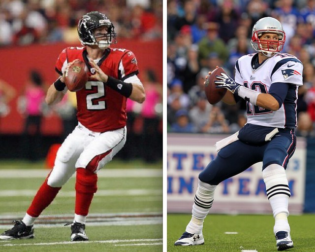
Barring a surprise, the uniforms shown above are the ones we’ll be seeing in Super Bowl LI two weeks from now. The NFC is the designated home team this time around, and there’s no reason to think the Falcons won’t choose to wear red, which means the Patriots will wear white.
It’s not the greatest uniform match-up, mainly because Atlanta’s design is a clown show. New England’s would be perfectly acceptable if not for the ridiculous side panels (although they definitely get bonus points for the striped socks).
As usual, longtime reader Jay Braiman has wasted no time in compiling his annual compendium of Super Bowl uniform minutiae. I hereby turn the floor over to him:
Assuming the Falcons wear red, that would make them the third team to wear two different primary jersey colors (other than white) in Super Bowl games, after having worn black in Super Bowl XXXIII. The Patriots (red and blue) and Broncos (orange and blue) are the others. This does not count the Eagles, who wore different shades of green in their two Super Bowl appearances, or the Seahawks, who wore different shades of blue.
Speaking of different shades of the same color family, just so we can start another debate about that, this is either the seventh (counting only the same or similar shades) or the 10th (counting all shades of the same color family) time that one Super Bowl team’s primary jersey color — in this case, the Falcons’ red — is a trim color for the other team (primary jersey only; not counting alternates). Limiting to the former, the primary-color teams are 5-1 against the trim-color teams; expanding to the latter, the record swells to 8-1. Here’s the list:
Same/similar shade:
• SB XII: Dallas (blue primary) def. Denver (blue trim)
• SB XXI: NY Giants (blue primary) def. Denver (blue trim)
• SB XXVI: Washington (red primary) def. Buffalo (red trim)
• SB XXXVII: Tampa Bay (black trim) def. Oakland (black primary)
• SB XLIII: Pittsburgh (black primary) def. Arizona (black trim)
• SB XLVIII: Seattle (blue primary) def. Denver (blue trim)Expanded to different shades of same color family:
• SB XX: Chicago (blue primary) def. New England (blue trim).
• SB XXIV: St. Louis (blue primary) def. Tennessee (blue trim).*
• SB XXXVIII: New England (blue primary) def. Carolina (blue trim).*The Titans, of course, used blue as both primary (navy) and trim (powder) colors.
The Falcons are the seventh team to have a major uniform overhaul between Super Bowl appearances (the others are the Patriots twice, Giants, Broncos, Seahawks, Rams, Eagles; this list doesn’t count the 49ers, who changed back before returning to the Super Bowl). These teams are 3-4 (Patriots are 1-1) in their first Super Bowl appearance in the “new” uniform design.
This is the fourth year in a row (first time that’s happened) that neither team’s helmet logo includes any letters of the alphabet. It happened three times in a row one other time, from SB XXVI to XXVIII (Washington/Bills and Cowboys/Bills twice). This is also the fourth year in a row, also an unprecedented streak, that the left and right sides of both teams’ helmets are mirror images of each other.
This is only the fourth time that both teams have no striping or other decal down the center/crown of the helmet. The other three were SB IV (Chiefs/Vikings), XXXVI (Patriots/Rams), and XXXIX (Patriots/Eagles).
Assuming Atlanta’s Matt Ryan starts the game for the Falcons, he will be the first Super Bowl starting quarterback to wear No. 2. After he starts, the only number from 1-19 never worn by a Super Bowl starting quarterback will be No. 6.
Tom Brady is one of 11 different Super Bowl quarterbacks to have worn No. 12 (5 of those, Brady included, in more than one game), by far the most, and this is the 25th Super Bowl in which at least one of the starting quarterbacks will wear No. 12. Those QBs are 15-12, including Brady’s 4-2. That also includes three games in which both starters wore No. 12 (Roger Staubach and Bob Griese in SB VI; Terry Bradshaw and Staubach in SBs X and XIII).
In addition to Ryan’s No. 2, Nos. 1, 4, 18 and 19 will be the only numbers worn by only one Super Bowl starting quarterback (two of those in more than one game and one of those for more than one team).
This will be the third time that the difference between the two starting quarterbacks’ numbers is exactly 10. The quarterback with the higher number won both of the previous times (Doug Williams [17] over John Elway [7] in SB XXII, and Peyton Manning [18] over Rex Grossman [8] in SB XLI). Overall, starting quarterbacks wearing double-digit numbers are 14-11 against those with single-digit numbers.
And that, my friends, is some serious uni-centric number crunching. Let’s please have a round of applause for Jay (along with the inevitable fact-checking of the items he might have miscalculated and the sniping over certain items that are open to interpretation). Nice job, as always!
Not mentioned by Jay: All but one of the past 12 Supe winners have worn white. This has led some fans to ask me, “Will the Falcons choose white, just to be safe?” I’m fairly certain that the answer to that is no. But we’ll find out soon enough.
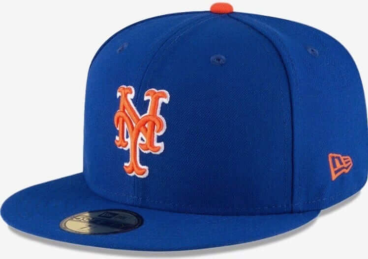
Mets/QBC update: The cap shown at right is the Mets’ new home alternate cap. It replaces this cap, which is basically the same thing but with a different-colored brim. The new cap is the same as the Mets’ primary cap, but with the completely pointless white outlining on the logo (and, of course, the even more pointless New Era logo creep, but that’s a separate issue).
This new cap is one of several issues we’ll be discussing on Saturday at the Queens Baseball Convention’s uniform panel, which I’ll be chairing. Panel participants include uniform designer/historian Todd Radom; Mets uniform number savant Jon Springer; Mets stitcher Russ Gompers; Mets game-used jersey collector Nick DiSalvo; and our own Phil Hecken.
Doors open at 11:30am, and our panel will run from 2-3pm. Further info and tickets here.
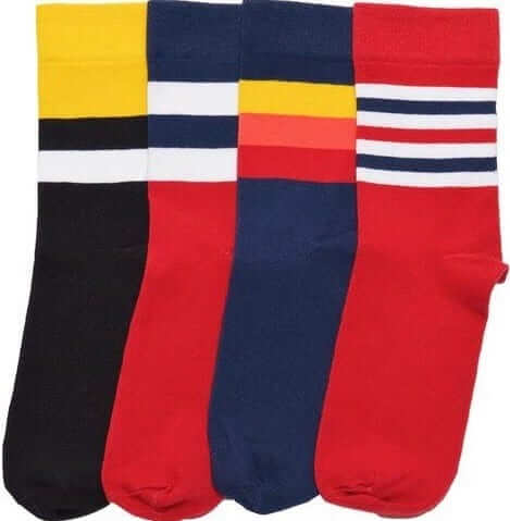
StripeRite update: The first batch of StripeRite socks, which had sold out, is now back in stock. Three of the four designs from the second batch remain available as well.
The Ticker
By Alex Hider

Baseball News: Fake news: Fox Sports ran a story titled “Yankees First Team to Number Uniforms” yesterday. Of course, we all know the 1916 Indians were the first team to wear uniform numbers (thanks Phil). … JUCO school Lower Columbia Red Devils will wear an alternate jersey with that includes the zip code for Longview, Washington ”” the town in which the school is located. Anyone know of any other team that uses a zip code on its jerseys? (From Michael Carman.) … Check out this old FAU cap based on the ’80s White Sox batterman logo (form Hem). … Brewers GM David Stearns got married this weekend and had a Miller Park cake at his wedding (from Mike). … Ronald Kremer sent along a photo of his grandfather, Frank Kunkel, when he played for the Williams Crushers, a local St. Louis team, back in the early 1920s. The uniform is notable for having a plaid pattern, similar to what the Brooklyn Robins and New York Giants wore in 1916.

NFL News: Three-digit uni alert: Ziggy Ansah of the Lions wore No. 275 on his jersey in a commercial for a pizza chain (from Jeffrey Sak). … There were lots of NFL shield soda displays in grocery stores around the country yesterday (from Kevin Kielczewski and Rob Warner). … Jonna Zwiep sends along a forgotten tidbit from the 2007 NFC Championship game. With frigid temperatures in Green Bay, Giants equipment manager Joe Skiba added a layer of sheepskin in the players’ helmets for extra warmth against the sub-zero temperatures in Green Bay. You can see a bit of sheepskin poking out of the earhole of the helmet in this photo.
College Football News: … Uniformswag gave its Uniform of the Year award to Air Force’s alternates (from Bill Schum). … St. Norbert College, a DIII school near Green Bay, will have four new uniform combinations next season (from Brian Kerhin).

Hockey News: If the video game NHL 17 is correct, it would appear that the Penguins will be wearing yellow helmets with their Stadium Series jerseys (from Gav). … Red Wings G Jared Coreau appeared to tape over the maker’s mark on his goalie mask yesterday (from Superyan). … A Minnesota fan wore a Wild/North Stars frankenjersey the other day. Just stick to the right side, buddy (from Tony Tengwall). … The Bridgeport Sound Tigers of the AHL appear to sell ad space on their helmets (from David Wilock). … KHL All-Stars were given a team jersey on Sunday ”” except for Enver Lisin, who wore the jersey for his team, Salavat Yulaev (from @TovarishchLisa).

Basketball News: Hall of Fame inductee and longtime Ranger Ivan Rodriguez received a personalized jersey from the Dallas Mavericks on Sunday (thanks Mike). … One Raptors fan is wearing his team on his sleeve ”” and all over the rest of his jacket. That guy is apparently known as a Raptors “superfan” (from Mike). … The Los Angeles D-Fenders of the D League will become the South Bay Lakers after this season (from Andrew Beckner). … Michigan wore blue at home on Saturday against Illinois. That move was in response to an Illinois’ Maverick Morgan referring to the Wolverines as a “white collar team” (from Stephen Ceruolo). … Awesome lettering on this vintage Tulane warm-up top (from Craig Bates).

Grab Bag: A member of the Arsenal medical staff was carrying a bag with Champions League branding the other day but taped over the logo because the Gunners were playing a Premier League match (from Collin Pearce). … Yahoo Sports shared this video about short-lived sports logos yesterday (from Jamie Burditt). … Couple of racing notes from David Firestone: Kyle Bush is wearing the same suit he wore last season ”” only the Sprint Cup patch has been replaced with the new Monster Energy Cup Series logo. Busch and Sebastian Vettel swapped helmets after Sunday’s Race of Champions. … Here’s a behind-the-scenes look at boxer Canelo Alvarez’s personal logo and the designer behind it (from Gabe Oppenheim).
Proofreading:
“New England’s would be a perfectly acceptable”
“longtie reader” (unless that’s Jay’s uni quirk)
For me, the Patriots uniforms remain ugly; they’re just a longstanding ugly uniform that we’ve become used to.
Fixed.
Tulane Tigers? Is that a High School?
“This is the fourth year in a row (first time that’s happened) that neither team’s helmet logo includes any letters of the alphabet.”
technically, isn’t the Falcon’s logo a stylized F?
“Technically,” no. Aesthetically, maybe, but only the right-side/right-facing decal. The logo itself resembles the letter F, but does not contain the letter F (the way, e.g., the Ravens logo contains the letter B).
I think a majority of AHL teams wear helmet ads these days.
Doing a quick look through all the Syracuse Crunch games I’ve been to this year, a couple exceptions are Wilkes Barre/Scranton (no decal) and St. John’s (primary logo).
Speaking of minutiae, the patriots jersey posted is not current.
link
Actually, the falcons jersey is also out-of-date. (Reebok)
“Michigan wore blue at home on Saturday against Illinois. That move was in response to an Illinois’ Maverick Morgan referring to the Wolverines as a ‘white collar team.'”
Looking at those jerseys, wearing blue doesn’t combat that because the necklines (closest thing to a collar) were predominately white.
I’m not buying that new Mets although cap but at least it’s blue…
ALT cap…damn auto correct…
I suppose the Mets’ new home alt cap is an improvement, but I would have preferred ditching the white outline instead of the orange bill. I get that they want the logo to match the home alt jersey script/numerals/lettering but I still think this cap (like its road counterpart) is wholly unnecessary. The standard cap looks fine with both. (Any word on whether there will be alt batting helmets this year? So far there haven’t been…)
Last year we were mercifully spared the sight of both blue alts, which were worn only rarely (in part, I think, because of the ’86-retro Sunday alts); not sure if this bodes well for a repeat of that. Anything new has to be worn a lot in order to boost sales. OTOH, if the home alts are worn only on Sundays, I could live with that.
Harvey was injured for half the season. He was the main pitcher who chose to wear the blue jerseys. Once he went down I am not sure they wore them at all.
1) Mets do not let starting pitchers choose the team’s jersey.
2) Even when Harvey was healthy, Mets wore blue jerseys less and less last year — including in many of Harvey’s starts.
True, but Mets seems to have worn the blue jerseys significantly more often in Harvey starts than in other games, I am not sure I can recall them wearing them at all after the All Star break last year.
It is true that they wore blue more frequently when Harvey pitched prior to 2016. But you stated that Harvey “chose” to wear the blue, and I was simply pointing out that that’s not an accurate characterization of how things work for the Mets.
According to this article, Terry Collins does allow them to choose:
link
Whoa — I stand corrected! Thanks for that.
I was honestly unaware of that. My understanding had been that the equipment manager chose what to wear. I also know for a fact that there is a high-ranking team exec who prefers the primary home pins and road greys, and that this exec’s preference has had an influence on what the team wears.
I wonder if that exec is Alderson, as from 1998-2010 they hardly ever wore the pinstripes. The snow whites were the most favored home jersey. I love the pinstripes and prefer thatbthey wear those the most.
To compound the horror, Minnesota guy also tucked in the frankenjersey. I will never understand tucking a jersey into casual clothing.
Especially a hockey jersey, since it’s historically derived from the sweater (and may be called such out of tradition). And I don’t know anybody who tucks in a sweater who isn’t a total knob.
If we are being really technical, the Atlanta uni Matt Ryan is shown in the above picture, is actually NOT the one the Falcons will be wearing, since that is clearly the Reebok uni they wore before 2012 when Nike took it over.
If we are being really technical, the jersey he’ll wear in the Super Bowl will have a Super Bowl patch. And the pair of socks he’ll wear in the Supe won’t be the same pair he wore in the photo. And, and, and…..
It’s the same design. I’m all for nitpicking, but let’s save it for nits that actually matter. Thanks.
With this new Mets hat, if the biggest difference is a white outline on the logo (and not a different color brim anymore), expect more on field snafus. When the local team that Paul and Phil follow make that mistake, we’ll hear about it because this is what we do here. Glad the Mets keep us busy!
Excellent point — expect lots of “wrong cap” situations this season.
I expect roughly the same # of snafus as the Pirates have on a year-to-year basis with their un-outlined P hat and outlined P hat. Which is to say not as much as one might expect. Which is a good thing that they have their ish together for the most part haha
In regards to the Minnesota Wild/North Stars mashup, it’s that way because it’s a dual Parise jersey. Zach Parise wears number 11 for the wild right now, and his father, JP, wore number 11 for the North Stars.
One very sad addition to Mr. Braiman’s excellent compendium above: Bay State (f/k/a Boston) has never won a Super Bowl against an opponent whose helmet logo has letters, but has never lost a Super Bowl against an opponent whose helmet logo has no letters.
Topic for debate: Does the Falcons helmet logo not include any letters? Doesn’t the falcon’s in-flight depiction form an ‘F’?
Not to MY eye. Never has. Old or new.
The right-facing logo/right-side decal sort of resembles the letter F. Not sure if that’s intentional; it could be. But regardless, resembling a letter is not the same thing as including (or being) a letter.
The Ravens logo includes the letter B; the Chiefs’ logo includes the letters K and C; the Dolphins’ logo used to include the letter M; the Bears’ logo is the letter C; and so forth.
Well stated, Jay.
Now you see what it’s like having to defend/explain your positions to people who make apples/oranges comparisons, move the goalposts, etc.!
Not necessarily saying that the current Falcons’ logo is meant to be an “F”, but I think it’s a valid question as to whether or not a design can double as both a letter and something else.
Best example would be Washington State’s helmet logo, which clearly contains the letters W,S,and C and also is clearly meant to resemble the head of a cougar.
Or the Brewers’ ball in glove logo. I certainly couldn’t describe that cap as having no letters.
Remember what I do for a living. ;)
The Williams Crushers (and Robins and Giants) uniforms have a check pattern, not a plaid one.
wait – didn’t the Panthers wear black last year and the broncos wore white (I remember being disappointed by that)? So wouldn’t the AFC team be home for this SB? aka Pats in navy?
Broncos were home team and chose to wear white, because they’d been 0-4 wearing orange in Super Bowls.
The simple way to remember is — if the Super Bowl is an odd number (like 51), the NFC team is the home team.
It says something about me that, besides not liking NE, I REALLY didn’t want them to go to the Superbowl because I knew the AFL was wearing white this year, and I HATE dark pants. If I don’t have a horse in the race, I root for the best looking match up.
Ha… oops, AFC… I’m only 45, not sure where that came from :)
The Falcons are the seventh team to have a major uniform overhaul between Super Bowl appearances (the others are the Patriots twice, Giants, Broncos, Seahawks, Rams, Eagles; this list doesn’t count the 49ers, who changed back before returning to the Super Bowl).
Shouldn’t the 49ers still count, since they wore throwback uniforms when they beat the Chargers?
I would expect that game is excluded from all calculations of this nature because it screws things up. That was a one-off alternate uniform; the only alternate uniform ever worn in a SB game. It doesn’t represent an overhaul of the team’s primary uniform design, akin to what the other referenced teams did.
I would consider the shades of blue in the Rams/Titans Super Bowl are closer that then the shades of red in the Redskins/Bills Super Bowl.
Good for Paul finding some quirky Super Bowl uniform factoids. But you overlooked the dominant current SB uniform superstition–that is the fact that 10 of the last 11 winners have worn the white jerseys. Denver went way out of their way last year to acknowledge this white jersey trend, both for the recent stats and their own bad luck with their orange jerseys in Super Bowls. Worked out very well for the Broncos. Atlanta has obviously chosen to ignore this superstition when they could be wearing white.
By the way Paul, seems like any team choosing to display stripes that aren’t straight on the sleeves, helmet top and down the pants gets disparaged by your column. Is there any NFL uniform designed since the 1960s that you actually like?
The Falcons home red is one of the best looking NFL uniforms precisely because it is creative and great mix of their black, red and white colors–although they also have silver in their colors and it would look great to have more splashed into the stripes or numbers somewhere. Silver pants would be a great addition.
I’m not a big fan of the Patriots unis compared to the old Pat Patriot design. But they have dominated the NFL in the new set since 2001, so I can’t imagine any changes there for a long, long time.
you overlooked the dominant current SB uniform superstition—that is the fact that 10 of the last 11 winners have worn the white jerseys.
Someone didn’t read today’s lede very carefully.
Is there any NFL uniform designed since the 1960s that you actually like?
Yes. Many.
Apologies to Paul. You did mention the white jersey luck and it is 11 of the last 12 winners wearing white.
Nonetheless, I don’t recall much praise for any recent NFL uniform redesigns. It seems your favorites are teams like the Packers, Bears, Chiefs, Raiders, Giants, Steelers. These are many of the teams that are basically the same as their 1960’s styles.
I have never hidden the fact that I am a classicist. If that’s what you’re trying to say about me, then I agree with you. If you think there’s something wrong with being a classicist, I welcome your critique (although I suggest you be prepared to defend it with intellectual rigor).
More recent NFL designs that I’ve liked:
– I’ve said many, many times that I love the Jags’ inaugural set. Wish they’d stuck with it.
– Unlike many Pittsburgh fans, I’m fine with the Steelers’ current number font.
– I appear to like the Pats’ current uniforms more than most. Not as good as Pat Patriot, obviously, but I still think they’re not bad.
– I think link is the best thing the franchise has ever worn.
And so on.
Actually, Jay wrote most of the lede today. But Paul, in fact, did mention the white jersey thing.
Jared Coreau and all goalies wearing “Vaughn” masks (that aren’t actually made by Vaughn) are required to cover up the logo since Vaughn didn’t pay the fee to have their logo shown on masks. Similarly, Sherwood did not pay the logo fee for their goalie sticks: link
I don’t get to watch much hockey on tv anymore, but awesome!
I was going to ask if the Patriots road uniform is the only one with a helmet color that doesn’t show up on the uniform, until I noticed a very subtle silver neck collar. Still, it seems like the silver helmet doesn’t go with this uniform combo.
I’m pretty sure I know the answer to this question, but can a team elect to wear an alternate jersey for the Super Bowl? For instance could the Chargers wear their light blue instead of navy? I would love to see the Falcons wear their black jerseys. Of course these were “throwback” and not alternate, so I’m sure these wouldn’t be allowed.
No alts in the Supe.
The one exception came in the 1994/95 postseason. Niners had played well in their throwbacks and asked for permission to keep wearing them in the postseason. Permission was granted, and the team wore that uni all the way to a championship.
Thanks. Haha…the 94/95 Niners throwback uniform, both home and away, is an example of my first point about helmet color not showing up on uniform. I really disliked this uniform.
If only we could get a Pat Patriot/Black Fauxback Color on Color Superbowl
In the Fox article about the Yankees uniforms, there is a statement of
“Back in 1912, the Pacific Coast League had uniform numbers, but abandoned the idea at the end of the season. It would take close to twenty more years before they returned to the league.”
Is this true?
In re: Falcons, I was hoping that the Falcons would invert their current uni set next year for the new stadium, and return to the original red helmet black jersey combo.
In re: the Patriots, I, too, prefer Pat Patriot, but I don’t see why both logos can’t be on the uniform. I’d love to see Pat on the shoulders instead of Elvis (or even better, on the helmet).
Pat is too complex a logo as it is, but especially at the size of a sleeve patch.
Too complex? For who?
*Bringing up an old item.
Re: NFL Endzones for visiting teams.
Last week Paul posted many examples in his flashback Friday, and the corresponding link he provided had additional examples.
One notable exception was the 1983 AFC Championship between the LA Raiders and Seahawks.
(*note: in this abbreviated footage, you can clearly see SEAHAWKS in the end-zone, but the Raiders were home…first seen at 6:32):
link
Of the two uniforms, I actually prefer the Falcons’.
Sure, it’s a little busy, and if I had my druthers I’d simply things a bit, but “clown show” seems pretty harsh for what amounts to a little bit extra stuff on the sleeves.
The red jerseys look great with the black helmets, the number font is unique but not too crazy, and with the white pants they avoid the dreaded “mono” look.
The Pats, on the other hand, are a trainwreck. Goofy logo, navy pants when silver would look better, and outdated “side panel” along with weird number font. Not a fan.
What exactly is “weird” about this number font?:
link
Not saying you have to love it. But what is “weird” about it?
Hard to put my finger on it, exactly. It’s like it’s almost the traditional block number font, but not quite.
Actually, if you look at Brady’s #12, it appears the thickness of the vertical parts of the number is wider than the horizontal parts. Not a huge deal, admittedly. But a little weird. Also, it seems the 5’s have one too many serifs and the 7’s are missing one at the bottom.
While I’m not the one who started the “weird” description of the font, I’ve long thought that. The inconsistency between how the outer edge of a curve uses 45 degree angles while the inner edge uses a 90 degree angle makes parts of the numeral look strangely constricted.
Yeah, that too. :-)
Regarding the Patriots socks, while I too generally prefer stripes, to me New England’s stripes on their socks is a “where the F did those come from?”.
They seem to not fit in as an element with the current uniform set, and can’t even be considered a holdover from previous sets.
Their socks always struck me as out of place overall.
Lee
Haha…We all have weird ideas about uniforms, or we wouldn’t be on a site about uniforms. One of mine is not liking dark pants with white jerseys, unless matching the helmet. For instance I like Washington with the burgundy pants and helmet, but not the Cardinals red pants and white helmet. I’d rather see the Patriots with silver pants, or better yet the old white “Pat Patriot” uniforms.
I second this emotion.
A little late for this and, unless the mods include this post tomorrow, I imagine few will see it but that FAU hat was from when the team (I think 99% sure it was exclusively the baseball team) went by the “Blue Wave” moniker. They have since changed to the with the rest of the teams at FAU and with that the logo died. They used it into the 2000’s.
Re: area codes on the uniforms
Raptors 905 of the NBA D League is for Toronto’s area code. I saw one of their games on tv recently and had to look it up.
What’s really sad is that the Pats and Falcons once had great uniforms. Their 70’s/80’s throwbacks were gorgeous!