Click to enlarge
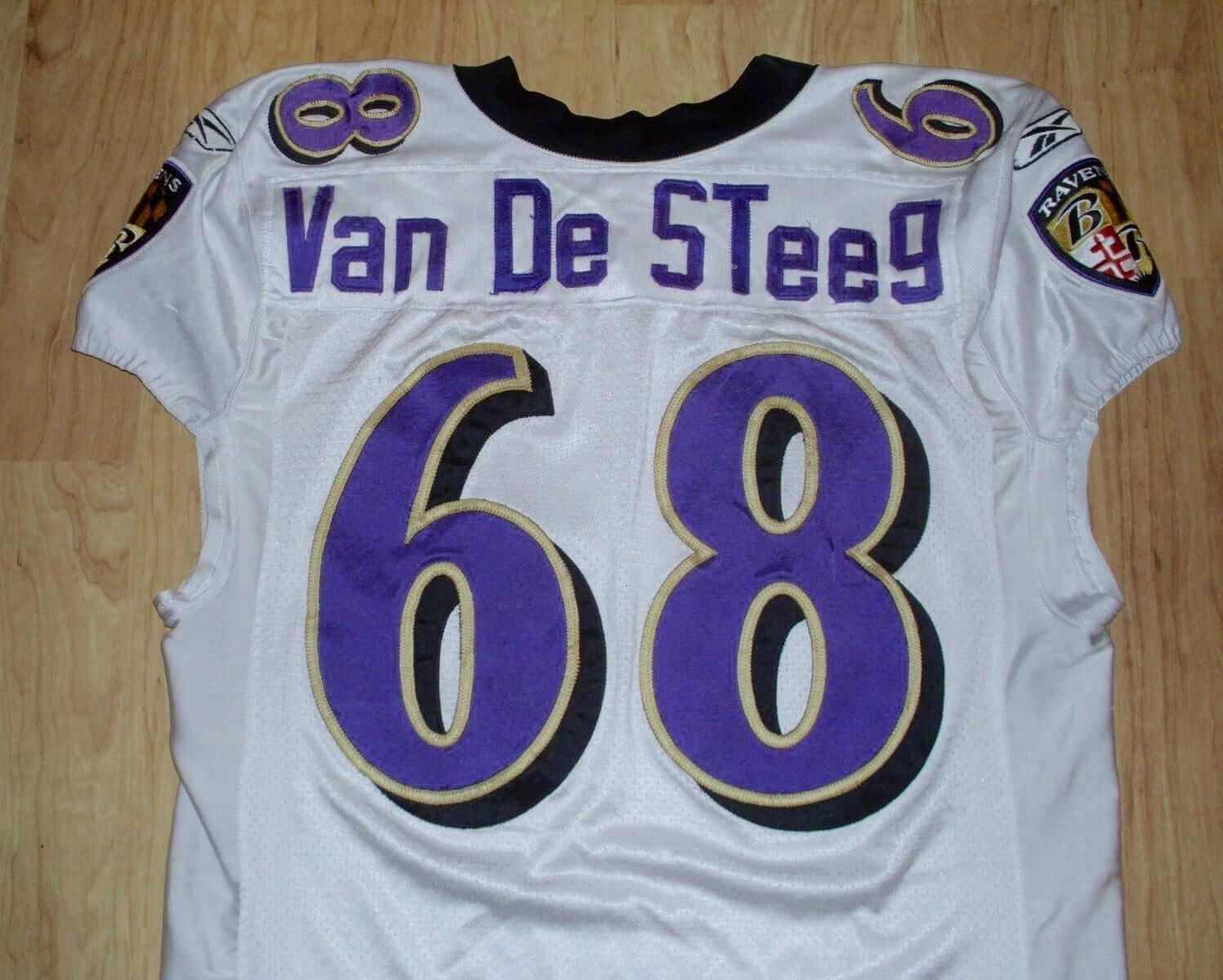
The jersey shown above is currently available for purchase on eBay. The seller claims that it was worn by William VanDeSteeg, who was a linebacker on the Ravens’ practice squad in 2009 but never made it onto an NFL roster. If the jersey really is legit and not a counterfeit knockoff, it has one of the more unusual NOBs we’ve ever seen. Consider:
• Internet references to VanDeSteeg all show his surname as intercapped with no spaces, but the NOB shows it as “Van De Steeg,” with two spaces.
• Instead of being all-caps, the NOB includes lowercase letters.
• The “T” is capped, when it should really be lowercase.
• The “g” is base-aligned, instead of having the descender projecting below the baseline.
What a mess! I’m sure some of you are saying, “Chinese knockoff,” but why would anyone make a counterfeit jersey for a player who never made it past the taxi squad? Moreover, the eBay seller is a Ravens specialist with a near-perfect feedback rating, so he appears to be reputable. Definitely a weird one.
Update: Reader MJ Kurs-Lasky has found an action shot of VanDeSteeg wearing this jersey! It’s from a practice on Aug. 11, 2009 (click to enlarge):

So: Confirmed!
(My thanks to longtime Uni Watch reader/pal Joe Hilseberg for bringing this jersey to my attention.)
Click to enlarge
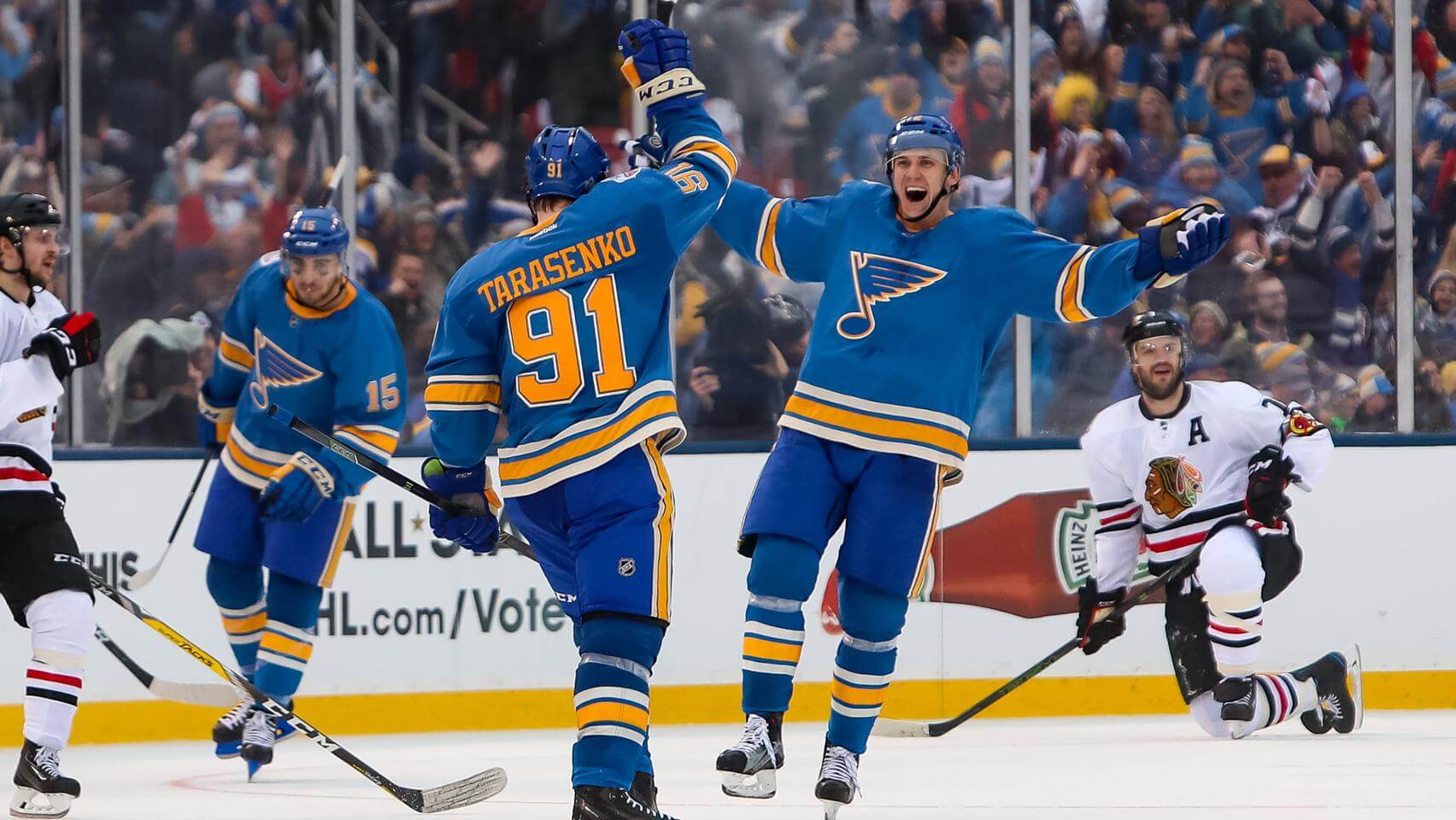
Winter Classic: It wasn’t all that wintry, but this year’s Winter Classic was a winner from a uniform standpoint. Man, did those Blues uniforms look great or what? Additional photos here and here.

KRC update: After a bit of a holiday hiatus, Key Ring Chronicles is back! The first installment of 2017 involves an unattractive pink bow. Check it out here.

Birthday boy: Please join me in wishing the happiest of birthdays to our own Phil Hecken — that’s him at right — the best and most loyal bench coach a web editor could ever hope to have (and a damn good curling skip to boot). Enjoy your special day, buddy!
The Ticker
By Paul

NFL News: Someone on Reddit says that his uncle was on the Oilers’ medical staff. Here are some of his shirts and caps (from Justin Cliburn). … Black memorial armbands in the NFL are uncommon but not unheard of. One example: the 1979 Cardinals, who wore the armband for tight end J.V. Cain. Here’s how it looked on the white jersey (from Max Grimes).
College Football News: Penn State RB Saquon Barkley had his uni numbers on his thigh pads yesterday. … The Pride of Broken Arrow March Band, which took part in the Tournament of Roses Parade, had new uniforms. … Oklahoma kicker Austin Seibert wore black and teal shoes for the Sugar Bowl (from Andrew Cosentino).

Hockey News: Here’s more about how Hurricanes equipment manager Jorge Alves got into a game as the team’s emergency goalie the other day. “It even has shots of him doing his equipment manager duties in full goalie gear during the game,” says Taco Todd. … The old WHA was supposed to have a team called the Miami Screaming Eagles. “They actually signed the great Flyers goalie Bernie Parent, but they couldn’t find a rink in Miami, so they moved to Philadelphia and became the Blazers before ever playing a game,” says Jeff Flynn. Here are some photos showing how their uniforms would have looked. … Buried within this page is the news that the Bridgeport Sound Tigers will wear military-themed uniforms on Jan. 14.

NBA News: The Bucks wore their green road uniforms at home last night, with the Thunder wearing their white home uniforms on the road (thanks, Mike).

Grab Bag: New 20th-anniversary logo for SportsLogos.net. … New uniforms for the Vienna Philharmonic (from Seth Horowitz). … This interview with U.S. Surgeon General Vivek Murthy begins with a question about his uniform.
Happy Birthday Phil!!!
Happy Birthday Phil!
Happy Birthday, Phil!
Happy Birthday Phil!
Happy happy!
Thanks guys!
So, Surgeon General Vivek Murthy is actually a him, not a her, it turns out. I feel bad that I didn’t know who our current surgeon general was, but I appreciate the opportunity to learn that he is the first person of Indian descent to hold the position. I also did not know that the surgeon general wore a military uniform.
Reader MJ Kurs-Lasky has found an action shot of VanDeSteeg wearing the odd-NOB’d jersey. It’s from a practice on 8-11-09. I’ve added it to the main text, and here it is for people following the comments:
link
That updated VanDeSteeg photo of the jersey is compelling, but it sure looks like the “T” in the photo is lower-case. So maybe not the exact jersey, but definitely close enough to make this one seem legit as well.
Disagree. Looks uppercase to me.
Compare the position of cross of the T to the top of the e – it looks closer on the action shot, hence lowercase.
That “t” is definitely lower-case.
Yup, it’s lowercase — my bad. I see it now!
That’s recent enough that people who would be able to explain it should still be in the organization.
The link for the Oilers gear is from Imgur not Reddit
Happy Birthday Phil!
I do love the classic hockey uniforms and am sad some of them are gone. If I had my way, it is clear from the Winter Classic yesterday that the Blues need to consider going back to these original uniforms full time.
Just some tweaks needed. The blues of the helmet and pants need to match better with the jersey and socks. No vintage white in uniforms or gloves. A uniform trimmed with navy could stay as a third. Would this not be a great primary look?:
link
The blue uniform is beautiful as art, terrible as design. The crest on the front lacks sufficient contrast, especially given how plain the undecorated expanse of blue on the front of the jersey is. Find a way to make it pop – much thicker white outline, or render the note in navy or white or gold or literally any color other than than the royal of the jersey – and it would be a good jersey.
The St. Louis Winter Classic uniform is better than what the team wears now, but it’s not their best uniform. That honor falls to the 1978-79 outfit. The 1979-80 is also a classic.
I thing the beauty of the old unis is that they don’t match perfectly. To make the sweater and the shorts the same would make it the same as any other modern uniform.
Thanks!
Austin Seibert has been wearing those shoes the entirety of his two years at OU. Look terrible but must be some attachment to them.
Happy Birthday Phil! You’re a uniform content machine.
Thanks — cheers!
Happy birthday, Phil! The Uni Watch community is far more thoughtful and interesting because of your involvement.
Thanks!
Honestly wasn’t a fan of chicago’s uniforms, mostly because they were pretty much exactly the same as 2 years ago. Now this could be fixed by the simple method of ending the NHL’s love affair with the ‘hawks, but seriously, it’s like they completely forgot about the jerseys.
It was really weird that the Blackhawks used a black helmet instead of white. When they wore nearly the same uniforms two years ago they use white helmets. Which made sense since dark helmets are usually only worn when the white jersey is “vintage white.” This was a similar set up to last year’s Stadium Series which had black helmets too.
It was almost like I could see Glenn Hall and Red Berenson on the ice in those beautiful Blues unis.
All that’s missing to complement those gorgeous uniforms is the late, great Dan Kelly’s play-by-play:
Tarasenko gets the puck – he shoots – he SCORRRRRRES!
Agreed! Why the heck can’t they look like that every game of the season?! I hate the modern designs and the gratuitous dark-tinged colors that hint at black. Best-looking Blues jersey since the 70’s.
-Jet
Me too!
Those Blues uni’s really brought back a lot of good memories from my childhood: Berenson, Plante, Unger, the Plager bros., etc.
It was great to flashback to the seventies when I loved hockey so much more than I do today.
And the Blue Note is the coolest logo in pro sports, IMHO.
At the bottom of this page is another Van De Steeg Ravens jersey.
link
Interesting — totally different NOB style!
I had thought that I could get past the use of the vintage white on the Blues’ jerseys, since it was in relatively small doses, and the gold (yellow) would help to distract from it, as it did with the Bruins’ WC and Sabres’ anniversary jerseys. Unfortunately, the more I look at the Blues’ jerseys, the more I realize that it’s just no good after all.
This “artificial aging” phenomenon is just too artificial for me. It rings hollow with the “high-tech” modern fabrics attempting to emulate naturally-discolored wool blends of a century ago, and it just makes the uniforms look dirty instead of “old”. Granted, I’ve had this complaint for years now, so I’m basically repeating myself….
Both Winter Classic teams looked very good, but then, they were going back to classic (and timeless) designs. But I also liked the look of the black helmets for the Blackhawks. Helmet matching the breezers….nice!
Concerning the spacing in the surname Van De Steeg:
Having lived in West Michigan my entire life, I’ve seen more than my fair share of Dutch surnames. I don’t recall ever seeing a “Van De-” prefix that didn’t include both of those spaces. I’ve never seen “Vander-” (for instance, VanderWaal) spaced, nor, to the best of my recollection “Vanden-” (VandenBrink).
I’m not sure if these examples are due to the rules of Dutch grammar or the whims of US immigration officials, but it’s what I’ve seen for my entire life.