MLB made it official yesterday: They confirmed that Under Armour will be taking over from Majestic as the game’s official uniform outfitter in 2020 — a development that had first been reported, but not officially acknowledged, about six weeks ago.
But yesterday’s announcement came with a new wrinkle: While the Majestic logo has appeared on MLB sleeves, the Under Armour logo will be appearing on the upper-right chest area.
This is, of course, extremely disappointing. Just as the addition of the New Era logo to MLB caps collapsed the wall between major and minor league caps, and also between on-field and retail caps, the chest placement of the Under Armour mark will erase the boundary between professional and college jerseys, the latter of which often have the marker’s mark on the chest. It’s the latest step in what seems like an inexorable spread of branding and advertising on sports uniforms.
Baseball isn’t the only college sport that features chest-positioned maker’s marks — you can see the same thing in college football, college hockey, college basketball, and so on. Chest-based logo creep is also common in lots of international sports, like soccer, rugby, and cricket, along with Japanese baseball and many others. But just as the Big Four pro leagues here in North America have resisted the use of uniform advertising, they’ve also kept manufacturer logos off of their chests. That will change next October, when NBA uniforms begin carrying the Nike logo on the chest (along with uni ad patches, of course). With MLB moving to a chest mark in 2020, you have to wonder how long it’ll be before the NFL and NHL move their maker’s marks to a front-facing location. All of this feels like a move toward a more international model of uniform design.
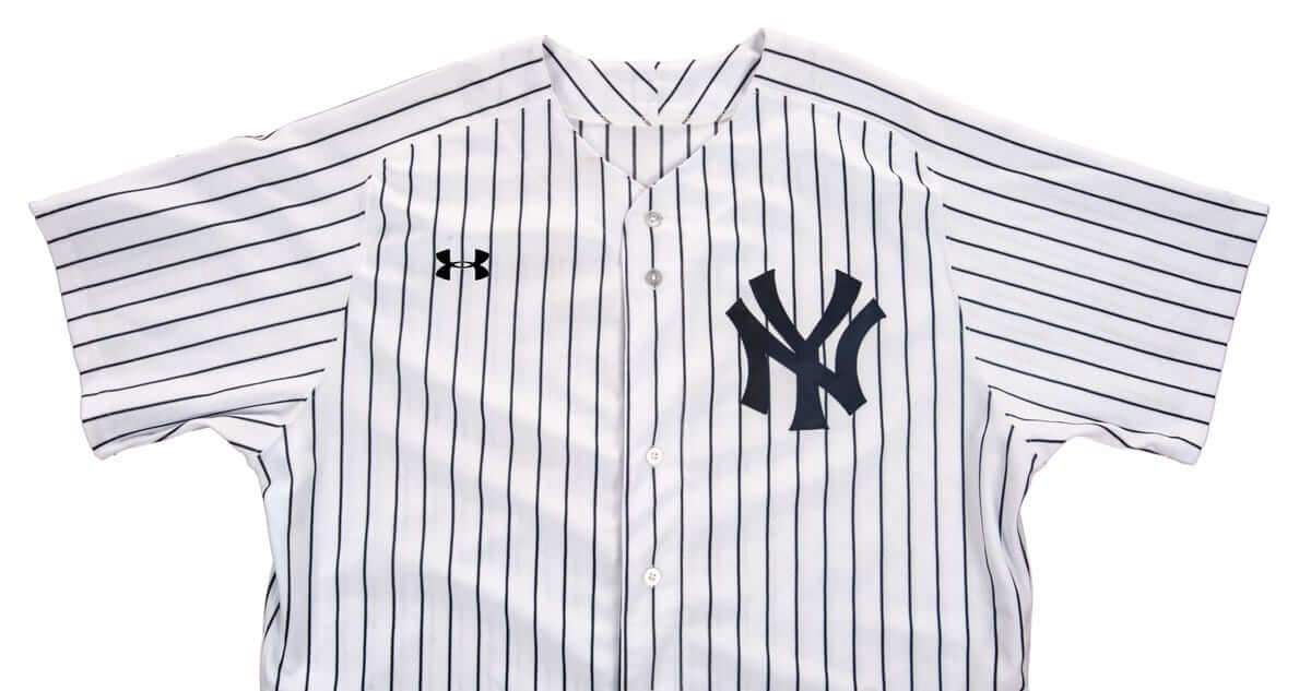
So how will it look? We can get a hint by looking at Under Armour’s college and high school uniforms. Here’s a good example (click to enlarge):
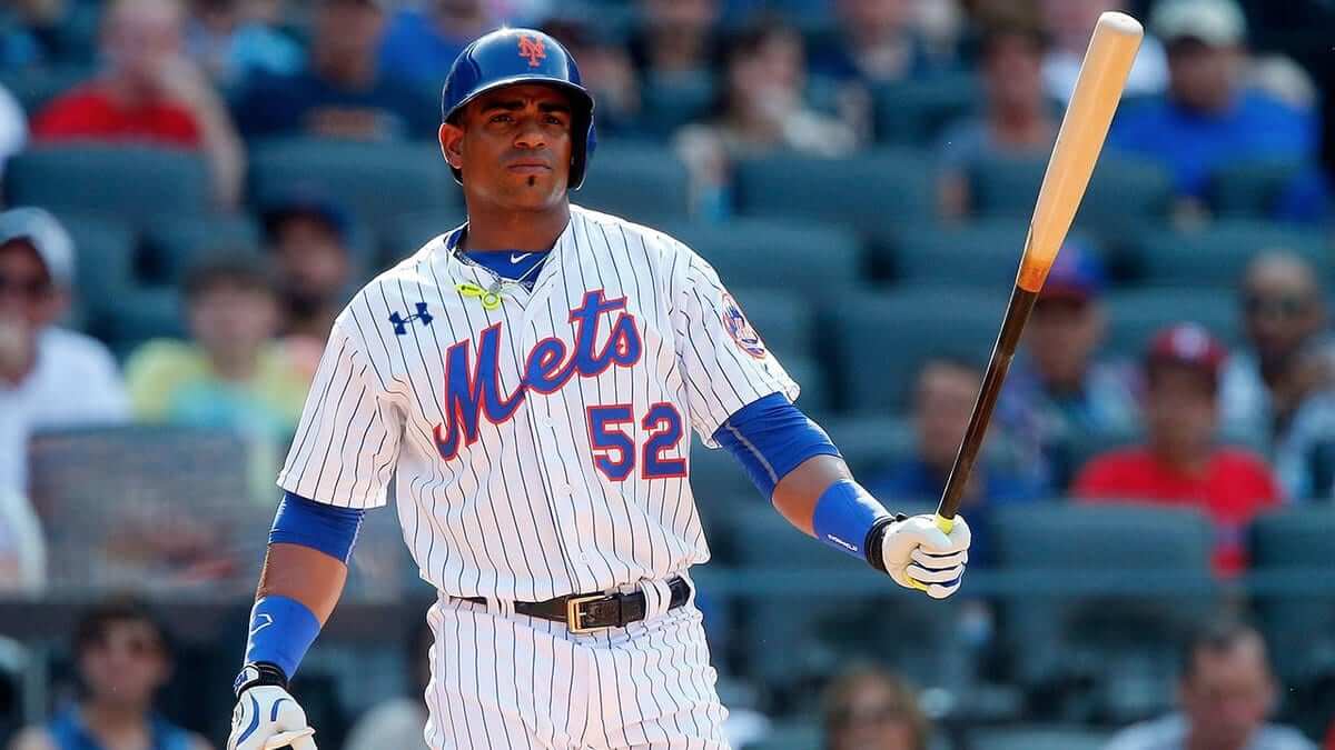
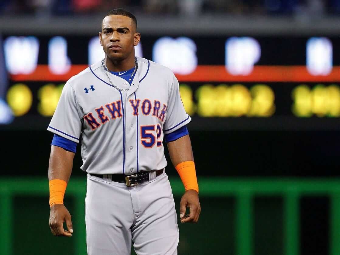
But it’s one thing to see a chest logo on the jersey of a team you’ve never heard of. It’s another to see it on a jersey design you’ve been staring at for years. And thanks to the magic of digital imaging, it’s easy to get a sense of what that will look like:

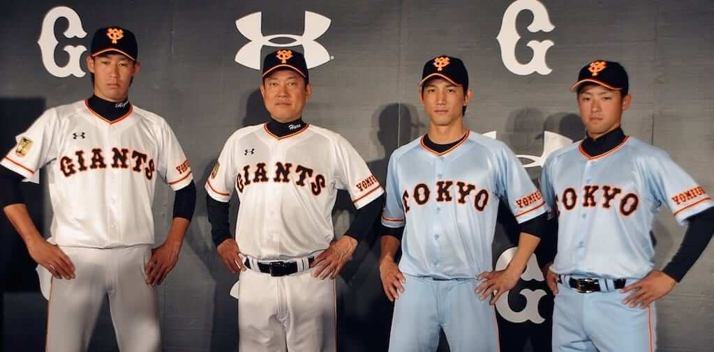
And we already have a good sense of what the Giants will look like, because Under Armour already outfits the Yomiuri Giants, who have the same color scheme and a similar jersey design:
Of course, all of this is still four seasons away. And will we get used to it, just as we’ve gotten used to all the other little things that have chipped away at the integrity of uniforms? Yes, we will — but it’s beginning to feel like death from a thousand cuts (to the uniform as well as to my psyche). And if you don’t think the move to a chest mark is a big deal, check out this Bloomberg News story, which says the chest placement doubled the value of the deal for MLB. Think about that — Under Armour was willing to pay twice as much to move the logo from the sleeve to the chest. That’s how unavoidable the Under Armour mark is going to be.
That story also includes the following quote from Under Armour founder Kevin Plank: “Think of a Yankees fan who is standing in front of a shoe wall deciding what they want to buy. They will think about the fact that there is an Under Armour logo on the front of their jersey.”
And there you have it: The point of Under Armour’s deal with MLB is to sell sneakers. That isn’t really a big revelation — you probably already realized it, at least on an intuitive level — but it’s really something to see it spelled out so plainly, right?
By coincidence, the day before this news broke I was reading a really good article about the encroachment of advertising into everywhere from national parks to report cards and permission slips and even church sermons (which all comes across as another example of a system that has succeeded too well). The guy who wrote that piece, Tim Wu, has a new book called The Attention Merchants, which is about the history of advertising’s various attempts to worm its way into our brains (like, say, by putting a logo on a baseball jersey in order to sell sneakers). I haven’t read it yet, but there are reviews here, here, and here, and there’s an interview with Wu here.
Wu’s thesis is that we need to be more selective about what we pay attention to, and that we shouldn’t give away our attention so easily, because that’s when advertisers get to manipulate us. But how can we avoid that in a realm like sports, where advertising is everywhere, from TV commercials to stadium naming rights? I’ll have more to say about that — and will be presenting you with a small defense mechanism — in a few days. And what about all the advertising on this here website? I’ll have more to say about that shortly as well.
Meanwhile, let’s enjoy the look of the next three MLB seasons. Well, except for the caps.
———
One footnote to all of this: Ever since news of the Under Armour deal first surfaced in October, officials in Pennsylvania have been very concerned about preserving the 600 job at Majestic’s factory there, and they’re now lobbying to have Under Armour either acquire that facility or use it as a subcontractor. Lots of good info here.
(My thanks to @Braves_Leo, @GetterOne, Doug Rowan, @Whittness, and Phil for the MLB jersey mock-ups.)
Click to enlarge
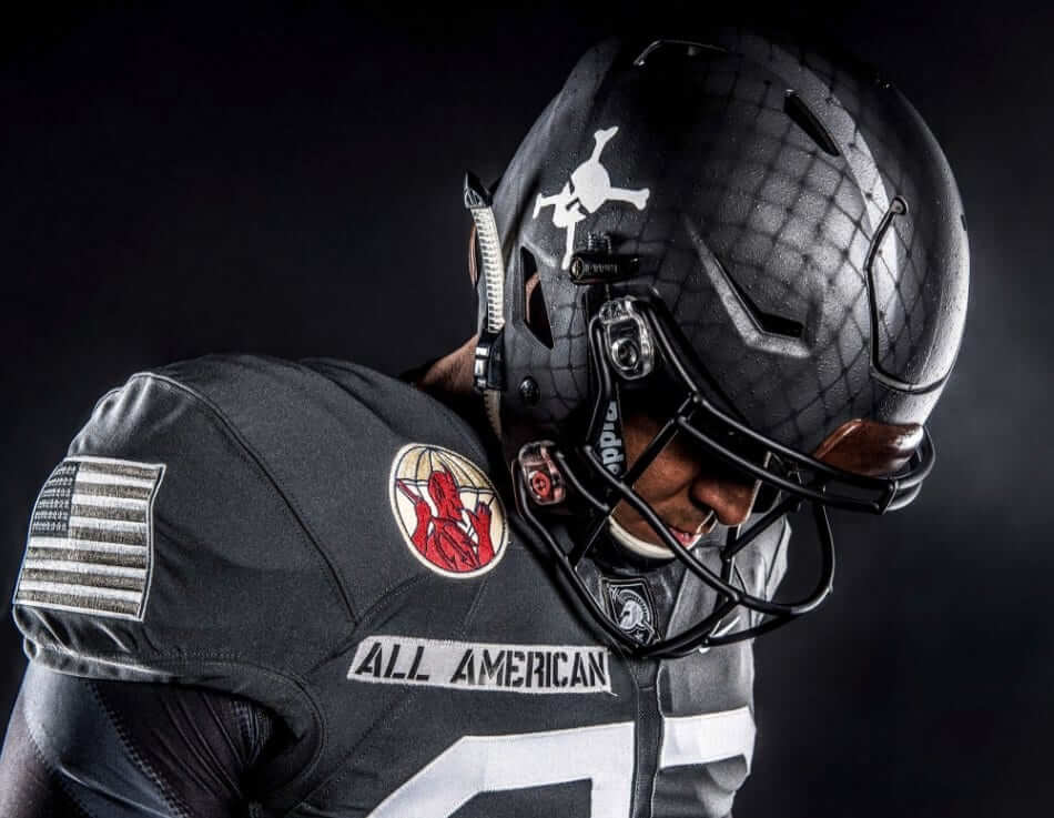
Parachutes not included: Army unveiled its uniform for this weekend’s Army/Navy game, and it’s a doozy. It’s based on the uniforms of Fort Bragg’s 82nd Airborne Division, with a difficult number font, patches that identify individual regiments and battalions within the division and a helmet design mimics the netting worn by soldiers of the era. There’s additional info here, and here are some additional pics (click to enlarge) and a promotional video:
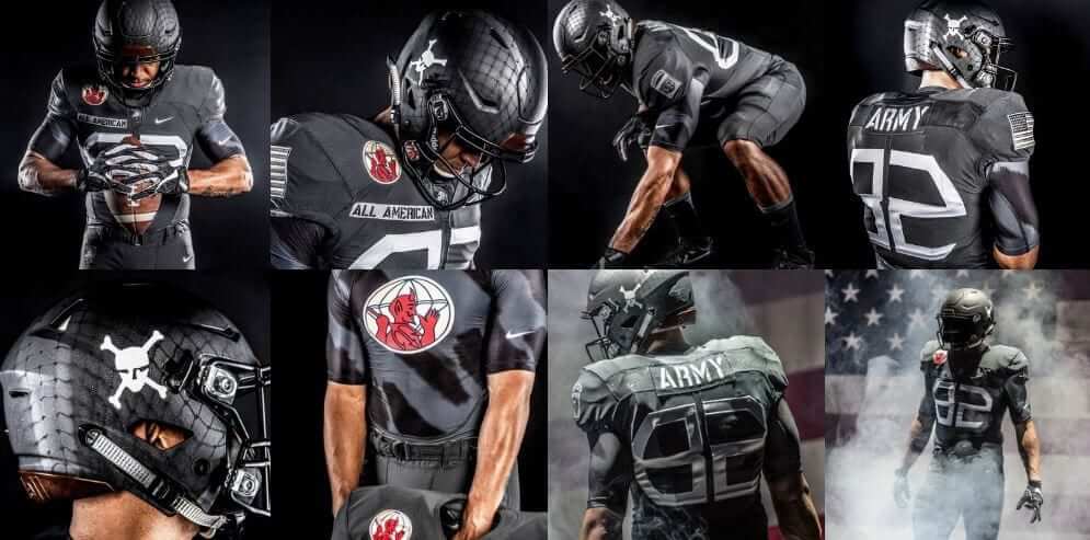
Interestingly, as you can see, the flag patch (which has 48 stars, don’tcha know) is facing the “right” way — which is actually the wrong way, according to proper flag protocol. Phil will have more to say about that, and about the rest of this uniform, and also about the upcoming Navy uniform, on Saturday, so you’ll want to check back here for that.
Click to enlarge
Collector’s Corner
By Brinke Guthrie
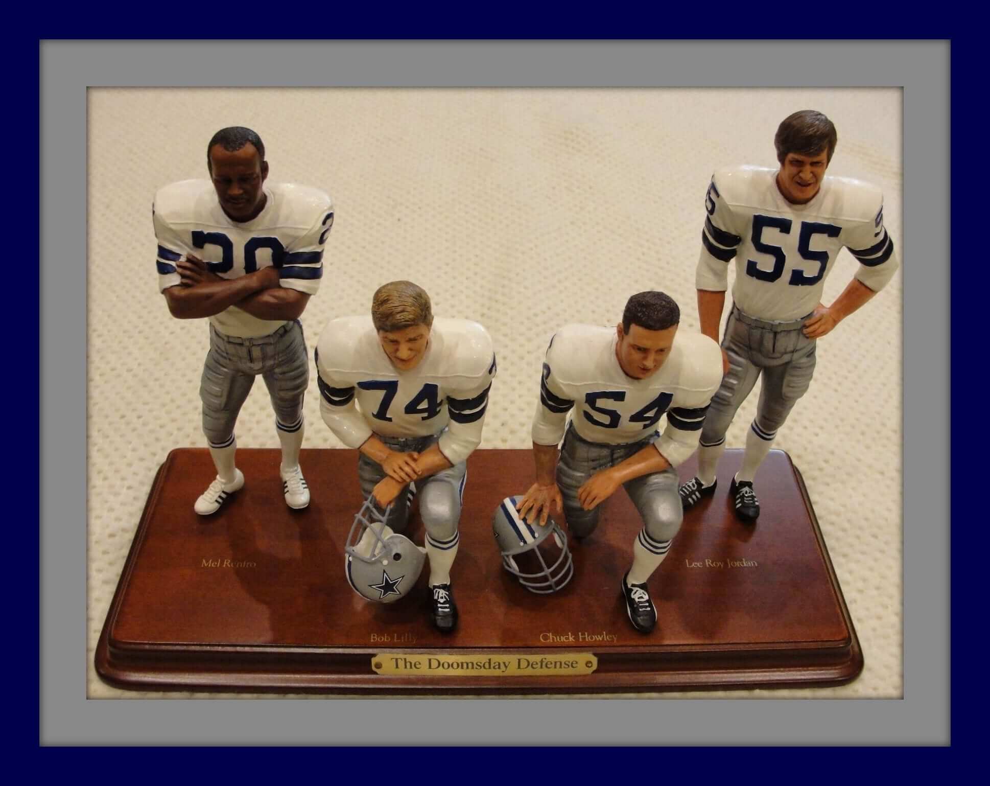
The Dallas Cowboys look like the team to beat in this year’s Super Bowl derby. This “Doomsday Defense set” from the Danbury Mint reminds us that they were pretty good back in the 1960s and ’70s, too. Look at the detailing here! Mel Renfro, Bob Lilly, Chuck Howley, and Lee Roy Jordan were mainstays in Big D for years. How ’bout dem Cowboys!
Now for the rest of this week’s picks:
• This 1970s Cleveland Barons NHL Puck Bank is still in the package!
• This New York Islanders tee from the 1970s uses the team font in the lettering. Note the “Y” in “My Game.”
• Coca-Cola was the sponsor for this 1970-71 season poster of Yvon Cournoyer of the Montreal Canadiens.
• From reader Mike Powers, check out this vintage 1940s hockey jersey (or sweater, whatever you like). “BR Flyers” on the front, and “Colmers Park” on the back.
• Here’s a set of 1970s PRO! gameday magazines. Check out the cover art on that first one. It’s Clobberin’ Time!
• Remember way back when these “SuperStripe” caps were all the rage? This Cowboys cap looks like it’s never been worn.
• Great artwork on these 1970s NFL curtains!
• Even better is this 1970s NFL belt. Never seen this one before!
• How ’bout a pair of official New Orleans Saints wristbands from the 1970s, still in the package. Extra absorbent, too!
• Still in the 1970s, but this time featuring the Chicago Cubs: Look at this retro art for this window decal!
• And from reader Will Scheibler, three CFL items: an Ottawa Rough Riders satin jacket, a 1974 Edmonton Eskimos Dave Syme Quarterback Buck, and a rug from the office of the Baltimore CFL Colts.
T-Shirt Club reminder: In case you missed it last week, the Uni Watch T-Shirt Club’s final design of 2016 is now available for ordering. The design is a mash-up of uniform elements from all of our previous 2016 shirts (click to enlarge):
The only new element is the baseball cap (which didn’t appear on our baseball-themed shirt because the player was wearing a batting helmet). It’s comes in four color options — our usual grey, black, green, plus a new “military green” (that’s what the manufacturer calls it, although I’d just call it light olive) — and is also available with either short or long sleeves.
The shirt will be available through this Friday. The shirts are due to ship right after Christmas, so they should arrive in time for you to wear them on New Year’s Eve. (I had hoped to have them delivered in time for Christmas, but it just wasn’t possible to get things finalized in time for that. Sorry.)
If you’ve ordered all five of this year’s previous shirts and also get this one, you’ll be eligible for our year-end “Collect ’Em All” prize, which will be a patch based on the jock tag design used on this year’s shirts. To qualify, please send me proof that you’ve bought all six shirts. The proof can either be (a) a photo showing all the shirts or (b) screen shots of the “Thank you for your order” emails you received from Teespring and Represent.
Once again, the new shirt can be ordered here. Thanks for your consideration.
On a personal note: One of my all-time favorite roadside attractions is Roadside America, a completely amazing and thoroughly charming miniature village in Shartlesville, Pa. If you’ve ever been there, you know how awesome it is.
Roadside America now needs our help. The roof is leaking, threatening the village display, and a new roof will cost at least $80,000. If Roadside America has given you pleasure over the years, as it has for me — or if you just care about preserving America’s vanishing culture of quirky roadside attractions — please consider donating to their repair fund. Thanks.
The Ticker
By Mike Chamernik

Baseball News: The Dodgers held a press conference with Rich Hill yesterday after the pitcher re-signed with the team. He was given a cap without a New Era logo and a blank Dodgers jersey. Again, he re-signed with them, so he could’ve just worn a game jersey, or even a retail jersey, that already exists (from David Feigenbaum). … R.A. Dickey’s high school baseball team at Montgomery Bell in Nashville used the Brewers ball-in-glove logo (from David Arnott). … A few things are wrong with this Derek Jeter jersey-shirt (from Jack Connell).

NFL News: The NFL changed course and will allow the Titans and Browns, who had byes last Sunday, to wear customized cleats for Week 14. There had initially been reports that the custom cleats would not be allowed, but the league backtracked late in the day yesterday (from Brinke). … A sign in the Georgia Dome has former Falcons QB Steve Bartkowski’s name spelled incorrectly. As Jake Jahimiak points out, the sign includes a photo of Bartkowski holding a jersey with his name spelled properly. … Not only is the XFL’s website still online, but there’s a page with logo and uniform style guides for each team! Tremendous stuff (from Joe Gemma). … Remember how someone once compared the Buffalo Sabres’ “buffaslug” logo to Donald Trump’s hair? There’s a new seafood eatery in Kurdistan called Trump Fish, and it uses an illustration of Trump with his hair represented by the Chargers’ lightning bolt logo.
College Football News: Penn State will wear blue for the Rose Bowl. Also, “I’m convinced that Saturday night’s Big Ten Championship in Indy was the first time that Penn State has worn blue jerseys for an indoor game,” says William Yurasko. “They wore white for five indoor bowl games (’75, ’79, and ’83 Sugar and the ’99 and ’07 Alamo) along with away games at Syracuse, Minnesota, and Indiana (at the Hoosier Dome).” … Old Dominion will wear these white helmets for the Bahamas Bowl. That’s quite the logo (from @norfolkology).

Hockey News: Dunkin Donuts will become the official coffee, donut, and breakfast sandwich of the NHL. It’s an odd choice, because Tim Hortons is not only synonymous with Canada, but it was actually founded by an NHL Hall of Fame player.

NBA News: Chesapeake Energy, the company that has the naming rights for the Thunder’s arena, may have a new logo (from Justin Cliburn). … Here’s a short video clip that explains why Kelly Oubre Jr. of the Wizards likes his shorts fairly tight.

College Hoops News: Last night, Providence wore jerseys with “Us. We. Together. Family. Friars.” stitched into the inner collar (from @joeymisdemeanor). … You may remember Grinnell College as the D-3 school that produced a bunch of record scoring performances a few years ago through a gimmicky offensive strategy. The team also wears some bad two-tone shorts that look particularly awful with a folded waistband (from Jesse Gavin).

Soccer News: West Ham’s kit man talked about equipment requests, building relationships, and cleaning players’ boots (from @the_boot_room). … DHL was named the new sponsor/advertiser of Pumas, a Mexican club (from Ed Å»elaski).

Grab Bag: In case you missed it during the Thanksgiving weekend, Paul wrote about the death of longtime Uni Watch contributor Terry Proctor back on Nov. 25. Here’s a more formal obituary from The Rochester Democrat & Chronicle (from Steve Lega). … American Airlines introduced new uniforms for its workers in September, but the flight attendants union is calling for a recall. It suspects that the uniforms have triggered headaches, rashes, hives, burning skin and eye irritation for more than 1,000 flight attendants (from John Gogarty). … The stock markets have soared since the election, with the Dow Jones Industrial Average recently rising above 19,000 for the first time. Some traders are wearing “Dow 19,000” baseball caps to commemorate the milestone. They are inspired by the “Dow 10,000” hats that were popular in 1999 (from Jason Hillyer).
The official title for the DD-NHL sponsorship is “the official American coffee, donut, and breakfast sandwich of the NHL” so there’s always room for Tim Horton’s
Plus Tim’s is a huge NHL sponsor in Canada. They’re just not prevalent in the US, so it sort of makes sense.
Back when we lived in DC and took regular road trips to the Midwest, we always stayed overnight on the way home at a motel in Columbus, OH, with a Tim Horton’s in its parking lot. I had a morning ritual of walking the dog up to the drive-in window for a cup of joe to go. The Canadian-ness and the NHL connection of Tim Horton’s being on the boards at pretty much every Canadian rink was the main attraction for me.
They just added a Tim Horton’s in Dinkytown which is just north of the University of Minnesota campus. I’m hoping that a trip for donuts becomes a ritual for Gopher hockey fans. It’s almost a straight line walk to/from Mariucci Arena.
I love Tim Horton’s, but live just outside of Cleveland. There is a Timmy Ho’s 2 hours in every direction (Columbus, Erie, Toledo, and obviously across Lake Erie) but none closer. The wife and I will occasionally make a trip for some Tim Bits.
Yeah, I think I’ll be keeping my current old Sunday red Braves jersey, that UA logo creep can go jump in a fire
The XFL has a side banner ad that advertises “Want a high impact job?” followed by their logo. I doubt those listings are still available.
Dunkin Donuts? BOO! HISS! BLEH! To hell with them! I want my Timmy’s!
Between that bit of news and seeing that ugly Under Armour logo on the front of baseball jerseys, my day’s really off to a flying start… :P
The XFL site referenced is a fan site (check the URL and footer). I also found this quote on the homepage:
“The entire ALL-XFL Memorial Network has been completely revamped, to try to capture the look and feel of the original XFL websites.”
I’m actually a Shartlesville native, I know there are like maybe 100 of us
I”ve only been to roadside america once when I was about 11 and it was a blast
never been as an adult but it sad to see that the trains are under potential damage
not my type of thing at my point in life but it really is an incredible collection
Wow! With that Cowboys Super Stripe hat I can almost smell the Red Man, Jack Daniels, and Pabst Blue Ribbon (before PBR became “hip”).
I had a similar reaction but as a Texas resident when these hats were a thing, I imagine a combination of Skoal, Wild Turkey, and Lone Star beer.
Small point of clarification from a big Friars fan. Those jerseys worn by PC were from Saturday’s win against in-state rival, URI. We’ve had grey alternates for a few years, but these are updated and match the new home and road uniforms. Maybe I’m biased, but it’s a really nice set (link, link, link).
Also, some nifty work with the wordmarks. Friars on the shorts for link/link, Providence on the jerseys, and a complete swap on the alternates.
Sorry for the flood of comments!
I work in a school and took our graduating kids for an overnight to HersheyPark, and we stopped in at Roadside America on the way back. The detail of the town was astonishing and our kids got a pretty decent charge out of it…
But that “Night Pageant” where all the lights go down and an old record spins some 1940’s recording of God Bless America and then all of a sudden Jesus is being projected on the wall… That was something else, I’ll tell ya, brother.
The night pageant (complete with the spotlight on an American flag that’s tacked to the wall with a little fan blowing at it) is spectacular in the most literal sense of the word. It’s a spectacle!
Oh gosh, Paul! Thanks for the info on Roadside America. I haven’t been there in 40 years and it’s STILL one of my favorite places. In fact, I just recommended it to a friend who’s planning a cross country trip next summer, as a must see. GoFundMe donation duly taken care of…
The UA wangle looks looks like crap on all of those jerseys, but especially on the Yankees. It’s essentially a ripoff of the interlocking NY to begin with, so you have one big logo and a smaller logo that kinda-looks-like-but-not-exactly the big one, throwing the entire thing off. What a goddamn mess.
I’m going to be a bit pedantic here, but that’s really what this site is for…
I’d say the UA logo is more of a rip-off of the Dodgers LA logo than the Yankees NY. The NY are just overlayed on top of eachother, one letter does not contribute to the other. The Dodgers LA logo and the UA logo part of one letter contributes to the other (the bottom of the “L” is the cross of the “A” for LA, while the bottom of the “U” is the cross of the “A” for UA).
At the University of Maryland in 1996, a young student-athlete named Kevin Plank decided he didn’t want to work out in sweat-soaked cotton t-shirts anymore. Plank researched the athletic benefits of synthetic fabrics, then designed a compression T-shirt, the first UA HeatGear shirt.
The UA logo is a U layered with an A, simple and plain. The name was inspired by the term “body armor.” Plank’s brother Bill accidentally called it Under Armour one day, and the name stuck.
I think the flag direction on the Army West Point uniform is historically accurate (star field in upper left).
link (Encyclopedia Britannica)
Agreed. The flag facing front is absolutely accurate to uniforms of the time. In fact, they were only worn (IIRC) during Allied operations where distinction was needed, not full time like they are now.
Picky Canadian proofreading for Collector’s Corner:
“an Ottawa Roughriders satin jacket”. Should be Ottawa Rough Riders.
Ottawa is the 2 word Rough Riders, Saskatchewan is the 1 word Roughriders.
Fixed.
Wow, my heart sank when I started reading the lead about the UA logo’s future placement on the chest…then I saw the mock up pictures. It looks even worse than I imagined!
Two questions…
1. The mock ups show the UA logo rendered in team colors, but the ESPN article only states where the logo will appear. Will the UA logo actually appear in team colors? I’m hoping so, as I imagine that would soften the blow aesthetically.
2. What will this mean for players who have endorsement deals with other companies (i.e. Mike Trout with Nike)? I know there were no previous problems with Majestic, but seeing as UA has a much higher profile I wonder if there will be some drama there.
1. No way to know for now.
2. No matter what the storyline is, it always comes back to corporate theater, eh? Excuse me while I go cry in the corner…..
Hoping that they pull a ‘Harold Ballard’ and render the logo in the same color as the jersey (a guy can dream, can’t he?)
Sigh, even the Uni News seems all bad these days. First the NBA, then the recent news of the EPL giving up a sleeve for more advertising,and now this. Maybe I’ll grow to ignore the UA logo sometime in the early 2020’s, but I suspect not. Paul said it best, it’s death by a million papercuts.
“Interestingly, as you can see, the flag patch (which has 48 stars, don’tcha know) is facing the “right” way – which is actually the wrong way, according to proper flag protocol.”
Fer crying out loud. No, putting the stars on the right on the right sleeve is not “proper flag protocol.” That is a recent exception to proper protocol made by the Army for the Army. The Army’s internal rule about its own sleeves doesn’t change the Flag Code, which directs that the stars be displayed on the viewer’s left unless affixed to the side of a vehicle. Congress, not the Army, has the legitimate authority to change codified flag etiquette. Paul’s repeated assertion that the Army dictates flag protocol for everyone puts a huge crack in the credibility of his claim to oppose the militarization of American life through camo uniforms and the like. Either the military is the supreme focus of legitimate patriotism, or it is not. If it is not, then the Army’s internal rule about flag display doesn’t actually have any authority over civilian conduct or general norms.
Furthermore, American paratroopers on D-Day wore a (48-star) flag on their right arms, with the stars properly oriented on the left: link
In this instance, Army players are violating current Army rules about display of the flag in order to mimic the Army’s prior fidelity to proper etiquette.
So the orientation of that flag patch is the one good thing on a disaster of a uniform. Simply rendering it in shades of brown and olive instead of black and gray would have made it a tolerable uniform.
ArrScott,
AR 670-1 (Wear and Appearance of Army Uniforms and Insignia) only dictates how the flag is displayed on U.S Army combat uniforms. West Point Football uniforms do not fall under that regulation, despite them being an Academy. While I do think it’s tacky they wear the reversed-field flag on their regular uniform, it is allowed. I personally feel the reversed flag should be only on our combat uniforms (I’m a Warrant Officer with the Minnesota National Guard), but hey, First Amendment right? Nothing is sacrosanct.
UA logo on the front of the uni looks like shit, especially on the Yankee pinstripes. Good job, MLB.
Uni Watch madlibs: “___ logo on the ___ of the uni looks like shit.” It always works!
Because it’s always true!
I really like the Army uniforms, one of my favorite alternates ever. Those rank up there with Air Force’s Thunderbird alternates.
The Under Armor logo will always look like an “H” to my eyes.
1. The chest placement cheapens the look of those MLB uniforms. It instantly de-professionalizes them.
2. While emulating the double A patch with the numbers is interesting and well executed, I think it would have been better to do it on the sleeves or shoulders with an actual round patch instead of on the body. I think the body numerals should be a bit more readable.
That Jeter Jersey Shirt is from Jackie Robinson Day…MLBShop was being funny and sold 42 shirts for all the teams with the big stars names on them…so someone must have gotten the Jeter one….I didn’t think anyone would actually buy that,
I also don’t like the UA logo on the chest of MLB players, but I guess it’s better to have one common advertisement on all uniforms than the upcoming advertisements on the NBA players chests. I wonder how much each team could have generated if they cut their own deals, compared to one deal for all? Or like college sports, where a school will sign with their own uniform/shoe deal. Say the Yankees sign with Nike and the RedSox sign with Adidas. The rich would get richer and the small market teams would be lucky to get free shoes.
Thing is, this only frees the sleeves up (you know UA was going to make their logo bigger than Majestic’s, no matter where they got placement) for later “sales opportunities.”
I mean, at this point the leagues are just plotting strategies to arrive at the EPL uniform design, are they not? Billboard ad up front, sleeve ad on side, “maker’s mark” ad on right chest, team crest on the left chest. It feels like a game of “adjust this, wait for this demographic to die off a little more, adjust that…”
Usually I don’t really mind logos on jerseys that much. The New Era logo on hats doesn’t really bother me, although I won’t be a fan of the ads on NBA jerseys. This Under Armor logo is terrible though. Besides the fact that there’s a makers mark on the jersey, the UA is one of the worst brand logos on the market. It sticks out like a sore thumb. I understand why it’s there, but one things that’s interesting to me is that I played for travel team that in 2 years went from being called the Rockies to the Dodgers. The reason was that the coaches son played in the Rockies organization to the Dodgers, and we had UA jerseys. However the UA logo was on the sleeve and not he chest. Strange they would make amateur jerseys without the logo on the chest and professional ones with it on there.
I’m having a uniform-related Xmas present problem: For a friend’s gift, I need to choose a uniform matchup between the Packers and Vikings, and I really can’t decide which looks better: Vikes in purple, Pack in white; or Pack in green, Vikes in white. Anyone have strong opinions on which is the better uniform combo between these rivals?
If you’re able to avoid the Vikings’ purple leotards (purple pants with purple topped socks), go Packers in green. Otherwise, go the other way. Thank goodness the Packers will have gold pants and green socks regardless.
My work is done here.
Yeah, the choice is Vikes in purple over white, or in white over white; versus Pack in white over yellow, or in green over yellow, respectively. (Talking Tudor licensed team sets here.) She’s a Packers fan, so I should probably go with Green Bay in home colors as you suggest.
Color on color!!!!
Actually, I would base in on where their loyalty lies. Put their preferred team in color and the “other guys” in white.
If they have split loyalty (is that even possible??), I think the Vikes should be in white. The Pack in white, with their piss yellow pants, are too washed out.
I keep hearing rumors about a certain NL team that was going to do a full rebrand. will this new deal with UA postpone any rebrands? seems like a long wait until 2020
1) Nobody is going to hold up a makeover for four seasons.
2) Redesign, not rebrand:
link
1. Those UA chest logos are going to look horrendous. Ugh. There’s really nothing else to say.
2. Like someone above said, pretty sure that Jeter shirt is from Jackie Robinson Day. MLBShop always has jerseys and tees with current players and 42 for sale around then.
I just had one of those moments when you think about something too much and it starts to make no sense… in this case it was about Rich Hill “re-signing” with the Dodgers.
First of all, we seem to primarily use “re-sign” in reference to sports contracts. It’s odd because resign is already a word and means the exact opposite in the employment context. Re-sign and resign are almost one of those garnish/garnish situations where one word has two diametrically opposed meanings.
Then I started to think about Rich Hill re-signing with the Dodgers. That’s, of course, a perfectly proper thing to say, and nobody would ever argue, since he was a Dodger, became a free agent, and is again a Dodger. But here’s the thing… he never signed a contract with the Dodgers in the first place. He signed a contract with the Athletics, who then traded him to the Dodgers. What happens to the literal contract after a trade? Does Rich Hill have to sign something acknowledging that the contract, which previously had “Oakland Athletics” as a party, is now held by the Dodgers?
My head hurts.
The reason why Hill didn’t have his old jersey with his name on it was that he was at the Winter Meetings I believe, meaning that the Dodgers didn’t have access to their own equipment while on the road.
The cap, however, is inexplicable.
The Tim Wu Fresh Air NPR interview really captivated me back in October
I’m inclined to read the book now, but I’m afraid it’s just going to depress me and make me more cynical.
Same here, I’m going to get it out from the library but probably return it soon after for my sanity. Since all my other escapist entertainment is relatively ad-free, I’m increasingly needing to psych myself up to not get too cynical about baseball when the new season starts, because increasingly it feels like I’m being vastly over-charged to sit there and be advertised to at every turn.
Can someone photoshop the Cardinals for me? Please?
That’s going to seriously affect the beauty of the birds on the bat. Dang!
The logo placement on the chest is quite jarring. There are just some places a product plug doesn’t belong. No problem with the tiny M on the sleeves, but right there in front is just glaring.
It’s all in what we’re conditioned to- we’ve never had one there. I don’t mind the swoosh on the front of a college FB jersey for example, though I think it looks fine on the sleeves.
Wonder how the Yankees had to roll over to have this happen to them too.
perhaps a Yankees fan knows a lot more about this, but wasn’t this just Big Stein’s philosophy of branding (ie, don’t diminish the value of your own for a few dollars in the short-term)? I think that’s totally out the window at this point. Now the money is substantial enough to be a major revenue stream, and they know from other league’s experiments that people seem to keep forking over money and attention even as the noise piles up.
When the hell did IU and Penn State ever play a football game at the Hoosier Dome?
Was actually the RCA Dome. Maybe he’s “Still Calling it the Hoosier Dome”.
Anyone else bothered by the grammar of “us-we-together?”
I know it’s not a sentence but it is grating on me.
Yes. Us or We. Pick one. or pick none and get rid of it altogether.
and that Trump Chargers logo looks to have come from link, which I believe was tickerized at some point.
I remember the first time I saw Bob Bratkowski on the field I thought they had misspelled HIS last name.
Under Armour are suckers. I’m sure MLB would have agreed to the chest logo placement for an additional five cents.
I have to wonder why UA couldn’t have put the logo on the pant leg instead (though it’ll probably be there too).. It’s not like they will have to compete with any other brand selling MLB gear. I know the idea is to sell other shoes, but I would have to think that anyone who would buy shoes based on who outfitted their favorite MLB team would be aware of who made the jersey, regardless of logo placement. I love the Dallas Mavericks but I’m not buying Addidas crap just because the league mandates them to wear it. I will say I hope their quality is higher than Majestic. I own several recent MLB Majestic jerseys and the are the first to lose a button, fray, etc. My Nike NFL jerseys never frey or look worn, even after being washed weekly.
I have no inside information and I read the quote from Mr. Plank but still I have a strong sense that the UA logo will not make it onto the front of a Yankees jersey.
Any hope that the Dodgers along with the Yankees can avoid the horrible glaring UA logo on the front?
I would think that it would effect things from a competitive standpoint and be distracting to hitters to see the logo there.
I absolutely HATE this in every way.
Totally unrelated to anything from the Ticker this morning…
Happened to be in the Olympia Club at Joe Louis Arena last night, where they have large photos of Red Wings’ players dating back to the first years in the 20s. Was astounded to see how so many of them had unrepaired (and repaired) sweaters over the years, all the way through the 70s. Compare that with how some games, like the All-Star game, have the players don brand new jerseys every period, makes me think of how it cheapens the whole experience of getting something like ‘game-worn’ paraphernalia.
UA on the chest of the MLB logos is where I draw my line. I didn’t like NE logo on the hats, but figured that’s not that bad in the grand scheme of things, but the patch on the chest is absolutely terrible. It KILLS the visual flow of each teams design, and any pinstriped uni looks even worse than the others.
Proofreading:
– Under Armour was willing to pay twice as much to move the logo from the sleeve to the logo.
And MLB was willing to have Under Armour pay 3x as much to replace the team names and logos on the front of the jerseys with an LED display showing off the latest footwear, but Under Armour thought it might alienate the fans.
Fixed.
I just hate that anything can be bought in this world and nothing is sacred. I thought baseball was better than that. This world has gone to shit, to be honest. If this attracts a younger generation (I am only 34) then I am afraid for what changes happen to the game in the future beyond this.
More obnoxious maker’s mark on MLB jerseys effective with Under Armour. Gross. I understand that pro uniforms are slower to change because of merchandising rules, and also that pro uniforms are less likely to change “just because of a new manufacturer” because owners are older, more conservative, and generally not looking to win recruitment wars to win 18-year olds.
BUT. The Seattle Seahawks happened to make a design change just in time for, if not “for,” Nike, and it sure looks like they made a very attractive swoosh box on the sleeves. Who’s gonna give the Under Armour logo a “frame” on a new jersey? I’ll predict Washington. It took forever for the Orioles to make a “Baltimore” jersey for the road, and Washington is close enough to Maryland (Under Armour’s geographic capital).
I’m bracing myself. It’s shenanigans, and I’m not gonna like it at all.
At least the Dodgers, Yankees, Red Sox, Detroit, Cardinals will never change.
Well, they’re *all* gonna change — if you count the addition of the Under Armour logo to the chest as a change — in 2020.
I just keep telling myself – I ignore the majestic sign now. I can come to ignore the ‘UA’ sign then. And maybe 10 years after that we will see it go back to the sleeve.
I thought Syracuse and West Virginia had the worst number fonts in college football. Army has now moved into the top slot with those new atrocities. Even more a shame when a team steeped in such tradition drinks the kool aid.
I’m not kidding when I say the changes to the MLB uniforms have actually markedly diminished my affection for my favorite sport. Part of what I love about baseball is the grace, timelessness, and historical continuity of the game. This (and the new era branding) moves against that visually by marring classic aesthetics and imposing hyper modern branding on uniform sets that are defined by traditional styling. This is all especially crappy in baseball because it runs so counter to the identity of the sport.
That is, unfortunately, precisely the identity they’re trying to change. They don’t want it to be timeless anymore; they want it to be “now,” because they think (and maybe they’re right) that that’s what kids want/like.
Maybe Under Armour can sponsor the new roof at Roadside America.
This isn’t the first time the nhl has multiple sponsors for a category based on country. They already have 2 credit card sponsors (visa in canada and discover in the us), and in the early 2000’s they had multiple restaurant sponsors (mcdonalds in canada and Wendy’s in the us). The nhl is just trying to double down the profitrack by having multiple category sponsors based on country in this category as well. I wouldn’t be surprised if we see more of this in the future.
50 bucks says the Yankees pay a boatload to prevent the logo from appearing on their uniforms, same with the New Era caps.
Disgraceful. In quick succession, MLB has sold out the elements that made their uniforms so special, so timeless… and in doing so, they have sold their last cap and jersey to this fan.
For shame, for shame.