For most of today’s photos, you can click to enlarge
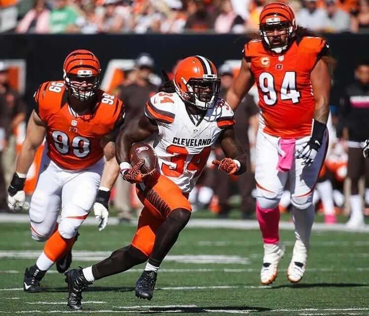
Serious orange-o-rama action yesterday in Cincy, as the Bengals wore orange over white and the Browns countered with white over orange. Toss in the two helmets and you have the most orange-centric NFL match-up imaginable. I heard from a bunch of people who thought it was too much, but I thought it looked great — orange is an underutilized uniform color, and I liked the yin/yang of the two teams essentially wearing inverse versions of each other’s uniforms. Additional photos here and here.
In other news from around the league yesterday:
• The Falcons wore their black fauxbacks, which looked pretty good (additional photos here):

But the seemingly endless saga of Falcons’ logo inconsistencies continues, because the team changed its helmet logo from the one that was shown in last week’s promotional photos. Here, take a look — promo photo on the left, game photo on the right:

As you can see, the logo in the promo shot had the feather lines connected to the wing, while the feather lines in the game version were floating in space. This means neither the helmet logo nor the sleeve logo was era-appropriate, but at least they matched each other.
Incidentally, the Falcons caught us all by surprise when they unveiled the fauxbacks last week, because there hadn’t been any previous announcement about them. But it turns out there was a hint: The ticket design for yesterday’s game included a throwback logo, instead of the current logo.
• The Dolphins wore their throwbacks. This is the part where everyone says, “They should go back to wearing that design full-time,” and I don’t disagree (additional photos here):

While the uniforms were sweet, I liked the diamond-patterned end zones even better:

• In Philadelphia, the Eagles went mono-black, and the Vikings wore white jerseys for the first time this season:

• In that same game, the Eagles gave the end zone logos a serious pinkification treatment:

• The Titans went mono-navy.
• The Jets went mono-green.
• The Rams went mono-blue.
• Washington’s burgundy renaissance continued, as they wore their burgundy pants.
• Speaking of Washington: NFL helmets aren’t supposed to have any maker’s marks, but Washington cornerback Josh Norman had a Rawlings logo on his nose bumper:
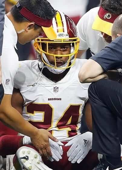
I checked to see if Norman had worn the Rawlings mark prior to this week — he hadn’t. But he did have something written on his nose bumper for the Oct. 2 game against the Browns. It appears to have been “JNO”:
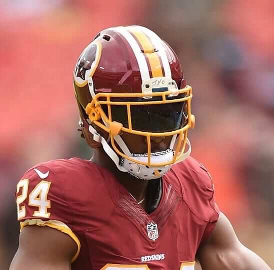
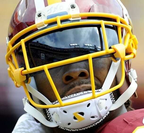
Anyone know what that’s all about?
• You don’t often see a team wearing its alternate uniform on the road, but the Seahawks routinely choose road games for wearing their grey alternates, which they wore last night in Arizona. After looking at that design for five seasons now, my reaction is still the same as it’s always been: It looks like a dirty white uniform that was laundered without enough detergent or bleach.
• For Giants/Rams game in London, CBS kept using its Thursday Night Football graphics package. I get that it was the same production crew they normally use on TNF, but it still felt weird to see all the Thursday references for a Sunday game.
• Only one team wore white at home: the Jaguars.
• Players participating in postgame jersey exchanges included Derrick Johnson (Chiefs) and Kenny Vaccaro (Saints); Ahmad Brooks (49ers) and Howard Jones (Bucs); Allen Hurns (Jags) and Clive Walford (Raiders); DuJuan Harris (49ers) and Evan Smith (Bucs); JaCorey Shepherd (49ers) and Bradley McDougald (Bucs); Albert Wilson (Chiefs) and Wil Lutz (Saints); Charcandrick West (Chiefs) and Tim Hightower (Saints); Odel Beckham Jr. (Giants) and Todd Gurley (Rams); and Patrick Peterson (Cardinals) and Jermaine Kearse (Seahawks).
• Here’s a list of players who protested during the national anthem.
(My thanks to all contributors, including Braden Classen, Jack Daley, Charlie Kranz, @RJ24544, @SteveBCreations, @wd_4, and our own Alex Hider.)
World Series Preview: With the two World Series teams now set, I’ve written a Uni Watch World Series Preview column for ESPN, breaking down some of the uni-notable details for each team. Check it out here.
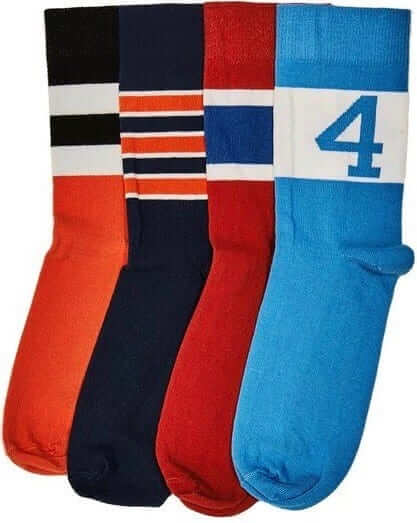
StripeRite update: In case you missed it last Friday, I’m excited to share our latest batch of StripeRite socks with you.
The basic concept behind StripeRite remains the same: You want to show your stripes, literally and figuratively, but how can you do that when the stripes found on most stirrups and athletic socks are up around your calf, where nobody can see them unless you hike up your pants? Our own Scott M.X. Turner ”” the guy who designs all the Uni Watch membership cards ”” came up with a great solution to that problem: What if there were socks with the stripe patterns down by the ankle? That way the stripes would be visible as you walked, when you crossed your legs, when you put your feet up on your desk, and so on.
We were very happy with the response to the first batch of StripeRite designs. Now I’m happy to show you the second batch:
.
.
Nice, right? They won’t be ready to ship until Nov. 21, but you can preorder them now. They’ll definitely arrive in time for the holidays. The socks are available individually or as a four-pack. As always with American Trench product, the socks are made in the USA and shipping is free.
As promised, all the profits from sales of the first batch are being donated to the Jackie Robinson Foundation. A check for $4,451.25 is on its way to them now. Those first four designs are still available, and all profits from them will continue to be donated to the JRF.
Continued kudos to Scott Turner for coming up with the idea for these socks, and to American Trench honcho Jacob Hurwitz for executing Scott’s concept so well. Again, you can preorder the new designs here, and the first batch is still available here. Thanks.
Click to enlarge
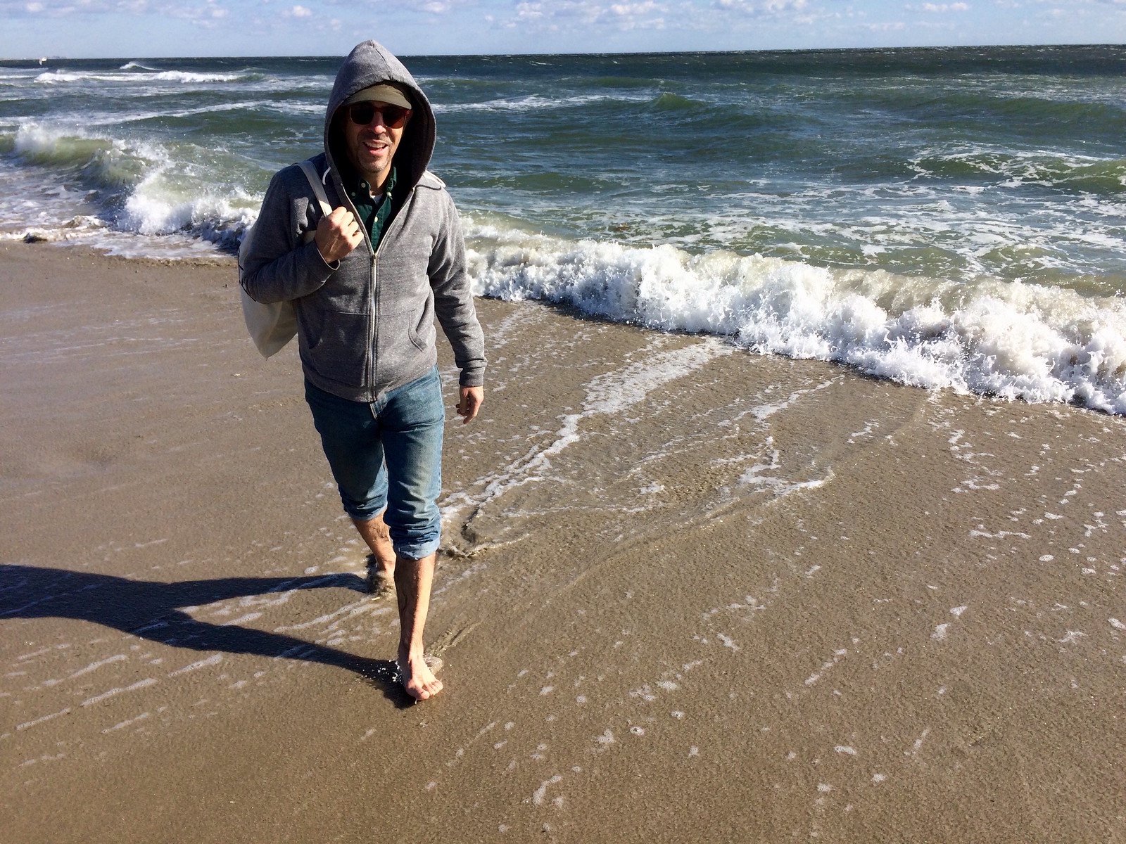
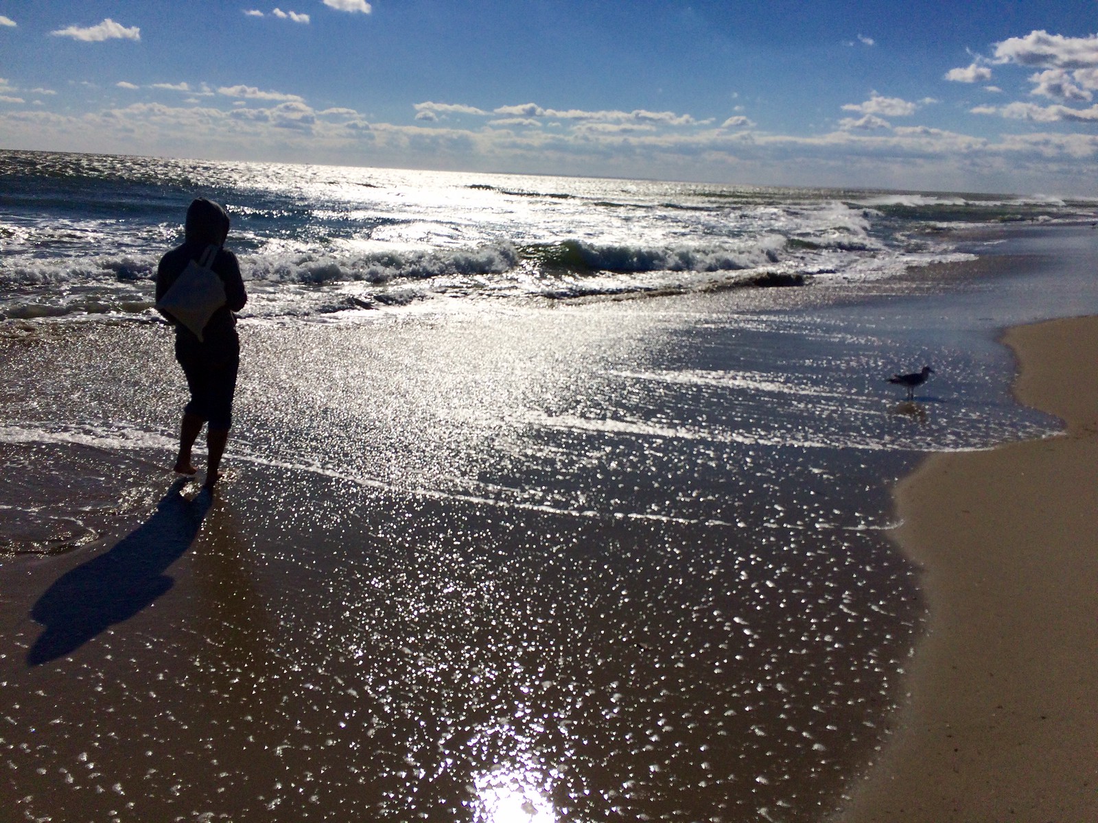
Best Summer Ever, continued: The Tugboat Captain and I recently had to break our long-running string of Last Summer Weekend Walks on the Beach (we were upstate for one weekend and busy with chores on another), but yesterday we picked up where we left off, taking a stroll in the Rockaway surf. The air and water temperatures were both fine, but it was sooooo windy, with gusts in the 40-mph range — the airborne sand really stung. Still, it was worth it. Man, what a gorgeous day:


Afterward, we checked out the scene at a Knights of Columbus that we’d been meaning to investigate. It’s technically for members only, but nobody seemed to mind our presence as we split a bucket o’ beers and watched football. Still, I tried not to be too loud while pointing out the various throwbacks and other uniform anomalies unfolding on the TV screens — seemed like the kind of crowd where that might not have been appreciated.
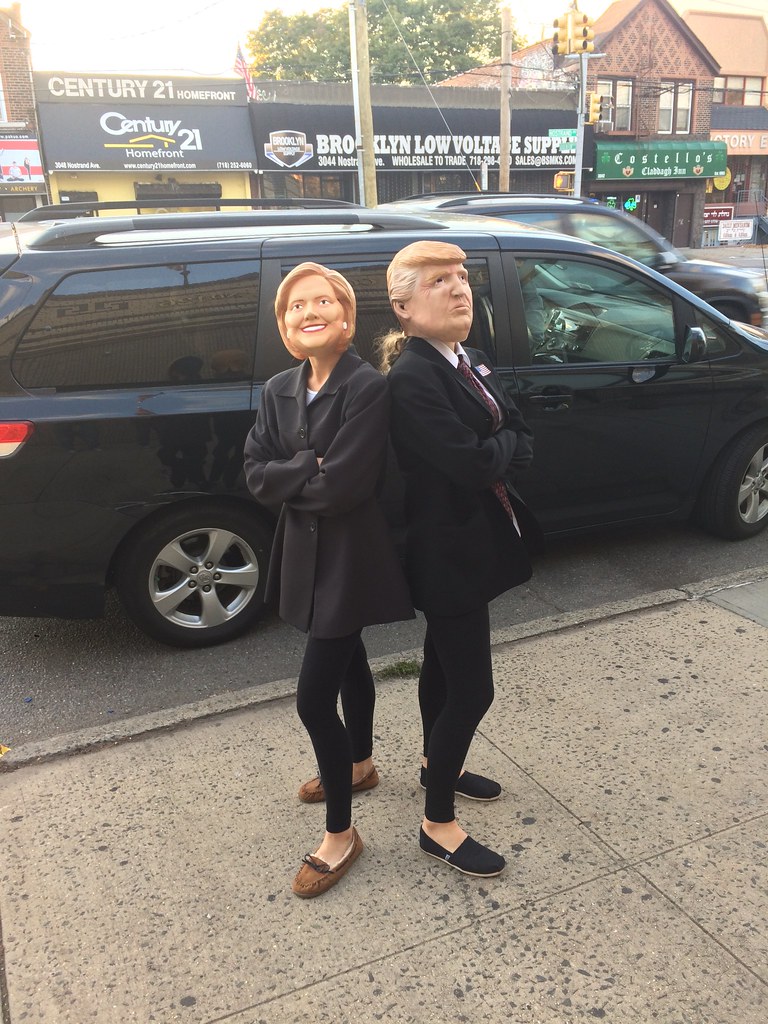
As we were leaving, a bunch of costumed kids were coming in for a pre-Halloween party being held in one of the adjacent party rooms. There was the usual assortment of ghosts, ghouls, witches, and so on, but none of them were as scary or horrifying as these two:
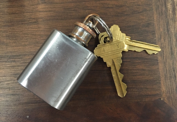
KRC update: The latest installment of Key Ring Chronicles is about a mini-flask. Check it out here.
The Ticker
By Alex Hider

NFL News: Late-’60s Rams DL Roger Brown was ahead of his time. When everyone else was wearing long sleeves, he had his jerseys tailored with short sleeves, to keep opposing players from getting a handhold. … Jim Moeller found a Jets shirt with an upside-down logo at Kohl’s ”” and it was still listed at full price!
College and High School Football News: Great piece from The New York Times about how some coaches go about awarding single-digit numbers, which are highly coveted by players (from Drew Stiling). … Utah State has a logo history at their newly renovated field (from Benji King). … Good luck telling these two teams apart! “That’s St. Mark’s School of Texas (the home team, in navy), based in Dallas, and the Texas Alliance of Christian Athletes (the visiting team, in gray, a “home school” team),” says Bud Brooks. “Apparently TACA only has this one uniform, no white jersey at all.”

Hockey News: The Kings debuted their gray alternates on Saturday, and it looks like they’ll be wearing special gray-trimmed gloves with the new sweaters. Compare to their normal gloves (from Wade Heidt). … Dustin Byfuglien of the Jets wore special skates for the Heritage Classic yesterday (from Andrew Paterson). … WGN used an old Maple Leafs logo in a graphic on Saturday (from Aaron Rusnak). … Jeremy Reeder spotted some construction equipment with Penguins logos. … The Rangers wore purple warm-up jerseys last night for Hockey Fights Cancer (from Alan Kreit).

NBA News: Looks like the Raptors will play on an alternate throwback court when they wear their Huskies throwbacks this season (from Mike Guterman). … Gorgui Dieng of the Timberwolves appeared to have a ghosted Adidas logo on his jersey during yeserday’s preseason game against the Hornets. It was probably showing through from his base layer (from Alex Benezra).

College Hoops News: New uniforms for Mercer (from Clint Richardson). … Wisconsin will wear a memorial patch honoring head coach Greg Gard’s father, coach Lamont Paris’ mother, and former player Ab Nicholas (from Scott Hurley). … Speaking of, here’s a full shot of those unis in action (from Jim Polzin). …

Soccer News: ITV in the UK is running a documentary called “Get Shirty,” which follows the rise and fall of Admiral, a company that was an early player in the soccer apparel game. I can’t find a way to watch it in America, but here’s a quick preview (from Cort McMurray). … Here’s what each team wore in the Premier League this week (from John Devlin). … With the MLS regular season coming to a close, we can close the book on this kit tracker (from Kyle Burkholder).

Grab Bag: Not even our food is safe from Pinktober (from Devon Kuckenbecker). … During yesterday’s Bengals/Browns game, CBS ran a graphic saying the Indians last won the World Series in 1947. The Tribe actually last won it all in 1948 (from Marc Viquez).
Click to enlarge

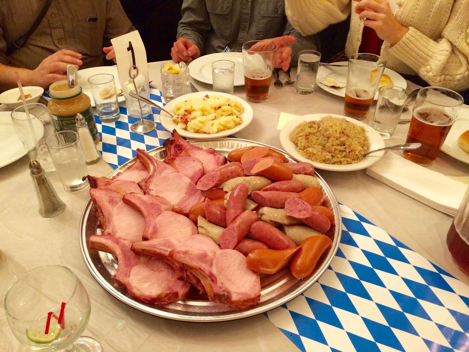
What Paul did last night two nights ago: The feast shown above — pork chops, assorted wursts, sauerkraut, and German potato salad — was part of an Oktoberfest celebration that some friends and I attended on Saturday night at the very wonderful Danish Athletic Club in Brooklyn. As longtime readers may recall, about four and a half years ago I wrote about my first visit to the club, which at the time was on the verge of closing due to its membership literally dying off. Happily, the DAC has recently been rejuvenated by a new influx of members, which led to Saturday’s Oktoberfestivities.
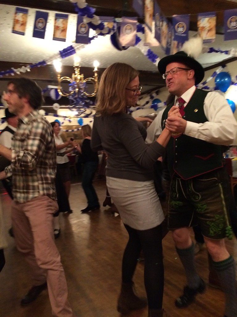
There was a German-style band and a German dance troupe. Some of the dance moves looked like they were straight out of the Ministry of Silly Walks, but whatever — it was all great.
At one point the dancers invited the rest of us to join them. Here’s the Tugboat Captain with one of them (click to enlarge):
All in all, a splendid way to spend a Saturday night.
New sock designs look pretty good though one is a repeat of the BoSox yes? What a great cause and almost 4500 bucks to the JRF. That’s what it is all about. Buy the socks and support a great cause!
The new one is orange, not red.
Did we ever get an explanation of the new one in blue with a 4?
link
Great call going with the classic UNC sock!
Glad you like!
Love the UNC socks & will order, but the number should be 44, not 4. Photo is of Larry Miller, late 1960s star who wore 44.
That was just a photo showing the basic design. Not saying it was meant to be Larry Miller’s socks.
I would assume that “JNO” is a “hip” truncation of J-osh NO-rman.
It is. He also uses that in his Twitter handle
Did he wear the makers mark because his other one was broken or he got a new helmet/facemask right before the game?
Interesting to me that the LA Kings wear grey (or silver I guess) and it is a dark color (Vancouver wore white) and Seattle Seahawks wore grey (or silver) and it is the light color (Arizona wore red)
As Paul mentioned, Seattle’s gray appears nearly white – Kings look much darker.
However, the last time Kings wore grey – 2014 outdoor game – their opponents wore orange (Ducks). NHL seems to be flexible on colour matchups in outdoor games though (see Detroit red vs Leafs blue that same year).
One of the Kings’ other historic colours has also been treated both ways in the NHL. Kings & Canucks both had gold/yellow sweaters instead of traditional home white in 70’s/80’s (played against dark-clad road teams).
The Kings wore gold throwbacks in this year’s home opener, vs a white-clad Flyers team – treated the same as Nashville Predators current home gold (dark substitute).
When the Kings wear their yellow throwbacks, it would be better if the league makes it the light uniform for that game so that it can look like a proper throwback event. Especially if they had an original 6 team coming in. Bothers me that they do not schedule the opponent of the Kings to wear their dark uniform during those games.
The Seahawks alt is a light grey, but not, in my opinion, ‘nearly white’ or ‘dirty white’ as Paul describes.
I really like the grey and think it’s their best uni.
I watched a bit of that Kings-Canucks game on Saturday night. Even on high def TV, there is not enough contrast between the grey vs. white.
It would be best if the Kings wear the grey as the light uniform and have their opponent wear the dark uniforms. Much like Seattle does in the NFL and San Antonio does in the NBA.
proofreading: Wisconsin patch ticker item should read “Greg Gard’s father” instead of mother.
Fixed.
Re: Buff’s VH skates in Winnipeg – appears he wore the same boots, with white holders, at the World Cup of hockey (same colourways for Jets outdoor uniform & Team USA @ WCoH).
link
The Dolphins should go back to wearing that design full-time. Stunning.
An indication that outdoor NHL games are becoming routine, when the outdoor game that took place yesterday Edmonton at Winnipeg doesn’t even make the ticker.
I know this has been discussed before – but what shade of green do the New York Jets wear, is it deliberately one washed out looking green?
Sorry my mistake, there is a slight reference to it.
Nike has had problems matching the Jets’ greens since taking over in 2012.
Agreed, on the poor mismatching, and in addition, I find the shade of green seems to change depending on camera shot, but even the stuff they put around the stadium at ground level and I believe even at press conferences, the Jets are using a green shade very different from either a kelly or a hunter green.
The Jets are dead to me since they ditched the kelly green.
Just to illustrate the point, the shade in the background is the same shade the Jets uni looks on TV, its somewhere between green and grey
link
It’s the lighting more so than the camera angle. The green gets washed out in sunlight and becomes almost greyish, more of a military olive-drab. The jerseys actually look fine under most artificial lighting conditions.
N.B.: The helmet decals and shoulder inserts are the only elements of the Jets’ current uniform that appears in the correct shade of green.
“An indication that outdoor NHL games are becoming routine, when the outdoor game that took place yesterday Edmonton at Winnipeg doesn’t even make the ticker.”
~~~
I can’t vouch for Paul’s twitterstream nor the Uniwatching e-mail (Alex had it yesterday), but for the Alumni Game, played the day before, there was not one single e-mail nor tweet directed towards me re: that game. Maybe no one commented upon yesterday’s actual game either. If you guys don’t make us “aware” of this, it’s probably not going to find its way into the ticker. I was off the grid entirely yesterday for much of the day, and the little sports I did get to see was some of the SNF game.
I wouldn’t say the outdoor games are becoming routine (and I loved the Jets fauxbacks/throwbacks — the NHL doesn’t seem to mind new/expansion teams poaching unis from existing, but relocated franchises), but if Paul (or Alex or Mike) or I are away from the tube/doing other things, you guys need to bring them to our attention sometimes.
I’m a Jets fan living outside Winnipeg.
I watched some of the game on TV and followed twitter/facebook posts from friends at the game.
I normally tweet interesting things at Phil, but I didn’t tweet anything yesterday because nothing interesting happened. The uniforms on both sides looked exactly like we expected them to, and the uniform unveiling was pretty extensively covered when it happened earlier in the fall. I didn’t see anything that counted as “news”.
The greatest thing that happened all weekend was seeing Teemu back in a Jets uniform, and that was on Saturday.
link
Surprised and disappointed there was no mention other than a close-up of someone’s skates.
Love the gold pants the Redskins wear with the burgundy jerseys but on the road they should definetely wear the burgundy pants over the yellow with the white jersey reminiscing of the years they won the super bowls.
While the Browns/Bengals may look good in a photo, it was virtually impossible to watch. It was difficult to tell the teams apart.
That and the Browns are just difficult to watch, period.
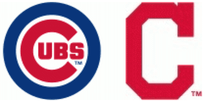
Anyone know if this World Series matchup is the first between two teams who have both in the past utilized the Wishbone C as a logo element?
I’ll join the chorus. The Dolphins throwbacks are all sorts of awesome! They should drop the awful uniforms they currently use and adopt the throwback look as their regular uni.
Second the motion for a permanent return of the Dolphins throwbacks and logo here except for the pants. I still prefer the orange/aqua/orange striping from the early70’s-mid 80’s era.
Another vote for the Dolphin throwbacks. Such a clean, gorgeous uni. Not to mention iconic.
I will place the fourth vote for the Dolphins throwbacks, even guys in my gym who are not that into uniforms were commenting how good they looked on that field. The current uniforms they wear look like they are from the Arena league. The throwbacks have such a clean look and the striped socks just finished it off perfectly, I even forgot how good those gray facemasks look on the helmets.
I am going to speculate that CBS/NFL Network labeled the Sunday morning game “Thursday Night Football” so that the league can include the ratings in their year-end totals. NBC also labels the season-opening Thursday night game as “Sunday Night Football”.
Hey Paul, good recap on the faux back uniforms for Atl and Mia (I agree BOTH teams should go back to utilizing them full time).
I haven’t been around in a while – when did the Uni Watch turn into a personal blog with photos??
when did the Uni Watch turn into a personal blog with photos??
On Day One.
When are we gonna have a team called the Schuhplattler? Named after the folk dancers you tend to see around Oktoberfest.
I play as the Falcons on franchise mode on Madden 17 was excited for the new uniform update except it has a red helmet. Looks better with red imo
When I played Madden, I used to change all the teams default uniforms and that’s basically how Atlanta looked on mine. Then I would edit all the WR’s to proper 80s numbers. I wish there was a way that retired numbers would be removed. I hated seeing a 49er wr in 16. Or a Bears 34. Stuff like that.
Right! EA Sports knows how too I remember NBA 04 you were able to retire numbers heck even had a room where the jerseys hung
‘JETS’ – completely upside-down and still full-price? I’m sure there’s a joke here somewhere…
It’s a conversation piece!
Your girlfriend can look down and remember who she is rooting for!
Hey OH!!
I was wondering if you’ve heard anything about a potential cavs ring ceremony jersey? I haven’t seen you say anything so I’m assuming that’s a no, but have you head that it is a for sure no?
I have not heard anything about that.
I guess you can say I called it
I guess you could say they’re wearing their existing black sleeved alternate but with a champions patch, since that’s what’s happening.
The Falcons’ kind of hinted at the Dirty Bird throwbacks back in July with their sideline caps
link
49ers vs Bucs had Niners using pink accessories but not any for the Bucs. Pink creep even extended to the border of the Print-at-Home tickets.
I might be wrong, but my understanding is that putting a picture of your ticket barcode out there is not a great idea. It’s possible to counterfeit it that way.
As someone who believes the only true LA Kings colors are the original purple (Forum blue) and gold, and as someone who has hated every post-purple and gold uniform iteration they’ve worn… I gotta admit I really like those gray unis…
-Jet
The players didn’t protest the National Anthem. They protesting DURING THE PLAYING OF the National Anthem.
Point well taken. Will adjust wording in text.
I’ll have to check out the Danish Athletic Club; link looks delicious. Sort of gave up looking for good German food after I left Wisconsin, but perhaps I was too hasty.
Also love the link table accents. Very cool.
The new socks looks great. I bought the first set and really like them.
What teams are represented in the new set? I just read about North Carolina. I’m guessing the Orioles and Bears but the red and blue socks?
Thanks.
Orioles and Bears – yes.
Red and blue socks – Montreal Canadiens.
I just ordered a set too, I’m a huge fan of the designs.
Red and Blue are Montreal Canadiens. One for all four major sports.
Hint: Hockey.
Wish they came in women’s/big kids size too.
Montreal Canadiens
Thanks. I’m not much of a hockey fan so my mind drifted to the Patriots. I like the 4 major sports idea. I’m guessing I missed that discussion.
Proofreading:
Continued kudos to Scott Turner for caming up with the idea for these socks
Fixed.
Not a fan of socks matching pants in football. If a team wears colored pants, have contrasting socks. Otherwise it just looks like they’re wearing long pants, or tights. The Jets and Washington both wore colored pants, but had contrasting white socks. Also the Browns looked good with orange pants with brown socks.
The “leotard look” has long been lamented on these pages. You are most definitely not alone.
Good luck telling link apart! “That’s St. Mark’s School of Texas (the home team, in navy), based in Dallas, and the Texas Alliance of Christian Athletes (the visiting team, in gray, a “home school” team)
So the Christians were playing against… the Lions?
Can’t understand why you would allow that uni v uni game. That’s whack!
“At one point the dancers invited the rest of us to join them.”
Did you join in, Paul?
Yes!
I was hoping so!
Life is fun. Do stuff. Try stuff. If you look cool–Great! If you feel silly–Great also!
That my be my motto.
WGN’s not the only one still using the Ballard Leaf. ESPN.com hasn’t yet updated the Maple Leafs’ logo, nor have they updated the Penguins’ either. They do have the new Panthers logo, though (for the most part, anyway – the mobile version of ESPN.com uses both the old and new Panthers logo).
Maybe in 2019 if the Viking celebrate the 50th Anniversary of their only NFL Championship in 1969 they could do diamond-patterned end zones too:
link
Paul, as a Knight myself in CT, you are always welcome at our events…and we can always talk unis…
Thank you!
I hope the third installment of StripeRites hits on more “bottom” colors. By “bottom” I mean the bottom of the sock. I hope there will be another black like the Pirates from the first installment. I wear a lot of black when I get gussied up. Yellow would be cool… maybe the Bruins. Royal? White?
Why is it that the Browns/Bengals is too much orange yet no one gets ruffled at a Steelers/Ravens game or one of the hundreds of blue vs blue games? Orange is very under used in all of sports. That game was magnificent and that’s saying something with the Bengals.
The World Series Preview is up:
link
Teams that have the same color scheme tend to make an ugly game no matter what they wear. Chiefs/Redskins and Patriots/Texans stand out in my mind. The road team should have all its light-colored apparel on, with the home team being solid dark, in such cases.
Re: Striperite socks
I need Green Bay ones in my life ASAP!
Wish we could. At the moment we’re limited because only certain yarn colors are available to us, and a Green Bay-ish tone is not currently an option. Keeping my fingers crossed that it may become possible in the future.
Very, very, very disappointed in the Jets going mono green yesterday, after not doing it once in a non-Color Cash game last year. They’ve now gone three home games without wearing their proper home uniforms.
I would love some Stripe Rite socks that have all 500 colors (I jest) in the Cowboys color scheme… Navy blue, royal blue, black, white, silver, silver-green, silver-blue, the pale, grey tone of Jerrah’s skin, etc.
Just read the 5 & 1. So now USA Today watermarks all over their photos. Lovely.
The son of a friend of mine plays for the TACA team, and I can say with certainty that they do have a white jersey this season. I’m not sure why those two teams squared off in such similar colors.
Thank you for making the national anthem opposition list a link rather than a list on the main page.
Those Falcons uniforms look like someone was playing with Madden. Helmet and jersey from the 1990s and pants from the 1960s. They needed the gray pants to make it a complete 1990s throwback. As has been explained many times, due to NFL rules they can’t use red helmets to make it a 1960s throwback.
It’s great to see the DAC is still open! My parents had their wedding reception there, in 1977. They were both stunned and happy to hear it was still open.