Click to enlarge
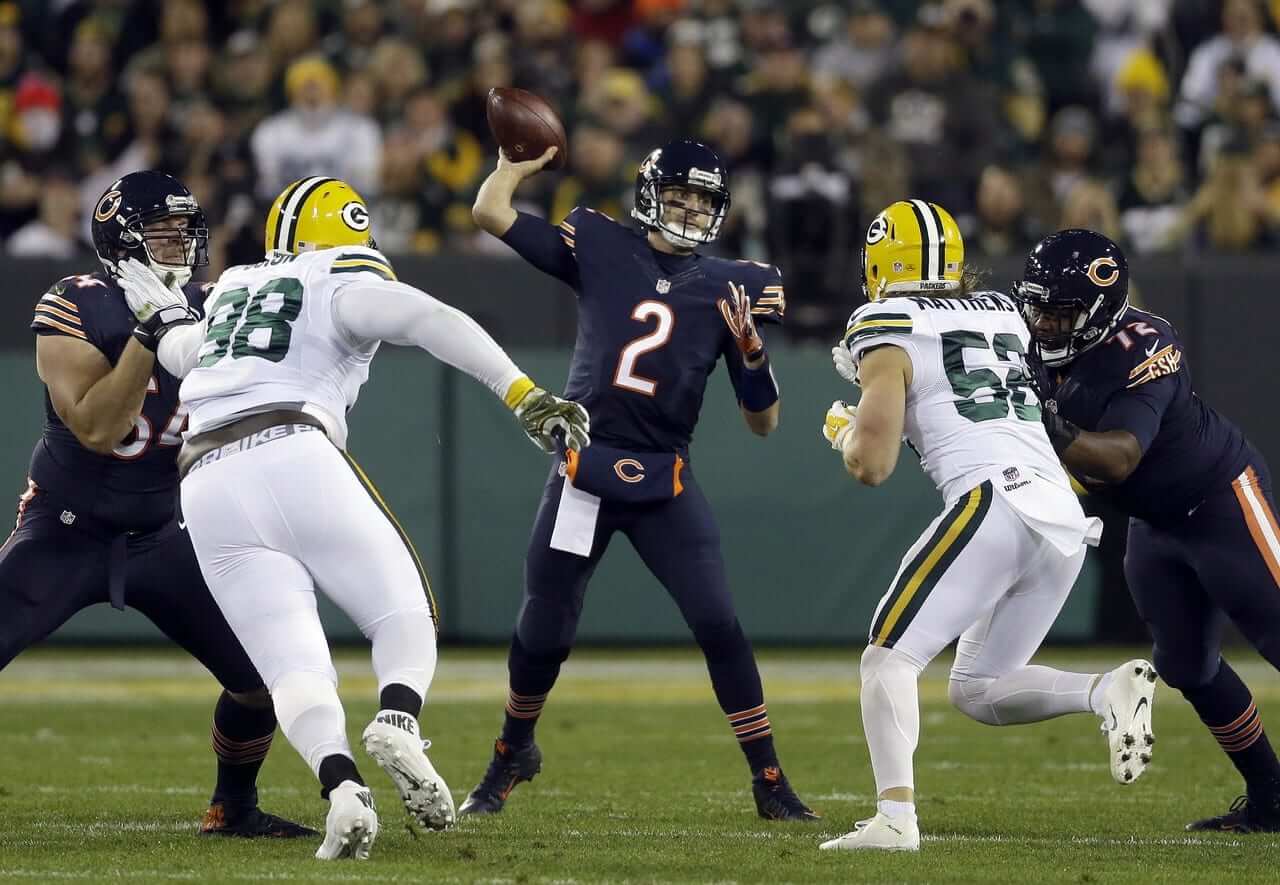
Disappointing game last night in Green Bay, as the mono-white Packers hosted the mono-might-as-well-be-black Bears. Not a good look for either team. Did anyone else think the Packers looked like they were at a yoga class or something? You can see lots of additional photos here, here, and here.
Imagine if they’d put the Bears in orange the Pack in green — would’ve looked way better, plus it’d be suitably autumnal. (Better yet, imagine if they’d just worn their regular uniforms, which would be, as it usually is, one of the best-looking games of the year.)
Some additional notes:
• A few players tinkered with the mono look. For the Packers, wide receiver Randall Cobb had yellow sock stripes (or maybe just tape), Davante Adams had yellow shoes, and defensive back Ha Ha Clinton-Dix had pink shoes. For the Bears, wideout Alshon Jeffery had white shoes and defensive lineman Willie Young had orange shoes.
• The Packers even extended the whiteout theme to their website.
• According to the mighty Gridiron Uniform Database, the Packers had previously worn white at home only twice in the past 60 years. Those two games were both in 1989. Here’s why they did it.
• Had the Packers ever worn mono-white before last night? Yes! Green Bay had white road unis in 1956, ’57, and ’58, which were worn for the final time on Dec. 14, 1958, in L.A..
Next Thursday: Jags vs. Titans, which is a do-over of a uni match-up we already saw last year.
(My thanks to Chance Michaels and Bill Schaefer for their contributions to this section.)

Click to enlarge
NBA Season Preview: The annual Uni Watch NBA Season Preview, with all of the changes for the upcoming season (including the Jazz’s new set, shown above), will be out today. Check it out here.
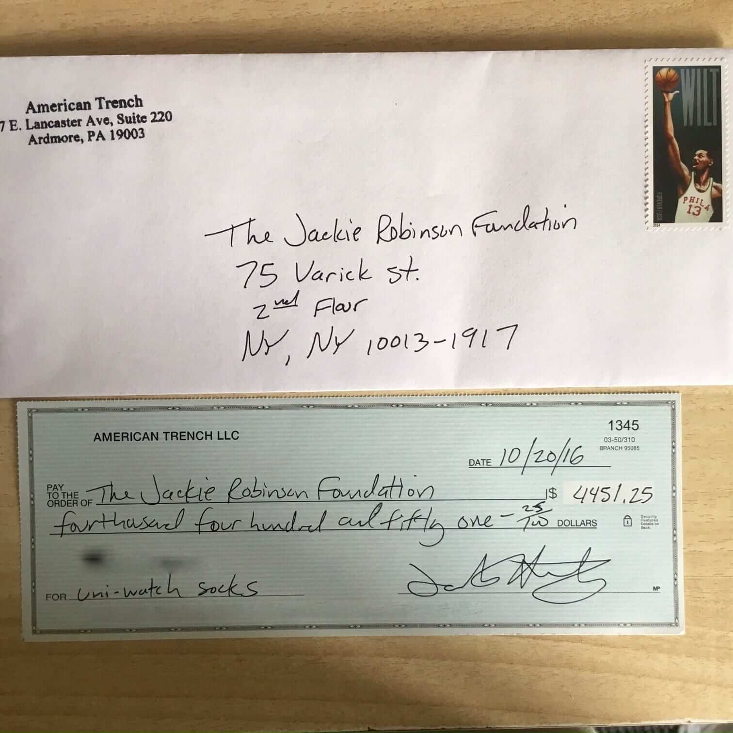
StripeRite update: Big thanks to all of you who made the first batch of StripeRite crew socks, which were released back in July, such a big hit. As promised, all the profits from sales of that batch are being donated to the Jackie Robinson Foundation, and I’m pleased to report that they’ll be receiving a check for $4,451.25 from American Trench. It mailed out yesterday:
.
.
Those first four designs are still available, and all profits from them will continue to be donated to the JRF.
Meanwhile, I’m excited to share our next four designs with you — check it out:
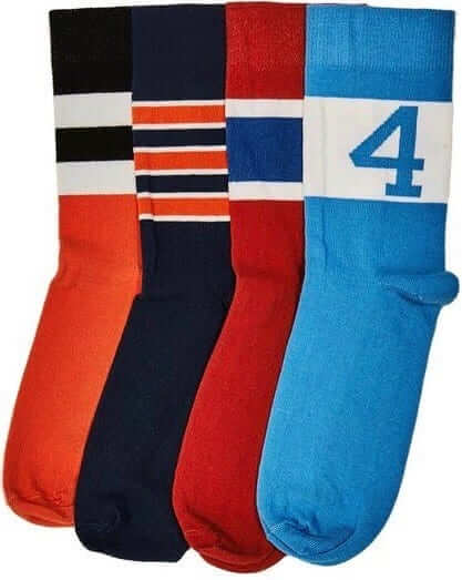
Nice, right? They won’t be ready to ship until Nov. 21, but you can preorder them now. They’ll definitely arrive in time for the holidays. The socks are available individually or as a four-pack. As always with American Trench product, the socks are made in the USA and shipping is free.
Continued kudos to Scott Turner for caming up with the idea for these socks, and to American Trench honcho Jacob Hurwitz for executing Scott’s concept so well.
Again, you can preorder the new designs here, and the first batch is still available here. Thanks.
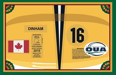
Membership update: A few more designs have been added to the membership card gallery (including Trevor Dinham’s card, shown at right, which is based on the Windsor Lancers’ helmet). I still have a few slots open on the current sheet and plan to send it to the printer on Tuesday, so people who sign up now will get their cards very quickly.
As always, you can sign up for your own custom-designed card here, you can see all the cards we’ve designed so far here, and you can see how we produce the cards here.
The Ticker
By Paul

’Skins Watch: The mayor of Toronto, who also happens to be a former CFL commissioner, says it’s time for the Edmonton Eskimos to change their name (from Chuck Loads). … Chief Wahoo was controversial at least as far back as 1972 (thanks, Phil).

Baseball News: While looking for something else, I came across this shot from a 1960 Indians game. Note how the wishbone-C on the helmet doesn’t match the one on the cap. Also of note: Umps in neckties! … A Broadway show made a set-design adjustment, changing a White Sox pennant to a Cubs pennant after someone pointed out that the story is set on Chicago’s north side (from Jared Peterson). … There’s a new book celebrating game-worn baseball jerseys. I’ve requested a review copy from the publisher, so I should have more info on this soon (from @SportsCollector). … Look at the sensational championship cufflinks presented to Cleveland player/skipper Tris Speaker in 1920! … Criminal Records — a record store in Atlanta — is selling Reds-themed T-shirts. … Dodgers C Carlos Ruiz wears No. 51, but he appeared to be wearing teammate Yasmani Grandal’s catching helmet last night.

NFL News: But tell us how you really feel: NBC broadcaster Al Michaels referred to the Color Rush uniforms as “caca” during an interview the other day. … The Browns will wear white jerseys and orange pants for Sunday’s game in Cincy. The Bengals will be wearing their orange alternate jerseys, so that will be a very orange-centric game. … New logo, and no more Snoopy, for MetLife. The new blue/green color scheme matches well with the Giants and Jets, who both play at MetLife Stadium. … Reprinted from yesterday’s comments: In this 1968 footage of a Bears game at Wrigley Field, one of the end zones didn’t fit entirely onto the field and had to be truncated (from Mart Guttag). … The Dennis Byrd memorial decal that the Jets wore on Monday night will be worn again this Sunday.
College Football News: Duke will wear “Battleship Gray” helmets on Nov. 5, as part of the festivities marking the 75th anniversary of the school’s 1941 Rose Bowl appearance. Additional views here. The logo was used by the 88th Infantry Division — known as the Blue Devils — in World Wars I and II (from Robert Hayes). … New uni this week for South Dakota State. “It’s their third week in a row with a new getup,” says Tanner Butler. … Ball State’s going mono-red tomorrow. … Flag-desecration helmet logo tomorrow for Marshall (thanks, Phil). … Also from Phil: Why are Boise State’s 30-yard markers orange? Because it’s the 30th anniversary of the blue turf.

Hockey News: Not sure why this wasn’t announced until now, but the Bruins have designated last season’s Winter Classic jersey as their new alternate (from Matt G). … Pinktober pregame warm-up jerseys next Monday for the Blackhawks (thanks, Mike). … The Rapid City Rush are wearing old-school Phoenix Coyotes-themed jerseys tomorrow night (thanks, Mike). … The Flyers raised a banner last night for former owner Ed Snider (from @Franny214920).

NBA News: Expect to see a lot of uni-specific sock designs this season. The Suns, for example, have six different jerseys with a corresponding sock for each one. … I heard back from the Hawks about their racing stripe design. Unfortunately, they have no records indicating who the original designer was.

College Hoops News: New uniforms for Dayton (from Detroit Don). … New road uni for Utah (from Trent Knaphus). … There’s a lot going on in this shot of the North Iowa Area Community College women’s team. First, the matching horizontal stripe patterns on the jersey and shorts. Second, always fun to see uni numbers on the shorts. Third, at least two of the players are rolling down their waistbands. Fourth, do those shorts have zippers? Looks like it. And fifth, the unis are by Russell, the headbands are a mix of Nike and Adidas, and I don’t know what that logo is on the leggings (from Jesse Gavin). … This is pretty wild: The baseline from UVA’s old court is being used as the floor in the snack aisle of a Charlottesville supermarket (from James Gilbert).

Soccer News: A Chilean soccer team has a badge design that looks a lot like the Pittsburgh Steelers’ logo. If you scroll down to the responses to that tweet, you’ll see why (from Mark Roberts). … Serious jersey mishap yesterday for Robin Van Persie. … Pinktober jerseys last night for Florida State (from Kyle Baker).

Grab Bag: For those of you who like to keep up with everything I write, I have four entries in The Village Voice’s current “Best of New York” issue. … Hey look, a legitimate example of rebranding: The governing body for Canadian college athletics, which had been known as Canadian Interuniversity Sport, will now be known as U Sports (from Moe Khan). … New uniforms for the Japanese men’s volleyball league (from Jeremy Brahm). … New logo for the Bozeman (Mt.) Public Library. … Hillary Clinton outfits for the three presidential debates were inspired by Death Row Records. Okay, probably not, but it’s still pretty funny. … A truck competing in the Fred’s 250 race at Talladega Superspeedway tomorrow will feature a “Trump/Pence 2016” design. … Rugby news from Eric Bangeman, who writes: “Anthony Foley, longtime player/coach for the Irish professional club Munster, was found dead in his hotel room last Sunday. Welsh club Scarlets are memorializing him this weekend with a number eight on the chest of their jerseys. Foley played eight-man for Munster during his playing career.” … Here’s why the PlayStation logo is now purple.
– The Packers even extended the whiteout theme to their website.
– According to the mighty Gridiron Uniform Database, the Packers had previously worn white at home only twice in the past 60 years. Those two games were both in 1989. Here’s why they did it.
Both are dead links. FYI.
Thanks. Now fixed.
Proofreading: “a uni match-up we already say last year.”
Fixed.
I don’t believe that Indians picture is from 1970. If I had to guess, maybe 1960. I believe that’s Jimmy Piersall, who played on Cleveland at that time. Plus, the uniforms don’t match up to the ones they wore in 1970.
Thanks — typo on my part. Was indeed supposed to be 1960. Now fixed.
More proofreading. First paragraph after “Some Additional Notes,” has Bears’ wideout Alshon Jeffery’s name reversed as “Jeffery Alshon.”
Proofreading: “…Jeffrey Alshon ”
If you are referring to the Bears receiver, then it’s Alshon Jeffrey
Fixed.
Better yet, it’s “Alshon Jeffery.”
Reminds me of back in ’02, when I thought the name was “James Lebron.”
“Welsh club Scarletts” are Scarlets.
“Foley played eight-man”: When I first saw that, I thought, “Don’t they play seven-man at the Olympics?” But that was a position he played, number-eight. In rugby union, players traditionally wear numbers according to their position. Number-eight is a forward, similar to a lineman in gridiron football. It appears they ran out of names and decided to just give the number to the position.
Fixed.
What is the significance of the #4 on the Light Blue sock design?
It made me think of that Monty Python “mollusk” sketch.
my first (and only) thought was the Fantastic 4
While a downgrade from normal I think last nights game wasn’t awful. Idk, just my thought.
I agree that it wasn’t awful. The problem with this sort of Color Rush matchup is that the teams wore uniforms that are just similar enough to their standard uniforms (while also being clearly inferior to them). In a way, it almost makes the whole gimmick seem even more stupid and unnecessary.
In my opinion there is not a better looking NFL game than when the Bears play the Packers. While this color rush thing was a downgrade I didn’t think it was bad. I think the Bears in all orange would have looked awful and the Packers in all green with those bright yellow helmets would have looked silly. One of the very few times I’ve actually disagreed with Paul.
“U Sports, known as Canadian Interuniversity Sport (CIS) until Thursday, wants to operate as a sports business rather than a governing association and sell its athletes and their competitions to sports fans across Canada.” Like the NCAA?
Maybe this was a proactive move, seeing that “cis-” has a much different meaning these days.
That is literally the dumbest thing I’ve heard. If CIS doesn’t know the difference between NCAA sports and CIS sports, they’re in for a rude awakening.
Hint: CIS sports are small-time. There are no scholarships, no full rides. The teams are composed of students who get degrees and play sports in their spare time. There are no football or basketball factories. Almost nobody goes on to the pros. And there’s no hero worship of student athletes.
Also, I still call it the CIAU.
The logo on the leggings in the North Iowa Community College photo is the new McDavid logo. Not sure how long it’s been around.
I’m not sure how the Crunch are handling it since he’s been a healthy scratch the first two games of the season, but Letourneau-Leblond’s NOB with Albany last season was just “Leblond”.
Also if the article does mention it, it’s not loading at all for me.
Proofreading: It is “Ha Ha” Clinton-Dix, not Ha-Ha Clinton Dix. (Hyphenated last name, not hyphenated nickname.) Roll Tide.
Thank you. Fixed.
Wow this post isloaded with juicy info. Great job! Regarding the Wahoo picture…I wonder, is there any other sports team that will blissfully mirror-image their logo and be totally cool with it like the Indians do with Wahoo? Not to say it was ever on their outfits backwards, but ads
Also, I know football teams will mirror their logos on one side of their helmets e.g. Ravens but I’m talking about reversing the image for the sake of reversing the imag. Like on shirts or posters
Every football team looks good in all white. Teams wearing white has been the only redeeming aspect of the Color Rush thing, which has demonstrated the undignified ugliness of monochrome of any other colour, and the garish awfulness of colour-on-colour matchups.
Every football team looks good in all white.
No, they don’t. The Packers in mono-white was a crime against the sport. The Raiders in mono-white is going to be even worse.
They didn’t look bad, they just didn’t look like the Packers. Which I guess means that they did look bad,
Thank you The Jeff. The all white uniform is always a horrible look on a football team. I hate the trend in college to trot out these all white monstrosities. If you see a game at random (at a sports bar for example) featuring an all-white team, I think–who the heck is that? Team colors are how you can instantly identify who is playing. Your team colors are your team’s identity and if you wear all white, you have no identity. Baseball and hockey both understand this so you never see all white, at least the caps (baseball) and breezers (hockey) are never white.
In case you haven’t noticed, wearing all white at home has been traditional forever in baseball. It’s true that caps are usually not white; but some have been (Philadelphia A’s, St. Louis Browns).
Anyway, the Packers’ helmets are not white, and neither are the Raiders’.
Furthermore, all white has been worn by other football teams, including the Browns, Rams, Giants, Jets, Colts, and Dolphins — the latter three with white helmets.
So there’s nothing unusual about a football team in all white, a look which is very sharp.
I thought orange vs green would have been perfect for last nights game as well, but I think the orange vs green would have a similar effect on some of the color blind population that the Jets vs Bills game did last year. This could be wrong, but when white vs blue was announced as the colors, I thought it was odd and tried to figure out why…this conclusion is where the internet took me.
I can’t speak for all colorblind people, but for me, red and green together is more of an issue than orange and green. Although for some reason, orange and green together (like the Miami Hurricanes uniforms) makes the green come across as drab and sort of brownish to me.
Could Randall Cobb be wearing yellow/white/yellow wristband around his shin region???
His left leg in particular shows skin above and possibly skin below the yellow.
If the Packers/Bears had gone Green/Orange, I wonder if that would have led to another “Color Blindness” issue like with the Jets/Bills last year.
Also, regarding StripeRite: Has anyone who wears size 14 or bigger shoes purchased them? If so, how did they fit? I’d really like to get the new orange pair, but I’ve bought normal sized specialty socks before, and they’ve been really tight, or the heel of the sock bunches up under my foot and gets uncomfortable.
If green/orange colorblindness was a *real* problem, and not something that only effects a tiny tiny percentage of the population, then camouflage hunting gear wouldn’t use orange as the standard safety color.
The game should’ve been yellow vs navy anyway.
The Syracuse NOB link doesn’t seem to be working. Timed out on two different connections for me.
Yeah, same here. Definitely worked yesterday! Sorry — will remove from Ticker.
Now I’m wondering if it was affected by the DDoS attacks that have been going on today, that’s taken down Twitter and various other sites.
What was up with the mono-chrome badges on the sideline gear and the chrome Packers logo on the TV score? Blech. Guess it was just part of the theme.
The reasoning behind Snoopy being “fired” is so corporate America. “We brought in Snoopy over 30 years ago to make our company more friendly and approachable . . . ” and now that we accomplished that, you are no longer needed. Even cartoon characters aren’t immune from corporate greed.
How is changing a businesses look “corporate greed”?
I told The Wife (an ardent Peanuts fan) that Snoopy won’t be on the blimp anymore and she asked, “Why??” “Guess they’re going in a new direction,” I replied. She snapped back with, “Do they remember what direction the Hindenburg went in?”
Since GB wore throwbacks last week, with helmet sans decals, it might have looked better to leave them that way for last night. Better yet, maybe just apply a single white stripe rather than the normal green/white/green.
Good point on the Bears looking black. Before the advent of high-def, they always looked black to me, even though I knew that they were navy blue.
The PlayStation logo isn’t turning purple. Sony just changed the profile pic purple for Spirit Day yesterday. Lots of pro teams did the same.
So, I don’t watch the WNBA (don’t really watch basketball at all outside of March Madness), but I caught ESPN highlights of last night’s final game. Wow. Those unis are the Unipocalypse. Two large corporate logos bracketing the number on the front… and no team name. If it weren’t for the Sparks colors being the same as the Lakers, I wouldn’t know who is who…
Interesting points. I often wonder how the WMBA remains in business. My guess is that they break even or possibly lose money. The NBA may keep them afloat as some type of outreach to woman fans.
Obviously I meant WNBA but you get the picture. The advertising in their uniforms is probably a financial necessity too.
You don’t need to be a woman to be a fan of the WNBA.
The NBA Preview is up:
link
The 4 socks designs:
I see Bears and Oriles, what are the other two?
We tried to draw inspiration from all four major sports.
The red ones are probably the Canadiens. Light blue UNC maybe?
The Packers didn’t remind me of yoga class so much as they did link. Or even link.
Although I hated the idea of white pants, I did like the stripes themselves. They looked so much better than the jersey stripes, in part because the white stripes muddy the design and in part because they were dyed and not silkscreened. It’s link how much better looking they were, and I’m still hoping this was an elaborate test-drive before changing the jersey stripes.
Something about the Run-TMC era Warriors seems off. Maybe it’s using the modern neckline? Regardless, still better than the hot garbage they’ve been wearing.
I’m watching an old USFL game on YouTube (Blitz vs. Federals, opening week of the 1983 season) and Jim Lampley and Lee Corso are discussing why the Feds had a green & black color scheme – not because of the colors of the dollar, but because they are the colors of team owner Berl Bernhard’s yacht.
link
USFL had some nice looking uniforms and logos. Many of which would have looked in today’s game had the league stuck around.
-The Breakers had a unique and cool helmet.
-One of my favourite uniforms belonged to the San Antonio Gunslingers. Not the logo, that was not great, but I liked the green helmet over the blue jersey.
The linked “This Week in Pro Football” video includes footage of the Cowboys vs the Lions. Their uniforms are so similar that it looks like an intrasquad scrimmage: link
Irrespective of how one feels about corporate naming rights, I will always consider it a lost opportunity that the naming rights for that stadium were not sold to either JetBlue or Green Giant.
This Color Rush needs to end after this season. If you want to have an occasional game where both teams wear their colors then go ahead, but one team wearing white makes no sense. Practically every game could have had both teams wearing a color. The 49ers could have worn gold instead of black, with the Cardinals in red.
By the way your comment about the Bears looking black, as a kid watching on inferior, but color, TVs I had a lot of team colors confused. I thought the Bears were black & red, Knicks royal & red, Suns blue & orange, Tigers & Yankees black, just to name a few. I knew the Lakers had switched to purple and gold (yellow), but the color never really looked the same on tv. The owner, Jack Kent Cook, required the announcer, Chick Hearn, to call it “Forum Blue”. JKC liked the color but not the name.
M LOGO on the leggings of the NIACC pic is McDavid. They are presumably padded baselayer
I’m a big fan of that Bruins new alt design. I love how it’s both a uni with 4 colors, and a simple tasteful design.
At first glance I thought Trevor Dinham’s Membership Card submission was a take on the Tour de France yellow jersey (semi-unzipped and covered with sponsor logos).
link
I’d be happier if Duke wore Battleship Potemkin helmets…
As a Chicago Cubs fan I am ecstatic to see the team come roaring back against the Dodgers (after defeating San Francisco in dramatic fashion), but as a supporter of colored road jerseys and an Anti-Gray partisan, I’m disappointed that the team is 0-2 wearing blue and 3-0 wearing gray in this post-season.
Hopefully there will be a few more postseason road games still to play!
Interesting. I think the Cubs’ road gray set is one of the best uniforms in all of baseball. I love the vertically arched chest lettering, love the red numbers fore and aft, the whole package.
I love the home pins, too. And I can live with the blue alt. A very good-looking team!
The road uni could be improved with this lettering: link
But, it’s fine as it is.
It could be improved even more with that color scheme!
Mark couldn’t be more right. Decades later, that’s still among the very best baseball uniforms. Also all their jerseys would be improved by using the “angry cub” instead of the “walking cub”
I don’t know, I wouldn’t want them to switch to the powder blue reverse pinstripes. Maybe because I’m too young to remember them (I was three in 1982 when they switched to the royal blue softball top for the road jerseys), but the powder blue just feels horribly dated to me. It’s fine for a throwback/alternate, but it would be too gimmicky/retro/bizarre for their full-time road unis. I think what they have now, white pinstripes, road grays, and blue alternates, is just right.
The Cubs road uniform is entirely adequate. A great Cubs road uniform would look like this: link
The blue jersey is not horrible. But it’s not good.
The gray is average at best. It could be great IF it wasn’t such an obvious Dodgers ripoff. Switch the letters and numbers to be consistent with the home unis (blue with red trim — no red/white trim nubmers & blue/white letters) and you have got a nearly perfect look.
Ummm…. “obvious Dodgers ripoff”? Which part; the block lettering? The curved numerals? The white trim? The cub’s-head sleeve patch? Seems to me the only thing they have in common is the colors, and that’s only on the front. No offense, but I think “obvious Dodgers ripoff” is a massive overstatement.
You caught my meaning immediately so I rest my case.
“Royal wordmark and red numbers.”
“Who are the Dodgers for pretty much as long as anyone alive can remember, Alex? Oh, and the Cubs… but only their road jerseys since the 90s.”
And why do the Cubs have numbers only on the gray jerseys, anyway?
Proofreading: Those Black Hawks shooting shirts are NOT properly Pinktober, since they’re for general cancer awareness, not breast cancer specifically. Also, they aren’t pink.
Proofreading:
Continued kudos to Scott Turner for caming up with the idea for these socks
Speaking of striped socks, has anybody commented or noticed the vertical striped socks in the KFC “Kentucky Buckets” commercials? They match the chicken buckets and were probably difficult to find.
September 9th:
link
See NFL section of ticker.
Paul, can you explain the sock designs? I know the inspirations for some of them (and all from the previous batch) but am still wondering about a couple from this new release.
Orioles, Bears, Canadiens, UNC.