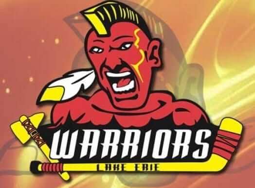
What you see at right (and can click to enlarge) is the logo for the Lake Erie Warriors, a Pennsylvania-based team in the new National College Prospects Hockey League, which will have its inaugural season this fall. The team and the logo have existed for at least four months, but I didn’t become aware of them until yesterday, when reader Bill Stewart brought them to my attention. “I’m not generally against Native American themes, but this just seems in poor taste,” he wrote. “Can’t believe that’s what they went with.”
Neither can I.
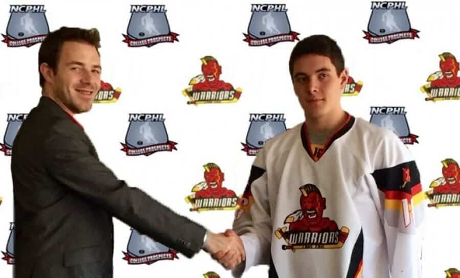
In case you’re wondering, the logo also appears on the team’s jersey (click to enlarge):
And here’s the beauty part: The team has a promotional video that begins with an inspriational slogan. And that slogan is…
I don’t have much to say about this one, because the whole thing pretty well speaks for itself. I don’t know what I could possibly add.
As it happens, just two days ago I accepted an invitation to be part of a panel discussion on Native American team names and mascots at Baruch College in Manhattan. It will take place on Sept. 8, probably in the early afternoon (I’ll have more info soon-ish), and will be open to the public. I imagine the Lake Erie Warriors may come up in the discussion once or twice.

Raffle results, and today’s new raffle: The winner of the A’s cap is Keith Winney. Congrats to him, and thanks to all who entered.
Our next ’47 cap up for raffle is this Tigers cap, which has a cloth adjusta-strap in the back:
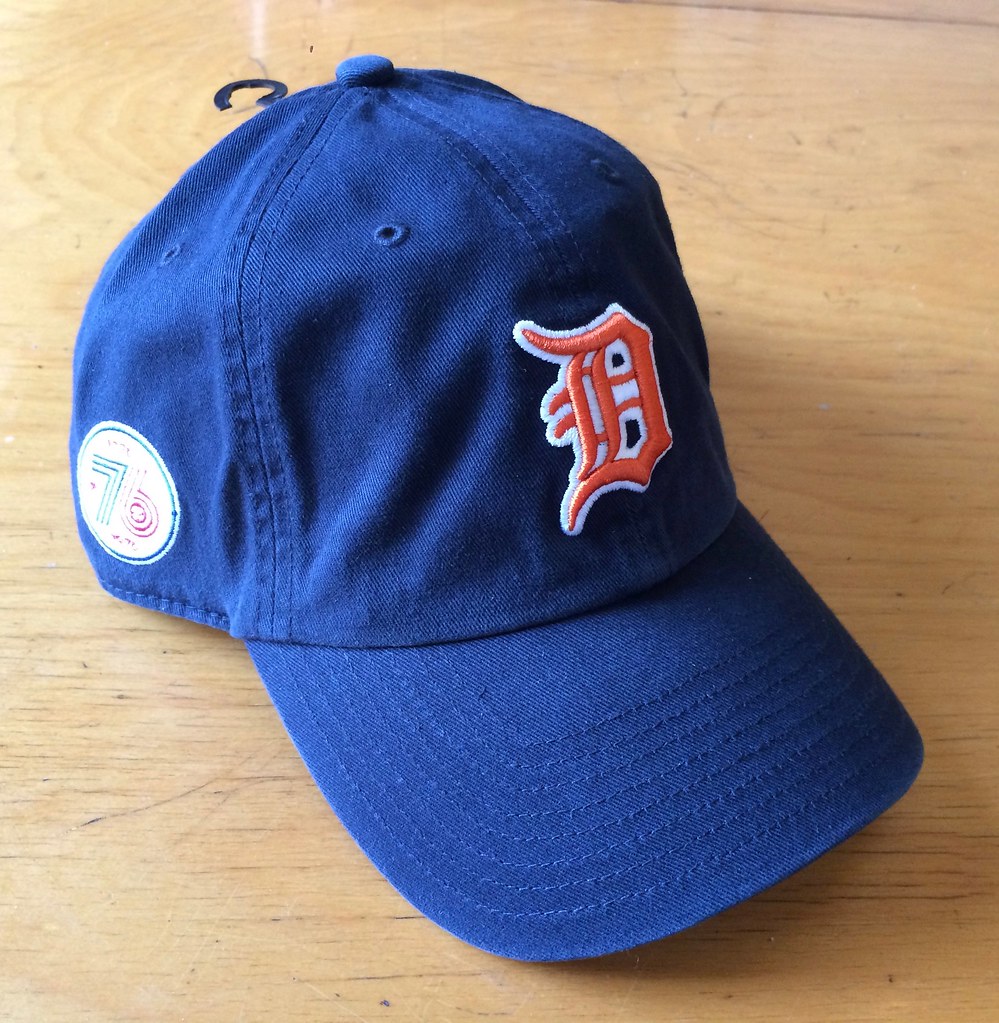
Here’s a closer look at the logo on the side (against a different background). There’s a ’47 maker’s mark on the other side.
To enter, send an email with your name and shipping address to this address (not to the usual Uni Watch email address, please) by 8pm Eastern TODAY. One entry per person. I’ll announce the winner tomorrow, and I’ll also announce tomorrow’s raffle cap, which will bring our July raffle project to a close.
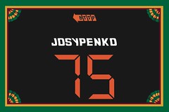
Membership update: We received two new membership orders yesterday (including one from Elliott Josypenko, whose card, shown at right, is based on his “Bat to the Future” softball jersey). I’m going to send this batch to the printer tomorrow and should have the printed/laminated cards in the mail by Saturday. So if you sign up today, you’ll likely get your card by early next week.
As always, you can sign up for your own custom-designed membership card here, you can see all the cards we’ve designed so far here, and you can see how we product the cards here.

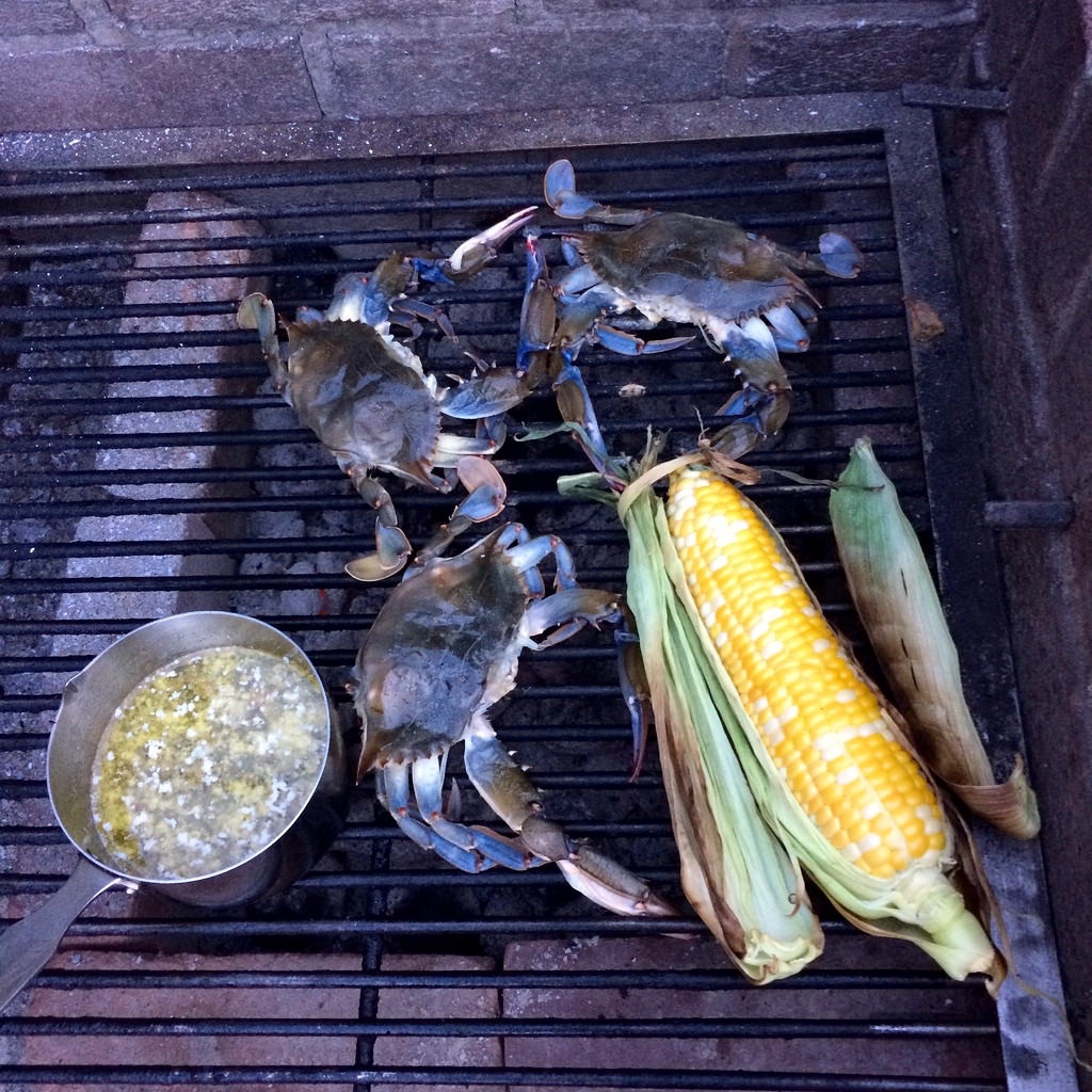
Culinary Corner: Two years ago I wrote about how I’d decided that the best bun for a hamburger is an English muffin. Earlier this week I decided to make soft-shell crab sandwiches on the grill and was trying to decide which kind of bun to use when it occurred to me that English muffins might once again be the answer. I’d never seen a crab sandwich served on an English muffin before, but the more I thought about it, the more I liked the idea.
I grilled an ear of corn along with the crabs and the muffins, and also made a sauce out of half a stick of butter, some lemon juice, and some capers. For each sandwich, I laid out a bed of corn kernels on the bottom half of the muffin, spooned on some of the sauce, and then added the crab (for all of these, you can click to enlarge):
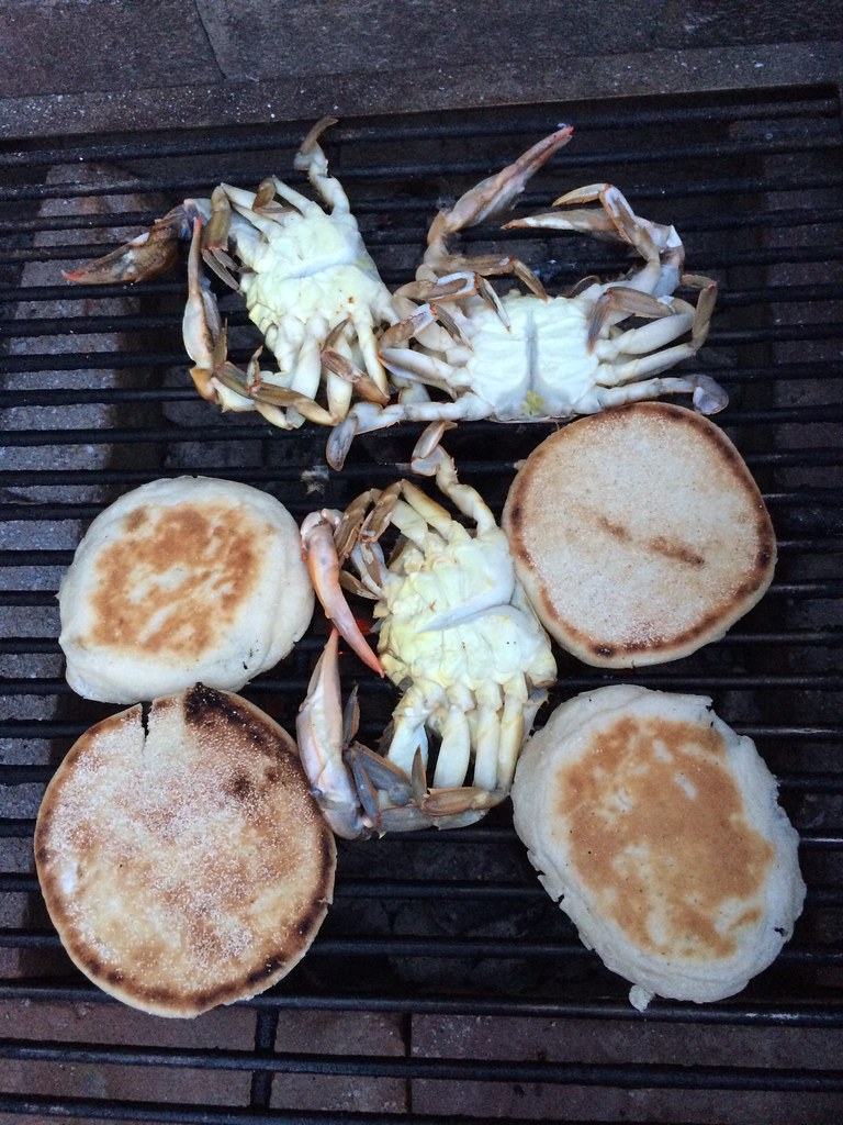


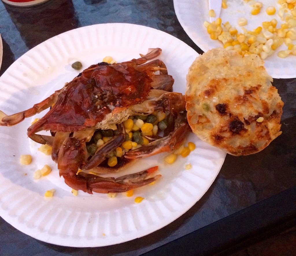

It turned out really, really well. The muffin was sturdy enough to handle the butter-based sauce, but not so thick or dense that it distracted from the succulence of the crab. This is definitely going to be my go-to crab bun from now on.
The Ticker
By Paul

Baseball News: Here’s the logo for next season’s MLB All-Star Game. … The Fort Wayne TinCaps will wear Indiana bicentennial jerseys on Friday (from Tony DesPlaines). … The “Hilly Phanatic” appeared on Stephen Colbert’s show the other night (from Will Shoken, among others). … Here’s something I didn’t know: Former Cubs C Randy Hundley was nicknamed “the Rebel.” So when he hit a homer at Wrigley, it was customary for a Confederate flag to be waved in the crowd. Pretty appalling (thanks, Phil). … Chris Sale, the gift that keeps on giving: ESPN broadcaster Rick Sutcliffe cut his necktie in two on the air the other night (from Rand Martin). … Tuesday night’s game between the Tacoma Rainiers and the El Paso Chihuahuas was delayed because the umpires’ gear was late (from Kenny Ocker). … When Darryl Strawberry played for the Giants in 1994, he had his jersey tailored with unusually short sleeves. … Who’s that in the football uniform? None other than Teddy Ballgame himself — Ted Williams! Lots of additional pics here (great find by James Gilbert). … Orioles 1B Chris Davis, mired in an 0-for-24 rut, batted bare-handed last night as a slump-buster move and promptly got a bunt single (from Andrew Cosentino). … Cardinals 3B Matt Carpenter has a new personal logo (from @c_r_fap). … Sloppy work on Astros OF Jake Marisnick’s NOB, as the negative space on the “A” was filled in with orange. Compare that to his teammates (good spot by Hunter Towns). … A kid who asked for Reds 1B Joey Votto’s batting gloves was basically told that Votto stands with the 99%. Pretty funny (thanks, Mike). … Mets OF Yoenis Céspedes has been wearing pants imprinted with the Declaration of Independence. Here’s another look at the pants (from @derpthrone). … Aroldis Chapman, making his Cubs debut, was wearing a black belt, instead of the Cubbies’ usual blue (good spot by Derrick Owen).

NFL News: Concussion discussion: The NFL claims that its “Heads Up” youth football program has reduced concussions among young players, but the data contradicts that claim. … New Eagles coach Doug Pederson is a big believer in using a helmet-cam during practices and workouts (thanks, Phil).
College Football News: Some Virginia Tech football helmets have been stolen (from Andrew Cosentino). … If you’ve been waiting for someone to rank the Big 12’s uniforms, today’s your lucky day (from Andy Altemus). … New uniforms for East Carolina (from Daniel Leyva) and also for Western Illinois (from Jack Giroux), and they sure do look similar. … Cal is planning a pretty cool Marshawn Lynch bobblehead (From Robert Hayes). … Oregon, as usual, appears to have something new in the works. … New away uniforms for the Virginia Military Institute (from Lenny Brown). … Whoa, check out these early-1900s Clemson unis! (From @ACC_Tracker.) … Here are Louisiana Tech’s new uniform combos. … Here’s a list of the greatest college football players as broken down by uni number (thanks, Brinke).

Olympics News: Here are some pics of the USA field hockey team’s uniforms. “There were three jerseys made — red, blue, and white,” says the team’s official photographer, Mark Palczewski, who took those shots. “Olympic rules state that only two different uniforms can be worn, so the team decided to wear the red and the blue during the Olympics.” … Here’s an infographic with 17 fun facts about gold medals.

Hockey News: Concussion discussion: Despite overwhelming evidence, NHL commish Gary Bettman says there’s no link between concussions and chronic brain disease. Uh, sure. … Looks like the Blues will be wearing their 50th-anniversary patch on the shoulder.

NBA News: Last month I did an ESPN piece on Robert Grove, the designer who created the Cincinnati Royals logo that was recently revived and updated by the Sacramento Kings. Here’s an article about him from a Cincinnati website (from Mike Dyer).

College Hoops News: Wake Forest will be playing some games in the Bahamas next month, and has new uniforms for the occasion (from Will Lawson).

Soccer News: New away kit for FC Zenit (from Adam Sell). … Stoke City went NNOB last night, although I’m told that that’s fairly common for preseason games.

Grab Bag: Color-coded breakdowns of media credentials are always fun. Here’s one for the Democratic National Convention (from John Chapman). … Here’s a bracket-style setup to choose the best sports uniform in Arizona. … Jail workers in Australia have been told to stop wearing their uniforms outside of work to avoid provoking angry community members. … 7-Eleven is suing two grocery shops in Brooklyn for using names, logos, and colors similar to the convenience chain’s branding. … “UW-Madison hosts one of the largest college cross country meets, which was formerly called the Wisconsin Adidas Invitational,” writes Ryan, who didn’t give his last name. “This year the name appears to have been changed to the even more atrocious ‘Nuttycombe Wisconsin Invitational Presented by Under Armour.’ Why they can’t just call it the Wisconsin Invitational is beyond me.” What he said. … New package design for Diamine fountain pen inks. “Diamine sells ink generally at the lower end of the fountain pen market, and it’s rare to see an ink maker improving its aesthetics except at the high end of luxury brands,” says R. Scott Rogers (who, if anyone had asked me to guess, I would have singled out as the Uni Watch reader most likely to use a fountain pen). “But it’s nice to see, since Diamine makes generally excellent inks with an unmatched variety of colors — and the old bottle and label design barely identified the color of ink in the bottle.” … New logo for Oklahoma City’s upcoming streetcar system.
The Lake Erie story has somehow also made its way into the baseball section of the Ticker.
I have no idea how that happened! But in any case, it’s now fixed.
‘Best sports uni in Arizona’ link broken
Fixed.
Looks like there are tagging issues at the beginning of the Grab Bag.
One stray character can have a huge ripple effect. Now fixed.
Picking nits, I know, but I don’t think Sutcliffe is working for the White Sox. He was calling the game for ESPN, who just happened to have the Chicago series this week.
Not nitpicky at all — thanks for the clarification. Now fixed.
The first ‘Grab Bag’ item is messed up. The hypertext is for Arizona uniforms, and the link is dead.
Already fixed.
Growing up in the Chesapeake Bay area, we only ever ate hard shell crabs. There’s a pretty standard process I learned at a young age to picking and pulling out the crab meat while getting rid of some of the less desirable innards. I’ve actually never eaten a softshell crab, so I’m curious, is there anything that needs to be taken out? Or do you literally eat the entire thing?
Before cooking a soft-shell crab, you (a) cut off the face, (b) remove the lungs/gills (just as you would when eating a hard-shell crab), and (c) remove the apron from the bottom (just as you do when starting to open/eat a hard-shell crab). All of this is usually done by the fishmonger, so you don’t have to do it yourself, unless you want to.
You eat everything that’s left after that.
I love the hard- AND soft-shell varieties. Both are a special treat!
More:
link
link
But… the shell part. Isn’t it like eating a toenail?
Eating a HARD shell would be like eating a toenail. But eating a soft shell is like eating, I don’t know, something soft.
I agree that it’s counterintuitive and therefore requires a bit of a mental leap for some folks. But there’s a reason many of us consider it to be a delicacy!
Woof, props to you. I could never get by the look of those claws hanging outside the bun. I was never able to separate crabs and lobsters from roaches, but like you said, delicacy for those who do.
I was so confused. I’m a foodie so I would (and probably will) give it a try sometime.
Paul – Keep sharing your food adventures, please. A uni-nut that loves food – the perfect blog!
Soft Shell Crab sandwiches freak me out!
They’re not for everyone. But they’re sooooo good!
Little-known fact: There are also soft-shell lobsters. But they usually get eaten by other lobsters in the trap, so it’s rare to catch one. If a lobsterman is lucky enough to catch one, he usually keeps it for himself.
I’ve eaten softshell crab exactly twice in my life. I ended up puking my guts out both times.
Correct me if I’m wrong, but aren’t all shellfish, at a certain point during the year, what could be described as “soft-shell” creatures? I thought that the term simply refers to a shellfish that has molted. They are then caught before the shell grows back, cooked, and served.
First, just to clarify: You referred to “shellfish,” but that term encompasses two distinct groups of sea creatures — mollusks (clams, oysters, mussels, scallops, etc.) and crustaceans (lobsters, crabs, shrimps, langoustines, crawfish, etc.).
Yes, crustaceans all molt and go thru a soft-shell stage. But crabs are the only ones, to my knowledge, that are routinely caught/trapped during molting and then sold/served/eaten.
In 1989, I had a big bag of deep-fried soft-shell crawfish at a street fair in Jackson, Mississippi. Soooo good! It was my first time in the Deep South, and I figured, “Oh, this must be a normal thing that they serve all the time! I’m gonna eat this over and over and over again.” That was the only time I’ve ever seen it offered for sale. It was such a singular experience that I now almost question whether it really happened.
I see they do still exist, however:
link
Crab samich question: I get the English Muffin functionality part of using one as a bun, but do you find any interesting taste issues? I find English Muffins sort of sweet in taste. Do you find that goes well with burgers, crabs, etc.?
Also, for anyone/everyone who has not had a soft shell crab. Have one. They are really good and I don’t think you’ll be weirded out too much by the shell part.
Uni context for fountain pens: Manager and coach Jerry Narron uses fountain pens with three colors to fill out lineup cards. Here’s a story that details how he got into it and shows some of his work with the Brewers (2011-2015): link
I think the Marlins — or whomever designs the All-Star Game logos — did a nice job. I like how the fin of the marlin creates the top point of the star.
The Marlins uniforms have really grown on me. That design wouldn’t work in a more traditional baseball market, but it’s very Miami.
Still some room for improvement. I do think the cap logo is a little too big, and I’m not keen on the number font. And, I’d rather see Marlins on the home jersey instead of Miami.
But overall it’s a nice look, and I like how the All-Star Game logo goes along with it.
Seconded. I can’t wait to see the Home Run Derby uniforms!
The uniforms in general have also really grown on me. But two design elements haven’t: The cap logo, specifically the Apostrofish, which feels just as ill considered and poorly rendered today as it did when it was unveiled – though I agree that the way it’s incorporated into the All Star logo is nice – and all the black. To come close to modern perfection, the Marlins need to ditch the black entirely, substitute the bright blue, and add a stronger medium gray/silver as an accent color, and replace the Apostrofish with either something stronger or nothing at all.
^^^ This. Every word.
Replace the black with teal and bring back the orange caps.
No, I like the new piscine; it looks like neon. The “Florida” Marlin flunked the basic test of an insignia (Can a child draw it?) and made their cap look like something you’d pick up at the Tarpon Springs Trading Post.
Specific aesthetic piscine disagreement aside, and this is a general rant and not actually an argument with you, I don’t buy that “Can a child draw it?” is either “the most basic” test of an insignia, nor even a valid test at all. For one thing, it’s not a meaningful test. I was a precocious drawer as a child; I most certainly could have drawn the Florida Marlins cap logo with reasonable accuracy. I drew much more complex logos and figures, often from memory, while not paying attention to classes that involved numbers. Conversely, if you ask an average person of any age to draw any of the simplest and most famous logos, most of the time they’ll fail quite badly. Seriously: Try asking a baseball fan to draw the Yankees cap logo, or the Mets cap logo. If the test is, are there children who could easily draw this insignia? Then any insignia will pass. If the test is, can most children easily draw this logo? Then nearly all insignia will fail. Empirically, it is a meaningless test. It is, literally, nonsense.
But even if it could in theory be a meaningful test, it doesn’t stand up to practical application. Is Belgium’s flag a better design than the American flag? Anybody can draw three stripes of black, yellow, and red. But even Belgians sometimes mistake neighboring Germany’s flag for their own. Drawing the American flag is hard – those seven red stripes are difficult to space properly, few people know from memory exactly how many stripes tall the blue field should be, and even professional artists often fail to get the number and pattern of stars right. I can draw all 50 states to scale into a single, detailed and correct map of America, and I can do it from memory, and yet I can just barely draw a good American flag if I try really, really hard. So if “Can a child draw it” is “the most basic” test of an insignia, it’s QED that the American flag is a shitty design. Even the most reductionist simpler-is-better vexillologists I know nonetheless regard the American flag as a pretty good design, even if they’ll gleefully argue the contrarian position that Old Glory is overrated, even if solid. Or take commercial brands: Nike’s swoosh is one of the easiest-to-draw corporate marks ever. Coca-Cola’s logo is a complex holdover from nineteenth century overly filigreed commercial design. Anybody can draw a reasonable swoosh; none but a few trained calligraphers can even approach a credible Coca-Cola logo. Yet you’ll very few people, designers or members of the general public, who would regard Coca-Cola’s logo as either vastly inferior to Nike’s logo or a logo of deficient quality.
Look at #12 on the SI story on the greatest players by number- sweet uni. Do THAT as a throwback, please.
Looks like the Toronto team in that College Prospects League completely borrowed (ripped off?) the Winnipeg Jets logo –
link
Jeez, that’s not even subtle.
It surprises me that the Warriors logo got past any sort of public review.
Or private/internal review! How did anyone sign off on this in 2016? Unfuckingbelievable.
It got by because its awesome in it’s “we’re sick of people pandering to every group of people who complain about anything” glory. Its a team logo, if you don’t like it, don’t buy it. If enough people don’t buy it it will fail and get changed. If it’s popular it will last. It’s a simple concept.
Oh, I’m not saying its a good logo, its really poorly done and looks like a grade-schooler drew it. If it was the same theme but drawn well it would be fine, they are not doing it to mock anyone. They are calling themselves the warriors. If they were making fun of the emblem, they wouldn’t be using it for themselves.
If enough people don’t buy it it will fail and get changed.
1) The notion that a design’s success or failure is based exclusively on retail sales is, as always, utter bullshit.
2) They just changed it. And not because of lack of sales.
Meh. It’s a generic Native American Warrior. What the heck do you want it to look like? I mean, if you’re not opposed to the entire concept of a Native American mascot, then it just looks like any other modern computer-designed, aggressive-looking minor league logo. If you are opposed to Native mascots… then you’re going to not like anything they do with that theme, so, ya know, whatever.
In this unsettled and chaotic world, it’s reassuring to know there are still three things I can count on: death, taxes, and….
False. I am not opposed to Native American imagery and mascots as such. I am opposed to demeaning caricatures of my fellow American citizens. That Warriors logo is almost as bad as it gets – the only thing missing was a more prominently hooked nose. Also, it’s a badly drawn, poorly rendered logo, a literal mishmash of symbolic elements and racist stereotypes. “Savage” screaming face? Check. Redface? Check. Feather? Check. Mohawk? Check. Tomahawk? Check. Stereotypical Northeast Indian features? Check.
Even if you stick with the Warriors name and a commitment to logos and uniforms built around Native American imagery, and even if you keep the basic elements that whoever was involved in the design barfed onto their brainstorming notes, this could have been respectfully done – and in so doing, it might actually have looked good. I mean, just take the tomahawk: That was a distinctive tool of the Northeast’s tribes before European contact. But soon after arrival, English settlers adapted the form of the stone tomahawk to create the metal bladed tomahawk, and for centuries that has been the distinctive personal weapon of American warriors fighting in the Northeastern woodlands or serving with units descended from those that fought in the Northeast. To this day, some Army Rangers carry tomahawks, mainly because that was the personal weapon of choice for Rogers Rangers in the French and Indian War, from which today’s Rangers claim a sort of martial-spiritual descent. So a Warriors identity built around a tomahawk – you could even stick a ceremonial feather near the head, and/or incorporate a hockey stick as the handle – and you’d have a strong identity with deep local connections and a clear Native American theme that avoids racial caricature and transcends ethnic particularity.
Draw me a Native American Warrior, that doesn’t invoke any sort of racial stereotypes, that anyone can actually identify as a Native American Warrior. Stereotypes are not always negative, you know. Certain traits sorta need to be there, or else you can’t actually recognize what it’s supposed to be. I’m pretty sure that “blatantly white guy dressed as a native american” is going to bother people more than “stereotypical native american” will.
The whole “caricature” and “reducing humans to memes” thing is lost on you, isn’t it?
…and that’s different from Vikings, Spartans, Trojans, etc, in what way? We’ve reduced every historic culture down to stereotypes. No one with a functional brain thinks any of these teams are trying to be an accurate representation of modern Native Americans. If the Irish can be summed up by shamrocks and leprechauns, and Vikings are (historically inaccurate) horned helmets and swords, then Native American Warriors are tomahawks and feathers. The fact is, the vast majority of people don’t care either way. The logo got approved because someone thought it looked “bad-ass” or “cool” or whatever slang term you’d prefer. It’s not exactly a great logo, but it also isn’t intended to be racist or demeaning or anything. Being a warrior is not typically seen as a negative trait.
It’s not exactly a great logo
Now there’s a generous understatement! It’s honestly one of the worst I’ve ever seen, simply on the technical merits of the rendering. An average high school art student could not produce something as bad even if she tried. It’s actually worse than the crappy Jim Aparo-ripoff superheroes I used to draw in middle school.
it also isn’t intended to be racist or demeaning or anything
None of us can ever truly know the intentions of any other person; our minds are opaque to one another. All we really have is our actions and their consequences. Results, not intentions, have ethical and moral weight.
Being a warrior is not typically seen as a negative trait.
Exactly. Which is why my objection is not to the name, nor even the use of Native American imagery, but to the lazy racial stereotyping of the particular drawing in the logo. There are so many ways to communicate that team identity without grasping at cheap, lazy, and indecent racialist tropes.
Man, you hit that thing outta the park! The logo is a pretty blatant racist caricature of a Native American warrior. Being exactly half Native Amercan myself, I am doubly offended. The logo honestly looks like line art of a screaming, generic punk rocker made up to look like a stereotypical Native American. Only thing that is missing to make the image complete is a nose piercing. Absolutely disgusting. Shoulda saved for ‘Skins Watch?
You’re completely missing the point. It’s not about “how do you draw a non-offensive Native American.” Don’t even use a Native American at all. It could be a tomahawk, an arrowhead, a feather, a bow, etc. Why do you think the KC Cheifs and Atlanta Braves avoid so much of this controversy? It’s because they don’t have red-faced racial stereotypes on their uniforms.
Not surprising at all if you understand the hockey culture, especially at the minor and junior level. Just as concerned with promoting a certain political viewpoint as it is with developing hockey players.
I’m a hockey fan on the AHL and NHL levels, but I’m not very familiar with the lower minors or juniors. What political viewpoint are they promoting? I’m not trying to be a smartass here, I’d be genuinely interested to learn.
Should clarify minor is referring to kids minor hockey, not minor pros. Just promoting a conservative political viewpoint as a supposed way of instilling “values.” Using the typical forms of control you would find in any social dynamic. Today’s example, with the logo and the slogan, encapsulates this perfectly.
See cherry, donald s and Subban, PK as exhibits a abd b of the “good canadian boys” phenomenon.
Have to try the English muffin bun for soft shell crab. Works great for a burger. Also I do grilled chicken sandwiches and the English muffin holds up better than a bun on tbat too. Regular buns seem more fragile.
Tonight is beef tenderloin butterflied, slightly pounded out then rolled with lobster tail inside. Grilled. Good stuff.
Please send photos!
In addition to the obtuseness of the logo, the actual design is awful. The proportions are all off, the video uses a default font, the whole thing is just completely amateur looking.
Their insignia gives off an overheated “Beast of New Haven” vibe. It appears everyone involved had an axe to grind.
Thank you for forcing me to remember The Beast. My vote for worst logo in sports history.
Reminded me of this guy. Perhaps due to the overly red redness of it all.
link
Paul: there’s nothing sloppy with the NOB for Jake Marisnick. His last name is 9 letters long and the letters are kerned to be narrower to accommodate his longer last name. You’re comparing him to guys with shorter last names (Castro, Rasmus).
Do the Astros have a condensed font for players with long names?
Those letters are indeed narrower than the other players’ letters. Not sure if they were just digitally squashed or if they have a full and proper second set of condensed letters.
Usually the latter – an entire second set. The Astros’ NOBs are thicker and wider than a lot of others teams and probably use theirs more than other teams.
That “Jail workers in Australia” article was frustratingly vague. Was the public angry about seeing chain gangs on the side of the road? Or do they think jail security is being confrontational with the average citizen? Too much ambiguity.
Some context; the Northern Territory Corrections department is currently under investigation after a new program aired a feature exposing widespread abuse and what basically amounts to torture of juvenile inmates. See link
The name Erie literally comes from the Erie people who lived in the area in the 1600’s. So the Native American theme (to me) seems to work in this case. Why not at least use a part of their history?
From Wiki: The names Erie and Eriez are shortened forms of Erielhonan, meaning “long tail.” The Erielhonan were also called the Chat (“Cat” in French) or “Raccoon” people, referring to that characteristic.
Lake Erie Cats
Lake Erie Longtail or Long Tails
Nice research! I like Long Tails as a nickname/mascot. Different and still historic.
I went back and read your old post on hamburger buns–things like cheese and mayo/butter serve a functional purpose of creating a barrier between the bread and meat/veggies to keep the bread from getting all soggy.
much like paul , colbert is a stupid lefty jew. Who gives a F if they have an indian as a logo? its a tribute to their fighting spirt dumbarse. sick of people like you & you p.c bulls^^t. Speakin of filthy jews you spelled Bettman wrong.
Bettman typo fixed — thanks.
link
Bravo to you, PL for not taking the bait. I’m not as strong as you.
+1
Lee
Why is AntiPC’s ignorant, hateful, anti semitic comments allowed in this forum, Paul?
Sometimes it’s good to let assholes show themselves as assholes.
1) I’m amazed that this post even made it through the review. Kudos for allowing free speech, no matter how ridiculous and hateful it is
2) Colbert is a devout Catholic, not Jewish in any way shape or form. Just further proof that ignorance of mind begets ignorance of speech.
I don’t find Colbert as funny as when he was in character. The Colbert Report was brilliant satire. The Late Show is just another interchangeable talk show.
@AntiPC, looking to get banned, are we?
There’s a difference between being Anti PC and being a fucking prick.
Last night on Garbage Time with Katie Nolan, she did a bit at the beginning where the network forced her to wear a retro sweater, so she took a knife to it. When she was told she had to wear it anyway, she appeared with it stapled back together. (She changed later in the episode.)
Cutting up the shirt: link
Wearing stapled shirt:
link
You wouldn’t think it was possible to have your head both in the sand and up your ass at the same time, but unsurprisingly, Gary Bettman finds a way.
Well you just have to put your ass in the sand first… that’s not too difficult…
That flag being waved at Wrigley seems like a lesson in historic context. It used to be able to be used as a symbol for a guy nicknamed ‘rebel’ without all the weight of controversy that automatically comes today.
Looking at it through 2016 eyes, it’s positively disgusting. In the early 1970s, it was more benign. Shoot, there was a popular TV show with a rebel flag painted on the roof of a Dodge Charger in the ’80s.
It was not at all more benign in the 1970s; it was just more socially accepted. Today, anybody who was actually directly persecuted by Jim Crow laws is an old man or woman; in the 1970s, there were still schoolchildren who had experienced the worst forms of American racial tyranny; every adult of color knew white oppression first hand. And the use of what we call the Confederate flag as a symbol of white supremacy and resistance against civil rights was fresher in memory. It wasn’t even a memory at all, since there were still at the time white folks (mainly in the North by then) resisting desegregation and using the Confederate flag as a symbol of their white supremacist cause. As a very young boy at the time, I recall a couple of times hearing white men speaking in overtly racist language in polite company when my older relatives were present. Things my grandfather or great-uncles would never say, and would have punished any of us kids had we said them, went unremarked upon when said by peers among white-only audiences. Today, you’d sort of expect any decent, self-respecting, or patriotic adult to speak out against any such language, to confront the speaker in the moment. I know I would feel deeply ashamed and humiliated were I not to do so. But back then, such expressions of white bigotry were both more common and more accepted by white folks, and white men in particular had much more cultural authority to set the general norms of acceptability. You maybe didn’t support that sort of thing, but good people didn’t necessary feel a duty to resist it.
Living in the rural part of the mid atlantic, i regularly see houses and cars flying the stars and bars, often alongside the US flag and/or the dont tread on me flag.
You actually see people flying the stars and bars?
link
Or do you see people flying the battle flag of the Army of Northern Virginia?
link
I’m probably poking a bear here. That isn’t a “Confederate flag” per se, that particular flag was never used as an official flag of the Confederacy (a version of it was used as the flag of one of the armies of the Confederacy). It gained cultural acceptance as the “rebel flag”, “Confederate flag”, or “dixie flag” during the civil rights movement (or more commonly as resistance to the civil rights movement), the “history not hate” side (which I personally am willing to listen to/entertain) never seems to acknowledge that that particular flag wasn’t ever representative of the Confederacy. Just a small thing that always gets me.
Minor nit in your otherwise spot-on nitpicking: What’s commonly called the “Confederate flag” today was in fact used in essentially its modern form by the Confederate States during the Civil War. Officially by the Confederate Navy as a naval jack, and also unofficially by civilians. That design, which was more prominently used in square form as the battle flag of the Army of Northern Virginia, was by far the most popular image to depict the Confederacy and to communicate loyalty to it by pro-secession civilians at the time. You see it at least as often as any of the official Confederate national flags in things like pamphlets, sheet music, newspaper mastheads, and so forth. The history of using that particular design to symbolize white Southern cultural solidarity and/or white supremacy began during the Civil War, not after it, even though the Confederate government never quite used that flag as an official civil ensign.
Good point, Andrew. But it’s kind of like traveling through the southwest and seeing various “swastika” designs used on indigenous pottery and other places (including Hoover Dam, built in the early 1930’s); the design itself predates a certain notorious 20th century use by hundreds of years, but it’s jarring effect when encountered today has rendered it seriously out of play. Come to think of it, Adolph was a perfectly acceptable name for a long time till it became associated with a certain guy…
There was at least building on the iu-Bloomington campus that had the “reverse” swastika as part of its mosaic tiling. And i think it was built before the 1930s, iirc.
Swastikas are side-effects of key patterns, and as such, tend to appear on a lot of prewar government buildings and Classical architecture.
We may have discussed this two years ago, but decades before Ruby Tuesday became a terribly average mid-range restaurant and had several recent rebranding attempts, they were famous for serving their premium burgers on English Muffins.
It was always fun and unique to go there when I was a kid (and it was a smaller chain based here in Knoxville) and have a giant burger on the toasted English muffin that held all of the toppings in so well.
During RT’s failed attempt at becoming a burger place a couple of years ago, they brought it back as the “original,” although it was the same average patty and toppings as the rest of their burgers, just on a below-average muffin. I hate to quote one of the political candidates, but it was, in a word, SAD!
Regarding the US Field Hockey item:
1) There may be a regulation stating that a team can wear only two uniforms, but I think that’s not through the Olympics, but the world governing body of field hockey instead.
1a) Otherwise, how do you account for Mexico’s men’s soccer team wearing three different colors at London 2012? They wore green vs. Brazil, red vs. Switzerland, and white vs. Japan. You can look it up.
2) The women’s field hockey team has traditionally worn red as its primary strip since the late 70s. It’s been one of the only U.S. teams to do so during the Cold War. That being said, the current red kit is awful. Can’t see the numbers or names because they are printed in blue.