Click to enlarge
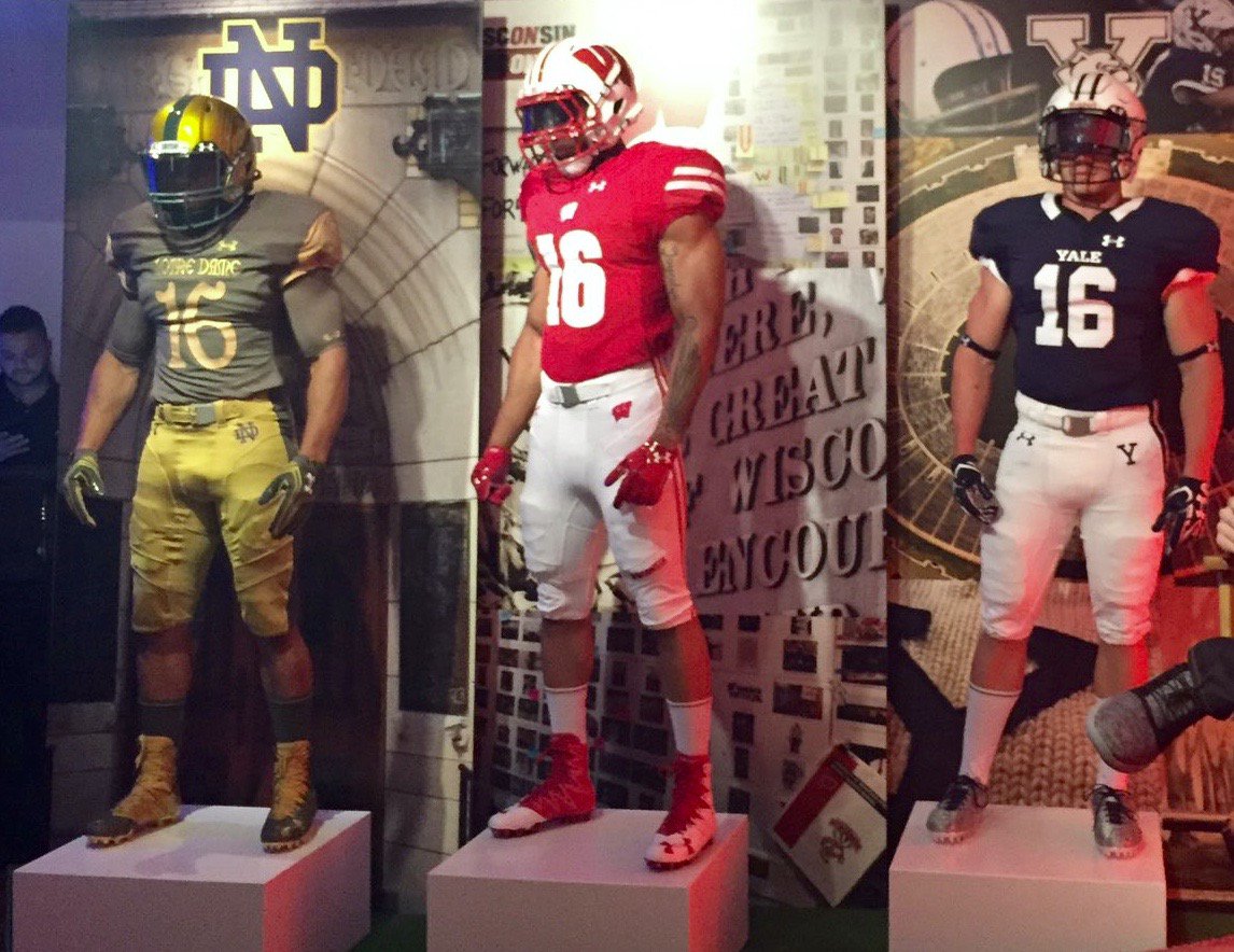
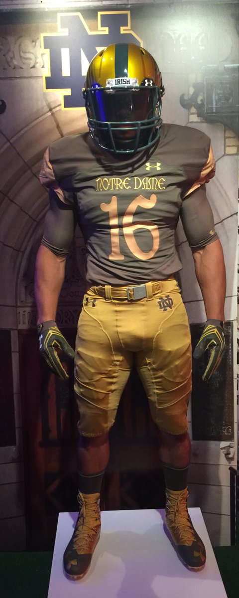
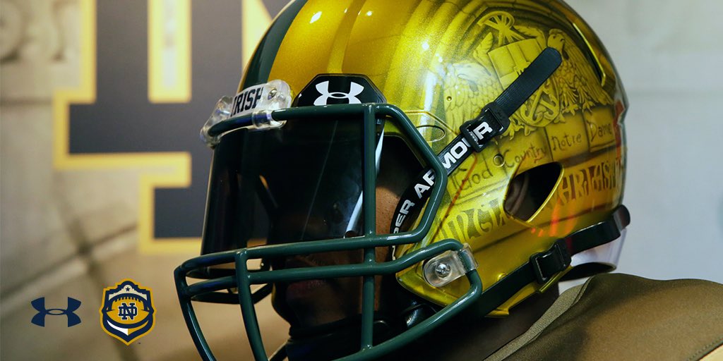
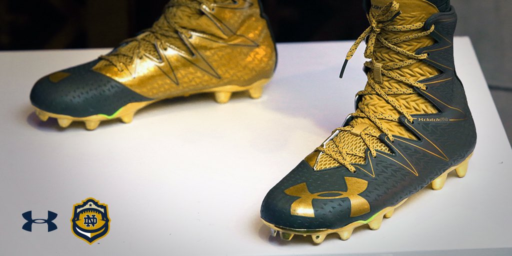
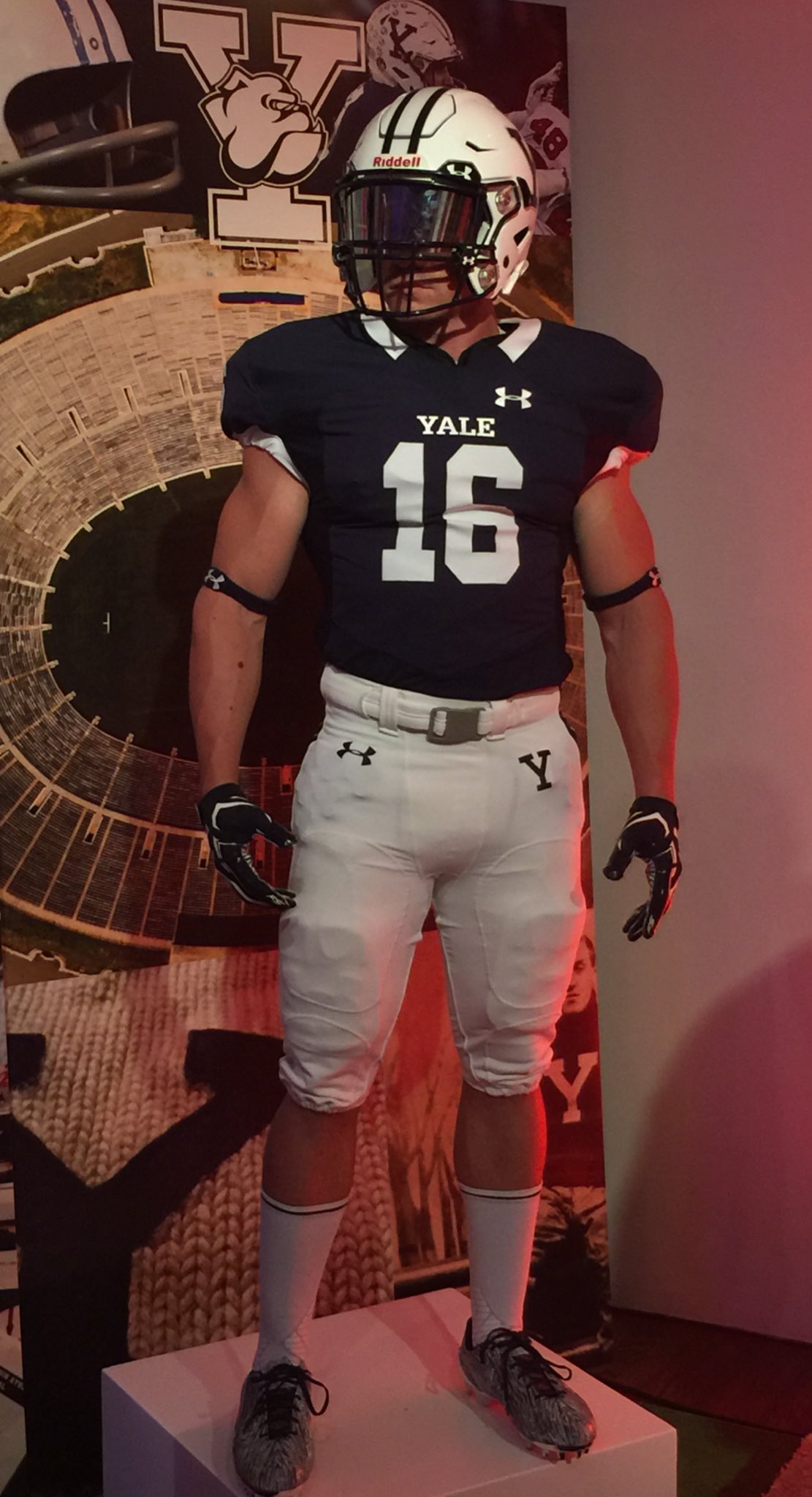
Under Armour threw itself a 20th-birthday party last night and took the occasion to unveil three new college football uniforms: Notre Dame’s 2016 Shamrock Series design, plus the new looks for Wisconsin and Yale.
My thoughts on the Wisconsin and Notre Dame uniforms can be found in this ESPN piece, which was published this morning. Meanwhile, here are some additional photos (many of which can be clicked to enlarge).
Side-by-side comparison of old (left) and new Wisconsin football uniforms. pic.twitter.com/fOMQ9YIvDi
— Paul Lukas (@UniWatch) July 21, 2016
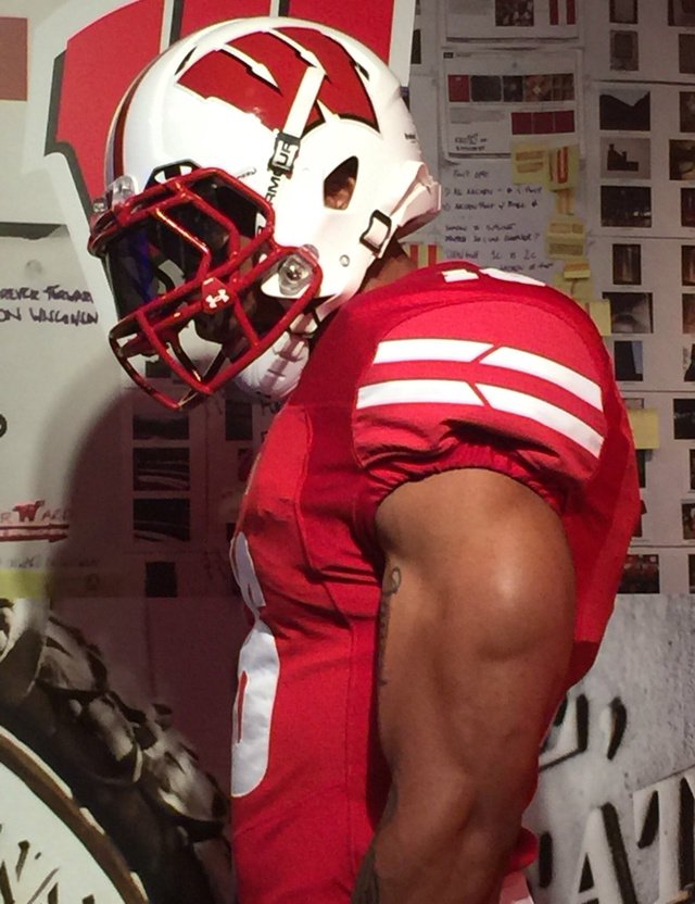
Arrows incorporated into Wisconsin's new sleeve/pant/helmet striping symbolize new slogan, "Forever Forward." pic.twitter.com/Cjac7a0XwW
— Paul Lukas (@UniWatch) July 21, 2016

Click to enlarge
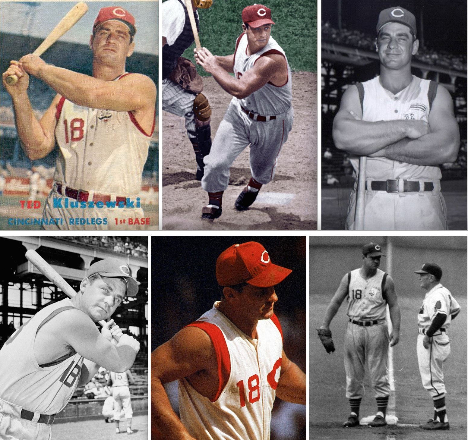
Friday Flashback: My latest Friday Flashback column over on ESPN takes a look at the history of MLB vests (including some discussion of the ultimate sleeveless player, 1950s Reds first baseman Ted Kluszewski, shown above). I even wore a vest for the video accompanying the piece. Check it out here.
Timberwolves-redesign contest reminder: In case you missed it earlier this week, I’m running an ESPN contest to redesign the Timberwolves. Details here.

Raffle results, and today’s new raffle: The winner of the Padres cap is Bryant Robinson. Congrats to him, and thanks to all who entered.
Our next ’47 cap up for raffle is this Orioles snapback:
Here’s a closer look at the logo on the side (against a different background). There’s a ’47 maker’s mark on the other side.
To enter, send an email with your name and shipping address to this address (not to the usual Uni Watch email address, please) by 8pm Eastern TODAY. One entry per person. I’ll announce the winner on Monday, and I’ll also announce Monday’s raffle cap, and then we’ll keep repeating that process for each remaining weekday this month. If you win one of the raffles, please be nice enough to step aside and stop entering the remaining ones. Thanks.
The Ticker
By Mike Chamernik

Baseball News: The Royals visted the White House yesterday and the presented President Obama with one of their gold-trimmed championship jerseys (here’s the front). They also asked Obama to sign a standard home top, and he obliged. … Bryce Harper wore Stance socks with MLB logos on the backs yesterday (from Jason Whitt). … Both the Twins and Red Sox wore Heart of 29 patches at Fenway last night. Rod Carew, who wore a Red Sox jersey for the game, started the campaign to raise awareness about heart disease. … The Dodgers’ 3D-printed helmet logos are coming undone in the DC heat and humidty. … The Mets increased the visibility of their retired numbers by moving the displays from a wall behind the left field bullpen to the top of the stadium. Are there any other teams that position their retired numbers that high? (From Patrick Sesty.) … As a Brewers fan, I know they wore their new dark blue ball-in-glove alternates often, but not this often. … David Ortiz wore a misspelled uniform during a game in his early Twins years. It reads “ORITZ” (from Mike Menner). … As Paul noted yesterday, the Giants wore historically inaccurate socks during their throwback game against the Red Sox on Wednesday. That’s even odder considering that they wore period-appropriate black stirrups with orange sannies against the Rays just last month (from David Taub). … This blog post says that a couple of 1970s White Sox uniforms are on display in “The Bard’s Room,” an exclusive dining area at Sox Park. Scroll down to see old photos of the uniforms in action (from Eriq Jaffe). … Mets OF Timo Perez wore the wrong cap during player introductions prior to Game 1 of the 2000 World Series. … The Fresno Grizzlies will wear mariachi uniforms tonight. … We saw renderings a few days ago, but here are photos of the Myrtle Beach Pelicans’ Kenny Powers tribute jerseys. … The Brazos Valley Bombers, a Texas summer collegiate team, wore Top Gun jerseys. … Here are the away and home uniforms for the Under Armour HS Baseball All-America Game on Saturday night at Wrigley Field. As you can see, both teams have racing stripes. Here’s a front view of both sets (from Robert Onolfi). … Wow, check out these old Utah uniforms, circa 1916 (from Ben Wilkinson). … Dugout Memories, one of the earliest and longest-running vendors of throwback/nostalgia apparel, has had its MLB license revoked and will have to stop selling MLB merchandise soon. “To say I am heartbroken would be an understatement,” wrote DM president Glenn Gough in an email to customers. You can read the entire email here (from Bernd Wilms).

NFL News: We’ll have to continue to wait patiently for the Packers to reveal their Color Rash unis. … The Bears’ season tickets suggest that the team will wear Monsters of the Midway throwbacks twice in October (from Jamie Uthe). … On a related note, check out this slideshow of Bears ticket designs through the years (from Ron Roza). … Hall of Fame CFL quarterback Matt Dunigan had a huge facemask for a time in the mid-1980s (from reader B.Q. G).
College Football News: Texas A&M coach Kevin Sumlin says that the Aggies will soon unveil throwbacks. The coach says they will honor a title-winning team, which means the unis will be from either 1919, 1927, or 1939. … Yesterday we noted that Michigan has a different shade of yellow after their switch to Nike/Jordan. Mark Praschan is here to clear up confusion: “Per the owner of M Den, the official retail outlet for U-of-M, Nike’s ‘Amarillo’ is PMS7406, which is the exact color listed on the University’s official Style Guide. Michigan calls this color Maize. Nike calls this color Amarillo.”

Hockey News: The Islanders’ first year at Brooklyn’s Barclays Center was a disaster, so the team is reportedly considering building a new arena near Citi Field. … After doing the Metropolitan Division last week, Adam Rickert redesigned the jerseys of teams in the Atlantic Division. I like Adam’s concepts because they are very clean and subtle, unlike the wacky reinventions we usually see in this space.

Basketball News: The NBA has pulled the 2017 All-Star Game from Charlotte due to North Carolina’s controversial House Bill 2. New Orleans appears to be the most likely substitute city, although others are being considered as well. … Players on three WNBA teams were fined for wearing warm-up T-shirts protesting recent shootings by and against police officers. … Kevin Durant was in the middle of a shoe war in 2014, when Nike retained Durant by matching a $285 million offer he received from Under Armour. Durant says that the drama was one of the reasons he opted out of the FIBA World Cup that summer. … Jordan Brand unveiled the Jordan XXXI sneakers, which go on sale in September. The shoes are known as the “Banned” edition, an homage to the original black-and-red Jordans that the league fined MJ for wearing in the mid-1980s. … Rapper Lil Dicky sells his own sports-themed merchandise. Those socks say there’s an outside chance he’s a Uni Watcher (from Paul Kos). … Check out the wild dark pinstriped shorts (and script jerseys, and afros) that North Dakota State wore in 1972-73.

Soccer News: EA Sports may have leaked Manchester United’s new kit (from @HolyCalamity). … Also from, um, Holy: After changing his jersey number to No. 3, Liverpool’s Mamadou Sakho will sign fans’ outdated Sakho No. 17 jerseys. … New away kits for Burnley FC and Sparta Prague (from John Hinton). … New neon-and-blue third kit for Arsenal. “Thankfully third kits are so rarely worn,” says Ian Wright. “Yet Puma has created a new one for Arsenal in each of their three years [here’s 2014-15 and 2015-16 – MC] as uniform manufacturers. In years past, with Nike, the previous year’s away kit would become the current third kit.” … Uniform ad regulations at the Rio Olympics will prevent Germany from wearing kits with the three stripes design (from Robert Marshall). … “1860 Munich of Bundesliga 2 (the second division of German soccer) have found a new jersey advertiser that actually fits quite well with the club,” writes Bernd Wilms. “The company is called Die Bayerische (‘The Bavarian’), and its logo happens to be a light-blue lion — not bad considering 1860 play in light blue and are nicknamed ‘the lions.’ In addition, the team is letting fans vote on the final design of the ads on the jerseys.”

Grab Bag: The WWE held a draft the other night, and RAW chairwoman Stephanie McMahon wore a custom dress for the occasion (from David Firestone). … Also from David, director Garry Marshall wore a BFBS NASCAR jacket on the set of The Princess Diaries 2 in 2004. … I think we knew some of this, but Under Armour is seeking public funds for its move to Baltimore (from Andrew Hoenig). … Athletes not using Rogue-branded gear at the CrossFit games have to cover up logos with duct tape (from Chris Corbaz). … Someone did a pretty decent job dressing up as Abe Lincoln for Donald Trump’s speech last night. … Readers can vote to determine the best uniform in Arizona pro sports history.
That Matt Dunigan mask was big, but it wasn’t for a reason such as injury, it was just what was dubbed the “USFL mask” (they were the mask of choice for the USFL in ’83) version of say, like the Dan Marino facemask. Those masks were just bigger and heavier than typical masks…. thicker bars… usually worn by lineman. Even if he was looking for a little more protection for the jaw like the Marino mask offered, these did look very unusual when worn by the likes of a QB.
Oh and I wasn’t trying to imply that the ticker piece was saying anything about injury, it’s just that when big masks are mentioned on this page, it usually has something to do with protecting an injury. These masks were just bigger than typical masks was my point.
Those big masks were made by Riddell, who included their in-house masks as freebies with the helmets. That’s why the USFL teams used them (low budgets). The Bengals, who were notoriously cheap back then, also always had a lot of players using the free Riddell masks.
The Marino style was/is a Shutt design and therefore cost extra. I suspect that cost, not extra protection, was the main reason.
I didn’t know those were freebies… thanks for the info :)
Yeah, to this day, those masks are significantly cheaper than other retro masks.
I also miss the big shoulder pads…those linemen look way more intimidating than today’s small pads/tight jersey players
That elbow pad is also super-sized.
I noticed the great Garry Marshall photo ran in a few articles about his death – love it. To be fair, though, I don’t know if it is was BFBS in it’s truest sense. If I recall correctly (I’m guessing David Firestone could either confirm or deny this), when the NASCAR fan jacket became more popular with the boom in the 1990’s, black jackets were predominantly more widespread than their driver’s “authentic”colors because of cost and ease of production. Basically, JH Design and Chase Authentics, the companies who made most of these jackets, could produce black twill significantly cheaper and easier than colored twill, and simply add trim/patches based on the sponsors. Perhaps “BFPS” or “Black for Profit’s Sake” is a more appropriate moniker.
The timing is about right, because around 1995-1996 you started seeing the replica jackets. That directly affected driver suit design because suddenly, because of the replica jackets, more attention to detail was needed for suits to not only look alike, but match the replica jacket. If you look at pictures from the 1970’s to early 1990’s, there was no attention paid whatsoever to patch placement, and patches were placed where ever they fit. After 1996, suits began to follow a more controlled design.
As for the BFPS, I think Black for Profit’s Sake is the best term, not just for this example, but for uniforms in general. How can you force your fanbase to buy overpriced polyester shirts, and make them think they look cool while wearing them? Add black of course. And it appears to work in NASCAR, as I looked up NASCAR’s online shop, and they are still pulling this shit today!
link
Are we sure those are actually Stance socks on Bryce Harper’s feet? The high cuffed players on the Yankees and Mets have worn socks like that for a few seasons now.
MLB revoking Dugout Memories’ licensing is total bs. I discovered their site and became a loyal customer years ago because they have a great stock of historical caps and I really love the the accompanying photos and baseball cards showing the style of caps being worn by the players of their era. Yes, their website is a bit outdated in terms of look. But that’s just gloss.
Dugout Memories is a great merchandiser and I encourage everyone to tweet at MLB to get their license restored.
Paul thanks for sharing.
Nice. I agree. Tweet, tweeples….
Glenn at Dugout Memories is an honorable businessman. Too bad that can’t be said about those greedy @#%%$#@ at MLB.
Also a correction: the Mets retired numbers were on a wall in a “party deck” in left field, not behind the bullpen. The bullpens are in right center field.
Good move by the Mets to make the numbers more visible. The Red Sox have their numbers mounted up high, maybe not that high. I wish the Phillies would do that – theirs are painted on a back wall behind center field that you can’t really see all that well.
Hmm. So they’re more visible for the 35,000 in attendance, but invisible now for the hundreds of thousands who watch them on TV. Not sure they thought this one out.
Are the “hundreds of thousands” tuning in to see the retired numbers? I get your point but sometimes you’ve gotta be there. The Mets open their gates 81 times a year. 3 million people come in to watch. It isn’t like football, where you don’t need to be there to see the game well.
For all the talk about baseball hosiery and “uniforms not being uniform” it’s easy to forget abominations like what Kluszewski did.
What an embarrassing look and kind of disgusting as well. I am surprised he got away with it especially on a very traditional team like the Reds.
Who was gonna tell him “no”?
Not only did he look like an utter douche, Kluszewski helped set a precedent for a lot of the things that followed. Once you could make a name for yourself by monkeying with your sleeves, why not the trousers & socks?
Gosh, he looked like such a “douche” that the Reds retired his No. 18 in 1998 before they retired Bench, Morgan, Concepcion, Anderson, Larkin or Roses’ numbers. Beloved in the ‘Nati.
He was probably the most popular guy on the team with the fans, a beloved star (and post-playing career, the batting coach for the great Big Red Machine teams of the 70s).
He said the front office wasn’t happy, but he genuinely thought the sleeves were affecting his swing and that he was a better player without them.
Confusing the artist with the art: I was unhappy with Chris Andersen, Chris Hovan, Pete Vuckovich, Jason Williams, and Dennis Rodman for their appearance on television. Those guys were fucking slobs. Is this to assault their character? No. I don’t know any of them. For all I know, the aforementioned athletes are the nicest men on the planet. My ire would be better reserved for Carl Everett and Milton Bradley, proven douchebags (who at least managed to look neat). So I won’t assail Ted Kluszewski, even if I think he could have presented himself better. But, yeah, those of us who mock the uniform stylings of today’s players; start there.
[i]So I won’t assail Ted Kluszewski, even if I think he could have presented himself better. But, yeah, those of us who mock the uniform stylings of today’s players; start there.[/i]
Jimmie Foxx begs to differ:
link
Players have been messing with their uniforms since the earliest days of baseball. Their just isn’t the amount of photographic evidence tha any from about the mid-20th century has.
I thought for sure that there would be a line of commenters waxing lyrical about how cool Big Klu was for messing with the Reds’ signature look. Glad to see I was wrong. He might have been a nice guy but he was a butcher to those sleeves.
Sleeves, like v-necks, are evil.
Hey now…
So, wait… you’re anti-sleeve? In what context? There are a lot of sleeves in sports. Baseball undershirts, for instance?
He’s just anti-me.
wouldn’t be surprised if Lil Dicky was a Uniwatcher. He usually wears baseball or basketball jerseys when he performs or is in public. I am sure he has a massive collection.
I hope he isn’t .
It’s so ironic that the Forever Forward logo has two arrows facing in different directions. I know it makes it look symmetric, but stupid for such a slogan
Again impressed with Adam Rickert’s hockey jersey redesigns.
-Sabres and Senators should just adopt these redesigns right now. They both need a uniform upgrades and these redesigns for them are excellent in my books.
-Maple Leafs and Panthers designs good as well and would have been a legit option instead of their recent redesigns.
-I like the idea of the Bruins wearing their traditional colours of brown and yellow – but would only want to see this and a brown jersey for a third uniform – a fauxback of their first ever uniform.
That Leafs concept is soooo what they should have done. Same thing but with matching stripes and keeping their great socks.
I agree, great-looking designs.
Absolutely. Ditch the third the Bruins have now and bring in a brown and yellow replacement. In fact the 2010 Winter Classic uniform would fit the bill beautifully.
As far as uniforms go, I still love the Ivy League. Most schools have kept a classic design.
The Yale redesign, along with the recent one for the Toronto Maple Leafs, concerned me. However, thankfully, both came through the process without being destroyed.
377 years … and YALE STILL SUCKS.
Proofreading:
“The Dodgers’ 3D-printed helmet logo are coming undone”
“Mets OF Timo Perez wore a the wrong cap”
“Here are the away were home uniforms”
“Dugout Memories, once of the earliest”
“On a related note, check out the this slideshow”
“at the CrossFit game” games?
All fixed.
-As far as the Shamrock series jerseys go, I actually like those ones better than most years. The helmets are dumb though.
-Maybe it was just me, but everything like I went to Brokloklyn for an Isles game last year (both ref season and playoffs) everything was great. I hope there’s nothing to the Queens move story honestly.
Does anyone actually buy that moving the retired numbers at City Field from home run territory to above the nosebleeds is designed to *increase* visibility? They’ll certainly be on TV a lot less. Am I missing something?
I’m wondering if the move has anything to do with the upcoming Piazza number retirement. Perhaps they’ll put him on the wall for the weekend and then move him to the top of the stadium after that?
Does seem odd to move them, but I’m fine with them being on top of the stadium.
Matt Dunigan isn’t wearing an over-sized face mask. More like he’s wearing a mini shopping cart.
It’s interesting watching Under Armour mature. From trying to make Maryland the Oregon of the East, the blood-spattered Northwestern uniforms and basically doing anything to get attention, their last few efforts have been really well done. They’ve honored the history of programs like Yale and Notre Dame and kept things looking traditional, which is more than can be said for adidas destroying everything they touch. And the Shamrock Series gives UA and ND a chance to cut loose and be ridiculous once a year.
Why does Wisconsin have a horizontal Oldsmobile logo on the sleeves?
Ha! That took me a moment since – after reading your comment – I was thinking of their last round logo. Good eye!
At least the colors are similar.
I’m not surprised one bit the Islanders are apparently looking for a new building already. What kills me is that they could’ve had a Barclays Center designed to properly accommodate hockey, but ownership at the time was still trying to salvage the Lighthouse Project in Uniondale, which by that point was like trying to bail out the Titanic with a single teaspoon.
The Friday Flashback is up:
link
I understand you can’t include everything, but my favorite piece of Uni Watching trivia with vests:
The vests made for a uniformity problem with Ken Griffey Jr’s Reds. The “official” undershirt had a sleeve patch on the left, but Griffey preferred wearing Nike base layers that did not have the patch. The patches did not survive.
I didn’t know that story!
Okkonen has the sleeve patches removed on the last year of those particular Griffey vests, before changing to what they wear now. I remember being a Uni Watcher back then in my younger days before I knew I was a Uni Watcher. I would try to find pictures of the inconsistency in action, but I’m at work.
And by Okkonen, I obviously mean MLB style guides, as seen on the Dressed to the Njnes database for the relatively recent years.
My piece on the Notre Dame and Wisconsin uniforms is also up:
link
For a noisy, overdesigned football fashion outfit, I sure to like that Notre Dame uniform. Render it in, you know, actual school colors – that is, change the jersey and other bits from the color of a mushroom that’s been in your fridge’s crisper drawer a month too long to blue – and it would be one of my favorite ND uni ever.
Maryland: The little details are good, like the forward stripes, but the most visually dominant change, the number font, is a big downgrade. I get that they were trying to more closely match the serif style of the motion W. But the old block numbers actually matched the form of the motion W pretty well, and were much more easily legible.
Maryland?
Maryland, Wisconsin, potayto, potahto.
“Maryland, Wisconsin, potayto, potahto.”
#COTD
Not sure they were trying to match the serif of the motion W with the numeral typeface. I think it’s UA’s attempt to update the typeface UW’s athletic department has been using off and on (most notably in the basketball uniforms) since the late ’90s.
It’s too bad. While it actually looked pretty nice along the hockey boards in the Kohl Center, the typeface never worked on uniforms. It looked way too chunky and awkward on the basketball uniforms, where it was vertically arched. Too bad UW decided to “double down” on it (to use a cliche) rather than move away from it.
In a move that serves to oppose the Mets, the White Sox moved their retired numbers from extremely visible spots on the left field wall:
link
To a far more sedate and less visible spot above the press box:
link
That might have been due to space considerations. The last player to have his image placed on the wall was Frank Thomas. To add another image would force them to re-do the entire panel, and make every image smaller. And the White Sox pretty much knew that they would be retiring Paul Konerko’s number soon after.
So, they move them to the newly re-painted facade behind home plate.
That this freed up the left-center field wall for advertising is, of course, a coincidence.
“Rapper Lil Dicky sells his own sports-themed merchandise. Those socks say there’s an outside chance he’s a Uni Watcher”
He wore a counterfeit Dodgers Jersey he got for $5 for his music video $ave that money where he tried (and succeeded) to do things raps are stereo-typically associated with for free. He got someone to open their mansion for him to use, got to use a Lambo for a little bit, got into a bottle service club, side-showed at a T-Pain music video, got some celebrities to cameo (including Mark Cuban), and they even returned the equipment they recorded the video on to the store for a full refund.
that’s a great video
Re: Retired numbers. For a time, Oakland put the few they had on those big tarps that blocked out the upper deck seating.
(I believe they have them smaller now, just past the LF wall.)
They’re still on the tarps out in center field. Championships are on tarps down the left (Philly championships) and right (Oakland) foul lines.
Thank you. I might have confused moving them with a different park.
Close enough, Baltimore’s retired numbers are on the front of the upper deck:
link
aw fudge, that link worked in my browser but not from here.
The Orioles’ retired numbers are also displayed in sculptural form at the north end of the Camden Yards warehouse.
Don’t know if they’re still there, but Petco Park’s retired numbers on top of the batter’s black back drop would make them pretty high.
Another link gets caught by the site software changing an “x” between numbers into a times sign again.
Seriously, WHY IS THAT EVEN A THING? That kind of character substitution is frustrating, annoying, and it just pisses me off!
Anyway, link.
Aha, thank you!
Cardinals have retired numbers in two locations, on the left field wall (with pictures of the players), but also higher up, just below the scoreboard (just the numbers, no pictures or names).
link
For their Kenny Powers tribute, the Myrtle Beach Pelicans did not use the correct Myrtle Beach Mermen cap.
link
The Cubs have a new bobblehead that features the 1942 uni with the Health patch, striped sleeves and white shoulder yoke, but biffs when it comes to showing that it was a vest jersey.
link
Standard body; it appears the only seams molded into it are on the placket.
It’s wonderful to see more pictures of the White Sox in the 1976-81 uniforms. The white shirts and navy pants was the best combination in their wardrobe. Call them leisure suit uniforms, call them whatever, I call them awesome.
And they wore white sox…er, socks. Unlike now. I miss those unis.
The Brewers have their retired numbers up high.
link
Yesterday we noted that Michigan has a different shade of yellow after their switch to Nike/Jordan. Mark Praschan is here to clear up confusion: “Per the owner of M Den, the official retail outlet for U-of-M, Nike’s ‘Amarillo’ is PMS7406, which is the exact color listed on the University’s official Style Guide. Michigan calls this color Maize. Nike calls this color Amarillo.”
The link cited in the passage above perpetuates a long-standing myth about Nike “owning” the color Maize that simply will not seem to die. This same issue came up in yesterday’s comments. Put simply, Nike does not own the rights to the color maize, never has, and does not hold any kind of trademark or copyright protection on it.
The myth has been debunked several times in the Uni Watch comments sections over the years, including a fairly lengthy discussion of it
link. link also provides some good information on why the myth is not true.
Candidly, I don’t think blog entry is correct about Nike’s trademark applications for yellow design elements on certain sports equipment could have actually been used to prevent Adidas from making Michigan uniforms in the proper shade of maize. There’s a big difference between a trademark claim for a yellow piece on a golf club head and outfitting the Michigan Wolverines in maize football britches. But it’s an interesting read nonetheless and does a nice job of distinguishing between copyright and trademark.
Have to give credit to the elegant way the Dodgers handle their retired numbers: above the outfield bleachers, but featured in view of everyone, and with each number individually featured within the undulation of the pavilion roof. A collection of numbers, but each given an individual treatment. Classy. A few featured here:
link
Mike is correct about the retired numbers at Petco Park. They were above the batter’s eye until this year, when they were moved to an NFL-style ring of honor display above the press box: link
If I am thinking correctly, the Cubs retired numbers only fly on flags located on the left and right field foul poles.
Move the All Star Game to Seattle in that new Arena we’ve built…oh wait…
Move the ASG to Vegas…
Mariners haven’t officially retired anything other than 42, which is on the facade of the upper deck in LF. Griffey Jr.’s number will be officially retired on August 6. Have to wait and see where that will go.
At some point they’ll retire 51, for the Big Unit and Ichiro; Based upon team policy, that apparently won’t be until six years after Ichiro retires.
Official team policy states, “To be eligible to have one’s number retired, the former Mariners should have either a.) been elected to the National Baseball Hall of Fame and been in a Mariners uniform for at least five years, or b.) come close to such election and have spent substantially his entire career with the Mariners. Eligibility shall not commence until after the former player has been voted on once for the National Baseball Hall of Fame, which for all practical purposes, means six years after retirement.”
The Reds even went as far as displaying a sleeveless jersey for Kluszewski’s number retirement at Riverfront/Cinergy:
link
Those Notre Dame uniforms are awful. Makes me happy my USC Trojans don’t do alternate uniforms.
Oh goodie, more ridiculous number fonts for NCAA football powers.