Very odd situation today in MLB, as eight teams will apparently be wearing throwback uniforms. I say “apparently” because the information on this has come in dribs and drabs — an offhand comment by a broadcaster, a tweet by a beat writer, a small mention deep in the dot-dot-dot section of a team report. Oddly, there’s been no official announcement by MLB. Even odder, at least two of these throwback tilts are afternoon games, which means they won’t get much exposure. And even odder-er, why would you run a bunch of throwback games on a Wednesday when you could do a Throwback Thursday promotion?
It’s all very strange. I sent a note to an MLB contact yesterday, asking for more info, and got no response.
Anyway, here’s what we know:
-
The Mets, who’ll be playing a day game against the Cubs at Wrigley, will be wearing road grey versions of their 1986 racing stripe throwbacks (the ones they’ve been wearing for Sunday home games).
-
The Cubs will also be wearing throwbacks, but it’s not clear (at least to me) which year they’ll be from.
-
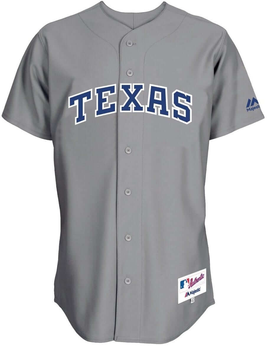
The Rangers, who’ll be playing a night game in Anaheim, have announced that they’ll be wearing 1986 road greys. (The Angels will presumably be turning back the clock as well, since it would be bizarre — and maybe unprecedented? — for the road team to be wearing throwbacks while the home team dressed conventionally, but I haven’t heard anything about the Halos. They wore late-’70s throwbacks last weekend, so maybe they’ll just dust those off and wear them again.)
-
Buried deep within this item is the news that the Reds, who’ll be hosting the Braves for a day game, will be wearing early-2000s uniforms to honor Junior Griffey’s Hall of Fame induction. No word on whether the Braves will also be throwing back. (Update: Here’s a peek at the Reds’ uni for today.)
So that makes four teams participating (or five, if we include the Angels), but the word is that there will supposedly be eight teams involved, and it’s not clear who the remaining ones will be. All 30 teams are playing today, so your guess is as good as mine.
But here’s a possible hint: Google’s MLB scoreboard was listing the Dodgers as the Brooklyn Superbas last night.
@UniWatch @PhilHecken Some weirdness with the Dodgers on Google's MLB scoreboard tonight. pic.twitter.com/RzYyaYc5DV
— Matt Sampson (@matthewjsampson) July 19, 2016
@matthewjsampson @UniWatch @PhilHecken Same thing on my phone. pic.twitter.com/360MGaUmO5
— Morskie (@morskie29) July 20, 2016
The Dodgers didn’t wear throwbacks last night. But maybe Google knows something we don’t..?
Update: Commenter “Coach” has spotted this news item on MLB.com, which explains that today is “Turn Back the Clock day, MLB’s new annual tradition.” Hmmmm. Why would you wait until the morning of the new annual tradition to announce that tradition?
Anyway: The fourth throwback game, in addition to the ones I already listed, will feature the Giants and Red Sox. No indication of which era(s) they’ll be throwing back to. This promotion continues to be very, very odd.
Another update: Here’s what the Red Sox, Angels, Braves, and Giants will be wearing:
Red Sox throwback for today pic.twitter.com/fcvSqCuMbf
— Phil Hecken (@PhilHecken) July 20, 2016
LA Angels throwback for today pic.twitter.com/7fMAsauWzJ
— Phil Hecken (@PhilHecken) July 20, 2016
Atlanta Braves throwback for today pic.twitter.com/Ir8lQTu1Oy
— Phil Hecken (@PhilHecken) July 20, 2016
SF Giants throwback for today pic.twitter.com/RDEdKq8kEZ
— Phil Hecken (@PhilHecken) July 20, 2016
Still very strange that none of this was formally announced or promoted until this morning.
• • • • • And speaking of throwbacks…: My Friday Flashback took a look at the history of throwbacks. Among other things, I stated that the first NBA throwbacks were worn during the 1996-97 season:
NBA's first throwbacks were worn as part of the league's 50th-anniversary season in 1996-97 (h/t @MikeChamernik). pic.twitter.com/wO3pPt2GM8
— Paul Lukas (@UniWatch) July 12, 2016
That prompted a note from reader Matt Beahan, who set me straight:
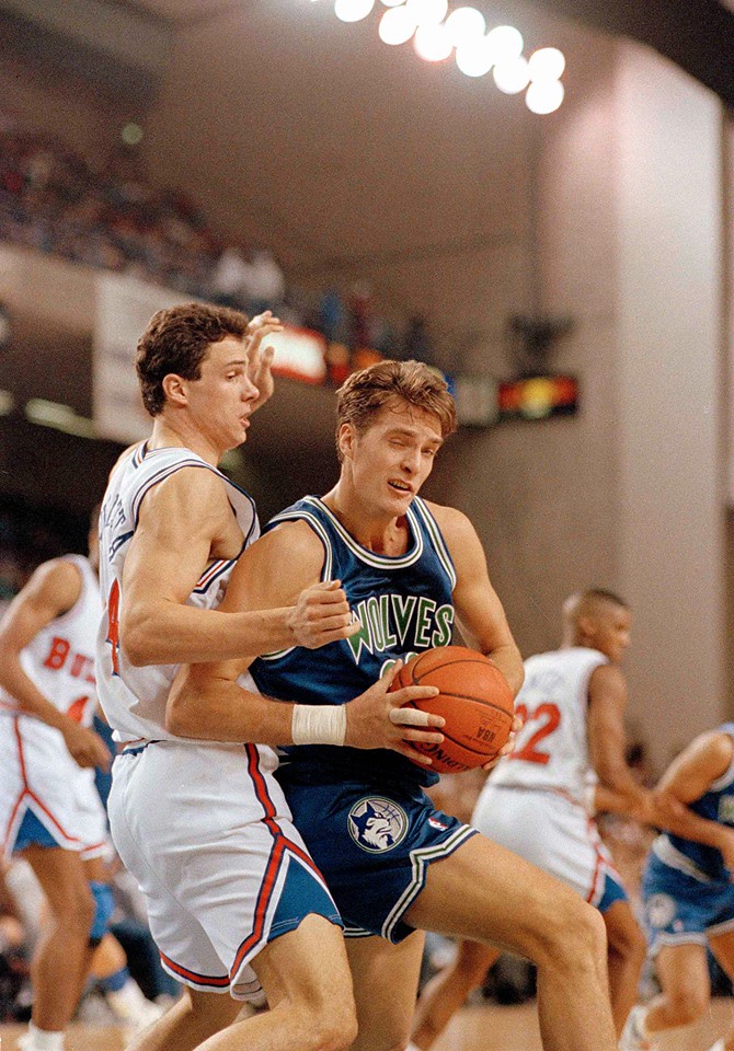
The NBA was putting on throwback games long before the 1996-97 season. I’ve been researching these games for a while now (although they’re very difficult to find info on) and I’m pretty sure the first NBA throwback uniforms were used on Nov. 27, 1992, when the Bullets wore 1964 Baltimore Bullets throwbacks against the Timberwolves [click to enlarge]:

Other games that I know of:
• Jan. 13, 1993: Golden State at Philadelphia. Both teams wore 1966-67 throwbacks.
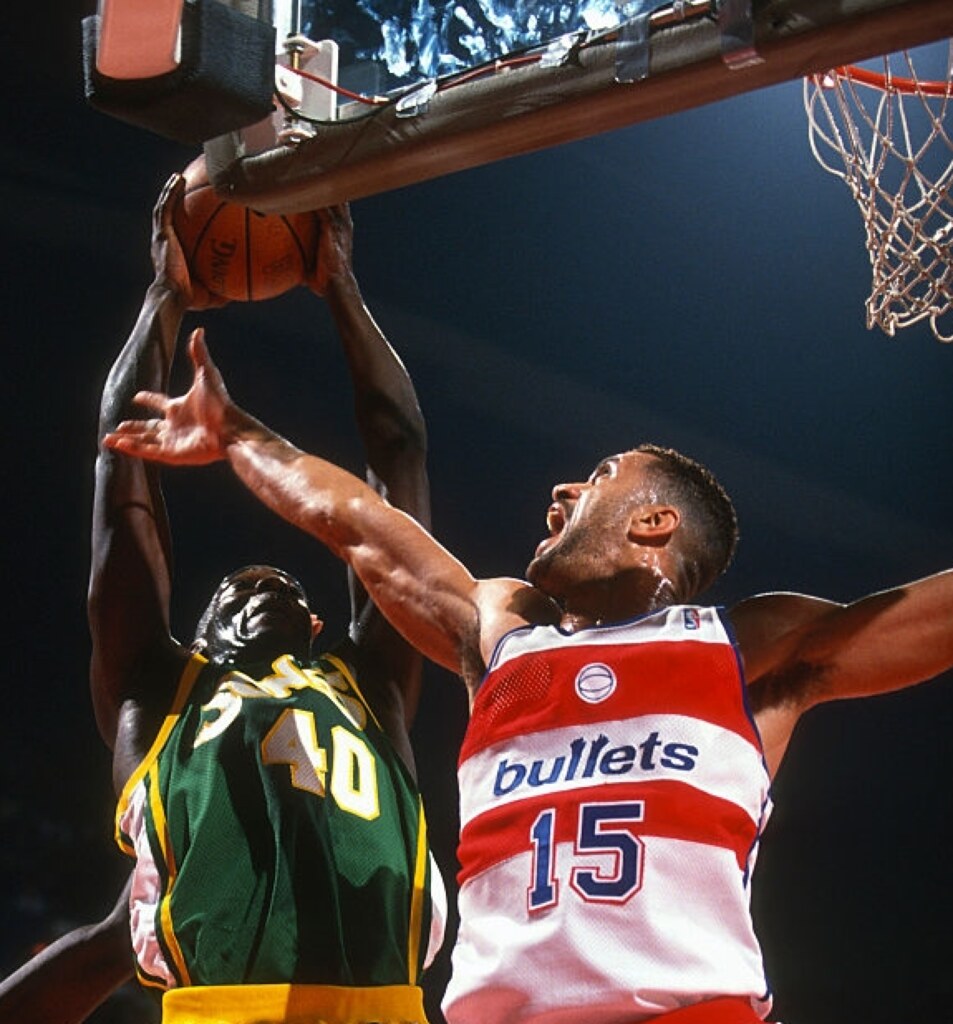
• Dec. 2, 1993: Seattle at Washington. Both teams wore 1974-75 throwbacks [click to enlarge].
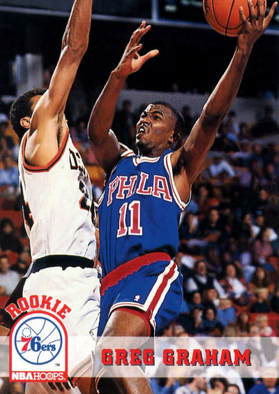
• Jan. 2, 1994: Philadelphia at Denver. The Sixers wore 1967 unis (although the waistband should have been white instead of red) and the Nuggets wore 1967-71 Denver Rockets unis.
• April 22, 1994: Washington at Cleveland. Both teams wore 1975-76 throwbacks.
• March 31, 1995: Denver at Indiana. Both teams wore 1974-75 ABA throwbacks.
There may be more, but that’s all I’ve found so far. The Lakers and Celtics planned a throwback game in the 1993-94 season, but it was scrapped for some reason.
Great stuff from Matt, and a bad job by me for getting this wrong. One thing about this — and I say this as an explanation, not as a justification — is that it really points out once again how desperately we need a uniform database for the NBA, the only one of the Big Four leagues whose uni history has not been comprehensively documented. As we’ve discussed many times before, databases aren’t perfect, and it’s important not to take them as gospel, but they’re tremendously useful resources.
Uniform databases are also a shitload of work to compile, so let’s take a second to give thanks to Marc Okkonen, Bill Henderson, Andrew Greenstein, and Tim Brulia, Bill Schaefer, and Rob Holecko, whose painstaking research has been a massive gift to all of us.
Now we just need someone nutso enough to come up with something similar for the NBA.
• • • • • Timberwolves-redesign contest reminder: In case you missed it earlier this week, I’m running an ESPN contest to redesign the Timberwolves. Details here.
• • • • • 
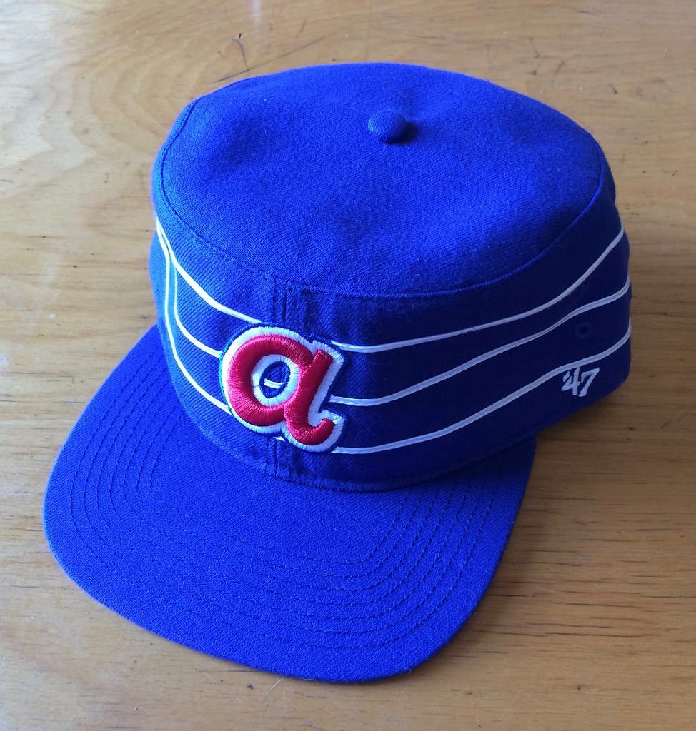
Raffle results, and today’s new raffle: The winner of the Astros cap is Kevin Rudolph. Congrats to him, and thanks to all who entered.
Our next ’47 cap up for raffle is this Braves pillbox snapback:
To enter, send an email with your name and shipping address to this address (not to the usual Uni Watch email address, please) by 8pm Eastern TODAY. One entry per person. I’ll announce the winner tomorrow, and I’ll also announce tomorrow’s raffle cap, and then we’ll keep repeating that process for each remaining weekday this month. If you win one of the raffles, please be nice enough to step aside and stop entering the remaining ones. Thanks.
Incidentally, this is the last of the pillbox caps I’ll be raffling off. The remaining seven raffle caps that will take us through the end of the month are non-pillbox. We’ll get started on those tomorrow.
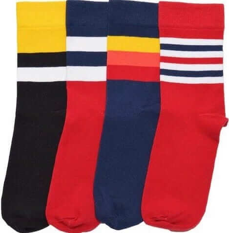
• • • • • StripeRite reminder: In case you missed it last week, I’ve partnered with Scott Turner and American Trench to produce a new line of crew socks with great stripe patterns down toward the ankle, where everyone will be able to see them:

The socks are available here, and there’s lots of additional info here.
• • • • • The Ticker
By Paul
Baseball News: Holy Toledo: Fun move last night by the Toledo Mud Hens, who wore “Holy” as their chest mark last night from Andy Bentley). … Here’s a really cool blog featuring comic book-style illustrations of old baseball cards. My compliments to the chef (and also to John Glynn, who sent this one my way). … “On Monday night we played the Stevens Point Sixers American Legion team,” says Nate Meihak. “They wore two different colors of camouflage BP jerseys. We couldn’t figure out if it was based on underclassmen and upperclassmen, or personal choice.” … The Czech catcher in the Women’s World Softball Championship has the lion from the Czech coat of arms on her mask (from Dennis Abrams). … Mets C Rene Rivera has been wearing a neon-green armband, which has caused problems with the green-screen ads behind home plate (from Jim Walaitis). … Dodgers OF Yasiel Puig broke his belt while sliding into second base during the top of the 5th last night. “He immediately called time and walked towards the dugout to get a new belt,” reports Andrew Cosentino. … I don’t know what the Sugar Land Skeeters were trying to do last night, but it wasn’t a good idea. Yikes! … Muhammad Ali-themed jerseys last night for the Richmond Flying Squirrels. … Sometimes life really can be reduced to one simple thing in a nutshell: In America, we have the Home Run Derby; in Korea they have a bunting contest.

NFL News: Interesting piece about how NFLers with concussions are facing skepticism from their disability insurers. … Blast from the past: Remember the Bears’ old script “CB” secondary logo? Ryan Becerra recently spotted it on a cap that’s being currently available at the team’s online store. “The Bears do release vintage logos on their apparel, but this is the first time I’ve seen them bring this one back,” he says.

College Football News: Yale’s new uniforms will be unveiled tomorrow night (from Casey Hart). … Straight from the 2016/2017 NCAA football rules manual, here are examples of permissible facemasks, impermissible facemasks, and assorted jersey-related rules. You can see the whole manual here (big thanks to James Gilbert). … Ray Lewis showed up at Miami camp and covered up the Adidas logos on his shirt and cap (from Jp, among others). … New uniforms for Ball State. … Here are Virginia Tech’s new road jerseys. “The ‘Ut Prosim’ slogan on the collar is for Virginia Tech’s motto, which means ‘That I May Serve,'” explains Andrew Cosentino.

Basketball News: If you’re a video gamer, here’s what you can expect in NBA 2K17. … Some era-inappropriate logos at the Pistons’ practice facility. … Tim Duncan is suing a San Antonio realtor for using a Photoshopped photo of Duncan in an ad (thanks, Mike). … New court design for Auburn.

Soccer News: Here’s how Barcelona’s new jersey will look with the Qatar Airlines logo. … Sports Illustrated’s current cover design shows the wrong Olympics uniform for the U.S. women’s soccer team. It should look like this (from Alex Seder). … New home kit for Fulham (from Tim Cross). … “Last year’s Liga MX champion Pachuca got new Nike jerseys recently, but they seem to be reusing the shorts from last year,” says Diego Yanez. “The jersey numbers are based off of the shape of the team’s crest and have a picture of the player. The NOBs, which are below the numbers, are shown in the players’ own handwriting. Do you know of any other teams that have done something similar to this?” I sure don’t. Anyone else..? … New uniforms for Penn State’s women’s team.
Grab Bag: Maybe synchronized swimming is a real sport after all: It has a growing problem with concussions, just like so many other sports. … And hey, maybe pro wrestling is a real sport too! … Here’s a piece on the rise, fall, and rebound of EA Sports NHL. … Protestors who get injured at this month’s GOP national convention are being encouraged to seek medical assistance from a group of volunteers who can be identified by their logo. … In a related item, there’s a dress code for reporters covering the convention. An official explained, “People are coming in jeans and sneakers, just slobbish attire.” … One Olympics record that will apparently be broken in Rio: the number of condoms per athlete that will be distributed (from the Tugboat Captain). … LGBT pride-themed uniforms for the Aussie rules football team St. Kilda (from Cody Royle).


Proofreading: “Ray Lewis showed up at Miami camp and covered up the Adidas logos on his shirt can cap”
Fixed.
When the Mets introduced the racing stripe jerseys back in 1982 I didn’t like them…34 years later I still don’t…
I can take them or leave them. The worst aspect of the uniform was the grey v-neck on the road jersey.
I agree about the gray v-neck…I preferred the henleys much more than the racing stripes…especially when two other teams in your division (Phillies and Expos) had them as well…
Customarily I dislike pullover uniforms with pinstripes, but I have to eat my words when the subject is the bumblebee Pirates. That said, the best Mets’ uniforms have all used button-fronts.
“That said, the best Mets’ uniforms have all used button-fronts.”
As long as they don’t have a swoosh underneath the wordmark or a black dropshadow, I agree with you.
Lids is selling a Brooklyn Dodgers cap (listed as a 2016 turn back the clock):
link
Yet another gold Motre Bame Brewers cap. Why won’t the Brew Crew ever re-up their late-Motre-Bame-era caps with the white M? Second-best cap logo* the Brewers have ever worn, but I think it’s literally never been worn by the team since 1999.
*Gold block M, white Motre Bame M, white Miller M, ball-in-glove on yellow, ball-in-glove on blue, blue block M, gold Motre Bame M, gold Motre Bame MB.
I don’t know, but you’re right – that was an amazing cap.
Your list is close, but not perfect: knock the current cap down to third-from-bottom and you’re good.
I’m so glad to see link back again, but only wish New Era would link.
The correct M matches the one the Braves used, amirite? Only the colors are changed?
link
Although, in fairness, the Braves did use a link of link Ms in their short history. But New Era seems to have link, squat and stout, that they insist on using for both the Brewers and the Braves no matter how inaccurate.
The Brewers at least link. But I wish they would do something about the caps.
Happy to see that design too, even though it’s among my least favorite Brewers cap (which just speaks to how good the team’s cap history has been). But for me, even more than getting the M right, I want to see New Era get the stitching right. Don’t run blue thread across the yellow panel! They had the know-how and technology to get this right in the 1970s; no excuse for getting it wrong today.
Sorry, Walter, my comment seems to have been swallowed up.
The Brewers’ M cap was indeed the same as the Braves’ (although the Braves wore several different types of Ms during their short history). But none of them are the same as the short and squat version New Era puts on their caps.
You know what I’d like to see in the Brewers future? Adopt the colors of the People’s Flag: link Navy, royal or sky, yellow, white. I’m not a fan of the ball-in-glove logo, but aside from my subjective issues with it, it suffers from what I’d consider an objectively valid design flaw, in that it’s a visually weak mark when rendered in blue one blue. But make the ball-in-glove logo itself royal or sky blue with yellow outlines and white accents on navy and that flaw would be fixed. I still won’t like it very much, but it will at least work. Using two shades of blue alongside yellow and white would also hugely open up the team’s potential to use retro or fauxback-style alternate elements within a single, coherent uni set. And the advent of the People’s Flag design would give the team a fresh, forward-looking news hook for a redesign along those lines.
Hurm. Not sure about that, although if the People’s Flag is ever adopted I’d love to see it incorporated into a sleeve patch.
Still can’t get that Brooklyn “B” right.
“Mets C Rene Rivera has been wearing a neon-green armband, which has caused problems with the green-screen ads behind home plate (from Jim Walaitis)”
What’s really fun about the green screen ads is watching them on MLB AtBat app (thanks for the free season T-Mobile!). It looks out of place and awkward having just a blank screen behind the batters through the TV cameras, does it look as garish at the stadiums?
The only decent look you have in stadium of the behind-home-plate boards are from the outfield seats, and from that distance (with the human eye), they’re small enough to not be highly noticeable.
From MLB.com news wire on their homepage, Major League Baseball is call today Turn Back the Clock Day with 8 teams wearing throwback uniforms. 4 games will be turn back the clock. Braves-reds, Giants-Red Sox, Mets-Cubs, and Rangers-Angels.
link
Thank you! I’ll add that to the main entry.
Fingers crossed that we see the Giants busting out those orange beauties. The Sox wore a ’75 throwback last year, it’d make a nice looking game.
1) If I haven’t sung Marc Okkonen’s praises on this website, the oversight is mine.
2) Extra yahoos to the comics-themed baseball card art blog, which is called Cecil Cooperstown.
Some era-inappropriate logos at the Pistons’ practice facility.
3) Enlightening to a person who thinks “inappropriate” always connotes “unfortunate”; it can simply mean “mismatched”.
I would totally get into a BUNTING CONTEST for MLB’ers. Problem is, there are fewer players that can bunt compared to home run hitters.
I like how Cincinnati will be wearing “early 2000’s era” throwbacks to honor Ken Griffey Jr’s Hall of Fame induction, but how much better would it have been if they had done this back in May when the Seattle Mariners played in Cincinnati. Both teams could’ve worn Griffey Jr style throwbacks.
Everyone could walk around with their hats on backwards during pre and post game.
If I’m not mistaken, all the visiting Braves would need to join in the early-’00s throwback would be wearing their red-billed home caps & helmets.
Peek at today’s Reds throwbacks:
link
Beauties! Now that’s how you do drop shadows.
And here’s what the Red Sox, Angels, and Giants will be wearing:
link
link
link
And the Braves:
link
So throwbacks for the Braves vs. Reds.
Braves throwback to 1969. Reds throwback to 2002.
Can there be a term TBFTBS: Throw back for throw back sake?
Another piece of evidence to advance the theory that the tomahawk is on its way out of the Braves’ design program.
Yeah I really don’t get how you miss Throwback Thursday by a day. All of MLB’s Instagram pictures could have had a vintage filter or something. Too bad a little foresight is unreasonable.
Wayback Wednesday? I’d love to hear an explanation from MLB as to why a random hump day in late July is the anchor for a new “annual tradition.” Is MLB like really stoked about the moon landing anniversary? Celebrating Heinie Manush’s birthday?
Wednesday before Induction Weekend, perhaps?
Now that could be fun, throwing back to 1969. A bonus b/c it was an expansion year, adding the Padres, Expos, Pilots, & Royals, bringing the league up to 24 of the 30 clubs. The Mariners, Jays, Rockies, Marlins, Rays, & D’backs could just as easily come up w/ fauxbacks to mark the occasion, so as not to exclude 20% of the teams.
Pretty excited to see the Cubs bring back their timeless ’80s home uniforms. I don’t have a preference between having the red border around the numbers or not, but they look so much better without NOBs, at least at home.
The Pistons logo tweet has been deleted.
Does the Yankees uniform count as TBTC?
Only if they take the logo off the back collar.
Found a “cave man ” era Indians cap online listed as a Turn Back the Clock hat. Would love to those. Since people do not like the Chief, than bring back the old “C”.
Or even stick the Chief’s feather on the back of the C. I’ve really come to appreciate the block C the Indians are using, but the caveman unis remain my favorite Cleveland uni. Distinctive! Whimsical! Fun!
The red Stevens Point Sixers jerseys are from this season and the white ones are from last season.
That photo of Laettner winking is spectacular for so many reasons.
Random thought after seeing a couple of posts in the Ticker this week about the Bowie Baysox. What a missed opp for a great team name.
I suggest the Bowie Ziggys, Spiders, Thin White Dukes, or Serious Moonlighters.
Didn’t they already settle on “Diamond Dogs”?
By the looks of it, the Bullets/T-Wolves game was played in Baltimore at the Civic Center (Royal Farms Arena these days).
Also the city of Bowie, MD not only rhymes with bouy, that’s pretty much how it’s pronounced. I found their Bowie-“Bowee” press release funny
The Toledo “Holy” Jersey is part of their Holy Toledo promotion (link) . This is a new alternate that they wear on Tuesday home games. The “o” in Holy is a cracking egg, one of their secondary logos also worn as a hat for the Bacon and Eggs series against the Iron Pigs and worn the night that Mike Hessman hit the home run for the new minor league home run record (link)
Huh, I always thought the expression was “Drips and drabs.”
Ha — I actually like that better!
But it’s dribs:
link
I always liked those Rangers uniforms (both the road gray and the script home). Clean, classic… I wish they’d go back to them permanently.
A wee bit too plain for my tastes. But the lettering *is* an improvement upon what they now have.
The Nov. 27, 1992 Bullets vs. Timberwolves game was played in Baltimore, at what was called Baltimore Arena (formerly the Civic Center), hence the Baltimore throwback jerseys. The Bullets still played several games a year in Baltimore through the mid 90s.
Apologies if I’m misinterpreting your post, but as I recall the Bullets playing several “home” games per season in Baltimore only occurred during a brief period (1988-1993). It wasn’t an ongoing thing following the franchise’s early ’70s move from Baltimore to Landover.
link
And the arrangement almost didn’t last the full 5 years, even. The NBA threatened to terminate it early when the Civic Center’s antiquated (by which I mean dilapidated) electrical circuitry couldn’t withstand having a few extra heating pads plugged in…
link
You are correct… 88-93. Didn’t mean to suggest otherwise, though pre-season games have been played since.
“Sports Illustrated’s current cover design shows the wrong Olympics uniform link. It should look link.”
The reason for the change, as some may already know, is that the International Olympic Committee has strict rules link from
link. See Rule 8, on Page 9 of the link. But the IOC has no problem with link all over the USWNT’s Olympic uniforms. If I may quote Paul, “douchebags!”
“Even odder, at least two of these throwback tilts are afternoon games, which means they won’t get much exposure.”
Stranger yet, Fox Sports Ohio didn’t even air the Reds game this afternoon. They also didn’t air the Throwback game against the Cubbies for the 100th Anniversary of Wrigley. I think it’s safe to assume they’re not doing this for the Almighty Dollar (like the NFL and their Color Rash scheme) because most Reds fans aren’t even seeing these throwbacks.
Not liking the ’86 road grays the Mets are wearing. The script is too low on the jersey front.
Yup. That was the first thing I thought when I turned on the game.
I don’t mind that…at least it is not the current script with the way too fat letter e and still slightly slanted M (though not as bad as the Wilpon Script days).
Current fat e:
link
Classic Mets Script:
link
Wilpon Script:
link
Jeez Majestic, it’s not that hard to get the script positioned correctly…it’s not like there isn’t any photographic evidence…but it was cool to see Loney rock orange sanitaries!
Did anybody notice that the NCAA uniform specs for collar and arm band width are not being followed in those new Virginia Tech Unis. For that matter, most Nike uniform templates are violating that rule. Perhaps I just misinterpreted the rule. Or maybe Nike is above having to pay attention to such an arbitrary rule. I don’t know.
Looks like Dae Ho Lee of the M’s stopped wearing the white shoes (note the item from a couple days ago)
Proofreading: “My Friday took a look at…” should have the word Flashback in there.
Also, in the college football section there’s a reference to “impremissible” facemasks.
On a non-proofing note, should I feel old when the Mets and Cubs are throwing back to the unis they wore when I was in college and went to every Mets/Cubs game at Wrigley during the school year?
Fixed.
The MLB network was really pushing that these are MAJESTIC throwback jerseys and MAJESTIC caps. It all sounded very scripted, rushed and forced.
Yankees wore their throwback jerseys last night too ! Oh, wait. Their jerseys have barely changed since 1915, so I guess they always wear throwbacks !
Current Yankees home jersey dates back to 1936, not 1915.
Or to put it another way: Babe Ruth never wore the interlocking “NY” on his chest. Not even once.