My favorite Mets blogger, Mets Police honcho Shannon Shark, recently poked some fun at Tom Seaver’s 1972 Topps baseball card, noting that Seaver was still wearing his jacket while pretending to throw a pitch (a fairly classic spring training pose that Topps often used back then):
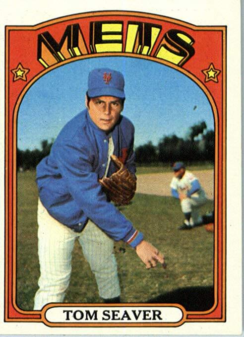
As it happens, 1972 was the first year I collected baseball cards (I was eight years old at the time), and I remember that Seaver card well. But here’s the thing: The ’72 Topps set included a series of cards called “In Action,” which consisted of game photos instead of posed shots. Seaver had a card in the “In Action” series, in addition to his regular card, and the “In Action” card was even worse:
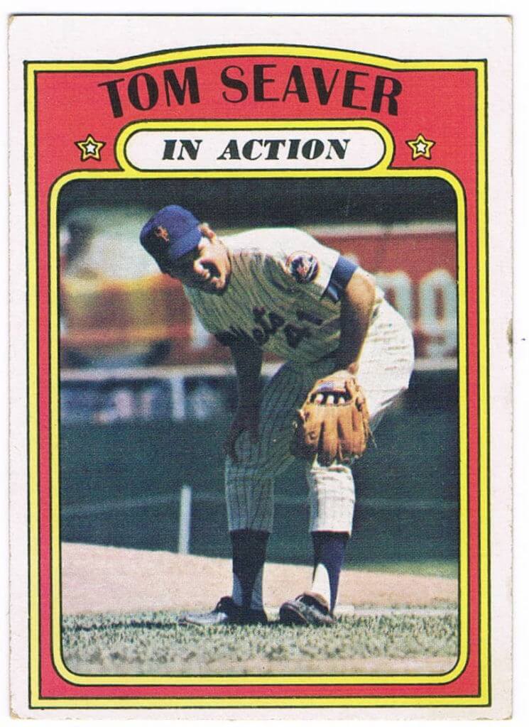
I mean, it’s a swell photo and all, and it’s nice to see Seaver having fun out there, but you call that “action”?! This is the best pitcher in baseball (and, obviously, the best player on my favorite team), and that’s the best you can do? As a kid, I found it very unsatisfying and even confusing. Why would they have chosen that photo?
After telling Shannon about this, I looked back at the “In Action” series and was reminded that Seaver’s card wasn’t the only curious entry. Many of the cards did indeed feature cool action shots of players hitting, pitching, sliding, fielding, and so on. But the series also included some real head-scratchers. Here’s a sampling, in rough order of head-scratchiness:
1. Roberto Clemente
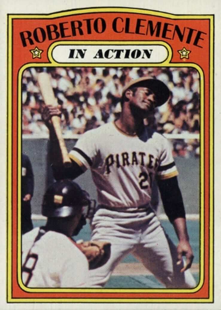
Here we have one of the best and most exciting players of his generation … rolling his head back after taking a called strike. Maybe even a called third strike. You call that action?
2. Ron Santo
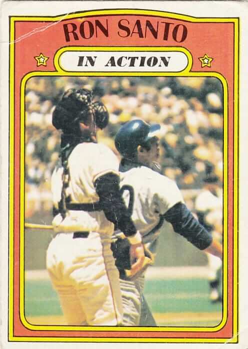
You could be forgiven for thinking this card was actually for Giants catcher Dick Dietz, who mostly obscures Santo from view. Judging by where Dietz is looking, Santo has just hit a pop fly. Action-packed! (Dietz, incidentally, had his own “In Action” card, which was actually pretty good.)
3. Reggie Jackson
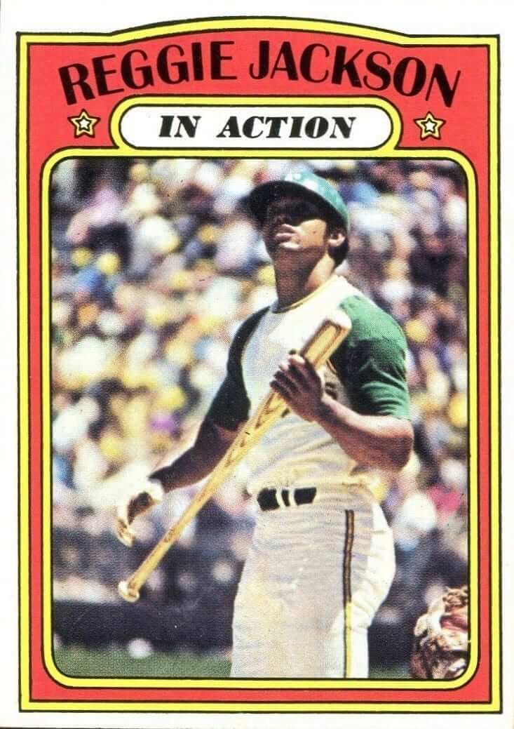
Much like this Seaver card, this isn’t a bad photo (it’s actually pretty good), but come on — where’s Action Jackson? I mean, is Reggie following the flight of a foul ball, looking at a jet flying overhead, checking out some chick in the second deck, or what?
4. Bob Barton
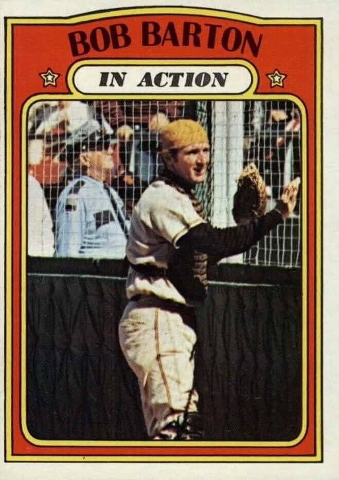
Yeah, nothing says action like a resigned, forlorn gaze after you run out of room chasing a foul ball.
5. Ed Kirkpatrick
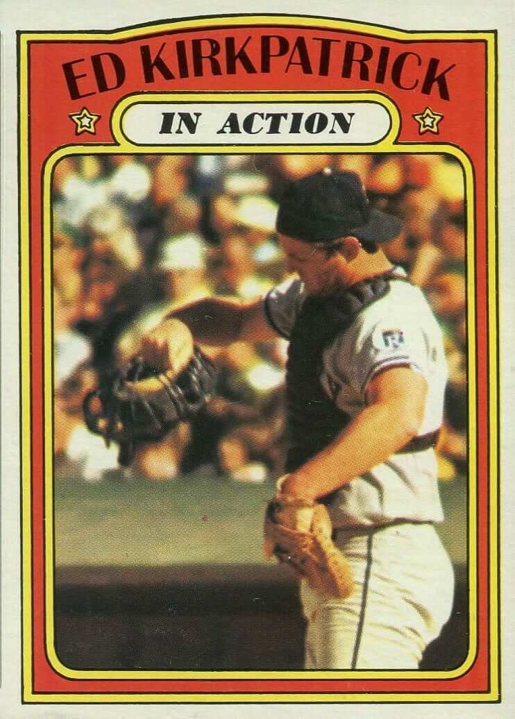
A catcher ripping off his mask can look dramatic, but Kirkpatrick looks more like he’s swatting away a bothersome insect, not engaging in an action-packed baseball play.
6. Jose Pagan
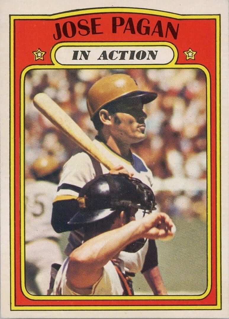
Man, was Topps looking to mess with the Pirates or what? “Just stand still, relax — good. And now move one step forward so you’re blocked by the catcher. Perfect!” (Incidentally, that might be Dick Dietz again behind the plate — tough to say.)
7. Pete Rose
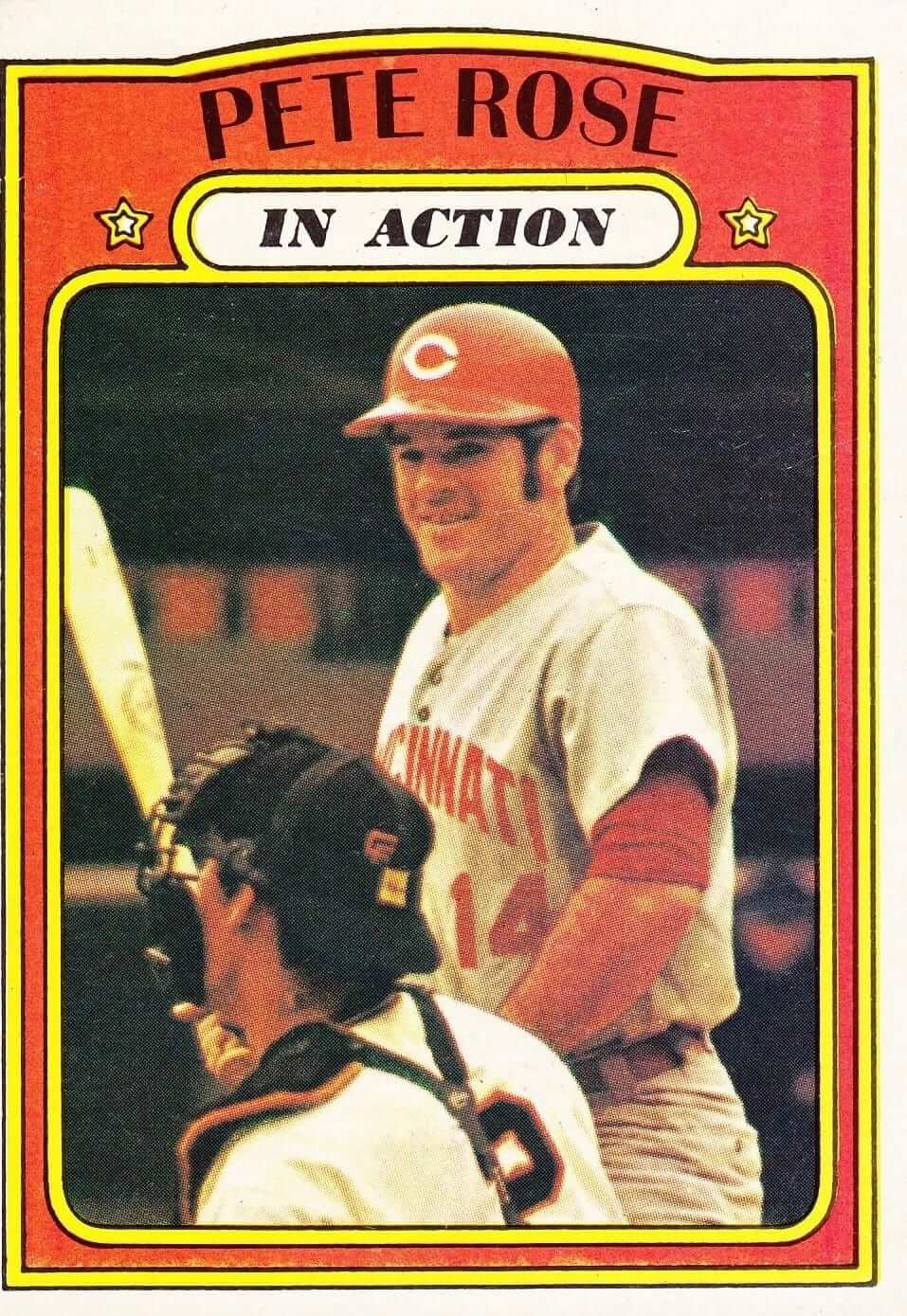
Let me get this straight: You have a guy nicknamed Charlie Hustle and your “action” shot of him shows him standing still? (Footnote: Dick Dietz makes yet another cameo here. Crazy.)
8. Vida Blue
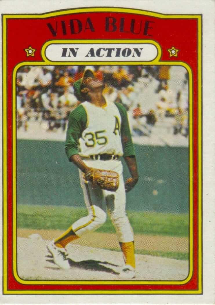
Vida Blue had one of the most distinctive and dramatic wind-ups in the game, and he had just won the Cy Young and MVP Awards in 1971. So why would you show him tracking the flight of a pop fly, and in a weird knock-kneed pose to boot?
9. Bobby Bonds
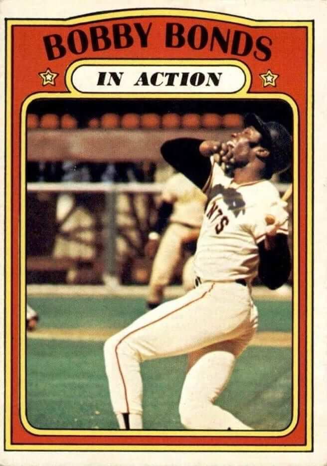
Again with the pop flies. I actually love Bonds’s body posture in this shot — the angles are really nice — but even as a kid I thought to myself, “Why are they showing him making an out?”
10. Thurman Munson
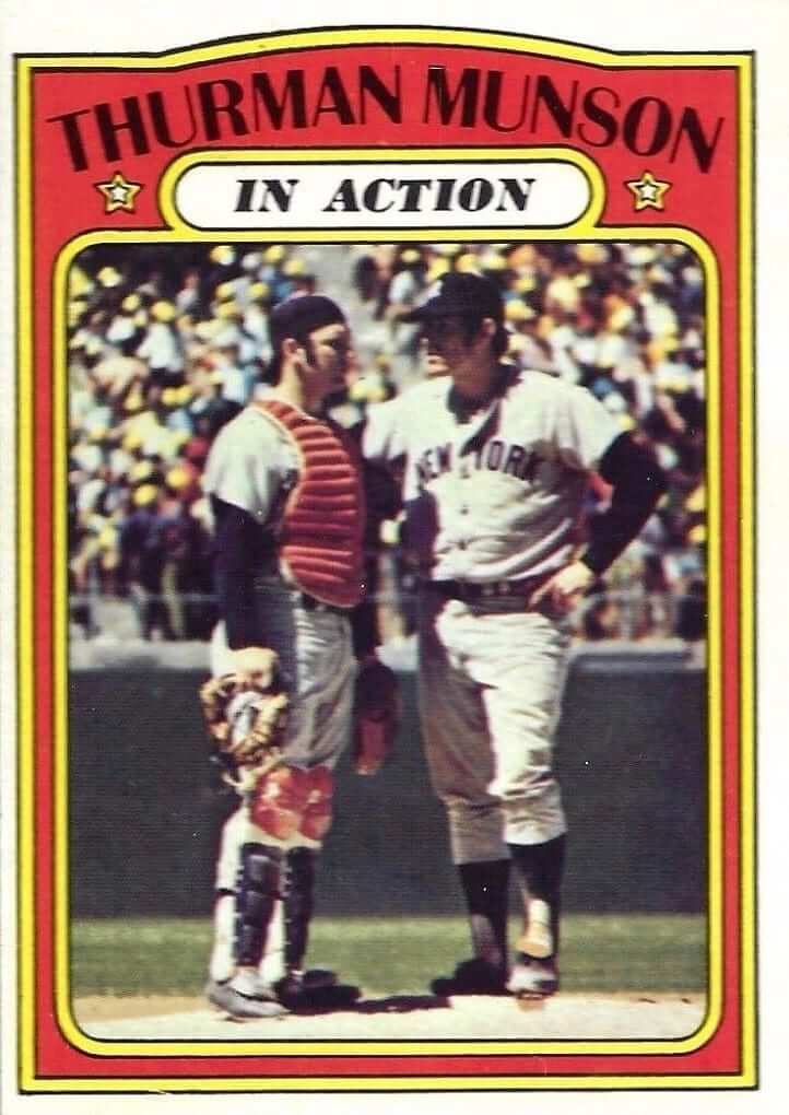
Okay, I don’t actually have a problem with this one. A catcher going to the mound is a real (if not particularly action-packed) part of the game, so why not? I’m including this one mainly because it shows Munson’s orange chest protector and orange-trimmed shinguards — weird for a Yankee, right?
Honorable Mention: Billy Martin
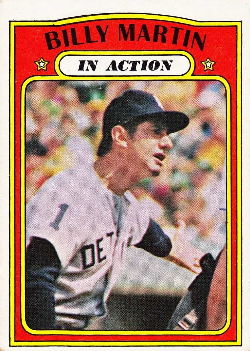
No gripes about this one. It’s actually my favorite card in the “In Action” series, because it was pretty clever of Topps to include a manager. Too bad they didn’t also have one for Earl Weaver.
I’m sure there are some contrarians out there (looking at you, R. Scott Rogers!) who think some of these shots, non-action-y though they may be, capture the rich tapestry of what goes on during a ballgame. And you’re right, they do! But the card series wasn’t called “Rich Tapestry”; it was called “In Action.” Judged against that self-declared standard, some of these cards were real stinkers.
But there were plenty of “In Action” cards that lived up to their name. You can check out pretty much the whole series here.
Timberwolves-redesign contest reminder: In case you missed it yesterday, I’m running an ESPN contest to redesign the Timberwolves. Details here.
Click to enlarge
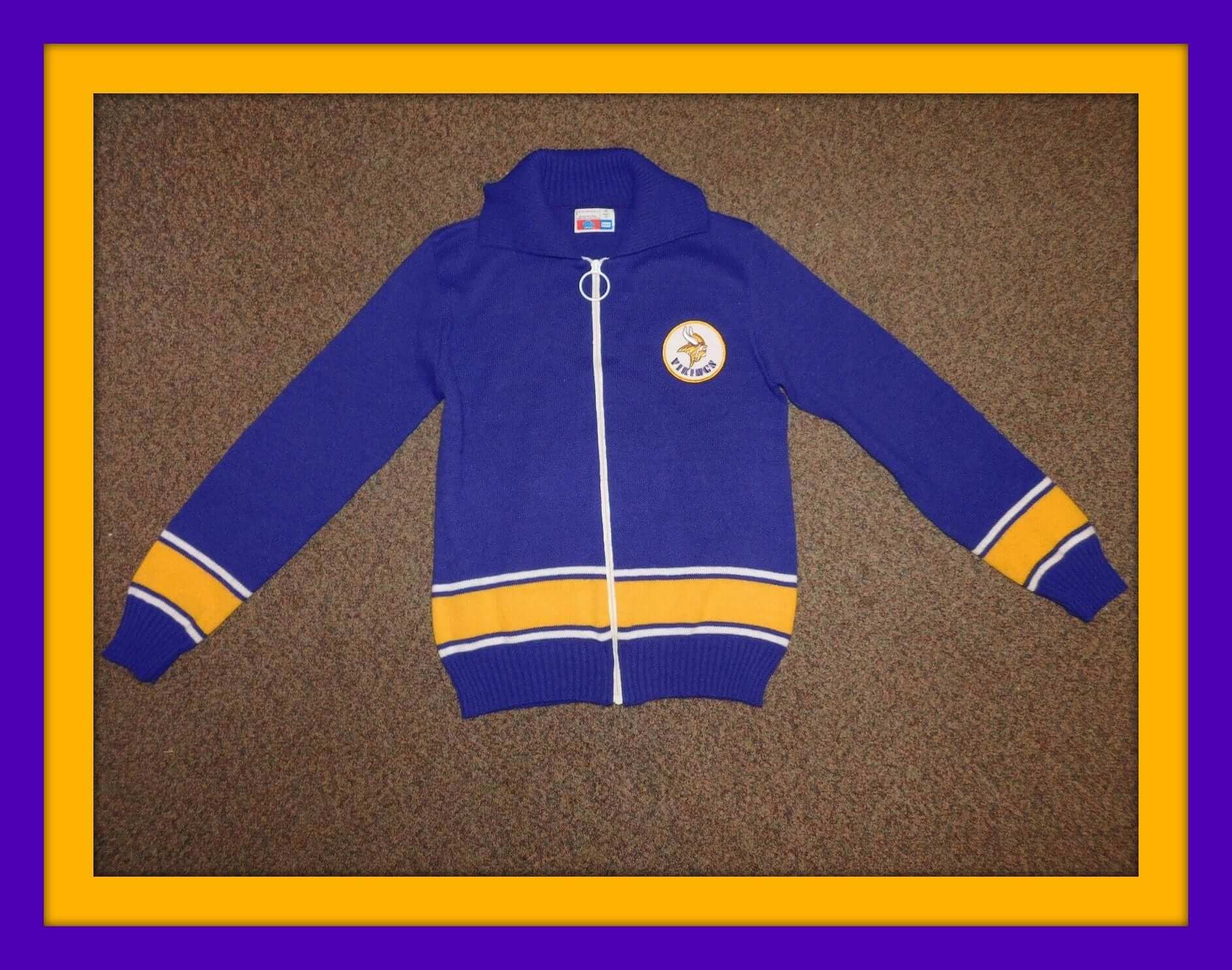
Collector’s Corner
Collector’s Corner
There, my friends, is the classic Sears NFL sweater styling from the 1970s. The famous “Big Ol’ Honkin’ Zipper Pull Ring Thing” (for lack of a better name) means you’ve got the real thing from the Sears NFL Shop. One hundred per cent Orlonâ„¢ Acrylic, too. A keeper for all Vikes fans. (Ditto for this pennant, too.)
Now for the rest of this week’s picks:
- Here’s a massive lot of 1970s-1980s NHL stickers, buttons, cards, patches, and more.
-
Just another Tequila Sunrise Astros jersey — this time No. 8, made by the folks at Ravens Knit.
-
Don’t often see a facemask facing left, like on this (I’m thinking late-1960s) Packers jacket from Stahl Urban.
-
Here’s a “World Champion Oakland A’s” tee from the 1970s –unopened in the package.
-
This listing for a 1969 New Orleans Saints helmet never mentions that it was game-worn, though it does look like it’s seen some battle. Note the striping and the extra trim around the fleur de lis. Helmet by Kra-Lite.
-
Check out the “California” font used on these 1970s California Angels stickers by Fleer.
-
A couple more Angels items for you: If you were a Junior Angel in the 1970s, you got this patch. And I always liked this version of the team logo but felt the ball stitching was a bit too fat.
-
Helmets? We got more helmets right heah. Check out the artwork on this cardboard NFL/AFL helmet set.
-
Like this 1970s-era San Francisco Giants window decal. As a Giants fan, I’d sure like them to use this as a primary logo or even an alt. (This was one of the kind that you had to get wet and then slide off onto the glass. Virtually impossible to do w/o destroying it, as I recall happening with more than once when trying to affix a “University of Cincinnati” decal onto the back window of my old VW Beetle.)
-
And take a look, will you, at what appears to be a hand-drawn 1960s San Francisco Warriors pennant.
-
Nice conservative look to this 1990s (not ’80s or ’70s as the listing suggests) Philadelphia Eagles Apex jacket. Pair it with this 1970s Eagles canvas bag that’s in great shape.

Raffle results, and today’s new raffle: The winner of the Cardinals cap is Joshua McHenry. Congrats to him, and thanks to all who entered.
Our next ’47 cap up for raffle is this Astros pillbox snapback:
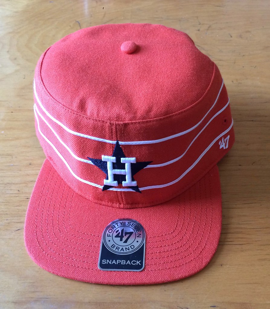
To enter, send an email with your name and shipping address to this address (not to the usual Uni Watch email address, please) by 8pm Eastern TODAY. One entry per person. I’ll announce the winner tomorrow, and I’ll also announce tomorrow’s raffle cap, and then we’ll keep repeating that process for each remaining weekday this month. If you win one of the raffles, please be nice enough to step aside and stop entering the remaining ones. Thanks.
StripeRite reminder: In case you missed it last week, I’ve partnered with Scott Turner and American Trench to produce a new line of crew socks with great stripe patterns down toward the ankle, where everyone will be able to see them:
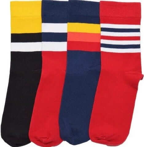
The socks are available here, and there’s lots of additional info here.
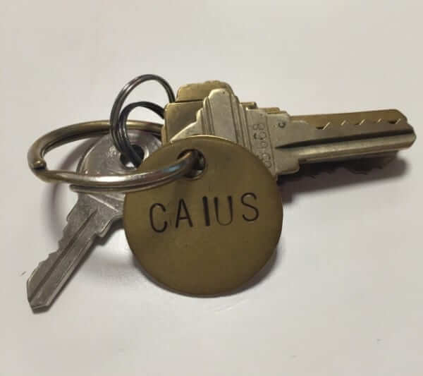
KRC update: The latest installment of Key Ring Chronicles is about a little metal tag that says, “Caius” — which is pronounced “keys.” I really like this one. Check it out here.
The Ticker
By Mike Chamernik

Baseball News: Kris Bryant isn’t necessarily a company man. The Cubs 3B said that the Pirates have his favorite uniforms in baseball. He’s a fan of the black and yellow. … The Mariners’ Dae-ho Lee has been wearing white spikes (from Mike McLaughlin). … Also, the M’s are 1-7 on home Sundays this season, and manager Scott Servais (jokingly) blamed the cream alternates for the poor performance (from Phil). … The Bowie Baysox will honor their heteronym with a clever David Bowie Tribute Night on Friday. The team’s name rhymes with “buoy” (from Andrew Cosentino). … The Myrtle Beach Pelicans will wear Mermen jerseys, a nod to the HBO show Eastbound & Down. The main character, Kenny Powers, played for the Mermen in season three. … The Washington Wild Things of the Frontier League wore Cicada jerseys and hats the other night to honor the 17-year cicadas that have returned to western Pennsylvania. Here’s a good look at the logo (from Yancy Yeater). … The PCL’s Los Angeles Angels had great sweaters (from @JDaniel2033, via Phil). … The Brooklyn Cyclones will wear these caps for Irish Night on Thursday (from Phil). … The Lehigh Valley IronPigs will wear ’Festers jerseys, in honor of the region’s 10-day Musikfest, on Aug. 4 (from Phil). … A couple uni-related anecdotes here in this 1987 story on the retirement of Pirates exec Joe O’Toole. One, as a kid O’Toole stole hall of famer Al Lopez’s catchers mitt, and two, an old clubhouse guy was able to distinguish one player’s jersey from another by smelling them (from Jerry Wolper). … We’ve seen this before, but here’s a really good shot of the MLB logo tattoo on the back of Cubs INF Javier Baez’s neck (from Solutionzâ„¢). … Fred Garvin says he heard Cubs broadcaster Len Kasper mention on the air that eight MLB teams, including the Cubs and Mets, will be wearing throwbacks tomorrow.

NFL News: The Packers will wear their 1937-48 throwbacks on Oct. 16, the same day they will honor Brett Favre during a halftime ceremony. … The NFL is placing data chips into the game balls used in the preseason and Thursday night regular-season games. The data retrieved could lead to a narrowing of the goal posts. … Mmmmmmmm Rams pancakes. … A Trump supporter eschewed the standard political party logos and made a Trump logo based on the Detroit Lions’ lion (from @longlivetheboy). … Here’s a cap with an interesting variation on the Oilers’ logo.
College Football News: North Carolina will stop selling NNOB jerseys that had the same numbers as current players (from Dan Tarrant). … Speaking of UNC, here’s a good history of Carolina Blue (from @JohnnyDax). … Jon Solomonson found this awful football player statue at Home Goods. “It looks like someone sculpted it from a description of a football player,” he says. … Virginia Tech’s football team showed off new uniforms, and the hoops team introduced its new players with a jersey graphic with each NOB. “Note the new Virginia Tech number font and the new sweatback,” says Andrew Cosentino. All of the Hokies’ programs will have new looks for the fall. … New gradient facemask for Kansas (from Alex Boyer). … It looks like Iowa State is switching to a dark gray facemask. The Cyclones wore light gray last year. … New jerseys for Oklahoma State. The inside of the collars read “These Boys Ain’t Ready”, which is what players chant in the tunnel before running onto the field (from Justin Southwell). … Speaking of Oklahoma State, they’re another school that will no longer sell jerseys with current players’ numbers. Instead, they’re selling No. 16 this year, for 2016 (from Dan Medina, via Phil). … Washington will wear VICIS helmets this year. The helmets are designed to better reduce impact (from @JayJayDean). … Nike released a Volunteers T-shirt that has the stars of the Tennessee flag misaligned (from Lee David Wilds). … Hey, a mascot dance off! … New uniforms with silver helmets for Idaho (from Phil).

Hockey News: Centennial (MN) High School combines Wild, Flames, and Avalanche uni elements into its third jerseys (from Teddy Ice). … Someone created a concept for the new expansion team, and he called them the Las Vegas Vipers.

Basketball News: Non-Nike players on Team USA had rival makers’ marks obscured in the team photo. Harrison Barnes (second from left) and Kyle Lowry (No. 7) had their Adidas logos blocked, and Klay Thompson (fourth from right) had his Antas logo hidden. This has become commonplace now, as similar posing maneuvers were done with Dwight Howard (Adidas) in 2008 and Kevin Love (361 Degrees) in 2012. I understand why Nike does it, but at this point, doesn’t this just draw more attention to its competition? Further info here . … Kevin Durant is still using a Thunder keychain/lanyard. … Here’s the history of the logo and mascot of DePaul, my alma mater. I loved the demon on the rim as much as I dislike their generic current logo. The alternate logo is no better (Thanks, Ken Traisman).

Soccer News: New third kit for Creighton (from Trent Rogers). … Here’s a slideshow featuring the jerseys of all of the German Bundesliga teams. “Most interestingly, note that Darmstadt’s jersey features diagonal stripes with 18- and 98-degree angles to honor the fact that they were established in 1898,” says Anthony Zydzik.
The next level of uniform advertisements should be subliminal ads. I can certainly use a refreshing lemon-lime soft drink right about now.

Grab Bag: Solid piece here on how athletes choose their uni numbers, along with general rules and guidelines by sport (from Phil). … Here’s an examination of the fashion at this past weekend’s Open Championships (from Kevin Byrne). … Good collection here of bad political campaign cartoons and logos (from Brinke). … NYC’s new fleet of subway cars will be colored blue and gold, not yellow, as stressed by New York Gov. Andrew Cuomo (from Heather McCabe).

Click to enlarge

What Paul did last night: I first saw the great New Jersey texture-pop band the Feelies in 1985, when I was 21. At the time, I thought I was pretty late to the party — the band had formed in 1976 and released an important LP in 1980, so I was playing catch-up. Incredibly, they’re still playing, and I’ve seen them many more times over the years.
Last night they played a free show in Central Park, and it was one of the best sets I’ve ever seen them do. As usual, I couldn’t take my eyes off frontman Glenn Mercer, one of my heroes, the perfect mix of geek and punk. Ya ever know someone who, for whatever reason, always pushes your buttons and makes you think, “Man, you are so fucking cool”? That’s how Mercer is for me. Three decades after I first saw him on a stage, he’s still what I wanna be when I grow up.
My favorite Feelies album is their second one, 1986’s The Good Earth (which you can listen to in its entirety below). Must be their favorite these days too, because they played almost all of it, along with plenty of other stuff from their catalog. Then they threw down some markers and showed their classicist roots by encoring with five covers: Modern Lovers, Stones, Velvets, Beatles, and Televison. Perfecto.
The card series name is accurate: “Inaction.”
It isn’t even 8:30am yet, and we already have our comment of the day.
Dang, wish I’d thought of that one!
You’re welcome!
“North Carolina will stop selling NNOB jerseys that had the same numbers as current players”
I find this a side-step of keeping pay away from student athletes. You can custom order jerseys for whatever you want anyway, and since according to the NCAA, you can have up to 105 players on a football team during practice (up to 70 dressed) there is a possibility that there could be no numbers left to sell. How completely idiotic.
1) If you can have up to 105 players, how come you have 20 pairs of guys wearing the same number?
2) They’ll never pay the players in college sports. They’ll pay $92M+ in settlements because some coach has a yen for little boys but if some mook from Wichita gets an extra $20 there’ll be hell to pay.
I was the one who brought this to Paul’s attention, and technically speaking his summary is not quite accurate.
In the past, UNC would sell NNOB jerseys that “just so happened” to have the same numbers as that year’s star players (for both basketball and football). The linked story says that they chose to sell jerseys numbered 16 (for the 2016 season) and 89 (to honor the school’s founding in 1789), even though both numbers have been assigned to (lesser-known) players.
The idea is to prevent star players from being able to say UNC is capitalizing on their image by selling their jerseys, even with NNOB.
“Here’s a cap with an interesting variation on the Oilers’ logo.”
You spelled “horrible” wrong.
Proofreading:
“an old Pirates clubhouse guy was able to distinguish one player’s jersey from another” Actually the AHL Hornets, not the Pirates.
“Kevin Durant is still using an Thunder keychain/lanyard.”
It looks like Dick Dietz is so prevalent on those cards because so many were shot in the Bay Area. (The A’s are wearing home unis.)
Fixed.
Perhaps the photographer for those images were, indeed from the bay area. Feasibly he just went to every game he could close to his location.
Either that, or Dietz was his fav player and he’s kind if a troll lol
Typo – Dave / Ed Kirkpatrick
Ugh, what was I thinking on that one?
Fixed.
Topps must’ve had a go-to Bay Area photographer for most of those shots. They all seem to be either in San Francisco or Oakland (note the amount of green & yellow/gold in the crowd behind Munson and Billy Martin).
For a while, the Topps photographer got AL players when they went through Yankee Stadium, and the NL players when they went through Shea.
What I really liked is if a player was traded, they’d alter his card by coloring out the old team cap, brush in the new team cap and TRY to do a good job with the cap logo. Often times, they botched it royally!
link
This link card is my favorite paint job.
Sam for the hockey cards. I recall a lot of Islanders’ home sweaters. Between Rangers and Islanders (then Devils) it was a great spot to pick up just about all the players.
MLB – San Fran / Bay area and Chicago also make sense, in addition to NYC, for obvious reasons.
RSB
I’ve been out of the trading card game for several years (after being in it pretty deep for a while). I like the vintage/throwback posed cards. All the modern “In Action” cards are all the same: Pitchers pitching, hitters hitting, running backs running. Even the candids are boring.
I like the “Hi coach, I’m Bob from Topps. I have 30 minutes to take photos of all your stars. I won’t get in the way–I promise.” approach of the old days!
Saturday was Wisconsin’s WFCA (Wisconsin Football Coaches Association) All-Star Game at UW-Oshkosh for players from last year’s teams. As you’ll see, they used Tampa Buccaneers numbers (and, apparently, name font) for the jerseys:
link
*Tampa Bay Buccaneers
Interesting that #88 is Richter. Pat Richter, former Badger AllAmerican, NFLer,and A.D., wore 88 in college. Perhaps part of the family?
When I was a kid, Munson was my hero, and yet I never really thought about his orange chest protector and orange trimmed shin guards were such a unique look for him as a Yankee. This is what Uniwatch does best, pointing out aesthetics that one can just take for granted. Thanks for reminding me to keep my eyes open and give a thought or two while I am doing it!
The 1982 Carlton Fisk In Action card is one of my favorite cards. He’s obviously in action, laying out for a pop foul ball.
link
Now THAT is action!
The only sideways In Action card in the set!
So in all of the In Action pics, the Giants and A’s are wearing white, and all other players are in road uniforms. Maybe the photographer from Topps was based out the Bay Area?
“I’m sure there are some contrarians out there (looking at you, R. Scott Rogers!) who think some of these shots, non-action-y though they may be, capture the rich tapestry of what goes on during a ballgame.”
Newp. Bad cards is bad cards. I was at a garage sale the other day and they had a big box of 1987 Topps cards, carefully sorted and sheeted by team. That wood-bordered set is my all-time favorite design for baseball cards (plus that was the season my Twinkies won it all, and most of my previously favorite Phillies players were still in the game, and it was a darn good season in baseball uni history). Looking through that box of my favorite cards, I was sort of stunned by how terrible most of the photos were. One of the worst things about being an adult is being confronted with the material reality behind your fondest childhood memories. That epic playground at the elementary school? Turns out it was really just a rickety, tiny assembly of wood scraps. Those beautiful miniature works of art you treasured? Turns out they were terrible photos mostly printed with bad color registration. Turns out not knowing better was a good thing.
Five bucks for the set, no cards sold individually – I’d have bought those ’87 Topps cards despite realizing how bad the photos were, except there were no Twins or Brewers in the box.
Granted I’m not a GB fan, but am I the only ones who finds is strange that they’re wearing throwback uniforms he barely wore in 94, from an era long before him on the night they’re honoring Brett Favre? I guess they wanted to do both for the big Cowboys rivalry game, but just very off-putting to me.
Also Paul, in case I’ve never said this your taste in music is spectacular.
Munsons 1971 Topps card was more in action then his 72.
link
Regarding Thurman Munson’s chest protector and shinguards, I’m pretty sure that the wearing of team colors wasn’t that big of a deal until later years. my recollection of catchers gear growing up and playing in the 60’s and early 70’s was that catchers gear – almost exclusively – was predominantly black with accents of either orange or a mustardy kind of yellow.
“Just another Tequila Sunrise Astros jersey – this time No. 8, made by the folks at Ravens Knit.”
An incredibly bad replica, among the bad typeface, inaccurate collar and the number splitting the white and the stripes (something the Astros jerseys never did and something that drives me nuts when teams do it on their rainbow-gut knockoffs).
Real Astros’ uniforms have the rainbow treatment beginning high enough for it to intersect the base of the sleeve (where the gusset would go). In so doing it provided enough room for the number to go completely in the orange. In practice, it probably gave players too big a visual strike zone.
That Astros pillbox totally looks pink to me.
It’s orange, I promise.
Pink-ish to me too.
It’s been like this for all the caps! I don’t know under what conditions these photos are being taken but it’s resulting in a lot of weird colour misrepresentation for certain people. It’s the UniWatch version of that damn blueblackwhitegold dress
The Saints helmet appears to be a bad knockoff. That logo is a current logo. Note the simple outline on the logo of this helmet, then compare to the eBay version. Also note there was no gap in the stripes on the original, then compare to the eBay version.
link
link
Agreed. It is a nice old helmet, repainted a long time ago probably (judging by the hook in the back to hold it up while spraying). But the decal IS new. This may or may not have been an actual Saints throwback, but the new decal means it hasn’t been sitting around in THIS condition for all these years.
It’s a fake. The older version of the logo was bigger and had only a single outline. The striping pattern is also incorrect.
The helmet is made by Riddell with Kra-Lite being their name for the plastic used to manufacture the helmet shells.
The “In Action” was a big deal in the 72 set. Look at all the previous Topps sets (and Bowman, for that matter).
link
Except for ’56 Topps background photo…
link
…practically all the cards released were the players in posed positions or portraits. Sure, you had the great Munson card of 1971:
link
But an image of a player on the field, during the run of play – that was innovation at the time. Small innovation – sure. But still a big deal.
But come 1973, action was all the rage on cards.
In all fairness, 1972 was only the second year in which Topps featured action shots in some regular cards. They were still getting the hang of it, as reigning World Series MVP Brooks Robinson likely would attest:
link
And as iconic as the ’71 Munson action shot is, IMO the Cookie Rojas one is even better:
link
Midway thru the baseball portion of the ticker: Mertyl Beach should be Myrtle Beach
Fixed.
This is some REAL action!
link
Doesn’t the fact the packers are wearing a throwback this year for a game confirm the packers to be wearing either solid green or solid white for their color rash game? Can’t wear more than one third jersey could they? Kind of rules out yellow as their unitard of choice.
I remember the article announcing color rush mentioning that the new color rush jerseys were in addition to alternate jerseys.
Ahh got it – thanks
The Rams are the only team I can think of from last season to wear four different jerseys. Home, away, throwback, color rush.
Jacksonville also.
This is GREAT. I also started collecting baseball cards in 1972. But I was 7. These cards bring back memories. thx Paul
I would bet money that Saints helmet in Collector’s Corner isn’t game worn. The logo looks current and no gold stripe in the middle. Looks haphazardly put together.
1. The Giants actually use the 1947-82 primary logo on their Orange Friday jerseys. (See, for example, link)
2. The catcher in the Clemente and Pagan 1972 InAction cards was Russ Gibson, who wore #18. Judging from the crowd in the LF bleachers at the Stick, both pictures were taken during an August 1, 1971 DH. Pagan’s picture was taken in the bottom of the 2nd of Game 1, as Manny Sanguillen (#35) was on 3B. (Sanguillen batted 6th while Pagan batted 7th in that game, Sanguillen having reached 3rd on a double and a failed pickoff attempt by Juan Marichal.) Presuming the picture of frustrated Clemente was taken after striking out, that was taken in the 9th when Clemente was struck out by Don McMahon. (Clemente didn’t play in the night cap and Pagan PH in the 9th with the bases empty.) See link and link
3. The Dietz picture was taken during a June 6, 1971 DH vs. the Phillies, which is significant, at least for me, as that was the first Major League game I saw in person. The picture appears to have been taken during the 1st while Tim McCarver was stealing 2B! Ron Stone was the batter. See link (PS: Mays hit a walk-off HR to win Game 2.)
4. I have a few of those Giants stickers and you are right about they being a pain to apply without ruining.
In half of the “in action” series cards, the logos of the teams are either not present or mostly covered.
I knew the Giants script has been co-opted for the Friday jerseys- but it needs to be on the V-neck pullovers they’ve worn once or twice. Classic.
And the 1972 series was the first I collected as well, but I don’t remember the IN ACTION ones. I used to take the whole team and I’d spread them out on the coffee table in the shape of a baseball diamond, in positions, and I’d simulate game substitutions and moving them around.
Man, what memories those cards bring back! Think I had the whole set and I remember especially the Tom Seaver with the warm up jacket card, the colors, the typeface, the smell of the cardboard flavored gum, when we used to “flip” cards in the playground during lunch… and they were only 10 cents a pack back in ’72.
Thanks for bringing back those memories Paul, this made my day! I am a big fan.
Great archival footage of The Feelies in this doc:
link
The orange catchers gear was made by Rawlings. The orange was to give the pitcher a target. Thus only the knees and chest. They also made a glove with an orange ring around the edge for the same reason.
Look it up. I know Lance Parrish used the target mitt though the 80s. And I think you can still get them from Rawlings with the orange trim.
The orange-ridged glove came later, didn’t it? I think of that as a late-’70s thing.
“New and sometimes quirky innovations in mitts have arisen since the 1960s. For example, in 1975, Al Campanis, former general manager of the Dodgers, introduced an orange fluorescent stripe around the perimeter of the mitt to help pitchers concentrate on their targets (patent 3,898,696).”
Source:
link
OK, so I was close. But my basic point — i.e., that the orange-ridged glove didn’t yet exist when Thurman Munson was shown wearing orange catching gear in a 1972 card — was accurate.
That reminded me of this Yogi Berra SI cover. His chest protector says Spalding FWIW.
link
I am struck by the “1” on Billy Martin’s sleeve. I am guessing the Tigers had uniform numbers on their right (both?) sleeves, given that Martin usually wore #1. I never knew they’d done that.
Or am I wrong and it’s a tribute?
Tigers had TV numbers during that period. Google photos of the 1968 World Series to see more.
Those are the TV numbers made famous with that road DETROIT style. They wore them from 59-71 with minor variations. The sleeve numbers were usually on the right sleeve, but sometimes were on the left:
link
I saw the Feelies in Tampa around 1990-91 or so, while I was stationed at Mac Dill AFB and I believe I still have 2 CDs of the band. I have not thought of that band for quite some time. Yet another reason to continue to visit Uni-Watch!!
That was a great period for the band, Rick. My second-favorite album of their is 1991’s Time for a Witness. Unfortunately, they don’t play much from that one these days.
Anyone else really dislike newfangled “custom” number fonts with “open-topped” 4’s? I’ve yet to see one I like.
I’ll go along with that. I have nothing against open-topped fours in handwriting, but they have a dissonant look on a uniform jersey.
It does, however, help avoid the typical problem of a closed-top 4 looking too heavy amongst the rest of the numbers.
I hate open-topped fours. Even in handwriting, I draw a closed-top 4 in one motion, starting at the bottom.
I think the “action” on Billy Martin’s base card is better than on his In Action card.
link
When it comes to the In Action series, keep in mind that these were the photos that were the best of the available. I would love to see the photos they didn’t choose.
Rollie FIngers’ 1982 “In Action” card made tenth place on my list of the 20 worst Brewers card ever, mostly for his inaction….
link
Don’t know if anyone has clicked through it, but the slideshow in the article about the Mariners’ cream uniforms is excellent. Covers nearly the entire history of Seattle baseball.
The Feelies . . . what an incredibly great band, and still sounding as good as they ever did. “High Road” is a permanent fixture on my personal soundtrack.
Kind of ironic that the Cicada jerseys would be sponsored by Orkin, a bug-killing company.
Sponsored by Orkin. Okay, that almost makes sense. I mean celebrating/honoring cicadas? Semi-pro baseball is really running out of things to commemorate.
The Washington Wild Things are a professional minor league baseball team, not semi-pro. Really love that they honored the cicadas; back in June, they were everywhere in western Pennsylvania, and even when you didn’t seem them their presence could be heard.
I know. The cicadas made their presence known in north central West Virginia in May and June as well.
Non-Nike players on Team USA had rival makers’ marks obscured in the team photo.
Where is the token white guy????
“Bowie” doesn’t rhyme with “buoy.” They’re pronounced identically. That’s like saying “cat” rhymes with “cat.” It rhymes with “Louie”, but it doesn’t rhyme with “buoy” because that’s exactly how it’s pronounced and a word can’t rhyme with itself or an identically pronounced word.
“Buoy” is pronounced “boy”. The “boo-wee” affectation came along to prevent confusion between the two words.
But you’re right. A word doesn’t rhyme with itself or homophones.
Some people call them “boowies”, others call them “boys”. as in, buoyant.
RSB
I love those “In Action” cards. Those are the real moments of a baseball game. Not the highlight reel stuff that the media is so obsessed with. These are the moments that the league is so dead set on eliminating from the game. Back then those were the moments that you only really got to see if you were at the game.
I personally think that the cards should reflect the reality of the game and the player. The home run leader from the previous season should have a card of that player in full home run swing or trot around the bases. While, the player with the most strikeouts as a batter should have a card that shows him swinging and missing on a third strike or an image of the player with look of disbelief at the plate after they just struck out.
This is a perfectly legitimate point of view — or it would be, if the cards weren’t called “In Action.”
Does these photos show a lot of what goes on in a ballgame? Sure. But do they show “action”? No.
By the definition of the word, yes. The process of doing something.
Great. So someone sitting in a La-Z-Boy and watching TV is “in action”; sleeping is “in action”; etc.
You’ll forgive me if I try to apply a somewhat higher standard than that.
There is raw emotion of the everyday play in those photos. Clemente is frustrated by a strike call. Santo is watching an in field pop out. Jackson watching a foul ball. Kirkpatrick picking up his mask in disgust after a missed throw on a steal of second base. Pagan getting signals from the first base coach. Rose talking shit to the Giants catcher. Munson giving encouragement to his pitcher prior to being pulled.
To me, personally, that is the baseball in action. It is all part of playing the game. Again, I love the cards.
Pagan getting signals from the first base coach.
You’re reeeeaaaaally stretching.
And besides, some of them aren’t even good photos! Whether you think Ron Santo popping out (a) is a great thing to show on card or (b) is a stupid thing to show on a card, it might be nice if the photo actually, you know, *showed Santo* instead of having him obscured by the catcher.
On that note, the Munenori Kawasaki card:
link
RSB
I think those cards are inaction cards, not “in action.”
I guess I should read the comments before commenting.
White spikes on the Mariners’ Dae-ho Lee. Not a good look. Leave white spikes to the A’s.
O totally expected to see Uncle Fester on that “‘Festers” jersey.
I rather like the idea of non-team color catchers gear. Players wore the manufacturer standard, no fussin’ around. It is also kind of like when hockey goalie pads/gloves/blockers, and players gloves, were just brown leather. Does every piece of equipment need to be team colors? Not in my book.
Those Las Vegas Vipers concept uniforms – the primary logo’s negative space looks like a … snake head….
Lots of defensive zone penetration on the cards for that team.
RSB.
That Fleer California Angels sticker has the lower-case ell aligned above the star for Anaheim’s location, creating an exclamation point I’ve never noticed before.
A quick Google image search shows it was an inconsistent alignment.
link
link
Nothing yet about the Vin Scully patch for the Dodgers?
Those cards show gorgeous vest are compared to the atrocious sleeveless jerseys today.
According to Reds Assistant Media Director Jamie Ramsey, the eight teams wearing throwbacks tomorrow (Wednesday) are part of “MLB Throwback Day”
“Wednesday, July 20, 2016 — Reds vs. Atlanta Braves, 12:35 p.m. (Business Day Special, Senior Citizen Special)
– Throwback Jerseys: The Reds will wear uniforms from the early-2000’s era to honor Ken Griffey Jr.’s upcoming induction into the National Baseball Hall of Fame. The Reds are one of eight teams participating in MLB’s Throwback Day.”
link
Where did this “throwback day” come from? Is it like the 2002 promotion in which a handful of teams played series in old-style uniforms?
According to that Idaho article posted they’ll be changing decals for their two helmets based on being home / away. I know teams swap decals out quite a bit to make it seem like they have more helmets than they do, but never heard of anyone with a method to the madness like that. Pretty cool.
Will the chips be able to tell if Brady’s deflated his balls again?
If you look closely at the Seaver In Action card, you can see a white fence in the outfield, which tells me the action shot was taken during Family Day…when the Mets would bring their wives and kids on the field to pose for photos and play a fun game. Seaver is laughing at the actions of the kids during such a game.
The Bowie Baysox have had a “Diamond Dog of the Game” this year.
link
There was no need to obscure Kevin Love’s shoes in the 2012 US team photos. His 361 deal only included regulation NBA games and he wore Nikes during those Olympics.