
Click to enlarge
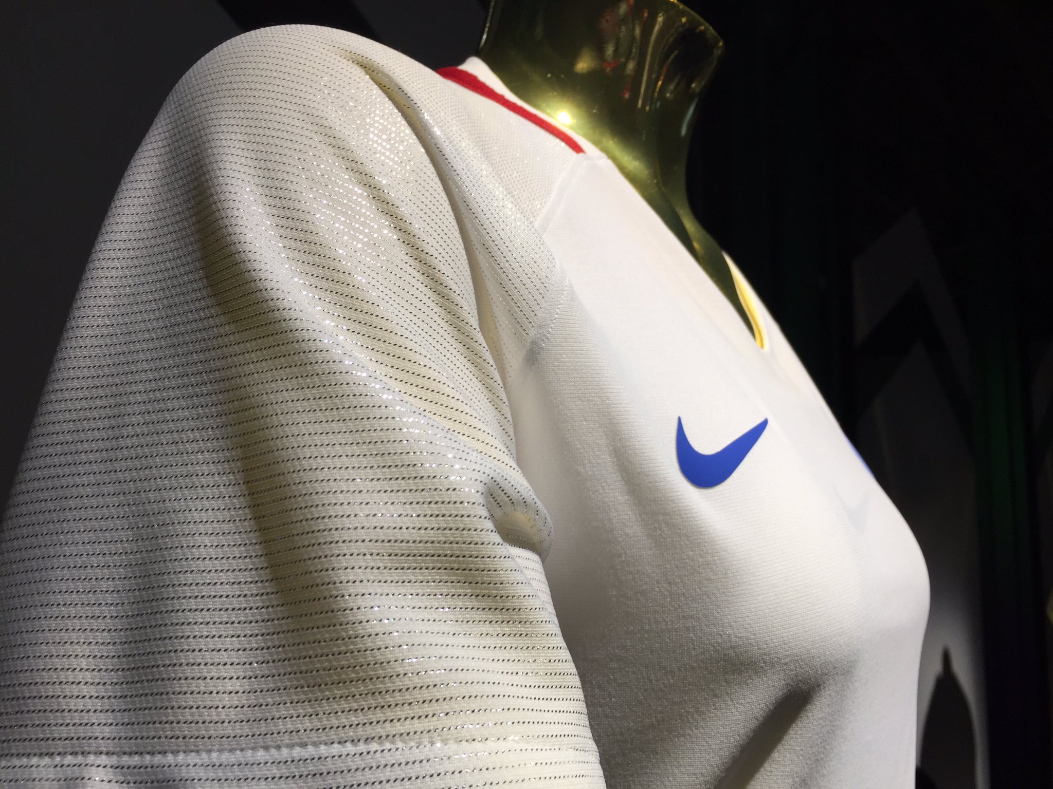
Lots of Olympics news yesterday, as a bunch of Team USA uniforms were unveiled, beginning with the women’s soccer kit (shown above). There are lots of additional photos and details here. Interestingly, the shoulders and sleeves have sparkly thread that should reflect in the light (click to enlarge):
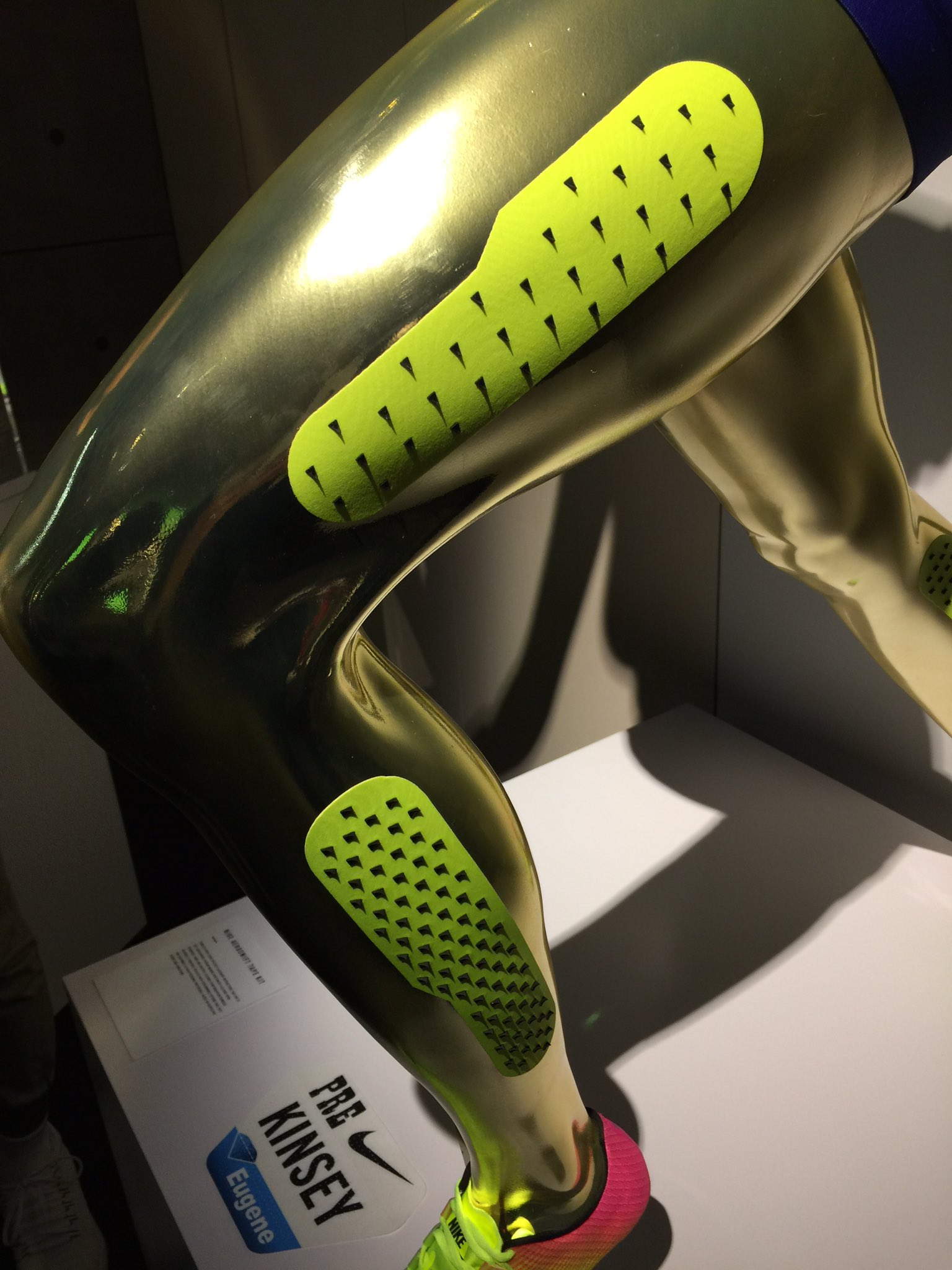
• Nike-outfitted track and field athletes will wear tape — neon-colored, of course — studded with little silicon blades, which will supposedly cut down on aerodynamic drag (additional info here; click to enlarge):
• Meanwhile, over by the pool, Speedo unveiled Team USA’s swimming uniforms (click to enlarge; additional photos and details here):

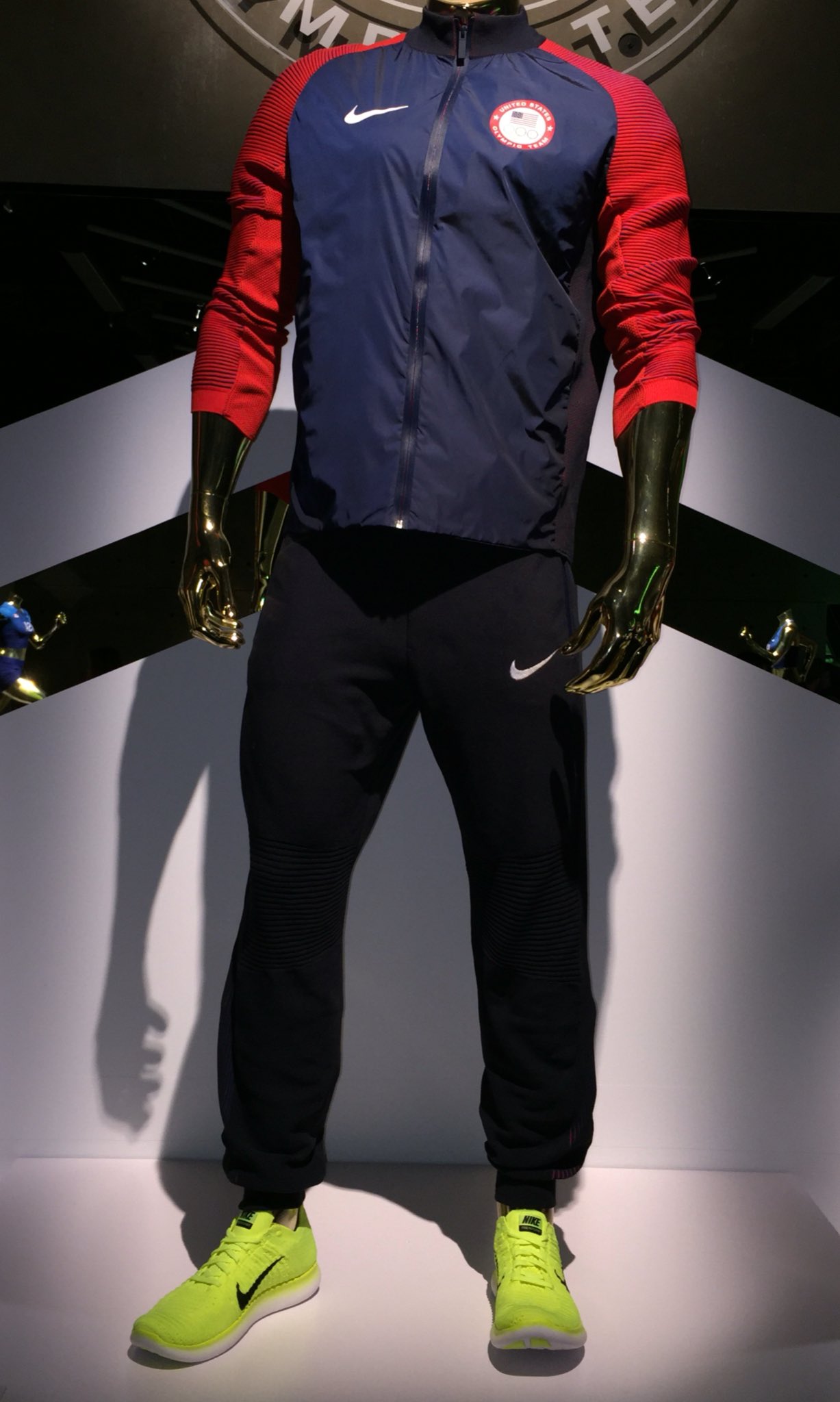
• And when Americans win gold, silver, or bronze, here’s the outfit they’ll be wearing on the medal stand. It’s a perfectly nice design until you get to the shoes — a textbook case of Nike, you know, being Nike (click to enlarge; additional info here):
(As an aside, there’s been lots of chatter about Nike having “unveiled” Team USA’s basketball uniforms earlier this week, when the team’s roster was announced. But those uniforms were actually unveiled more than three months ago, so there’s nothing new there.)
(My thanks to Andrew Cosentino and Phil for their contributions to this section.)
The Ticker
By Paul

Baseball News: Frightening prospect: D-backs players say they’ve heard that their charcoal road uniforms will soon be copied by other MLB teams. … New “Legend Series” uniforms Hokkaido Nippon-Ham Fighters (from BigDaddy45). ”¦ The Iowa Cubs and OKC Dodgers went blue vs. blue yesterday (from Chuck Eldridge). … The recent Atlanta/Cleveland games provided a very nice stirrups vs. stirrups moment. That’s Francisco Lindor batting against Tyrell Jenkins (from Samuel Barrett). … Camel-themed jerseys — yes, camels! — for the Kane County Cougars. … Very supersitious: As reported in yesterday’s Ticker, Cubs 3B Kris Bryant tore his pants on Monday night. He also became the first player in history to hit three homers and two doubles in the same game. So, perhaps unsurprisingly, he’s sticking with the torn pants. For the record, he went 1-for-5 last night with an RBI (from @burkeman78). … Brutal flag-desecration cleats for Rockies OF Brandon Barnes. … But that’s not as brutal as the Independence Day jerseys that will be worn by the El Paso Chihuahuas. … Yesterday was Army Day at Nats Park, so the racing presidents went G.I. Joke (from Andrew Hoenig). … I think we’ve seen this before, but once more won’t hurt: The visiting batboy in Tampa last night had a facemask (but no logo) on his helmet (from Stephen Hayes). … Oooh, look at these teal-striped D-backs socks. Too bad the other high-cuffed player didn’t get the memo, eh? (Thanks, Phil.) … Speaking of the D-backs, here’s a close look at how their grounds crew applies the logo to the back of the mound. … Cubs C David Ross uses a QB-style wristband. “It contains scouting reports about specific hitters, and he refers to it in situations to call pitches specific to hitters and counts,” says Ariel Shoshan. … Mets trainer Ray Ramirez appeared to be wearing baseball pants, but without the Mets’ blue stripe, last night (from Frank Manganello). … Pretty sure we’ve seen this before, but just in case: Here are some early logo concepts that were proposed for the Royals (from Matthew Lippe). … My newest hosiery hero: Dodgers INF Chris Taylor.

NFL News: Just when you thought Johnny Football’s behavior couldn’t get any weirder, he boarded a plane yesterday wearing a Browns jersey — but not his Browns jersey. … Reprinted from yesterday’s comments: Good view of the bizarre throwback that the Cardinals wore in 1994 as part of the NFL’s 75th-anniversary program. Still looked better than what the coaches were wearing, though (from Dave Mills).
College Football News: Back in the 1960s and ’70s, Esso gasoline (forerunner of today’s Exxon) had a years-long ad campaign featuring a tiger. Take a close look at that tiger, and then check out the helmet in this 1963 Auburn locker room photo. Looks pretty similar, right? “To my knowledge, a tiger’s head has never been worn on any Auburn football helmet,” says Brian Powers. “Perhaps a few players wore this as a one-off ‘test’ decal similar to the oversized ‘AU’ logos Auburn wore on a trial basis during their 2009 Spring Game.” ”¦ New uniforms SUNY-Buffalo and Clemson. … Virginia Tech’s new cleats have a backwards swoosh (from Andrew Cosentino). … Changes apparently in store this Friday for Boston College (from @sleepkins).

Hockey News: As you’re probably aware, Wisconsin’s athletics dept. is about to switch to Under Armour (the official unveiling will be late tomorrow night — too late for me to have coverage on Friday morning, but Phil will have full coverage on Saturday). That includes the hockey team, which will wear UA jerseys and socks, but the rest of the team’s gear will be Reebok-CCM (from Jeff Ash).

Basketball News: Here’s a look at Team USA basketball jerseys through the years (from Phillip Foose). … Remember that distiller who was making a product called Kentucky Mist Moonshine and then got into a trademark spat with the University of Kentucky, in part over basketball merch sales? Incredibly (at least to me), the distiller has lost the case. … UNC women’s basketball coach Sylvia Hatchell did an interview about the passing of Tennessee women’s coach Pat Summitt, and it includes a passage in which Hatchell talks about why the Lady Vols wore light-blue trim (from James Gilbert). … Oh baby, check out the sensational shorts lettering in this 1949 Texas A&M shot. “Throwbacks, please,” says Ryan Sprayberry, and I’d second that request.

Soccer News: New away kit for Inter Milan, and Manchester United’s new third kit has leaked (both of those from Josh Hinton). … Dani Alves, now with Juventus, says he will wear No. 23 in honor of LeBron James. … GQ has some thoughts on the right way to wear a soccer jersey. … Louisville wants fans to vote on a scarf design for 2016 (from Joseph Matlock). … Umbro has decided to kick England while they’re down.

Grab Bag: Lots of tremendous photos of classic NYC storefronts here (from Michael Planey). ”¦ Here’s a look inside Under Armour’s new innovation lab, where, among other things, robots make sneakers (thanks, Phil). ”¦ Air France will feature the logo for Paris’s bid to host the 2024 Olympics on 10,000 of its flights. ”¦ Parents in England are upset because Christian school removed the cross from its logo. … Our own Alex Hider reports that Frisch’s, a chain of “Big Boy” restaurants in Ohio, has given the iconic Big Boy mascot a makeover. As some of you may recall, a few years ago I visited a manufacturer of fiberglass statues, whose assortment of molds includes several Big Boys. … That wispy tennis dress that Nike whipped up for Wimbledon is shaping up as a major snafu.
Typo in the baseball ticker…Army Die at Nats park
Fixed.
Proofreading: “but the rest of the team’s gear will be Reebok-CCMM” There’s an extra M.
Fixed.
Aside from the garish highlighter neon yellow accent crap that, from what I’ve seen, affects ONLY the US kits they aren’t bad.
That NYC business store-front project was pretty cool. As someone who has never been to NYC, and would probably get stuck in tourist mania if I do go, some of those storefronts look like the businesses you avoid when you go to Detroit because your car will get jacked before you get out.
some of those storefronts look like the businesses you avoid when you go to Detroit because your car will get jacked before you get out.
During our most recent installment of Question Time, someone asked how I find such cool places when I’m traveling. I said, among other things, that I go to places that everyone says to avoid.
Dibs on the Egg
I’ve found cool off-the-beaten-path places before but my experiences in doing that in Big Cities (Chicago, Detroit, and St. Louis) have been stressful to say the least.
Perhaps those shoes are placeholders on the mannequin. I could easily imagine the athletes being forced to wear Nike shoes on the podium, but could imagine some (say, members of the basketball team) wearing their normal Nike shoes, which might go better with the podium outfit.
On the other hand, it seems to fit Nike’s latest design principle, as seen in their soccer uniforms — go relatively simple and conventional with the jersey and pants, go garish and radical with the shoes/socks.
I don’t have a problem with charcoal gray road uniforms in baseball per se. What I have a problem with is the Diamondbacks’ execution of their charcoals, with the thin neon outlines around black NOBs and numbers that make them rough to read.
My reaction is along the same lines. Maybe other teams who are looking to do this will take into account the hideous accents/elements the D-Backs currently employ and tweak it to something less so.
Agree. Light-colored numbers and graphics would look better.
The charcoal grays are very popular in the little league. My sons 10 y/o All Star team has them. Our towns colors are maroon & gray so it kind of goes together. However the little league president ordered all the uniforms in pajama pants style which is killing me.
I really like the USWNT new uniforms. It’s simple but elegant – and there’s no black in sight. I’m not so sure I like sparkly thread on the sleeves.
I wonder how much you’ll really be able to see the sparkly thread when watching the game. It seems to be another of those things that looks cool in the promo photos or if a fan purchases a jersey, but is imperceptible to the average spectator (similar to the tiny USA on the back collar).
Other MLB teams switching from very slightly off-white to gray on the road: Good! As long as teams learn from the D-Backs design failure that you need to use lighter or brighter colors on jersey elements to contrast with actual gray.
Racing Prexy “GI Joke” unis: Not a problem. It was Army day! They’re mascots, not players! And three of the permanent five Racing Prexies actually served in uniform. (Washington, Lincoln, Roosevelt.) All five served as commander-in-chief of the armed forces. It’s not an insult to those who serve for those mascots to play soldier dress-up like it is when pro athletes do so.
Royals logo early drafts: Yes, they’ve been Tickered before. But they’re so good that it’s worth re-mentioning from time to time. I notice something new about them every time, such as the little K logo beside one of the early drafts that uses two colors to make the legs of the K appear to be a C. Never caught that detail before. Easy to see the Royals adopting something like that for their cap logo if they’d gone in a more overtly bovine direction.
Big Boy: It’s not that he’s slimmer that bothers me about the new mascot, it’s that he’s not holding a plate above his head with his left arm. It’s the pose and the overalls that say “Big Boy” to me.
Racing Prexy “GI Joke” unis: Not a problem. It was Army day!
This argument would be much stronger if Army Day were part of a well-rounded slate of promotions that celebrated a variety of occupations and civic pursuits (Peace Corps Day, Civil Servants Day, Volunteer Firemen’s Day, etc.), rather than the latest note in the sports world’s endless drumbeat of promotions that celebrate the military over and over and over and over again, to the near-exclusion of all other sectors of society.
Just sayin’.
This counter-argument would be stronger if the Nats were the only team in baseball, and not one team in a particular place. Depending on how you count it, the military is either the largest or second-largest employer in the region where the Nats play. Circumstances and context matter. Army Day at Nats Park is no different than, say, Tech Day at AT&T Park. And if the Giants don’t do a Tech Day, well, shame on them, but that’s not the Nats’ problem. Also, May 24 was Federal Workforce Day at Nats Park, where they honored civilian government employees (who represent either the largest or second-largest employer in town, depending on how you count it). Presumably, the Racing Prexies wore their normal outfits, since they dress in civilian government employee suits most of the time.
The fact that military appreciation events are problematic when everyone does them doesn’t mean that they’re problematic when anyone does them. And how they’re done matters too – dressing a team’s mascots as soldiers is a much better gesture than dressing a team’s players.
May 24 was Federal Workforce Day at Nats Park, where they honored civilian government employees (who represent either the largest or second-largest employer in town, depending on how you count it).
Seriously? That’s great. Objection rescinded.
Dark Grey…Light Gret….none that matters unless its like another person said here, teams execute them like the D’backs have. They are atricious.
I’ll accept the Diamondbacks made a stab at putting diamonds on their actual backs, but the execution is bad.
Maybe there are some charcoal-grey softball tops coming. Maybe one of MLB’s “special” jerseys (e.g., Father’s Day) will be charcoal-grey. Maybe CGFCGS will become the new BFBS.
As long as the umpires wear black, I’m not crazy about charcoal roadies. That being said, concur with the choir, Arizona’s execution is bad because the numbers need more contrast.
Brandon Barnes plays for the Rockies, not the Diamondbacks.
So are they SUNY-Buffalo? Or University of Buffalo? Or New York Buffalo? I can’t keep track.
I’m still calling it SUNY-Buffalo.
– Paul, proud SUNY-Binghamton grad
UB grad and local here. We call it “UB.” Despite it’s proper full name, most just think of it as the “University at Buffalo.” I think most of us realize its full name is “The State University of New York at Buffalo,” but honestly, no one calls it that, nor does the SUNY acronym come up in any capacity outside of referring to UB as “a SUNY school.”
Just my two cents anyway.
Some of this is probably generational. I graduated from SUNY-Binghamton in 1986. At that time, it was common to refer to all of the SUNY schools as “SUNY-[whatever].” Soon after I graduated, there was a move to stop using “SUNY,” presumably because everyone wanted the schools to sound more exclusive, more private, less public — like they were ashamed of being SUNY. Fuck that.
At one point after I graduated, Binghamton was being called UCAB (University Center at Binghamton). Then it was BU (for Binghamton University). Anything to avoid the SUNY connection.
Fuck all of that. SUNY is a great thing, and public higher education is an even greater thing. It’s something we should be celebrating and reinforcing, not running away from.
“like they were ashamed of being SUNY. Fuck that.”
Amen to that. I graduated from Cleveland State University and there was talk a few years back of changing the name to Cleveland University or some such crap. It smacked of elitism in my eyes. I’m proud of my education and having worked my way through school and don’t want some C-level jackass changing its name in a phony attempt to make it appear more scholarly than the working-class commuter school than it has historically been.
Originally, most of the SUNY four year schools had names associated with their specialty – SUNY Geneseo was Geneseo Teachers College, SUNY Delhi was Delhi Agracultural College, etc. As most of the schools expanded their curriculum, their names were changed to a more general ‘State University of New York at…” Of course, nobody used that term, people would just say, “I’m going to Potsdam/Geneseo/whatever, and everybody knew what you meant. And they still do, no matter how much the SUNY system tries to push the SUNY as a brand.
The same thing happened with the two year schools. Originally almost all of them were called ‘community colleges’, as most of them were started by local groups with state assistance. Our local school was ‘Orange County Community College’, which lent itself very naturally to be called OCCC (‘ock’) by just about everyone. Then a few years back, the SUNY decided to unify the two year schools names under the SUNY label, so OCCC became ‘SUNY-Orange’. But the funny thing is that most of the locals still call the place OCCC!
OCCC, Oklahoma City Community College, is commonly (and almost exclusively) referred to as “O-Triple C.” The really old-timers still refer to it as SOC-JOC (“Sock-Jock”) for South Oklahoma City Junior College.
Wasn’t it also Harper College in the 70s, when Kornheiser went there?,
Harpur (with a “u,” not an “e”) was the name of the undergrad college before it was incorporated into the SUNY system. It’s still the name of the liberal arts school that’s now part of the larger university center at Binghamton, which in turn is part of the still larger SUNY system.
So I am, technically speaking, a grad of both Harpur College and SUNY-Binghamton.
That Auburn helmet logo does look a bit like that Esso tiger logo… too bad we don’t have a closer look at that helmet.
The Esso/Exxon name thing is fascinating to me. Esso comes from “S.O.”, the initials of Standard Oil; Exxon was the Standard Oil Co. of New Jersey that resulted from the 1911 breakup of the Standard monopoly. Because the antitrust ruling gave territorial rights within the United States to the “Standard” name to the regional oil companies formed from the breakup, Esso couldn’t use that name nationwide, so after merging with Humble Oil in the early 1970s, they came up with the name Exxon. Still, they retain international rights to the Esso name, so “Esso” remains in use to this day.
It’s exceedingly rare these days to see a Standard-branded gas station, though. Each of the “baby Standards” that used the Standard name have long since been consolidated into one of three of the Big Oil supermajors: ExxonMobil, Chevron, and BP. The few stations that still bear the “Standard” name do so for the sake of their parent companies retaining their regional trademarks.
I believe in Canada the Standard Oil stations are still marketed under ‘Enco’- a name they used in portions of the midwest. For some reason after the merger, the ‘Exxon’ name disappeared from New York state, and all you saw were ‘Mobil’ stations. Lately, however, the ‘Exxon’ name is reappearing in places.
I could direct you to many Esso stations near my home. They are all over Canada. There are no Enco stations.
I’m glad SOMEONE still calls the school SUNY-Buffalo
As a proud SUNY-Binghamton grad, and a proud supporter of public higher education in general, I will continue to use the SUNY prefix for SUNY schools.
I’m shocked the new soccer uniform does not use the brand new crest. That said, I’m not a big fan of the new crest (or the old one), and I think the USA text looks worlds better. It’s also very unique in the world of soccer. A+ on these.
Can’t use federation crests in the Olympics, because you’re not representing the federation — you’re representing the country.
By Olympic rules, you cannot use the federation’s logo as part of an Olympic uniform. As nondescript as this is, it’s better than four years ago, when there was no logo at all.
The 1994 NFL throwbacks were weird. Some teams did very well in replicating their vintage looks, others half-assed it, a few others didn’t bother throwing back at all for various reasons… and then you’ve got the Cardinals.
They actually did a pretty good job of replicating their early uniform, front number notwithstanding. It’s hard even now to find good imagery of those uniforms, so I can’t image how difficult it was back then.
I don’t have any opinion on the accuracy of that Cards uni, but I like it in its oddness.
“Oh baby, check out the sensational shorts lettering in this 1949 Texas A&M shot.”
I’m surprised you didn’t also call attention to the ref’s sweater.
Good point! Was so fixated on the shorts that I didn’t even notice that!!
The mismatched navy on the USA Medal Stand jacket is driving me nuts. They could definitely get that woven fabric on the front bodice to be darker.
I like the Diamondbacks charcoal grey. I wish the Blue Jays had the courage to go through with it when they announced it a decade ago.
link
My complaint against the Diamondbacks isn’t the charcoal grey, its the eight jerseys, seven caps, weird shoulders, sublimated patterns and bloodstained pant legs. The uniform set as a whole is far too much.
As an aside: is anyone uni-tracking the Diamondbacks? Are they wearing everything in the closet, or have they settled on a standard home and road out of their set?
Daily MLB tracking available here:
link
I think this will be a little more useful for you, mike 2, for what you’re looking for: link
So far the only one they haven’t worn as of yet is the “Los D’Backs” one.
Looks like they’re spreading it around pretty good.
Ten different jerseys through eighty-something games.
DBacks charcoal looks terrible when they wear their black shirts. They look almost exactly like the umpires. The DBacks “bloody pant legs” also looks terrible. But charcoal could work with some tweaks.
When did the USA add neon green to our colors? Oregon was fine with it since green & yellow are their colors, and this is like a combination of both. But the USA is Red-White&Blue.
I would like to see the Las Vegas team of the NHL to have charcoal in their uniforms.
Why doesn’t the USWNT Olympic kit feature the new USA crest? Or any crest at all, for that matter? Is it because of the labor dispute between the women’s team and the US Soccer Association?
As noted in several earlier comment threads, Olympic uniforms can’t feature the federation crests, because you’re not representing the federation — you’re representing your country.
Why is the USA away black? Since when is black a national color?
Red,White,Blue and Black? Jeez Nike either blue or red!
I like the away, but I think the blue is too light. Not sure.
those nikes with the backwards shoosh is kind of their new thing. Alot of their shoes now have had that incorporated into their designs