
Click to enlarge
The NBA Draft was yesterday, so the Timberwolves’ office marked the occasion with prospect jersey cookies. If you click on the photo to access the larger version, you’ll see that they did a pretty amazing job of including makers’ marks, conference logos, patches, etc. — impressive! My compliments to the baker.
(Thanks to T-Wolves group events program supervisor Jared Hensch for the photo.)
Click to enlarge
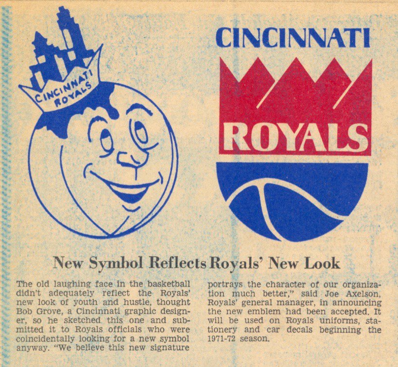
Friday Flashback: The clipping you see above, announcing the release of the Cincinnati Royals’ new logo — the same logo that was recently revived by the Royals’ current incarnation, the Sacramento Kings — appeared in The Cincinnati Enquirer on April 2, 1971. As you can see, it mentions that the logo was designed by a graphic designer named Bob Grove.
Grove’s name has been lost to history, and his story has never been told — until now. I have an exclusive interview with him for my Friday Flashback column today on ESPN. Check it out here.
Raffle reminder: Today’s the last day to enter the raffle for the pair of green Adidas baseball cleats. Details here.
The Ticker
By Paul

’Skins Watch: A Delaware school district will no longer call its teams the Redskins (from Kurt Esposito and Erik Autenrieth). … The DC school from which President Obama’s daughter Malia just graduated has banned ’Skins-related clothing. … I’ve seen plenty of football helmet designs based on Native American headdresses, but until now I’d never seen that idea used for a baseball batting helmet. That team, incidentally, has nothing to do with the Atlanta Braves — it plays in a Pennsylvania amateur league(from Brian Wulff) dang, that link has been taken down. … A school in Edmonton will no longer call its teams the Redmen. Students recently participated in a project to cover up paintings of the old logo — good for them (from BQG).

Baseball News: The Battle Creek Bombers, a collegiate summer league team in Michigan, is hosting Second Amendment Education Night tonight. Key quote: “Open carry is permitted at the game, however anybody caught drinking while carrying will be asked to leave immediately.” What could possibly go wrong? (From Patrick Sesty.) … A bunch of pro wrestlers attended Weds. night’s Pirates game. Further info here (from our own Mike Chamernik, who’s supposed to be busy with other stuff this week but apparently couldn’t resist contributing). … Not many white jerseys so far in the College World Series. … Edward Kendrick has provided up-to-date uni tracking for the Diamondbacks. … The annual Congressional baseball game was last night. Politicians wore the uniforms of teams in or near their districts. So Connecticut Senator Chris Murphy wore a Hartford Yard Goats uni (from Stephen Langdon).

NFL News: Here’s a marketing partnership you probably never thought of before: the NFL and Cirque de Soleil. … The Vikings apparently have an inaugural-season logo for their new stadium. No word yet regarding a jersey patch, although that seems likely (from Luke H.). … Falcons prexy Rich McKay says he’d like to revive the team’s throwbacks (from Britton Thomas). … Check this out: NFL Films softball teams! That’s the 1975 team on the top and the current squad on the bottom (from Robert Leavell). … Eric Wright spotted an NYC construction worker wearing a 49ers hard hat. Matches his safety vest! … Inconsistent “7” styles and NOB spacing in this old Oilers photo (from Pro Football Journal). … John Chapman recently scored this awesome-looking NFL Huddles book at a library sale. “I’d also be willing to part with it if anyone is interested,” he says. If that’s you, contact John here.
College Football News: There’s some sort of contest for the best-looking college marching band truck. Frankly, I didn’t even realize college marching bands had trucks, but live and learn (from James Gilbert).

Hockey News: Holy moly, look at this amazing old Buffalo Bisons jersey. That’s from a Buffalo fan’s vintage memorabilia collection, which you can see more of in this slideshow (from Buffalo Tony). … Jeez, ya think they have enough circle-R trademark symbols on this Game Six Stanley Cup puck? (From Ryan Connelly.) … Great shot of Kevin and Kelly Klima — Petr Klima’s 19-year-old twin sons — with FNOB and smaller-lettered first names (from Kevin Tiessen).

Basketball News: Derrick Rose will wear No. 25 for the Knicks. … Draft prospect Denzel Valentine wore Denzel Valentine socks to the draft (from Mike T). … The draft picks were given team-branded headphones, the Kings version of which had the wrong logo (from Chasen Rogers). … Man, French basketball has some seriously weird uniforms (from our own Alex Hider).

Soccer News: New home kit for Slovenian national champs NK Olimpija LJ. … New home kit for the Polish team ZagÅ‚Ä™bie Lubin (from Ed Å»elaski). … New kits for Wolverhampton, Sevilla FC, and Celta Vigo (all of those from Josh Hinton).

Grab Bag: Product placement deals are just another bullshit form of stealth advertising. The new movie Independence Day: Resurgence, which opens today, has one that’s more than a little awkward. Douchebags. … Here’s a timeline of NC State mascots, colors, and team names (from J. Huckel). … A measure to bar the Confederate flag from cemeteries run by the Dept. of Veterans Affairs has been dropped. … I haven’t bet money on sports since I was seven years old, in part because I don’t like to set up conflicts between my heart and my head (that’s what I learned when I was seven), in part because it’s a sucker’s game (I figured that part out soon enough), and in part because sports betting is an unsavory scene populated by scumbags. So I don’t usually read articles about sports betting. But this one, about betting tout RJ Bell, is really, really good. Like, really good. Strongly recommended. … Here’s a list of the year’s best corporate logo redesigns. … The 2016 edition of ESPN Mag’s annual Body Issue will feature a transgender athlete for the first time. … Oh man, check this vintage 1960s STP racing jacket (from David Firestone). … “What do you get when you combine a love for Helvetica, Swiss-style poster art, and thoroughbred racing jockey silks?” asks Ben Fortney. The answer can be found here. … Here’s a history of Batman’s costume in movies (from Steve Dodell). … An international trade commission has ruled that the Chuck Taylor sneaker’s diamond-patterned sole pattern is protected by trademark, but the sneaker’s other design features are not.
What could go wrong at Battle Creek’s open carry night at the ballgame? Probably nothing because the sort of people who would open carry at an event like that are responsible gun owners.
You’re right.
100% without a doubt beyond perfect response. The only people who would ever even think of bringing their weapons to a baseball game that will be filled with other armed folks, kids, and alcohol, are Responsible Gun Owners, and history (and daily news reports) clearly demonstrate that Responsible Gun Owners never make mistakes, have accidents, or do stupid stuff that results in harm to themselves or others.
Interesting ruling on the Converse trial. After all, the sole is the less seen part of a sneaker.
re: NCSU’s mascot/colors
“Student government sold 25-cent shares to purchase a timber wolf, which was shown during the first game played at what became Carter-Finley Stadium. The animal howled, making it popular, but it was later discovered to be a coyote.”
how did they not know that to begin with?
also odd they didn’t touch on the blue that was in the basketball unitard
Even better, in 1946 they had a ROBOT mascot. His nickname, you ask? HELL
link
… that is absolutely horrifying.
Native American batting helmet link doesn’t work.
Thanks for the heads-up. Text now adjusted.
As a Michigander, I want to make it known that Battle Creek is in the center of Michigan’s “Bible Belt” that fills all the stereotypes you would associate with that term.
There’s also the Michigan National Guard’s Fort Custer Training Center just a couple of miles down the road in Augusta.
Good thing the Niners’ logo works regardless if the headgear in on backwards or not.
Braves-like Batting helmet says “page doesn’t exist”. #OOPSIE
Re: those wrestling jerseys. Brian Knobbs (at the far right) has his name spelled wrong on the jersey. I wonder if that was on purpose in his part, or a mistake.
Watching the Diamondbacks/Rockies game last night, the sheer awfulness of the D-Backs’ road unis was impressive.
There is so much going on with that uniform, it overwhelms everything. Like they appeared on “Pimp My Uni” or something.
But the thing that got me the most is that I feel like it’s crossed over from uniform to costume.
“Pimp My Uni” made me chuckle. “Yo, dawg, I heard you like pinstripes and fresh colors, so my boys at West Coast Customz gave you vertical AND horizontal pinstripes that have flashing neon LED lights backing them so you can look fly as hell rounding third base, dawg.”
On the Oilers jerseys – I think they are still mixing between durene and mesh jerseys. Smith may have a durene with tackle-twill numbers and Matuszak has a mesh jersey with screened (or heat pressed) numbers.
Ah, interesting — good info. Thanks!
That Buffalo slideshow is pretty nifty. The gold shoulder piping on those 70s Sabres jerseys was huge! About as huge as the center stripes back then.
Man, I really hope those cookies weren’t iced by an inkjet printer. Then it would be much less impressive.
They definitely look hand-painted to me. I’ve seen computer-printed cookie logos and they do not look like that. Nicely done, from one baker to another.
The Friday Flashback is up:
link
That was certainly a satisfying read, especially with a strongly-hinted-at happy ending after all these years. Good history mixed with some warm fuzzies? What’s not to love?
Well, link The Penguins are going back to Pittsburgh Gold for good, and are resurrecting their 80s-style white jersey for the road.
Of note is the waistline stripes. Instead of replicating the link that featured the same wide white stripe as the road jersey, they opted to go with link featured on the 1980-88 versions (most closely resembling the 1986-87 version), which actually carried over from the link that preceded the black-and-golds.
Count me as sad. I have always been a fan of the vegas gold. Oh well…
I liked the original iteration (2000-07) better when it was the nice, shiny metallic fabric making up the diagonal gold stripes. The misshapen blobs of khaki-colored jersey mesh on the Edge uniforms wrecked it for me.
Band truck? We used to rent a U-haul each Saturday the football team was on the road.
Marching band’s a pretty big deal these days. High school bands get their own trucks now. link, a campus in Canton, Michigan that houses our district’s three high schools: Plymouth, Canton, and my alma mater, Salem.
TYPO: Falcons President is Rich McKay
Thanks. Fixed.
The Friday Flashback made me see something I’d never realized before about the Kings logo. I’d always seen the crown as mountains, with the peak on the far right as the foreground, and the 2 on the left as the rear-most.
But when the designer referred to the white lines as highlights, I finally saw the actual crown. Peaks 1, 3, and 5 are the foreground and 2 and 4 are the background. It’s much easier to see in the old logo.
Just throwing that out there in case I’m not the only one.
Pretty much a happy coincidence there. It’s just unfortunate that they retired that logo for such an ugly-looking mess back in 1994. The wordmark was flat-out brutal; the crossed lances made little sense (really, how often do you associate jousting with kings?); and the crown element gets a bit lost behind the “Sacramento” banner, such that it looks more like a gray explosion. I’m glad that 1994 turd is gone now.
Now, if only the Los Angeles Kings can get past their ugly late-1990s aesthetics…
Amen.
For L.A. Kings: 1960s/70s > anything since.
Paul, I have a question unrelated to the topic but I wasn’t sure how to contact you. It’s been bugging me for a while, but who was the first team to wear sleeveless baseball unis? If anyone knows the answer it would be greatly appreciated
1940 Cubs:
link
You’re the best! Was that jersey style consistently used from 1940 on? Cuz I thought it was a newer style and expected like the Rockies, but that’s crazy, thank you !
The Cubs only used the vests for a few seasons, reverting to sleeved jerseys in 1943, but the Reds and A’s rather memorably used vests in the 1960s. There may be others that I’m not recalling at the moment.
Cubs used it for the next several years after that. You can explore that yourself here:
link
A decent number of other teams have used vests since then, esp. in the 1960s (but also in other eras). You can use that same database link to poke around. Unfortunately, there’s no place on the web (at least that I’m aware of) that shows all of the MLB vest uniforms in one place, and there’s also no way I’m aware of to search on them.
You’re the best Paul, appreciate it
On the Jeep/ID:R cross-promotion continuing unabated… Fox and FCA can go to hell. Go directly to hell, do not pass GO, do not collect $200.
They really should’ve pulled back on the campaign after what happened last Sunday. Ad campaigns have been pulled outright in the past for less.
Buffalo Bisons jersey is one of the best old sweaters I have ever seen.
It would be a PERECT throwback for the Sabres, even as a fauxback with thir current buffalo rendered in gold and “BISONS” swapped out for “SABRES”
Paul, in reference to the trucks for Marching bands, it’s also a pretty common thing to to in High School as well, as they are what haul the trailers with the bands’ instruments and other equipment. Usually, the Livery or Decal on the truck will match or compliment that of the one on the trailer.
Seems to me that high schools are more likely to own just the trailer and rent a cab as needed. That’s what my high school does.
… and that was supposed to be in reply to the post above. Oops.
While I can’t understand the choosing of numbers for all of of the wrestlers, I can understand Kurt Angle’s (far left) since he won an Olympic Gold Medal in the 1996 games, and Booker T’s (third from right) since he loves to say he’s a “5-time, 5-time, 5-time world heavyweight champion!”
As for the Nasty Boyz, I didn’t realize they were still alive.
I read McKay wants Falcons throwbacks and I thought of the red look of late 70s/early 80s yet most tweets on that thread were “OH YEAH! BRING BACK THE BLACK!
I hope the falcons are featured on the Sunday signature series one day to see what most uniwatchers think is their sig look.
Well if “only one color shell allowed” is still a thing, it’ll be SB33 throwbacks or nothing.
1. Major fail on the otherwise impressive cookies – no UNC jersey even though the Heels had a first round selection?
2. If done right, product placements in movies aren’t that bad…brands exist in real life, and it always struck me as distracting when a character goes into a bar and orders “a beer”, etc.
The new Toronto Maple Leafs jersey was worn tonight at the NHL draft. The stripe at the bottom looked oddly sloppy tonight, but I suspect might not be popular with Leaf fans as it looks like its paying homage to the Red Wings of all teams. No doubt they’ll say it’s to pay tribute to the Leafs 70’s and a good part of the 80’s look, but it looks thinner, more like the Red Wings, Lightning.
To note, Kelly and Kevin Klima played for the Moncton Wildcats of the QMJHL this past season, and they both simply wore ‘Klima’ on the back. Lame.
Haters gonna hate!
What does a transgender athlete being in ESPN’s Body Issue have anything to do with the “aesthetics of athletics”?