For many of today’s photos, you can click to enlarge
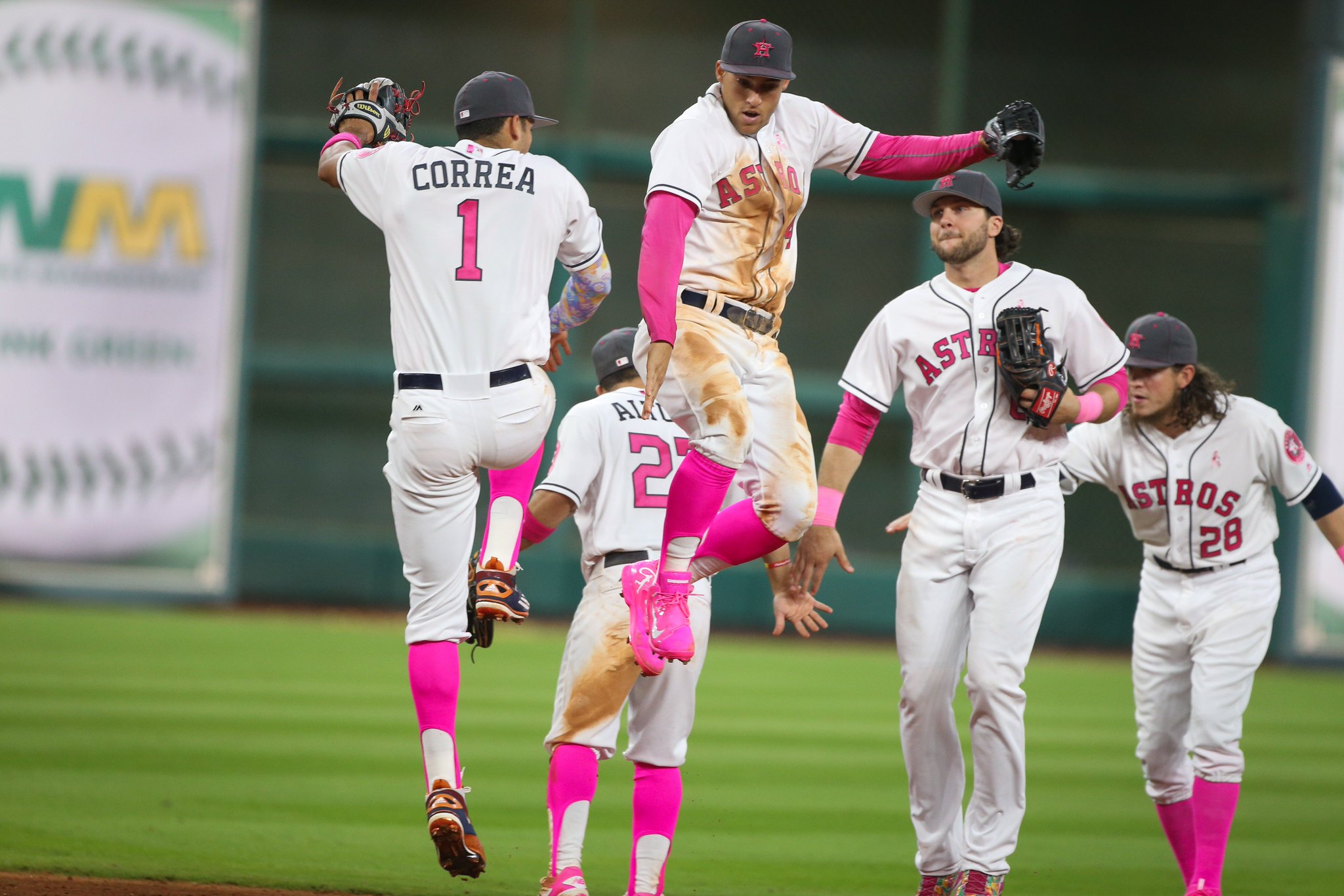
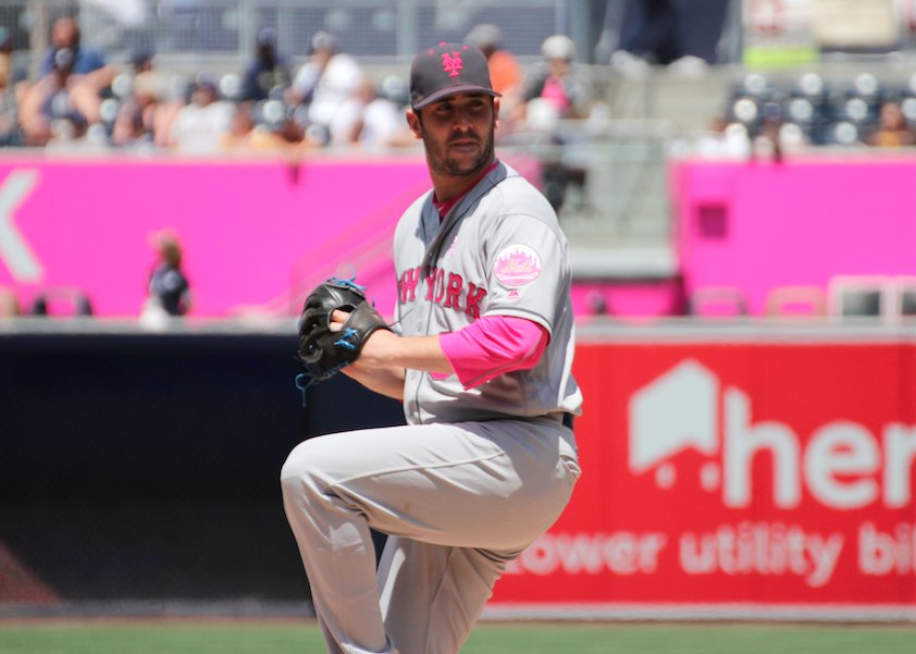
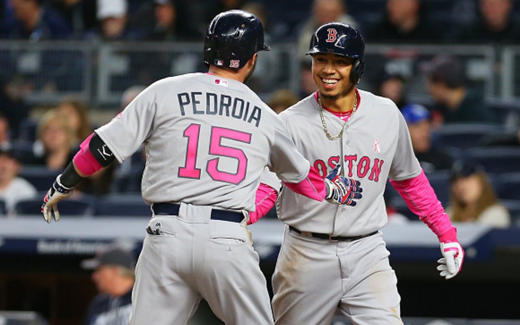
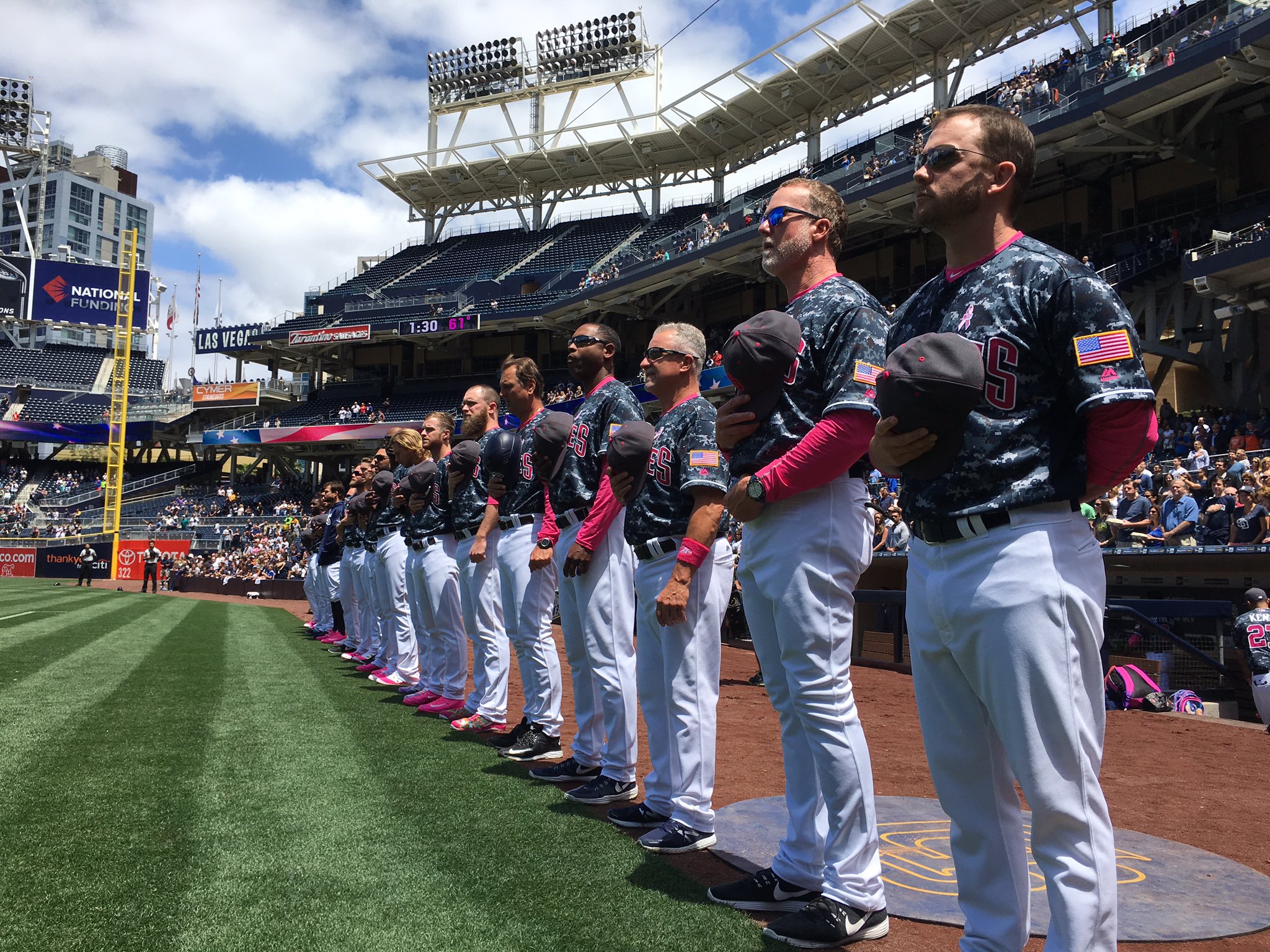
We knew MLB players would be wearing a lot of pink yesterday, including pink-lettered and -numbered jerseys (first time those have ever been worn on Ma’s Day), caps with pink logos and top-stitching (ditto), and the usual assortment of pink batting gloves, bats, wristbands, chest protectors, and related accessories. But we didn’t know — or at least I sure didn’t — that high-cuffed players would be wearing pink socks and stirrups. Not every high-cuffed player did that yesterday, but lots of them did. Here are some additional examples:


There were also several teams whose high-cuffed players stuck with their standard team-colored hose. Here are a few of them (there were definitely others):


Why do these players hate Mother’s Day? (Also, for that last photo, shouldn’t Javier Baez’s faceguard have been pink?)
On some level, the pink hose worked better than their team-colored counterparts, at least in terms of chromatic consistency. If your jersey and cap and undershirt are pink-themed, it makes sense for your socks to be pink as well. So yeah, MLB gets points for consistency here. The problem, of course, is that in this case the look was consistently bad, literally from head to toe. But consistent, nonetheless.
Bonus points to Reds pitcher John Lamb, who apparently tried to have it both ways, as you can see at the base of his front leg in this photo:

Other notes from yesterday’s games:
• Teams with colored pants piping didn’t change the piping to pink — they just removed the piping altogether. And in the day’s one development that constituted an improvement, these new custom pants didn’t have the MLB logo on the back belt tunnel:


• The pink theme on the jerseys was extended to sleeve patches:
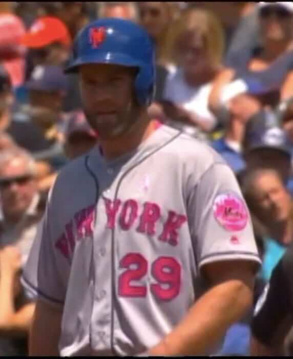

(Footnote: Seeing the Mets’ patch in pink is a good reminder that the team’s original colors were supposed to be pink and black. So yesterday’s sleeve patch was, sort of, a throwback, or a “What if?,” or something like that.)
Even the Orioles’ Maryland flag-themed sleeve patch and the Rangers’ Texas flag sleeve patch — which are based on, you know, official state flags — were pink:


But the American flag patch on the Padres’ G.I. Joe jersey was left in its usual colors, which I guess means we’ve now established a hierarchy of pandering — Mother’s Day trumps state flags but not the American flag:
• I was kinda hoping (and also kinda dreading, but mostly kinda hoping) that Mets outfielder Yoenis Céspedes would wear his neon compression sleeve, just so we could see how pink and neon collided. Alas, it was not to be:

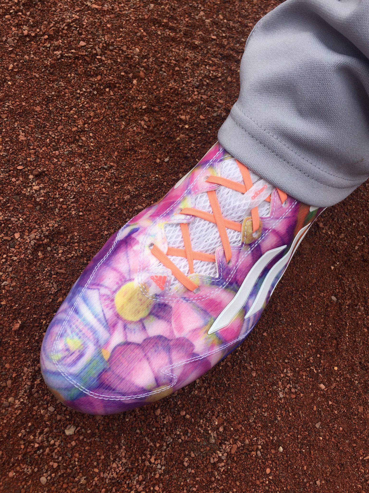
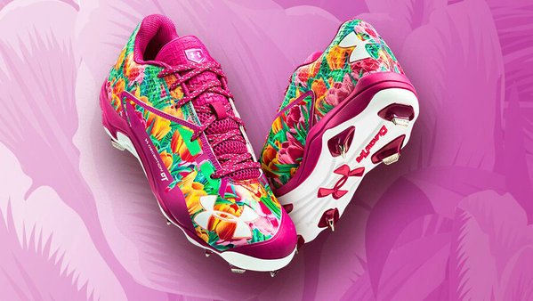
• Flower power: Now, I happen to like flowers. You probably do, too — who wouldn’t? At various points in my life (most recently about three weeks ago), assorted friends and relations have given me flowers many times on my birthday, as a gift when I’m hosting a party, as a “get well soon” sentiment, or just for the hell of it. I’m sure the same is true for many of you who are reading this. But it appears that for MLB and its promotional partners, flowers are strictly for girls ”¦ women ”¦ mothers. Which is how yesterday’s games ended up featuring footwear and accessories like these:

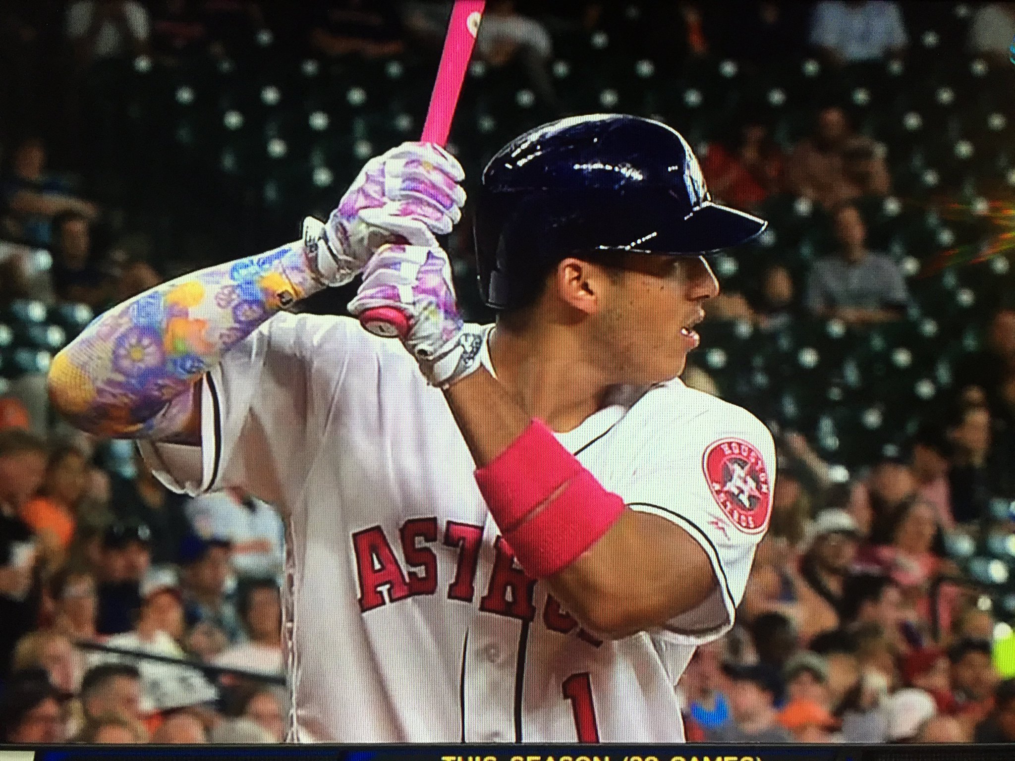
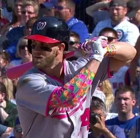

On the one hand, seeing all these big, tough athletes wearing flowers feels like a good refutation of standard gender stereotypes. On the other hand, they’re doing it for a reason that perpetuates gender stereotypes. Hmmmm.
• The circle-R trademark symbol that usually appears on the Cubs’ jersey logo was missing from their pinkwashed design:

• The Angels wore pink, just like everyone else — really, they did — but it was hard to tell:


• The Giants’ uniforms were white — white! — instead of their usual cream:

• The pink looked particularly bad on the Diamondbacks’ road grays charcoals, which I guess is just another way of saying the road grays charcoals look particularly bad, which we already knew. But still:


• Think the Yankees’ uniform is sacrosanct? Then don’t look too closely at these shots:


• The pinkwashing also extended to umpires’ masks:

• And on-field graphics (shouldn’t the Reds have renamed themselves the Pinks for this game?):

• And the batter’s box (or at least the right-handed batter’s box in Miami):

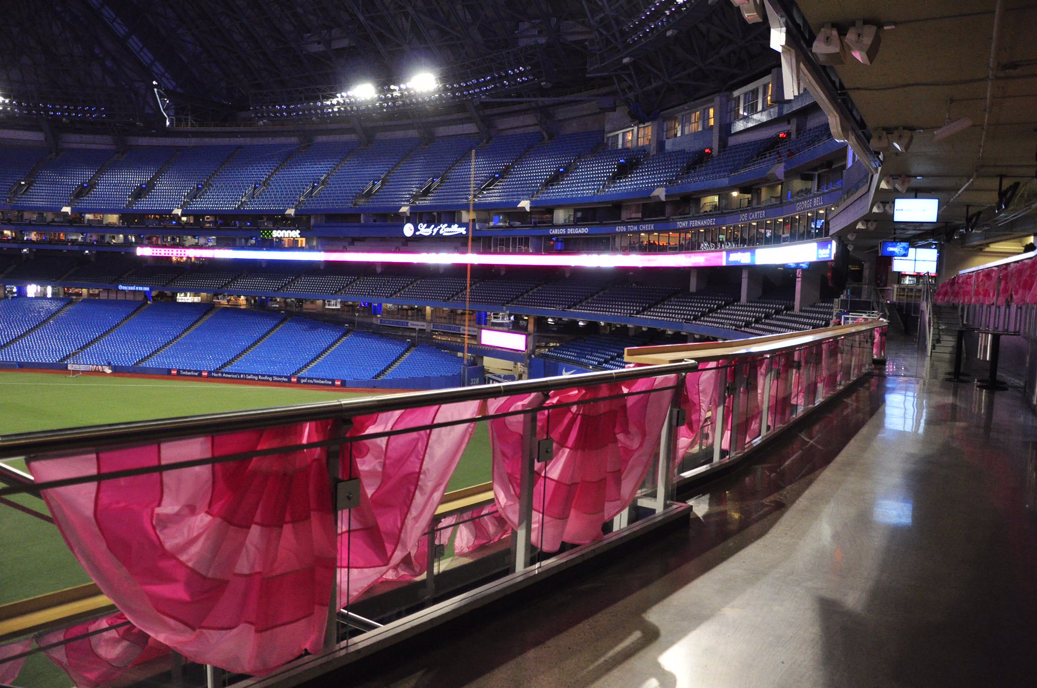
• And bunting (in this case at the Rogers Centre I still call it Skydome):
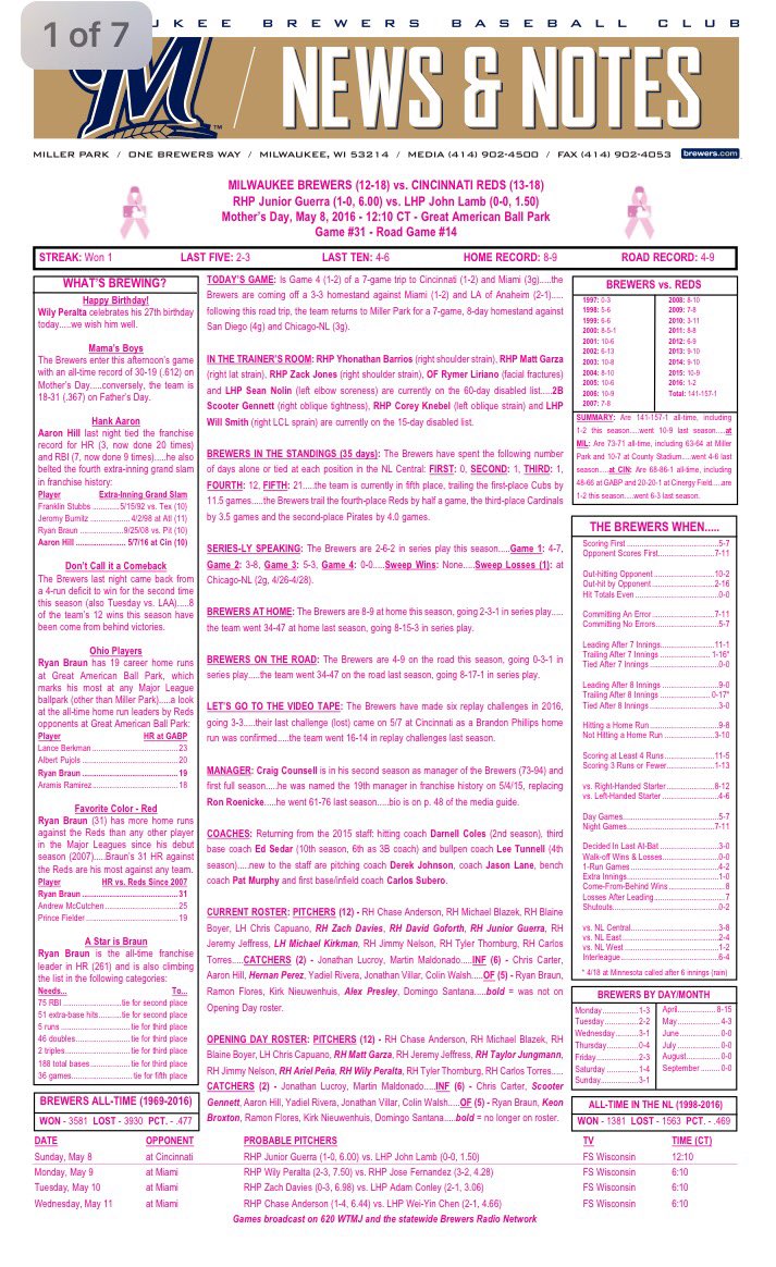
• And game notes distributed to the media:
Did I miss anything noteworthy? Probably! Feel feel to add your own observations in today’s comments.
Meanwhile: I’ve seen lots of people referring to all of these pink uni elements as a “cash grab” by MLB. That’s not accurate, because MLB is donating all of its proceeds from pink merch to Susan G. Komen for the Cure. However, that in turn raises several issues of its own:
• Komen’s work has been controversial on several fronts, and so has pinkwashing in general.
• It would be easy enough for MLB to donate to Komen (or to any group) without furthering the merch-industrial complex, which has clearly gone too far.
• If fans are reflexively screaming, “Cash grab!,” even when no cash grab is taking place, it probably means they’ve become seriously jaded and cynical about the endless merchandising barrage. So while the “cash grab” accusation isn’t entirely accurate here, it’s a symptom of a bigger problem — a problem that MLB should be asking itself about.
In any case, the chief concern here at Uni Watch is always how it looks on the field, and in this case it looks terrible.
Finally, it turns out Batman was way ahead of the Mother’s Day trend. Remember the episode when the Mad Hatter turned his cowl pink? Right, me neither, but here you go:

And remember, kids, only six more weeks to Father’s Day!
(My thanks to everyone who emailed or tweeted photos and info my way yesterday. I hope you also managed to squeeze in some quality time with Mom. My thanks also to new Uni Watch team member Alex Hider, who was on Ticker duty for the first time and freed me up to take a deep dive on the MLB coverage.)

Photo by the Tugboat Captain; click to enlarge
Don’t tell Tucker and Caitlin, but sometimes I like to play with dogs, too. The pooch here is named Faust, and we were roughhousing duing the rooftop segment of an excellent Kentucky Derby party that I attended on Saturday.
Speaking of which, I maintained my annual custom of baking a Derby Pie but totally forgot to post the recipe on the site last Friday — sorry about that. If you want to make it for the Preakness and/or Belmont (or, really, anytime — it’s a great pie), here’s the recipe (click to enlarge):


KRC update: The latest installment of Key Ring Chronicles is now available. It involves two Lego bricks (as shown above). Check it out here.
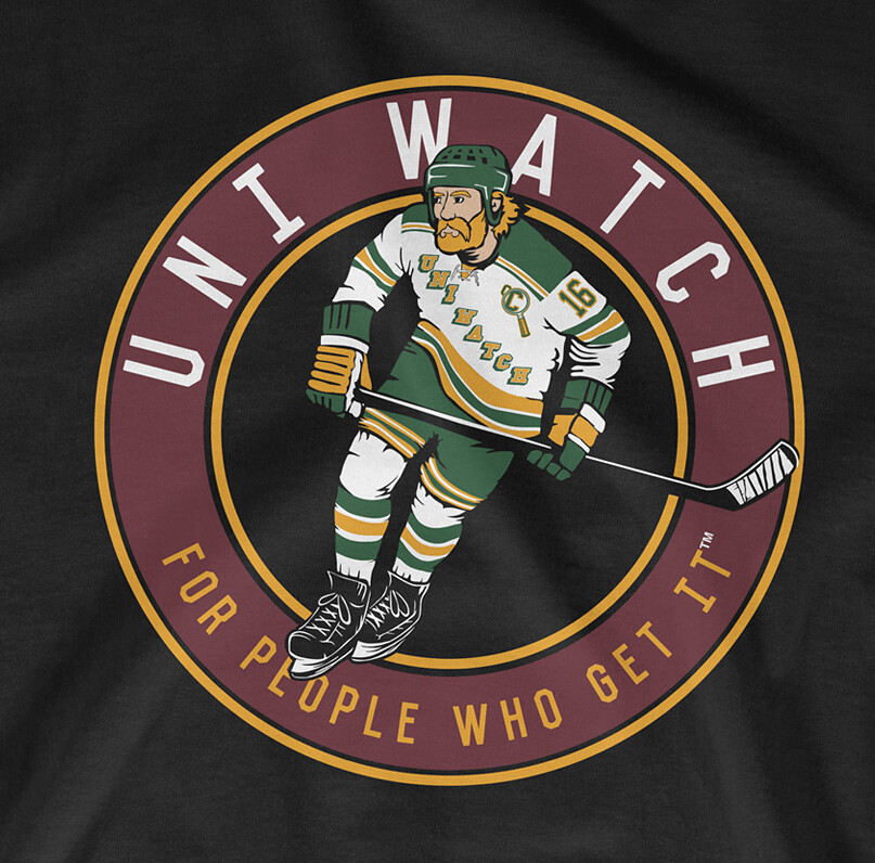
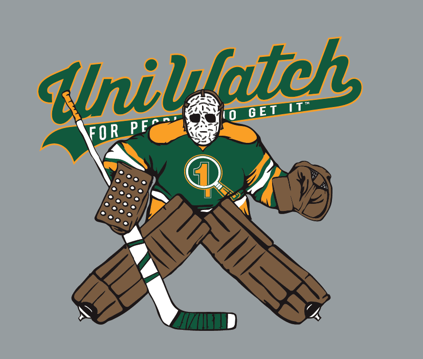
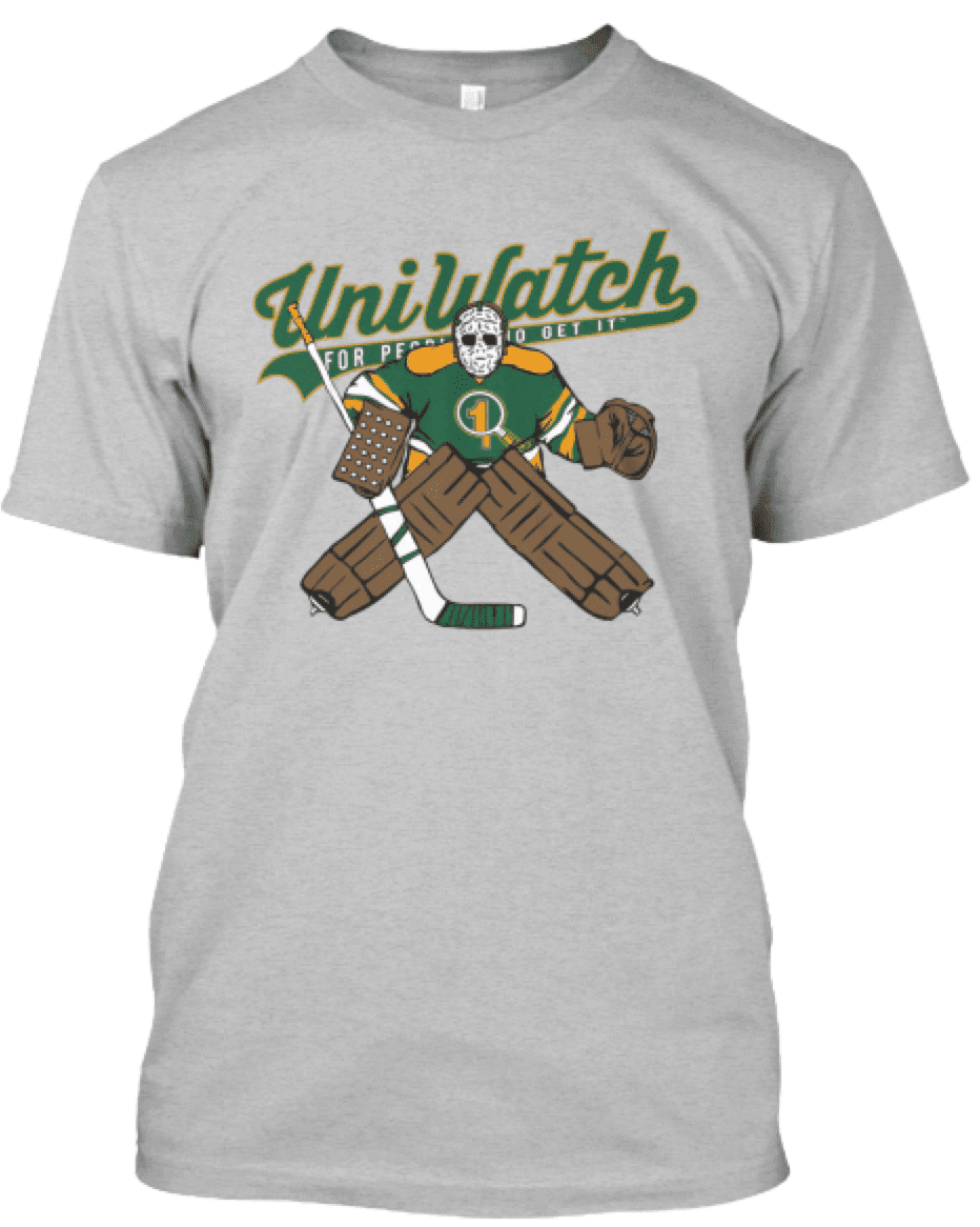
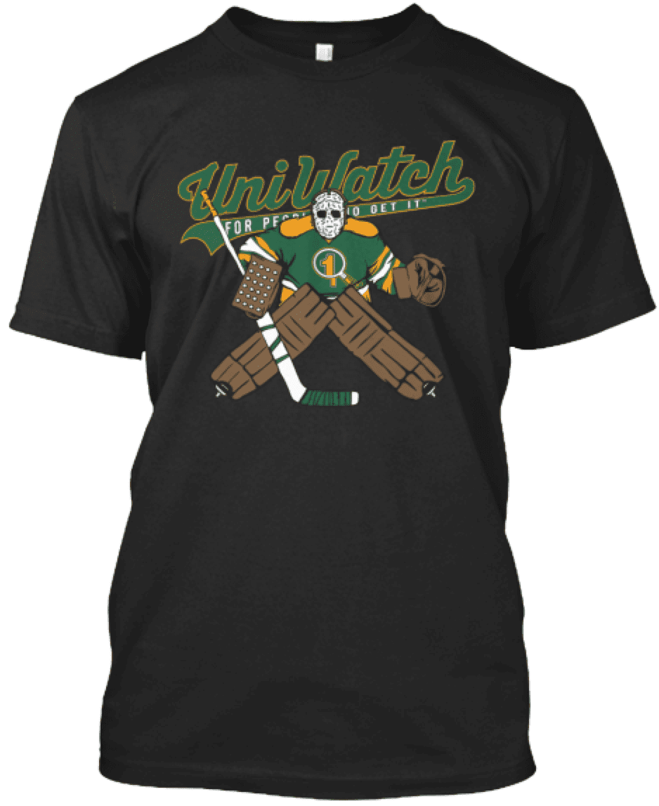
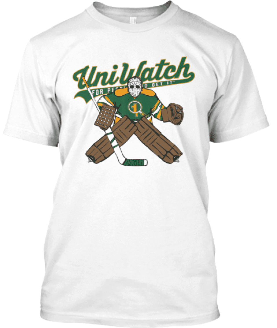
T-Shirt Club reminder: The Uni Watch T-Shirt Club’s second release of 2016 — the hockey design — is now available. Here’s the base design (which you can click to enlarge), followed by the three shirt color offerings:
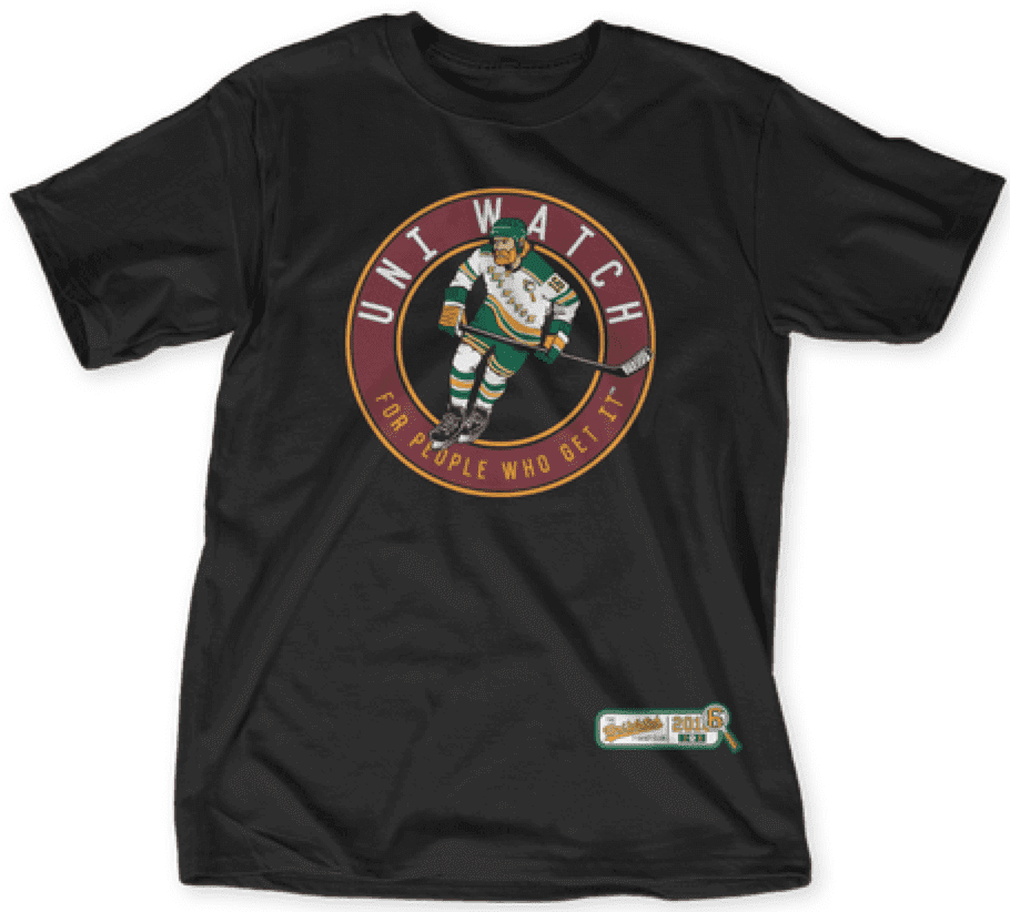
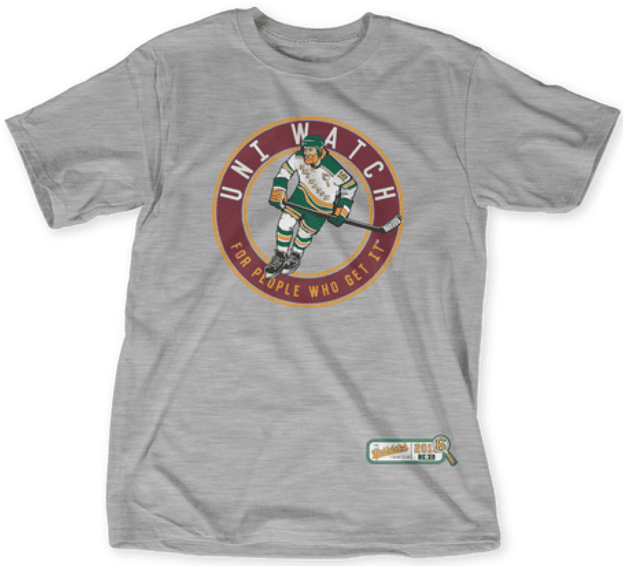
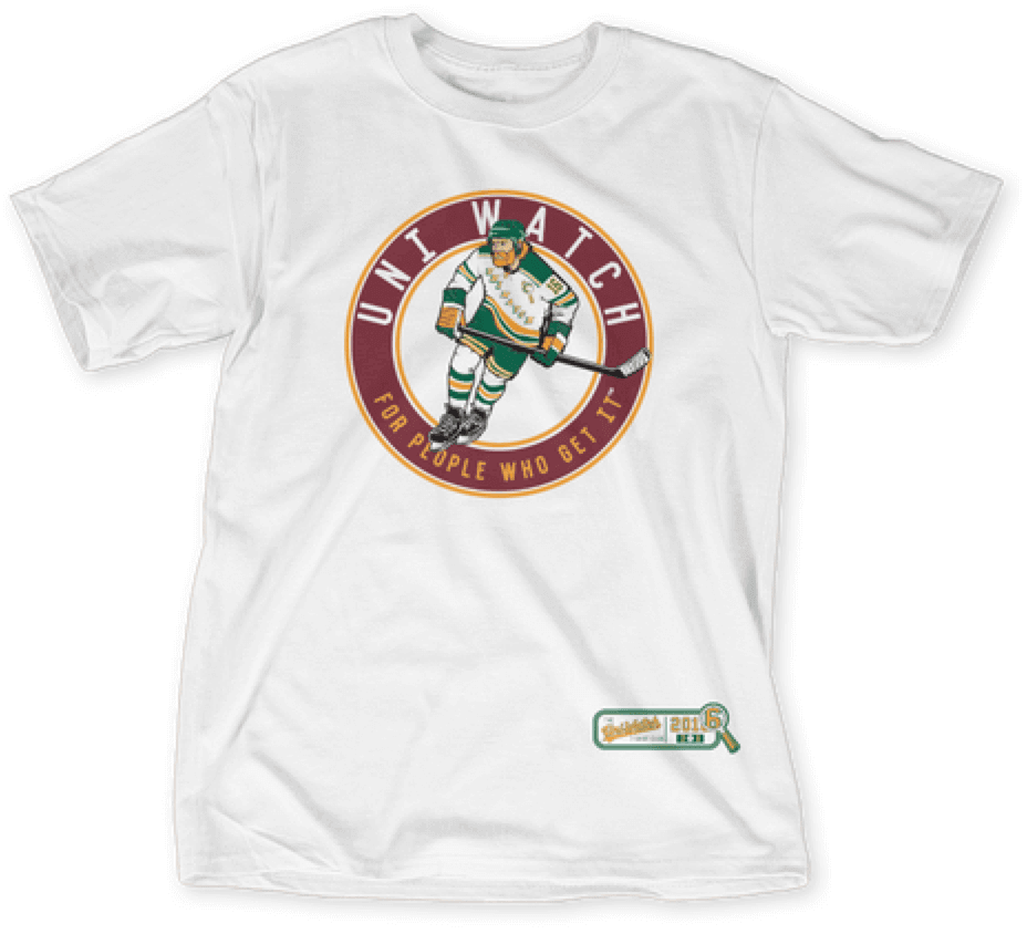
The shirt is available here from now through next Tuesday.
We also have a goalie design that’s available for sale as a bonus shirt. Here’s the base design, and the three color options:
This shirt is not part of the T-Shirt Club, does not have Club’s jock tag graphic, and neither counts toward nor is required for 2016 “Collect ’Em All” eligibility. It’s just a bonus design that we’re offering for those who want it. You can get it here.
The Ticker
By Alex Hider

Baseball News: Not to be outdone by the big-leaguers, Louisville and Stephen F. Austin also went pink for Mother’s Day (from James Gilbert and Chris Mycoskie). … Lots of readers pointed out that the Brewers’ Junior Guerra lost his helmet logo. … According to Mitchell Barbee, Braves centerfielder Mallex Smith has been switching back and forth between a single-flapped and double-flapped helmet. … Good story on the repurposed Darth Vader helmet that’s been popping up in the Mariners’ clubhouse. … A few users were kind enough to remind us of the White Sox’s egregious Ted Kluszewski NOB error, which took place 56 years ago yesterday. … They don’t make stadium giveaways like they used to. That’s a pendant the Yankees gave away for Mickey Mantle’s 500th homer on Mother’s Day 1967 (from BSmile). … Color-on-color alert: UNC-Wilmington and College of Charleston. Thank god there’s no pink (from Zane). … Lots of stripes in this Texas high school baseball photo, including some White Sox beach blanket unis (from William Banowsky). ”¦ After Mets P Bartolo Colón made history on Saturday night by becoming the oldest player in MLB history to hit his first career homer, the Mets — or maybe just the people at their TV network, SNY — had a little fun by listing Colón as an available pinch-hitter in yesterday’s game. ”¦ Kansas State’s jerseys yesterday were mostly blank.

Pro and College Football News: New uni number assignments for Eagles’ rookies. … Andrew Cosentino writes in with an interesting uni dilemma for Ravens rookie Keenan Reynolds: “He’s already already had No. 19 retired by Navy. However, he’s currently wearing No. 6 for the Ravens. Why No. 6 and not No. 19? Well, the Ravens have never given out No. 19 in their history, out of respect for former Baltimore Colts legend Johnny Unitas.” … The Lions make heavy use of Honolulu blue and gray in this ad, but no black. Sign of things to come? (From Scott Frederick.) ”¦ Is West Virginia football adding pride stickers to its helmets this season? Sure looks like it (from Zack).

NBA News: ESPN used an outdated Hawks logo during Sunday’s game against the Cavs (from John Sabol). … Five female city council members in Seattle are facing sexist backlash after voting against a land-use deal that could have brought a publicly-financed basketball arena to the city. … Fashion plate and part-time basketball player Russell Westbrook wore an Anaheim Ducks alternate jersey to the stadium on Saturday (from Travis Ford).

College Hoops News: No, that’s not a black-and-white photo. It’s the new basketball floor at the University of Findlay (Ohio) (from Ryan Kovar). … North Carolina basketball players got to wear argyle one last time at graduation (from James Gilbert).

Grab Bag: Apparently, not even the PGA was immune to pink on Mother’s Day (from Pat Costello). … United Soccer League expansion team Reno 1868 will wear blue and gold when they take the field in March 2017 (via @TheAestheticSB). … Members of the terrorist group Boko Haram have started wearing uniforms to identify themselves. … A rugby team in Australia wants its fans to vote on a 50th-anniversary patch to be worn next season. However, fans are upset that the club didn’t wear an ordinal patch this season. … Interesting take: Does instant replay take the fun out of watching sports? … A couple of NASCAR items from David Firestone: Throwback paint schemes for the upcoming Southern 500, and commemorative rings for Hendrick Motorsports following Jeff Gordon’s retirement. ”¦ And speing of NASCAR, here’s your latest chance to vote for the Paint Scheme of the Week. ”¦ Aussie football news: New guernsey for Richmond (from Franklin).
NBA TICKER :Westbrook wore the Ducks Sweater on Sunday not Saturday like the ticker says.
I don’t know if I can find a photo, but the Marlins spelled out ‘MOM’ on the mound with two of their logos and a Heart in the middle.
This highlight clip starts with a view from behind the mound.
link
Might be in the minority here but I thought the pink on the Dbacks charcoal looked the best of the bunch.
it looked like something I would want a team to wear everyday
I agree–pink and gray go well together.
I agree, it actually wasn’t bad. Also no weird bloody ankles.
Proofreading:
“After Mets P Bartolo Colón made history on Saturday night by becoming the oldest player in MLB history to hit his first career home,”
“and commemorative rings for the Hendrick Motorsports following Jeff Gordon’s retirement”
Fixed.
Unfortunately, as a Lions fan, I’m much too aware of Scott Mitchell’s #19…
link
I repeated this Mystery Science Theater 3000 quote too many times during his career in Detroit:
“Mitchell. Even his name says, ‘Is that a beer?'”
I’m sure Ravens fans wish Mitchell hadn’t worn 19 for his short stint there, especially since he’s the only player to have ever worn it for the Ravens.
In short, the quote from the submitter (quoted below) is inaccurate, because the linked tweet says it hadn’t been issued “in years”, not “never”:
“He’s already already had No. 19 retired by Navy. However, he’s currently wearing No. 6 for the Ravens. Why No. 6 and not No. 19? Well, the Ravens have never given out No. 19 in their history, out of respect for former Baltimore Colts legend Johnny Unitas.”
No picture, but it looked like Papelbon had pink laces on his glove. New glove, or a retro-fit? Did Anyone see this?
Under armor used the flower design already this year. Manchester United’s Memphis Depay wore flowered pattern shoes back in March. Said it was a tribute to his Dutch nationality.
Yup. The design does appear to have tulips, but it’s labelled “Tutti Frutti”.
RSB
Those caps, ugh… It has taken me this long to finally feel MLB has “jumped the shark” with special uni days. Those caps look like tacky New Era “fashion” caps rather than proper ballcaps meant to be worn on the field. Why not just swap out one color for pink like they did with the uniforms? Better yet, stick to pink accessories like wrist bands and bats and leave the uniforms alone.
Plus, what does it really mean to “raise breast cancer awareness”?
A couple thoughts: watching the Twins-White Sox game on TV, the pink in the White Sox back numbers combined with the dark pinstripes made them look like the Twins’ old 1987-2014 home look — while playing the actual Twins in their current roads.
Meanwhile, that Milwaukee ball-glove logo showing up on the sleeve for, I believe, the first time ever on a jersey with the “Brewers” script (as opposed to the “Milwaukee” script or on a throwback/”retro Friday” jersey) makes me think even more that the Brewers are pushing to make that the primary logo at some point soon.
I love my Mom … but I HATE the pink out. At least in MLB it is over in just one day verses the excruciating month that the NFL puts us through for BCA.
link
I think the Diamondback’s Mother’s Day unis look pretty ok, but maybe it’s because they don’t have the snakeskin pattern on the shoulders and ankles. The charcoal gives a pretty good contrast to the bright pink
Is a link missing for UNCW v. College of Charleston? I’m on the mobile site so not positive.
Now fixed. Here’s the link, so you don’t have to scroll back up to the Ticker:
link
My mother turned 69 on Saturday. She is a tremendous baseball fan: loves the game, everything about it, including the look of the game. To her, the Curse of the Pink Pander is a joke. The game of baseball — with its black cleats, red stirrups, navy caps, etc — is what she wants from MLB on thia and 180 other days of the season. … Just add up the total cost of the purchases for the players to wear all this pink, don’t buy it and donate that amount.
“Curse of the Pink Pander” — oh man, that’s perfect. Did you come up with that? Have you used it before? So good! (Although I wonder if young ’uns who didn’t grow up with Inspector Clouseau might not get the joke…)
If you mention “Cato” they will go all “Hunger Games” on you!
So does MLB actually donate any of their own $ or do they just take all the sales from the pink merch, pay themselves back for their costs (so they don’t lose $) and give the scraps to Komen?
My understanding is that net proceeds (i.e., profits after expenses) go to Komen. I do not know the profit margin — and neither do you, so it is not fair to label the net proceeds as “scraps.”
As already spelled out toward the end of today’s lede, I think there are bigger issues here than how much $$$ Komen ends up with.
your mixing up your terminology, profits are the revenue minus expenses and net proceeds have to do with real estate. It is the revenue minus closing costs, has nothing to do with merchandise or expenses.
you’re*
link
Maybe Mike didn’t word that right, but I understood it to mean “does MLB donate any money above and beyond the profits from pink merchandise, or do they donate just the profits from pink merchandise only?” In other words, would they have donated any of their own money too.
Don’t know. Anything they do that isn’t related to uniforms is, you know, not related to uniforms, so not as much of concern from a Uni Watch perspective.
So in other words MLB is giving a part of the money raised to a company that also gives a part of the money raised to cancer “awareness”. Why can’t MLB just give the money to an organization that actually does something to fight breast cancer?
This is simply not accurate. Whatever one thinks of Komen (and I have huge reservations about them myself), saying they’re only interested in “awareness” is just wrong. Their activities include breast cancer education, research, advocacy, health services, social support, and more.
There’s plenty to critique here. But let’s please keep the critiques within the realm of reality. Thanks.
This is really a weird thread. Does anyone think a company should operate at a loss to donate money to a charity?
There are costs involved with making the pink merchandise. If that $25 pink hat costs $22 to make, deliver, market, put in a store, etc, and the company donates $3 to the charity when the hat is sold, in my book that’s the way it should be. That way the company selling the hat doesn’t make any profit off of the misfortune of others, but they’re not going broke making the stuff either.
I know in the past Paul has had the opportunity to ask (I think it was MLB) what portion of the profits would go to whatever charity the profits were going to, and they kind of brushed him off. Nobody should be making money off of the misfortunes (cancer, 9/11, etc) of others in these cases. Or going broke either.
That entity (if it was MLB) should have been donating 100% of the profits, not part of it.
I know in the past Paul has had the opportunity to ask (I think it was MLB) what portion of the profits would go to whatever charity the profits were going to, and they kind of brushed him off.
This is a reference to a press conference about 8 yrs ago regarding MLB camouflage uniforms. At the time, MLB was saying that they were donating “a portion” of the proceeds to a veterans charity. I asked what percentage that portion was and, as Tom indicates in his comment, was basically given the brush. (The guy running the presser, MLB’s then-COO Bob DuPuy, is no longer with MLB. I’m told that current execs would deal with this type of thing much better than he did.)
They no longer say “a portion.” They now say all net revenue, or all profits, or all cash after expenses, or however you want to phrase it. In short: Their balance sheet doesn’t come out ahead on any of these merch sales. (Some would say that this alone makes the merch sales OK; I disagree. But that’s a separate issue. All I’m trying to do with this comment is clarify the past and current factual situations.)
I’m sure this has already been well documented on the site, but it was new to me
while watching the Cubs sweep my Nats, I saw that the Cubs’ Javi Baez, REALLY likes the MLB log: link
Yup. Was covered last year.
What? The D-Backs were the best – er, least bad looking team yesterday. By far. The darker gray suited the pink nicely. Pink would be a terrific and distinctive primary team color; the D-Backs showed how to use contrast to make a pastel-y color work. A pink team would either need to pair pink with a dark second color – black, midnight, plum – and road unis like Arizona’s, or use a wider mix of light/bright colors like Miami.
Mostly agree. The D-backs new set is so hard to read since the lettering is too dark against the dark gray background. I can’t say I liked the pink, but it did pop a bit more than the usual red (or whatever) or teal, and was MUCH easier to read.
Agreed. The darker gray with pink was the best look of a bad bunch.
Interesting that so many of you think this!
My take: Yes, the dark grey provided more contrast against the pink, but not in a good way. Made the pink look more electric, and therefore more garish. No thank you.
On the plus side, however, the charcoal caps that everyone wore yesterday did match pretty well with Arizona’s jersey/pants. So they had that going for them.
I think it looked OK but would have been better with white (or maybe lighter gray) outlining on the pink.
I agree with you, JTH. I think the details would’ve popped a little better with white outlines in this instance.
The pink was too electric, but that was true of all teams. A more true pastel would have been better all around, and would have shown even better on the D-Backs’ darker gray. But even the too-electric pink was a pastel. It’s was to red about what powder blue is to navy. If a team’s primary color was powder blue, and it just rendered its jersey script in powder blue on either white or MLB’s usual slightly off-white “gray” road unis, it would be much too pale and washed out. As we saw with most of the uniforms yesterday. Many were actually hard to read. A lot of teams had faint pink blurs on their chests.
On those Angels photos, I wonder if the pix were color-corrected to lean red. The couple of video highlights I saw looked pink to me, not almost-as-red-as-the-helmets red.
Obviously, this whole discussion is setting aside consideration of the Pink Pander event itself – shameful and ugly – in favor of considering the aesthetics of the color pink on a uniform. Wouldn’t want positive consideration of pink, as a color, to be misconstrued for approval of yesterday’s monstrous desecration of one of our country’s great institutions. If sticking a “los” before the jersey script is the taco bowl of uni design, then yesterday’s pinkening was the Thomas Kinkade of uni design.
I’ll say the Mariners look was pretty good as well. Road Greys with pink and blue…
At least they didn’t change team names, like on heritage nights. Well, the San Diego Madres might actually work.
+1
Atlanta Squaws?
Phila. Fillies
Boston Red Stockings (again)?
Houston Dat Astros?
I would think that the Cubs didn’t have the Circle-R because it was pink, not red. Although, that line of logic doesn’t work, as I expect that if someone did the logo in purple and green, they would have lawyers at the door.
I am a Red Sox fan, but those Yankee uniforms made me die a little inside.
I believe you’re right on both counts regarding the Cubs logo.
The jerseys were generally awful. The grey caps were also a failure. Following the NFL example and “pinking” shoes, sox, sleeves sweatbands, and especially bats is great. But visually they really didn’t work.
Thanks for the Seinfeld reference in today’s headline! Jerry: “Up all night playing poker. I told you you’d never make it…” George: “Hey, where’s your ribbon?”
Users?
Man, I realize that lots of us here have what many might consider a problem, but to call us users…
(Welcome aboard, Alex.)
My bad for not changing that when I edited the Ticker. Now fixed.
while I agree that all the uniform changes for holidays are pretty dumb, after seeing these uniforms I would actually like for a team to use pink as a color. Some of these uniforms looked really nice.
It works well with the White Sox monochromatic colors, though it would be better if the Sox did it as red accents/outlines. That would be a great update to a decent uniform, IMO.
i agree with the monochromatic bit, pink would have to be the only color… it does work well with gray, charcoal, and white
Check out Wahoo on the Indians pink jerseys. I don’t think they were changed to pink, but remained red. How does that fit in the heirarchy? Interesting….
Excellent point — I missed that. Here’s a photo:
link
I watched the entire Giants game and didn’t realize they were wearing white. Something looked off to me- those pink #’s really popped on the jersey- but I didn’t catch on. Now that I see it- I really don’t like it. Creme all the way.
Here’s a question I have concerning all the different uniforms and equipment throughout the season: Do the players like having to wear all this stuff? Not b/c of dubious aesthetics but because the stuff is not “broken in.”
I have favorite articles of clothing that I constantly go to and they feel good while wearing. I assume that players would prefer that as well.
Any ideas?
The Braves Mother’s Day jersey matched neither the home whites or the weekend cream alts. It lacked the tomahawk of the whites and the front uni number of the alts. It also used the single color piping of the alts rather than the red/blue piping on the home whites. All that made the jersey look very plain. It also lacked the the Turner Field Final Season patch (though better remove it than pinkwash it) and the crossed tomahawk patch on the alts.
link
I hadn’t flipped through every team, but did other teams modify the jersey design rather than just replace existing elements with their pink counterparts?
Also: No piping on Braves’ belt loops yesterday!
link
The grey hats are awful, just simply awful. When will this crap ever end?
Likely never.
The Richmond AFL jumpers look like they’re specials with purple accents to support the Alannah & Madeline Foundation. If you look at the twitter feed the link sends you to, they have a lot of use of the dreaded purple.
(Does Australia or any other country outside of North America do the whole pink thing?)
That’s correct (except for the word “dreaded”).
Madeline Riewoldt died February 2015 of a rare blood disease and the foundation in her name uses the color purple.
link
link
Her brother is St. Kilda Saints full forward/captain Nick Riewoldt and her cousin is Richmond full forward Jack Riewoldt. Last season when those teams met (after Madeline’s death) St. Kilda added a purple back panel to their jumper and lots of players wore purple shoe laces. There was lots of purple all around the MCG that day, and I expect the same will be true of this round’s Richmond/Sydney match.
link
link
link
Straying off uni-topics, but to avoid confusion, the Alannah & Madeleine Foundation is actually a different charity which aims to protect children from bullying and violence. Maddie Riewoldt’s Vision is the charity described.
I actually sort of liked the grey hats with pink accents/team logos. The rest was a bit over the top.
Will all teams, on Father’s Day go all blue, and auction off the uniforms for the benefit of the National Prostate Cancer foundation?
Yes.
The Ravens have never given out #19 in respect for Johnny Unitas?
I get the deep Baltimore connection with Unitas (basically because he essentially severd ties with the Colts franchise), but given they are the former Cleveland Browns, who trounced Unitas and the Colts in 1964 NFL Championship…
That history was left in Cleveland.
Interesting that the Thunder (whose Sonics history has supposedly been left in Seattle) wanted to retire #20 for The Glove. Fortunately, The Glove said he only wanted his jersey retired in Seattle.
Which brings me full circle to the Seattle City Council voting to not to vacate a right of way (thanks to the Port of Seattle or Seattle Mariners, who work Pink yesterday, who don’t want a new arena where it is proposed) to put up a new arena to potentially bring the Sonics back…
Don’t blame the Mariners. (And also, people should stop being jerks to the council members!) link
From an aesthetic standpoint, replacing all of the secondary color with pink looks much better than having players wear pink accessories with their normal uniforms as the colors often look terrible with pink added to the mix.
What we saw yesterday is ridiculous, though. at what point did Mothers’ Day become another promotion for Breast Cancer Awareness® anyway?
at what point did Mothers’ Day become another promotion for Breast Cancer Awareness® anyway?
MLB’s been doing the pink ribbons (and then adding wristbands, bats, etc. to the mix) since the late 1990s.
Let’s give the NBA and NHL credit for avoiding all this nonsense in their playoff games yesterday.
Odd aside: The pink, in the right lighting, looks close enough to red that, when paired with dark NOBs, it almost seems like you’ve transposed the back of the Braves’ uniforms onto many other teams.
Or maybe it’s just me and my twisted mind. [shrug]
Paul,
One thing you missed was that some name plates were changed to black where previously they had been colored. The Orioles were the one’s I kept noticing.
Didn’t miss it. That was already common knowledge, as the basic jersey designs, front and back, had been released and discussed last month.
Fair enough. It did however make me wish the O’s would go back to link, although I know vertically arched would be a bit much to ask now days.
If there were a candidate for vertical arching in 2016, I’d propose the Tigers since there is but one home and one road uniform.
The underside of the cap’s bill was white or light gray, not the usual black in the standard everyday caps. Looks like the Memorial Day caps will have a light underside too.
It’s interesting, but as someone who only wants to see white uniforms at home and gray uniforms on the road, I am far less bothered by the Mothers Day promotion than I am by teams wearing softball jerseys. Maybe that’s because we know this sort of league-wide promotion only happens a handful of times a year, whereas the dark-colored jerseys teams wear are trotted out far more often – and look a lot worse.
You forgot two items:
The San Francisco Giants wore “Gigantes” unis on Cinco de Mayo.
The Fort Myers Miracle (Class A Advanced – Twins) wore Bad News Bears unis on Friday.
The pink nonsense exceeded saturation point, like the kids peeing in the pool on the South Park episode. Truly we are now in the end of days.
Ordered my goalie shirt yesterday. Thanks again for making it available, maybe I’ll send a pic of me wearing it once it comes. Awesome design. Keep up the great work, guys.
Paul,
While it is fun and shocking to say the Mets colors “were supposed to be pink and black”, I think that is highly misleading. I re-read Todd’s research and while the Sporting News suggested contestants might want to submit logos in pink and black, and Ray Gotto did so, he was asked to re-submit the logo in blue and orange pretty quickly. Todd also states “that particular color scheme would likely never have made sense.”
I personally think there would have been very little chance of an MLB team using pink and black in 1962. I think it would be more accurate to say something like “the Mets may have been considering pink and black as team colors” even though that would even be debatable.
Proofreading: And speing of NASCAR,
Pirates’ road uniforms should have read, “Pinksburgh”, no?
“I happen to like flowers….I’m sure the same is true for many of you who are reading this. But it appears that for MLB and its promotional partners, flowers are strictly for girls … women … mothers.”
Paul, your quote reminds me that the opposite is true in the Olympics, where medalists receive flowers at the medal ceremonies, whether they’re male or female. Maybe we should continue this discussion around the time of the games in Rio this summer.
the opposite is true in the Olympics, where medalists receive flowers at the medal ceremonies, whether they’re male or female.
Ah, nice — I like that!
Heard on the radio here in LA:
Max & Marcellus were playing a game where one would name the city and the other would name the nickname and a player from that team. I can’t remember who was asking the question and who was answering, but the first team mentioned was “Tampa.” The answer came immediately: “Lightning,” but upon realizing he was wrong, he changed the answer to “Devil Rays,” but it was too late. He then asked, “Blue Rays”? And I was racking my brain trying to think which sport does the Blue Rays play and in what city. It hit me like a whole minute later: Blu-Ray disc.
It’s sad, but the pink-out uniforms for the Rockies look better than any of their regular uniforms.
I keep hoping the Padres will have a Madres jersey for Mother’s Day, maybe next year.