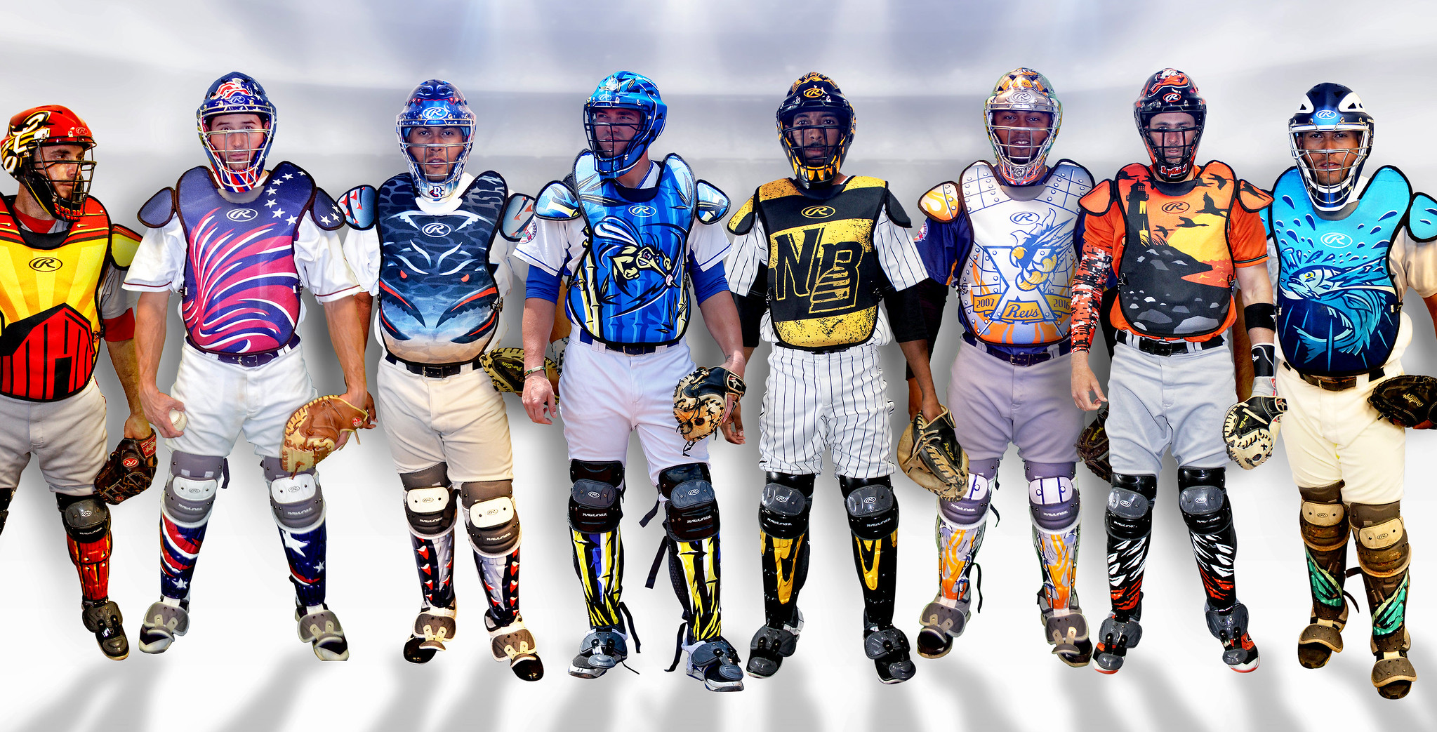
Photo by Skye Design Studios; click to enlarge
The catchers shown above play for the independent Atlantic League. As you can see, their masks, chest protectors, and shin guards feature team-themed designs (from left: Lancaster Barnstormers; Somerset Patriots; Southern Maryland Blue Crabs; Sugar Land Skeeters; New Britain Bees; York Revolution; Long Island Ducks; and Bridgeport Bluefish). It’s part of a new initiative by the Atlantic League and Rawlings to make catchers’ gear the next frontier of baseball graphics and design. Although it’s limited to the Atlantic League for now, they think it will spread all the way to the majors.
I was given an exclusive on this one. Full details in this ESPN piece, which went up yesterday afternoon.
The ESPN piece is a little light on the photos, but here’s a slideshow with lots of additional images (if you can’t see the slideshow below, click here):
Interestingly, it was about 10 months ago that reader Taj Tedro sent in a Photoshop mock-up of a Cardinals catcher wearing team-themed gear, which I linked to in the Ticker. Looks like Taj was ahead of the curve.
Click to enlarge
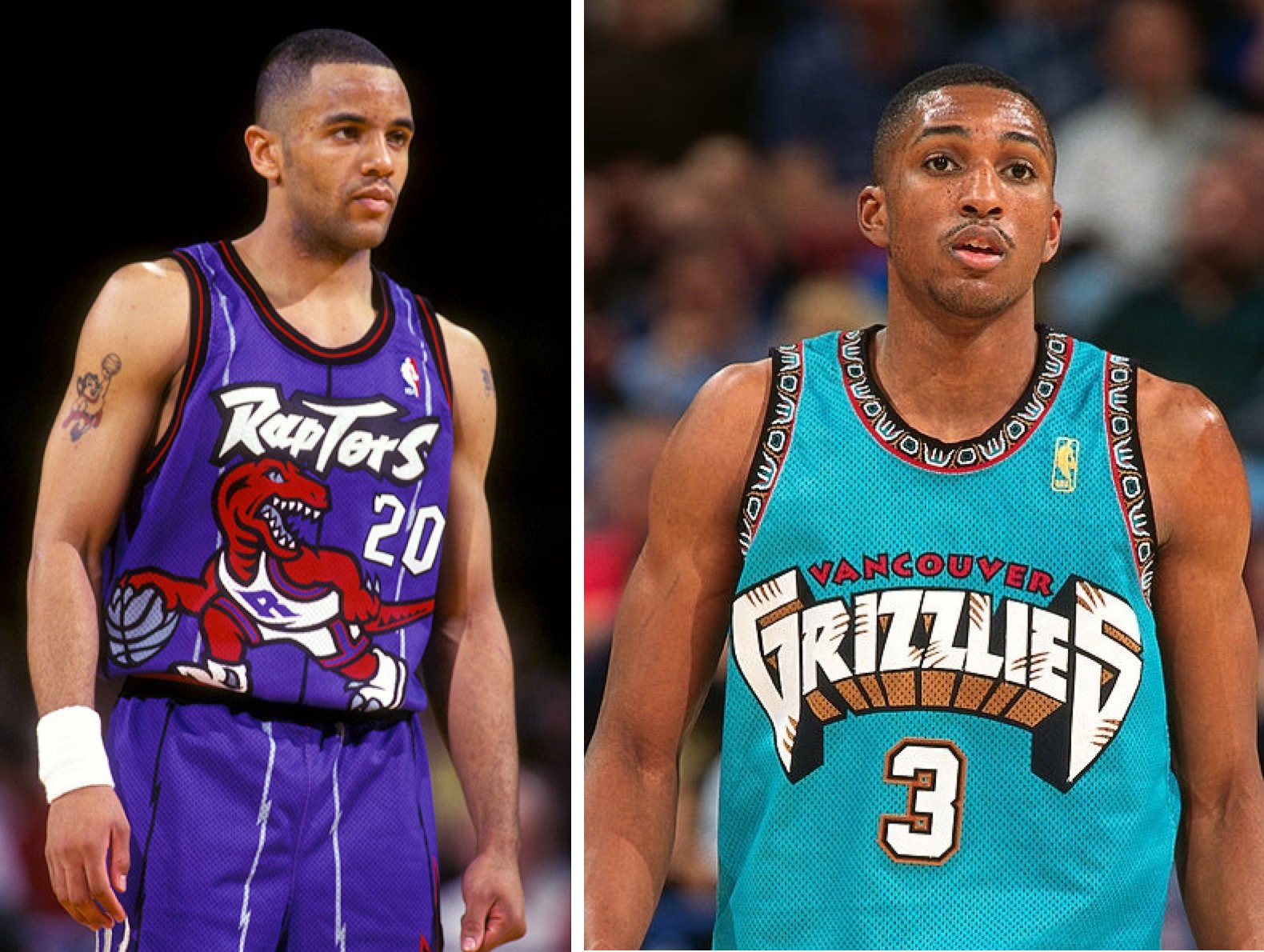
Friday Flashback: With purple and teal both back in the news lately, my weekly Friday Flashback column takes a look at how those two hues became the signature uniform colors of the 1990s (as exemplified by the Raptors and Grizzlies, shown above). Check it out here.

Click to enlarge
NFL Draft notes: Man, they really botched the kerning on Cardinals first-rounder Robert Nkemdiche’s NOB, eh? As several readers pointed out, we should probably just be happy that they spelled it correctly.
Other notes from last night’s festivities: The Falcons’ promo video for first-rounder Keanu Neal shows him wearing a new Falcons jersey design and a red helmet. Hmmmm. ”¦ Anyone know why the Bucs presented first-rounder Vernon Hargreaves with a white jersey, instead of their red jersey? ”¦ First overall pick Jared Goff already has a keen grasp of today’s douchebag-driven sports scene. He spent much of the night on Twitter, where he sold out to one corporate advertiser after another. Gross.
Traditionally speaking: Yesterday’s post about “sounding old” vs. “sounding young” led several readers to post comments in which they described themselves as “traditionalists.”
These readers may have been using “traditionalist” accurately ”” I don’t know the readers personally, so I can’t be sure ”” but the term is often misused.
Some people, for example, try to hang the “traditionalist” tag on me. But I am not a traditionalist; I am a classicist.
What’s the difference? This:
• A traditionalist, as the term implies, wants things to stay the same simply because of tradition. The idea is to keep things the way they are because that’s the way they’ve been and therefore that’s the way they should remain. Stability is self-validating.
• A classicist sees no reason for change as long as something is working. The classics are classics for a reason. Ain’t broke? Then no need to fix it. But if something is broken, or if it can be improved, then the classicist is usually fine with making changes.
Do traditionalists’ and classicists’ positions and opinions align? Often, yes (especially in the uni-verse, where most of the proposed changes have nothing to do with fixing or improving but are just change for change’s sake). But not always. And more importantly, their motivations for arriving at those positions frequently don’t align, because they’re working from two different sets of underlying values and premises.
Of course, classicism has its own limitations, which always makes me think of this John Cale song, “The Trouble with Classicists”:
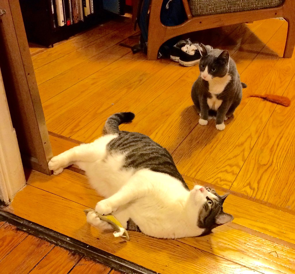
Photo taken Tuesday night; click to enlarge
Turn it up to 11: Tomorrow is a big day here at Uni Watch HQ, as Uni Watch mascots Tucker (foreground) and Caitlin will be turning 11 years old. There will be toys, treats, and catnip aplenty. But thanks to a certain someone’s travel schedule, the kitties already got a head start on the festivities:
I’m happy to report that T&C are healthy, happy, and still plenty frisky. They make my life better every single day, and I can’t even begin to express how much I love them. Happy birthday, buddies!
The Ticker
By Paul

’Skins Watch: There’s been more legal maneuvering regarding the ’Skins trademark issue. The team has asked the Supreme Court to review the case. Further info and a good analysis of the situation here (from Ryan Goldstein).

Baseball News: Mets OF Yoenis Cespedes’s neon compression sleeve is now being honored with a giveaway. ”¦ Now that personalized bat knob decals are kosher again, Chisox 3B Todd Frazier got himself a set (from Greg Sharp). ”¦ Blue Jays-style throwbacks on tap for the Buffalo Bisons (from Joseph Pitirri). ”¦ Tyler Maun notes that the World Baseball Classic caps have grey underbrims. “They also feel more like the old-school wool, which (I think) means they’re made by New Era in China instead of the Buffalo manufacturing facility.” ”¦ Not sure if it was a missing letter or a buttoning problem, but Brewers P Sam Freeman had some jersey insignia issues yesterday. ”¦ French heritage promotion for the New Hampshire Fisher Cats. “Instead of doing some sort of ‘Le Fisher Cats’ jersey, they’re hosting a Poutine Fest prior to the game and serving poutine during the game,” explains Brendon Browne. “I thought this was a more interesting way of doing a heritage night than wearing yet another themed jersey.” ”¦ Wilson is holding a design contest for the glove that will be used in the Legends and Celebrity Softball Game during the All-Star break. ”¦ Thieves stole a 14-foot-high mannequin of a Royals player from a billboard (thanks, Mike). ”¦ What’s worse than a pink jersey? a pink plaid jersey. That’s the Orix Buffaloes from last night. Wow.

NFL News: We all know Eli Manning was originally drafted by the Chargers, who then dealt his rights to the Giants. But why was he wearing a Cardinals lapel pin? (From Ronald Sayers.) ”¦ Packers CEO Mark Murphy says the team’s new Color Rash design will be revealed soon and will totally suck and won’t please traditionalists (from Jeff Ash). ”¦ Here’s a list of the most popular booze among fans of each NFL team. “The article is hilariously illustrated with photos of fans mostly drinking beers other than the ones that market research indicates is their favorite,” notes R. Scott Rogers. (And no, the most popular liquor among Washington fans is not “firewater,” surprisingly enough.) ”¦ The NFL has settled a lawsuit that had claimed that the league’s exclusive apparel license with Reebok was a violation of antitrust law (from Chris Bisbee). ”¦ New gold unis for Kansas Wesleyan (from James Westling).

Hockey News: If a uniform violates a league’s uni rules (not enough contrast, personal message written on the jersey, socks not worn properly, etc.), people will sometimes mistakenly refer to it as being “illegal.” But that’s not right, because something can’t be illegal unless it’s literally against the law. But it turns out that the Czech Republic’s jersey design for the World Cup is literally illegal under Czech law and must be changed (from Larry Lifrieri). ”¦ The Red Wings’ new arena will be named after a “pizza” chain. Here’s how the center ice will look.

NBA News: Here are some new details on the Kings’ upcoming uniform set. ”¦ Judging by a tweet from 76ers CEO Scott O’Neil, the team may be getting some newfangled unis when Nike takes over the league’s uniform contract in 2017 (from Michael Preston). ”¦ Here’s a baseball field in Oklahoma, of all places, that’s been mowed into a pattern of the Trail Blazers’ logo. ”¦ You’ve probably heard about the death of former Spirits of St. Louis owner Ozzie Silna, who struck a ridiculously lucrative deal with the NBA 40 years ago. But this obituary includes a neat uni-related detail: “He spent his career in a variety of embroidery, textile and photo-processing businesses. One of his companies, Action Embroidery, makes insignia for the military in Ontario, Calif. He was active in the company until two months ago” (from Adam Herbst). ”¦ Steph Curry is now a brand of heroin (thanks, Mike). ”¦ Also from Mike: Thunder players, led by Enes Kanter, enjoy Turkish food during road trips. Kanter is Muslim and observes Halal dietary laws. ”¦ Celtics G Isiah Thomas must have been wearing a Nike base layer under his jersey last night.

College Hoops News: We already knew that North Carolina’s new anti-LGBT law might lead the NBA to pull next season’s All-Star Game from Charlotte. Now it turns out that it might also cost the state some NCAA tournament games. ”¦ New centennial logo for Marquette. ”¦ Cool thrift store find by Eric Schmid, who scored this gold Boston College prototype set. It has Starter tags, which dates it to the mid-’90s, because that’s when Starter outfitted BC. “I can’t find any evidence of BC basketball wearing gold jerseys in the ’90s,” says Eric. “In fact, the earliest I’ve ever found them in gold is the 2006-07 season with Reebok. With that, and seeing how these tags match the early-’90s Starter jock tag design, I think Starter rendered this for BC as a new uni possibility for the 1994-95 season.”

Soccer News: At least one observer thinks Boca Juniors’ new jersey is perfect. ”¦ Here’s the story of how Real Salt Lake got their name and colors (from Landry Heaton). ”¦ Villareal has one of the weirdest number fonts I’ve ever seen (from @g847m).

Grab Bag: When I try to wrap my head about a big, abstract topic that starts with uniforms but extends into a larger rumination about culture, society, and so on — like yesterday’s entry about “sounding old” — that’s known in the media biz as a “think piece.” I’ve now added a “Think Pieces” category tag to the site and have applied that categorization to a bunch of our earlier think pieces, so now you can find them all in one place. I was just working from memory, trying to recall as many of the previous think pieces as I could (the sponsorship vs. advertising piece, the “What does it mean to be a critic?” piece, etc.), but I’m sure I missed a bunch. If you can remember any that aren’t included in the current batch, let me know and I’ll add the category tag as needed. ”¦ Did you know there’s a library at Harvard that protects the world’s rarest colors? It’s true! Fascinating stuff (big thanks to James Poisso). ”¦ New logo for Guinness — the beer (from Charlie Kranz). ”¦ The new logos for the 2020 Tokyo Olympics may have a secret message (from Chris Bisbee). ”¦ Mitchell & Ness is now the official outfitter of an Australian basketball league (from Richard Meloy). Came across this last night and it’s too good not to share:
I will never stop running pic.twitter.com/2XHRWkw3Mt
— Susie Cagle (@susie_c) October 8, 2015
Eli’s lapel pin actually has a black ribbon behind the Cardinals helmet. I’m assuming it was a Pat Tillman memorial gesture.
It was. link
I love how Peyton is wearing a DirecTv lapel pin in the picture of him and Eli (3rd pic on the page).
he’s such a sponsorship whore.
link
Here’s a pic of Big Ben with the same pic. Pat Tillman was killed on 4/22/04 and the draft was held a few days later.
Could be just me, but if I was a pitcher in the Atlantic League, and had to look at a melted box of crayons during every pitch, I’d get blow chow right there on the mound.
As a Rams fan who thinks they should have gotten Wentz instead of the local kid (or waited and gotten Conner Cook). This makes me hope he becomes Bradford 2.0 even more.
Goff is just reaping the benefits that come with being the highest profile player in the 2nd largest media market. No shame there.
“Reaping the benefits” and “engaging in shameful behavior” are not mutually exclusive actions.
You are basically saying that any and all behavior is self-justifying, and that there are no moral, ethical, or douche-y considerations to one’s behavior. “As long as you can do it, it’s OK.”
Uh, no.
Like I tried to say earlier in a comment below, I think this stunt was NFL-driven, because it was all NFL advertising partners that got their tails wagged by those tweets.
If it is true, as I suspect it is, then that’s just another heaping of corporate douchebaggery from a league already well known for it. Kid probably went along with it only because, hey, “free” goods and services.
While it comes as no surprise that the Red Wings would pick their corporate brethren (Mike Ilitch made his fortune on Little Caesar’s, after all), it is disappointing. But even more disappointing is the continued persistence of the “Hockeytown” logo long past its expiration date. That logo, with its jagged font, is a badly outdated relic of the 1990s, and it just needs to go.
I could not agree with you more. I was so happy when it was removed for the playoff games this month and was hoping it would be gone for good.
Indeed. It also seems to use a past version of the Red Wings logo as well; thicker, more rounded edges on the trim.
Seems like the Red Wings center ice should look more like this: link
I’m disappointed its not Little Caesar’s Palace
Well, there is the little matter of that building in Auburn Hills…
In the Anglo-American positivist tradition, legality is not limited to statutes. A statutory law is just a particular kind of rule, and a rule is any behavior that is required or prohibited by an authority with the power to punish disobedience. So within the context of playing a sport, “illegal” is an entirely accurate and appropriate description of rules violations. There’s a reason that when Americans and Britons formalized many sports rules in the 1800, they titled their documents “The Laws of [name of sport],” including the just-auctioned “Laws of Baseball” document.
The Czech jersey crest was legal in the sport of hockey, but illegal in the polity of the Czech Republic. Which is not all that uncommon – most of the contact in contact sports (checks in hockey, tackles in football, punches in boxing, etc.) are legal under the rules of the sport but are ordinarily regarded as serious criminal offenses under the laws of the state.
also, fyi, in soccer, the official “rule” book is called “Laws” of the game link
I agree. “Illegal Procedure” and “Illegal Defense” are commonly used, official terms; they’re not wrong. Merriam-Webster, I think rightly, has “not sanctioned by official rules (as in a game)” as the second definition of “illegal”.
New Hampshire Fisher Cats, not Hamilton.
Fixed.
“The Falcons’ promo video for first-rounder Keanu Neal shows him wearing a new Falcons jersey design and a red helmet. Hmmmm”
Helmet is red, which would also be a departure from the current uniform. Perhaps the Falcons will have new uniforms in 2017 to coincide with the opening of their new stadium.
Falcons going to a red helmet/black jersey would be a step in the right direction and certainly a marked improvement over their current abominations.
It would probably be too much to hope that they would change that goofy-ass logo as well…
“They also feel more like the old-school wool, which (I think) means they’re made by New Era in China instead of the Buffalo manufacturing facility.” It’s the opposite. I’ve been working in a sport shop for a decade and I can tell you that when the hats are made in China, they feel more synthetic and less like wool.
“With purple and teal both back in the news lately, my weekly Friday Flashback column takes a look at how those two hues became the signature uniform colors of the 1990s”
The Solo Jazz cup perfectly reflected the design aesthetics of the era.
The catcher gear reminds me of the turn-ahead-the-clock jerseys.
You’re too kind; I’m getting a distinct roller hockey vibe. Those things are as putrid as a durian in a dumpster behind a supermarket in July.
I like the shinguards. I like nothing about those chest protector designs. Much too busy.
Anyone know why the Bucs presented first-rounder Vernon Hargreaves with a white jersey, instead of their orange jersey?
Because they don’t have an orange jersey anymore, obviously. As for why they didn’t use the red jersey, I have no idea. Maybe they’re planning on doing the whole white-at-home thing that teams in warm weather do a lot.
Yeah, sorry, meant to say red. Will change text.
The Bucs gave Winston a white jersey last year too.
Tell me the Goff thing is just a joke, right? That is like a Saturday Night Live skit. “I’m going to put on my Citizen eco-drive watch to go out to Club Wild on 45th and Main in my new Ford F150 Platinum Edition pickup with my date from FarmersOnly.com.”
Right? It’s Idiocracy come to life. Total fucking douchebags.
Jared Goff makes me want to puke more than Ipecacâ„¢ brand emetic! Ask for it in stores!
Surprised Subway didn’t pick him up to fill the void left by RG3
All of those companies are NFL advertising partners. I suspect those tweets were league-driven.
Douchebaggery all around!
All of the companies Goff tweeted, that is.
You know what’s going to happen with that graphic catcher’s gear, right? Ad space.
Green chest protectors like those green screens behind home plate, so rotating ads can be superimposed on ’em for the viewing pleasure of the teevee audience.
And now I’m gonna go punch myself in the face for having had such a despicable thought …
So when it comes to the catcher’s gear graphics, my concern wouldn’t be distracting the pitchers from their target. It would be:
Will the pitcher lose the ball on potential comebackers?
There’s a reason no team uses white catcher’s gear. And there’s also a reason not many have experimented with light grey beyond Carlos Hernandez of the Padres in the late ’90s (link).
If I’m a pitcher, and I’m throwing upwards of 100 MPH, with a line drive or a hard ground ball coming back at me at 115 MPH, and the graphic on a chest protector makes me react even one millisecond slower, it could be the difference between making a play and not…or life and death.
Um…
link
link
link
I could go on.
Not MLB, but the UVA catcher wore some white gear in the CWS a few years back: link
Again, I said “not many have experimented with light grey,” because yes, obviously the use of grey has become more commonplace this decade, but Hernandez seemed to used a much lighter shade of grey. Not to mention, it wasn’t broken up by any contrasting panels. I know I’m not the only one who found the use of that gear jarring back in the ’90s.
The Cubs picture you linked to uses white in the smallest possible way, and no team uses white as a base color.
So again, I guess I will pose the question as to elicit an actual response: Let’s say Yadier Molina wore the chest protector that was mocked up on Twitter, you don’t see the creating a problem for the pitcher on a comebacker? Or even a centerfield who might lose a split second in picking up the ball off the bat?
Good question. Don’t know! I’m sure they’d test it.
I know for a fact that the Atlantic League did a lot of testing on these designs. They used pitches and middle infielders; not sure if they used centerfielders. The response was 100% “no problem.”
Todd Frazier had personalized bat knob decals last year with the Reds. Last week I was in the Reds Authentics Store @ GABP and noticed they have several of his broken bats from last season for sale…each of which has a red and white Flava Fraz knob decal.
The Cowboys’ 70 shades of blue are “working.”
Great example. Traditionalist would say, “Don’t change the shades of blue — it’s our tradition!”
Classicist would say (and I am hereby saying), “It’s a good-looking uniform, but it’d look even better if you standardized the various shades of blue. Fix that!”
The different silvers are a bigger issue IMO. I wouldn’t mind if they’d keep all variant the blues, but standardize the silver to the one used on the pants worn with white jerseys.
A few things that I would consider “think pieces” that I didn’t see included in the tag:
link
link
link
link
link
link
Thanks, Andrew. I’ll add the tag to those entries.
The crotchety old man in me was all ready to hate the enhanced catcher’s gear, but I…actually like it (?) At least they’re not plastered with ads (yet!).
And on another note, I’m still calling it ‘Joe Louis Arena’
I’m still calling it the Olympia
Same experience here! The Atlantic League catching gear is exactly the sort of thing that usually makes me throw up my hands and bemoan the ongoing collapse of society’s taste and standards. And as a matter of theory, I still don’t like the idea of yet more individually expressive gear taking the place of what’s supposed to be, um uniform uniforms among all players on a team. But heck with it, most of those designs look good. And catchers wear so much protective gear that they already look more like hockey goalies than like baseball infielders, so no real harm done.
How long before February brings a daily drip of MLB teams tweeting photos of the new season’s catcher’s gear, as NHL teams do with goalie masks? I’ll put my money on 2018.
How long before February brings a daily drip of MLB teams tweeting photos of the new season’s catcher’s gear, as NHL teams do with goalie masks? I’ll put my money on 2018.
I think this is a very fair prediction.
The one place where the goalie/catcher comparison breaks down is that hockey goalies tend to be among the most (if not simply THE most, period) important players on their respective teams, while many catchers are journeyman .240 hitters. I think it will be much harder to create a cult of personality around the average catcher than it is around the average goalie.
Excellent point. But it looks like the Atlantic League’s model sort of anticipates that. These are essentially team designs, not player designs, yes? So more like an actual uniform, and more about the team than the player. There will always be a couple of star catchers employed by teams who aren’t smart enough to realize that any catcher capable of hitting over .265 is worth more to the team playing every day at literally any other position than he is playing catcher, no matter how good his defensive skills are behind the plate. So those guys may have their own personal gear and the team and fans will make a big deal of it.
But mostly, fans like me will regard the late-winter catcher’s-gear reveal as a milestone on the countdown to Spring Training. Not because I’m all hot under the collar for Kurt Suzuki, but because I’m anxious to see what the Twins as a team will be wearing this year. (Though maybe not the truest of statements: I like Suzuki a lot, and have always followed his career, whereas I dread finding out what fresh uni-hell the Twins are unleashing on us in a given year.)
These are essentially team designs, not player designs, yes?
Yes, but there are lots of reasons for the Atlantic League to use team-themed designs instead of player-themed. For one thing, their players are not well-known — they’re not name commodities. For another, players tend to cycle thru minor league rosters quickly, so it wouldn’t make sense to invest in custom gear for a player who probably won’t even be with the team for very long, especially since the customization is expensive. All of these factors led the league to go for team-based designs.
But at the big league level, fans really to respond personal designs. I’ve seen this myself in the response to bat knob decals, e.g. Moreover, as noted in my ESPN piece, Wilson holds the license for team logos on catching gear, so any non-Wilson catcher who wanted custom-designed gear would have to go with a non-team design anyway.
So if this idea makes it to the bigs, I think we’ll see player-oriented designs. But I don’t think it’ll be as much of a “thing” with fans in the same way that custom goalie gear is, because so many catchers are journeymen.
The Friday Flashback is up:
link
You omitted a little-known entry. The St. Louis Stallions were to be a new NFL expansion team in 1993 (instead it went to Jacksonville and Charlotte) and the proposed color scheme was…
Purple. Just google it.
Ah, good one — I forgot about that!
My guess on the Sam Freeman lettering, is that the seamster/seamstress didn’t complete the stitching on that portion. They often use an adhesive to temporarily hold the lettering in place for the stitching, and at casual glance looks OK, but it’s just a matter of time before it falls off. Chalk it up to poor QC, as it has happened to my baseball team’s jerseys.
I forgot to grab the screen caps, but there was some good uniform-related stuff on last night’s episode of “The Odd Couple”. (Side note: this new version of my all-time favourite television show is much better this season that it was in its uneven first season. And Tom Lennon, who plays Felix, is a national treasure.)
In one scene, Oscar and his father (played by Garry Marshall, who adapted “The Odd Couple” for television in the first place) are watching a baseball game between the Mets and the Marlins on television. Someone on that show obviously digs traditional uniforms, because Matt Harvey is shown in the white home jersey, and the Marlins are shown wearing their grey road jerseys.
The plot of last night’s episode had Oscar throwing out the first ball at a Met game. He was wearing a home jersey with no. 4 and “Madison” on the back. A regular character in the show is Murph (full name Marcus Murphy), an ex-Major Leaguer. He is shown wearing a no. 11 jersey with “Murph” — not “Murphy” — on the back.
Also, Mr. Met, wearing his traditional no. 00, plays a big role in the episode.
How the hell did Garry Marshall play Jack Klugman’s father?
Jack Klugman, being departed, is not available for the current version of “The Odd Couple”. Oscar is played by Matthew Perry. His performance was not so good last season; but he, like everything about this show, has improved tremendously in its second season.
Garry Marshall is a consultant, and is very hands-on with the scripts. This is his first appearance in the series.
I did not know there was a new version of the show.
Tom Lennon, who plays Felix, is a national treasure.
Beloved in our household because of The State and Reno 911!
I could not help but check out the list of most popular booze of NFL fans. Never knew about a liquor named “Fireball.” Sounds like something made in someones bathtub.
Its definitely not a sipping whiskey.
I tell you what though, if you’re having a bunch of people over to get silly, its the perfect drink for shooters. A 21st century version of peach schnapps.
I was all set to make a smug joke about fans of a bunch of teams I don’t like being Fireball drinkers when I sent the link to Paul, but then I saw the results for the Vikings and hung my head in shame. There are so many not-terrible flavored whiskies these days that there’s just no excuse for Fireball. Plus, they actually still make and sell peach schnapps.
According to Nielsen’s market research, I ought to be a Bears or Steelers fan. So, um, go Steelers! and pass me some of what you’re having.
Come out to Denver where a nonconformist is pouring local microbrew and Old Grand Dad.
Fireball is not intended to be a “good” whiskey. It’s intended to be something you do shots of when you’re not in the mood for lemon drops or tequila. I was a huge fan of fireball candy when I was a kid, and I’m not ashamed to admit that I’ve been hammered on Fireball shots more than once. I felt like crap the next day, but not nearly as bad as I’d feel after a night of indulging in shot of schnapps, peach or otherwise.
That’s kind of my point. There are great whiskeys out there, but Fireball is for those moments when you’re drinking shots in a parking lot and yelling after every shot.
Found it odd that most of the beers were mass-market, but many liquors were higher up the shelf, like Grey Goose, Ketel One, Patron or Hennessy.
“Together, they tracked the most popular beer and alcohol brands for all 32 NFL fan bases by looking at engagement across social media to see which brands were most talked about in each region.”
And apparently Bears fans talk about…
Evan Williams bourbon?
It isn’t nearly as bad as some (looking at you Ancient Age) and it is affordable.
I’m not commenting on the quality. Quite honestly, I’ve never tried it and I can’t recall ever seeing/hearing about it aside from the times I’ve noticed it on the shelves of liquor stores and bars.
So basically, I’m just puzzled that, as a Bears fan, I’m not familiar with the fanbase’s liquor of choice.
I can’t believe they listed Miller Lite as the Buffalo Bills’ preferred beer. Buffalo is more of a Labatt town, generally speaking. Hell, Labatt’s US headquarters is there.
Hi Paul. Thanks for grouping together the “think” pieces. I love the daily content, but especially enjoy features like the one you posted yesterday. It’s always nice to have your thoughts provoked!
Happy birthday to your kitties, btw (or in this case is it more appropriately, “kiddies”)!
Glaring omission from Friday Flashback: 1991 renovations to Madison Square Garden, which replaced the old blue, red, green and yellow seats with purple and teal.
link
Good one! It hadn’t occurred to me to include stadium/arena design. But you’re right!!
What? I’ll be making my first trip to MSG on Sunday and those are the colors I’ll be seeing?
As of the most recent renovation, link.
that’s a relief.
Though, if you really wanted to, I’m sure you could find someone selling one of the old purple or teal seats as a “collectible”…
-Not at all meant as a defense of Goff or the concept itself, but considering all those sponsors are NFL-wide, I think whoever was picked first would have sent out the exact same tweets.
-Like a couple of others have said, my gut reaction is telling me I should hate that catching gear, but I don’t. I actually think it would be cool to see in MLB, maybe with some underused secondary or tertiary logo represented. (I’m picturing Yankees catcher gear with the little used Yankee “catcher-man” logo.) Of course it would probably lead to add eventually, which would suck.
They’re not sponsors; they’re advertisers.
link
The fact that others might have behaved just as douche-ily doesn’t make Goff’s behavior any less douche-y.
No, it doesn’t excuse it. The whole thing is a sad commentary on the state of affairs, though, when you break it down.
Basically, it amounts to his getting “free” stuff in exchange for his tagging them in social media. The tail wagging the dog so the dog could wag the tail right back. It is pretty sickening.
It’s not just HIM getting the free stuff — there’s also the tweet of his sister and mom wearing certain clothing. And it’s not like he or his family actually need any free stuff — he’s about to sign a contract that will make him a gazillionaire. The whole thing is gross.
Idiocracy, Idiocracy, Idiocracy.
Well, at least it’s not the point where Fuddrucker’s has been corrupted to… you know….
The Canadian Football League set to unveil new duds for all nine teams on May 12, marking the change of partnership supplier to Adidas from Reebok.
link
That’s funny. I’ve been checking out Boca jerseys online over the last week looking for uni news and didn’t see nothing and boom there it is. Thanks for the contribution, but, assuming this is legit, it just isn’t Boca. It’s like The Dodgers changing from Dodger Blue to Navy Blue. Sacrilege!
I think it’s a third/alternate jersey. Thank God!
link
Boca’s president says that the black kit is not going to used and that he doesn’t like finding out (about a black kit) from the newspaper.
link
“No se va a usar la camiseta negra, no me gusta enterarme por los diarios”.
Seeing those catchers’ equipment – One of those things that you see and instantly wonder how on earth did this not happen sooner? Designs aren’t great, but the club branding opportunities beyond mere colour coordination seems obvious once you see it.
Someone mentioned why fathers never wear white gear – I just assumed it’s an issue of looking crappy once it gets dirty, which is inevitable.
Worried about contrast? Perhaps we’ll see a return of the bright orange accented catcher’s glove: link
Technically, the current Hornets are still the same Hornets. As part of their deal with the NBA when the team changed its name from the Bobcats back to the Hornets, the franchise reclaimed its history and stats of the 1988-2002 Hornets and retained its history and stats of the 2004-2014 Bobcats. The period between the original Hornets departure and the Bobcats creation is officially designated as “operations suspended”.
So, like the Cleveland Browns?
“the franchise reclaimed its history and stats of the 1988-2002 Hornets”
I don’t think a team can “reclaim” something it never accomplished. It would be like the New York Mets calling themselves the Giants and “reclaiming” the accomplishments of the 1883-1957 New York Giants. It’s a different franchise despite whatever legerdemain the league allows the owners to use so that they can pretend to have past glories.
Yes, you can “re-claim” your team’s history. If you search for Charlotte Hornets franchise records, their stats include those include the current Hornets (2015-current), the Charlotte Bobcats (2004-2014), as well as the original Charlotte Hornets (1988-2002). That was part of the agreement between Charlotte and the NBA. All of the history and records of the Hornets that occurred in New Orleans falls under the New Orleans Pelicans.
That was part of the agreement when the NFL allowed Modell to move the Browns to Baltimore in 1996. Cleveland’s team history, colors and records would stay in Cleveland. Baltimore was technically an expansion team with no history when they started play in 1996. They also could not use brown or orange in their unis.
Lastly, if I’m not mistaken, the history of the Oklahoma City Thunder does not include any of the history and records of the Seattle Supersonics. Those accomplishments will stay in Seattle until they receive another franchise.