There’s a guy out there named Skye who has a popular Twitter feed called @Uniformswag. You may recall that I interviewed him three years ago. In Skye’s Twitter profile, he describes himself as, “The official source for all of your uniform news and information.”
That’s silly, of course — there is no “official” source of uniform news. But I don’t blame Skye for using that term, because it’s fun to call something “official.” I’ve done it myself, like when I recently declared that Nueske’s is “the Official Smoked Meat Purveyor of Uni Watch.”
I’ve been thinking a lot about “official” lately, especially as it relates to design. What is it about an ornate border, or an embossed seal, or an embroidered patch, that exudes such a sense of authority, and why do we find such things so compelling?
I was apparently thinking about this stuff even when I was a kid. In this 2014 article about the design of various types of membership cards, I described an early membership card from my childhood and then wrote, “In short, the card looked and felt very official, and that had immense appeal to me, because there aren’t many chances for a child to feel official.”
I remember another time from my childhood when I got to feel official: When I got my first Little League uniform. I suspect many of you felt the same way (and if you were in the Boy Scouts or Girl Scouts, you probably felt similarly about your first scouting uniform), because uniforms are very official. They connote status and authority, which I think is a big part of why we like them.
“Official” isn’t just an adjective, of course — it can also be a noun. The guys in the zebra-striped shirts are officials, and then there are governmental officials, church officials, administrative officials, and so on, all of whom have their own status and authority.
“Official” has the same root word as “officer” (they’re both derived from the Latin officium, which means “performance of a task”). The most common uses of “officer” refer to police officers and military officers. You could say that these officers are official and they are officials. They also wear uniforms to convey their status and authority. See how this all ties together?
———
We interact with official things every day. Our driver’s licenses and passports are official identification documents. Our mail carries official postage, which is then marked with official cancellation stamps, and is delivered by an official letter carrier (who wears a uniform). Our coins and currency are official legal tender. Most of these items tend to be designed in such a way as to communicate formality and authority — that’s part of how we know they’re official.
Things that are official don’t just get to be that way — their official status has to be conferred by a higher authority. When I got out of college, my first job was for a legal publisher that bid against other companies to publish the officially certified versions of various state laws — the South Carolina penal code, say, or the Ohio criminal code. The texts of these laws are in the public domain, so anyone can publish them, but only one version is officially certified by state proofreaders to be accurate, and only the officially certified version has any legal credibility. (Or at least that’s how it worked in 1986. I imagine the internet has changed a lot of this.)
So in that example, the state proofreaders were the higher authority. But you can go a lot higher than that. If you happen to be religious, you might say that when Moses brought the stone tablets down from Mt. Sinai, he was carrying the world’s first official documents, with their official status conferred by none other than God himself. Now that’s official.
———
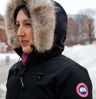
If you live in a cold-weather town, you’re probably familiar with Canada Goose jackets, which have that distinctive patch on the sleeve or chest. When I first started seeing people wearing the patch-clad jackets here in NYC a few winters ago, I’d never heard of Canada Goose and had no idea that the patch was essentially a maker’s mark. Instead, I was thinking to myself, “Who are all these people, and what organization do they belong to?” It seemed uni-related, so eventually I approached someone wearing one of the jackets and asked about his patch, and that’s how I learned that the whole thing was just a branding exercise.
Nowadays, even though I know better, the Canada Goose patches still look very, well, official. Whenever I see people wearing them, the part of my brain that responds to uni-related imagery sort of perks up — the patch pushes my buttons. That’s the power of something that looks and feels official.
I’ve tried to draw upon that power myself with the Uni Watch T-Shirt Club. The sleeve patch graphic we used for last year’s designs and the jock tag we’re using this year both convey a sense of being official. That wasn’t my specific intention when I decided to use those graphics — it’s not like I sat around saying, “Hmmm, what can we do to make the shirts feel more official?” It just instinctively felt like a good thing to do, and I think many of you instinctively like the feel of it. That’s part of the appeal and allure of official.
About a year ago someone tried to piggyback on that appeal, or maybe just satirize it, by launching a Kickstarter campaign to produce a knockoff of the Canada Goose patch. The idea was that you could put the knockoff patch on your jacket and everyone would think you were cool unless they looked closely and noticed that you weren’t wearing the official patch.
The Canada Goose people apparently got that project shut down, but the faux patch raises interesting questions about what is or isn’t official. Some people, I’m sure, would be happy with the faux patch; I’m also sure there are others who’d insist on the real thing, the official patch.
This strikes me as being very similar to the situation with cheap Chinese counterfeit jerseys. I know many of you out there will only buy the Chinese knockoffs because they’re easier on your budget, while others among you insist on buying licensed replicas or authentics because you want the official jersey.
As you know, I don’t buy retail jerseys myself, so what I’m about to say here is something of a projection, but here goes: I think it’s intuitively implicit that if you buy an official jersey, you also think you’re buying the official status that comes with it. In other words, if you’re the kind of person who buys an official jersey instead of a Chinese knockoff, you’re probably doing it in part because you think the official jersey makes you more official. I can relate to that impulse, but I don’t think being official is something you can buy. It’s something that has to be conferred upon you (usually by someone who’s — of course — official). That’s why it felt so good to get your first Little League or scouting uniform — that made you official. But buying something official doesn’t make you official. That doesn’t mean you shouldn’t buy it; I just think it’s good to be realistic about what such a purchase does and doesn’t mean.
Somewhat relatedly: We expect official things to look and feel high-quality, not cheap. When it comes to uniforms, that means we want things to be sewn or embroidered, not heat-pressed or sublimated — not just because sewing and embroidery is more aesthetically pleasing, but because they seem more official. As more and more uniform patches have changed from embroidered to Chromaflex, many people have complained to me that the Chromaflex patches seem cheap and cheesy. That’s an interesting response, because Chromaflex patches actually cost more to manufacture than cloth ones, but people are still used to cloth patches and tend to think Chromaflex looks and feels synthetic — and hence not very official. (Hmmmm, would Canada Goose jackets have the same cachet if their patches were Chromaflex?)
This basic construct of something needing to be of high quality if it’s going to be official is something I can relate to. Check out this Facebook entry I posted last September, and note my wording at the end of the first paragraph:
I'm proud to be a card-carrying ACLU member, but for years their membership cards have really sucked. They used this…
Posted by Paul Lukas on Wednesday, September 16, 2015
I’ve rambled a bit here, because “official” is a big, sprawling topic and I’m still figuring out how to get my arms around it. But it’s an intriguing subject — one that I’d like to keep exploring — and it definitely has a lot to do with uniforms.
Discuss.
Click to enlarge
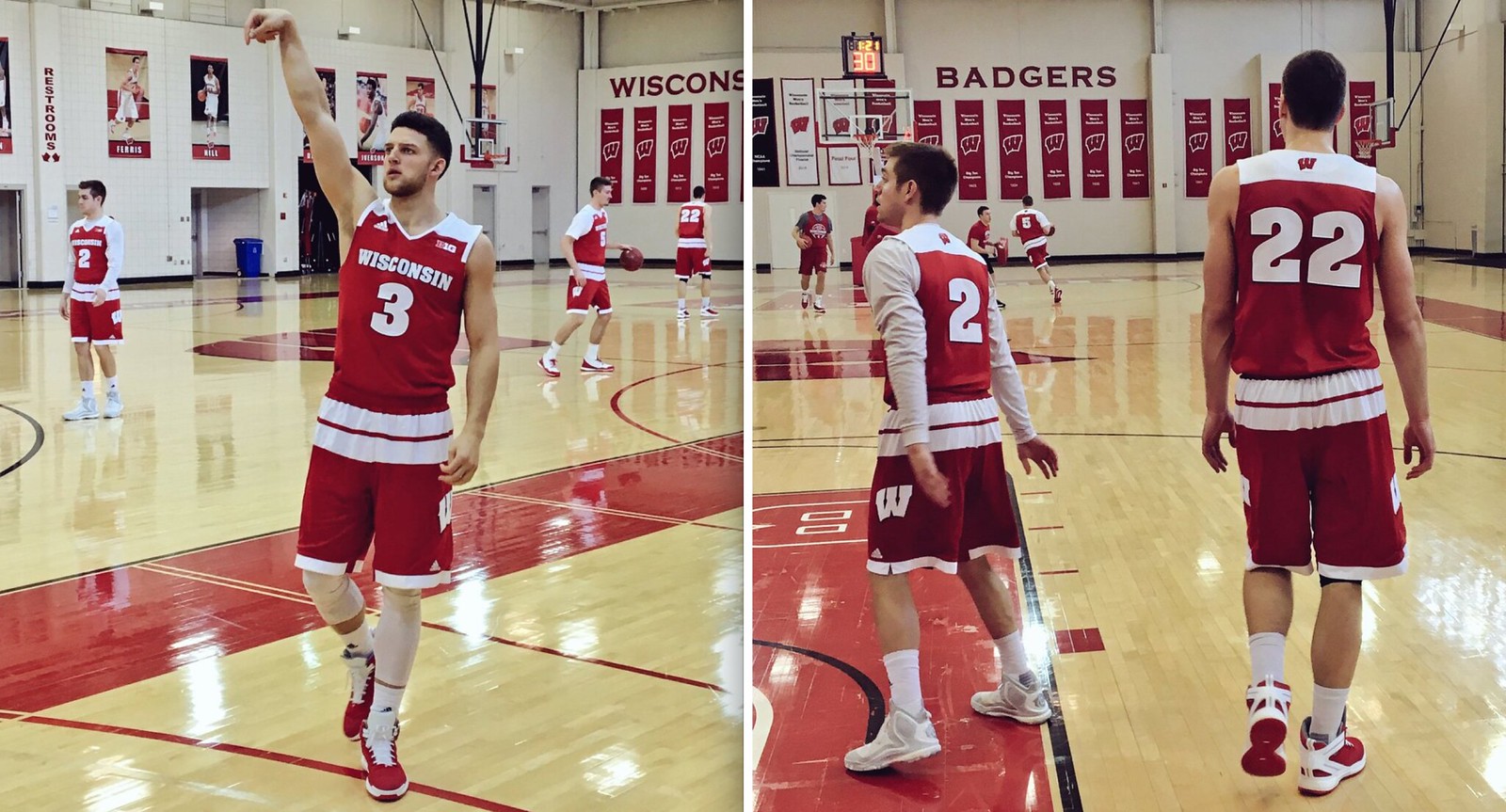
No wonder Bo Ryan quit: As you may recall, Wisconsin wasn’t included in last week’s unveiling of Adidas’s March Madness unis, which we figured was because the Badgers are switching to Under Armour this summer. That seemed like a narrow escape for Wisconsin, but not so fast! It turns out ’Sconnie is getting the full Adidas uni treatment after all, and holy moly does it look like shite (see above).
It’s tempting to say this must be Adidas’s parting shot at Bucky, except most of the company’s other March unis are just as bad.
LAST CALL for the Lions-redesign contest: As most of you are probably aware by now, I’ve been accepting entries for an ESPN contest to redesign the Detroit Lions. Today is the last day to enter. Full details here.
Speaking of football design concepts, you may have noticed a new ad in our right-hand sidebar, for SportsTemplates.net. I’ll have more to say about the site and its founder soon.
The Ticker
By Paul

Baseball News: Last week we linked to a story about a family that found super-valuable Ty Cobb baseball cards in their great-grandfather’s house. Here’s a follow-up article about finding similar treasures in the attic. … Here’s a piece comparing the names of minor league hockey and baseball teams (from Jason Getz). … Yesterday was former Bosox OF Jim Rice’s birthday, and someone marked the occasion by tweeting a photo of him wearing a phantom 1986 World Champions shirt (good spot by Jay Wright). … The San Jose Giants will wear “San Bernardino Strong” jerseys on April 15 and gold-trimmed championship jerseys the day after that. … Very nice striped stirrups for Northern Colorado (from @CamP8506). … The Braves and Marlins will be play each other on July 3 at Fort Bragg. The location and the date appear to be MLB’s latest attempt to conflate patriotism with the military, and I think it’s a safe bet that the uniforms will be a disaster. … Here’s something I didn’t know: The Giants had pillbox caps but never wore them on the field. … Check it out: orange vs. burnt orange! … Friday the 13th jerseys upcoming for the Fresno Grizzlies (from Jared Colville). … Check it out: J. Edgar Hoover in an FBI baseball cap. … South Alabama’s American flag sleeve patch is facing the wrong way.

NFL News: One of the more interesting factoids to emerge in the wake of Peyton Manning’s retirement came from Washington QB Kirk Cousins, who revealed that he imitated Manning when choosing his facemask design back in high school and has kept that same design ever since. … Remember when the Browns’ coaches wore plaid pants? Right, me neither, but it’s a pretty wild look (from @dawgpounddaily).
College Football News: Boise State’s QBs have added silver helmet stripes for spring practice. They did this last year, too — it’s so the coaches can assess where the QBs are looking as they make their reads. … Whoa, check this out: The 1964 Liberty Bowl, featuring Utah vs. WVU, was played indoors at the Atlantic City Convention Hall. “First bowl game played indoors,” says Miles, who didn’t give his last name. “It was on natural grass laid on top of burlap. They brought in lights to grow the grass. Field was shrunk to eight-yard end zones.”

Hockey News: NHL/MLB crossover in St. Looey, as Blues D Alex Pietrangelo was wearing a Blues cap in Cardinals colors (from Bryce Fearday). … New “Maple Leafs-themed” jerseys for the Orlando Solar Bears. I put that in quotes because the jerseys don’t look very Leafs-themed to me. … New Donkey Kong-themed mask for Ducks goalie John Gibson (from Chris Cruz). … “For Tuesday night’s Islanders/Penguins game, NBCSN changed the score bug black and used the Isles’ alternate logo from the black jersey,” says John Muir. “I’m not a fan of the black alts, but this is some nice attention to detail.” … The Sabres wore white at home last night. … Here are the teams for next season’s outdoor games (from @Farms9). … Check out the awesome logo used by the Minnesota women’s team. Unusual number placement, too (from Ryan Connelly).

Basketball News: Here are five NBA team logos redesigned as soccer crests (from Derek Buchheit). … Here’s a look at all of the ACC’s court designs (from @ACC_Tracker). … NC State’s March Madness uni has a little sublimated “Wolfpack” wordmark — but it’s two words instead of one, which is wrong (from James Gilbert). … More Iowa high school basketball observations from Jesse Gavin: Pella and Perry both use the same Purdue-style “P” logo on their shorts; Spirit Lake’s uniforms are extremely no-frills (here’s a rear view); Des Moines Christian has its school name printed up the sides of its shorts; you don’t often see a game between two teams that both have lettering above and below the chest number; and it’s a little hard to see, but Cascade’s armholes aren’t rounded — they come to a point at the bottom. “Not sure I’ve seen that before,” says Jesse, and neither have I.

Soccer News: Real Madrid’s Gareth Bale cuts holes in his socks to relieve pressure on his injury-prone calves (from @yellawkt). … Fara Williams, who plays on England’s women’s national team, is being saluted with a collar inscription for her 150th game. … Afghanistan’s new national soccer uni set includes a hijab (from Leland Orten). … FC Kansas City — that’s a women’s team in the NWSL — has a new jersey advertiser: Domino’s Pizza (from Griffin Smith). … Tottenham and Nike are moving closer to a massive kit deal (from John Muir).

Grab Bag: This is pretty awesome: A professional photographer shot a bunch of Daytona 500 pics on super-expired 35mm film, and the results are spectacular. … New uniforms for the Australian Olympic sailing team (from Graham Clayton). … Very interesting article on the latest generation of Chuck Taylors. Recommended (from John Gogarty). … New uniforms for the USA Olympic gymnastics team (thanks, Phil). … Those gymnastics unis are from Under Armour, which unveiled lots of new uniforms at a worldwide media day event yesterday (Phil again). … Here are the car designs for the Firestone Grand Prix of St. Petersburg (from Tim Dunn). … Here’s a cake shaped like NASCAR driver Denny Hamlin’s firesuit. Also: Hamlin’s website includes a page that describes where each advertiser patch is on his firesuit (both of those from David Firestone). … New lacrosse uniforms for Bryant (from Griffin Smith). … New athletics logos for Elon. … New tourism logo and slogan for Pennsylvania, and both are embarrassingly bad (blame Andrew Rader).
The Blues hat Petro’s wearing is part of a giveaway coming up. Odd, not many times you see a player wearing a (likely) cheaply made hat. Probably was either forced to promote it or maybe he just didn’t care and wanted to show support for the Cardinals. Lots of players in STL are extremely close to the other sports teams players. Probably like that in most mid-market teams.
Pursue your proofreading: “to relieve pressure on his injury-prone calfs” calves, right?
Tagging issues for the Aussie sailing team
Somehow I thought it was “calves” for the animals but “calfs” for the body part. But I was wrong — now fixed.
Paul, I’m a longtime reader but have become far too busy to read every day. I’m really glad I did this morning, though. Great stuff.
Glad you liked, Alan — thanks!
So. Alabama flag patch. Wrong?
Depends who you ask. Here is a an article about why the Boy Scouts (for intance) flag patch is placed the same as So. Alabama (and not like the US military).
In short, an organization can choose how it is placed.
link
Browns coaches in plaid pants…..
And the others are sporting white pants with white belts!
How “Herb Tarlek” can you get??
Thought I was having deja vu… this pic was in yesterday’s ticker too.
Interesting to me, but it appears there were no goalposts for the 1964 Liberty Bowl. Or maybe they were just using one endzone, and the uprights are just out of the frame to the left? I couldn’t imagine a game without field goals (although I could see assuming extra points), but damned if I can find any evidence of them.
If you scroll down on this page to an article from 1964, it says the Utes were up 3-0 after the 1st quarter, so there must be goalposts on the side the picture was taken.
link
Actually, looks like the goalposts were just incredibly short and lost in the background on the linked picture. You can make them out in this one:
link
Google image search “1964 liberty bowl convention center” for additional angles. 1969 Boardwalk Bowl also shows up with the same set-up.
Not to be a stickler…but that isn’t Danville with the pointed arm holes…it is Cascade. I only know because I live 15 minutes from Danville.
Thanks. Fixed.
The matching plaid collars on the polo’s are equally impressive on the browns coaches. Well done
So thoser Daytona pictures have a late 70s/early 80s vibe to them.
The standalone item about the Islanders wearing black last night toward the end of the hockey section of the ticker is redundant to the item earlier in the section about NBCSN changing their score bug to match the Isles’ black unis in last night’s game.
You’re right. Second mention now deleted.
“The Giants had pillbox caps back in ’76 but never wore them on the field.” – The Tweet says 1980 and Vida Blue wasn’t a Giant until ’78, so it wasn’t ’76.
My bad. I assumed it was ’76 because that was the big pillbox year. My fault for not reading carefully. Now fixed.
So I’m assuming the Giants had a supply of pillbox hats from 1976, and either the team, or some players decided to use them in 1978? This was long before the era of BP caps, so I’m guessing the Giants were one of the NL teams(like Houston, San Diego, etc.) who had pillboxes made, but decided not to use them in ’76.
Too bad Uniwatch wasn’t around in the 80s, or we would have more answers. So in 1976, it was Pittsburgh as the pillbox leader, followed by St. Louis, Philadelphia, and the Mets.
I went to a trivia championship over the weekend, and the volunteers/potentially paid employees of the governing entity of the championship were walking around in t-shirts that said “Official Trivia Official” on the back.
My Chinese bootleg was $30 compared to $199 and looks very close to an official jersey. Only a reader of this site will be able to tell the difference.
Smacking my forehead at the Baseball ticker, where our host (A) castigates two MLB teams for buying into militarism and the (B) buys into militarism himself to criticize South Alabama’s flag patch. According to more than a century of civilian flag etiquette, two rules apply to flag patches on one’s clothes. First, a flag patch should never, ever be affixed to a sports uniform. Second, a flag patch or pin is to be treated exactly as a flag flying from a pole or hanging on a wall. That is, the union (the blue field with white stars) should always be displayed on the left. Always.
link
The thing with reversing the flag on the right shoulder is a recent innovation by the U.S. Army. It’s an Army rule for Army personnel. If we want to act as though the Army gets to set the rules for civilian patriotism, fine, but if we do so we don’t get to criticize playing an Independence Day game at an Army base.
Pretty sure the Atlantic City convention hall became Trump Plaza. I recognize it from Wrestlemanias 4 and 5.
It’s definitely back to being the Atlantic City Convention Center.
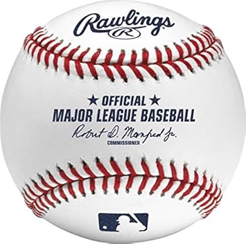
I like buying things that are “official” just because it’s a quick and dirty way of knowing whether something is quality or not.
Let’s say I wanted to buy a basketball. I go to a sporting goods store and see a whole aisle filled with basketballs. How do I know which to buy? Through experience I know that a lot of basketballs are junk. Some are too slick, some bounce oddly, some are too heavy. As consumers, we have so many options nowadays (which is another story, but I digress), and I don’t want to go online and review every single ball. Or worse yet, pick a ball and hope it’s good.
I’d rather just spend the money and get an official NBA basketball. Good enough for the pros, good enough for me.
I agree with you completely.
But I’ll take it a step further: what happens when I don’t care about the quality?
I buy official business suits and official dress shoes.
My beach flip flops don’t have to be official.
The California Golden Seals jersey that I bought to play pickup hockey on a frozen lake didn’t need to be official NHL. The miniature soccer ball my kids kick around in our front yard doesn’t need to be official FIFA.
And frankly, part of me resents being told by the teams / leagues / manufacturers / etc. that anything they don’t slap a hologram on is “counterfeit” and “pirate” and that I’m a bad consumer for not wanting to spend an unreasonable amount of money for it.
Especially when the manufacturers are trademark bullies and try to craft for themselves the exclusive right to sell (as in the Canada Goose example) winter coats
That depends on if it is the Official BALL or official brand…
Not just 5 MBA logos as soccer crests, all of them:
link
The site linked in today’s blog had a link to the full set.
Official also goes to the DIY world. Official social media pages are like “anybody can make a fan page, but this is me right here.”
Ironically, as a child of the 1980s, most NFL “authentic throwbacks” from that era are wrong. IIRC, the Steelers, Browns and Raiders were the only team to wear tackle-twill numbers at one point. The other teams’ “official/authentic” jerseys were heat-pressed numbers. I’m always surprised how often reputable vendors like Mitchell & Ness screw this up.
I wanted a kelly green throwback Eagles jersey and spent weeks looking for one that did not have sewn-on numbers (which the Birds did not wear in 1985).
Sears Canada’s own line of winter coats have a round “maker’s mark” on the left sleeve, and it’s similar to the Canada Goose logo. There’s been a fair bit of publicity up here on it – not surprising that winter coats are a hot topic in Canada!
Those Canada Goose parkas are SO expensive, and are now a status symbol. They are everywhere, and often sported by people who have no business (finanically) wearing one. Of course, that has led to an influx of knockoff Canada Goose parkas from China.
Interesting thoughts regarding “Official”-ness, as it pertains to jerseys and merchandise. For me, it has nothing at all to do with “feeling” official, but everything to do with quality. The cheap Chinese counterfeits are just that: cheap. The fabric and twill is inferior, the cut of the garment is boxy, and the stitching is sloppy. They simply look shitty upon close inspection.
Conversely, when it comes to t-shirts and the like, I tend to prefer stuff made by smaller companies run by fans over the “official” template-based designs churned out by Majestic, Nike, etc…as long as quality is good (slimmer-fit shirts, good screen-printing, etc.). As long s they’re not ripping off MY art to put on their merch, that is!
For me, buying counterfeit is a no-no. And that not only applies to jerseys, but I see it this way:
Someone spent a good deal of time making/designing a videogame, record or even a shirt. If I had spent the time doing that, I would be furious that people just went and buy something cheaper.
Quality is a second thought for me, as it should be a given when selling something official, not the reason to sell something official.
The one and only counterfeit shirt that I own was purchased at a Metallica concert. The real shirts were $30, and were kinda boring, the guy in the parking lot was selling a far cooler design for $10.
As far as I’m concerned, the band already got my money when I bought the tickets.
Yes, as long as it is not the same design as the one the band is selling, you’re not ripping the band’s art (well maybe the logo)
Well, there’s that, too, for sure…even though the major sports leagues are rolling in so much money that its occasionally difficult to muster much sympathy for them, counterfeiting is always a scummy way to make a buck.
BYU’s alternates also have pointed armholes. link
Must be a throwback thing
Better image: link
Illinois has them on their Flying Illini throwback.
This has always puzzled me? Is Butch Goring wearing a flecked hockey helmet?
link
He always wore the same old white helmet so for road games he would cover it with tape.
You point on the Chromaflex logos and how people thought they where cheeper then the more traditional embellishments when really there more expensive is the same problem we used to have in my old job for a soccer kit manufacture. people thought an embroidered team crest ( with the added skin chafing ) was more expensive and official then the real on field crests we used for football kits that where similar in application to Chromaflex.
the thing i want to ask is, Q.in baseball how many versions of a jersey is there, can you only buy official on field or cheep Chinese knock off?
i ask this as my last job provided 3 versions of the England football kit,
The on field
The official
The fan
the on filed was an exact version of what david beckham etc would were while playing, costing around £90 and has all the technical features, Chromaflex style badge etc
the official was the same as the on field, but without the technical features, and an embroiderd badge, it looked near identical and cost about £60
the fan was then a normal football top, with cut lines to mimic the on field but had a looser more causal fit, softer fabric to be worn buy people who will never run around in it. but looked from a distance the same Beckham wears. this was about £40
all 3 were made in china, in the same factories, then you’d have the un official knock off tops.
There IS a middle level, the “replica”, but for baseball jerseys, the manufacturer leaves off any sleeve patches, which for me is kind of a deal breaker, ’cause I love patches. Also, anything that would be made of twill, stacked and stitched on (the team name on the front, player name and number, etc.) is instead made of a cheap, plasticy printed twill material and heat-pressed, which I find a lot less aesthetically pleasing.
The replica baseball jerseys also don’t even bother to include front or sleeve numbers (where applicable). They’re total shit.
thats quite funny in a way that the reverse is done in football when it comes to emblishments, the printed for high end the sewn on for low end,
thanks for the answers!!
Well you have the Game, Limited and Elite jerseys in the NFL. The Elite being the same as the one players wear and the game being the cheapest with patches for numbers instead of sewed ones.
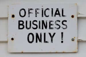
Appreciate today’s post. My least favorite sign needs the word “official” to really grind my gears:
link
I don’t understand all the hate for the Kirk Cousins facemask. It’s far more “modern” compared with the one their recently released QB draft bust wore, which I think first appeared in the 1970’s.(but tweaked slightly over the years) If he wore the standard “double-bar” helmet that every kid wore in the 70’s and 80’s and not to mention Jim Plunkett in two Superbowls, then I’d understand. But young people today were making 2007 sound like the “stone age” which is a big, big peeve of mine. It was only 9 years ago, people. That isn’t “ancient times” in any scope of the phrase and certainly not in the realm of football protective gear. It’s okay to dislike it for its aesthetics, but to say it’s dated, or old is ridiculous considering other, older ones in use. Regardless if they look better.
Even if you aren’t a racing fan (I’m not), please check out the Daytona 500 pics on super-expired 35mm film. Awesome!
Lee
Amen. Great, great stuff.
Mr. Lukas,
Good morning and I hope you’re well. Although I’ve been a fan of your website for many years, this is my first time commenting.
I served in the Coast Guard on the USCGC Polar Star. The ship’s duties included traveling to both the Arctic and Antarctic regions to provide support for scientific operations. During my time in Antarctica, I was issued cold weather gear with the official US Antarctic program patch:
link
Within the past few years, I started to notice Canada Goose jackets. I always assumed that the Canada Goose patch was the same as the US Antarctic Program patch. The patches are quite similar.
Wow, how about that, they just ripped off the design of that patch. Nice share.
Ohio State’s alternates also have the pointed arm holes
link
The Converse article reminded me of an article I found a while ago about Converse Japan. It is a bit dated now as it was published in 2013 but a few points stand out.
One thing I never realized that there is an autonomous Japanese arm of Converse. I found it interesting that Converse Japan was producing shoes with higher quality materials at a time when Converse America was just releasing the same product in different colors and patterns. They seem to have such an appreciation of the brand that their “Converse Addict” shoes feel like more of a celebration of the brand than the Chuck Taylor IIs in the ticker today. Maybe that is just in how the blog post and article are written.
link
My favorite “official” things are the ones that aren’t actually but make fun of the concept of official-ness. Such as Narragansett Lager packaging itself as the “official beer of the clam,” as our host detailed in 2013:
link
Not to be “that” guy but the Jim Rice 1986 Red Sox World Series shirt was first featured on Uni Watch in the ticker April 27, 2012 sent by yours truly.
link
Ticker correction: “The San Jose Giants will wear “San Bernardino Strong” jerseys on April 15 and gold-trimmed championship jerseys the day after that”
The first part of this sentence is good to go, but it’s the Fresno Grizzlies who will be wearing the gold-trimmed championship jerseys.
Of course, as all sports fans across the nation surely know, the SJ Giants finished second in the Cal League last year after being swept in the championship series by THE 2015 CALIFORNIA LEAGUE CHAMPION RANCHO CUCAMONGA QUAKES!!!
(And yes, I’m a bit proud of the local nine :-)
Also, the S.J. Giants and Fresno Grizzlies are not related. The Fresno Grizzlies are now a Houston Astros affiliate, and are no longer an S.F. Giants farm team. If the Grizzlies were still a Giants farm team, they wouldn’t have won their championship.
The designer tasked with supplying the image for the article about Cousins’ facemask couldn’t even find a picture of Peyton Manning wearing the correct corresponding mask, but instead went with his most recent Speedflex. “You had one job”.
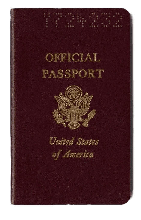
Interesting to note that Paul uses a US Government Official official passport. Can tell by the red color. There is also a black one for diplomats and the familiar blue for citizens. So you have different levels of official passports issued by officials for officials and citizens.
I assumed that was a stock photo and not Paul’s actual passport.
I did notice that its not a biometric passport, which means (I think) that its a pre-2007 passport.
Also, great stuff on the “official” topic. This got me thinking about the state of officially licensed replica jerseys for the big four sports. Compared to the 90s, I’d say they are of much poorer quality across the board. And yet, the leagues have made small tweaks designed to make them look more “official” on the surface, like adding the league patch to the replica jersey. Throughout the 90s and early 00s, the NBA was the only league whose replica jersey carried the same league patch as the authentic (the NHL used a similar-but-not-official NHL puck patch for a time). NFL replicas never used to bear the shield at the center of the collar, nor did MLB replicas on the back neck. Over time, these patches have been added to the replicas while the quality of seemingly every other element of the jersey has devolved—flimsier materials, cheaper printed numbers and logos, and the addition of elements like the side cuts and jocktag to NHL replicas.
Maybe my 90s replica hockey jerseys didn’t have the NHL logo patch on the back hem, but the logos and lettering were at least real twill. The only noticeable differences between a replica and authentic were the lack of the league patch, fight strap and reinforced shoulders and elbows. But they were certainly a helluva lot more official-looking than today’s inferior version, whose fabric will get a pull if I look at it wrong.
Part of me wants to order this just to see if I really do get a “San Jose State Gauchos” tshirt. link
In relation to the feeling official thing, I had to wait unail my sophomore year of high school. See, I grew up in a small village in the Cleveland area called Newburgh Heights. We were pretty broke, so we played baseball and basketball in tshirts. Granted they’re pretty stylish nowadays, with the script “Newburgh” on the front and the number on the back.
Then when I was 13, I moved to.the Mansfield area to a small.town called Crestline. 7th and 8th grade we had ha d me downs from the highschool. So our game jerseys were pretty much practice jerseys, and we had plain white helmets woth blue facemasks.
Freshman year they switched from a beautiful Script logo that said “Dawgs” on the side (we were called the Bulldogs, but our stadium literally bordered a junkyard, so they called us the Junkyard Dawgs) to a plain Black helmet with a blue facemask, and extremely.plain jerseys. Hell, they didn’t even have the team name or city name on them, just a stripe.
Finally, my.sophomore year I transferred to Galion, the neighboring town, which is quite a bit larger. (Crestline in OHSAA was Division 6, just barely, while Galion was Division 4, 1 being the biggest, 6 being the smallest at the time) I FINALLY felt.official sonce Galion got brand new tech for Nike jerseys, and a logo on the helmet. To understand what the uniforms looked like, imagine Illinois Illini uniforms from 2009, but with orange numbers with white outline.
It took 12 LONG years to feel official in a uniform on me. Plus in 2009, we made the playoffs and got our last names on our jerseys. (I was the only one on the team with “jr” NOB)
It would be interesting to hear an intellectual property lawyer weigh in on the Fair Use implications of the Canada Goose/American Duck parody patch and its apparent suppression.