Happy Groundhog Day! The MLB news just keeps-a-comin’. Okay, one thing at a time:
1. I mentioned last week that Majestic appeared to be adding a mesh panel on the rear shirttail of the new Flex Base jerseys. I hadn’t thought about how this might look on a pinstriped jersey, but now we know:
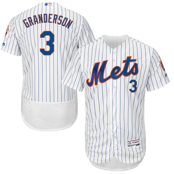
Yes, that’s a legit image — it’s from this sales listing. Weird, right? Here’s how it looks on pinstriped Phillies, Brewers, and Rockies jerseys:


The pinstriped Flex Bases for several other teams (Yankees, Cubs, White Sox, etc.) aren’t yet available, but you can use your imagination.
And wait — the shirttail panel doesn’t look so hot on G.I. Joke jerseys either:

The shirttail panel won’t be visible on the field, of course, because the players will tuck in their jerseys, so it makes no difference to me. But it’ll look like a diaper on fans wearing untucked retail jerseys and therefore certainly won’t help sales (which, as you can imagine, has me so upset that I can’t stop laughing about it). Seriously, people who love buying authentic jerseys were having absolute conniptions about this on Twitter last night.
I feel bad for those people — honestly, I do — but let’s give Majestic and MLB some credit: They’ve actually done something for their on-field program that might work against their retail program. Good for them.
2. Speaking of pinstriped Mets jerseys, look what else the Mets are selling:
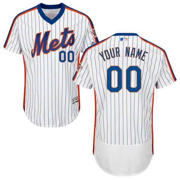
That’s a 1986 throwback, complete with the 25th-anniversary patch on the left sleeve (which was a misnomer, because ’86 marked the Mets’ 25th season, not their 25th anniversary). Are the Mets going to be adding that throwback to their on-field rotation this year? That would certainly make sense, because 2016 is the 30th anniversary of the ’86 championship team, and the team’s promo schedule for the coming season features tributes to the ’86 team — including a 1986 replica jersey giveaway — on May 27, 28, and 29. Draw your own conclusions.
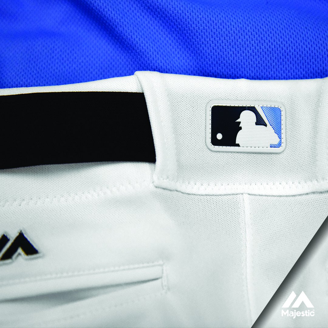
3. I also mentioned last week that the MLB logo patch on jerseys would be changing from embroidered to plastic this season. And new we can see what that’s going to look like:
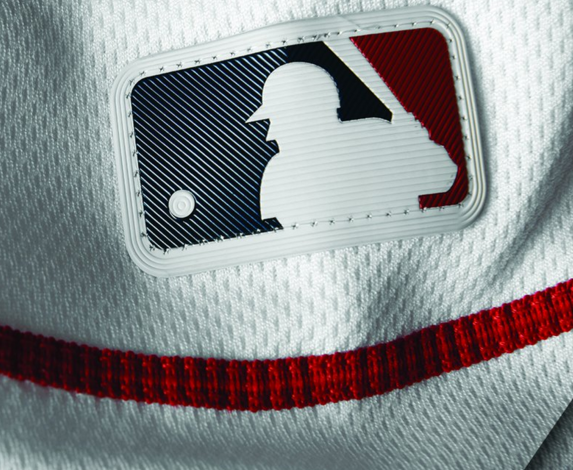
Majestic actually tweeted that image late last week, but I didn’t see it until yesterday morning. Here’s how the new patch format looks when rendered in Brewers, Royals, and Twins colors. And here’s how it looks in its new location on the back belt tunnel (click to enlarge):
When assessed in a vacuum, I think it looks pretty cool. I like the multi-directional ridges and the concentric circles on the ball. If Jerry Dior were still alive, I bet he’d be pleased. But as a uniform patch, it just feels too plastic, too synthetic — I’ll take embroidery over this any day.
4. This article provides some the simplest, most straightforward info we’ve yet seen about Majestic’s new Flex Base uniforms. Among the new details (or at least they’re new to me):
• The mesh panels on the sides are called “Air Belt” panels. Using the word “belt” to refer to part of a shirt seems odd to me, but whatever. I’m just gonna call them side panels or mesh panels anyway.
• The Flex Base jerseys use a lighter version of the Cool Base fabric.
• The pants’ waistbands now have “silicone motion grippers” to keep the jerseys tucked into place. This is the same thing the NBA has been doing for more than five years now.
That last item could have an effect on a uni-related ritual: the recent habit of some players to untuck their jerseys at the completion of a game:
Might those players now find their shirttails anchored a bit more securely in place when they try to pull them out? We shall see.
5. The latest team to unveil a new alternate jersey is the Phillies, who’ll be wearing this red jersey for weekday-afternoon home games (further info here; click to enlarge):
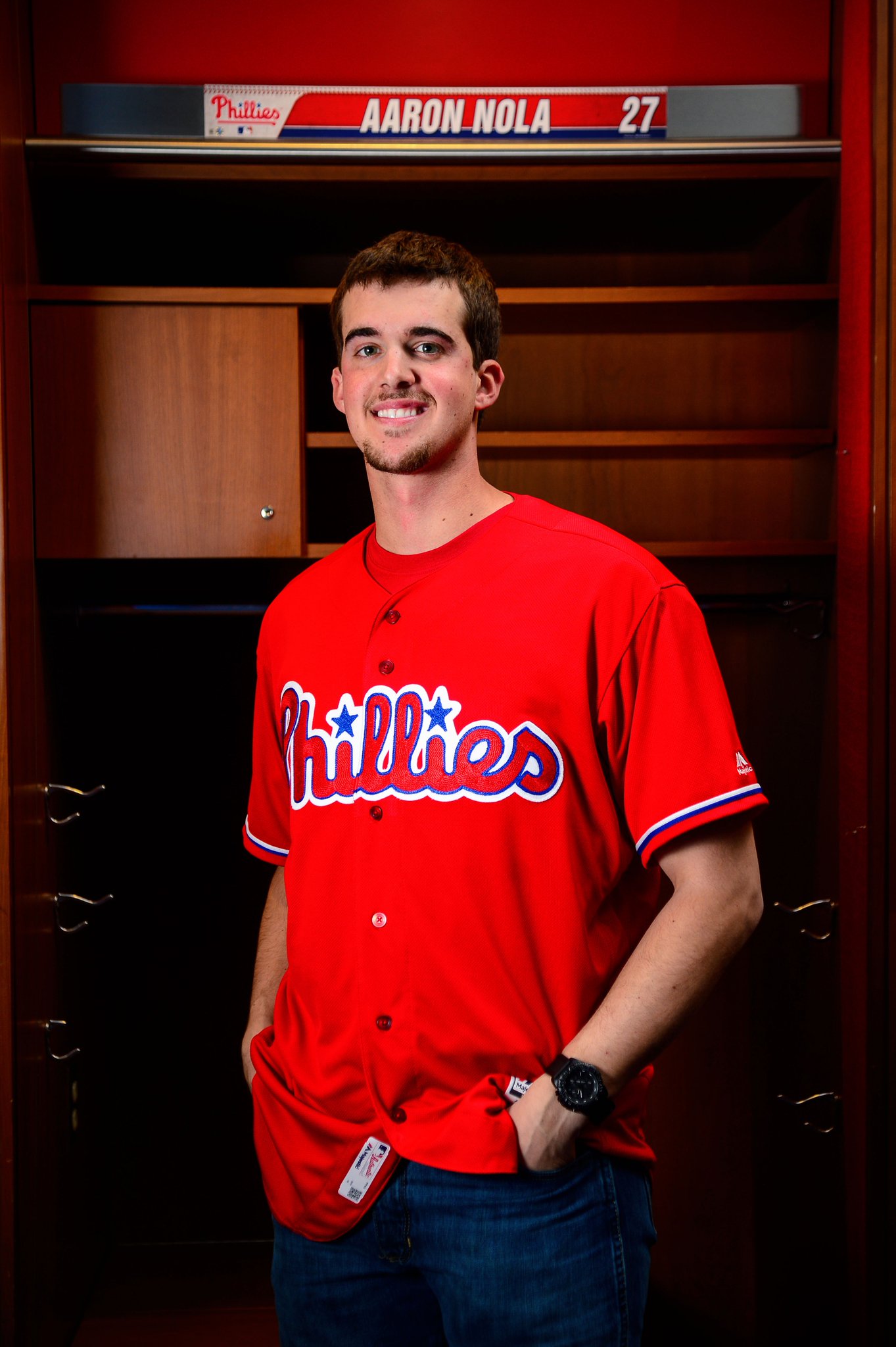
This will be worn with the team’s pinstriped pants and primary cap. I’m not nuts about it, as it waters down what was one of the best uni sets in the game, plus the MLB uni scene doesn’t exactly need another red alternate. Meanwhile, I was puzzled by the plan to wear these for weekday day games — don’t they wear the cream alt for day games? So I asked the Phillies and was told that the creams will now be worn for weekend afternoon games.
As long as we’re talking Phillies: Everyone knows the Phils wore the infamous maroon “Saturday Night Special” uniform for one game in 1979. But I hadn’t realized that they also wore their red BP tops for one game against the Padres in 1992:

And no, that’s not a spring training game, because the Padres train in Arizona while the Phils are in Florida. I’m told it was a one-day slumpbuster move. Good find by Twitter user Boo Hurlock on that one.
(My thanks to Brian Erni, Steve Dodell, Joe LoVerde, and Phil for their contributions to this section.)

Click to enlarge
Culture clash: Yesterday was the first day of Black History Month, so NBA players wore the shooting shirt shown above. There was also an uncomfortable moment in Sacramento, where the Kings were giving out T-shirts for Chinese New Year, which happens to be the year of the monkey (click to enlarge):

Kings center DeMarcus Cousins didn’t think a monkey-themed promotion was a good fit for the start of Black History Month, so he apparently complained to the team’s management, which then decided to remove the shirts.
Click to enlarge
Collector’s Corner: Super Bowl Edition
By Paul Lukas
San Francisco/Santa Clara plays host to The Big Gameâ„¢ this Sunday (not going anywhere near it, pure insanity). Let’s start off with this
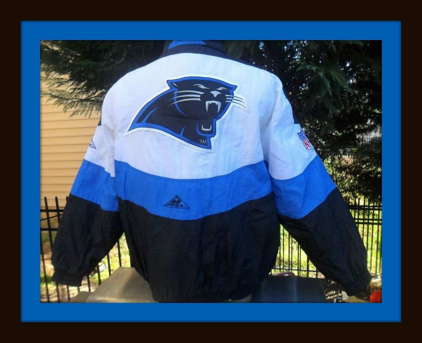
NFL Pro Line Panthers “Swirl” design parka by Apex. Along with Russell Athletic, Apex set the standard for fan apparel in the 1990s. Nike wasn’t there yet, and Reebok would soon come along with fine stuff — but as the 1990s hit their midpoint, Apex and Russell were gettin’ it done.
A few more items to sort through for the Supe50 teams:
• This vintage Broncos helmet plaque is in excellent shape. This one’s made by Placo and features the classic retro Broncos look. The seller has many different plaques available; just click here. (And they missed the mark with this Chargers one, did they not?)
• This 1970s Broncos spiral notebook features some nice bold graphics.
• This Panthers NFL Pro Line sweatshirt by Russell is top quality. Always were.
• One more Panthers/Russell Pro Line item for you: an authentic game jersey from 1995 for quarterback Kerry Collins. Now there’s a name from the past!
• Broncos high-top basketball shoes? Sure thing, from “Eastport by Starter.”
• Really nice-looking 1980s Broncos sweater by Cliff Engle. Screams Dan Reeves.
• Nice graphics on this set of 1970s NFL helmet drink coasters (but they feel more like the 1980s to me).
• Moving beyond this Sunday’s game: If plain is your style, and you happen to be a fan of the old St. Louis (Football) Cardinals, you’ll love this red jacket.
• Montreal Expos fishing bait? Well, of course.
• Great-looking artwork on this vintage Cleveland Cavaliers poster.
• And from reader Jim Ransdell: An eBay seller called “nascatman” has all sorts of cool stuff, including gumball helmets, a Pete Rose bobblehead, soda bottles and cans with college basketball team logos, and more. Check out his stuff here.
Follow Brinke on Twitter: @brinkeguthrie

Click to enlarge
PermaRec update: The latest letter from the Hoge Brush Company files was typed on stationery that’s suitable for ’Skins Watch. Get the full scoop over on Permanent Record.
The Ticker
By Mike Chamernik

Baseball News: New White Sox-themed uniforms for Northern Illinois (from Phil). … The Royals have a really neat 3D billboard. The team has used some other innovative billboards in past years. … Conor McCarthy spotted a spelling error on a Dustin Pedroia jersey for sale on MLB.com (from Phil). … Mike Clary found two interesting photos: A 1963 spring training shot of Ted Williams in backwards stirrups, and a 1961 pic showing an L.A. Angels batboy in the background with “Visitors” on his chest. … The Binghamton Mets will wear giraffe-themed jerseys in July (from Tony Arnoldine). … Tennessee altered its new home jerseys.

NFL News: Cam Newton wore NBA socks at media night. Not just any NBA socks, though: They’ll be the same ones players will wear in the Rising Stars Game during All-Star Weekend (from Todd Krevanchi). … San Franciscans have been cleverly defacing Super Bowl 50 sculptures around the city. … A writer called out Cam Newton’s, and some other Panthers’, lack of off-field style (from Phil). … A White Castle ad shows generic, yet recognizable, NFL jerseys (from Jason Hillyer).

Hockey News: Here’s a really cool piece on the mysterious skybox that hangs above the ice at the Cincinnati Gardens (from Tris Wykes). … The AHL will extend its licensing deal with CCM/Reebok for five more years. “This will overlap with the NHL and Adidas’ supplier contract beginning in 2017,” says Daniel Lavender.

NBA News: Here’s a throwback that we’ll never see: The Pacers wore uniforms with blank jerseys and mismatched shorts for the ABA’s first preseason game in 1967 (great find by Jeff Flynn). … On Sunday, the Staples Center hosted a Clippers game in the afternoon and a Lakers game at night. Here’s how the crews changed courts. … The Spurs have a few cool George Gervin-era warm-ups hanging up at their arena (from Steve Stevenson).

College & High School Hoops News: Martinsvile (IN) High School wore throwback uniforms last week. The school honored the 1927 state championship team that was captained by John Wooden (from Derek Linn). … Houston Baptist University wore pretty wild throwbacks the other night against Sam Houston State (from Josh Jones).

Soccer News: Manchester City’s new crest looks a little like the seal of the U.S. Department of Commerce (from JohnMark Fisher). … New jersey for IFK Göteborg. … New jersey for the Vancouver Whitecaps. The fading blues are meant to look like the sky blending into the ocean on the horizon (from Conrad Burry). … The English club Milton Keynes Dons F.C. went with a double-decker NOB for newcomer Jay Emmanuel-Thomas (from Tim Cross).

Grab Bag: Tennessee women’s teams other than basketball will drop the Lady Vols nickname but will wear a Lady Vols jersey patch (from Phil). … Trademark law is already difficult to understand, and the internet has made it even more flummoxing (from Brinke). … An online study examined the fashion sense of the presidential candidates (from Tommy Turner). … More politics: The logo for the Iowa Barnstormers — that’s an arena football team that plays in Des Moines — has apparently been adapted by Bernie Sanders supporters.
Those NFL coaster are from the 80’s (or even early 90’s) The Bills are shown with a RED helmet!
going on my previous comments about the side panels on mlb jerseys from a few days ago, and why they won’t have done pin stripes etc, and while i stand fully buy my points on that, i can’t think of a single reason why you won’t pinstripe the rear panel
sure its tucked in in a game environment, but do fans were it always tucked in, unlikely. thats just pure money saving, sure a $0.02 saving on 100,000 jerseys is quite a saving but it looks awful, i’m very surprised it was approved like that,
the only reason i can think it was done like that is to ‘draw attention’ to there new fancy ass butt flap technology.
Note that the Mets 1986 throwback has the racing stripes down the side, right where we’re supposed to believe that it’s impossible to put stripes.
Sure, the pinstripes on the side gussets wouldn’t line up perfectly with the pinstripes on the front and rear panels. But pinstripes already don’t line up perfectly where the sleeves meet the body, or even across the front of the jersey.
Note that the Mets 1986 throwback has the racing stripes down the side, right where we’re supposed to believe that it’s impossible to put stripes.
This is no different than the snakeskin pattern on Arizona’s side panels. Nobody ever said it’s impossible to put a pattern there; they’ve simply *chosen* not to use a pinstriped panel for pinstriped jerseys.
My first thought when I saw the Mets blank side panel was that it would be a perfect way to resurrect the racing stripes.
i’m not saying that its impossible to add pinstripes, i’m just giving my opinion on why they won’y have them. while your correct about pin stripes on arms and body never match perfect on the sleeve, thats accepted, and the front as well due to it unbuttoning
having a mis matched panel doesn’t look correct unless its deliberately mismatched say with stripes at 90 degree angles. when you have to make it across multipul sizes of multipul jerseys its gonna cost a hell of a lot to get it correct every time, we’re talking many dollars per jersey, unless you wanna add $40 to the RRP of them. a slightly out of sync pin stripe on the size will look way worse then a blank panel
as for the racing stripe. its a completely diffrent pattern so adding it to the panel is easy as it won’t make a messy joining point regardless of size of garment.
Exactly. It’s a choice, not a technical limitation. And it’s the wrong choice.
Probably drives up the sewing and material costs by about 25 cents per jersey. This is what happens when decisions are made based entirely on cost considerations as presented to the corporate bosses by bean counters instead of being focused on delivering a quality good looking product.
Unfortunately everything is about he bottom line… saving $00.02 per jersey is money in someone’s greedy f***ing hands. Jersey design has taken the brunt of this. And it is why we don’t have a nice piece of high quality knit or silk mesh fabric that feels good in your hands and on your skin as a football jersey anymore – we have tiny scraps from the floor stitched together with an overabundance of seams making a stiff, unwearable jersey. Sure, you can justify some of it by saying “no sleeve to grab onto and assist with a tackle” – and there is some tiny truth there. Although, back in the day an attempt at similar tackle evading tactics with tear-away jerseys was banned… I played professional football (women’s – joke if you must), and I cannot imagine competing in those restrictive uniforms.
Anybody know how the numbers are rendered on the Phillies new softball top? I can begrudgingly accept a new softball top, but I draw the line at monochrome no-contrast outline-only numbers a la Atlanta navy.
White letters/numbers with blue outline.
Good, because I’m like Mike. I didn’t want this looking like the Angels’ devilishly red top. Get rid of that thing already,
LAAnaheimCalifornia.Agreed,
Much prefer the old (previous years) batting practice jerseys with the white numbers on the backs. I get it. The RED Angels rather than the BLUE team from up the 495 freeway… LA Scully’s.
Having said that, Anyone who would spend hundreds of dollars on a sporty jersey, even with the afore mentioned fart flap with extra special pit- inserts (pitserts?) because that will make you awesomer… is a fanatic.
However,
If the older BP jersey as a gift… might consider wearing it, nah put it in the “regifting” pile.
Starter had some major pull in fan apparel world in the 90’s as well. I would say they were bigger than both Apex and Russell.
bigger, yes.
better, no. (IMO)
Agreed
Proofreading: “The Pacers wore uniforms blank blank jerseys and mismatched shorts”
Fixed.
Whoa I mangled that sentence. I didn’t have a mental breakdown when writing it; I was editing my wording while in HTML mode, where it’s tough to read everything with all the coding. Thanks for catching.
Mike, you didn’t mangle it. I edited the sentence slightly and *I* mangled it in the process.
Paul, I noticed that when you go look at the new flexbase jerseys at the MLB shop, there was no Home or light blue jersey for the Rays.
Lots of game jersey designs aren’t yet available for sale in Flex Base (including some of the pinstriped designs that I mentioned in today’s text). Looks like they’re still getting everything into the retail pipeline.
My guess on the Chargers plaque is that it was made just ahead of the 1974 season, when they switched to the blue helmets. If you look close, the dark outline is around the yellow bolt like it was on the white helmets. I think the change came down the pike, and being how it was back then compared to now where they would just start over from scratch to get it right because of licensing, the company just slapped the old bolt on a blue helmet. They weren’t even prepared for the first colored mask in the NFL it appears, so it remained grey.
So does a particular color/font combination on a jersey represent a trademark and/or copyright? I know teams *can* own a copyright on a color, right?
So I wonder if the White Castle ad is in some sort of violation (technically speaking).
We would call that “trade dress” – visual appearance of a product or its packaging that signify the source of the product to consumers.
I wonder what one of those helmet plaques would look like if the half helmet was mounted on a mirror. Hmmmmm.
Starter WAS athletic apparel in the 90’s. Best items came from them. Nike is now OK, but Starter had more style and would actually create new looks year to year, all Nike stuff looks the same to me (which gives them more longevity I guess).
Logo Athletic tried, Apex was much smaller. Puma/Reebok and finally Nike ended Starter’s reign in the early 2000’s. They are still missed.
I don’t know if “they are still missed”
I mainly just buy ’47 Brand these days. I love that style.
Pete Rose also wore the red Phillies top in the 1979 ASG and the whole Phillies team wore the red jerseys in the 1981 Topps team photo too. (shot in the Vet)
Any other intel on the Phils alternate?
NOB? Player’s number on the sleeve? There is no number on Nola, but I’m assuming that’s probably because it’s a blank for the photo shoot.
I’m not thrilled about it, either – not because of another red jersey, but because they have one of the best alternates in MLB already with the cream unis. If this is differentiated in some way – like no NOB, then I guess it’s okay.
NOB = yes.
Sleeve number = no.
Sigh. So it’s a red version of the cream.
While I’m disappointed that there will be no number on the sleeve (I like that the Phillies are the only team that does that), I like the red jersey and I like that I don’t have to fear that it will be overused. It’s only going to be worn for 6 business persons specials and the sweet cream alternates will remain for weekend day games. I respect the Phillies for knowing how to stick to a uniform protocol. I’m thankful we’re not like the Blue Jays or Marlins who wear their alts more than their primarys.
I do like the idea of the number on the sleeve; the Tigers did it with their road grays back in the 60s, and I wish they would do it again. Get rid of the three color letters and numbers, remove the number from the front, and put it on the sleeve.
Yes, it’s always better to have a specific protocol for wearing alt jerseys, and glad to see the Phillies sticking with one. But it’s sad that we’re down to four teams that don’t wear softball tops.
This may be new to the MLB but was done both on the front and back of the Nike Total 90 football (soccer) jerseys for the 2002 world cup and some years after. Nike even made a waist line as you can see in this front and back pictures
link
link
Personally, I have one of said jerseys, Arsenal, and it is uncomfortable as hell. The tail looks plain ugly if untucked and I do not want to tuck my jersey in. Needless to say, it is one of the jerseys I do not wear regularly
All I remember with the jersey tails in soccer is that it actually once saved Croatia’s checkerboards. I think the rule is that soccer jerseys have to be at least 60% any one color, so the tail got colorblocked in order to tip it over the threshold and make it legal. By continuing the checkers in the tail, it would have been against regulations (neither white nor red “enough”), but since the jerseys are supposed to be tucked in anyway, hardly anyone could see a difference in practice.
To my knowledge, there’s no rule that says “60% any one color.” Never heard that before either.
Here’s another reason not to buy those Flex base monstrosities: depending on the team and style, they cost up to *$350*. No wonder everyone just buys fake jerseys.
I wish people didn’t work so hard to be offended. It’s like people relish the chance to get to pull out the “Well I’ve never….” card.
I loved going to Chinese restaurants as a kid, and always studied the zodiac placemats, picking out who in my family was under what sign. Being born in 1980, I was born in a “year of the monkey”. Connecting that to racism by Boogie is a stretch, and in my opinion another example of people wanting/needing/craving the attention of being offended.
I agree. The Chinese New Year zodiac is not going to change because the term “monkey” is tied to racism.
I suspect it had less to the with the monkey per se and more to do with the timing re: Black History Month.
Rich, I’m guessing you’re not black. Neither am I. So we can’t know what it’s like to deal with monkey-related insults throughout our lives.
But I can google “Obama monkey” (and so can you) and see that such insults are still very much a part of our world.
I’m not saying this means DeMarcus Cousins was right or that his request was justified (nor am I saying the opposite, just to be clear). But I’m saying that maybe the mechanism that led to him making the request is more complex than simply “people wanting/needing/craving the attention of being offended,” and that it’s a mechanism that you and I will never be in a position to fully appreciate or understand.
Something worth thinking about.
I respect that take, Paul. And yes I am white, so I can’t say I’ve dealt with racism like many African-Americans did/do,but I feel like we can pick out tiny things everywhere and tie it to something negative. I’m of the opinion that this issue is one of those examples.
“but I feel like we can pick out tiny things everywhere and tie it to something negative”
Makes me want to stop watching Sack-o-tomato basketball, actually I hardly ever watch them since Webber and Vlade left town.
Can’t wait for Honkey Night in Canada.
Actually I concur with Scottrj, the Kings marketing peeps could have floated this one by the players BEFORE the releasing them on the first day of Black History Month.
One promotion at a time – marketing 101.
“[Y]ou and I will never be in a position to fully appreciate or understand.”
It’s easy to understand. I, as an Asian American, am being told my holiday is offensive. And that is nonsensical.
BTW, Asians get called monkeys, too. Maybe you should learn some empathy for all people instead of just certain races. You really make it hard to want to read this site.
I, as an Asian American, am being told my holiday is offensive.
No. You, as an Asian-American, are being told that monkey imagery on the first day of Black History Month isn’t a great combination, especially when the players are already wearing Black History Month apparel. Or at least that’s how DeMarcus Cousins felt. I’m not saying I agree (or disagree) with him, but I do think his position is defensible, and I don’t think it has to be framed in the binary/zero-sum way you’ve chosen to frame it.
It’s worth noting that yesterday was not Chinese New Year. But yesterday was the first day of Black History Month.
While all that’s true and worthy of consideration, what’s equally true and worth considering is that California is home to some 6 million or so Asian-Americans, which is like 30% of the Asian-American population nationwide. And that the only days the Kings could plausibly commemorate the February 8th Chinese New Year’s at home were yesterday (2/1) and tomorrow (2/3), as their next home game after that isn’t until February 19th. And that the shirt’s a pretty cool one, not even remotely capable of being construed as insulting.
The only thing even arguably insensitive about the promotion is that it was planned for the very first day of Black History Month, and not the third day. Which, yeah, I can see the displeasure, though only somewhat.
I have no dog in the fight, but I do own a MBA. Given these facts, I personally would have commemorated Chinese New Year on the first possible date in the Chinese new year, or mybe even the last one beforehand. In other words, pick 3rd or 19th, but not the 1st. It’s just too cognitively dissonant to celebrate the year of the monkey while you’re welcoming Black History Month. I’m not saying you have to get BHM out of the way first, but I am saying Sacramento’s marketing department deserves a self-inflicted slap in the forehead.
The fart flap on those new jerseys would be asinine even if it didn’t connect to the “air belt”.
Ooooh, “fart flap” — that’s good. Shall we adopt that as Uni Watch’s official term for this uni element?
Motion seconded.
How about we just call it the “ass wipe”?
or the “T.P. Tail.”
Another vote for it.
Better than cummerbund, which I’ve been (mis)applying to the wide butt-stripe on too many basketball jerseys.
“Better than cummerbund, which I’ve been (mis)applying to the wide butt-stripe on too many basketball jerseys.”
If it’s a butt-stripe, I’d think “cummberbum” (incorporates cummerbund, cumbersome, and butt) could replace your cummerbund.
Fart Flap and Air Belt. Got that’s good…
Absolutely!
I wonder if the design is to discourage the untucking of jerseys
Regarding the Super Bowl 50 vandalism – way to stay classy San Francisco!!!
You call it vandalism, I call it civic pride (I live in SF).
link
Lee
It’s vandalism. The city agreed to take these abominations for the cash, the people of the city voted these people in. They destroyed private property, that is vandalism. Was it wrong of the NFL to pay to desecrate one of the most beautiful cities in the world? No. Was it right for these people to desecrate private property that was in place legally? Also no.
The residents around Alamo Square (a park where the sign was toppled a couple times and then removed) specifically asked that the sign to not be placed there. Their request was not considered.
I call the result it civic pride.
Lee
No*.
*Well, not in its current condition. If someone gave me one (because there’s no way I’m paying that much for a jersey), I’d probably cut the bottom and have it hemmed to right around the beltline.
Would I wear that ’86 Mets throwback? If it had YOUR NAME as the NOB and 00 as the number, then yes.
And I definitely most certainly would wear a George Gervin era Spurs warmup shirt. The essence of cool.
Speaking of hoops, I propose another UW design contest…let’s redesign the Staples Center court. I still say two courts for two teams who share the same building is a waste. Someone (or several someones among us) could make a nice hybrid court. Ladies and gentlemen, sharpen your crayons!
Another case for the hybrid court: Say the first game of a double bill goes into six or seven overtimes. It can and will happen someday. You want to postpone the game, or, perish the thought, play on the other team’s court? No and no. Just share.
Probably won’t happen, but the Mets should consider making that 1986 uniform a regular alternate.
Another question about the new MLB jerseys is will the Yankees pinstripes still be stitched on?
Yankees use a raglan template which, once common, is now only used by the Bombers. Their pattern has no breathable panels.
Several other teams besides the Yanks still use raglan sleeves, including the Red Sox and Tigers.
But the Yankees are the only *pinstriped* team that currently uses raglan sleeves.
The Cubs use raglan sleeves with their pinstripes. At least, it looks like a version of raglan sleeves, as the sleeve pins go all the way to the neck.
link
Oh, interesting! Not shown that way in the MLB Style Guide (which, amazingly enough, does show the difference between raglan sleeves and set-in sleeves). But this is one of those instances in which the style guide is wrong. Thanks for the correction!
I have several team-issued Cubs jerseys. I think they all have raglan sleeves, but I can say with certainty that the home pinstripes and the alternate blues are both in this style.
A couple years ago I bought a pair of Under Armour baseball pants that has the silicone on the inside of the waistband, as you describe Majestic is doing for the new MLB pants. It works pretty well for keeping the jersey tucked in. I’m surprised Majestic is years behind incorporating something like that at the top level of the sport.
That “technology” has been around for decades.
Here’s another method for keeping you shirt tucked in.
link
I’d almost want those to keep my socks up!
It’s a Socksierre!
That could really hurt on a slide into third…
I wore those during my years (1998-2006) in the Marine Corps, as well as another brand which consisted of four straps rather than two ‘Y’-shaped straps. They work extremely well at keeping your shirt tucked into your pants neatly and tightly, even when wearing police belts which hold a lot of heavy gear and weapons. Whenever you see a military guy (usually a Marine or sailor) whose shirt is tucked in perfectly without any muffin-like overhang around the belt area, it’s almost certainly because they’re wearing these.
Wife was complaining that she didn’t like the style of strapless bras that incorporate significant silicone on the inside to help the bra stay in place; says that type has been around for quite a while.
Re: That Broncos notebook on eBay.
I had a New York Jets one in the ’80s, same exact design. Reading the description, it also had drawings on the inside back cover that had all the officiating calls. I thought that was pretty neat.
The Denver Broncos online store is selling orange jerseys with the SB50 patch featuring the “batwing” design they’ve worn since the late ’90’s. But the white jerseys with the SB50 patch do not have the navy sides or collar. What gives? Since the Broncos have selected to wear white, could this be a new design for the big game? Would the NFL even allow a jersey style change?link
Note that those white jerseys sans ‘batwing’ say ‘Game Event Jersey’
Still wondering how the Detroit Tigers will handle the MLB logo on a belt loop. I’m saddened that the classic Spring Training livery of road white/road grey is going away, eschewed for a blue top and an orange gawd-awful cap.
I just asked Majestic that very question — no response yet.
Can you refresh/fresh my memory as to why it may be an issue with Tigers?
Sure, because the Tigers’ pants use skinny belt loops all around, with seemingly no place for the batterman.
See it here: link
They have thinner belt loops that are not centered on the back.
link
My “picking a fight”/pessimistic mood for the day says the will find a way – or make them connect those two skinny loops since they are in such close proximity.
Cincinnnati Gardens article is excellent- spent many nights there, tho I was more of a Riverfront Coliseum guy. Loved those Swords banners hanging- what a dominant team. It wasn’t IF they’d beat you, that was a given. It was more like, would they reach double digits in goals that night.
Nice mention of Cincinnati Gardens. One of the very best old-school arenas left. I spent a whole day there taking photos a few years ago, inclusive of a behind-the scenes tour – up top, under the arena, etc.
Pics here; link
“And they missed the mark with this Chargers one, did they not?)”
The Saints one is REALLY an epic fail!
This Bears one is pretty tragic.
link
I have admittedly shelled out far too much money over the years for various retro baseball jerseys, every New York Islanders jersey since 1992, and my current obsessive collection of race-used NASCAR pit shirts. I can fully accept the realization that I look a bit silly wearing them and allocating a good bit of discretionary income to them, and yet I have no real embarrassment. These new butt-bibs, however, would make wearing any jersey design a no-go for me.
Butt Bibs, Fart Flaps… too many good options for those horrible jersey elements!
Wait… sweaty, used NASCAR Pit shirts??? Why?
Has anyone heard any responses/opinions from players about the Flex Base jerseys. Majestic’s go to social media response is that the jersey is “designed for the player.” The butt flap does look like something that a team trainer would quickly sew onto a jersey at the special request of a player.
I’m sure it’s cooler, more comfy, etc. And that’s a perfectly good reason to do it.
It will make zero visual difference in how the game looks, and the players apparently like it. That’s the very definition of a win-win.
It may hurt sales, but who cares? Sales should always be secondary to what’s happening on-field. One more time: Good for Majestic.
I’m curious about player opinions because I still don’t get the point of the butt flap as a benefit. It has been over 20 years since I last played summer ball. From what I can remember, that area was not a major concern for comfort not even when I would have to catch. I totally get the under arm gusset and side panelling. The butt flap feels like they are trying to add something for the purpose of adding something. I’m sure Majestic knows what they are doing. It just appears weird.
Maybe it’s easier/less sweaty when sitting on the bench (shirttail would be under your ass, etc.)?
Which team’s back belt tunnel is pictured above?
Good question! Honestly, I’m not sure. The patch appears to be black-white-royal — there’s no MLB team that currently uses that color scheme for its MLB logo.
Exactly! I couldn’t think of a team with a royal jersey and black/white/royal MLB logo.
Totally Waste of Time Tech,
Is this little gem from the link..
They built a simulator to see how historical Rams teams measure up against each other… and other NFL teams.
Silly I know, and I still can’t get the Rams to beat the Stillers inSuper Bowl XIV. The other thing I noticed was that if you have Kurt Warner QB’ing… you have a fighting chance.
I’ve personally never bought an authentic jersey (I prefer the cheaper yet way more comfortable replicas) and after seeing the dart flap designs, I won’t be starting now.
I understand why the Yankees pinstripes aren’t up, as some other striped unis aren’t either, but I find it strange that roads aren’t up yet either. Could the Yankees somehow be avoiding this outside of ST?
I understand why the Yankees pinstripes aren’t up…
You do? Why, specifically, do you think they’re not up?
From what I can see, there’s no rhyme or reason to why anything is or isn’t up. I think it’s strictly a matter of which stuff is already in the retail pipeline and which stuff isn’t. That’s how it goes sometimes — hard to get all your inventory together at the same time.
Understand was the wrong wording. I just meant that one can pull some sense out of it since some of the other pinstriped teams aren’t up yet (which as you pointed out is probably simply a matter of inventory in the pipeline).
I love the shot of the Los Angelas Angels batboy in a “VISITORS” jersey. Can anyone determine where that was taken? I’ll bet it’s done in the home team’s colors (navy and red) and just happens to match the Angels. Or – maybe it’s the uni the Angel’s use for the visting teams in L.A., and was brought on a road trip. The point is – there were NO extra Angels road uniforms. Real uniforms were hard to come by.
As a kid in Chicago, I remember the visiting team’s batboys at Comiskey wore White Sox road uniforms. And after 1964, the powder blue really stood out in the visitor’s dugout.
Looks like Briggs Stadium, from what I can see.
Shin guards give it away and all that Starter and NIKE fanboy garb in the crowd – no wait, their ilk had not been invented yet and fans had to dress as normal human beings. Ah better days. Of course this was 1961 and I was just a housewife in Orange County at the time.
I do know that the Angels have always been at oddities with their Bat Boys.
Case 1. link Take a good look. Why it’s Aurelio Rodriguez, a veteran of 17 major league seasons and 124 career dingers. He is sporting a classic first generation halo topped Angels uni – since he broke in with them, later wound up with the Detroit Tigers because the Angels had horrific management upstairs ( breaks my heart to say that Cowboy), a awful trend that carried into the next millennium.
But I digress, let’s take another look at Mr. Rodriguez link, notice anything peculiar? What in the Wide World of Sports is going on here?
For those of you who care you can read the rest of the story here…link.
Because baseball cards is magic.
That’s Yogi Berra making the catch, so I’m pretty sure the picture was taken at Yankee Stadium.
SWC Susan: I collect the team shirts as a sort of way to connect with my favorite sport. Most actually come in great shape, as they are more likely used by engineers and guys not directly on the pits. A few pit jackets I have are oil stained and gross, but that is to be expected. On a practical level, the shirts are durable, lightweight, easy to clean, and as a manager in a large warehouse, make for great visibility and great conversation pieces. Moreover, I can usually acquire a pit shirt for less than I would pay for a polo at a Kohl’s or Macy’s. Even my “expensive” ones with full embroidery and sewn on pathches are under half the price of an authentic NHL jersey and in line with a low-end MLB jersey. Plus, you don’t see them every day, which makes me like them more despite being quite silly.
Paul, not sure if you got my email, but here’s my old Apex Panthers jacket from 1995.
link front
link Clemson patch
Another thing to note. When buttoned, the bottom hemline of the new jerseys no longer gives the illusion of a solid, unbroken hemline. It’s now rounded toward the button placket creating a scalloped look.
You mean when it’s untucked. Which means when it’s worn by fans. Which is a secondary concern at best.
Exactly. It wasn’t necessarily a concern for the appearance of the jersey when it is worn on the field. However, I do think it’s interesting because it’s something that I have never seen on a button front shirt of any kind, let alone a jersey.
Has that element of the jersey ever changed? Is there any reason for it? I can’t imagine it makes the jersey any easier to manufacture. Even the White Sox jerseys from the 1976 that were worn untucked maintained the hemline that dropped in the front and the rear (it appears last year’s throwbacks were a straight hem though).
I can’t imagine it makes the jersey any easier to manufacture.
I’m sure it makes it harder, because it’s an extra panel/seam/etc.
But hey: They got input from the players, the players apparently said they wanted this (or liked it when it was proposed), and so Majestic went ahead with it. That’s how design evolution happens. It won’t look any different on the field, so no problem there. And if it puts a damper on jersey sales, that’s (a) a total bonus in my book and (b) something to admire and respect, because it means Majestic and MLB prioritized on-field performance above overpriced polyester shirt sales, which is how it’s supposed to work.
Wild speculation: What if it’s not for on-field performance, but rather to make it easier to piss? There would be 2 less flaps of fabric to push out of the way.
A different take on the flexbase jerseys and how fans will react. i can see these as a way for MLB to really differentiate the different tiers of replica jerseys to the casual fan and to shame them to buy the top of the line. Most people probably wouldnt notice the difference between the on the field jersey or the replica but now there is a way to make that clear. As dumb as they look there is definitely a contingent of fans that will need to show off that they have the official gear and wear it as a statement.
New Leafs logo looks great!
Blackhawks Avalanche game and the ref just tied up Dennis Rasmussen’s pants.