[Editor’s Note: Today we have a guest entry from Chris Spisak, who has some good stories about submitting uniform designs to pro teams when he was in high school. Enjoy. ”” PL]
By Chris Spisak
I am currently 38 years old, I live and work in Akron, Ohio, and was born and raised in the east suburbs of Cleveland. Back in 1993 and ’94, long before Instagram, Facebook, or the internet, I submitted uniform design ideas to my local teams — the Indians and Cavs. I was in high school at the time and didn’t have access to Photoshop, so I used colored pencils. I didn’t have any word-processing software, so I typed my cover letter and descriptions on a typewriter. I didn’t have email, so I sent everything through the mail. What a difference 20-some years make, huh?
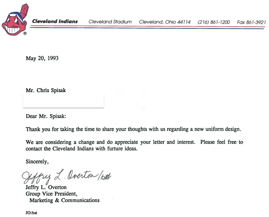
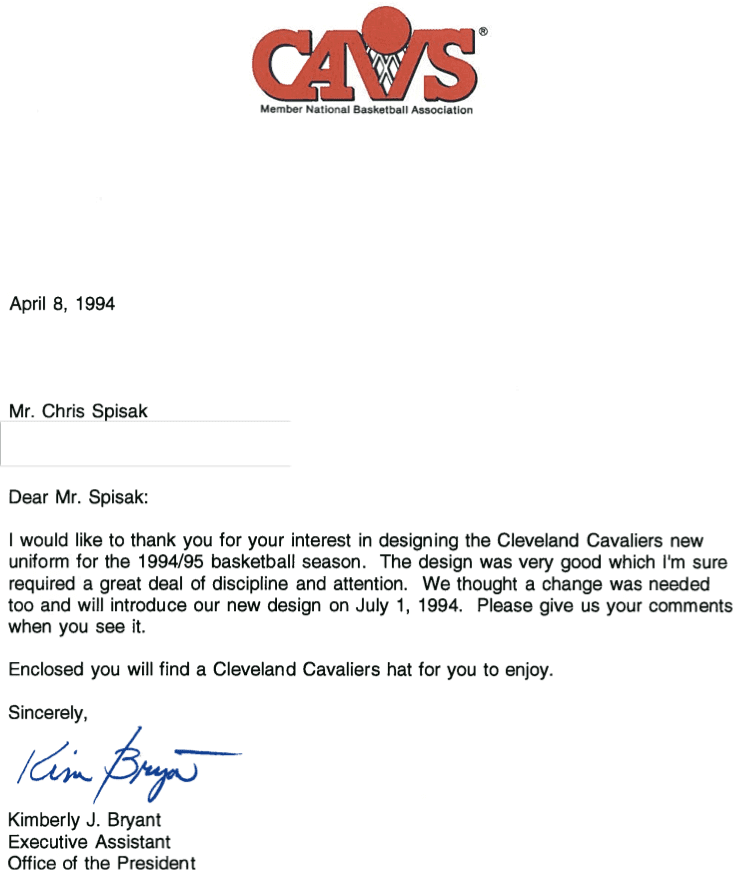
The best part of this story is that both teams wrote me back! I didn’t expect that at all. Representatives from the Indians’ and Cavs’ front offices sent me very nice responses on official letterhead. I don’t care if you’re in high school or an adult — to get a response letter like that is pretty darn awesome. The Indians thanked me for my time and suggested that I contact them again with future ideas (unfortunately I never did). The Cavs thanked me for my time as well. They even sent me a hat and wanted me to give them comments on the new logo and uniforms (unfortunately, I didn’t).
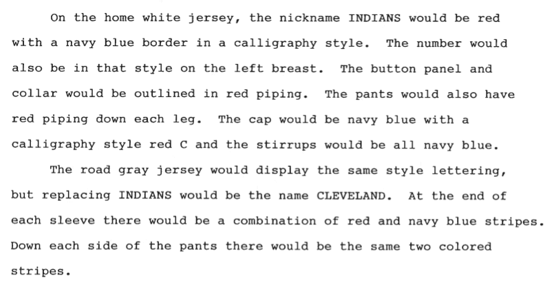
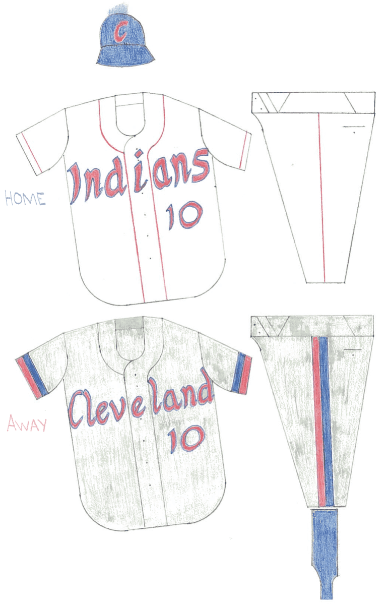
Here’s the submission that I sent to the Indians, followed by the response I received from them about two months later [for all of these, you can click to enlarge]:
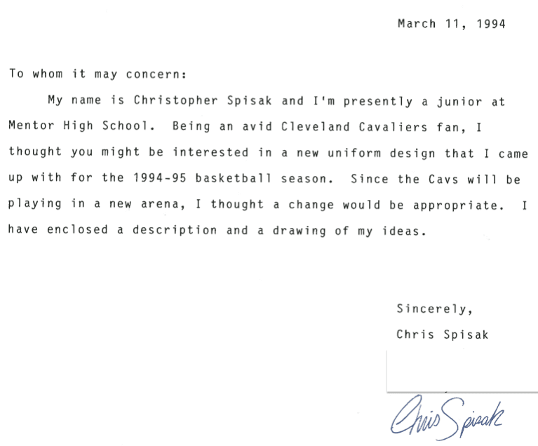
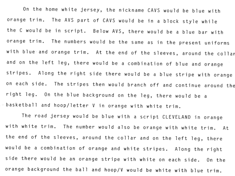
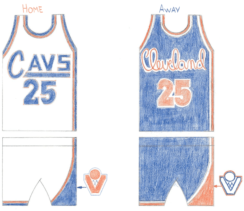
That was in 1993. The following year I sent a proposal to the Cavaliers — here’s that submission, and the response they sent back:
Fast-forward to today: Uniform design ideas are constantly being created, shared, and submitted in the blink of an eye. Last year, after I sent this submission to Uni Watch’s Cavs redesign contest on ESPN, I also my designs to the Cavs via email and regular mail. Unfortunately, I didn’t hear back from them either way.
It really shows how things have changed. The process of designing has become a lot easier and precise because of digital technology. But maybe because sports organizations can be so easily contacted, and in such heavy volumes, they no longer have the time to respond.
———
Great stuff, Chris — thanks for sharing.
That wraps things up for 2015, people. My thanks to everyone for a(nother) great year. Everyone have a happy and safe New Year’s Eve, and I’ll see you back here to kick off 2016.
The Ticker
By Paul

Baseball News: Our own Phil Hecken discusses baseball uniforms on this podcast. ”¦ “I was at my mom’s house for Christmas and found these 7-11 MLB Slurpee cups in the basement,” says Rob Heubeck. “Not sure how old they are, but probably from 1973.”

NFL News: This may be old news to some of you, but not to me: Levi’s has an NFL apparel line. ”¦ “On Sunday the injured Terrell Suggs made his first appearance back with the Ravens since Week One and was wearing a beanie with Haloti Ngata’s No. 92 rather than his own No. 55,” notes Jack Krabbe. “There have been many reports that Ngata was Suggs’s closest teammate and he was disappointed with the Ravens trading him to Detroit. Suggs also did a tribute dance to Ngata last season while Ngata was on suspension.” ”¦ Interesting story about the 49ers and their cleats, plus there’s an accompanying video (from Brinke Guthrie and Gilbert Lee).
College and High School Football News: A high school team in Samoa, of all places, uses Wisconsin’s motion-W logo. ”¦ Looks like Clemson will be going mono-orange for its CFP game. ”¦ College programs are now spending millions of dollars on giant, Fathead-style sticker graphics (from Chris Flinn). ”¦ Here are the helmets for the Semper Fi Bowl. ”¦ Players on Adidas-outfitted teams have been wearing team logos on their tights, below the knee, including Texas A&M and Nebraska (thanks, Phil). ”¦ A Louisville coach was wearing a Texas Longhorns cap during the Music City Bowl, apparently because Louisville was playing Texas A&M (from Joey Breeland). ”¦ Get this: Tennessee and Georgia went color vs. color way back in 1969, and it totally didn’t work, because red vs. orange doesn’t provide enough contrast. “I remember that a year earlier, Tennessee had to get white uniforms at the last moment prior to playing Texas in the Cotton Bowl because Texas wore burnt orange,” says Kenny Kaplan. “I believe Tennessee wore orange for every game that year, and I’m sure that was also the case in 1969 when they visited Georgia.” ”¦ Wisconsin coach Paul Chryst wore a Holiday Bowl sweatshirt on the sidelines last night.

Hockey News: The Hurricanes give out a WWE-style championship belt to deserving players. Meanwhile, the Panthers award their game MVP a Kevin Spacey space shirt
(both from John Muir). ”¦ Finland has retired Teemu Selanne’s No. 8 from international competition. Selanne showed up at the number-retirement ceremony in full uniform and gear (from Mike Styczen). ”¦ Here’s our best look yet at Canadiens G Mike Condon’s Winter Classic mask (from J. Walker). ”¦ 20th-anniversary logo and uniforms for the Pensacola Ice Flyers (thanks, Phil). ”¦ Ugly sweater jerseys for the Muskegon Lumberjacks. ”¦ Oooh, check out the gorgeous Blues/Red Wings stained glass display at the City Museum in St. Louis (from Greg Stamps).

Grab Bag: After a judge in Florida wore a camouflage robe (insert eye-roll here), the state is adopting a new rule requiring judges’ robes to be black. ”¦ For the first time ever in an Australian cricket match, an umpire wore a helmet. ”¦ The article about the National Pigeon Association’s Grand National — sort of like the Westminster Kennel Club tournament, but for pigeons instead of dogs — includes a slideshow that shows some interesting jackets being worn by pigeon owners and judges (from the Tugboat Captain). ”¦ New logo for Mello Yello soda. “This will result in a new logo for the NHRA Mello Yello Drag Racing Series,” notes David Firestone.
A followup to my Mello Yello ticker item, this is what the current logo, as of today, looks like. BTW the green caps are given to drivers who run the lowest ET during qualifying. This specific example was worn by Tony Schumacher at Bristol in 2015.
link
Ugh that Mello Yello can is obnoxious.
I agree, but I’m interested in seeing what they do with the NHRA Mello Yello Drag Racing Series logo for 2016.
Chris –
Your Cavs concepts are MUCH, MUCH better than what they came out with on July 1. Great job.
Thanks Scott. Yeah, that “new” design they came up with in ’94 was, to put it nicely, bizarre. The powder blue and black screamed 90s!
Agreed. I really wish the Cavs would’ve used your design. Great job!
Thanks Jim!
I love how the Indians misspelled “future” in the response letter.
Whoa, I never noticed that!! I guess their typewriter didn’t have a spell check.
What’s a typewriter?
It’s a magical machine that transfers text onto paper, like a printer, only slower.
The Indians’ letter shows obvious kerning adjustments–beyond any doubt, it came from a word processor. Either someone switched his spellcheck off, or it wasn’t a defgault [sic] option.
I think we can all agree that team letterheads were awesome back in the day.
Here’s Tennessee at Alabama (in Birmingham) color on color 1967 link
Red vs. orange totally worked.
Thanks for posting.
Red vs orange can totally work. I suspect that the camera didn’t do justice to the contrast.
That said, the game was also daytime. I’ve personally played red vs orange games where re lights have turned both uni into something that looked like tomato soup. Not good!
SB
A judge in a camouflage robe could ONLY happen in Florida, America’s Cousin Eddie.
“A Louisville coach was wearing a Texas Longhorns cap during the Music City Bowl, apparently because Louisville was playing Texas A&M.”
Sounds like a pretty douche thing to do, which makes it right up the alley of a team coached by Bobby Petrino. I don’t like Texas A&M, but that just doesn’t seem right.
Actually, that looks like a fan, not a coach. So my apologies to the Louisville coaching staff.
like the Carolina Hurricanes, the Browns do the WWE style belt too
If the Browns award a belt, then that title must be vacant.
hey Chris,
did you do a browns one as well? if so i am guessing it wasn’t added to this post because you never got a response back?
I did do a Browns design back then too, but never submitted it. It did, however, include a brown facemask and brown pants. Something they have implemented recently. Coincidence?…Absolutely.
Reading today’s lead with Chris’ concepts reminds me of when I used to do the same thing in the 90’s, only I never submitted them to teams. I just recently grabbed them from my parents house, maybe I’ll upload them to the Internet someday.
I think it was a missed opp for the Canadiens WInter Classic uniform. They should have gone with the Globe Crest rather than, yet again the C and the inner H. Would have been a nice change of pace from the Heritage classic jersey and other re-designs.
Habs goalie mask of interest … link
The most interesting thing for me about the Florida judge story was that their new rule also prohibits embellishments on robes.
Which would prohibit both Rehnquist’s Adidas stripes and RBG’s lace collar (if they were Florida state judges and, in Rehnquist’s case, not dead).
Are they part of the robe, or what they are wearing underneath?
ed
the tOSU medical center is giving out football themed blankets to newborns again
link
Chris – It looks like you drew your stirrups backwards on your ’94 uniform sketch. Nonetheless, I like your design very much!
Thanks for liking it! Good catch on the stirrups.
Sorry to pick a nit, but you are missing the “y” in “totally” in the ticker under the college football section.
Never apologize for pointing out typo. I want the site to be as error-free as possible and appreciate the extra set of eyes.
Now fixed.
So cool Chris, thay must have taken some serious time, great work!
Say what you will, but IMHO the best Mello Yello logo is the one they had in the early ’90s (think Days of Thunder with Tom Cruise–_that_ Mello Yello logo). They should have just gone back to that one.
No argument here!
Thanks Bill! Kinda wish I could have used a “paint bucket tool” at the time.
RE: FANS LOGO SUBMISSIONS.
The “free” logo submission world changed after this:
link
Back in the ’90’s the Leagues was much less ligitation happy than they are today. Obviously, the licensing boondoogle that is logo, uniform and merchandise design drives the obsession of suing everyone and everything.
A source who worked in NBA Creative Services in the early 2000’s pointed out that over time… the NBA (all leagues) discouraged “free” logo/uniform “fan” submissions because of trademark violation implications that might happen purposely/or accidentally should a fan’s “free” design start to resemble work that might have already been started and commissioned by the League.
He told me that when their creative director(s) would open a package and find “free” logos within, they were told under no uncertain terms to “not” look and the contents… close the package… and forward to the NBA Legal Dept. who would then insert a very legal sounding “thank you for your interest” letter and they would send the package back to the submitter.
You can’t make this stuff up…
I remember those 7-11 cups. I had a Mel Stottlemyer one. I had it before we moved away from NJ in 1974, so 1973 is about right for the time frame.
Winter Classic Masks: Also Tuukka Rask’s…
link
The new Mello Yello symbol looks a LOT like the Milton Keynes Dons from the British Football League Championship link
link the Cleveland Browns football team moved to Baltimore in late 1995 they needed to choose a new name, having agreed to leave the “Browns” name in Cleveland for use by a new Cleveland team. As the new Baltimore team was considering name choices, an amateur artist named Frederick E. Bouchat prepared a number of drawings of logos that could be used by the team depending on the chosen name. One of the drawings depicted a shield with a central “B,” the name “Ravens,” and feathered wings extending on either side of the shield (the “Shield Drawing”). Bouchat obtained common law copyright rights in the Shield Drawing by virtue of his authorship of the drawing.
The Baltimore Ravens, along with the NFL, has been embroiled in litigation with an amateur artist ever since that artist submitted drawings of proposed team logos when the old Cleveland Browns moved to Baltimore in the late 1990s. Although the Ravens hired their own artists to create an insignia for the new team, the courts have decided that those artists based their logo on the amateur’s design. The Ravens’ trademark use of their new logo was ultimately held to infringe the artist’s copyright in the underlying design drawing. Although the Ravens stopped all use of the logo by their 1999 season, it had already been incorporated on player uniforms and other articles and memorabilia. The tortuous legal battles that ensued have centered on whether the copyright “fair use” doctrine allows a continued limited use of the Ravens’ original, and infringing, team logo in its historical context. Almost fifteen years into the fight, the Hollywood film industry has now joined the fray.
Hey Chris – MHS Class of ’86 here!
ed
The Blues – Red Wings stained glass at the City Museum is from the old St. Louis Arena’s Arena Club.
Chris, your experiences submitting uniform designs sound a lot like mine. I sent pictures to the Minnesota Twins (1986), Houston Astros (1987), and Washington Capitals (also 1987). Only the Twins replied, with a polite letter from Andy McPhail, mentioning that a new Twins’ identity had been set into motion. As much as I liked the Twins’ pinstriped uniforms, which they wore while winning a World Series, I felt snubbed. I had whipped up an insignia of a two-faced player (think the Roman god Janus) bisected by a baseball bat. The left-facing player had a white pillbox cap; the other, a traditional navy blue hat. The picture was superimposed over a red silhouette of the state.
Owing to the litigious state of affairs when it comes to big sports, and the democratizing effects of the Internet, we can say our experiences will never be repeated.