I received a note the other day from reader Derek Reese, who raised an interesting point about NHL pants:
I go down to the glass during pregame warm-ups at Florida Panthers games, and I’ve noticed that the pants/breezers are made by several different manufacturers. In this shot, for example, you have players wearing both Bauer and Eagle brand pants:
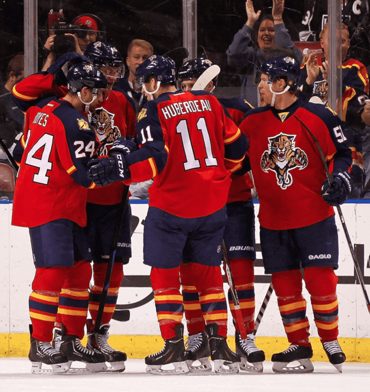
I’ve also seen Panthers players wearing CCM and Warrior pants. I found it odd (a) that Reebok makes all the sweaters but doesn’t make the pants as well, and (b) that the league would allow so many different brand marks on the pants. I guess hockey pants kinda blur the line between equipment and uniform.
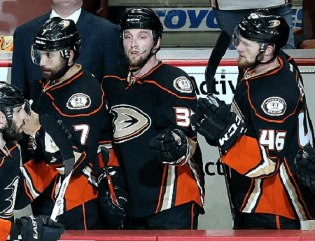
The Panthers’ pants are solid-colored, with no design on them, so the pants basically look the same except for the brand marks. But one day I was on the visitors’ side of the rink and noticed that the stripes on the Anaheim players’ pants were thinner or thicker, depending on the manufacturer, as you can see on No. 7 and No. 46 in this photo:
Obviously, this is something only eagle-eyed uni nerds such as ourselves would notice, but I’m curious if other teams also have variations in their pants, depending on the company producing them.
Good stuff, Derek. The distinction and occasional overlap between uniform and equipment is something we’ve explored before. A year and a half ago, in fact, I actually coined a new term, uniquipment, for elements that straddle the line. Hockey pants seem to have fallen into that category, although I find that to be very odd — they seem like they should be part of the uniform, period.
Meanwhile, Derek’s parting question is a good one: Are there other NHL teams with slight manufacturer-based variations in their pant designs? Teebz, Mike Engle, Alan Kreit, and all the rest of you hockey obsessives, let’s hear from you.

Reminder No. 1: Yesterday’s post mistakenly stated that yesterday was the last day to get in on my “Let’s Redesign the Maple Leafs” contest. That was incorrect — the deadline is actually today, 7pm. Full details here.
Reminder No. 2: In case you missed it on Sunday, longtime Uni Watch reader Jim Vilk is raffling off some very cool stuff from his personal collection. Full details here.
Reminder No. 3: The patches for those of you who collected all 12 Uni Watch T-shirt Club designs have arrived, and they look great. If you’re eligible for the prize but haven’t yet claimed it, you need to prove that you ordered all 12 shirts by either (a) taking a photo of the 12 shirts or (b) taking screen shots of your 12 order-confirmation emails from Teespring and putting the 12 shots into a folder. Then email the photo or the folder to TshirtClubProof@gmail.com, and be sure to include your mailing address so I know where to mail your patch.
Speaking of the patches, reader LH Griffel received his and has already found a good place for it (click to enlarge):
Nice, right? If you’ve made good use of your prize patch, feel free to send photos this-a-way. Thanks.
Gromm-It update: Potatoes already have eyes, so why shouldn’t they have eyelets? You can see a hint of how that looks at right; see the full treatment over on Gromm-It.
The Ticker
By Paul

’Skins Watch: Big boost yesterday for the ’Skins, as a federal appeals court ruled that the section of the Lanham Act that allows the government to deny trademark protection to offensive or disparaging marks is unconstitutional. The government may appeal to the Supreme Court.

Baseball News: Single-digitized pitcher alert! That’s newly signed Cardinals RHP Mike Leake. He says he’s trying to break the mold. Further thoughts from him in this video clip”¦ Robert Brashear found a set of 2004 Yankees Christmas tree ornaments. “Only A-Rod is still with the team,” he notes, although I wonder how many teams have even one player remaining from their 2004 rosters. Anyone wanna tackle that? ”¦ DIY genius Wafflebored’s latest triumph is a gorgeous art deco-style baseball jersey. ”¦ Too bad newly signed Mets OF Alejandro De Aza’s goes by “De Aza” rather than “de Aza,” as it would’ve been fun for the Mets to have yet another NOB with a lowercase “d.”

NFL News: Here’s a short history of the Panthers’ uniforms (from Joe Mustian). ”¦ The Ravens hare having fans vote on various uniform combinations, including some with grey pants. ”¦ Good article about how the NFL used to produce — and still sells! — “brain damage snuff films,” which is admittedly a slightly hyperbolic term, but only slightly. ”¦ And hey, speaking of concussions and such, check out this photo (from Val Sobrevilla). ”¦ The Bears have posted a photo gallery of their players involved in postgame jersey swaps (from Austin Huette). ”¦ Speaking of jersey swaps, here’s another article about how that phenomenon is sweeping the league (from Tommy Turner). ”¦ Also from Tommy: Washington players discussed the stories behind their uniform numbers.
College and High School Football News: This is weird: two different helmets on the same sideline. “Probably the JV team standing on the sideline for a varsity game,” says Mark Miller. ”¦ Utah State players had old sideline capes with out-of-date lettering at the Spud Bowl yesterday. ”¦ Tulane is bringing back grey uniforms and will also have a matte grey helmet. “For a school whose colors are blue and green — hell, they’re called the Green Wave — this is such shit,” says Phil. ”¦ Western Kentucky’s locker room has display case featuring a helmet from every school WKU defeated in 2015 (from Josh Claywell).

Hockey News: The Rangers wore white at home last night. Like most NHL teams, they look better in white, but man, they really look better in white — such a great uni. ”¦ From that same game, this report from Alan Kreit: “After a fight, Ryan Kesler removes his jersey in the penalty box. Teammate skates across the ice and throws it to the equipment guy leaving Kesler in just his pads. Equipment guy sprints into the locker room.” ”¦ The Kings had pretty cool Xmas-themed warm-up jerseys last night. ”¦ Here’s a website by a guy who’s drawing every Hockey Hall of Famer (from Will Scheibler).

NBA News: Celtics F Evan Turner is selling T-shirts featuring an NBA logo-zied treatment of himself. ”¦ The Chicago Tribune asked longtime uniform/logo designer Tom O’Grady to assess the state of NBA court design (from Jeff Cox). ”¦ A Stephon Marbury museum is opening in China (thanks, Mike).

College Hoops News: Santa showed up at UNC’s game the other night in a Carolina blue Santa suit. “It’s a longtime UNC holiday tradition,” explains James Gilbert. ”¦ Syracuse F DaJuan Coleman was wearing two different-colored shoes last night (thanks, Phil). ”¦ Throwbacks last night for Ohio State (from Brendan Fitzgerald and Robert Hayes).

Soccer News: Early Christmas present for soccer fans yesterday, as lots of new jerseys were released, including designs for Real Madrid, Juventus, Inter Milan, and England.

Grab Bag: “The Guardian has a great story on the history of the Australian cricket team’s baggy green cap,” says Craig Snyder. “The first part of the article is about the auction price. The history part starts at the ‘Origin of the Species’ subheading.”
Mets still have David Wright from 2004. I think he and A-Rod are the only ones still with the same team.
David Ortiz.
Duh. Can’t believe I forgot Ortiz!
Joe Mauer started in 2004, but then he tore his knee.
Ryan Howard was a September call-up in 2004, if that counts.
Cardinals: Yadier Molina made his ML debut in June 2004. Also, their starting catcher, Mike Matheny, is now the manager. Granted, he went to the Giants, then retired after ’06, then was hired to his current post for 2012. Fourth OF John Mabry (ret. ’07) is now the hitting coach.
In fact, from that team, only Molina, Albert Pujols, & Jason Marquis are active in the majors (Dan Haren retired following the ’15 season).
Hockey pants can display the marks of any manufacturer who pays the NHL license fee for equipment, so they’re clearly considered “equipment” by the league. The license also covers helmets, skates, goalie pads (a big one), sticks, gloves…
For standard team uniforms, players’ pants will typically be that color and pattern (the Islanders were seen breaking in separate black pants for their new third uniform). For one-offs in the NHL (Winter Classic), at the lower levels, and for players who want to wear their same old pants (superstitious/new), they wear link, a decorated nylon covering. This can stand out when a player tucks his jersey in, because the shells don’t cover the part of the pants above the belt.
As a hockey player, I totally get why the pants are “uniquiptment”. I wear a girdle when I play, and any nylon shell can go over easily, but I wore several other brands growing up, and there is a big variety in comfort/preference depending on the player.
The Ravens are having fans vote on various uniform combinations, including some with grey pants.
Dear Ravens, gray pants would be even more stupid than the gold ones. Please don’t do this.
I’m with you, my hard-bodied bachelor friend. Why does a team with three official colors need to add a fourth? Purple! Black! We’re done! Sheesh!
Proofreading: “The Ravens hare having fans vote”
Tagging on the Stephon Marbury museum link is broken
“Juventes” should be “Juventus”
Fixed.
Yadi Molina came up with the Cardinals in June of 2004 when Mike Matheny was hurt. He’s definitely the only one still on the team from ’04 unless you count Matheny himself who was a player then and manager now.
Sorry, Paul, but I have to disagree that hockey pants, “should be part of the uniform, period.”
The primary purpose of the pants is for protection and all manufacturers have a different fit and feel. Not everyone is comfortable in every make and style, so forcing players–particularly NHL ones–to all wear a single manufacturer would not go over well (the same is true for hockey helmets, gloves, etc.).
No, but having everyone in Reebok pant shells over whatever they want to wear would not be a major impediment. That said, the league considers it equipment, and it *is* equipment. No need to overthink.
Oh please, like the players can’t have them custom tailored… or they can’t just, I don’t know, maybe not have a manufacturers mark on them at all?
In the CHL all the pants, gloves and helmets are made by the same manufacturer so they are truely uniform. They currently all wear CCM.
link
That’s because of marketing; the OHL has long had a contract with a particular equipment manufacturer to supply all of the gear (especially visible uniquipment) for the league. That’s how you indoctrinate the next generation’s NHL stars to wear your brand, by getting them used to it in juniors. It’s no surprise why every goalie that comes out of Quebec wears CCM (and Reebok before that, and Koho before that) pads and gloves; for several years, that was the only brand that the Q would allow goalies to wear. The fact that it is manufactured by the Lefebvre family plant in St. Jean, and first made famous by Patrick Roy didn’t hurt.
This is the right answer. Hockey pants aren’t like jerseys or like football pants, hockey pants these days ARE the pads.
I’ve seen Reebok, Eagle, Bauer and Warrior Franchise pants on the Flames (who have a unique pants design) but I’ve never noticed any variation in the striping.
Seconded. Each team issues a style guide to the manufacturers, including everything down to the width of the stripe (if any) on the pants. The Red Wings have had 2″ stripes since the beginning of time (or so it would seem). Can you imagine trying to guesstimate the pattern on the Rangers’ pants?
Also of note: one could do an entire article on the Cooperall system. Say “Cooperalls” and most people think of the long pants worn by Hartford and Philly in the NHL, but it was more than that; it was Cooper’s attempt to do a complete protective package that operated independent of the uniform sweater and pants.
“Cooperall” is synonymous with the failed long pants, but their idea of making the padding integral with the pants is the basis for modern pants.
I’m pretty sure Paul has written on Cooperalls before (I seem to remember a piece about the first time the Flyers played the Whalers in long pants) but I’m sure it was about the aesthetics, I don’t remember anyone talking about the integrated padding.
The protective function of the pant was a girdle made of a Spandex-like material that held the pads in place; you pulled the girdle on just like pants, laced them and tightened the belt to keep them in place, then pulled the color shell over it (the shell hung from suspenders, like the old style pants).
A good idea in theory, but the problem was that the girdle didn’t breathe, so it kept you too warm during the game. It was bad enough with the traditional short pants, but the full length pant shell was even worse. Same for the shoulder and elbow pads in the system; the tight fit meant you were skating in a sweatbox. At first, I think the only short pant shell was for goalies, but Cooper relented and made them available for the entire team.
It wasn’t the long pants that doomed the girdles for good. Back then, hockey pants had all the fit of a barrel: large enough to hold a few pads in strategic places without restricting skating movement, no tailored fit, held up by suspenders. Tackla then introduced the European style pants, with a tapered fit that hugged the body without affecting movement and allowed some ventilation, held in place by a belt.
Do we have a definitive list of NHL teams that look better in white or color?
Here’s my list for the East…
Metro:
Better in white: The Caps alternates (RIP), Rangers, Blue Jackets, Hurricanes
Better in color: Islanders, Devils, Flyers, Penguins alts
Atlantic:
Better in white: Leafs, Red Wings, Sabres, Bruins, Lightning, Senators, Panthers (?)
Better in color: Habs (I will fight for this one).
Not all teams look better in white than in color…
…but all teams should wear white at home, as god intended.
Bullshit
As a Blackhawks fan, I disagree. The red uni is one of the best in the NHL, and the loyal Chicago fans deserve to see that more than the white one.
I will never miss the black alternates…never have.
Considering that teams originally had just one, usually dark, jersey, and then starting adding a second, white, set to be worn on the road as the NHL grew, the “as God intended” argument is not based on a solid foundation. White did not become the home uniform until 1970. The argument is fine enough, to be evolutionary-based, with “white looks better at home, period.”
The white sweaters weren’t originally added just for the road, they were added as clash sweaters. The Maple Leafs, for example, wore their white sweaters against the Rangers whether they were at MLG or MSG, simply because the Rangers at the time only had their blue shirts. In addition, a few teams back then sometimes only had white sweaters (the St. Pats in the mid-20s, the Cougars in the late 20s, the Eagles in their lone season, the Amerks in their final seasons, and the Bruins for most of the 30s and 40s).
So, in short, the only periods where white* was mandated as the road sweater was from 1955-1970 and from 2003 to today. And the latter is ONLY the case because of the proliferation of third jerseys – which in most cases aren’t white – and the preference of teams to wear those thirds at home, and to not have to lug multiple uniform sets on road trips to accommodate those third jersey games.
* The 1967-88 Kings and 1970-74 Golden Seals wearing gold-yellow in place of white notwithstanding.
the “as God intended” argument is not based on a solid foundation.
Because in any discussion of God’s desires re: hockey uniforms, the key point is whether or not one is employing solid logic & attention to historical detail :-)
Said the same thing to another uni-centric website and got instantly told how very wrong I was to have an opinion like that. I know the Kings look a lot better in white than black.
Never really thought about it before, but it is ironic that hockey breezers are equipment (or uniquipment) while football pants are uniform. They both hold pads, so you would think that individual preference could hold influence either way.
But to the question, I’ve never noticed any mini disparities in breezers before. Good spot!
That HS with variant helmets also has at least four different jerseys: #5, #6, #2 and the guy at the far right (#28?) are all different in either striping, number font or number color.
Also #6 and #2 have different pants striping from each other
The team pictured on this site is Lake Travis in the Texas State High School state championship game. I watched a lot of the games from the various classifications and many larger schools also had kids in differing helmets and jerseys on the sidelines. They are indeed the JV players that got to dress and be on the sidelines for the State championship game. A reward for being live blocking dummies for the varsity I suspect and for being able to experience what going to State is about so they are mentally ready in a couple of years if they also make it there.
Also on same team since 2004: J Mauer, D Wright, R Howard, Y Molina.
I’ve got a lot of problems with you people…and now you’re gonna hear about it!
Happy Festivus to you too, Phil! Air those grievances!
The NY Rangers’ pants are another example of variation among manufacturers. The spacing between the blue and white trim is either tight and narrow or much wider depending on who manufactured it.
The Rangers wore white at home last night. Like most NHL teams, they look better in white, but man, they really look better in white – such a great uni.
The Rangers and Canadiens understand this better than anyone. If the Blueshirts were to adopt a white uniform that was merely a reversed blue uniform, the disappointment would be palpable. They almost went down this road when they wore the Liberty Head sweaters (not to mention the John Ferguson sweaters). Montreal’s uniforms are so utterly different I can’t pick a favorite, but the team clearly favors the red ones. If one of these teams would spring for a set of red helmets, we could be treated to a color-on-color game.
Well how do you like this? I figured that because my Habs have a tricolor stripe down their breezers (white red white on blue), they might be a candidate for some super slight variation. I submit this picture to the jury:
link
Alex Galchenyuk 27 wears Bauer. Fairly thick red stripe. Torrey Mitchell 17 is in Warrior pants. Seems thinner.
Ok this was fun, thanks for making me think about something new! But now it’s Alan Kreit’s turn to inspect the Rangers. (Talk about a prime candidate today: the Rangers have the most intricate breezers in the NHL!)
Link doesn’t work because you have a protected twitter account.
Here you go, THE
I was at the Rangers game last night. Kesler’s jersey got ripped in the fight and needed to be repaired. NHL rules frown upon “altered” uniforms (Rule 9.1) and protective equipment showing (rule 9.5).
The equipment manager was back in the locker room for a while; I was thinking they didn’t have a backup for Kesler ready to go so he had to get on a sewing machine to stitch it up.
First comment. Love the site!
I noticed different hockey pant manufacturers back in the early 1990s, when I actually really started paying attention to uniform details. Most likely the branding started circa the early 80s, around the time the sweaters started carrying makers’ marks.
link from the 1991-92 season of two brands showing on one team – Gerard Gallant is wearing Tackla pants, while Steve Yzerman, Bob Probert, and Kelly Miller are wearing CCM Supra pants. Of course, I’m just happy to share those 1927-28 throwback jerseys.
“And hey, speaking of concussions and such, check out this photo (from Val Sobrevilla). ”
What specifically are we checking out?
All the helmet-to-helmet paint transfer?
The apparent thin padding in Otto’s helmet?
The awesome silver numbers? !!!
Yeah… I’m not sure what we’re looking for either… but those silver numbers were/are definitely awesome and really need to be brought back.
The most commonly-recurring mistake in football livery is to introduce a white jersey with light-colored numbers that have dark outlines. Don’t get me wrong: They look great. But nobody wants to address the readability issue until everyone discovers the numerals can’t be read in real-game conditions.
Shouldn’t the team make a few different prototypes, get some players to run around the field wearing them, watch from the cheap seats, and pick the ones that are easiest to read?
Well, I had a longer post that I lost. Short version: The Rangers not only look better in blue than in white, but look better than any other team in pro hockey and maybe better than any other in pro sports. The whites are great, though.
Pants are considered equipment so just like helmets, gloves, sticks, etc. the players are allowed to wear any brand of their choosing that pays the NHL licensing fees which apparently are quite expensive and locks out a lot of smaller equipment makers.
As for no Reebok pants, Adidas the parent company pulled Reebok out of hockey except for the jerseys which it is still under contract for. All of the Reebok endorsers including Sidney Crosby have switched over to the equipment sister brand CCM. This is similar to when Nike pulled out of hockey and all of the Nike endorsers moved over to what at the time was it’s sister brand Bauer. It won’t make a difference to the player as all Reebok equipment was identical to the CCM gear with different branding.
Should be interesting to see what happens when Adidas starts branding the Jerseys in the 2017 season and whether they will re-appropriate CCM gear with Adidas branding or keep using 2 brands in hockey. I actually think Adidas is a terrible fit in hockey as they don’t make any hockey related gear (at least that is branded Adidas) and with the exception of a few college hockey teams haven’t even been in the hockey jersey market. I was hoping Under Armour or Bauer would win the rights but I guess Adidas / Reebok had some sort of right of first refusal or offered more money since Adidas just lost the NBA rights. I miss the days when teams could make branding deals for jerseys as I found more variety and team initiated design were far superior!
Inbreeding in hockey equipment is horrible, and got worse as the cost of licensing fees went up. Lots of good names went by the wayside, simply because the NHL required one fee per category per brand. So while Daignault-Rolland (DR) paid one fee for their player’s gloves, The Hockey Company (a private equity firm that picked CCM out of receivership, adding several other brands along the way) paid one fee for CCM gloves… and one fee for Koho, another for Jofa, another for Canadien… and so on. It only made sense for them to consolidate into one brand and discontinue the others.
Nice to see my submission getting some people thinking about the details on the pants! Now I’ve caught myself looking at each team that comes in to see if there are any differences.
P.S. the name’s Derek by the way, not David – but David is my father’s name, so needless to say I was a little weirded out when I logged on this morning haha.
Yikes. Will fix.
In professional sports league licensing arranngements… it’s always best to follow the money… In the NHL the cash cow is is the replica team jersey. REEBOK pays the league a king’s ransom to outfit the 30 NHL teams. Same with Reebok and NBA replca jersey and Majestic and MLB jerseys…
Companies like EAGLE use NHL player equipment (gloves and pants as an example) as a great way to expose their game equipment to the hockey playing populace.
I liked the Carolina Panthers article, and there’s really only one thing I think needs to be fixed with their unis: fix the shoulder stripes. They curve away from the body so obviously to end at the armhole that they look worse than the Jets’ and Colts’ truncated loops. It doesn’t seem like it should be that hard to give everyone proper shoulder loops like on Cam’s jersey, but whatever.
Yes, I was wondering what kind of article you could have on the uniform history of a team that doesn’t seem to have changed anything in their relatively short history. Odd that Nike can get the stripes perfect on a few jerseys (Newton, the punter and kicker, amongst others), but screws it up so badly with everyone else. Do they even know the definition of uniform?
I am curious about one thing, however; the article says there was a change to the uniform or logo after the first season, but I can’t find any documentation on that. Anyone know what was changed?
They changed the wordmark. The panther logo itself was untouched.
The logo changed a little bit.
Lee
The 1995 Panthers had inaugural season patches, and wore blue socks with both the white and black jerseys. Since 1996 they’ve had black socks which are always worn with the black jerseys – unless they’re wearing the black pants as well, in which case the blue socks are worn.
This is also true… but I think the article was referring to this: link vs this: link
Hopefully those links both work correctly.
True, though it was only the wordmark part that changed.
Sadly, the NBA court piece is behind a paywall on the Chicago Tribune (mobile site, at least). Is that the case on desktop?
I read it on desktop yesterday with no problem.
It’s behind a paywall on my desktop today.
link
Using a desktop as always.
After clicking the link, ‘Chicago Tribune Sports Plus’ subscription page immediately comes up and covers up the entire article.
It ask you to either login or register.
link
That just goes to the exact same paywall sign-up page.
Deskktop. And behind paywall (for me just now).
Grommet potatoes are the first of the project to give me a case of the creepy-crawlies. Can’t remember the term for that but someone mentioned it the other day.
That was me – trypophobia
link
link
WOW. That’s a really old North Stars jersey…