
Click to enlarge
NFL teams are only allowed to use one helmet shell, and their jersey colors have to be scripted months in advance. But there’s nothing keeping them from freestyling with their pants, and that was the case yesterday in Baltimore, as the Ravens pulled a surprise move by debuting the first set of mustard-colored pants in team history (additional photos here).
It’s not a terrible look, or at least no more terrible than what they already had. Obviously, I can’t stand purple, but I can appreciate on an intellectual level, if not an emotional one, that the new pants makes a pretty natural color pairing with the jersey. Yeah, it’s a bit Washington Huskies, but whatever. I’m not usually a fan of “switching things up” just for the sake of doing so, but in this case I think it’s a plus. Good for them.
Aside from the Baltimore’s new britches, it was a quiet day around the league, but here are a few tidbits:
• The Jaguars went mono-black.
• So did the Eagles.
• Colts defensive back Vontae Davis had some serious biker shorts action going on. For that matter, so did the other player in that photo, Texans wideout DeAndre Hopkins.
• As we had noted in a Ticker a while back, the 49ers went with throwback end zones for their game against the Bengals — a shout-out to the teams’ two Super Bowl match-ups in the 1980s.
• Speaking of Super Bowls past, very good-looking game yesterday in Oakland, as the Raiders and Packers reprised the look of Super Bowl II.
• Here’s a weird one: Broncos cornerback Aqib Talib was missing his TV numbers. What’s up with that?
Reminder No. 1: Today is the final day to enter my annual year-end reader-appreciation raffle. The deadline is 7pm Eastern tonight. Full details here.
Reminder No. 2: Tomorrow is the last day to get in on my “Let’s redesign the Maple Leafs” content. Full details here.
Reminder No. 3: The patches for those of you who collected all 12 Uni Watch T-shirt Club shirts have arrived, and they look great:
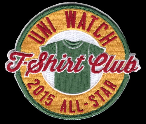
If you’re eligible for the prize but haven’t yet claimed it, you need to prove that you ordered all 12 shirts by either (a) taking a photo of the 12 shirts or (b) taking screen shots of your 12 order-confirmation emails from Teespring and putting the 12 shots into a folder. Then email the photo or the folder to TshirtClubProof@gmail.com (note that this is a new address — please do not send your proof to the regular Uni Watch email address), and be sure to include your mailing address so I know where to mail your patch.

Click to enlarge
Curling champs: Congrats to the Rock Its, skipped by our own Phil Hecken, newly crowned champs of the Fall 2015 Lakeside Curling Club. As you can see above, Phil wore his Uni Watch ugly sweater sweatshirt while leading the team to victory last night — nice.

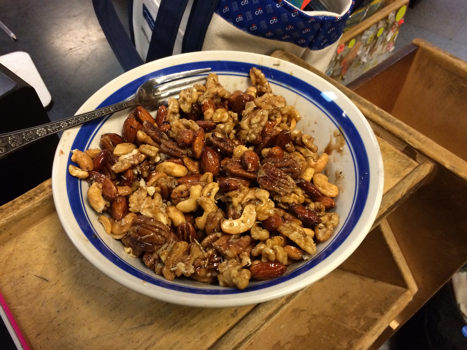
Culinary Corner: Over the weekend I was invited to a small party and needed to bring some sort of portable edible. I decided to make some spiced nuts, which turned out to be fun and delicious — a great mix of sweet, salty, spicy, and gooey. These are easy to make. Here’s how:
1. Start with four cups of roasted nuts. I used a cup each of walnuts, pecans, almonds and cashews, but you could easily substitute peanuts (which are less expensive), filberts, or even pumpkin seeds. Whatever you use, put the nuts in a big bowl and set aside.
2. Put a half-cup of sugar, a quarter-cup of water, a tablespoon of butter, a teaspoon of salt, and a few pinches of black pepper in a small saucepan. Then add whatever spices, herbs, and flavorings you want. I kept it pretty simple by using half a teaspoon of cayenne pepper, close to a tablespoon of dried rosemary, and a few splashes of Worcestershire sauce, but you could use almost anything here — paprika, cumin, mustard powder, Tabasco, garlic, cinnamon, whatever. Once you’ve added your flavorings, put the saucepan over medium head and stir gently until about a minute after the butter is melted.
3. Pour the saucepan mix over the nuts and toss to coat.
4. Put sheet of parchment paper onto a baking sheet tray, spray lightly with cooking spray, and then spread the flavor-coated nuts out into the tray. Arrange them in a single layer and then put them into a preheated 350 º oven for 10 minutes.
5. Remove the tray from the oven and use a wooden spoon (or something similar) to stir the nuts in the tray for three or four minutes. The coating should get slightly thicker and more syrupy as it cools, so try to get all of the nuts at least somewhat coated in the syrup. Then redistribute them in a single layer again and put the tray back in the over for six more minutes. Let the nuts cool a bit before serving.
That’s it. If the nuts begin to fuse together in big clumps (as mine did, although that might be because they had to travel to New Jersey on a cold day), just provide a fork so your guests can break apart the clumps:
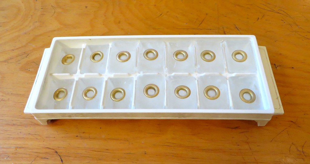
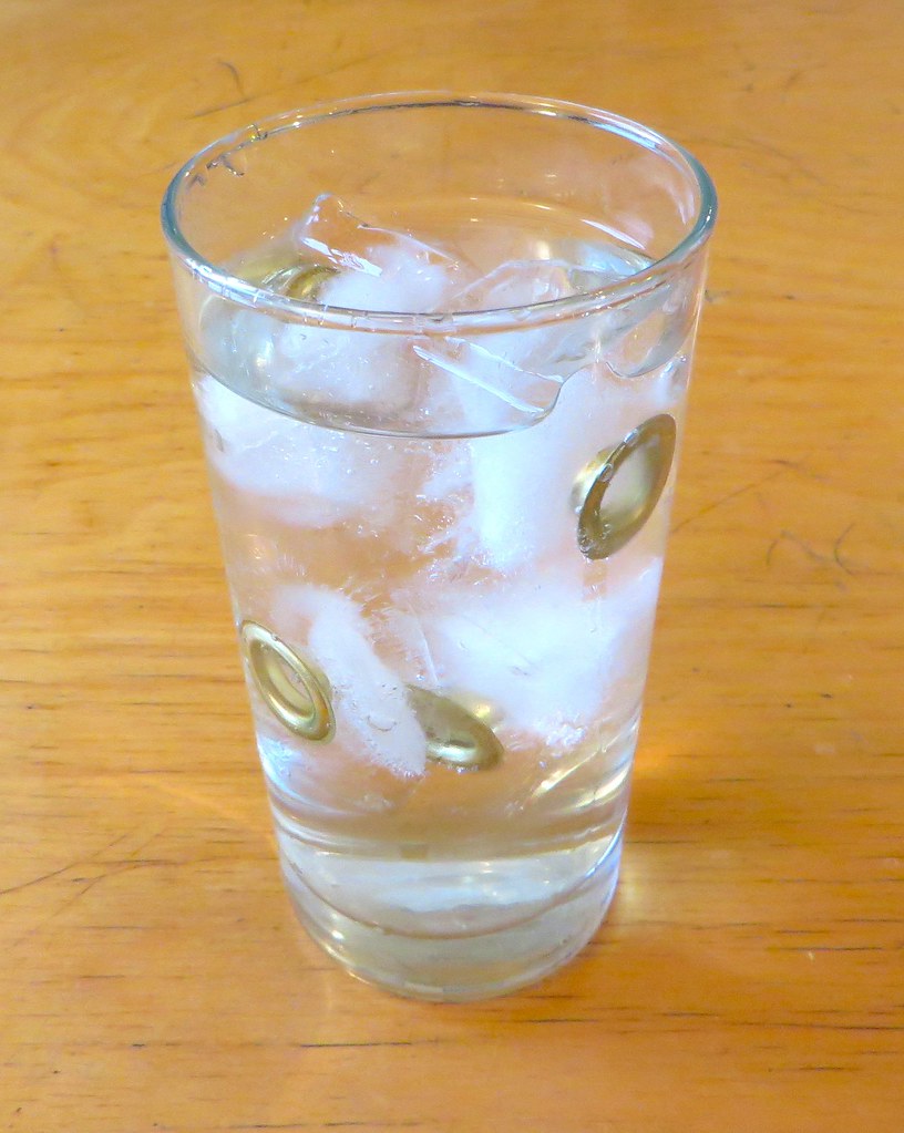
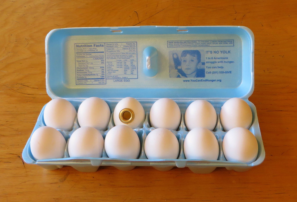
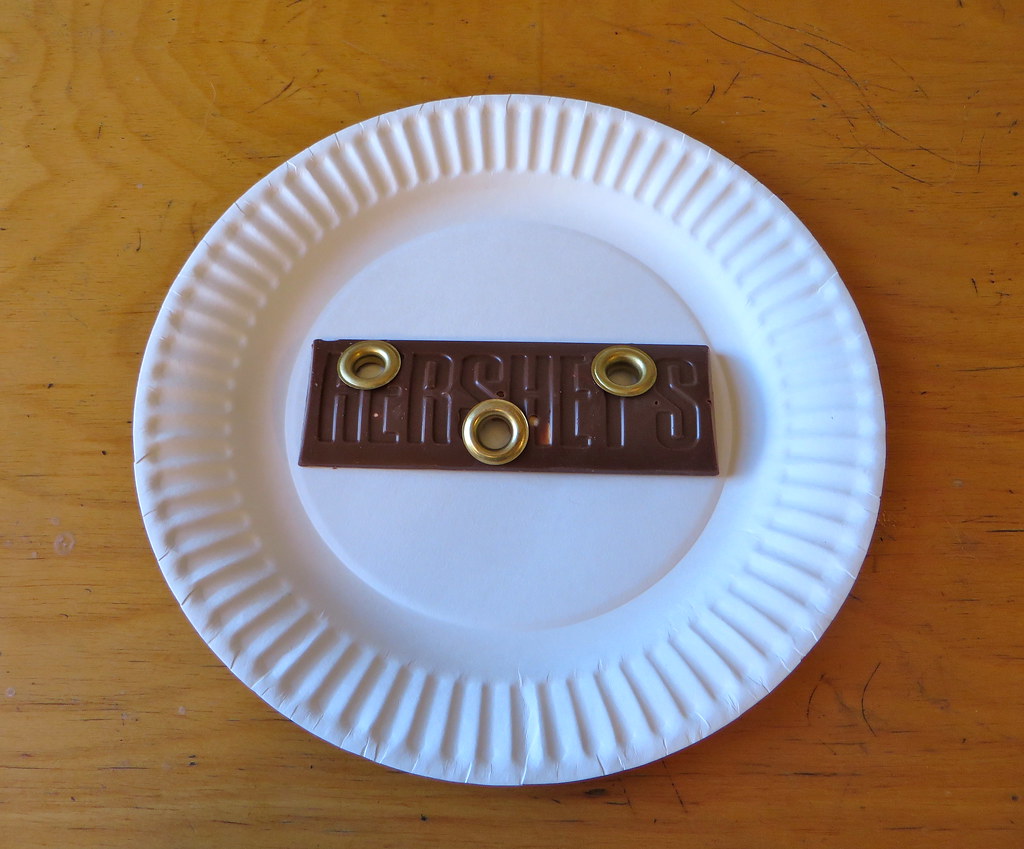
Grommets, continued: The grommet project now has a name: Gromm-It. I know, I know — lots of you really liked Hole Foods, but there were various factors that mitigated against that one. The good news is that I was able to work “Hole Foods” into the project’s subtitle, which you can see on the new Gromm-It website. If you scroll down to the bottom, you’ll see that the site includes posts for all of the grommeted foodstuffs I’ve shown here on Uni Watch (all backdated to when I originally took the photos), along with several new ones (including grommeted ice cubes and a grommeted egg, both of which I’m pretty damn pleased with, thank you very much). The site still needs some work — a logo would be nice, for starters, instead of that type treatment I threw together — but it’s a decent start.
I’ll keep posting photos here as I add them to the Gromm-It site. Here are a bunch, just so we’re caught up here…
Grommeted ice is twice as nice (click pics to enlarge).

Which came first, the grommet or the egg?

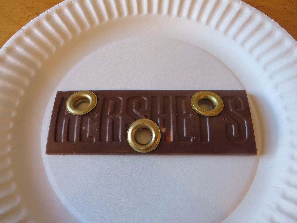
Why settle for Hershey’s with Almonds when you can have Hershey’s with Grommets?
Teeny-Tiny Ticker
By Paul

Hockey News: Goaltender Ray Emery, now with the Toronto Marlies, is still wearing his old Flyers mask, but with tape covering the team logos. I didn’t realize that the Maple Leafs have their top minor league affiliate right there in Toronto — interesting (from J. Walker).

NBA News: Nets F Thaddeus Young must’ve been wearing an old jersey the other night, because it had the NBA logo on the front. ”¦ The Hawks did the mismatched uni thing again last night. Lots of additional photos here. … Magic F Channing Frye lost his mouthpiece before shooting a free throw last night, and then put it back in after wiping it on his shorts. Five-second rule! (Thanks, Mike.) … Whoa, check out the amazing warm-up sweaters worn by the 1918 Christian Brothers’ Business College team (great find by Will Scheibler).
Whoa that’s a tiny ticker!
I really like the egg grommet.
Yes, egg grommet is excellent!
Yea, how the heck did he manage that?
Entailed a lot of trial and error, and lots of broken eggs.
I boiled some eggs, even froze some eggs, but the shell always developed fissures when I tried to create the hole. Eventually, acting upon some advice from the internet, I took a nail file to the target area (to weaken the spot where I wanted to create the hole), then covered it with a Band-Aid (to strengthen the surrounding area, so it wouldn’t develop fissures), and then began cutting a hole with an Xacto knife. Kept enlarging the hole until it was big enough to allow me to pour out the raw egg. THen kept enlarging the hole until it was big enough to accept the grommet.
I will not be satisfied with the grommets until you grommet a whole cut of meat, and use the circular pieces to make something on Culinary Corner!
You’re the first person I’ve seen who didn’t completely bash the Ravens’ gold pants. And I agree with you. I think they look good. It’s a color from their logo, and I think purple and true gold look great. Looks like royalty. Much better look then when they match purple jerseys with black pants or wear black jerseys and black pants. Too bad they lost, though, because it means we’ll probably never see those pants again.
Too bad they lost, though, because it means we’ll probably never see those pants again.
If the Ravens stopped wearing a given element just because they lost, they’d be naked by now (at least this year).
I LOVED the pants.
I hope they pair them with the black tops and wear those as a combo the next time the Stillers come to 1101 Russell Street.
Black and Gold are the Steelers colors. I would like the team to avoid this at all costs. I think I would have like the pants more if the color actually mirrored the gold in the logo, an actual metallic gold like the 9ers or Saints.
like these?
link
I don’t think it was a great look but it was certainly a zillion times better than the purple jersey with black leotards. I agree that it’s pretty well impossible for the Ravens to look good.
So did I. They looked like Omega Psi Phi. Would have been better with no stripes. The iggles need to take the stripes off their black britches.
I love the Ravens mustard pants. I would love any thing, actually, that forces them to not wear the leotard black pants. I think the NFL fashion police should pass a rule that all pants must have a stripe of at least 3 inch thickness to prevent the leotard look!
IMO, the Ravens’ mustard pants gave their uniforms a “pants lost on the way to the stadium” feel. Had they been “shiny”, looked more like a royal gold, they may have worked, but those “purple” jerseys are so much closer to blue (at least in pictures) than they are to what I think of as purple, I don’t know if even that would be enough.
I like the idea of it, but on the field it had more of a frankenuni feel for me. Basically nothing about the pants or the jersey relates in any way to the other. Jersey is predominantly purple and white; pants were entirely mustard and black. Even a consistent stripe pattern would have helped tie the uni together.
Figure out a stripe pattern that the jersey, helmet, and pants can share, then make sure the stripes can include at least two colors. As long as there’s purple and gold on the helmet, gold on the jersey, and purple and black on the pants, the gold pants would have worked pretty well with the rest of the uniform.
pants were entirely mustard and black
Incorrect. Pants striping was purple/black/purple. Not saying it looked great, but it was not “entirely mustard and black.”
Ah, thanks for the correction. I only saw a few highlights on the teevee, and even in hi-def it just looked like a thick black stripe to me. Which is not unusual; the only unique color combo the Ravens have is their dark purple and black, which generally just looks black. Anyway, my theory that multicolor stripes might save the gold pants from frankenuni ugliness is falsified: The Ravens were wearing multicolored pants, and it still looked like crap.
I’m just not sure it’s possible for the Ravens to look good. Dark purple and black is a unique combo for the team, but it never looks better than utterly terrible. Playing up white tends to make them look like either the Raiders or the Vikings, while playing up the gold shifts them into Steelers/Saints territory. So the Ravens can either be ugly, or they can be not the Ravens.
I’m just not sure it’s possible for the Ravens to look good.
As usual, Scott cuts to the heart of the matter. Our work here is done — we can all go home now.
The pants came off as too imbalanced for me. Gold is part of the color scheme, but there’ss very little of it in either the helmet or the jersey so the gold seemed bottom-heavy.
I think a little more white in the pants to serve as a common trim color (jersey numbers) might have helped. It took zooming in on the header pic to realize that the pant stripe was actually purple-black-purple; I think integrating some white there might help. That, or ditch the stripes altogether and just go with solid gold pants (sure, it makes it even MORE bottom-heavy with the gold, but the more I think about it the more my issue is with that stripe).
I thought the look was good, but those pants look far too much like the Steelers’ pants at a glance. The purple and black blend together, making the decoration look like the thick black band that the Steelers’ pants are known for. I’d much rather see white pants with some type of gold detailing. The black socks and helmet keep them from looking too much like the Vikings in that instance.
Appreciate the Philly-centric Ticker today w/ ex- Flyer Emery & ex-Sixer Thad Young. lol
IMO Ravens’ gold pants are too similar to the Steelers’ pants, largely due to the very broad striping. Had they used a different stripe, it would have been a better look.
I shan’t be convinced that this…
link
…looks as good as this……
link
Agreed… but I’ll take what I can get. It’s a helluva lot better than this:
link
The ravens looked like garbage. And the pants didn’t look good either. My theory is the ravens were field testing for a possible color rush game next year. And why does nike keep making these metallic elements when they just can’t do it with their fabric. Their gold is mustard and their pewter is brown. And they just add more and more of it to the uniforms.
First Thaddeus Young link leads to a Page Not Found.
Should work now. Here’s the link, so you don’t have to scroll back up for it:
link
Jerry Seinfeld: “*Anyone* can put the front of a grommet on something. You have be able to attach the back of the grommet.”
I agree it’s more satisfying when the back piece is included, and I do include it whenever possible. For some items, like the egg, and the ice cubes, it isn’t possible, but I think they turned out quite well.
Baltimore media reported NFL was “encouraging” teams to incorporate a gold element into the uniform for the 50th Super Bowl. No denials heard yet.
Were they just jumping the gun for more shenanigans in the next couple of weeks?
Wouldn’t doubt it. Methinks Paul may have to create a new entry in the UW Glossary: GFGS
Oops… just occurred to me the acronym for “Gold For Gold’s Sake” is identical to it’s “Grey For Grey’s Sake” counterpart. My mistake. To rectify the situation, I first looked to the Periodic Table for inspiration, but it looks most unfortunate in written form. I’ll go with “GoFGoS” instead.
Grommet For Grommet’s Sake?
Wow… forgot to take my anti-dumbass pills today. Got my atomic symbols crossed today. Was thinking Ag for gold rather than the correct Au. Duh.
“Baltimore media reported NFL was “encouraging” teams to incorporate a gold element into the uniform for the 50th Super Bowl. No denials heard yet.”
~~~
Interesting, if true. Be interested to hear if PL has heard anything thru the grapevine. I’m not buying it, but then, nothing would surprise me anymore with Goode$$.
Curious as to how that would work (the gold element) for other teams…especially if their unis contain no gold. Gold captaincy patch? Gold helmet stripe? Gold shoes?
I could see the Chiefs getting a set of athletic gold pants (since I assume they’ll go mono-gold for their Color Rash next season anyway).
I’d LOVE LOVE LOVE if the Chargers got a set of gold pants (and paired them with either the navy or the powder alts).
Jags already got their mustard set…
Washington already has gold pants.
Pittsburgh & GB already have gold pants.
The Rams have their throwback/Color Rash pants.
I suppose in theory the Cardinals could take on more gold, since it’s “in the bill” of their helmet logo.
I guess you could give the Vikes a set of gold trou…
And of course, the Saints already have “metallic” gold pants, as do the 49ers.
But for teams with “no gold” in their colorscheme, how might this extra gold element work and where?
This is the first I’ve heard of the Ravens’ pants possibly being part of an Supe50/gold promotion.
“But for teams with “no gold” in their colorscheme, how might this extra gold element work and where?”
link
Matt Ryan wore gold captains patch yesterday I believe.
That has nothing to do with the Supe50/gold program. Players with more than four years of captaincy service have been wearing gold patches for years now.
I thought there was a “five year rule” in which a team cannot make changes in their unis. Were the Ravens gold pants announced at the start of this season?
Technically speaking, adding an alternate element does not constitute a “change”; it’s just adding an alternate.
More importantly: Nobody in the league office gives a fuck about pants.
More importantly: Nobody in the league office gives a fuck about pants.
Good to hear. Hopefully the Browns can find a way to add pants ‘alts” next season and lose those embarrassing pants with the Browns word mark. These HAVE to go!
Thumbs up for the Ravens’ gold pants.
They actually would work well with the white jerseys I think also.
I don’t think they look bad with the purple jerseys, but think they would look better with the white or black ones (although that is pretty similar to the Steelers as mentioned in other comments above).
I have to stand up and applaud the Ravens. They went out there and it looked good! Maybe a different shade of true “Gold” would have been better, but I’m sure Nike has it’s limits.
Now if the Rams could, well stay, and put back on the gold pants. Best look by far.
The Rams have claimed via the StL media that the NFL forced them to cut back to two sets of pants for their regular unis, so they kept blue and white and dropped gold. Looks like that must have been BS (like so much else that comes out of the Rams).
Makes you wonder if Nike had extra fabric from Jacksonville’s color rush unis. Has anyone checked to see whether they’re the same shade?
Love the mustard pants – want to see them on the road with a white jersey!
Phil, your curling buddy’s suit is breathtaking. I can’t quite decide if it’s in a good or bad way, but breathtaking nonetheless!
The suit was incredible.
You can’t really see it from that photo, but he had a matching tie as well.
Funny thing is, he showed up to the warming room wearing sweats and a winter coat, so no one had any clue he had a suit on underneath. As he began peeling layers off, it became readily apparent he had the pants (which, thanks to the Norwegian Curling team, are now becoming an almost accepted part of curling attire). But then he put on a faux-collared shirt and tied the tie, and topped it with the suit jacket.
I told him, “we have to win now” not because I was confident (although I was), but because if you win wearing that, you’re the shit. But if you lose wearing that…well, you’re the opposite of the shit.
But he (name is Omoy) curled great last night (my whole squad did, in fact) so the suit was super-divine!
I told him, “we have to win now” not because I was confident (although I was), but because if you win wearing that, you’re the shit. But if you lose wearing that…well, you’re the opposite of the shit.
Like I’ve been saying for years now (I believe I first said it regarding Maryland’s football unis): If you dress like a clown and win, you look like a winner; if you dress like a clown and lose, you just look like a clown.
Agreed. And I said that too (in possibly different verbiage…don’t think I said “clown” — plus, that suit was fuckin’ sweet).
And my attitude in this goes back much further, although in different sports (golf and tennis). I suck at golf (or I did when I played, haven’t picked up a club in close to 10 years) — so my attire there is as unassuming and basic as you can get. No loud shirts or pants, no expensive “gear,” — just something any low level hacker would wear.
Tennis on the hand, I was (#1 singles two years running on my HS team, dontcha know) and to a certain extent, still am pretty good — so in that sport I tend to wear a bit ‘flashier’ stuff. And since I (usually) am victorious, I can pull it off. But if I try to “dress like the pros” and get my ass handed to me (and it has happened), I look like an even bigger loser than normal. I used to chuckle back in the day when (usually older) men with expense accounts would try to look like Borg or McEnroe but couldn’t play for shit. Nice clown clothes, bro.
So to sum…yeah, looking fine (like Omoy’s suit) is great if you can win. But if you don’t…well, then it’s not a good look.
the pants (which, thanks to the Norwegian Curling team, are now becoming an almost accepted part of curling attire)
Almost? Granted, I’ve only been curling since fall, but at the Madison Curling Club, while crazy pants or knickers with stirrups or loud patterned vests and the like aren’t exactly common, you’ll see one or two players dressed thusly anytime all six sheets are full, even for the seriously competitive Monday league, and I’ve yet to hear any negative comments about such attire. Feels pretty accepted hereabouts in my admittedly limited experience.
… if you win wearing that, you’re the shit. But if you lose wearing that…well, you’re the opposite of the shit.
Brief grammatical detour here: Pretty sure that the opposite of “the shit” is, ya know, “shit.”
Which got me to thinking. Are there any other words whose meaning is reversed by the addition or removal of an article?
Off the top of my head, the only other term that I could think of that comes close is “da bomb” (noun w/ positive connotation) vs. “bomb” (verb w/ negative connotation, at least regarding a performance).
Trying to figure out if I can duplicate that look on my little bottlecap curler…
link
Tell Omoy he wins an I’d Wear That award.
Very good look. They’ve worn too much black for years.
Suggestion to abbreviate gold for gold’s sake because GFGS is taken for gray:
AuFFS
(That’s pronounced “aw, for fuck’s sake,” with Au being the periodic table symbol for gold.)
I second this suggestion.
Love the mustard pants. As mentioned by another reader, my first thought was that they are part of the greedy scheme to sell more merchandise… uh,color rush program.
Also love the grommets! Very cool. Happy holidays to everyone.
Those are some mighty fine-looking nuts, Paul–and I say this as a man who’s violently allergic to cashews and almonds (But I reckon hazelnuts & peanuts would be perfectly adequate subs).
the 49ers went with
throwbackfauxback end zones for their game against the BengalsIf they went throwback, the NFC logo would have three stars instead of four.
Ooooh, good call!
Everyone is having a cow about the Ravens ripping off the Steelers pants. They aren’t the same shade. What about the black? If it were me, I’d downplay the black big-time. I’d make their helmet purple or gold and keep those gold pants. Too many black teams anyway. Then change that stupid font to a mans font.
“Then change that stupid font to a mans font.”
~~~~
What, EXACTLY, is that supposed to mean?
These?
link
I agree. Doesn’t bother me a bit when the Packers claim navy.
As for the Ravens, I don’t remember significant complaints when they adopted black jerseys. Seems a little late to start now.
When I saw the Ravens’ gold pants, my first thought wasn’t Steelers; it was Washington. I think the way the pants pair up with the Ravens’ purple is very similar to the way Washington’s gold pants mesh with their burgundy. Complimentary colors and all that.
my first thought was that the Jags might have sold Ravens their Color Rash pants as a way to recoup a little money out of them.
I didn’t realize that the Maple Leafs have their top minor league affiliate right there in Toronto – interesting
The Winnipeg Jets link. And in the same arena, no less.
The Leafs and Marlies also share a practice facility, but they have their own rooms/workout facilities/ice. So when a player gets called up, he walks 15 feet over to the Leafs side.
The Manitoba Moose was my all-time favorite non-Cleveland team growing up (back when they were IHL rivals of the Cleveland Lumberjacks). Something about a grumpy moose and the alliteration just epitomizes minor league sports to me.
RE: Manitoba Moose – Great name, and neat logo. I even purchased one of the last “Moose” sweatshirts when the team went to St. Johns as the Jets were moving in. and I haven’t been within 300 miles of Manitoba ever.
And also starting this season, the San Jose Sharks (link). Again, in the same arena.
Just to be clear – the Manitoba Moose are in the same building as the Jets, the Marlies are in the Ricoh Coliseum (a smaller, older facility a few miles away).
What is the deal with the grommets? Like why would I want one in my food?
I have no idea why you’d want one in your food. I certainly wouldn’t want one in *my* food.
If you bothered to go to the new website (which is linked in today’s text, but link), you’d find a statement of intent.
I’m happy you went with a non-food centric name, to allow non-food grommeting.
Did Brigham Young have a different shade of blue on Saturday?
Has there ever been an NFL uniform with 3 different colored main elements (helmet, jersey, pants) where one of the colors isn’t white?
Um, wouldn’t yesterday’s Ravens uniform qualify? Black helmet, purple jersey, mustard pants.
Sorry, I assumed that was understood. Has there ever PREVIOUSLY been one?
Yes: The link wore blue helmets, red jerseys and grey pants as an alternate from 2004-06. I suppose you could arguably count the link infamous neon-green one-offs, with the gunmetal-blue helmet, neon jersey, and navy pants, but then you might have to count teams like the link whose helmet and jersey were different shades of blue even though they weren’t meant to be. (Personally, I’d say the Rams don’t count for precisely that reason; the Seahawks explicitly had both gunmetal-blue and navy in their color scheme; note that the pants had both shades.)
Those are the only ones I can think of. Every other three-color home uniform I recall had white pants, except the old Chargers unis with powder blue jerseys and yellow pants, which had white helmets.
Not many teams have a third color besides white; the Giants, Ravens, Eagles, Patriots, Panthers, Jaguars, Buccaneers and Seahawks are the only ones.
The Panthers could potentially do it with their current elements — silver helmet, Carolina-blue jersey, black pants — but I don’t think they’ve ever worn that combo. The Jaguars also have a potential combo of teal jersey with black pants that might qualify if you consider the helmet to be gold, or teal jersey with gold Color Rash pants if you consider the helmet black, but I don’t think they’ve ever worn the former combo on the field and the helmet is ridiculous anyway.
Anyone else would have to add a new element, like the Ravens did; e.g., the Patriots would need a red jersey or pants, the Eagles would need a silver jersey or pants, the Buccaneers would need an orange jersey or pants, and the Seahawks would need — perish the thought — a neon-green jersey or pants.
And the Chargers. The Chargers too. Forgot the Chargers.
The 49ers could wear the gold helmets, red jerseys, and the god-awful black pants. Also, the Dolphins have the blue color but I don’t think they have used it as an uniform element.
Right, but they have a white helmet and don’t have an orange jersey or pants. Even if they did, any three-color combination they wore would have to have one white element.
Yes: The link wore blue helmets, red jerseys and grey pants as an alternate from 2004-06. I suppose you could arguably count the link infamous neon-green one-offs, with the gunmetal-blue helmet, neon jersey, and navy pants, but then you might have to count teams like the link whose helmet and jersey were different shades of blue even though they weren’t meant to be. (Personally, I’d say the Rams don’t count for precisely that reason; the Seahawks explicitly had both gunmetal-blue and navy in their color scheme; note that the pants had both shades.)
Those are the only ones I can think of. Every other three-color home uniform I recall had white pants, except the old Chargers unis with powder blue jerseys and yellow pants, which had white helmets.
Not many teams have a third color besides white; the Giants, Ravens, Eagles, Patriots, Panthers, Jaguars, Buccaneers and Seahawks are the only ones.
The Panthers could potentially do it with their current elements — silver helmet, Carolina-blue jersey, black pants — but I don’t think they’ve ever worn that combo. The Jaguars also have a potential combo of teal jersey with black pants that might qualify if you consider the helmet to be gold, or teal jersey with gold Color Rash pants if you consider the helmet black, but I don’t think they’ve ever worn the former combo on the field and the helmet is ridiculous anyway.
Anyone else would have to add a new element, like the Ravens did; e.g., the Patriots would need a red jersey or pants, the Eagles would need a silver jersey or pants, the Buccaneers would need an orange jersey or pants, and the Seahawks would need — perish the thought — a neon-green jersey or pants.
I wouldn’t count the Rams either, they just couldn’t get the helmet right. The Giants had the same problem back in the day. They eventually corrected with the “NY” helmets being more royal than navy, whereas the Rams solved it by changing their whole color scheme to dark blue. However, I was wondering if the Cowboys, for some strange reason, decide to pair the blue jerseys with the greenish-blue pants and silver helmets, would anyone consider that as the color trifecta?
The Ravens get an A for effort, but I’m not a fan of the look with the gold pants, at least not when paired with the rest of the current uniform. I thought they looked mismatched…not enough gold in the rest of the uniform elements to really make it work. If, for example the numbers on the jersey were gold, and/or a thin stripe of gold on the helmet or something, it would have worked a little better, IMHO.
Seahawks: Slate colored helmets, Snot green jerseys, Navy blue britches.
Good-looking teams where the helmet, jersey, and pants are three different colors tend to be the exception, and not the rule. Of the bunch playing this year, the best is probably the Pittsburgh road uniform (black/white/gold) followed by the Browns’ orange/brown/white combo. Uniforms like the Pats (road), Falcons (home), Broncos (home), and Titans (Sweet Jesus) just look like the designer couldn’t make up his mind.
If you’ve ever seen snot that color, it surely didn’t come from this planet. Id say that’s more like antifreeze, or that chemical the Joker fell into in 1989s “Batman,” maybe even the Dip from “Who Framed Roger Rabbit?”
It’s good to see the Ravens utilizing the gold more in their uniforms. The first few years of the Ravens existence a lot of their promotional materials and merch I remember utilized gold a lot more particularly before they had to change their logo and their identity was standardized into mainly purple and black. The uniforms never really utilized the gold but it was much more prevalent in media guides and the like compared to similar items today.
In addition to the Marlies, who have been in Toronto for a number of years, the Winnipeg Jets and the San Jose Sharks also have their AHL affiliates in the same city. The AHL reorganized this year and shifted 5 teams to California, thereby allowing the West Coast teams to have “local” affiliates (ex:LA-Ontario, Anaheim-San Diego).
Grommetized olives would be satisfying.
+1
NC State uniforms for the Belk Bowl. Check out those awful gloves and shoes!
link
The Ravens look like the Bizzaro World Vikings.
Paul:
If you think the Ravens yellow pants went well with the jerseys I am seriously concerned about both your eyesight and judgment. That may have been the worst look in the modern era. As much as I hate the BFBS nonsense, even that is better than the mess the Ravens wore.
Boo.
I’m fucking floored to see that the Ravens’ fuck ugly pants having a positive reaction…
Like really guys, you’re better than that.
Apparently not. I liked the look. Had a fauxback feel, without changing the uni too much.
Can anyone please explain the one helmet “rule”? I read in places that it is a suggestion by the head and neck committee not a actual rule. Plus I’ve noticed those color rush helmets are different from the team’s normal helmet. Or am I missing something?
Additionally I’ve long thought the Ravens should use more gold in the uniform. But that mustard Crap is ugly. Maybe true gold would work. But if you have truly gold pants you have to add more gold to the jersey. Gold numbers would make it pop!
Teams can swap out the logo/treatments on the helmet, but are only allowed one shell.
They can also swap out facemasks. But yes, only one shell.
Wonder if the Ravens’gold pants are a precursor to next year’s Color Rash unis? Perhaps Vikings are the only team NFL wants in mono purple (just to appease Paul, of course).
I can’t imagine they would only want to limit the league to one all purple team, but are okay with multiple mustard teams.
The Ravens gold pants look much better than any stripeless all black “stretch tights.”
I love love LOVE the gold Raven pants!!!
nike will ruin uniform and sports.
“will”?
I am genuinely shocked that you liked the gold pants on the ravens, Paul. Did not expect that.
This would seem to bad news for those hoping copyright law would force the Washington DC pro football team to adopt a new nickname….
link
I thought this was the most surprising NFL uniform move I’ve ever seen. I like the gold pants, and no it doesn’t look like the Steelers unless you’re color blind. I always thought they would look good with purple pants with white jerseys. I am certain they are the only team with 3 pants that are not the same color as 3 jerseys.
Other teams that would really pop with surprise gold/yellow pants: Chargers, Chiefs, Vikings, Jags (already have them now-wear with non gold jersey), Rams (bring back gold not yellow)