Full disclosure: I didn’t see the Color Rash game last night. Had made plans weeks ago to have dinner at a friend’s house and wasn’t going to break those plans for some silly Nike nonsense that I can’t even bring myself to take seriously. (That turned out to be a good call, as my friend Aimee’s Indian cooking was sensational.)
But I watched some highlights and looked at lots of photos, and it was all exactly like the photo you see above pretty straightforward: If you want football players to look like they’re wearing bodysuit costumes on Playstation, this was the game for you; if you prefer football uniforms with some contrast, you should have made other plans like I did. (Also: When the Bills had the ball, for some reason the field didn’t magically turn red like it did in the promo photos. Go figure.)
In an interesting subplot that emerged during the game, people with red-green colorblindness — estimated to be about six percent of the population — complained that they couldn’t tell the teams apart. Several such fans emailed me during the game. To them, the game apparently looked something like this:
That’s a screen shot taken from a video that Deadspin created in an attempt to simulate how the game looked for colorblind fans. I was impressed by how many other media outlets picked up on this angle, including NJ.com, Yahoo Sports, and ESPN.
A few other notes from the game:
• If you had a hard time adjusting to the Bills wearing red, you weren’t the only one. Buffalo coach Rex Ryan offered this quote after the game: “Hell, I look out there and my team’s in red. Blue, I might have had a chance. But I’m like, ‘Who are they? Oh shoot, that’s us.'” Nice job, NFL.
• Jets running back Stephen Ridley wore a green visor for at least part of the game.
• Nice to see that not even Color Rash jerseys are immune to the sweatbox.
• The Jets wore an odd American flag decal. The white stripes were apparently supposed to appear silver but just looked grey. Interestingly, the team’s NFL logo decal appeared in the standard colors. I guess some things, unlike the flag, are too sacred to be messed with.
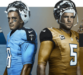
Meanwhile, next Thursday’s game will feature the Jags and Titans, and their Color Rash unis were officially revealed:
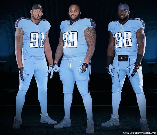
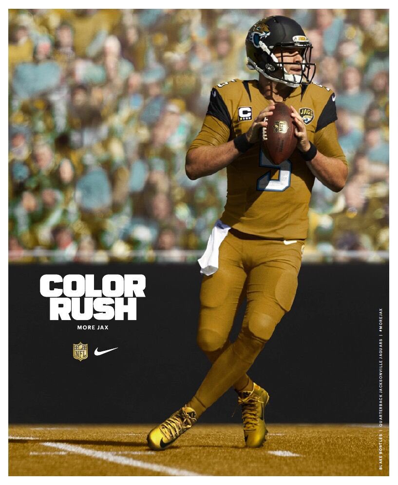
Pretty much what we’d been led to expect. No, I don’t know if the Jags are actually ditching the two-tone helmet, as that image sort of suggests. Might just be Photoshopping. Trying to find out.
Additional photos of both uniforms are available here. Just remember, the field won’t really be blue or gold during the game.
Jay Busbee of Yahoo Sports had the funniest take on all of this, as he juxtaposed the following two images:

That seems like a good place to stop. Have a great weekend and I’ll see you next week.
(Major thanks to David Paling and Phil for their contributions.)

And now for something that doesn’t suck: My Friday Flashback on ESPN today takes a look at the Warriors’ classic “The City” design, which is considered by many, including myself, to be the best uniform in basketball history (and is once again being revived this season as a throwback). Check it out here.
T-Shirt Club reminder: In case you missed it earlier this week, the Uni Watch T-Shirt Club’s design for the December — the ugly sweater design — is now available. We’re offering it in three formats: a standard short-sleeve tee (American Apparel or Teespring Premium), a long-sleeve tee, or a sweatshirt. I love how it turned out and can’t thank my Teespring partner, Bryan Molloy, enough for the sensational design (click to enlarge):
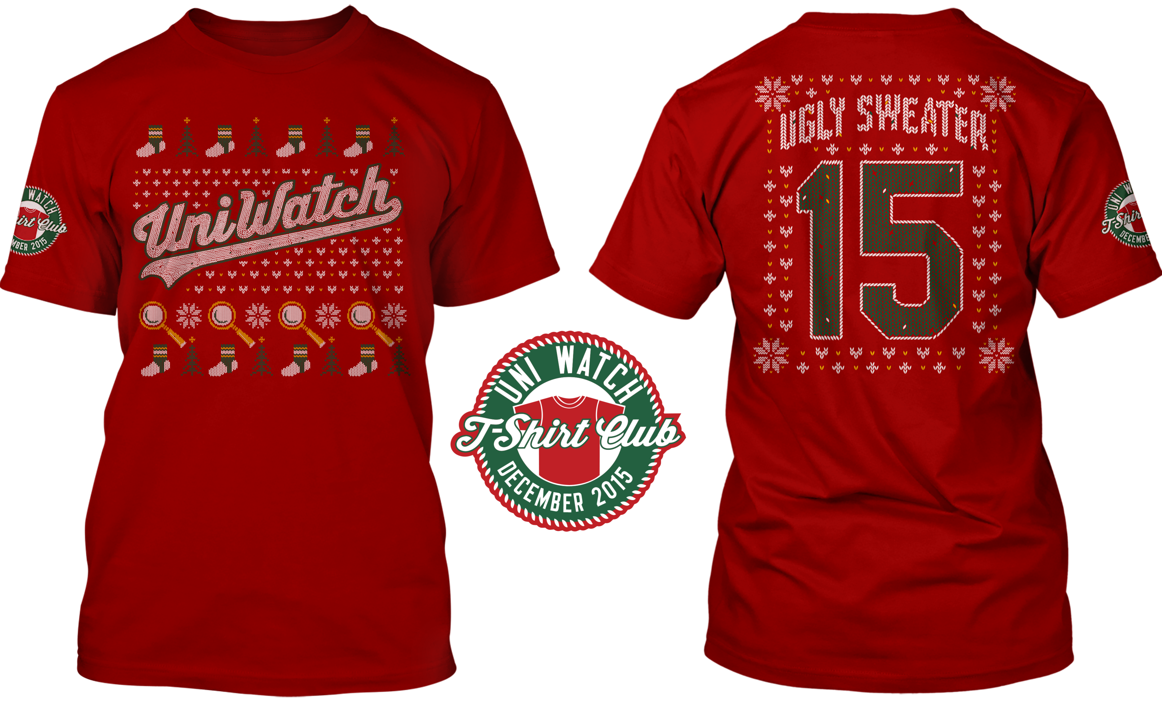
This shirt will be available through next Tuesday, Nov. 17. Again, you can order it here. Thanks.
The Ticker
By Paul

’Skins Watch: Lots of chatter about how an Apache leader named Terry Rambler, who’s been critical of the ’Skins team name, appeared in blackface for Halloween. That’s a bad move by Rambler, but it really has no bearing on the larger ’Skins debate. Rambler may be a hypocrite or worse, and he may have squandered whatever moral authority he had regarding this issue, but that doesn’t mean the issue itself suddenly goes away or that his position on the issue was wrong. By way of comparison, if it turned out that I had a bunch of camouflage jerseys in my closet, that doesn’t suddenly mean the G.I. Joke phenomenon would be okay. It would just mean I was a hypocrite. As always, focus on the message, not the messenger. ”¦ Adidas’s recent offer to create new logos and help finance new uniforms for high schools wanting to move away from their Native American-based team names was contemptuously declined by a school superintendent in Texas, who said, “Changing [the school’s team name from Indians] would be tapering down to political correctness of leftist extremists and we’re not going to do that here.” He then added, “They [Adidas] are all about making a dollar and selling a brand. That’s what’s driving them to do it.” Charming bloke (from Jacob Lipp). ”¦ Daniel Cortez, a Virginia Tea Party activist who’s also a Native American and a veteran, will be singing the national anthem for the ’Skins military appreciation game this Sunday, and he says the team’s name is a positive thing. He has some odd notions about this, though — at one point he writes, “Tragically, divisive politicians out of touch with Native American sentiment besmirch the respected Redskins moniker which courageously identifies my people.” Whatever one thinks about the ’Skins name, does anyone honestly think it’s courageous? (From Tommy Turner.) ”¦ “In the Netflix series Master of None, a journalist advocating for a ’Skins name change had a helmet made for the Washington Breadsticks,” says Coleman Mullins. “In an odd twist, the helmet has baguettes and mozzarella sticks.”

Baseball News: Reprinted from yesterday’s comments: Here’s something I hadn’t seen before — a jersey-themed wristband (from R. Scott Rogers). ”¦ New logo set for the Bowling Green Hot Rods (from Josh Claywell).

Pro and College Football News: Panthers CB Josh Norman has been fined $5K for wearing “patriotic” cleats last weekend. ”¦ Here’s a retrospective of Bills uniform history (from @TenThrizzle). … The NFL wasn’t the only place to find color vs. color last night. Georgia Tech and Virginia Tech also did it, but without the mono. ”¦ New billboards up at Fenway Park for the Shamrock Series game. ”¦ Back in 2011 I posted an interview with Will Johnson, leader of the great indie-rock band Centro-Matic who had also created a series of sensational baseball paintings. Now he’s turned his attention to college football with a series of Tennessee Vols paintings. Additional info here (from KC). ”¦ Here’s an interesting discussion thread about Notre Dame’s equipment operation in the 1980s (from @FinallySock). ”¦ Cedar Rapids Gazette readers have submitted a bunch of Iowa football uni concepts. ”¦ Here’s a video tour of Baylor’s locker room and equipment facility (from Luke Schaffner). ”¦ U! S! A! end zone design for UNC (from James Gilbert). ”¦ Just when you thought you’d seen everything: UCLA has a Navy SEAL tribute helmet. Sure, why not, wheee! ”¦ Alabama coach Nick Saban says nobody should mess with the team’s look (from Nolan Jones). ”¦ Here are this weekend’s uni combos for Washington State, Iowa, UNC, and Arizona State. ”¦ Given the events on the Missouri campus this week, it’s ironic that they’ll be wearing mono-white tomorrow.

Hockey News: Pretty cool Victoria Cougars throwbacks for the Victoria Royals (from Steve May). ”¦ G.I. Joke jerseys this Sunday for the Hershey Bears (from Matthew Scher). ”¦ Blackhawks paired their G.I. Joke warm-up tops with American flag helmet decals (from Jason Wyrick).

College Hoops News: Wow — FIOB, JrOB, and vertical arching, all on one jersey! ”¦ Here’s a good look at Oakland’s black-stained floor. ”¦ New “Don’t Tread on Me” uniforms for Navy. ”¦ New uniforms for Central Missouri.

Soccer News: More national kits: Sweden away, Bosnia away, Wales away, Spain, and Belgium. ”¦ Here’s the Euro 2016 match ball. Further info here. ”¦ New jersey for FC Dallas (thanks, Phil).

Grab Bag: As you may be aware, Twitter recently changed its “like” or “favorite” icon from a star to a heart. I don’t really care one way or the other, except for this: If you click on the heart icon, it briefly turns purple and then explodes in a puff of purple sparks before turning red. Grrrrr. ”¦ Men are increasingly swapping out dress shoes for designer sneakers (from Tommy Turner). ”¦ Here’s more on that Georgia high school cross country runner who was DQ’d for wearing a headband with a Bible verse written on it (thanks, Phil). ”¦ New Aussie football team logo for the Melbourne Demons (from Leo Strawn Jr.).
So… hopefully the NFL listens to the colorblind and the Bills are spared from wearing red again. Also, some contrasting socks would be really nice… and one team not going mono… God dammit NFL, why can’t you just let teams play color vs color without making it into a stupid gimmick that pisses everyone off?
Someone on Twitter made a great post to Phil this past week: “Make it stop!”
The Jacksonville jags color rash uni looks like a fresh pile of dog turd
You might want to change your dog’s diet.
More like a fresh batch of dog puke onto a turd.
Dog puke on a turd… more “Hue Spew”!
I wonder if there would be enough contrast for colorblind people if one team wore white pants?
I like color vs color matchups, but not if it’s forced and not if it effects someone being able to distinguish between the two teams.
I wonder if there would be enough contrast for colorblind people if one team wore white pants?
There would have been some contrast, but I don’t think it would be enough. Would we schedule a matchup between the Bills and Colts in their blue jerseys, so long as the Bills wore blue pants?
A good headline could have been “No Sight for Sore Eyes”
Let me get this straight…
Cortez is a singing Redskin? It’s a history mashup.
Wonder how that makes Mr. Aztec Warrior feel?
link
It’ll be interesting to see if next week’s color rash game has a similar effect on blue/yellow color blindness as this weeks did. Blue/Yellow, from what I have heard, is even rarer than red/green.
What color?
link
Why did you have to bring that up, DG?
The National Institutes of Health identifies three forms of colorblindness: Red/green, blue/yellow, and total. All of the forms affect perception of all colors, though the named colors have the least contrast for those with that type of colorblindness. And the overall rate of occurrence is closer to 15%-17% among American men. It’s very rare among women.
So if Thursday night games are mainly aimed at women, the NFL is just fine. If they’re trying to reach men, then making the game unnecessarily difficult to watch for a full one-sixth of the audience is maybe not such a great plan.
I am getting “403 forbidden” when I click on a lot of the links in the main article. Is anyone else having this problem?
Which links?
Many of them… all of the links regarding the Color Rash game and also the link for the pic of the “Washington Breadsticks” helmet
Spotted something I’d been looking for for a long time on eBay: link. When I was a student there, the football team may have been terrible, but they had some of the classiest uniforms in college football history. Simple red and white, with a timeless curved number font that has style but isn’t too weird. After this they went to a block number font that looks link
Those were dark years for the birthplace of college football, but nobody can say our jerseys weren’t awesome.
Spotted something I’d been looking for for a long time on eBay: this awesome circa-1996 Rutgers football jersey.
Gorgeous! One of my favorite numeral fonts.
1995 was the season of my favorite Rutgers’ helmet: The fancy knight helmet decal with the Old English “R”.
I got a stick-on patch with that logo on it at some point; it was perfect. Then they went to the one with just a helmet and a tassel, which was OK but not as great.
I thought the Rambln’ Wreck only wore white at home. Why the blue jerseys?
Also typo in that bit. Should be “…was not the only place….”.
Fixed.
They wore blue to commemorate their ’90 shared NC. They wore blue in the Citrus Bowl against Nebraska that year.
VT looked great in their Orange unis against their blues. One of the better Color on Color college games you’ll see this year.
If you zoom in on the Jags helmet, you can make out that it’s still the two-tone nightmare, sadly.
Could the flag decal on the Jets helmet be the same metallic malarkey that their main decals were made of (and just giving an odd reflection)?
Yes, I think that was the idea.
Was the middle stripe on the Jets shoulders supposed to be a darker green or is that just Nike still being unable to match greens? Also has anyone heard why exactly green is so hard for Nike.
It’s the Jets’ regular forest green. Pretty sure it was intentional – they were link the double-green connection on social media. And even Nike could embroider their logo patch in the lighter color if they wanted.
It’s always great when my wife (not a sports fan) walks in the room and someone has on a stupid uniform (on TV that is, not me!). Last night her quote was, “What is that supposed to be?”
The colorblind aspect of last night’s game was predicted in the comments section of last Friday’s Uni-Watch. Deadspin et al. owe some credit.
That would be assuming any of them read last Friday’s comments here.
It really wasn’t that hard to predict. And I’m not just saying that because I called it when the matchups were unveiled…
The game was not nearly as obnoxious as I expected, and in fact really liked the jets green. Contrasting socks would have made a big differnce
i thought the chrome green logo and stripes on the Jets helmet was an upgrade and would liek to see it become a full time thing
I agree with Tony on that and would add the facemask.
The green itself was amazing. Just add white pants and sleeves.
I agree. Not nearly as bad as I feared. I think the pants stripes helped a lot. I’ll probably change my tune when someone goes with a more of a leotard look.
No, no, no. With white pants they become the green Colts. NFW! Just use the existing uni with the lighter green and all is well.
What (other than the horrid mis-matched greens, but that’s a production error) exactly is so wrong with the current Jets unis that demand a change? I don’t mind if they permanently change the olive to kelly, but there is no reason for them to change the sleeves (as they did last night), and absolutely no reason to dress like high schoolers. Keep the kelly, but the white pants (with green tops) need to be used, and if wearing white tops with green pants, then white socks are necessary.
What (other than the horrid mis-matched greens, but that’s a production error) exactly is so wrong with the current Jets unis that demand a change?
Absolutely nothing.
I’d prefer they stick with white pants at all times, but other than that my only issue with the Jets is one of shade.
The Jets jersey was kind of nice. Unnecessary, but OK. The mono-green of it wasn’t horrible.
The Bills unis, on the other hand, WERE horrible. I don’t even object in principle to the Bills having a red alt (red has certainly always been part of their look). But it was unpleasantly bright, and certainly didn’t work in mono. And I do think that the colorblindness issue should have been taken into account.
On another topic, those Belgium kits look from a distance like they’ve all been shot. Yuck.
Last night’s game reminded me of one of those illustrations where you assume the artist doesn’t quite know what a football game actually looks like.
It looks like tagging for the Notre Dame link ends on the “of” before “Iowa”.
Fixed.
someone modded their Fallout 4 player to look like David Ortiz link
Pretty good except Ortiz bats left-handed.
Anyone else having issues with viewing today’s post on Firefox? The first 4 photos don’t show up, and neither do the ads on the left… Works fine on Chrome, however.
i am on chrome and the first photos dont work.. but i just chalked that up to being on my company’s VPN
I’m on chrome at my apartment and they don’t work for me.
I’m on FF and it’s fine for me.
Bowling Green Hot Rods’ road wordmark looks straight out of the 2005 MLB ASG font guide.
I actually liked the Bills red jerseys and think it would be a nice alternate. I also liked the green jets jersey better than their primary.
However it was a terrible looking game, maybe it would make sense if it was played on Christmas (or Halloween).
What kills the whole thing is the socks, how hard is it for football teams to wear white socks with colored pants and vice versa.
It looked like a Patriots throwback (plus red pants), which is not good if you’re a Bills fan, in my opinion.
I’m a Georgia Tech fan, and thought the game looked great. I thought that with GT honoring it’s 1990 Championship team, it would have been cool if they would have put the 1990 player’s name on his corresponding number. Don’t know if that’s allowed, but I think it would have been cool.
I strangely liked the mono colour game last night.
College Football section, no link for ASU uniform combo.
Here ya go:
link
Mock all you like, but next week’s Color Rash will almost certainly be the best-looking uniform the Jaguars have ever worn. Almost makes the helmet not look like the worst in NFL history. Almost.
next week’s Color Rash will almost certainly be the best-looking uniform the Jaguars have ever worn.
It’s hard to overstate how inaccurate this statement is. The Jags’ late-’90s/Brunnell-era look was among the best of its generation.
Aesthetic opinions are not, by definition, accurate or inaccurate. Accuracy is a characteristic of objective measurement, not subjective judgment. But that aside, if you’re talking about the era of teal jerseys with white pants, fair enough. I think those unis have a lot of design flaws, but they’re all small-bore stuff. Overall, a good-looking uniform with nice balance. But man, all of the little details were so poorly executed. Total incoherence of striping from pants to shirt to helmet. Complete lack of any thought to how the gold integrates across elements. Even the number coloring of white-gold-black served to soften the lines of the digits and make them slightly less legible, which undercut what was otherwise one of the better fonts at the start of the custom-number era. Still, if you don’t look at the details but just the overall shapes and color blocks, I’ll grant your objection. The Color Rash gold unitard will be the best uniform the Jags have worn recently. Certainly at least since they went to black pants at home.
The Color Rash gold unitard will be the best uniform the Jags have worn recently.
That is probably true. But hey, that’s not what you originally said!
“The Color Rash gold unitard will be the best uniform the Jags have worn recently.”
~~~
If you look up the phrase “damning with faint praise,” this should be used as the first example of such usage.
But hey, that’s not what you originally said!
Exactly – I’m agreeing with your objection and modifying my opinion accordingly. Learn when to take the win! ;-) But that doesn’t make my first judgment “inaccurate,” it makes it wrong. Two different things.
I agree with ARRRscott
The best combination of Jags unis, in my opinion, would be the 1998 unis (no black jerseys, no black pants) with the 2009 helmets with the teal-reflective paint.
Ha!! Dumb Guy – same with my wife, who said “eew – it looks like Christmas threw up”!
Today’s Friday Flashback is up:
link
Paul, no FB account, but I think SJ Warriors alt shows Santa Cruz boardwalk. Santa Cruz is Surf City – no offense to Huntington Beach. And as far as I can tell Santa Clara doesn’t have a boardwalk with roller coasters.
Yes, that would be Santa Cruz. And ya know, I’ve lived here for 16 years now, and I’ve never once heard Oak referred to as ‘the town.’ The City, all the time.
Funny – the link on the back of the 60s warmup prefigures the link, which wasn’t introduced until 1994. Coincidence or inspiration?
The Giants’ “SF” monogram with the “punked” corners actually goes back to 1958. It was streamlined in the 1980’s when the serif was shifted from the middle stroke of the “F” to the upper left corner. In ’94, when the punking was restored to the Giants’ identity, the new serif orientation was retained.
Didn’t know that. Thanks!
yep. that original cap logo on Creamer’s site link.
However, if you look at the full uniform, the cap is link.
Yeah, love Creamer but I should know better than blindly accept the database as gospel. Especially anything older than the past ten years.
Weird, but is it possible if the Jags put black sox with the Color Rash and it would be their best uniform set.
Over on the Hockey History sub-forum at HFBoards, there is a post about the “Telephone Ladies Hockey League” from 1910, with news clippings showing some spiffy sweaters…
link
-Jet
I know I could be cast out from the Uni-Watch comments by a mob of angry, righteous commenters, but… against all logic…
I actually kinda liked last night’s game.
I admit, it doesn’t make any sense. The Bills wearing red was weird and wrong. And the metallic green for the Jets was dumb. And the unitard effect always makes me roll my eyes. And the nearly identical uniform elements (monochrome everything up to the white helmet) made the game look pretty UFL-ish.
But still, even with my brain screaming at me, my eyes liked what I saw. It was so BRIGHT! The bright red vs. bright green clashed and popped (ew, marketing speak) so much that the game was really easy to follow. Not that it’s DIFFICULT to follow the sport when one team is wearing green and the other white, but the stark contract between the teams just plain worked.
I’m not sure I can coherently explain why I liked the matchup. I’m not sure I’ll like any others. I’ll show myself out now…
What makes that “The City” jersey even more awesome is the fact that both words do not come from standard type fonts, but look more like the hand-painted work of a signpainter.
Plus, the numbers practically touching the circle as well as the tops of the bridge would be considered design flaws in any graphic arts class, but I think it only increases the charm…
-Jet
I liked the Bills in red, maybe I will even drop $100 on a jersey…
Jacksonville’s mustard might not look so hot.
Time for me to weigh in on the Georgia high school XC runner controversy, since I was travelling and couldn’t yesterday.
He was disqualified under a NFHS, not GHSA rule. I am a GHSA official in another sport and easily the most annoying thing I do is be the uniform police. The NFL has nothing on me. It clearly states in the NFHS rules that the only adornment allowed on clothing is a manufacturer’s logo. The fact that other officials allowed it at other times and meets is irrelevant. It was against the rules, period.
I think the NFHS rules on uniforms are silly and pointless. That being said, it’s still my responsibility as an official to properly enforce said rules.
I agree with you 100% on this. Not that hard to read NFHS rules properly. I don’t agree with them (NFHS) on them, but it’s what is stated/mandated.
Only thing that can be done is State associations to rule their own way, but not sure that’s truly allowed.
The American flag decals may have looked that way because of an odd reflection, but I wouldn’t put it past Nike to say, “Hey, white stripes are boring. Let’s put chrome stripes on the flag!”
I get that blackface is offensive. The cartoon-like examples from the early 20th century are what I have in mind.
What Rambler did, however, seems more like what Robert Downey Jr. did for Tropic Thunder. Why is one okay and the other not? Or did I just miss the backlash when Tropic Thunder came out (entirely possible)? Both are costumes. Both are executed similarly, with different levels up craftsmanship and execution, obviously, probably due to budget. Does doing it for a movie or play make it acceptable?
What we have is yet another case of people overreacting without thinking about context. It seems to happen more and more often these days. Yeah, the guy was wearing a costume. He wasn’t wearing Blackface.
Blackface is a costume. That’s the whole point of it! Minstrel-shows were white people dressing in costumes to portray black people. It’s a tautology to say that any particular instance of blackface is a costume; it’s exactly like saying that any given square is a rectangle.
Well in Tropic Thunder the use of blackface being offensive and its wearer being ridiculously oblivious to it’s offensiveness was the joke, and if you think people being offended by blackface, redface, et al is just political correctness in 2015 I can’t help you.
There was some conversation around Downey’s blackface when Tropic Thunder came out. But the film dealt with it in the context of the story, including ridiculing the character’s decision to do it.
Hard to bring the same level of nuance to a Halloween costume.
Hard to bring the same level of nuance to a Halloween costume.
Exactly. Clearly, the guy didn’t intend his costume to mock anybody. He was dressing as Bob Marley, and nothing about the costume seemed to be making fun of or belittling Marley. Who, lets remember, is a widely beloved artist, so a Marley costume aimed at mocking him would be kind of weird anyway. But it’s also true that nuances of intent aside, every American adult understands full well that many people will take the appearance of blackface as a personal insult. Therefore the notion that the offense was unintended is bollocks: To wear blackface is to knowingly cause a predictable level of insult. You may not want to cause the insult, but you do in fact intend it. It’s not an accident, it’s the obviously inevitable result of a deliberate choice you made in the full knowledge that your action would be taken as an insult.
Pretty simple rule here: If you’re not black, and you want to dress up as a black person, go for it! Just don’t put dark makeup on your face or light makeup on your lips. Like, I would not hesitate to dress up as Jackie Robinson or Nelson Mandela for Halloween. But I’d let the costume tell the story, and leave my pale face alone.
But I’d let the costume tell the story, and leave my pale face alone.
Does this rule apply if a person dressed as a vampire paints his face white? Or Frankenstein, green? Or Braveheart, blue/white?
Really stupid. And the more you try to explain, the stupider the “rule” is.
Right.
Ho-kay.
Thanks for the clarifications and opinions. I’ve often wondered about the standard by which offensiveness is judged. Based on looks, the two situations seem no different, but I haven’t seen the film, so I wasn’t aware of the nuances behind the character. Now it makes sense why I don’t remember as much buzz around it it the time.
The rule of thumb for me is is you know someone is going to be offended (and that really isn’t very difficult to figure out) then you’re just an confrontational asshole if you decide to go ahead and do it anyway.
The black floor in Oakland is a great look. That’s what I had envisioned for Brooklyn when I originally suggested the herringbone floor.
The reaction to that Georgia high school runner are depressing. All the objections seem to be based on the notion that if a gesture is somehow rooted in Christian belief, then rules and laws don’t apply. There’s this whole cultural ethos at the moment that seems to be based on the idea that if holding Christians to the same rules as everyone else amounts to discrimination against and oppression of Christianity.
Whereas it seems to me that the rule being enforced is clear enough and universally applicable enough that its enforcement in any specific case is unobjectionable. Don’t want a DQ? Obey the rules of the event. Don’t know the rules of the event? Then you don’t get to complain if your ignorance leads to violation and DQ. But the rule itself is kind of pernicious: Headbands are permitted, and they must be a single color with no message or expression, except that manufacturer’s brand symbols are permitted. So a giant, highly visible Nike logo is fine, but a tiny hand-Sharpied “Mom” or “Isa 40:30-31” gets the DQ. That’s a problem, but the problem is not that the rule discriminates against Christians. It’s that the rule favors corporate marketing over individual participants.
Credit to the kid for choosing an actually event-appropriate verse, though, instead of the typical generic John 3:16 pablum. I always respect a topical reference to the Prophets or Wisdom books, since it suggests the person might actually have read the Bible.
My thought regarding situations like these is if it’s a personal message, why do we need to see it? Write it on the inside of the headband. You know it’s there. Isn’t that the epitome of a “personal” message?
Better yet, do exactly that, then write “Mat 6:6” on the outside to show your commitment to praying in secret like Jesus taught.
Can’t agree with you more, Scott, on all counts.
The body suit effect of last night’s game reminder me of the football game in Starship Troopers.
Where do you guys get that “The City” uniforms are widely considered the best in basketball history? I’m sure I will be bombarded with multiple links agreeing but I’ve literally never heard so much acclaim for it outside of this site. I think they’re horrible and the current updated version is among my least favorite in the NBA but I digress, that may be swayed by my intense disliking of Steph Curry.
I think its appeal comes from it still having a “traditional” look while managing to be “outside the box” at the same time.
I.e. it’s not as “out there” as the Astros’ rainbow unis or the Vancouver Canucks’ Halloween-V jerseys.
And it also wouldn’t work if other teams started adopting a similar approach… like the Knicks putting “The Big Apple” on their shirts with the Statue of Liberty… or the Bulls putting “Windy City”, etc. That would water down the effect.
-Jet
Yeah, it’s clever but not focus-grouped, unique without “look at me!”
Plus link is just brilliant.
To each his own. You think putting a number inside a cable car is brilliant while another might find it gaudy and yet another might find it cliché. I thinbk it’s a little bit of all three.
My biggest issue with the acclaim is this: Paul brought up in the article that it’s “everything a uniform should be: distinctive, attractive, snappy.” It’s true that it is all those things, but if “good design is good design and bad design is bad design” (as is often said here), then these probably fall more under the umbrella of bad design, to be honest. I like them a lot, but sometimes nostalgia and charm seep into our subjective evaluation processes.
Let’s evaluate it with some principles of design as our criteria:
BALANCE
The work should communicate a state of even tension and equilibrium. I think it’s nicely balanced in terms of positive and negative form. There’s tension in the way “the” is placed in the corner, but lots of calm in the symmetrical shape of the rest of the graphic. Pass.
DOMINANCE and HIERARCHY
The focal point should dominate the design with scale and contrast without sacrificing the unity of the whole. The type and images should be expressed starting from most important to the least important. The front graphic is successful. It makes a fantastic focal point because of how unique it is. For me the uniform hierarchy should be as follows: 1. What team do you play for? 2. Which player are you? Again, the front does a great job of this. The City text up top and the bridge graphic (along with that snappy color scheme) garner immediate attention, followed by the player number nestled in the graphic. The back, by itself, also does a good job of it, though without using words, which is an accomplishment itself. Problem is, the back graphic is also a major, major focal point, and it takes away the dominance that the front graphic deserves. It’s too much to look at on one garment. If the back of the uniform was garnished with a standard number and the cable car number from the jersey was moved to be the focal point of the warm-up, this would be a resounding pass, but that’s not the case. Fail.
HARMONY and UNITY
No individual part should be viewed as more important than the whole design. On the whole, I think this is an easy fail, because that back graphic is so bright, so large and so bold that it does exactly that. It says, “I’m more important than anything else on this uniform.” Lets get into some details, though. There are standard block numerals with serifs on the front and slender sans-serif numerals on the back. The front graphic has a nice, calm, static graphic language, while the back is a bit at odds with it, being so fast and italic. It’s much more dynamic in form. The front and back are too stylistically disconnected. Fail.
I could go on and find more criteria where it’s successful and some where it’s not, but for the sake of brevity, let’s look at this an an example of how bad design can be really attractive sometimes. We can’t always measure the “goodness” of a design with distinctiveness and attractiveness. There’s also function, cohesion, execution and lots of other factors that make a design good. This one doesn’t tick all the boxes.
And they evoke their city brilliantly. Nobody did anything like it then, and nobody’s really done it since. It’s not “this logo looks like a subway token” or “the shoulder inserts represent the Golden Triangle,” but “Here’s our bridge and our cable cars.”
(I was responding to Chance. Andy’s interesting post appeared between my download and response.)
I would up having to mess with the Hue control to watch the game and wound up watching this (trigger warning: purple) link . Everyone looked like a space alien but at least I could watch the game.
Why? Is it because you’re colorblind? Or because you thought it looked better that way?
Because I’m colorblind. The teams looked pretty much identical otherwise. I almost gave up before I decided to play “let’s see what this knob does.”
Paul, you once wrote a take on ‘political correctness’ and the phrase itself. I can’t remember exactly when and have been unable to locate it. Any chance you can post a link? Thanks.
I also commented last night on Twitter how the Bills and Jets looked like Christmas had thrown up onto the field. The game might have looked good to link, though.
The Bills just look wrong in all red. The red jersey could be okay as an alternate, but they should never wear those red pants again.
The Jets… well, the Kelly green was nice, at least, but again, way too much of it. Still, it would be nice if they ditched their ugly current green and went back to Kelly. But still, the shoulder stripes continue to look bad. I think Nike should just stop using that ribbed stretch fabric for those jerseys (and the Colts while we’re at it, since they’re the only other NFL team to use the same type of panel, even though their blues don’t seem to be as much of an issue). It could be done, and they could even fix the striping so that it doesn’t look link.
I could do without the mono look but I really liked the Jets jerseys. I’m a fan of the blending of the Kelly Green era with the darker shade of green (as long as that darker shade of green is limited to the striping).
If they went with that look definitely ditch the chrome decals but have them in Kelly Green.
No question this matchup was a disaster for Red-Green colorblind people but the jerseys for both were fantastic (mono look not so much).
I wonder if people would have similar issues if the jags were wearing black next week? It’s my understanding that the light blue would register different enough that it would be clear which was which but that’s based purely on my friend who could tell that something was blue when it was Royal or lighter and could occasionally tell the difference with darker shades of blue too (Navy was a complete guessing game unless it was next to black).
Jacksonville Nuggets vs. Tennessee Smurfs.
I am all for color vs color but last night was strike one, two strikes away from failure NFL.
Woops I meant Nike
I generally like mono uni sets. I also like white helmet teams. The jets have my favorite set. The normally wear white socks with two green stripes with their green pants, which is the right way to do mono. Absolutely no need to change. And who the hell picked baby blue over navy for the titans. Navy vs gold actually look good together.
The ONLY redeeming aspect of the NikeFL’s inadvertent salute to Anomalous Trichromacy’s sub-groups Protanomaly and/or Deuteranomaly is that there may be kids out there who spoke up and said, “I can’t tell which team is which.” And after the older brother stopped laughing an adult might be getting them checked. I was in high school before my Deuteranomaly was confirmed. The driver’s ed teacher sent home a note with a hand drawn picture of a stoplight on it with RED!!! written on the top light.
They couldn’t have made it worse head to toe. There was no helmet, jersey or pant contrast and stripes were very similar. And all that against a green field. When one team gets lost against the field I usually have the other one to go by but not this time. If you’ve got standard color perception, think Nebraska vs. Wisconsin with both in white jerseys. Close ups show ed the difference but that wide field shot was hopeless. Might as well be staring at a radio.
Watch, there will be a whole campaign to raise money for Color Defeciency Awareness (with zero for actual research) but what color would the ribbon be? Not purple.
(Now I realize why I haven’t gotten some people’s hate of purple. It’s just an odd shade of navy blue to me.)
I thought that pediatric testing was common these days – I remember getting checked as a kid, and my kids were all tested when they were little.
I never took that “undiagnosed color blindness” plot point seriously in Litle Miss Sunshine. Guess I shouldn’t’ve been so hard on Michael Arndt.
My thoughts on the Color Rash unis after seeing them in scathing didn’t really change from my initial ones.
-The Mono looked terrible on both teams.
-I know there are slight differences, but the Bills jerseys looked comically close to the Patriots Nike throwback set, something many people in my social media channels noticed.
-The kelly-Jets jerseys were the only redeeming quality of either set, and even those were killed by the mono look.
I will say, last night was the first major uni-stunt thatI noticed get universal negative reaction on all the social media platforms I used. I literally didn’t see one person defend it. Also, it did make me think about what color will be foisted on the Patriots next year. With the Bills reds being so close I can’t see the Pats going the throwback route. Maybe all-silver, using a jersey similar to the mid-00’s silver alt?
One thing that the Color Rash screws up is how gorgeous color v. color games frequently are. You just need to have the right contrasts. Bills-Steelers color v. color would be amazing. Chiefs-Chargers, amazing. It taking a good concept and making a stupid, self-serving gimmick out it.
I start scrolling down through the lead on my phone and reach the picture with the Titans all-blue and said out loud, “Thats it. They’ve done it. No way someone can top that monstrosity.” Then I saw the Jaguars and my jaw just dropped. Ive never been so wrong, so quickly.
If they want to do this for all tnf games, and all the games are divisional games, then at some point are we going to see an all yellow Steelers uniform? RAvens and bengals already have all black uniforms. How bad is this going to get?
“Going to get”? It’s already about as bad as it can be. But Steelers-Ravens is an interesting problem. (Not so much the Bengals, since they could just go with an orange mono with tiger stripes everywhere, which would be so ugly that both Cincy and Nike are guaranteed to jump at the chance.) Ravens could in theory go with mono purple, which would be an “interesting” approach for them. But that would be terrible contrast with an all-black Steelers. So either the Ravens would have to pull out a tertiary color and go mono gold (which might be spinnable as a Maryland tribute) or the Steelers will have to go mono gold.
Probably 90% of the time, color vs. color is a bad idea. It’s painful for those of us with normal vision, and downright discriminatory for people who are colorblind.
It only works when one team has a very light color and the other has a dark color. USC vs. UCLA, fine. The Lakers vs. other teams in dark, fine.
I guess beauty is in the eye of the beerholder, but I’ll never understand why so many uni-fans like color vs. color eyesore games.
Those billboards “at Fenway Park” are outside the park and actually across Brookline Avenue from the ballpark.
See this Google map image: link
it’s where the Jazz Festival ad is, and that’s Fenway across that street on the left side
Okay, I really like link. I wouldn’t call that “gold”, mind you, more of a British Khaki or Coyote Brown. But I happen to love those colors.
Pair it with white pants and a black helmet, and it would compete for best uniform they’ve ever worn. Yes, even against the early ones.
I liked it too, and I tried to do a version with black pants:
link
Paul….you were getting major plugs on the Steve Czaban show this morning…….mentioned your name, site and also the topic of today blog. Well done, sir!
How is it that we’ve gotten this far today and nobody has any comments (pro or con) about UCLA’s dead frog logo?
I thought the Jets Kelly green jerseys looked great, much better than that washed out hunter green they wear now. If the Jets kept the Kelly green, with their none chrome decals, white pants and white socks with kelly green at the top and two white stripes they would have one of the better uniforms in the NFL. I also think this uniform should be worn with white cleats and if they spat the cleat it should be white tape. Nothing looks worse than black tape halfway up the sock, it looks like a football player wearing work boots. If the Jest wanted to go the extra mile and bring back the glamour of the Namath era change the font of the number 2 back to the slanted style that looked so cool on Joe Willie.
Maybe this is too obvious, but let’s think about it – there’s a reason sports teams started out with color vs. color and eventually decided to have one team wear white.
Because the games worked better that way. Players in the heat of the action need to be able to quickly and subconsciously recognize who is on their team and who is not. Not to mention fans.
Look at it this way – no game has ever been ruined or made less enjoyable because one team wore white. Color vs. color, to be blunt, is stupid. Let’s hope the NFL mothballs this experiment after one year.
My girlfriend just now, “The Titans look like ballerinas in those.” Exactly. One positive: she also said, “Aren’t those Jaguars uniforms better than their normal ones?”