
[Editor’s note: I had originally planned on running the “Design An Ambulance” contest entries/finalist today, but the owner, Daniel Secord, threw out his back during the week and didn’t have a chance to pick a winner/do a writeup. As such, today’s lede (which was originally scheduled to be a sub-lede) will be penned by Mike Engle, our resident Habs fan, who’ll be reviewing the Canadiens’ new Winter Classic jersey, which was unveiled yesterday. Enjoy! — PH]
Montreal Canadiens’ Winter Classic Jersey
By Mike Engle
As the resident Habs fan on Uni Watch, Phil asked me to share a few thoughts on the Montreal Canadiens’ Winter Classic jerseys, which just got revealed on November 6. Sure thing!
Upon seeing the final jersey, the first thing that comes to my mind is, oddly enough, the Houston Oilers. The blue looks a hair lighter than normal, but for my tastes, it totally works here. The normal team color jerseys are red with a royal torso stripe–part of why it works so great is that the numbers are big and white, so there is no problem reading the numbers at all. If you try to keep the same blue torso stripe on the white jerseys, your results on readability vary. No matter how you try to save it, red on royal is a mixed bag. So lightening the blue, for me, actually does a really nice job this time. Legibility will be important outdoors, so the red numbers (with a white outline) will really stand out.
As for the rest of the jersey, consider me a fan of both the team and the look. I expected the torso stripe (the tuques on sale tend to betray the jerseys’ confidences) and the crewneck (I anticipated a shared template, because Reebok produces cheaply and sells expensively). The C in the CH logo is white from 1924 (expected again, see the tuque) and I’m a fan of how it pops off the blue and doesn’t bleed over to the white jersey, where it would have needed a border. I did not expect the globe patches (it was a World Champion crest for 1924-25, but it’s modified here as elbow logos), and it makes the look a tad busy, but for a one-shot deal, I like them. The Winter Classic patch will be on the right shoulder, and I plead indifference. It is what it is. Minor flies in the ointment: I do not like the NHL logo just floating in no-man’s land on the crewnecks, but it’s cool that the French version will get a little play and I accept that the logo’s presence is inevitable. Finally, something about the typography for the numbers just rubs me the wrong way. Can’t put my finger on it…just looks a little too new-school, and with old style stitching, felt materials, and a harkback everything else, oh well–nothing’s PERFECT.
All in all, it’s hard to ask for a better looking product, no less a better looking Franken-throwback that is invented to evoke old time hockey. I still don’t know how the rest of the uniform will look (socks are a good guess to match the torso stripe, but will the breezers change for the occasion, and maybe will the gloves go natural brown?), but I can only hope that the Habs play like the winners they’ll look like at Gillette Stadium! Happy birthday to me, and Go Habs Go!
Thanks, Mike — below are some photos from the unveiling (you can click to enlarge).
Un regard sur le chandail que les Canadiens porteront lors de la #ClassiqueHivernale 2016. #GoHabsGo
https://t.co/8YrmZr8Dq5
— Canadiens Montréal (@CanadiensMTL) November 6, 2015
Nous sommes prêts pour la #ClassiqueHivernale! / Ready for the #WinterClassic! #GoHabsGo ðŸ˜ðŸ‘Œ https://t.co/D7UbO1yvLC
— Canadiens Montréal (@CanadiensMTL) November 6, 2015


Classic Ballpark Scoreboards
I’m pleased to continue with a favorite weekend feature here at Uni Watch, “Classic Ballpark Scoreboards,” which are created by Gary Chanko. You probably know Gary best for his wonderful colorizations, but he has been a solid contributor for many years, and this is his new project. This segment will appear every Saturday on Uni Watch.
Here’s Gary (click on image to enlarge):
Classic Ballpark Scoreboards – Series II
by Gary Chanko
In this edition of Classic Football Scoreboards we travel to the Penn State University Park campus for a retro look at Beaver Stadium.

Beaver Stadium
Football Home of: Penn State University (1960 – present)
Opened: September 17, 1960
Welcome to Happy Valley and one of the superstar venues of college football, Beaver Stadium. I’ve always associated the curious place name Happy Valley with Penn State football. And, I’ve never given much thought about the nickname until researching information about Beaver Stadium.
It turns out there is no actual geographic location named Happy Valley. True, the Penn State campus is located in a valley, but it’s the Nittany Valley. The origin of the name Happy Valley is blurry. One account traces the name to the Great Depression era when the locale supposedly was not as adversely impacted as other areas in the country. But this article is probably closer to the truth.
Now back to Beaver Stadium (named for James Beaver, President of the Board of Trustees, 1906-08) and scoreboards. The early beginnings of today’s Beaver Stadium start on this athletic field. In 1960 the stadium was relocated to its permanent home and, after a half dozen or so expansions, became one of the great venues in college football.
A complete account of Beaver Stadium origins and development is covered in this history essay. You might also enjoy this visual history documenting the stadium’s long history of relocation and expansions.
The stadium’s first electronic scoreboard was installed in 1937, a gift of the Class of 1926. The Class of 1964 donated $2000 for a digital game time clock addition to that scoreboard. The Class of 1978 contributed an antique bronze Victory Bell mounted atop the stadium scoreboard (1978 photo before Victory Bell installed) where it rung for the next 20 years. The most recent scoreboard upgrades occurred in 2014 when HD video boards were installed at each end of the stadium.
The illustration depicts the ending of one of the ten most memorable games in Penn State football history. On November 11, 1967, the Nittany Lions beat the undefeated, No. 3 ranked North Carolina State Wolfpack 13-8. The scoreboard then was located in the open end of the stadium horseshoe framed by Mount Nittany across the valley.
A Few Things to Know
• The Beaver Stadium official seating capacity is listed as 106,572 – currently the second largest stadium in college football and the fourth largest in the world.
• For economic viability sports stadiums today typically host a range of entertainment venues besides football. Unfortunately Beaver Stadium currently lacks many of the amenities essential for sponsoring these events. Today Beaver Stadium finds itself at a crossroads. The university is studying what to do for the future — renovate or rebuild.
• The Nittany Lion was not the original Penn State mascot. It was a mule named Old Coaly!
If anyone is interested in purchasing a digital copy of these posters, Gary is working on an online purchase option. In the interim you can contact him directly at Classicscoreboards@gmail.com.

UW’s Friday Flashback
In case you missed yesterday, Paul had his latest piece on ESPN for the new column entitled “Friday Flashback.”
This one dealt with the two-year 1966-67 “Batman” design worn by the Pittsburgh Steelers. It includes a ton of great historical info an anecdotes, plus a skype session with the man himself.
Highly recommened reading/watching if you haven’t already checked it out!
T-Shirt Club update: Paul here. Yesterday I showcased some preliminary versions of what we had in mind for the Uni Watch T-Shirt Club’s December design. Those were good, but my Teespring designer, Bryan Molloy, did some additional work on the concept yesterday, and now it looks even more awesome. Check this out (click to enlarge):
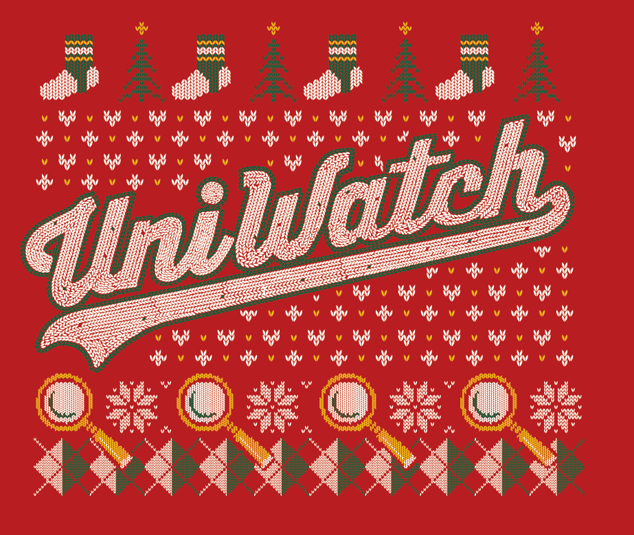
It’s hard to express how much I love this — probably my favorite design of the entire program. Full shirt reveal to follow shortly.
Brooklyn Gathering Today
Today at 2:00 we’re having a Uni Watch gathering at Sheep Station in beautiful Park Slope, Brooklyn — a stone’s throw from Uni Watch HQ.
If you’re in the area, be sure to stop by, and have your favorite $300 polyester shirt and/or hosiery…
Here’s some photos from past UW gatherings (not all of them were in Brooklyn, but you get the idea).
Hope to see a bunch of you there today (click any photo to enlarge):


Uni Watch News Ticker

Baseball News: For the first time since 2007 (and thankfully?), the Arizona Diamondbacks will be getting new uniforms for 2016 (h/t to many, but Andrew Joseph was first). They’ll be revealed on December 3, 2015. Joey Artigue is “hearing the #Dbacks new uniforms next season will have elements that sport the scale-like print in this image.” … Your 2015 World Champion Royals will be wearing this Championship patch on their uniforms next season (thanks, Paul). … Check out this great photo of Charlie Manuel and the original Charlotte Hornets, who are now the Charlotte Knights (from Jonathon Adam Hancin). … Crossover alert: “This may have already been on the site at some point, but check out this shot of Sonny Jurgensen sporting a Senators cap at Redskins training camp in ’71 (the last year before they moved to Texas),” says Michael Mazzucchelli. … “Don’t know if this has ever popped up on the site, but … (this) looks like a cross between the Oilers and the Cubbies,” says Ben Fortney, who adds, “Love how the C weaves through the derrick. Team is Petroleros de Cabimas, played in the Venezuelan league from 1991 through 1995.” … Mystery cap: “I recently purchased this baseball cap (Front, Back) on eBay, but I currently know nothing about it,” says Kellen Gewecke. “I was hoping that you could find out which team wore this cap, when and come up with a picture of someone wearing it.” Can anyone identify this cap? … And in an amazing coinkiedink, we have a SECOND cap mystery: Chris Castoldi found this old cap near Pittsburgh (here’s another view), along with a bunch of old Pirates hats that contain autographs from the 60’s. “I’m a big fan of the site, and you guys have solved a couple mysteries for me before. I was wondering if you’d be able to ID the team that this hat was worn by. Thanks!” OK, UWers, time to solve these cap mysteries!

NFL/USFL News: Contained within this article (besides lots of cussing), “Nike is Fucking with the Packers’ Uniforms,” is one factual error and a lot of ranting — but his point about the color rash uniforms and the fact that the Packers will be forced into wearing them are still valid. … “Here’s one I don’t ever recall seeing,” writes Bill Kellick. The Broncos had “Big Orange” painted in both end zones from this 1974 game footage against the Rams. … Not sure who, but someone wore these cleats for Thursday Night Football (pic from Josh Sánchez). … “Not sure if USFL 2.0 will ever get off the ground but Louisville is having some fun with naming the team for their market if it does,” writes John Gurnick. Here is the work of Doe & Anderson from their site, and the Louisville Biz Journal.” … The Carolina Panthers will “honor fallen heroes” tomorrow. … The Packers (as well as all 32 teams) will have joined the color rash in 2016. But will they wear all green or all gold?
College/High School Football News: “Clemson’s ridiculous new facility will include bowling alley, laser tag, barber shop & more,” writes Josh Sánchez. … Not wanting to be left out of the weekend flag desecration, the Indiana Hoosiers will be wearing this today against Iowa (thanks to Tyler Wilson). … UCLA will be both disrespecting the flag and dishonoring our veterans by playing dress-up soldier today. … Liberty University will be desecrating the flag as well (h/t Doug Hazard). … Not to be left out, Eastern Washington will be adding these stickers to their helmets (h/t The Links Finder). … Last evening, Madison Central HS honored the memory of KY police officer Daniel Ellis with a decal (thanks to Josh Claywell). … Patriotic Ponies for the SMU Mustangs last night (via RN’s Funhouse). It was also, I believe, the first time the Mustangs have ever worn red pants. … Western Oregon will desecrate the flag today. … Northwestern has a new combo: black/black/white.

Hockey News: It’s that time of year: Check out the ugly Xmas sweaters the Rockford IceHogs, (American Hockey League affiliate of the Chicago Blackhawks) will be wearing on Friday, November 27th (thanks to Conor Long). … The Hobart Hockey team has new uniforms for the 2015-16 season (thanks to HWS Equipment). … Hamilton hard rockers Monster Truck sponsored a peewee girls hockey team (thanks to Aaron Husul). … Alabama Hockey (yes they play hockey in Alabama) was late to the Pinktober festivities,a they were away all month. Submitter Dustin Semore adds, “The hideous pink rink. They had a good discussion on how difficult it could be for players and officials looking for the lines — especially the red lines.”

Basketball News: After Thursday night’s game, Derrick Rose wore a shirt with his son’s face on it. That shirt is now for sale online (thanks to Mike Chamernik). … Here’s a complete breakdown of shoes worn in every team’s 1st game of the NBA season (from Paul Lee). … Haskell Indian Nations University men’s and women’s basketball teams will wear special turquoise uniforms honoring Native Americans this month. … In the wake of a report from U.S. Senators Jeff Flake and John McCain that the Pentagon has paid more than $6.8 million to professional sports franchises over the past four years to stage “paid patriotism” events, and with the Miami Heat on Sunday to unveil their new Home Strong uniforms, the team has stressed, “No branch of our military has ever paid us as part of our Home Strong initiative.” … The UMKC (University of Missouri-Kansas City) Roos have unveiled a new Kansas City themed court (from Ryan Witkowski). … Ugh. Marshall Women’s basketball will be wearing these…things on their feet at some point this season (thanks to Coleman Mullins). … Indiana Men’s hoops will wear this patch this season to commemorate their undefeated 1976 season (via Brent Boles). … Check out these photos of Juwan Staten sporting the Warriors Classic Throwback (lots sent this one in). Here’s another look. … We already know LeBron James is no fan of sleeves, but shorter shorts too? “This is new, he’s the self-proclaimed harbinger of new acceptable fashion through shorts length,” says Mike Engle. “I’m just glad he’s not channeling John Stockton.” Of course, Jimmer Vilk thinks Stockton-length is still too long. … Along those same lines, reader Irv Chavous says, “Long time reader. Saw this and wanted to pass it along. I like the trend as long as it doesn’t get too short. Short length in the early 90’s was about right.” … Here’s more on LeBron’s shorter shorts fashion statement (thanks to Don Leonard). … In memory of Roy Marble, RM23 is stitched into Iowa’s uniforms this season (via Noah Wolf). … In the last 10 years, the NBA has evolved from a rule that required players to wear the same color sneaker to allowing players to embrace their team identities and allowing team colors on sneakers in any proportion (thanks Brinke). … The Clippers officially unveiled their BFBS alternates. They will wear them today. … New court for D-III Oglethorpe University in Atlanta. “I would normally say an all-black court is obnoxious, but it’s so much better than what we had,” says Austin Gillis, who adds “Go Stormy Petrels!” … The Indiana Pacers broke out their Hickory throwbacks yesterday — beauts! (thanks to RN’s Funhouse). Bunch more photos here and here (last one comes from Paul Lee). … Color rash in the NBA as the Kings and Rockets (h/t CJ Fogler) and Pistons and Suns (h/t Chris Langevin went color v. color last night.

Grab Bag: This is pretty cool — George Washington crew wore “Robin” (of Batman and Robin fame) suits as a tribute to Nick Upton (thanks to Matt K.). … Prince Edward Island Potatoes have gotten a new logo and packaging design, sent in by Mike Chamernik, who adds, “I just wanted to submit the most obscure item of the day.” … According to the author of this article, helmets are not on the way for curlers. Wonder if any of my curling crew will show up with helmets tomorrow night, when our league begins the 2015-16 season. … Pinktober paper towels??? Yes, according to Jeff Wilk, who writes, “Sorry my phone camera is shitty but Hooters went pink with their paper towels for Pinktober it seems. Yeah it’s Nov., but I bet they were on the table Oct. 1.”
And that’s it for this fine Saturday. Hope to see a few of you NYC-area readers and followers at Sheep Station today — and as such, I’ll be off the grid for a good chunk of the day, so tomorrow’s ticker will likely be pretty light. But hey, I’m sure TJ will be sure to bring us every flag desecration and GI Joketober uni/helmet out there in tomrrow’s SMUW — if you tweet at me, can you ALSO send a copy of that tweet to the Uniwatching at gmail address too? Thanks!
Big thanks to Mike Engle for (what turned out to be) today’s lede and Gary for the Scoreboards. Back with the usual SMUW fun and games tomorrow, but until then…
Follow me on Twitter @PhilHecken.
Peace.
“My generation loves seeing what Oregon comes out in every week. Loves seeing a team bring out a black, or grey jersey, and we wish teams like Alabama, and Texas would change it up every now and then.”
–Nate
Indiana basketball has been living in the past for 30 years. I really thought the usfl about Louisville was gonna name them something to do with hookers and or strippers because of the scandal going on right now. I know I’ve seen ” L1C4nicate” a lot lately
Sonny: The original blog post that WUSA references is mine: link and it was posted here before.
Beaver Stadium: My father-in-law used to own a steel erection company and it worked on the last two major expansions. The “north” scoreboard structure was assembled on the ground lifted by an 1000-ton crane to great fanfare. The Centre Daily Times led the next day’s edition with a photo of my FIL hugging my girlfriend, now wife, Erica. Somewhere on a zip disk, she has a bunch of photos of the lift since she was the webmistress of the company website.
Well wishes for a speedy recovery to Daniel Secord and NEEDING an ambulance the week of an ambulance design contest just adds to the lore of this, doesn’t it?
That new PEI Potato bag is also another example for Paul’s question earlier this week about packaging that depicts product packaging. It’s a paper or plastic sack of potatoes printed to look like a burlap sack of potatoes.
What is it with the NHL? I basically don’t like special-event uniforms, for two reasons. 1) You’re playing a big game for a national audience? Wear your best uniform. And 2) These days, one-off uniforms are almost uniformly terrible. Not just subjectively ugly, but objectively badly designed. Yet year after year, not only does the NHL continue to produce not-terrible Winter Classic jerseys, about half the time the Winter Classis jerseys is at least as good as, sometimes better than, anything the team has ever worn,
In my book, the Habs are, and have most always been, one of the best-looking teams in pro sports. I would not have thought it possible to improve on what they already have. But my gosh, that Winter Classic sweater is maybe my favorite Habs jersey of all time. They could start wearing that design full-time, and I wouldn’t mind. (Also the Caps and last year’s Winter Classic sweater.) How does the NHL manage to produce such terrific one-off uniforms in a world where Nikegon and Color Rash are the norm?
It’s amazing to me how the NHL has hit a home run with pretty much every Winter Classic design, while pretty much every Stadium Series design has been templatized pile of garbage.
Are those actual players modeling the Habs’ sweaters? I feel so old…
The Habs shoulder patch spells Foxboro, which is the old spelling. A few years ago it started showing up as Foxborough. Does anyone know why they changed and is this patch spelling an error?
Seems that either spelling is correct. There are a bunch of Massachusetts cities and towns ending in -o or -ough that use both spellings interchangeably.
I don’t remember where I’ve read this, but IIRC – The town is Foxborough. The old stadium was named “Foxboro Stadium” – so the site of the stadium and environs is referred to as o, the town proper is ough.
According to Wikipedia, Foxborough is the official civic spelling, while Foxboro is the official postal and public transit spelling (as well as the spelling used on the Pats’ former stadium).
Oh my freaking lord, the December shirt is epic! I literally guffawed at the snapshot of the latest draft/final product. Congrats on outdoing yourselves and going out with a bang.
I have sock envy. Seriously, seeing those pix sends a message, “I need to get some socks like those”.
“The Clippers officially their BFBS alternates.”
You accidentally forgot a word.
Thanks. There were several words I’d liked to have put in there, but “unveiled” is probably best, and I’ll just leave it at that.
Even though it borrows from the 20s and 40s, it’s kinda shocking to see an all new design from the Habs. Aside from the semi-modern fonts slightly clashing with the otherwise timeless design, I think it looks great. Still this is the habs we’re talking about, it should be a one-and-done design.
Not a fan of the Hickory throwbacks. While they were excellent uniforms in their time, the throwbacks look ungainly. The design may have worked with the traditional length of the shorts, but it does not translate to the current length.
Exactly. The somewhat garish color combo and the satin-esque material both would have worked if the length of the shorts was appropriate.
Unfortunately, I remember too well the throwback night the Lakers had a few years back that included the short shorts. They only made it to halftime. I’m afraid that’s doomed the short short option for throwback basketball unis forever.
More pandering (Anglo-Quebecers will certainly understand) – if the Winter Classic were being played at Molson Stadium, both teams would be mandated to wear “Classique Hivernale” patches. But, the game is being played in the United States and you still have the title of the event in French? Gotta sell jerseys, I suppose…
My sweatshirt from the CFL championship game, actually played in Stade Olympique, says “Coupe Grey Cup” on it, which is about the most Canadian thing I can ever imagine.
I’m with you. If they’re going to put it on that hockey sweater in French for a Canadian team, I’d rather French and English. (And for the Bruins special uni as well.)
The Stripe width is just bothering me on the Habs sweater. Normally the stripe is the same on the sleeves and the body, however to accommodate the white version of the CH, the body stripe is huge in comparison to the sleeve stripes. Seems out of balance to me. I like the powder blue however upon first glance it makes me think WHA Quebec Nordiques era. If they wear these with red pants it will look even more so. Hopefully they do the brown pants they did during their centennial celebration.
I think it’s a fair trade-off compared to the regular Edge version of le Sainte-Flanelle, considering the sleeve stripes on the red jersey have followed the contoured elbow panel since 2007, and look deformed as a result – the sleeve stripes are wider on the back of the elbow than the waist stripe.
No, silly, Nike is actually paying for a new field just for their stupid gimmick thing. That’s not photoshop.
Love the Sacramento Kings throwbacks. Just love them. Too bad Houston didn’t throw back with them.
I’m more excited about LeBron bringing back the shorter shorts look than I was about him returning to Cleveland.
The fieldhouse at Oglethorpe University! I hope the new court is actual hardwood and not the rubber-ish material when I attended 20+ years ago. If you get the chance, go see a baseball game at Anderson Field just outside those doors.
If you’re in the area, be sure to stop by, and have your favorite $300 polyester shirt and/or hosiery…
Given Paul’s stance on jersey wearers, he could be planning a rumble. Don’t let him talk you into it…be the good examples I know you can be.
PAID MILITARY PANDERING ….
The idea that the US Military pays taxpayer dollars to professional (or even college?) Sports Franchises for features and salutes to the Military – in the vein of “Recruiting”, is wasteful, corrupt, horribly fraudulent and downright unconscionable. The Miami Heat “solution” of announcing they WILL NOT be paid for their salute or honoring the Military is THE ANSWER to this cursed blasphemy. For every team/franchise announcing that the DO NOT accept money, they shame and curse those that HAVE accepted money for these salutes. SHAME THEM ALL. AND the corrupt Military/Political decision-makers opting to pay them …
On so many levels this is wrong and corrupt. Too many to count here. So offensive that Uber Right Wing (semi-national) Radio Host Michael Berry spent two hours last week condemning the practice and bringing it to the attention of a great many people who likely had no idea of this horrible practice ….
While we’re at it – ENOUGH ALREADY with the Camo uniforms. I’ll say allow the Service Academies to wear them, and that’s it. NO MORE. It’s tired and unsightly, much less unseemly.
If a team/school/franchise wants to salute the Military – salute them at your event and DO NOT CHARGE THEM MONEY FOR IT !!!! That’s plenty enough, especially considering that if it were not for the Military, you likely would NOT be having the event to begin with …
Cammo unis, BFBS unis, GFGS unis, “Chrome” helmets, “Chrome” facemasks, and ALL matte helmets after the first 59 teams to wear them – STOP! NOW!
ENOUGH ALREADY !!!
Speaking of Montreal, the second image from gatherings past shows a gentleman wearing an Expos jersey that looks like it was modified. Anyone have any idea about that?
Sorry that I’m so late to read and comment on today’s post.
My favorite part of the entire post is a bit of meta awesomeness. On the “Nike is f-ing with the Packers uniforms” post, Paul gets a mention. Well, kind of. The linked article at the end is entitled “Packers Have Awesome Uniforms, According to Some ESPN Guy.”
You’ve hit the big-time now, Paul. ;-)
I love how the NFL likes to protect its image by setting limits on how many times a team can wear alternates, but they drop this color flush on the teams and fans.