Click to enlarge
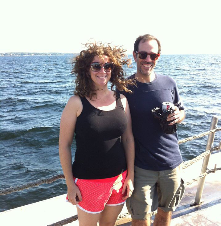
That’s me and my friend Aimee last Friday afternoon, aboard the Lake Champlain car ferry from Plattsburgh, New York, to Grand Isle, Vermont, part of a six-day, 900-mile New England road trip that we just wrapped up on Tuesday.
We began last Thursday by driving north from Manhattan to Lake George. The next day we drove up to Plattsburgh and ferried across Lake Champlain, and then spent the next several days rambling around Vermont, New Hampshire, Massachusetts, and Connecticut before heading back home (click to enlarge):
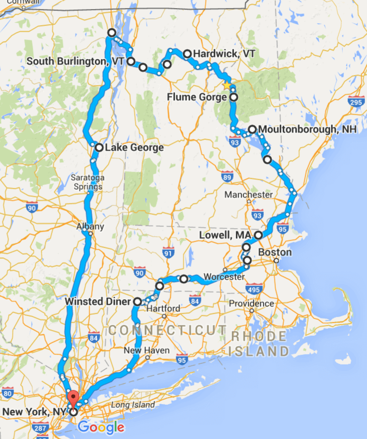
The route shown above is approximate ”” we went on tiny local roads whenever possible ”” but it should give you a rough idea of the territory we covered.
The trip featured everything from trained bears to a VFW Hall dance party, with plenty of hiking and other outdoorsy stuff in between. I’ll get to the details in a sec, but first I want to say this: I don’t know about you, but I think by far the most important component to a successful trip is not the place you’re traveling through, or the weather, or the food, or the people, or the level of service, or any of that stuff. The most important thing, I’ve found, is the person you’re traveling with, and I was incredibly fortunate in that regard for this getaway. I’ve known Aimee for less than a year, and we hadn’t actually spent that much time together prior to this trip, so the whole thing was a bit of a leap of faith for both of us. But we got along incredibly well on the road — never got annoyed with each other (no mean feat when you’re locked in a car together all day long), never felt the need for any “alone time” (ditto), never ran out of fun stuff to talk about, always in sync regarding what to do next, always had each other’s backs. Can’t believe how well it all worked out, and now lucky I am to have had such a great road buddy. Thanks, Aimster — you’re the best.
I documented most of our activities via a series of Facebook posts. So instead of rehashing those posts, I’m just going to embed them here. Here we go, beginning at, well, the very beginning (you can click on the photos to see larger versions, even if you’re not a Facebook member):
Day One
The start of a road trip is always very exciting … for Caitlin.
Posted by Paul Lukas on Thursday, September 17, 2015
Posted by Paul Lukas on Wednesday, September 23, 2015
My friend Aimee, who's my sidekick on this road trip, does something very sweet: Instead of taking photos, she…
Posted by Paul Lukas on Thursday, September 17, 2015
Very nice neon at Thursday night's dinner venue.
Posted by Paul Lukas on Friday, September 18, 2015
The good thing about our motel room's bathroom: big green stripes on the towels! The bad thing about our motel room's bathroom: absurdly long distance from the toilet to the toilet paper roll.
Posted by Paul Lukas on Thursday, September 17, 2015
Day Two
Now *that's* a nice start to a day.
Posted by Paul Lukas on Friday, September 18, 2015
It's a little hard to see in this photo, but each plank on this pier has a nail in the center (or at least *near* the…
Posted by Paul Lukas on Friday, September 18, 2015
Furtively sharing a contraband tall-boy with Aimee VonBokel while taking the Lake Champlain car ferry from New York to Vermont.
Posted by Paul Lukas on Friday, September 18, 2015
Spotted this woodpecker way high up in a tree while tramping thru a nature trail at Grand Isle State Park in Vermont. We…
Posted by Paul Lukas on Friday, September 18, 2015
Stopped for drinks at an American Legion hall outside of Burlington, Vt., where the bartender insisted that we try a "…
Posted by Paul Lukas on Friday, September 18, 2015
Tonight's endearingly named lodging.
Posted by Paul Lukas on Friday, September 18, 2015
Day Three
Just back from breakfast at the Parkway Diner, a classic Worcester diner in South Burlington, Vermont. Very well…
Posted by Paul Lukas on Saturday, September 19, 2015
This morning, a bit west of Richmond, Vermont, we came upon a nice little dairy farm and decided to say hello to the cows, one of which became oddly obsessed with licking Aimee's hand.
Posted by Paul Lukas on Saturday, September 19, 2015
A very nice stop today: the Old Round Church in Richmond, Vermont, a 16-sided beauty that dates back to 1813. A member of the local historical society — a real peach of a guy — gave us a tour.
Posted by Paul Lukas on Saturday, September 19, 2015
We stopped in Smuggler's Notch State Park, Vermont, to take the trail to Bingham Falls, where a bunch of local high…
Posted by Paul Lukas on Saturday, September 19, 2015
While driving thru Vermont's Northeast Kingdom region in near-perfect late-afternoon light, we came upon a lake with a small dam, which seemed like a good spot to stop for a drink.
Posted by Paul Lukas on Saturday, September 19, 2015
We heard there was a Saturday-night dance party with a country band at the VFW Hall in Hyde Park, Vermont, and there was…
Posted by Paul Lukas on Saturday, September 19, 2015
Day Four
The words "circuit" and "biscuit" end in the same four letters — "-cuit." So if "circuit" gives us the adjective "…
Posted by Paul Lukas on Sunday, September 20, 2015
Today we drove east from Vermont to New Hampshire. First stop was a hike to the Flume Gorge, a spectacular 800-foot…
Posted by Paul Lukas on Sunday, September 20, 2015
This afternoon we stopped at Clark's Trading Post, a New Hampshire tourist trap that's locally famous for its trained…
Posted by Paul Lukas on Sunday, September 20, 2015
I've always been curious about motel keys that say, "Drop in Any Mailbox – We Guarantee Postage." Like, do people…
Posted by Paul Lukas on Monday, September 21, 2015
Day Five
Yesterday we visited Lowell National Historical Park in Lowell, Mass., which among other things features a room full of…
Posted by Paul Lukas on Tuesday, September 22, 2015
This is Barry Green, a National Park Service ranger who works at Lowell National Historical Park in Lowell, Mass., which…
Posted by Paul Lukas on Tuesday, September 22, 2015
Was heartily entertained yesterday by this neon sign at a gas station in Lowell, Mass. Probably looks better at night, but still…
Posted by Paul Lukas on Tuesday, September 22, 2015
Day Six
Our last stop on this six-day road trip was the teeny-tiny Winsted Diner in Winsted, Connecticut, a little caboose of a…
Posted by Paul Lukas on Tuesday, September 22, 2015
———
That’s it — thanks for listening. We’ll go back to standard Uni Watch content tomorrow.
The Ticker
By Mike Chamernik

Baseball News: A bunch of Yogi Berra notes: The Yankees wore a No. 8 memorial sleeve patch. The Yanks also put an image of Yogi on their official lineup card (and included the outdated Blue Jays logo, too). Also: Yesterday we found that Berra’s “8” monument at Yankee Stadium is upside-down. MLB changed its Instagram avatar to the inadvertently flipped 8, and the Blue Jays, who the Yankees were playing in Toronto, even put the upside-down 8 on their scoreboard (Thanks to all of you who sent items in, including Mike O’Connor, who attended that Yanks/Jays game, for the scoreboard pic). … Speaking of the Yanks/Jays game, the telecast (not sure which station) had some green screen issues (from Will Leslie). … As for the Mets, they had a moment of silence for Yogi but will apparently not wear a patch or armband — surprising, given that Berra was a Mets player, coach, and pennant-winning manager. … I normally wouldn’t include this, but I received a press release that was a tad interesting: Sporting goods company 3N2 is selling the world’s first patented fastpitch softball pants called NuFit Knickers. According to the CEO of the company quoted in the release, “When 3N2 first entered the market, manufacturers were simply ‘shrinking and pinking’ men’s gear.” Is that true?

NFL News: Pilots flying in and out of San Jose Mineta International Airport are complaining about the bright lights at Levi Stadium (from Phil). … White-over-black this weekend for the Bengals and white-over-pewter for the Bucs. … NESN ranked the six best NFL uniforms. Phil was surprised that the Cardinals made the cut. I was perturbed that the Raiders didn’t make it. ”¦ Speaking of the Raiders: Contrary to a story linked in yesterday’s Ticker, they’ll add the gold 50-yard markers after the baseball season is over.

College Football News: Miami will switch its NOBs to block letters. Before, the Canes used a semi-illegible font (from Juan F). … Michigan TE coach Jay Harbaugh Instagrammed a mockup of new Wolverines uniforms (from Phil). … Arizona State will reveal new alternates on Sunday (from Phil). … Nevada removed NOBs this season. I found the rationale refreshing. Instead of the rah-rah “play for the front of the jersey, not the back” coachspeak nonsense, Wolfpack coach Brian Polian said: “I hate to disappoint our fans but the reason we did it is because we only have one set of blues, one set of whites and one set of grays. “When guys change numbers and you take the nameplates off, you start to tear the jerseys apart. I’d like to have a new set of jerseys every year. We don’t have that kind of budget. It was honestly a budget concern. We just don’t have that kind of money.” Polian said that Nevada uses the same set of uniforms for three or four years, and that new unis can cost the school $100,000 (thanks, Phil). … New color pattern this week for the argyle sideline border on UNC’s field (from James Gilbert). … Here’s a piece on the history of Notre Dame’s green jerseys (from Phil).

Hockey News: Wayne Gretzky received a misspelled jersey from Tottenham Hotspur. Not the first time the Great One had a NOB with a typo. Also, how awful must it be to have to pose for photos while smiling and holding a misspelled jersey? I’d feel like such a schmuck. … The Blackhawks’ Stanley Cup banner is nearly finished. … Here’s a look at the Islanders’ Al Arbour patch in action (from Phil). … Rangers prospect Brady Skjei wore the old RBK logo on his jersey Monday night (from Ryan Feuerstein). … Avalanche players are wearing protective guards on their feet (from John Muir). … ”ŽRed Wings LW Tomas Tatar has what seems to be some sort of latch on the back of his helmet. Jeff Sak and I wonder what it’s for. … New classic-looking logo for the Peoria Rivermen.

Basketball News: The Bulls confirmed that they will have a new court design. I’m going to miss the basketball under the logo at center court. It was a mainstay from the Jordan era. … New court design for the Nuggets, too. It follows the trend that the Pelicans and Cavs set last year. … Villanova might have leaked its new uniforms.

Grab Bag: Reader Kevin Mueller sends in a two items from the World Indoor Lacrosse Championship: The Iroquois wore BFBS unis and England has inconsistencies with jersey sponsors. Players have different sponsors, and some don’t have any sponsors at all. … Here’s the logo for Pope Francis’s trip to America (from Jim Vilk). … The logo for the 2016 Breeders’ Cup has been released.
Excellent trip report Paul. Looks like a fun time and you found some great local places to eat and some great things to do. Your friend Aimee is amazingly talented. The watercolors are such an awesome way to record a vista. Those should be cherished for all your lives.
Thanks for the kind words, James. I’ll pass your comments on to Aimee!
Pee El,
Thanks for sharing the “Roadtrip” pics… Looks like grand adventure was had by all.
Kudos for hanging out with “artists” like Aimee btw.
Thanks for the posts Paul! The lady and I are taking a day trip to Burlington soon and love going to old diners. I think you’ve found one for us!
Poor Gretzky. You would think by now people would know how to properly spell The Great Guy’s name.
Maybe the Spurs thought that’s how you’re supposed to spell the name in British English? Even though American/British spelling differences don’t typically apply to proper names, especially when such a name originates from a different language family altogether.
Not to go all pedant on you, but its “Spurs.” Not “the Spurs.”
There any reason other than tradition for that? I know it’s “one-nil to THE Arsenal…”
Because the team’s original incarnation was as Hotspur FC (Tottenham was added later to distinguish them from another London-based club also using that name). Grammatically I couldn’t tell you the reason (I blame being a product of a self-paced, open-space school system), but I’d imagine you don’t call them “the Spurs” for the same reason you wouldn’t call Celtic “the Celtic.”
I knew they were Tottenham Hotspur…
…but under that logic wouldn’t they be “Spur” and not “Spurs”?
I’m guess it’s just idiosyncratic habit. Like people calling the Colorado Avalanche the Avs.
I wonder if it has to do with the common practice over there of using ‘s’ where we in “the colonies” would use a ‘z,’ e.g. recognise, categorise, etc.
I think that happens only with “-ise”/”-ize” words, and either side is defensible: that suffix comes from the Greek word “izein”, which is spelled with a zeta (not a sigma), meaning that the Z spelling is more authentic, but when those Greek words passed through Latin, where speakers naturally voiced an S between vowels, that spelling also became natural.
Since we now use “-ize” on words with pure Latin roots (like “temporize”), maybe those should have “-ise”, with pure Greek-based words (like “ostracize”) having the original “-ize”.
But that would require a level of pedantry that I don’t think the world is ready for.
What always got me about the Rangers error jersey is that in that case, you had vertically-arched letters, and thus the swapped Z and K looked especially out of place. That takes an exceptional lack of attention to detail to pull off.
One of the guys on toronto radio said that when Walter Gretzky’s father or grandfather originally came to North America, it was spelled Gretsky. When they settle in Canada, someone wrote Gretzky on their forms and it stuck.
The link to the Raiders field and gold numbers doesn’t look right. Edit the code.
Thanks. Fixed.
Neat travelogue.
FWIW, black has been a part of the Iroquois Nation’s color scheme for its lacrosse uniforms for years now. Not really BFBS. They’ve incorporated the flag onto their uniforms in past years as well.
link
The BFBS is my fault, not Paul’s. I dropped it in the submission email by reflex
Looks like Tomas Tatar is wearing the new CCM Resistance helmet. From a website description, “a single, tool-free adjustment feature that ensures the back of the helmet securely locks on to the back of the head.”
link
Yes, that “latch” is the newest way of adjusting a helmet for a player. It makes the helmet expand or contract. It is called the CCM Resistance and is one of CCM’s newest helmets. It is the exclusive helmet in the USHL and major junior and many college and pro players wear it as well. They don’t work very well for the numbers on the helmet if you notice in the picture.
Shame… I was hoping the Raiders really weren’t going to do the gold thing. It looks so dumb on pretty much every field.
I hope they remove that yellow outline on the Blackhawks logo. No need for it.
I’m pretty sure those Michigan jerseys are just fan mock ups. Yellow sleeve numbers on white…not a good legible look.
Well, that’s what the big number on the front is for.
But that aside, the jumpman logo looks really…odd on a football jersey.
Eh, just another corporate mark. The fact that it depicts a basketball player seems secondary at best. Derek Jeter wore it for years, so why not a football team? (Better yet, why not nobody?)
Regarding the yellow outline, it looks like it’s a standard feature on link.
I think it’s supposed to evoke the Hawks crest of the 60s-70s, when the banners first appeared in that design. They’ve kept the design through the move to the UC, merely making the banners larger to better suit the larger facility.
It’s kind of funny, though, as the banners are consistent with the shape of the Cup, the logo, and the use of “Blackhawks” as one word. If they were to be representative of the actual year of each Cup win, the 1934, 1938, and 1961 banners would have “Black Hawks”, each of those three would have a different logo, and the 1934 and 1938 banners would have the “stovepipe” version of the Stanley Cup.
Though, on that last point, the Maple Leafs (the only other Original Six team that depicts the Cup itself on its banners) have the modern 5-ringed “barrel” Cup on all of its banners. They do depict period-specific team logos, though (e.g. 1922 St. Patricks logo; 1967 Centennial Leaf logo).
Paul, great photos from your trip. That little lake with the dam in the NE Kingdom looks maddeningly familiar. Do you remember the name? Is it near Lyndonville?
Not positive, but I *think* that is Lake Elligo, just north of Hardwick.
Looks like you rolled through my neck of the woods of Farmington/Rochester, NH. I hope you enjoyed your ride through Paul.
Beautiful pics! Is the lake with the dam Little Hosmer in Craftsbury Common? That’s a fantastic area.
Hi Paul, thanks for the travel pics. I grew up in NE and forgot how much I miss the scenery here in the Midwest.
Any idea why you always ask for an odd-numbered hotel room? That’s an interesting quirk!
I’ve always preferred odd numbers over evens (and prime numbers are best of all, although I don’t ask for prime-numbered motel rooms).
In most binary cultural constructions, I feel like there’s usually an Oreo (the really obvious thing) and a Hydrox (the similar but slightly less conspicuous or less popular thing), and I almost always prefer the Hydrox. Even numbers are definitely the Oreo, and odds are definitely the Hydrox.
I realize that probably doesn’t make sense to anyone else. But it makes perfect sense in my head!
You mean, in the same way days of the week or numbers have colors?
Exactly!
For me, numbers have colors. The digits, anyway. Four, for example, is bright yellow. Which is a shame, because 4 is my favorite digit, whereas yellow is nowhere near my favorite color. Too bad 4 isn’t green, like 3, or blue, like 5.
Well, in that particular example Hydrox *were* objectively superior to Oreos in every respect (prior to Keebler’s ill-fated changing of the recipe [and name], that is). Only a Philistine would claim otherwise.
Colbert would beg to differ
Well, then I guess I’m a Philistine, because I never cared for the flavor or texture of the Hydrox. :P
Wait, does that mean I have to emigrate to the West Bank? O_O
Brain fart. I meant Gaza Strip, not West Bank. Gaza is the region of the historical Philistia.
Out of curiosity, Rob S, were those the original recipe Hydrox? Or the abomination after Keebler acquired Sunshine?
This was back when I was growing up in the 1980s.
Though, admittedly, my tastes have changed over the years, so present-day me would probably be able to appreciate them more.
Check this story on the man who took over the Hydrox cookie name and is looking to reintroduce them.
link
People have always seemed to like this article about Hydrox, which I wrote for Fortune in 1999:
link
Hydrox were kosher, Oreos were treif (literally, they had lard) — so whether in Aza or Israel proper, Oreas were not an acceptable chocolate sandwich cookie :)
And somehow the Hydrox-Oreo distinction was omitted from Lenny Bruce’s famous shtick on the subject…
The NO Pelicans new court is disturbing. The stained Pelican in the 3-pt. area is way too busy.
FWIW, the new argyle pattern for UNC’s field is actually part of an entire field re-colorization for the Heel’s “Whiteout” promotion this Saturday. They will be going “full stormtrooper”.
Also, here is a look at the entire new field design:
link
I hope they stick with it…very clean and classy, IMO.
Geez, could the goalie gear in that lacrosse pic get any bigger!!
Indoor lacrosse is a whole ‘nother world – here’s a shot of a goalie without the jersey over the pads: link
contrast that with outdoor/full field lacrosse – they get a chest protector and throat protector, and that’s about it:
link
Paul, come on man. Nobody likes dudes that flash their stacks cash like this.
link
;^)
Basketball under Bull at center court is from the second half of the Jordan era, once the move to the United Center was made. it was always pretty ugly. Preferred Chicago Stadium’s court design. So this new one is a big plus.
Tangentially, this is not about athletics, but it is certainly about aesthetics and symbolism.
link But it did.
(Apologies if already covered.)
Sadly, that image is from the “uniforms” they were forced to wear.
What is it with the Wilpons’ Mets that they don’t want to pay tribute to anyone? Doubleday, Carter, Berra … anyone but Madoff, I guess.
Not a strong argument. Here’s why:
1) Regarding Doubleday, I am not aware of a single instance in which a team has memorialized a FORMER owner. So what the Mets did there was perfectly in keeping with standard sports protocol.
2) I don’t know why you listed Gary Garter there. When he died, they wore a patch for him AND put the patch design on the outfield wall:
link
Carter is also enshrined in the Mets Hall of Fame.
I am surprised about the lack of a Berra memorial, though.
Martin Maldonado of the Brewers had his NOB almost in the middle of his back link. Long names like his naturally become more circular than short names, and they tend to drop down a little so that they don’t bump into the seams that attach the sleeves to the body of the jersey. Back when most NOB baseball jerseys had nameplates, they would let the nameplate go right over this seam, but these days you don’t see that very often.
Loved the travelogue Paul, makes me hungry for some diner food!!
Great travelogue, Paul (& Aimee)!
Also, any reason why the t-shirts take so long to ship?
They don’t start making them until the sales period ends. It takes time!
Looks like a great trip Paul – most jealous of the diners you stopped at!
The green screen issue was on the Rogers Sportsnet Canada coverage of the Blue Jays/Yankees game – if there are any more boo-boos I’m going to turn it into an art project.
I was watching the same game on YES and they just had it as solid green. No attempt to put anything up.
My guess is because Rogers owns the Blue Jays also the naming rights to their stadium therefore if YES wanted to advertise they would have to pay big bucks (and support a rival team/business).
The Sportsnet broadcast is full of ads pasted in. Not just the greenscreen behind the batter but on the field, the batters eye, everywhere
link
That’s great stuff Paul. I have photos of me and my wife at some of those same locations, such as the ferry and the round church. Such beautiful country up there.
Oh Clark’s Trading Post how I have missed you.
Ok so I’m old enough to remember watching the elder Clark with the bears. He passed away a few years ago and I believe that is one of his sons.
Yes the bears are well taken care of. The elder Clark would truck out in the dead of winter a couple of times to make sure they, the bears, were ok. Hoping they still like marshmallows.
And yes so much better than South of the Border.
You skipped over RI???? May your days ahead be filled with visions of purple uniforms!
Didn’t skip it — just ran out of days.
I’m a biiiiig fan of Little Rhody. Even wrote this article about it:
link
Just verifying…do you pronounce “biscuitous” as a four-syllable word, rhyming with “circuitous”?
Yes: bis-SKEW-it-us.
I’m going to casually introduce that word to my vocabulary.
Mmmm…diner food. As much as I love the 50s style steel diners, I’m beginning to develop a real fondness for the wooden 30s/40s ones. If I can talk The Wife into it, I’d like to redo the kitchen that way.
Keep these travel stories coming, Paul. I don’t get to hit the road as much as I used to, so I’m living vicariously through you now. And if you ever get burned out from UW, feel free to start a full-time tiny local road travel blog. I’d read that.
The Ho Hum Motel sounds like a place where the beds are used to get a good night’s sleep…and absolutely nothing else.
wink wink nudge nudge say no more
Thanks for sharing your trip. Love the pix and the commentary.
First reaction to the Peoria Rivermen logo: That doesn’t look “classic,” it looks like a logo any team would have had circa 1996.
Second reaction: Come to think of it, that’s basically twenty years ago, so maybe what’s stale and dated to me is classic to society at large. Just another way that getting old stinks.
Paul
Thanks for the road trip pics. Looks like fun.
Regarding the softball pants from 3N2, my daughter played softball in middle school and high school. The various manufacturers do promote their pants as “softball” pants and they are cut a different than baseball pants, not just shorter and smaller. However, I don’t recall any of them going through the process of patenting a design. The 3N2 design does look slightly unique but not that different from other softball uniform manufacturers.
Couldn’t stop staring at that goalie in the indoor lacrosse game. Do they need that much padding or is he just a 400 lb Joe Schmoe that fills up most of the net?
About the patented softball pants:
Am I the only one who thought of this when looking at the pictures on the website? link
As a woman who wears men’s cargo pants at work, I can appreciate a company who designs for women’s bodies, but come on…
Regarding the fastpitch pants, and the quote “shrinking and pinking.” My daughter has played fastpitch softball for several years. When she started off, girls wore shorts with “sliders” – leg sleeves that covered the area that came in contact with dirt when sliding. When teams switched to pants (c. 2009), it was obvious to me that the manufacturers had never met a young lady athlete. Most girls went to great lengths to make the pants fit their forms (usually involving rolling the waistband down several times), producing a look that I hated. It’s only been in the last 3-4 years that we have been able to find fastpitch pants that really are made for the feminine athletic form. Doug Oe at the Gluv makes a great looking, high quality product right here in the US. You can read more about it here: link
That’s JONATHAN Oe with the Gluv (not sure how my “talk to text” got Doug…)
Once again the Yankees show the proper way to do a memorial patch. As always; simple and respectful. RIP Yogi.
Paul if you are ever in the Great Northwest, it would be a blast to hit the road with you. Great read!
Tomas Tatar appears to be wearing the CCM Resistance helmet (link — I have no idea how to create a link here) which has an adjuster under that flap to customize the fit. You can see a picture of it on the fourth image, the back of the helmet, on the link above.
Look at Paul getting him a lil girlfriend. Go head pleighboi.