Click to enlarge
Hey there. I’m back after a six-day road trip (more on that soon, maybe tomorrow). That trip wouldn’t have been possible, or at least would have been a lot more stressful, if I didn’t have talented and trusted lieutenants to mind the store while I was away. Phil, Mike — can’t thank you enough. Hope you’re both planning well-earned vacations of your own!
Now then: Woke up this morning to the news that Yogi Berra has passed away at the age of 90. My road trip buddy Aimee and I were talking about him just a few days ago because of his famous quip shown in today’s headline, which seemed to embody the spirit of our travels.
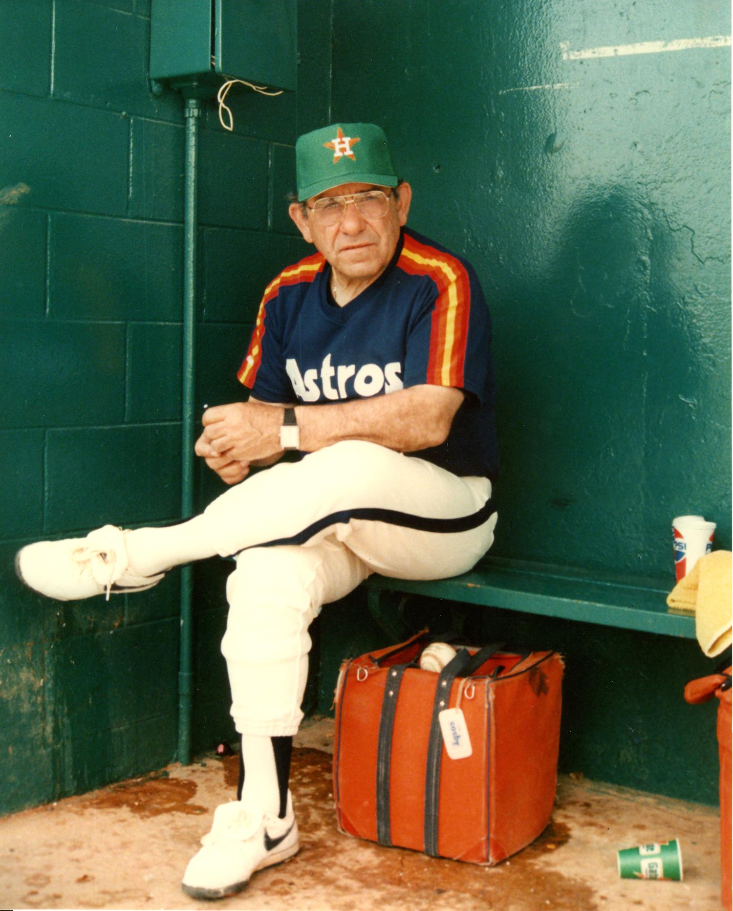
Berra was a bench coach for the Astros from 1985 through 1989. I chose the photo of him shown above because I always wondered what he thought about having to wear Houston’s rainbow stripes and white shoes (and, on St. Paddy’s Day, a green cap). Did he find the whole thing undignified after a lifetime spent wearing the much more traditional uniforms of the Yankees and the Mets?
Speaking of the Yankees, here’s something interesting — check out the tweet they issued overnight:
We have lost an icon: https://t.co/bqLwILR1bb pic.twitter.com/h0SDSvUzkw
— New York Yankees (@Yankees) September 23, 2015
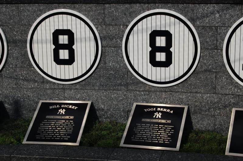
Notice anything there? As several eagle-eyed Uni Watch readers have already pointed out, the 8 is upside-down!
And wait, it gets better. As you probably know, the Yankees retired No. 8 for Berra and also for Bill Dickey. Their numbers are side-by-side in Monument Park. And it turns out that while Berra’s numeral is upside-down, Dickey’s is correctly oriented (click to enlarge):
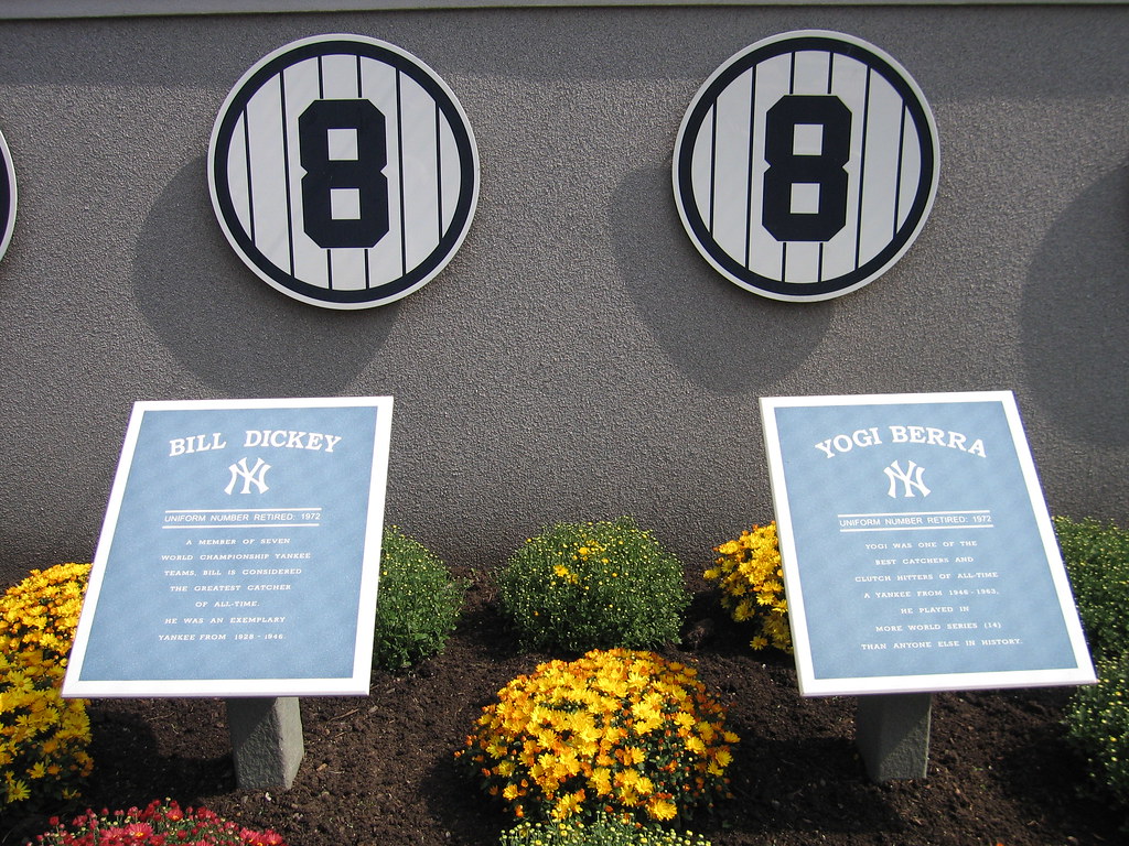
And it gets even better! At the old Yankee Stadium, both 8s were correctly oriented (click to enlarge):
So it appears that the Yanks botched Berra’s retired number when moving from the old stadium to the new one, and nobody noticed until now.
Berra was a fairly big figure in my youth. He became the Mets’ manager after Gil Hodges died from a sudden heart attack during spring training in 1972. That was the first year that I really followed the Mets (I attended two games in ’71 but hadn’t yet begun looking at box scores or collecting baseball cards or anything like that), so Berra was the first — and, for several more years, the only — Mets skipper I ever knew. I always liked how he wore his stirrups in those days. He was fired on Aug. 5, 1975, after the team dropped both ends of doubleheader to the Expos by scores of 7-0. I happened to be at that doubleheader (still have the stub!), but a day at the ballpark still seemed so magical in those days that I enjoyed all of it, even if my team was getting shut out in both games.
I’m pretty sure Berra appeared in a Mets uniform at a few old-timers games after he was fired. But his final appearance in a Mets jersey came on Sept. 28, 2008, when he was part of the on-field ceremonies to commemorate Shea Stadium’s final game, leading to this instant-classic photo of the team’s two most famous No. 8s (click to enlarge):

Among all of Berra’s famous Yogi-isms, the one we’ll probably hear most in the coming days is, “Always go to other people’s funerals, otherwise they won’t come to yours.” But I bet nobody goes to Berra’s funeral — it’ll be way too crowded. R.I.P.
The Ticker
By Phil

Baseball News: Reader Chris Shockey saw this cap in the Rockies store at Coors Field Monday evening, and thinks “someone could make a killer Rockies alternate based off of this beauty.” … Nice historical photo of the Atlanta Black Crackers taken at the Civil and Human Rights Museum in Atlanta (from Michael Blake Raymer). … The Phillies may be experiencing a lost season, but that doesn’t mean their fans can’t still get this sweet burgundy Oktoberfest hat/fedora — details here (from J. Walker).

NFL News: Check out this photo of Archie Manning and Oliver Luck, circa 1983-ish. Says submitter Eric Wright, “Stumbled across this photo from the early ’80s — amazing how they played together on the Oilers, and their sons have been a thorn in the Titans side for almost 20 years.” … Julian Edelman removed the Nike sign from his cleats due to Puma sponsorship (from Dirt McGirt). … Whoa — the Raiders aren’t refusing to do the “gold 50” at the O-dot-co because of baseball still being played there (as we had originally speculated) — they’re refusing to EVER put on-field gold marks at the 50-yard line (from Eric Wright, who adds “It would make Al Davis proud”). … Whoops — TV Guide has a hard time telling the Pittsburgh football teams apart (nice spot by Dane Drutis). … “Ragnar” is no longer the Vikings mascot after a contract dispute. Says submitter Jon Solomonson, “Wanted HUGE raise from $1500 to $20,000 per game. Greedy. Greedy.”

College/High School Football News: Here’s a ranking of the 25 ugliest college football alternate uniforms of all time. … UTSA will have new navy uni this week with custom socks (h/t Doug Hazard). … New uniform combo for the University of West Georgia (h/t Bo Childers). … Fairly big news out of Miami yesterday notes the Canes will change the nameplate font on all football jerseys to a traditional block letter font (from Jeff C. and Klay Kuban). More here. … In a somewhat related note, this article notes that “new (high school) unis may look cool, but difficult-to-read jerseys are on their way out.” (That noise you just heard was Jim Vilk, er, Jakob Wolf, screaming for joy.) … Utah will be doing the “white out” thing against the Ducks this Saturday in Autzen (h/t Real D-dawg 2020).

NBA News: The Warriors are the latest team to put ads on their practice jerseys. They’re not the first: The Pacers had practice jerseys with ads, as well as the (former) Hornets. And the Utah Jazz too (h/t Taylor). Several NFL teams do this, too.

Hockey News: From Mike Engle comes this: “Jack Eichel of the Buffalo Sabres has dibs on #15 when he (inevitably?) makes the team, but until then, he’s wearing #41 that was assigned to him at development camp. The Sabres themselves confirmed this to me.” He adds, “Other examples of “preseason only” numbers include Pavel Datsyuk’s #24 for Ruslan Sanei after the plane crash and Doc Gooden going back to #64 to feel like a rookie again.” … It is the 50th year of the Western Hockey League. The Moose Jaw Warriors will be wearing a one-time commemorative jersey on opening night of their season which recognized Moose Jaw’s rich hockey history (h/t Wade Heidt). … Add puck to the latest (excluding the ASG unis, sorta) sport in which fluorescent highlights are making their presence felt. Those are Aaron Dell’s new pads, blocker & glove (h/t J. Walker). … Michigan State wanted to replace their hockey blue lines with green, but the NCAA said “No” (thanks to David Ribar). … Check out the jerseys of this Swedish hockey team, who are “standing up against homophobia in sport.” To quote Jim Vilk, “I’d wear that.” … The Milwaukee Admirals will wear Star Wars themed sweaters. … This comes up every year, and every year we give the same reply: The Red Wings straight NOB will be arched come regular season, and it’s straight in the pre-season.

Soccer News: Here’s a pretty cool graphic of the evolution of Barcelona’s football badge (graphic by 90s Football, sent in by Tim Cross). … This is awesome: DC United gave Pontifex his own jersey (and he’s an XL, in case you’re wondering), via Holy Calamity, who points out he’s not the first Pope to get a United jersey.

College Hoops News: Powerhouse Duquesne has unveiled six new uniforms for the 2015-16 season, including an incredibly awesome 1970s throwback and an equally nice 1950s throwback (h/t David Ribar). … New white uniforms for the Charlotte 49ers (h/t Jonathan Bradshaw). … New white uniforms for the Kansas State Wildcats (h/t James Westling). Here’s a look at the sweatback.

Grab Bag: Readers of this site may know that aside from being an occasional contributor, Brady Phelps does some AMAZING pancake art. Here’s just one example of how he does it (and that’s for a charitable cause!). Check out the stuff he’s done for the Padres Chicken, the San Diego Chargers, the New York Mets, and well… you name it. Amazing! … The Force India F1 team is running a competition to design part of Sergio Perez’s race suit for the upcoming Mexican Grand Prix (from Matthew Walthert). … NASCAR’s Kyle Larson “Goes Mad for Plaid this Fall,” (From Davis Shaefer)…. New logo for Circle K (from Kurt Esposito).
1) It’s a shame Gary Matthews isn’t doing the Phillies broadcasts anymore cause he’d be rockin that Oktoberfest hat from day 1 on tv. 2)I have to agree w/ Eric on that Raiders’ 50-yd line argument. It’s the first thing I thought of.
That’s an awesome Phillies hat. But it’s not a fedora! It’s a Tyrolean or Alpine hat. In this era of trend-chasers donning Trilbys and calling them “fedoras,” it’s important to take a stand against the proliferation of “fedora” as a generic term meaning “hat.” We already have a generic word for a thing you wear on the top of your head: “hat.”
Shit. I knew I should have run that one by you first, Arr
Also, is “burgundy” the right color? I’ve always said it was maroon.
“What a maroon!” In the words of the only twentieth-century American more quotable than Yogi Berra. Personally, the classic Phillies have always struck me as more burgundy than maroon. Claret, even, but American sports fans mostly don’t know that as the name of a color. No rhyme or reason to my preference on that question, and I’m honestly not sure what folks called the Phillies dark red when I lived on the Main Line circa 1980-82.
Despite the team’s insistence on calling their color “burgundy,” the Redskins have always seemed more like “maroon” to me. I guess the colors named for wine strike me as more like red, but darkened, or maybe with a little blue mixed in. Whereas “maroon” feels more like a red-brown. Which, again, is just random personal prejudice, with probably no connection to actual color theory or anything. Wikipedia would probably define the two words opposite from how I use them!
“Powerhouse Duquesne”?
Lots more pinstripes on the newer Yankees monument numbers than the old. Seems more correct.
“Add puck to the latest (excluding the ASG unis, sorta) sport in which fluorescent highlights are making their presence felt. Those are Aaron Dell’s new pads, blocker & glove”
This isn’t new for Dell. He was wearing neon pads last season in Allen.
link
Lots of “if you say so” imagery explained in the Circle K logo change. They forgot one though: “It’s pointy now!”
“You Will Actually Die From How Mind-Blowing The New Circle K Logo Is”
More like mind boring.
Ah BuzzKill, the FoxNews of internet fake news. Lists, food pics and puppies to lure the lazy into clicking their life away. Gotta love social media.
“…one leg of the K in the logo intersects the circle, welcoming our customers and communities.”
Ummm… ’cause intersecting a circle with a leg is the international symbol of welcome?
“Reader Chris Shockey saw this cap in the Rockies store at Coors Field Monday evening, and thinks “someone could make a killer Rockies alternate based off of this beauty.””
I made these mockups in 2006:
link
Sweet!!
Splendid use of two excellent insignias. But I have a preference for the first-year baseball teams’ logo, with the small, centered baseball.
I used this quote in my senior year high school yearbook. RIP Yogi
“If you don’t know where you are going, you might wind up someplace else.”
The sign for Exit 8 on I-684 South has an upside down 8…
The picture of the Kiruna hockey team has the Sami flag in it, the Sami or Lapps have had the rainbow as a symbol for literally thousands of years. Happy coincidence?
Another Yogi story related to uniforms that I heard years ago is that when Yogi began coaching in Houston he told the team right away to get rid of their orange stripped uniforms because it helped opposing pitchers target their pitches in and out of the strike zone. I think the Astros got rid of their tequila sunrise uni’s within a season or two after Yogi’s arrival.
“But I bet nobody goes to Berra’s funeral – it’ll be way too crowded.”
Very nice, Paul. A fitting end to a wonderful tribute.
Thanks, Marc. I’ll admit to being a bit pleased with myself for coming up with that one — not bad for something I wrote on the fly this morning after a fitful night’s sleep following a six-day vacation….
You deserve to be pleased. It’s a keeper!
FWIW: In my experience, the stuff I create while half awake and close to a deadline is usually what ends up being the best.
“But I bet nobody goes to Berra’s funeral – it’ll be way too crowded.”
~~~
Indeed — that’s a great mixed-Yogi-ism! He’d be proud.
Agreed. When I read PL’s final sentence of his Yogi tribute I sat back and smiled. Well done.
Thanks for the Yogi tribute Paul. I wonder, is it somehow fitting that Yogi’s “8” is upside down given his personality?
It looks to me like the more stylized markers at old Yankee Stadium used an 8 whose crossbar is equidistant from the top and bottom, so “upside-down” wouldn’t have been an issue.
RE: Raiders no gold 50s….
Since the Raidaahs pride themselves on the SILVER and Black, I see why they won’t put any Gold on their field–especially when the other team in town uses that color.
Given the Raiders, it could just be “f*ck the NFL” too.
The first thing I thought of when I read the story and I suspect you are correct.
I bet the Raiders aren’t doing the gold 50 because it is a 49er color. Lots of hate in the Bay between those two.
Nice job on the Yogi tribute, which I know you must have pulled together very quickly!
Thanks, Dave. I had planned to use an “evergreen” lede today (i.e., something not time-sensitive and already written and ready to go), but then I woke up to the Yogi news and kinda hit the ground running. So much for easing back into work mode!
“Ragnar” gets $1500 a game for leading the team onto the field?! Geez, dude… suck it up. $12K (regular season) for riding a motorcycle, wearing a cool costume and getting to see some decent football from field level is a pretty sweet deal. Why not negotiate for licensing your image instead? Cash in on “Ragnar” shirts and bobbleheads, for the love of Mike.
These dudes tho, they’re putting in a lot of cash. The typical fan-mascot (imagine, Seattle’s Green Hulk or Big Lo’) are lifetime season ticket holders for whom gameday is a big event. I wouldn’t be surprised if your typical superfan was spending $1000 per home game, in one form or another.
My late father played on the same Little League team that Yogi & Joe Garagiola did for one season when he was like 10 y/o (he always said his position on the team was “Left Out”). Said that Yogi, while not unfriendly, barely spoke at all, and that Garagiola was the better player by a wide margin.
History has proved my father a poor judge of athletic talent.
Maybe Minnesota’s Ragnar was taking a cue from that former hedge fund manager, Martin Shkreli, who raised the price of Daraprim from $13.50 to $750 per pill.
Minor typo: It’s Ruslan Salei, not Sanei.
Also, it’s amazing how many people still jump on the whole Wings preseason NOB thing.
NASCAR’s Kyle Larson “Goes Mad for Plaid this Fall”
Oh Chip Ganassi Racing… it’s not plaid, it’s gingham.
Wait… why the hell do I know that?
It’s actually the other part of the racing team that’s doing all sorts of plaid stuff over the next few weeks. I’ll have to keep an eye out for any incorrectly-labeled plaid in my store.
“The Milwaukee Admirals will wear Star Wars themed sweaters.” How can a team called the Admirals go Star Wars with a stormtrooper theme instead of Admiral Ackbar? They could Admiral Ackbar’s body armor as the background. Then, instead of the pirate logo, they could use Admiral Ackbar’s face. (BTW…I just like typing Admiral Ackbar.)
On a semi-related note, your mention of the confluence of baseball and the Rebellion’s venerated Admiral made me hope the following existed, and quite giddy when I found someone with some amount of skill beat me to the punch:
link
Paul- will we get a debrief of your trip? This vacation seemed a little more under the radar than usual.
Right there in the first graf: “more on that soon, maybe tomorrow.”
Sorry I think I got too caught up in the Yogi tribute. Really well written.
Thanks! And thanks also for your interest in my travels, Mike — it’s fun to share my travelogues. Like I said, this next one may run tomorrow (and if not tomorrow, then definitely soon).
Paul, I rarely ever mention anything, but I love reading about and seeing pictures of most of your non-uniform travels & activities. Generally jealous, always interested.
Lee
Thanks, Lee. I know most people come here for the uniforms (and, for the most part, so do I), but it’s fun to go off-uni sometimes, and it’s great to know that you enjoy that. Appreciated!
Fluorescent colors on goalie pads? Ray Emery (another Brian’s client) colored his last Flyers pads with a distinctly highlighter orange instead of a more traditional orange.
Image from link.
Plus I remember Brian’s always showcased the SubZero2 line in catalogs with a black and volt green color way.
“I never play a game without my man.” – Casey Stengel
link
Wonder if the Yankees go patch, arm band or number on the sleeve.
I think they go number as they did in 95 with Mantle and 99 with Joe D.
Let’s please aim for a higher level of discourse in the wake of someone’s death:
link
Thanks.
Agreed, but the Yankees didn’t waste any time with their announcement.
Oh, as a Yankee fan, a big Yogi fan, I meant no disrespect, I just knew something was going to be done for the game tonight.
Here’s a look at the Yankees’ “8” on sleeve.
If there was ever a time to pull out the everybody-wears-the-same-retired-number shtick, the Yankees honoring Yogi would be that time.
Thank you, Paul, for a great tribute to our last link to “Baseball’s Golden Age.”
It’s a little weird, but when I think of Yogi, I see him managing the Mets in the early Seventies, because that was when I really started getting interested in baseball, or in the Astros Tequila Sunrise uniforms, because I moved to Houston in 1986 and he was here as a bench coach/special advisor to principal owner John McMullen. I know he was first and foremost a Yankee, but I don’t see him that way.
The best line ever about Yogi’s tenure with the Astros: a writer (it may have been a Sports Illustrated reporter; I can’t recall) watched Yogi strolling outside the dugout during batting practice in the Astrodome, dressed in the full stripey regalia, and said, “He looks like Saturn and its rings.”
What’s that patch on Yogi jacket in the link within this sentence, “I always liked how he wore his stirrups …”
NYC Diamond Jubiliee patch, worn on dugout jackets (but not on the uniform) in 1973. Here’s a better look:
link
More about that patch design: The patch lists all five boroughs of New York, but Staten Island is listed as Richmond. That’s fine, because Staten Island is Richmond County. But following that logic, Brooklyn should be listed as Kings, because Brooklyn is Kings County. But instead it simply says Brooklyn.
Thanks Paul. To me it looked like and upside-down omega with a globe in the middle. as I was only two-years old in 1973 I have no memory of this.
Did the Yankees wear it too or just the Mets? I don’t think I have ever seen a photo of a Yankee wearing it.
I think just the Mets. Which, in retrospect, is surprising.
according to wikipedia ” The borough is coextensive with Richmond County, and until 1975 was officially the Borough of Richmond”
link
Paul, the borough name was officially “Borough of Richmond” until 1975. Its flag even said “Richmond Borough”.
link
Only in 1975 was the popular usage of “Staten Island” for the borough name officialised.
If this auction item for a link is accurate (and I believe it is), the Yankees did not wear the NYC Jubilee patch and actually wore an odd version of their own logo.
Why the Mets only put that patch on the jackets is a mystery. It probably would not have looked good on the pinstripe jersey and actually looks good on the jacket. The 75 was even in Met colors.
Jack Eichel of the Sabres wearing #41 in camp/preseason while he has dibs #15:
I’m glad to see that practice is still in place. That used to be the unofficial rule in the NHL hockey. You wanted a standard issue number #1 through 30, and having a high number meant you were just in a temporary call up. Even when Gretzky/Lemieux kind of broke that mold, wearing a double digit number meant you were proclaiming yourself a hotshot.
My youth house team had an awful system where you had to have #45-#65. I hated it. You had to make the travel team to wear #1-20. So I had to wear #58, nobody in the NHL was wearing it, it wasn’t a real hockey number in my eyes!
Now, the NHLers wear what ever they feel like. I’m not sure if the Europeans changed the standard, or if it has to do with the influx of new hockey associations, during the 90’s rink boom, that are less likely to follow tradition.
Not sure if it’s a practice that the team ever had in place. Actually, since Ryan O’Reilly has #90, definitely not. I think it’s just Jack Eichel being old-school. Which is cool.
When did numbers explode? I’d say it was a few trickles going on all the time at first. First off, we know that link were the “tight ends” of the NY Rangers, wearing 88 and 77. Espo couldn’t get #7 from Rod Gilbert, and #12 wasn’t working for him, so he went rogue. Then in no particular order but all kind of close together, Butch Goring came to the Islanders and flipped his old/Bryan Trottier’s #19, Ray Bourque ceded his #7 to the rafters for Espo and took #77, and of course Wayne and Mario. Sure, the Euros took high numbers too, but it’s more civics and personal freedom than ego: Jagr’s #68 is for the Prague Spring Rebellion, while Petr Klima and Alex Mogilny took their years of defection from Communism as their new numbers. After that, Eric Lindros was ordained “the next one” with #88 (a high multiple of 11 but not Gretzky) and Jeremy Roenick took a bold #97 (only because #27 on the Coyotes was Teppo Numinen)…and now we’re at a time when numbers are years of birth (Crosby, Kane, Landeskog, Nugent-Hopkins). So back to the question, who/what changed the standard? I think the answer is, everything.
I’m a Habs fan and I love numerology. We kind of have to give high numbers to everybody because we don’t have too many small numbers left, but then the players tend to keep the high numbers because it got them this far. Our captain, Max Pacioretty, has never traded down from #67. That has to be the weirdest captain’s number ever. PK Subban? #76. Maybe if he didn’t get so “branded” as “PK76” so soon, he would have traded down to his OHL #6. I remember also remember when Alex Galchenyuk and Brendan Gallagher made the team right after the last lockout, less than a year after getting drafted. It was a statement that really resonated with me. Galchenyuk was the highest draft we’ve had in a long long time. #3 overall, gets #27. Gallagher was not a first round pick. #73. But by the time we reacquired Michael Ryder (who was similarly given #73 and then took it as his personal brand), Gallagher was clearly “sticking” with the big club and he got validated” with #11.
Maybe A’s should just paint Raiders 50-yard marker behind pitchers mound whenever they celebrate 50th anniversary season (should be 2017 but will be ’18).
That is what I thought ’50’ meant for a half-second (or honoring player who wore ’50’) watching game recently until they panned entire field.
the 8 is upside-down!
Hmmm…if I ever got a callup to the Pirates, I wonder if I could request an upside-down 8. Worth a shot.
new (high school) unis may look cool, but difficult-to-read jerseys are on their way out.
‘Bout time! Although I’m sure there are a few teams that will suffer the measly one-timeout penalty and keep them. The ref should hand the equipment manager some spray paint and say, “We’ll kickoff once you fix these numbers.”
I bet the Raiders can’t do the gold shield because they play on fu&&ing dirt in spite of being part of the big bad billionaire NFL.
Fu$$ing trashy third world field.
Possibly TMI in revealing what type of road trip partner I am, but I find, especially for the road trip – travelling solo is the way to go. Paul, curious to hear your thoughts on the one-man-trip.
Dislike traveling alone. Respect those who can do it, but it’s not for me.