
For all photos, click to enlarge
The 49ers have been my favorite NFL team for 45 years, which is longer than most of the people reading this have been alive. We’ve had our ups (all those Super Bowls in the ’80s and ’90s were nice) and some downs (people forget that the Niners went 2-14 two years in a row in the late ’70s), but there’s always been one thing I could count on: My team looked good out there. This isn’t to say their uniforms were perfect ”” the pants striping during the Montana era was way too wide, I could have lived without all the black trim that was worn from 1996 through 2007, and the current sleeve stripes are embarrassing and inexplicable. But the red/gold color scheme has always been a winner, the helmet logo has proven to be extremely durable, and the team’s overall look has been solid.
Until last night.
Man, what a disgrace. Leaving aside how lame-o it is to hop on a bad trend more than a decade late, there are sooooo many things wrong with this design: the red numbers on the black background, the old school helmet (complete with grey facemask!) with the new-school look, and on and on. And if you think the base design is bad, check out cornerback Tramaine Brock, one of the handful of players who went with black socks instead of red:

Aesthetic considerations aside, the uniforms also presented practical issues. Having trouble making out the uni numbers in these photos? Yeah, well, you’re not the only one, as noted in this email I received during the game from reader Ed Wright:
I’m listening to the 49ers’ home radio broadcast tonight, announcer Ted Robinson is struggling to tell his audience which 49er player(s) were involved in each play. He finally addressed the issue: “I’m only going to say this once tonight: I have to apologize to our listeners, but the numbers on these alternate uniforms are really hard to read.”
Additional photos here. Meanwhile, in that same game, the Vikings wore captaincy patches, which I’m pretty sure they haven’t worn in the regular season for quite some time (anyone know when they last wore them?):

Speaking of patches: In the other Monday-night game, we got our first on-field look at the Falcons’ 50th-season patch, which wasn’t worn in the preseason but has now been added:

Click to enlarge
Collector’s Corner
By Brinke Guthrie
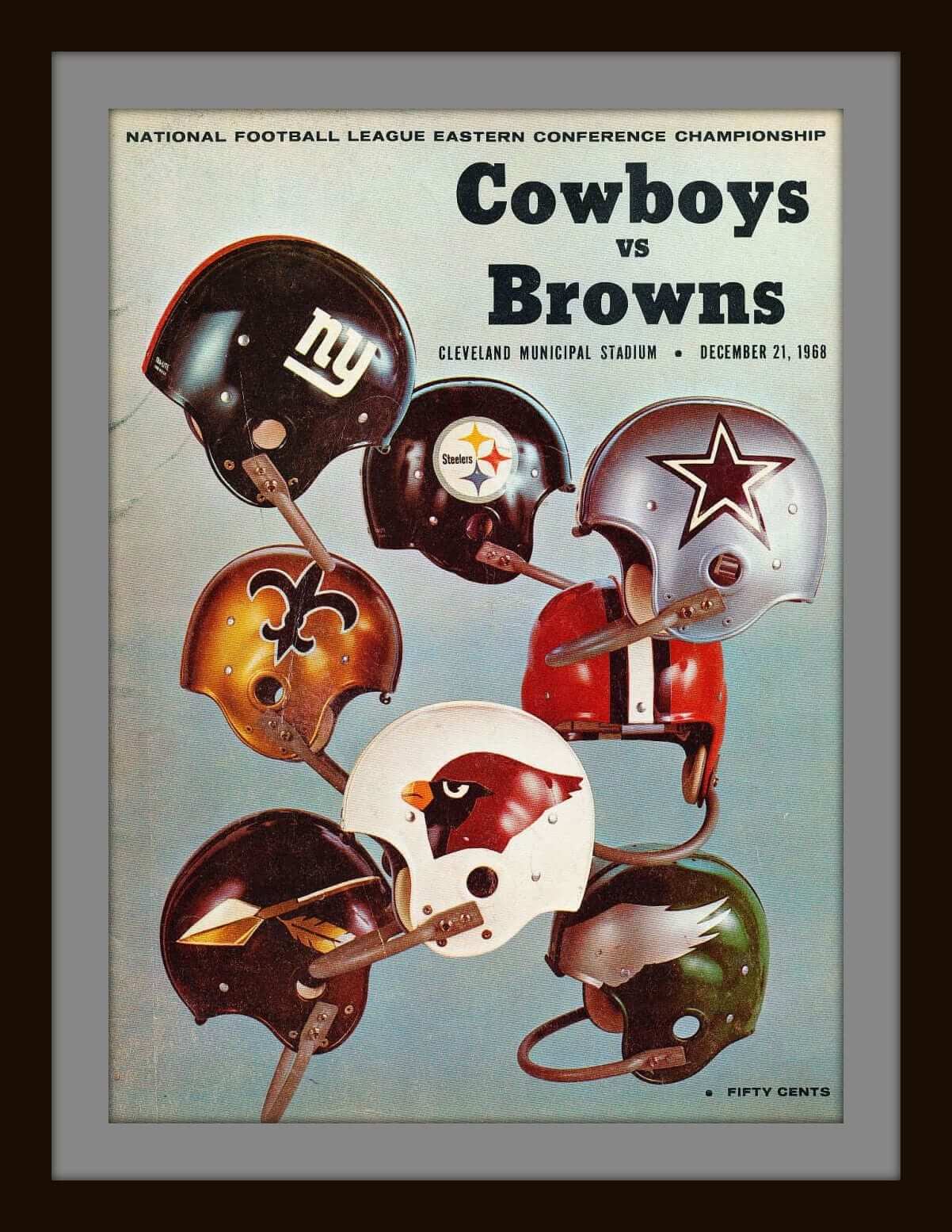
We’re featuring NFL program covers this week, ’cause, ya know, the season is finally here. First up: this great Cowboys/Browns program from 1968. Also from that same season, notice how simple yet effective this cover art is — just a battle-scarred helmet. (Wondering why a Steelers helmet was used for a Rams/Chiefs game? The cover says NFL Illustrated, which was the predecessor to Pro!) Finally, a program cover from Chargers/Colts game from 1969. Now, this was an August preseason game, as was the previous Rams/Chiefs game. That’s because NFL and AFL teams played against one another (even though the games didn’t count) prior to the 1970 merger.
Okay, here are the rest of this week’s picks:
• Ever seen a 1950s Chicago White Sox jacket like this? This model is called the “Timberline,” by Brill Brothers of Milwaukee.
• This is one terrific-looking “Evolution of the NFL Uniform” poster, sponsored by General Tire. Tiny tear near the top, but dry-mount/frame this guy and you’re all set.
• From about the same period, check out the graphics on this New York Giants poster — a classic. Is that supposed to be Tarkenton?
• If you collected NHL stickers from Esso in 1970-71, you kept ’em in this NHL Power Player Trader Wallet.
• Skip ahead a decade, and if you collected MLB trading cards in the 1980s, this baseball-shaped case from Skilcraft was the way to go.
• A hundred bucks is the lowest price I’ve seen in awhile for a complete set of the 1970 NFL Chiquita stickers.
• Did anyone from the quality control department check out this 1970s Baltimore Colts ice cream sundae helmet before it left the factory?
• Took me a couple of looks to even figure out what this was: a 1970s L.A. Rams “Pic-Nic Helmet.” Open up the top and stuff all your picnic stuff inside.
• This 1970s Fisher Nuts Steelers promo glass caught my eye for the simple reason you rarely ever see the facemask pointing to the left. (And there should be no logo showing on this side, either.)
Here’s a 1970s Atlanta Falcons helmet plaque still in the (somewhat crumpled) box.
Follow Brinke on Twitter: @brinkeguthrie
The Ticker
Compiled by Mike Chamernik

Baseball News: A beautiful gold watch that served as a lifetime pass to Brooklyn Dodgers games at Ebbets Field had mysterious origins. … Marcus Stroman of the Blue Jays made his 2015 debut the other night and he is another one of the few single-digit pitchers. He wore No. 54 last year (from Mike Styczen). … According to this piece, “Allyne Price from the Players Association was in the Yankees’ clubhouse showing several pitchers a new protective head gear that will replace the cap and has ear flaps” (from Fran Simmonds). … You might remember that the White Sox wore these uniforms from 1987 to 1990. Well, the Sox didn’t include them on their uniform history page on their website. In the team’s defense the Sox have worn a lot of distinctive uniforms (from Ferdinand Cesarano). … Good spot by Steve Shanabruch: The lines on Wrigley Field’s marquee aren’t symmetrical. Look at the horizontal lines at the ends of “Chicago Cubs.” It’s been that way for awhile, even during special events where the sign was painted other colors. … The St. Louis Browns had a great dog mascot in 1909 (from Will Scheibler).

Pro Football News: Yesterday we noticed that the Panthers wore blue alts on the road in Jacksonville. “The Panthers usually wear their light blue alternates on the road in September games where the temperatures could get really high (at Tampa, Bay, Arizona, San Diego, Miami and Jacksonville),” writes Florian Steininger. “Nothing out of the ordinary there. They’ll wear them again in Week 4 at Tampa Bay.” … Beginning next year, Adidas will be the official outfitter of the CFL. … A Wisconsin tourism commercial shows Packers WR Jordy Nelson in a Pack jersey with a whitened-out NFL shield.

College & High School Football News: Nebraska will wear these cleats against Miami this Saturday. The inside of the cleat has 17 “N’s” and a palm tree design to represent the Cornhuskers’ 17 Orange Bowl appearances, and the outside of the cleat has each player’s number. … Colorado will wear white helmets on Saturday (from Phil). … New helmet for Old Dominion. The team will wear it against NC State this weekend (from Jeremy Walker). … Houston tweaked its matte white helmets by adding chrome decals, a red chrome facemask, and the Texas state flag decal. Here’s another look (from coogrfan). … Not only is there a Bear Bryant Namesake Reunion, but the 20th annual version of it was this past weekend. … No pics of the NOBs, but Brice Wallace saw that Utah State has a Baker, Painter, Copier and an Artist. … Kentucky’s North Hardin High School has a helmet memorial decal for an officer that was killed.

NBA News: The Rockets will unveil new alternates tonight. … This weekend a Clippers’ blog posted a story on the team’s new logo. As it says in the deck, “All the facts in this story came from a secondhand source who got it from a conversation with the actual source,” so believe what you will. … Wizards rookie Kelly Oubre signed with Adidas (from Tommy Turner). … Reddit hosted an informal Thunder redesign contest.

Grab Bag: A Minnesota corn maze shows the Wild’s 15th anniversary logo (from Luke H). … The creator of the mid-century Marshmallow Sofa has died (from Tommy Turner). … Donald Trump’s hairstyle makes him look a little like Wichita State’s mascot (from Andrew Cosentino). … New uniforms for North Korean flight attendants (from Chris Bisbee). … Christopher Cameron runs his own cornhole board company out of his garage and a few of his designs are uniform-themed. … Brice Wallace was ordering a class ring for his son and saw these camo options in the ring catalog. … Canadian box lacrosse league teams rival European hockey teams for the amount of ads on their uniforms. The indoor lacrosse photos come from the Mann Cup (from Kevin Mueller). … Here’s the story behind Reddit’s alien doodle logo. … A tech company is flaunting San Francisco’s graffiti laws by stenciling its logo on sidewalks. Kind of reminds me of 2012, when Coke plastered its logo on the streets of New Orleans. … Here are some architects’ drawings of the Los Angeles Memorial Sports Arena and Dodger Stadium (from Will Scheibler).
will our TV sets blow up when the Niners play the Browns?
As a Browns fan I feel for you Paul! At least the Niners duds are alts. I am stuck with the Browns look for at least five years, UGH!
See everyone, *this* is an example of unreadable jersey numbers. The Browns are fine – it’s construction cone orange with a white highlight. No problem at all. Blood red on black? Yeah, that’s unreadable.
Just because you don’t have an issue with the Browns’ numbers, The, doesn’t mean that nobody does. If there are uniforms that I can read and you can’t, that’s a problem. If there are jerseys that you can read and I can’t, that’s just as much a problem.
And, yes, those 49er unis were awful, too.
The, you’re right that the Niners are the worst example we’ve seen. But this isn’t a question of aesthetic opinion; this is a question of objective fact. If you compare the actual color values – rgb or hsb – of the fabrics used by teams, the Browns orange-on-brown numbers offer less contrast in terms of both color value and light/dark value than anyone else in the NFL. Less contrast than the Bears orange-on-blue, and less even than the Bulls black-on-red. The Browns aren’t as bad as the Niners, but they’re closer to the Niners than they are to anyone else in the league, including the Bears.
If the Niners are “unreadable,” then the Browns are almost unreadable. If the Browns are fine, then so too are the Niners, since the Niners have only slightly less contrast than the Browns.
There’s more to it than just comparing RBG values. There’s a reason orange is used on hunting gear.
Yeah, and there’s a reason fluorescent green is used by runners and construction workers. But if you have a jersey that’s white and use that shade of green for the numbers, it would likely be unreadable to most people. The colors are too close on the color wheel to create sufficient contrast. That’s exactly what’s going on with the Browns and Niners. Not enough contrast for readability.
I watched two plays of the 49ers game and turned it off. Looking at those uniforms made me sick.
I thought I would hate the unis , but actually didn’t…
No, I liked ’em fine, too… but get ready to face a hurricane of disapproval. Me, I take it in the spirit that white is forced upon teams for imperfect reasons, too. Black? White? Neutral colors. See it as a pop-art project.
Even if you accept that black is a neutral color, these are just bad. The black jersey is the white jersey colored black. Ok, fine. Therefore, the white on the rest of their normal uniform should have been made black to match. The helmet & pants should both be gold, with a red-black-red stripe. That would’ve actually made sense. The numbers would still be hard to read, but it would have looked a lot better than what they used.
How ’bout using gold numbers & NOB on black?
You mean wearing Saints jerseys?
OK… got me. How ’bout red outline instead of white?
Same.
What I disliked most was the black pants. I think the black jerseys would look good with gold pants / gold helmets
I made it a point to hop on to Uni Watch today just to get Paul’s reaction to those 49ers jerseys. When they were announced, I thought maybe they’d be okay. But, after seeing them, they’re like those bad 90s “futuristic” NHL jerseys. Wow were they bad.
As I said back when they were announced, these jerseys look pretty much like they were based on link.
Wow, cool old architectural drawings in two consecutive tickers! (Of course, I would refer to the ones linked to today as renderings, ha ha. You just can’t win with me, I know. Never satisfied.)
Guess spell checking was a lost art in 1909, too. “Masot”?
Huh… I didn’t know Majestic had been around that long.
Does this mean they had a Dawg Pound at Sportsman’s Park decades before Cleveland Municipal Stadium did?
Sometimes I wish the Cardinals had become the Orioles and the Browns had stayed in St. Louis.
To me it just didn’t look like the 49ers, and their helmets stuck out like a sore thumb.
I don’t mind black and red together but I do for this team.
Kinda makes you wonder who and what their target is?
“Kinda makes you wonder who and what their target is?
It sure as hell ain’t people who understand color relationships and unnecessary design elements.
Raider Fans so that they could pretend that they still play NFL football
No. Us Raider fans would rather buy retro jerseys with names like Allen, Long, Jackson or Stabler on them, before we’d wear a 49ers jersey.
A vocabulary note: that tech company is flouting –not flaunting — San Francisco’s graffiti laws. (The newspaper story makes the same error.)
Not only did the Vikings wear captaincy patches… But they were white, not gold like a lot of other teams have been wearing this year. (Sorry, no pics to link to.)
I believe the “C” on the captains patch is only gold when you have been the captain for five years. Each year you get a new gold star below the “C” and the fifth year you get a gold “C”.
Looks like some black and red team borrowed the 49ers helmets for a game.
Nice mention of box lacrosse, the Western Lacrosse Association is an absolutely fantastic, little-known league. That’s the Victoria Shamrocks in green in the photo.
The thing that struck me about the 49er uniforms, aside from the points Paul has made, is that they look cheap. Just looks like something someone threw together and looks like some cheap uniform. I am not sure why a proud franchise like San Francisco has to sink to this level. An alternate, fine, but do something that looks sharp and not this crap.
Paul is spot on . The 49ers uniforms looked part awful, part ridiculous. While watching the game my wife even said “those uniforms are ugly”. Honestly, I’m watching the game last night thinking “who actually likes these black uniforms?” It is a horrendous look. The 49ers have a great look. Why foul it up with the black alternate?
It’s sad that, as you did, I thought of the Niners alt in merchandising terms along the lines of, “Who do they think will buy this?” But that is the reality of what is driving the team’s choices about uniforms, so I think that is a legitimate question. And here’s the thing: Nobody buys football pants. If the team thinks its fans want to buy a black jersey, but only if the team wears it in a game, fine. But why change the pants? Make it a black jersey over gold pants, add some hint of gold somewhere on the jersey, and bam! A uniform that doesn’t completely suck. I think it would still be an ugly jersey, especially for the Niners, but the overall uniform would be tolerable – and the team would still look like the 49ers, instead of like a 2-A high school squad.
“… that is the reality of what is driving the team’s choices about uniforms…”
And this is why we have crap uniforms today. Sports design is overly influenced by the aesthetic sense of 14 year old boys.
“Make it a black jersey over gold pants, add some hint of gold somewhere on the jersey, and bam! A uniform that doesn’t completely suck.”
~~~
Yeah, it would still completely suck.
“Why foul it up with the black alternate?”
$$$
Obviously. But nothing about the desire to sell black alternate jerseys requires the team to wear black pants. And if the pants were gold, then even the crappy artists at Nike would have put some gold details on the black jersey, maybe even number outlines, and then the uniform would have been tolerable. The Niners were much worse, much uglier, than a mere desire for merchandising lucre required.
Maybe they did it for the matching cheerleader outfits. link They kinda look like they belong on some S&M fetish site… or so I’ve heard.
How about a business name or a link for Christopher Caldwell’s cornhole board business?
He didn’t provide one. But yeah, if he sends in something and his products are good I’d give it a link!
Are they licensed?
Just asking.
My wife said the Niners unis looked like Halloween costumes. I asked “The colors?”. She said “No, it looks like a generic football COSTUME you would buy at Party City.”
Boom. That’s exactly what this is.
Here is the worst football-related costume currently for sale at Wal-Mart:
link
It’s the ugliest football-related uniform America’s largest retailer sells, and it’s still much better than what the Niners wore. “Generic football costume” would be a huge step up for San Francisco. If somebody showed up wearing the full Niners uniform as a costume, it wouldn’t read as a football player to the other people at the party, since the general public image of a football uniform includes contrasting pants and shirt and big, easily readable numbers.
Ice Cream helmets……
there are a couple of other wrong/bad ones out there:
link
link
I remember some of them gave you stickers to put on yourself.
Gotta laugh that even though the article is about how terrible the Niners’ uniforms were (and yes, they were bad), the title is another dig at the Browns. After the comments yesterday, I can’t say I’m surprised. Slam the Browns when they are playing, slam them when they aren’t.
It wasn’t about “slam[ming] the Browns.”
Many Browns fans have complained that I am “anti-Cleveland” (patently untrue — I’m fond of Cleveland) or “anti-Browns” (I have no strong feelings about the team either way). Some have also said that I’d never be critical of my own favorite teams. In short, they somehow think my assessments are personal. That’s absurd, of course, but people think what they think. So today’s headline was a way of saying, “Hey, look, I hate MY favorite team’s uniform too!”
And yet you didn’t mention your team at all in the headline. You mentioned “oversensitive Browns fans.” On a day when the Browns didn’t play and their team (and fans) didn’t do anything noteworthy, you thought it necessary to give them a jab.
For the record, I don’t have a dog (or Dawg) in this fight. I have no feelings at all about the Browns as a team or Cleveland as a city. I just think it’s interesting when obvious personal feelings overshadow the message of the blog. But I’ve read this blog enough to expect it at some level or another, and I know it’s not going to change because that’s the way you are. It’s part of the charm of this site.
you thought it necessary to give them a jab.
Necessary? Not at all. Just felt like it.
I just think it’s interesting when obvious personal feelings overshadow the message of the blog.
News flash: The personal feelings of one particular personal person (guess who) have ALWAYS driven this blog. Those personal feelings are why this site was created and why it continues to exist. Nothing new about that. Pretty much the definition of dog bites man.
I’m hoping tomorrow’s headline is “The sun rose, Browns still horribly ugly”. Both statements are accurate.
“you didn’t mention your team at all in the headline. You mentioned ‘oversensitive Browns fans.'”
~~~
Always check the URL, bro. Always check the url
If we wanted to unnecessarily slam Cleveland …
link
I’ve always loved that video. Of course my local river is at times a Browns shade of orange and ranked as one of the most polluted in the country as well. So I can’t laugh too much at it. Then again ours never caught on fire….. Yet….
I’m usually pretty lenient on team’s uni adventures, but on Sunday, I have to say the Browns new combo almost literally hurt my eyes.
As for the ’49ers, apart from looking like a college team alt, the whole thing just doesn’t look right. Kind of like playing 45 miles away from the city of San Francisco.
They can always go with an Angels type idea and rename themselves the San Francisco 49ers of Califirornia, Santa Clara, or the Golden State 49ers or something. Wait, I better not give them any ideas.
I noticed that many of the Vikings defensive backs were wearing BLACK gloves. On some plays (and replays) it was hard to tell if the d-back was grabbing the Niners player’s jersey or not.
I wonder if this was “planned” in some way, or merely coincidence.
Many other Vikes were wearing White gloves.
Hmmmmm…….
If I was a DB playing against a team in black jerseys, I’d wear black gloves. Just saying.
There are rules dealing with that
link
Just saying.
Actually, black is an approved glove color. according to Article 4, section h:
Approved Glove Color
(h) Gloves, wrappings, elbow pads, and other items worn on the arms below or over the jersey sleeves by interior offensive linemen (excluding tight ends) which are of a color different from that which is mandatorily reported to the League office by the club before July 1 each year. Such reported color must be white or other official color of the applicable team, and, once reported, must not be changed throughout that same season. Players at other positions (non-interior linemen) also may wear gloves provided they are a solid white, solid black, or a solid color that is an official color of the applicable club. Gloves may also be a tri-color combination of black, white, and one (1) official color of the applicable club. Gloves may also be a bi-color combination of black or white with one (1) official color of the applicable team. Clubs are not required to designate to the League office by July 1, the color of gloves that will be worn by their non-interior linemen.
In short, the glove colors of interior offensive linemen have to be mandated by the team ahead of time and submitted to the league office; other players do not have to report their glove color choices, and only have to stay within the color parameters outlined by the league.
I knew that black is a permitted color when I posted. The point being that the rules are designed in part to prevent deliberately wearing a color to camouflage your holding an opponent. Linemen — who make the majority of holds — get the standard colors as their holds could be easily camouflaged by matching gloves. When secondary guys hold, it’s usually in a manner that can’t be camouflaged.
Well, the 49ers may have a horrible alternate, and the Browns’ new unis may be a mess, but both teams can still be secure in the knowledge that they still don’t have the worst helmets in the NFL. Thanks, Jacksonville!
With all the black the 49ers would’ve looked better trimming the numbers and or stripes in gold.
With all the blackthe 49ers would’ve looked bettertrimming the numbers and or stripesin gold.And red.
The Browns uniforms are worse because we are going to be seeing various combinations of terrible for the rest of the season and we’re only going to have to see the Niners in black one more time. I feel like we’re going to see mono orange for the Browns Thursday night game which is equal parts terrifying and exciting.
I went to a Cleveland Browns game 2 years ago. As a Lions fan, I was so jealous by how nice and classic their uniform looked. It hadn’t been jacked up with modern design elements. It’s so sad to see some great classic look teams get the same work over as the Lions.
I think the Lions look pretty good. As far as “modern” uniform designs go, they’re definitely at the top. The black trim is consistent and looks like it belongs there. I’d prefer a blue facemask instead of black, but aside from that… I don’t see what the problem is.
The problem is why bring in black into the mix to the perfect combination of silver and Honolulu blue. When teams have silver helmets grey face masks look fine, although I like them on all colored helmets : )
This is what I think of when I think of the Lions.
link
The (newish) uni’s seem so delicate with their thin stripes and the detailed logo.
The details in the current logo don’t bother me, but I’m still not a fan of having black as a color in any capacity with the Lions.
If they were to go back to their old Northwestern striping pattern, they’d likely be cut off the way the Steelers’ stripes are now. Though, back in the 90s that happened a lot with the Lions anyway, before they moved their TV numbers to the shoulders for the 1999 season and moved the stripes up accordingly.
I like black so I’ve never had issue with any of the BFBS looks. But I like it as an accent for the Lions more than most. The Honolulu Blue and silver need a darker color to add with them. A navy color would work as well but gets too close to Bears territory. Black isn’t used by anybody else in the division and compliments the colors nicely. Now can they please bring back a modernized version of the blue pants? Silver pants are used by many other teams yet you own that shade of blue and limit it so much in the road uniform. It’s sad.
If they wanted an alt, they should have gone with a 2nd red jersey but with gold numbers and sleeve stipes, white pants with gold and red striping.
What’s the point of uniforms? To identify which team is yours. If they played shirts and skins,it might be difficult in a large stadium.
What’s the point of numbers? To identify one player from another. The refs and May be coaches can go by faces. Those of us at home and in a large stadium cannot.
So with these 2 very important things, those abortions they wore last night did not meet these conditions. As such they served no purpose.
Someone waking up from a coma would ask why is that mid major college team wearing 49er helmets and playing the Vikings.
The fact that you can tell they’re 49ers helmets sorta negates the point you’re trying to make. Anyone watching the game can tell within 30 seconds that it’s the 49ers and Vikings, they’re just wondering who died to cause the 49ers to wear black uniforms as a tribute, since there’s no way they’d wear those for any other reason…
No it’s actually not negated because black isn’t one of their colors.That’s why I had someone saying why is this team wearing 49er helmets. Uniforms are to identify someone or serve a functional or safety purpose. Police,fire,a priest,best buy employee.The only purpose these were for is so idiot Millenials will buy them.It was a hour commercial
and forget about trying to read player’s name or TV numbers!!
Impossible!
Utah state also has a Turner and a Wildman
I have no inside info, but I would bet money that the black uniforms came from Jim Harbaugh.
1. Harbaugh introduced very similar uniforms while at Stanford. In fact, the look is nearly identical to what the 49ers did.
2. NFL uniforms take a couple years to go from idea to the field.
My theory: Harbaugh suggested the uniforms a couple years ago because he either liked them and/or because he thought they would help “recruit” players. But by the time the uniforms came to fruition, Harbaugh was gone.
link
The Harbaugh theory is plausible. But the official story they’ve been telling is also plausible: The 49ers’ “no contact” QB practice jerseys are black (they can’t use red, because the team’s regular practice jerseys are already red), and players liked the black QB jerseys and suggested going ahead with a game version.
From what I got out of that article, it seems like it was Nike’s initiative, not Harbaugh’s, and he was actually reluctant to use them. He was gone to the Niners the next season, and the Cardinal didn’t wear black unis again until 2012.
Somehow I doubt he’d have been on board with these uniforms, either. The idea of black unis for San Francisco was probably pushed by Nike as well.
Manchester United seem to be plagued by the same condition that hit the Bay Area last night. Fortunately, it appears to have been contained to their shirts (though I wonder if this is due solely to PSV’s black shorts).
Man United’s jerseys were a bit more legible. Part of might be that bright (almost fluorescent) scarlet that Adidas has. Part of it may also be due to the technical specifications that UEFA has for uniform numbers
Yeah. I follow them on Facebook, and saw pics from the dressing room, pre-game, with all the shirts and what looked like black shorts laid out–I presumed third shirt w/ second shorts. Turns out those were their warm-up pants, though. And, yeah, comparing pictures side-by-side against the Niners–both in action–United’s were definitely less of an eyesore.
I thought the black uniforms were a terrible decision by the 49ers, but it would be great if the Falcons wore them. I didn’t find the red on black to be at all difficult to read. Since a lot of people seem to have problems, a thin white outline would quickly fix that. But in a vacuum, these pants and jerseys look great. The only problem is that they don’t work with the 49ers helmets and history.
Additionally, I really enjoyed the pop of gold provided by the swoosh on the shoulders.
It’s still a maker’s mark, and making it stand out as gold with every other non-black element (save the NFL shield on the collar) being red, just makes it come off as a marketing ploy – just another reminder, arguably more blatant than usual, that this is a NIKE-produced jersey.
Since the current trend in football is the wearing of jerseys with numbers and NOB that can’t be read easily, i.e. the 49ers, Browns and Oregon Ducks white on white jerseys, I have a solution:
Just get rid of the numbers on the jerseys, completely.
They can have the unreadable NOBs on them for the attention starved and pampered professional athletes, just do away with the numbers on the jerseys.
But to make the athlete distinguishable, remove the decals from the helmets and put over-sized numbers there, in contrasting colors that is. By over-sized numbers I mean large numbers as in 6″ numbers, not small ones like were on the old Chargers helmets. I’m talking like Bucs sized decal numbers.
Then, the pampered ones can dress as monochromed as possible, and still be distinguishable and the team can sell more laundry.
This would be 1,000,000,000,000 times worse. Helmets should not have numbers.
NO.
Take away numbers and they’ll just put ads in that space.
#savebiglegiblenumbers
I’m sure more will be coming out of this, since as of this moment the article is a stub, but link, and Gary Bettman seems to be against the idea of advertising on game uniforms, at least for now.
The key quote: “You’d probably have to drag me kicking and screaming, and it would take a lot, a lot of money.”
#NoUniAds
Full details in tomorrow’s lede.
That it’s going to be the lede makes me giddy with anticipation!
Adidas NHL pipe dream: Adidas takes the old CCM templates and restores them, the way God intended.
I’d settle for: absolutely nothing changes except the Reebok logo on the jersey to Adidas, as long as design doesn’t erode again. (Scoop tails suck, just don’t make anything worse please!)
So my Falcons are wearing red instead of black as they should be and the 49ers are in black instead of red as they should be? I’m in an alternate universe, aren’t I?
Sorry, Celeveland, your uniforms are still worse than the 49ers. Adding a gold outline to the numbers, gold names, changing the pants stripe to red-gold-red, or just using the regular gold pants, and for the love of all that is sane changing the facemask back to red would make this look a little better. That’s less of a fix than the burn it and start over mess that Cleveland is now.
But here’s my question on the 49ers alts. The jerseys are limited in use but the pants aren’t (at least I don’t recall them being). How many weeks will it be before we see them going gold-white-black on the road or gold-red-black at home? Both of those are worse than the mono black. UGH!!!!!!!
It’s true, they *could* use the pants with the regular home/road jerseys. It’s worth noting, though, that no NFL has ever used alt pants with non-alt jerseys (at least I don’t think so). The Cardinals, e.g., have never worn their black-accented pants except with the black jerseys.
Of course, there’s a first time for everything, but I kinda doubt that the 49ers, who’ve never even had an alternate uni until now, would be the ones to make that move.
I think one could argue that the Redskins did just that with their yellow pants. Those started as part of a throwback uniform before they were worn with the regular red & white jerseys.
Oh, fair point. Good one!
“no NFL has ever used alt pants with non-alt jerseys”
~~~
I realize this is splitting hairs, but this team sure has.
Splitting hairs, because this team has no alt jersey with which to wear their alt pants, but still…
What I meant was that no team has used the pants FROM AN ALT UNIFORM with a non-alt jersey.
Yep. I didn’t think it would actually happen. But with the way things are today and everyone wanting to be like Oregon and mixing and matching you never know. I’m shocked the trend hasn’t started yet.
It kills me when classic teams like the Niners and Brown succumb to these horrible uniform trends. What really bugs me is when a team gets new duds, they insist in creating their own wacky fonts. The Bucs being the worst culprits!
Yikes the new Rockets alts are horrific
link