
Click to enlarge
The Suns are such an odd team. On the one hand, there’s their home uniform, which is one of the best looks in the entire league. Then there’s that awful GFGS sleeved design, which was unveiled earlier this year and is easily one of the worst looks in the league.
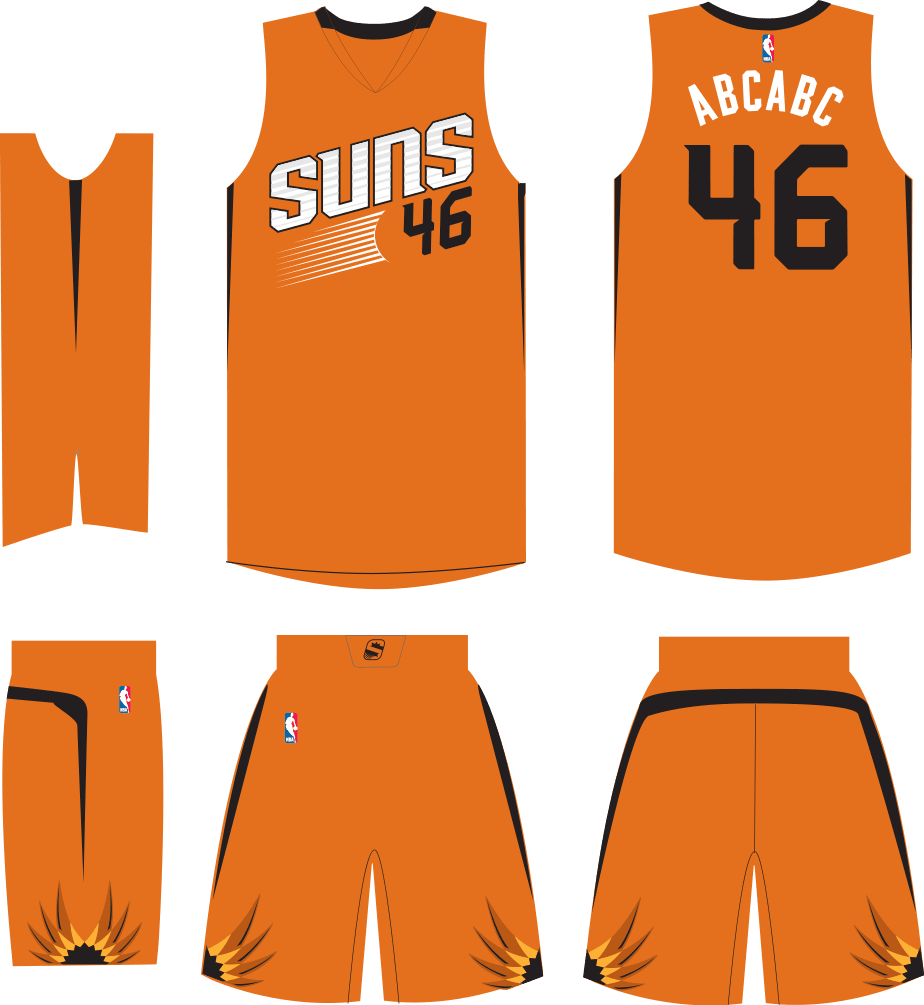
And now they have the new BFBS design shown above, which was unveiled last night and will be worn 13 times in 2015-16, beginning with the season opener on Oct. 28 (here’s some additional info and photos). A team source tells me that makes six unis in their current set, and I’m gonna take his word for it because I don’t want to tally that many designs in my head.
Anyway: Can’t say I’m nuts about this one, in part because I really dislike the black “PHX” lettering on the black background, and also because the whole notion of a black uniform — or a grey one, for that matter — doesn’t make sense for a team called the Suns. Yes, I know they had a black alt back in the day, but that one had way more splashes of color than this one has. The new design just doesn’t work for me.
Two other Suns notes:
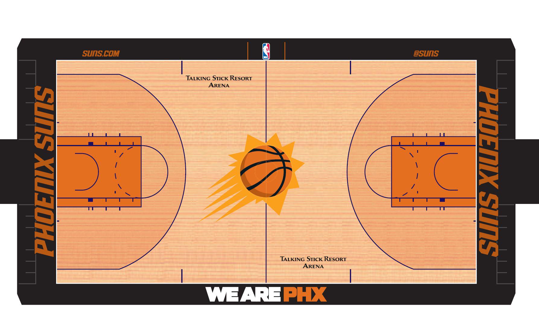
• They have a new court design (click to enlarge; additional info here):
• Their sleeved orange alternates are now sleeveless, so that’s a plus:
ESPN reminder: In case you missed it yesterday, my annual NFL season preview is up now on ESPN. Enjoy.
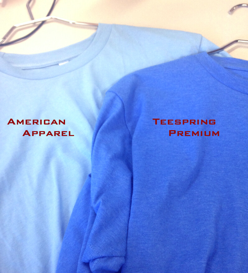
T-Shirt Club reminder: In case you missed it yesterday, the the Uni Watch T-Shirt Club’s latest design is now available for purchase. As we discussed last week, it’s the powder blue design, which looks really good now that we’ve added the gold outlining (click to enlarge):
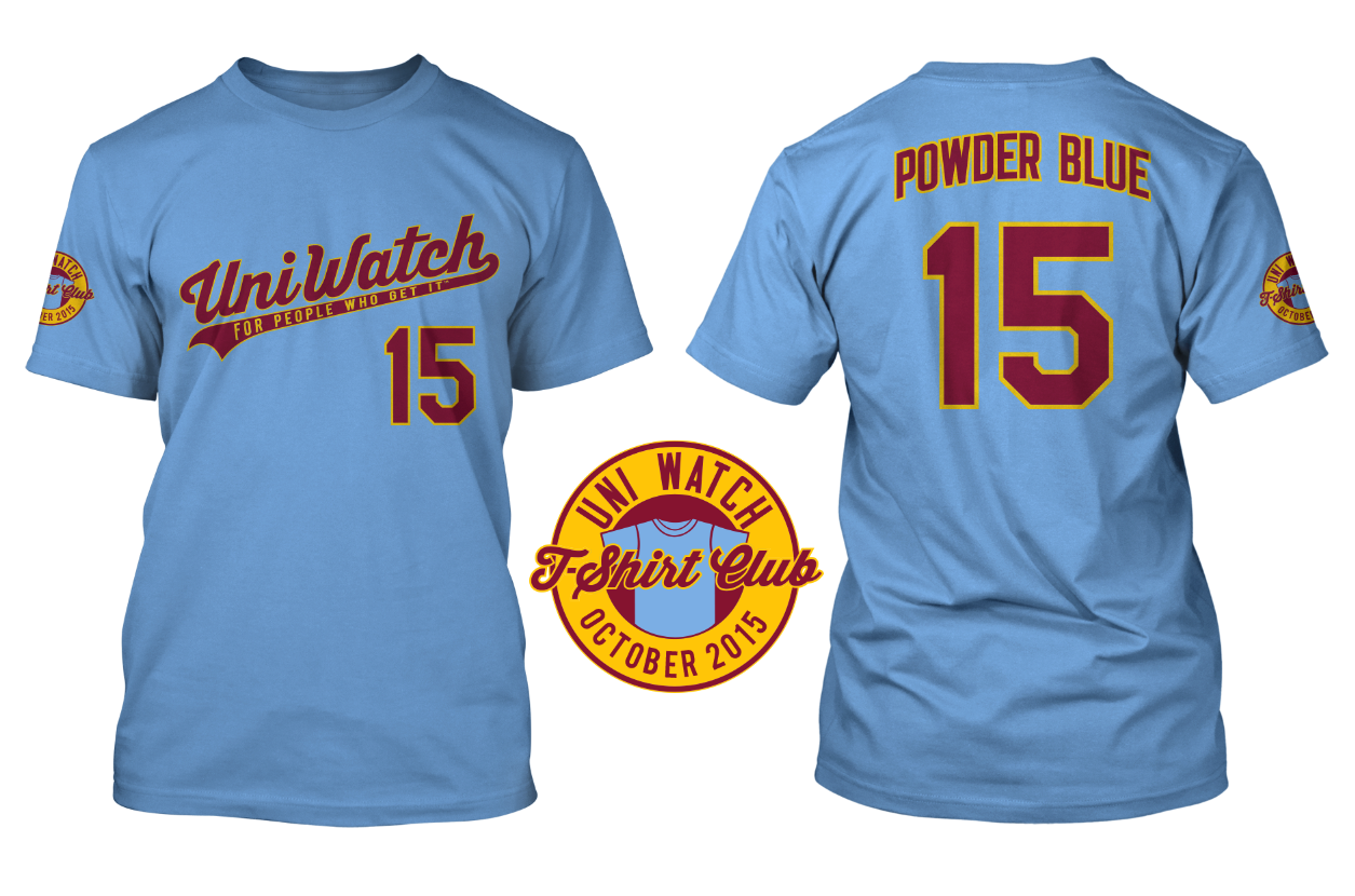
An important note: If you go to the ordering page, you’ll see that we’re offering three different T-shirt brands, each of which has its own shade of powder blue. American Apparel is the lightest shade and Teespring Premium is the darkest, with Gildan in between. Here’s a photo of the AmApp and Teespring fabrics (click to enlarge):
So compare the color shades, and also use the sizing chart for each brand, to choose the shirt that’s best for you.
Click to enlarge
Collector’s Corner
By Brinke Guthrie
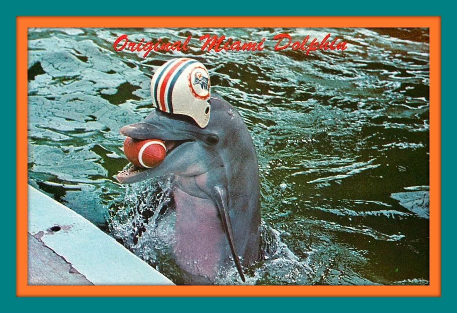
It’s finally time for pro football games that count. First game is tomorrow night! The fellow shown above is pretty excited about it, too — that’s a postcard from the Miami Aquarium showing the “Original Miami Dolphin.” Now onto the rest of this week’s Collector’s Corner:
• Check out these vintage 1970s NFL paperweights for the Chiefs and also the Bears. I still have a pair of these (Bengals, Cowboys) but mine were in black-and-white.
• The Vikes have one more outdoor season before moving inside. If you’re going to one of their home games this year, you could wear this 1970s Vikes jacket before the rain turns to snow.
• Remember the Fleer baseball patches from the 1970s? Get a box of 14 of ’em here.
• Nice “Hockey” lettering on the cover of this 1970s Leafs/Seals game program.
• Remember the manufacturer Sir Jac? I don’t, frankly, but they made this LA Rams varsity-style jacket from the 1970s.
• Remember Felco? OK, I do know those guys. They made this very nice-looking 1970s Dodgers varsity jacket.
• D’OH! Is it just me, or does the bear on this 1960s Chicago Bears pennant remind you of Homer Simpson? (Here he is again on a glass from the same period.)
• I’m not much of a hoops fan, but I don’t recall ever seeing the SuperSonics logo shown on this pin. Turns out it’s from their first few seasons.
• Here’s a terrific-looking 1969 “NFL Collector’s Series” poster released for the NFL’s 50th anniversary.
• And from the long-lost Ricko, a rather strange-looking 1970s Riddell store display.
Follow Brinke on Twitter: @brinkeguthrie
Membership update: Four new designs have been added to the membership card gallery (including Dennis McMillan’s card, shown at right, which is based on the futuristic high school football uniforms from the movie Starship Troopers). The printed and laminated versions of these cards should ship out early next week.
As always, you can order your own custom-designed membership card here, you can see all the cards we’ve designed so far here, and you can see how we produce the cards here.
The Ticker
By Paul

Baseball News: Reader Dave Murray was recently in China and saw this sign for MLB Underwear, complete with Jerry Dior’s logo. What’s up with that? ”¦ The Mets wore their grey-logo caps last night — except for Yoenis Cespedes. Someone must have noticed, because he changed to the correct cap later in the game. ”¦ What happens when you don’t wear batting gloves? If you’re Astros C Evan Gattis, your hands look like this (thanks, Mike).

NFL News: The Bills will wear throwbacks for their season-opening game, in honor of the 1964 and ’65 AFL championship teams. ”¦ Pretty cool Bears-themed mural being painted in Decatur, Illinois. ”¦ The midfield NFL logo at MetLife Stadium has been painted gold. It wasn’t like that during the preseason. ”¦ Alex Couckuyt has an idea for how the Carolina Panthers could take Pinktober to the next level: “If they wore an all-pink jersey at home during October (not dissimilar to the jerseys the NFL manufactures for its female market, only brighter), then for one month they would be the Carolina Pink Panthers. The game-worn jerseys could be sold at auction and the profits could go towards breast cancer. It would be a great publicity move, raise awareness and money, be fun for the fans, and might even tilt the line slightly in their favor (I refuse to believe that the noise of a crowd would be more distracting than a linebacker in a fluorescent pink jersey).” ”¦ Turns out former Bears coach Mike Ditka is a Donald Trump fan, which led The Chicago Sun-Times to do a bit of Photoshopping on a photo of Ditka’s classic Bears sweater vest (from @LindysBrews). … As you know, the NFL is now allowing color-on-color match-ups for its Thursday-night games. I asked Gridiron Uniform Database co-honcho Bill Schaefer about the league’s previous history with color-on-color games, and he had this to say: “1957 was the first year that all teams had a white jersey available. I’m assuming that color vs. color was still frequent as late as 1956.” The GUD site includes a visual listing of every color-on-color game since 1957, although they counted the Seahawks’ grey jersey as a color (I consider that to be just dirty white).

College and High School Football News: Cincinnati will wear solid white this weekend. ”¦ Reprinted from yesterday’s comments: Houston has added a Texas state flag helmet decal (from coogrfan). ”¦ New helmets for Columbia (from Jake Corbett). ”¦ Under Armour-outfitted teams had a strong opening week (from Matt Snyder). ”¦ Iowa is wearing the Nikelace this year, but DL Drew Ott appeared to be wearing a non-Nikelace jersey with smaller numerals for the season opener (good spot by Chris Williams). ”¦ Vanderbilt’s new GFGS unis will make their on-field debut this Saturday. ”¦ New red pants for West Georgia. ”¦ “My buddy just posted this crazy helmet from his kid’s school in Corpus Christi — Marvin Baker Middle School!” says John Romero. “They don’t mess around in Texas — all the bells and whistles of a college program, plus a Red Sox logo to boot.” ”¦ Rice will have a color-flipped helmet this Saturday and has also added a Froggy Williams memorial decal (from D. Asch). ”¦ Alternate jersey apparently in the works for Louisiana-Monroe (from Chris Mycoskie). ”¦ Blackout unis upcoming for Fresno State. They’ll be worn on Sept. 19. ”¦ Michigan’s new merit decals are a revival of the 1975-82 decal design. ”¦ Florida has changed its yard marker font from this to this (good spot by David Dupuis).

NBA News: Whoa, check out this multi-colored basketball court! Maybe not too functional, but definitely interesting (from James Gilbert). ”¦ Grantland has published a ranking of NBA primary logos. “The piece includes several tidbits that I didn’t know,” says our own Mike Chamernik. “For example: Nike is working with the Thunder to redesign their logo [more on that here ”” PL]; the Pistons nearly had a radical logo change in 1991; the Kings wanted to use burgundy but didn’t want to look like the 49ers (mentioned in a footnote); the Jazz are switching back to the jazz-note logo next year; the Rockets tried to scrap their mid-’90s overhaul after winning two titles; and most of all, this passage: ‘The league prohibits reusing “legacy marks” as primary logos, since that would cannibalize a separate revenue stream for vintage goods, so the Hawks had the thorny task of updating a beloved logo so subtly no one would notice.'”

College Hoops News: Some fresh paint has been added to Illinois’s court (from MrMichael). ”¦ Speaking of court designs, check out the new green court for the University of Arkansas at Monticello (from Michael Cossey).

Soccer News: AS Roma has donated several jerseys to an auction site to help raise money for the European refugee crisis. ”¦ New Oktoberfest kit for TSV 1860 Munich (from Conrad Burry). ”¦ Edoardo Salvati has written an article on how Nike and Adidas dominate the UEFA Champions League. ”¦ “Brighton striker Bobby Zamora used to wear No. 25 during his heyday with the club,” says Chris Cruz. “Upon his recent return, Kazenga Lua Lua gave up 25 and switched to 30.” ”¦ Interesting article about why Americans dress so casually (from Tommy Turner).

Grab Bag: New minor league hockey uniforms for the Portland Pirates (thanks, Phil). … More and more tennis players are wearing headphones when they enter the court for a match. ”¦ A random comment from a Japanese comedian resulted in the default color for Ping-Pong tables changing from green to blue (from Chris Bisbee). ”¦ Also from Chris: Could the Tokyo Olympics logo clusterfuck be solved by Pokemon? ”¦ Tennis player Victoria Azarenka had to apply tape to her arms after her Nike-made outfit for the U.S. Open caused irritation. ”¦ Here’s an article on the Russian designer who created Google’s new logo. ”¦ The city of Brownsville, Texas, is considering a new logo. ”¦ The very wonderful arts magazine Cabinet is hosting a free roundtable discussion about sports balls. The event is right near my house, but I’ll be out of town that day. Dang.
Paul, “The GUD site includes a visual listing of every color-on-color game since 1957” link is dead – 404
Weird – it was absolutely working last night. I’ll remove it from the Ticker for now. Thanks for the heads-up!
Wow you guys are quick. Thanks for the shoutout and ticker inclusion.
“Remember Felco? OK, I do know those guys. They made this very nice-looking 1970s Dodgers varsity jacket.”
Was those supposed to be a link to Rock Me Amadeus, because it feels like it should be.
Also, proper link for the Color vs Color page: link
Ooooh, it’s working again — thanks, Jeff!
I’ll restore that item to the Ticker. But I’ll also post it here, so you don’t have to scroll up:
As you know, the NFL is now allowing color-on-color match-ups for its Thursday-night games. I asked Gridiron Uniform Database co-honcho Bill Schaefer about the league’s previous history with color-on-color games, and he had this to say: “1957 was the first year that all teams had a white jersey available. I’m assuming that color vs. color was still frequent as late as 1956.” The GUD site includes a visual listing of link, although they counted the Seahawks’ grey jersey as a color (I consider that to be just dirty white).
Despite the propensity of purple, the 1992-93 Suns rebranding was an interesting change in their brand, and the team has never recaptured that energized look.
Great clip:
link
Alex’s idea about the Panthers intrigues me. They’d probably have to get MGM on board to okay it, though, seeing as how they own the rights to the Pink Panther franchise, and it probably wouldn’t clear legal without the studio’s blessing.
For some reason, I have a feeling that MGM would probably be willing to pay the NFL to use the character, rather than the other way around.
I think the Starship Troopers jerseys would be an improvement for the Bengals.
Better Phoenix Suns 1992-93 logo unveiling video here:
link
This has probably been mentioned before, but seeing the Browns unis again in the NFL preview column, noticed the perspective of the drop shadowing makes it seem like we are looking DOWN at the numbers (and therefore looking down at the players). How fitting for the Browns!
Other (successful) franchises have done drop shadows with the perspective of looking UP at the players. See the Lakers/Heat
The NY Rangers are pretty successful:
link
Their shadow is also still going down like the Lakers/Heat, just to the left instead of the right.
Ok maybe my monitor is upside down, or maybe my perspective is all wrong…. but probably I’m just not explaining well:
The Browns’ shadow surrounds the top and left sides, so it’s like you are facing them from above and left: link
The Rangers’ shadow in Paul’s link surrounds the bottom and left sides, so it’s like you are facing the number from below left.
Lakers/Heat were like the Rangers, but bottom/right instead of bottom/left: link
It seems to me like Rangers/Lakers make the athletes seem “larger than life” (or at least larger than a Uni-Watcher). But the Browns are making their players appear miniature.
Heck, just do a google search for “drop shadow numbers” and all the results will be Ranger/Laker styles.
At least, that’s a great example of a bootleg jersey!
Suns? Black? No connection?
C’mon!
link
Also, link (Warning: cheesy power metal)
I see Snowflake!
From Wed AM SI Hot Clicks link:
link
My only input on the new Suns attire…”Penny” shoes!
That UAM green basketball court is pretty sweet. The key is that it’s a “translucent”/lightly stained green and you can see the wood through it; if it were painted solid green (like teams used to do with the inside of 3-point arcs 15 years ago) it would look gross. Pretty sharp IMO.
Ah, the Boll Weevils. They were in the same conference as my alma mater at one time. Those D2 Arkansas schools have some great mascots – Boll Weevils, Wonderboys, Muleriders…
And I agree, the court looks great. I wouldn’t be surprised if some D1 schools steal that idea (if it hasn’t already been done).
I like the color of the court, but what is the purpose of making the center logo so big that it takes up most of the width of the court?
Anyway that new Suns black alt is hideous. Their standard home/road set is among the best modern designs in the league (though I’d nitpick that the numbers should be purple, not black, but it still looks dang good), and the de-sleeved orange alt looks great (though I reiterate the black/purple numbers issue).
I can’t find any redeeming quality in that black alt.
Well, it doesn’t have the tire tread/stretch trash bag pattern on it that Adidas football jerseys have… so… there’s that. I guess.
It’s perfect.
Iowa wore Nikelace last year fellas. However, Iowa State is this year for the first time.
Wish Columbia would keep the Block C on their helmets. I hate effin change.
All I can say about those tidbits in the NBA article is #douchebags. What greedy pigs they are!
Phil. I yhink it would be really cool if you changed the nfl logo on the nfl section of the ticker to gold for this season
Suns do not need another uniform and they especially don’t need this one.
Does Seahawks in grey count as color on color? I guess so, but I totally see the “dirty white” angle. The old alt silver jersey for the Patriots is the same thing, and GUD counts it. So logically, it’s consistent. But I guess if neither jersey is primarily white, it counts.
A) How would you pronounce “We are PHX”?
B) Evan Gattis hasn’t played C for Houston at all. Little bit of left field, but mostly DH.
I wouldn’t pronounce it in front of the kids…
Gonna miss the big SUNS at center court, which looked the same from both sides. Now fans on the non-camera side will see a setting sun.
Not a fan of the new alt, but on the whole the current set is still better than the previous one.
Also not a fan of the rule about “legacy marks.” If you had a great look and want to go back to it full-time, you should. At least this means throwbacks aren’t going away anytime soon, though.
Thank you for another opportunity to use the word ‘ambigram’, such a word that reads the same upside down as right side up.
I love that Miami Dolphins postcard. One more step closer to the infinite regression.
Ricko!
“Benchies”?
Why no comment on the NBA’s use of legacy marks and its impact on vintage/throwback revenue? This seems like less of a quality design issue and more like owner greed.
Could you add one of those “douchebags” remarks to the end?
Avowed Suns fan here. The problem with the Suns is that the current ownership is way too obsessed with those blacks and grays. The gray was fine as a tertiary color when it was brought in with the 2001 set, and black has been a part of the Suns color scheme for a while (see 94-95 alts, which are awesome). However, they need to stay on the back burner, not be front and center. There’s WAY too much black in the beautiful new uni sets (and on the court) at the expense of purple.
The idea for new black alts was great and I was excited, but these are hideous. And please don’t get me started on the gray sleeved set that doesn’t even match the pewter that’s in the Suns’ color scheme. horrible.