
[Editor’s Note: Paul is on his annual August break from the site and will return in September. Daily content is continuing under the direction of deputy editor Phil Hecken, who’s running the site this month.]
By Phil Hecken
Ahhh…1969. Woodstock, the Moon Landing, the Beatles were still together. The Manson Murders, the Stonewall Riots. Lots of things were happening in that eventful year.
It was also, in my humble opinion, the absolute apex for baseball uniforms — the best year, bar none, of all the years in baseball. Baseball had just expanded (for the third time in less than 10 years) to include four new cities, three of which never had major league teams before, and spread out across the USA and into Canada (San Diego, Montreal and Seattle, plus Kansas City). Teams still wore flannel, but the uniforms were tailored and fit a bit snugly. Stirrups were (of course) still worn, but slightly higher than they had been for decades. Only two or three clubs (technically) had an alternate uniform, but not everyone wore only white or gray. Almost every club wore the Jerry Dior patch. We still hadn’t witnessed the scourge of pullovers and sansabelt polyester.
In short, it was perfection on the diamond. Sure, not every team would be wearing the “best” uniform in their history during this year, but many were. I only wish I weren’t three years old when it took place.
Lets take a quick look at the uniforms each team wore in 1969. I think you’ll agree with me that you’d be hard-pressed to find another year when baseball uniforms looked so good. Click any photo below to enlarge.

Not their greatest uni, but still solid. Pinstripes at home, gray on the road, classic “A” on the cap.

Dressed to the Nines shows the O’s with a vest (and with all clubs who wore one this season, it was a true vest, not the sleeveless shirt of recent vintage, like the Rockies still wear). Other than the thicker font, this is definitely one of the O’s best ever unis. And the roads said “Baltimore.”

Classic home uni, basically their best look ever. I’m not as big a fan of the block outline “BOSTON” for the road grays (in a non-Tuscan font), but still a good look. Almost perfect.

Not their greatest uni (that would be what they were born in), but still a good looking set nonetheless. The caps still had the “halo” on them — probably the second greatest cap in history — and second only to another cap worn in 1969. The contrasting sleeves and stirrups bring it down just a smidge, as does the “ANGELS” on the roadie.

This is just a gorgeous set — probably the second best set in their uniform history (I prefer the zipper-front, non-pin just slightly more), but as a home and road combo, it’s probably their best historically. They may have had a bad year in 1969 (as well as 1909 thru present), but uni-wise, they were great.

OK. Not the best ChiSox home uni by any means (but they’ve had plenty worse over the years), but that road uni is beautiful, and (I’m sure some will disagree with me), one of only two seasons where a MLB club wore darker sanis than stirrups — a unique look they quickly jettisoned. But those roads were awesome.

It doesn’t get much better than this. Seriously, it doesn’t. When you think of the quintessential Reds uniform, this is it.

While this isn’t one of my personal favorite sets, there’s no denying this one is still pretty good looking. The zipper-front vest (!), the stirrups — that would look good today, and was still one of the better sets in the Indians history.

Best uni set in Tigers history. Classic. The block “DETROIT” on the roads should be brought back.

I’ve often said the 1965 (first “Astros” uni) set was their best, and they were still wearing that look in 1969 (they’d keep this until 1970, before swapping in the orange cap and uni elements). Still a beautiful uniform today, I was hoping they’d bring it back on a full-time basis.

A beautiful set, and almost their best look ever — for that, they’d need to wear their button-front powder blue roads, but it’s pretty close. The Royals don’t look bad in gray…they just look better in light blue.

Lets face it — the Dodgers have looked great for decades, and this uni is great looking, just adding to the uni awesomeness that was 1969.

Their best set was probably their first uni set in 1961, but this is still stellar. Their 1969 roadie is still their best road uniform ever.

Without question, this was the best uni the Expos ever wore. A new team, a new country — that crazy cap. Fantastic.

Lots of incredible stuff happened in 1969. The Mets taking down the mighty 109-win Baltimore Orioles to win the World Series was just one of those things. And those are certainly the greatest uniforms ever worn by the Amazin’s.

The Yankees have pretty much been wearing the same set since the 1930s. It looked great then, it looks great now, and it looked great in 1969.

A white, a gray and a gold (the horror!). I kid, of course, but the A’s were always one of the more progressive clubs when it came to uniform design (or at least they used to be, now they’re just like everyone else). But that vest set in 1969 was still gorgeous. Not their best ever (yes, I liked their next set — with the polyester pullovers and multiple caps/tops — because they basically invented it) but still a fine, fine uniform for 1969.

This was basically the set the “Whiz Kids” wore more than a decade previously, and it was a great set. Maybe not as great as when their red became maroon in the next decade, but a great set nevertheless.

Easily one of the best sets the Pirates ever wore (yes, I have a soft spot for the mustard Pirates set that would follow — again, because it was the first polyester uni in the bigs, although it led to mayhem when almost everyone followed suit). But this one was an all time classic. For some reason, the Pirates did not wear the Jerry Dior patch this year.

Another new club for 1969, I’ve always felt the Padres homes were their best home uni ever. I confess to liking their all gold road unis introduced a few years later a bit better than the ’69 roads, but this was still a fine set.

McCovey, Mays and Marichal all wore this uniform and looked damn good doing it. Just a great looking set.

This was one of the greatest uniforms of all time, and it’s a shame the Pilots only lasted one year (although the team the Pilots would become, the Brewers, basically used the shells of these uniforms in early 1970). The road uniform was perfection, and the scrambled eggs cap remains (IMHO) the greatest cap in MLB history.

This is basically (and arguably) the greatest uniform the Redbirds have ever worn (I’ve always loved this particular uniform, with the zipper-front and shoulder striping — a look that needs to return on some team). But the 1969 set, with the red cap on the road, is pretty damn close to perfection.

Once the original Washington club left for Minnesota, the Senators Part II never really had great unis, but this was probably the best of the bunch. It wasn’t bad, but it was pretty basic — almost like they were just biding time until they moved to their next venue. Basic, but not bad by any means. The classic ‘curly W’ and script “Senators” was still a fine way to round out the greatest uniform year of all time.
OK readers — what do you think? Clearly, opinions are just that, and I’m sure many of you will disagree with me — but if you do, what do you think was a better year for unis? Sure, we look back fondly at those crazy uniforms of the mid/late 1970s nostaglically, but there were some bad unis in the group. But hey, I’d love to hear what you think. Fire away.


And now a few words from Paul: Hi there. I’ve been enjoying my August break, thanks in part to a beautiful Wurlitzer organ, an unusual breakfast encounter, and a killer flea market find. But I’m back today to tell you about the next release from the Uni Watch T-Shirt Club.
The next shirt will be the last of our “core” designs — the road grey (click to enlarge):
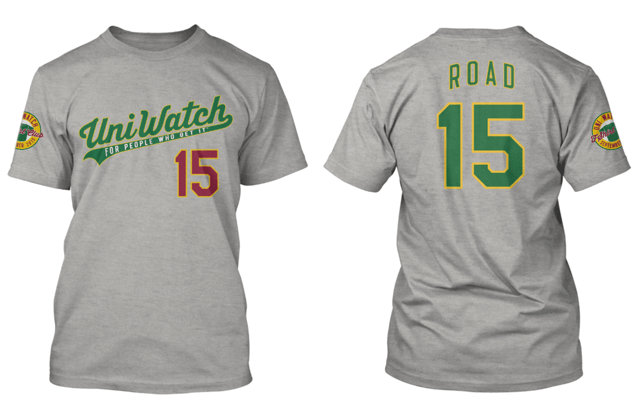
Obviously, this one is pretty straightforward. But still plenty handsome, right? It will launch next Tuesday, Aug. 18, and be available for ordering through the following Monday, Aug. 24.
After this one, there will be three more shirts left for 2015. I can pretty well guarantee that they’re all going to be pretty special — you’ll see.
Meanwhile: I’m hard at work on several big ESPN projects. More on that soon.

Classic Ballpark Scoreboards
I’m pleased to continue with a favorite weekend feature here at Uni Watch, but I’ll run it during the week while Paul is on sabbatical — “Classic Ballpark Scoreboards,” which are created by Gary Chanko. You probably know Gary best for his wonderful colorizations, but he has been a solid contributor for many years, and this is his new project.
Here’s Gary (click on image to enlarge):
Classic Ballpark Scoreboards – Series II
by Gary Chanko
In this edition of Classic Scoreboards we journey back to Canada (the previous visit was to Jarry Park) for a look at the “other mistake by the lake,” Toronto’s Exhibition Stadium. The characterization seems a bit unfair, but more on that later.

Exhibition Stadium
Home of: Toronto Blue Jays (1977”“1989), Toronto Argonauts (CFL) (1959”“1988)
Opened (after conversion to football stadium): August 1959
Inaugural Blue Jays game: April 7, 1977 (yep, it snowed)
Last Blue Jays game: May 28, 1989
Demolished: January 1999
Exhibition Stadium (aka Canadian National Exhibition Stadium and CNE) served as the home of the Toronto Blue Jays from 1977-1989. It was a multi-purpose facility located on the Exhibition Place grounds in Toronto.
As a ballpark Exhibition stadium can usually be found on one of those Top Ten Worst lists. However the original Exhibition Stadium grounds and that notable grandstand were never intended for baseball, AT&T Park has a sea gull problem, and it certainly snows at other MLB ballparks. So ranking it along side the hideous multi-purpose ballparks of 70s, Colt Stadium and the early domes is a bit unsporting. Plus the Stadium did host a number concerts featuring most of the legendary rock stars.
For more Exhibition Stadium history and analysis you will want to read this past Uni-Watch feature article.
Now about that scoreboard planted in deep, really deep right field. It wasn’t part of the 1959 renovations that converted Exhibition Stadium for football. In this 1959 image an end zone scoreboard is visible, maybe this one from 1963.
The reconstruction of Exhibition Stadium for baseball in 1976 included the now familiar pedestal mounted scoreboard in right field (as best as I can determine). This photo from 1976 appears to show the scoreboard under construction along with the baseball playing field already in place.
The football configuration of the venue obviously constrained baseball diamond placement. This plus the need to serve both baseball and football impacted the location options for the scoreboard. It had to have been a challenge to see anything on the board if you were seated down the right field line.
The scoreboard illustration recreates the Blue Jays vs Red Sox afternoon game played on June 12, 1988. The Jays first baseman Fred Mc Griff, who was among the AL leaders at this point in the 1988 season, is the batter.
A Few Things to Know
• The first game played after the 1959 renovation was an exhibition football match up between the CFL Toronto Argonauts and the NFL Chicago Cardinals.
• In 1999, the stadium was demolished after sitting idle for a decade. The site was converted to a parking lot parking with plaques commemorating the base locations, like home plate. In 2007 a portion of the site became BMO Field, a soccer only venue.
• Exhibition Stadium was the only major league ballpark where the main seating between first and third was totally uncovered. The original main grandstand, of course, was covered.
• Richard Petty made his NASCAR Grand National Series debut (the 1958 Jim Mideon 500) on July 18, 1958 at no other than – Exhibition Stadium!
If anyone is interested in purchasing a digital copy of these posters, Gary is working on an online purchase option. In the interim you can contact him directly at Classicscoreboards@gmail.com.
Uni Watch News Ticker:

Baseball News: After reading yesterday’s entry on Hall of Fame plaques Paul Dillon found this video on YouTube about the company that has been making the plaques since 1983. … The Toronto Blue Jays are going turn back the clock for Sunday’s game and wearing this hat. Submitter Mike Guterman adds, “Looks like the caps from the hr derby from the 2014 all star game as there is no baseball in the logo from the original version of the cap.” … Last evening was Breast Cancer Awarness night for the Fargo-Moorhead RedHawks, and boy did they pink up the joint (via Reid Cure). … The Chicago White Sox have added a new memorial patch for Billy Pierce, a former pitcher who passed away on July 31st. … Ever wondered what a day in the life of a Cardinals batboy is like? You’re in luck (thanks to Chris Flinn). … “I just came across this minor league baseball logo [Grand Rapids Dragonfish] that looks remarkably similar to the Simpsons ‘Flying Hellfish’ logo,” observes Benjamin Gorbaty. … Will Scheibler ran across this Mets fantasy card blog that had posts picturing Mets scoreboards made up as baseball cards.

NFL/College/HS Football News: In yesterday’s ticker, there was a question as to whether the Houston Texans added a larger helmet logo; Patrick Thomas whipped up a side=by-side and based on that, it looks like the logo is the same size as before. … “Saw this ad on Pandora [yester]day and it fascinated me,” writes Jonathan Daniel. “If you’re an official sponsor and presumably could use any player, why would you choose a backup QB (Hasselbeck) in your ad? He went to Boston College so there’s no apparent connection to Olivet Nazarine there and the Colts train at Anderson University, which is a small school northeast of Indy. I’m not positive that’s Hasselbeck, but I have no idea why you would put someone else in his jersey. Then he has one of those sports wedding rings on too.” … The Seattle Seahawks have new 3D helmet bumpers. Mike Princip says, “Looks to possibly be their official wordmark/font, although with the tiered embossed look, it’s hard to tell.” … Who has the best new unis in Dallas/Ft. Worth High School football? This article lets you vote (from Jedi54). … “Looks like Jimmy Harbaugh continues to bring Michigan football uniforms back to the way they were when he played,” says hawks sinbin13. “Michigan has now removed the block M off the back of the jersey. More surprisingly, looks like the block M is also gone off the new (original) maize pants. I believe Michigan has had the M on the pants every year since 1993.” … Holy crap — check out this elaborate end zone — and it’s for a High School! (from Kurt Esposito).

NBA/College Basketball News: Looks like Nike has declined to match adidas’ $200 million offer to James Harden to wear their shoes. … Here’s a look at the Miami Hurricanes adidas unis for the women’s team (h/t Matthew Bunch). … Here’s a look at Raptors rookie Delon Wright in the new red Toronto jersey. … Tennessee’s got some checkerboard Nike trainer sneakers for the 2015 season (from Miles Crowther). … Whoa — check out this photo of Red Auerbach with Batman villains (great find from Phil Lawson).

Hockey News: New York Rangers’ goalie Henrik Lundqvist has a new mask/cage for the 2015-16 season (from Matthew Hanes). … Looks like Marshall hockey is getting new uniforms for 2015-16 (h/t Rebirth Sports). … The Nashville Predators have unveiled a new gold helmet and events for “Golden Saturdays” (from Alexis W.). … Here’s a first look at the Ducks and Avalanche’s new third jerseys (thanks, Paul). … Here are mockups of the possible uniforms for the Red Wings vs. Avalanche Stadium Series on February 27, 2016 (h/t Justin Barsotta).

Soccer News: There is now a new USL team, FC Cincinnati (h/t Uniform Junkie). … There is also a new team in Florida, Miami FC of the NASL (h/t Leyland Privott). Here’s that badge on a polo shirt. … Apparently Manchester United’s new shorts have some inconsistent numbering (from Andrew Donnelly). … The Chilean national team has partnered with Nike and has debuted their new kit.

Grab Bag: The Channel 7 TV station in Perth, Western Australia had a ladies social netball team in the late 1960’s/early 1970’s, which wore a striking black and gold uniform (from Graham Clayton). … Southern Utah University has its logo on soap dispensers (via Benji King). … The James Madison University women got some new tennis gear (from Andrew Rader). … If you weren’t already aware, here’s the brand story behind Nike’s ”˜Just Do It’ Campaign (thanks Brinke). … The Royal Navy has new unis.
And that’s it for this fine Wednesday in the middle of August. Not a lot of uni news yesterday, but maybe that will change today. Thanks to Gary for his wonderful scoreboard feature, and to everyone who contributed by e-mail or tweet for the Ticker. Catch you folks tomorrow.
Follow me on Twitter @PhilHecken.
Peace.
“If you ask me, any hat with a Yankees logo is an awful hat.”
— Dan J.
Minor but the NFL section has a Mets article.
Thanks! Should be fixed now.
The quote on the Blue Jays cap item is duplicated.
Definitely the modern logo on that cap. Aside from the lack of the baseball background, the maple leaf is an obvious tell (it’s larger and lower than in the original logo).
Dammit. Thanks – should be fixed now. should be fixed now.
I assume Mike Guterman meant to say that new white-paneled Blue Jays cap *reminds* him of the 2014 Home Run Derby/All Star Game hat because the two caps look nothing alike. link
Phil, couldn’t agree more that 1969 was the best uni-year in MLB history. Superb entry, sir!
Ditto on that.
Always one of my favorite years. Thanks for the trip!
I see what you did there.
Phil was a victim of premature election when he made his pick. He should have held on until 1975.
link
The best of everything…classics, pullovers and color.
One could make a case for 1953.
link
The only pullovers that ever looked good were those of the A’s and the Pirates. (The A’s mid-70s uniforms are one of my all-time favourites.) The other pullovers were terrible; and it was tragic that even the Red Sox, Reds, and Cardinals fell victim to this trend. So that disqualifies the 1970s for me.
The one year whose overall aesthetic I like best (and I remember thinking this at the time) was 1993. I could quibble with certain things, such as the tail on the Mets’ wordmark. But all pullovers were gone by then; and the pollution of the coloured jerseys hadn’t yet descended. Also, most guys still knew how to wear their pants and stirrups. So that’s my pick.
Very nice year. BUT, the Padres weren’t brown (and the O’s weren’t orange enough), so that’s my bronze medal year. That was the best the Marlins ever looked, fersure.
The only thing I didn’t like was that the Red Sox took the piping off their classic home uniform. And bring back the road grays with the plain blue block lettering!
Great article Phil! This one is special to me as I started watching baseball in 1968 so these unis bring back good memories.
Phil:
Whole-heartedly agree, 1969 was for us, the 50+ club, the summit in terms of MLB uniforms (those expansion teams were pretty close to perfection). Actually, 1969 was pretty good for the NFL, NHL, and NBA. Thanks for the post and the photos.
Grand Rapids Dragonfish do not play baseball.
Baseball uniforms were pretty near perfect in 1993; a handful of softball tops, but just about every team in classic uniforms with the last of the pullover jerseys being phased out.
Why Hasselbeck in the Olivet University Ad?
Just a theory, He wore 8 Peyton wore 18. They used Hasselbeck because it was a less expensive fee and they believed that most people would assume it was Peyton (scan the image quickly notice the 8 take the implication that it is Peyton and move on to the written content.)
One other note on Exhibition Stadium – that was also where Cal Ripken’s Iron Man streak began.
I don’t think that’s correct. Ripken’s streak began against the Blue Jays (5/30/82), but at Memorial Stadium.
link
Yep, May 4th against Seattle and the second game on May 29th against Toronto were the only two games in which Ripken did not appear that season.
One thing that did happen at Exhibition Stadium involving the Orioles, though, was the most recent MLB game to be forfeited by a road team, as on 9/15/77, Earl Weaver protested the use of a tarp over the Jays’ bullpen mounds; since the bullpen was in foul territory, he was concerned one of his players could get hurt on the tarp chasing down a fly ball. When the umpires refused to have the tarp completely removed (it was a light rain, not enough to cause a full rain delay), Weaver kept the O’s off the field.
It is also where the Festival Express train tour across Canada began in the summer of 1970 (Janis Joplin, Grateful Dead, The Band et al.).
Festival Express is still one of my favorite documentaries.
Didn’t Festival Express have a tour stop in Winnipeg? And didn’t the local baseball team use an upside-down Expos logo for their own?
Phil:
Nice article regarding the 1969 unis; well presented and researched. For me, starting as a MLB fan in the early to mid-1970s, probably the best year of MLB uniforms was 1977. Texas Rangers wore a set that are still classic (powder blues on the road) with wide side pant stripes that matched the wasteband stripes. The Padres had the best set (maybe) ever in their brown/gold history, the A’s (as you referred to) had the awesome three interchangeable jerseys and gold sanis, and the Pittsburgh Pirates unveiled the mult-matching gold, black, and gold pinstriped uniforms. For me, the best Reds unis were those worn in the 1973-mid 80s. That was the best Reds Machine look. Thanks!
The Grand Rapids Dragonfish are a lacrosse team, not MiLB. Says right at the top of the page you linked to.
Regarding the Seahawks new 3D bumper, on third… fourth look it definitely isn’t their official wordmark and most likely isn’t their font style(Verlander). The all caps are on the same level, which is not consistent with their official wordmark.
Given all the newsworthy stuff that occurred that year, it seems piling-on to add baseball uniforms to the list of noteworthy 1969, but it’s fair. I like 1967, and ’69 added four teams.
My personal sweet spot was 1977, but I can’t make an objective case for it. Too many garish or faddish designs, which did not wear well. An additional observation was the ’69 Reds rocking the individual belt loops, a la Detroit. I wish more teams would tart up their belt tunnel area.
Love the 1969 article. What I don’t love are vests. I understand they have a practical purpose in hot weather, but teams that wear a vest look like they’re going to get Kool-Aid at coach Jimmy’s house after the game.
I agree, 1969 may have been the greatest year ever for MLB uniforms. Too bad I was born just the previous December, and not able to enjoy. But I can enjoy today as “one who gets it”.
As I understand, the Baseball Hall of Fame plaques, prior to Matthews International, were minted in a foundry near Scranton, PA for a number of years.
If I’m wrong on this, please let me know.
Baseball is not quite my favorite sport, but Cooperstown is far, far and away my favorite sports Hall of Fame. I’ve been there nine times and hopefully, many more to come. In a town of a about 1,600 people in a very rural setting, at the headwaters of the Susquehanna River, it cannot be beat. Compare to the Hockey Hall of Fame, located in downtown Toronto, a city of some 2.6 million people.
I don’t think the Cardinals had shoulder stripes and zip-ups in 1969. Wasn’t that more Musial era?
They didn’t — I’m saying I liked that style, possibly even more than what they wore in ’69. The pic and link to Okkonen shows what they wore in ’69 (which was still damn fine).
Great piece today Phil. Would love to see more articles like this for other years and sports.
How is it possible that the White Sox have never worn that road uni in a TBTC GAME? THEY… ARE …AWESOME!!! Also, its great to see The Simpsons in another sports item. Not enough of them in my opinion.
In the first few road series, the White Sox 1969 roadies had white lettering in the front AND white numbers and letters in the back. Somebody complained and by May the numerals and letters on the back were changed to royal blue.
Oops.
I should have read it again. My apologies, Phil.
Any year from 1965 to 1969 is the greatest for me. 1974 is probably the best of the pullover/sans-a-belt era, with a good balance of holdover classic looks and not-ridiculous modern sets.
Ditto 1969, and I can’t say enough about San Diego and Montreal being new and owning their future uniqueness. (Unless I added that the Royals’ simplicity works nicely for them too.)
To turn this around, I hope there is a “worst year” column in the offing. Given how the best reliables vary very little (I’m looking at you, Yankees, Dodgers, Cardinals…) it may be a more difficult task to assemble.
Oh, I’m sure those George Hendrick era blue Cardinals jerseys might not be everyone’s cup of tea.
link
Great article Phil. But you made one small error. The initial set of knit uniform the Pirates wore in 1970 were made by Rawlings using a 50% Stretch Nylon/50% Durene Mercerized Cotton plaited fabric. They were not made from Polyester.
In a plaited fabric all of one component yarn is knitted on one side while the other yarn would be on the opposite side. And the term “Durene” is in reference to a chemical-treatment bath that cotton yarn goes through making it more durable. It is not a fabric in itself.
Los Piratas uniforms had all of the Nylon on the front for color brightness while the softer cotton was next to the skin. Sort of like an early version of a wicking fabric.
Unfortunately this fabric didn’t hold up and the Polyester Warp Knit was developed and that cloth ultimately took over.
Thanks Terry! (hope all is well with you) — sorry about the mischaracterization of the Buccos unis in ’70 — I should have said the first non-natural fiber (or similar term) rather than polyester.
Appreciate the correction!
Cotton is a natural fibre as well. Maybe “non-traditional?”
I drive past that Matthews Foundry regularly. Located just outside the south exit of the Liberty Tunnel in Pittsburgh, you’ll drive right by the building since it’s pretty nondescript. But, wow, what they make inside. BTW, to Phil’s point yesterday: yes, the plaques look better with hand-lettering. I totally agree.
Why is the Senators set considered “pretty basic” but the Padres isn’t? Kinda generic typeface and boring colors compared to an interesting script.
A greater percentage of teams wore their best or second-best uniforms ever in 1990 than any other season. The Giants and Mariners are about the only teams that wore true clunkers that season. Well, also the Indians, but that’s just Cleveland looking like Cleveland. You can’t hold a team that almost always wears crap uniforms against any particular year, especially one when the White Sox actually looked like a professional baseball team for the first time in very nearly ever. My only beef with 1990 is that the Phillies had just ditched the powder blue roads. Also a minor shame that 1990 doesn’t capture the inaugural Rockies and Marlins uniforms.
Otherwise, for true across-the-board uniform excellence, you’ve got to go back to pre-expansion, say circa 1925-1948.
I don’t know about it being the best year ever, but a couple of teams should never have touched their uniforms again. The Reds is the first that comes to mind. The Mets as well. The Mets have been up and down with their road uniforms. Why the changes? Their miracle season nailed it! And I’ll ad the Braves to that list…I have not really had exposure to these, so the idea of them in pinstripes is kinda odd but looking at those photos, I don’t know that they’ve ever looked better. Those are really nice.
Strike against 1969 is every team wearing a huge MLB patch (even if some think it was after a then-active Twin). And some teams don’t look near their best. Astros (I think I am the only one not in love with the shooting star), Indians, White Sox, Phillies and Expos come to mind. With the Expos, this is their best pinwheel look. But the pinwheel is still goofy. Post-pinwheel is their best.
The MLB patch is the BEST part of that year!
But the pinwheel is still goofy. Post-pinwheel is their best.
Heresy. The home pins were drab, and the “Expos” lettering was ham-fisted. Everything original was tossed overboard and they made the squad look like a pale Xerox of the Cubs.
The 1969 year of uniforms is so great in many ways because the cut of the uniform itself arguably reached perfection.
The jersey and pants are trim but not tight. Button downs with short sleeves and true vests reign supreme. Hose is probably at the most ideal proportion of stirrup to sanitary allowing for plenty of white while still giving enough space for colorful and creative stripes (9 out of 24 clubs had stripes). It was pre-double knit so every jersey is soft flannel but you still had an injection of powder blue roads. The cap is not quite the exaggerated high peak but isn’t formless either.
So we see a point comfortably in between the loose fitting uniforms, heavy uniforms of the earlier era and the tight brightly colored ones of the 70s. It means no matter what style a team happened to wear, it was almost guaranteed to look like baseball.
Living only 3 1/2 hours from T.O. made it a favorite spot of mine to visit. The fact that I’m a big fan of the Blue Jays and The Blue and White (Leafs) didn’t hurt either.
I loved the old stadium. In addition to baseball (yes, I was there for snow) I saw the Argos play in 98-degree weather. We also saw the Soccer Bowl. BTW-The big structure at the end of the football field is a rolling stage for the grandstand shows.
In the first year of 1977 during the CNE you had to buy that ticket just to get on the grounds, even though you were just going to the game. But after everyne complained all you had to do was show your game ticket and you were good to go.
I saw the third game in Blue Jay history on Easter Sunday 1977 as Jerry Garvin beat the White Sox. I saw the Tigers the next day and the Jays won again. I left them in first place. Then reality sey in. LOL
My room at the Holiday Inn on Chestnut cost $21.95 CDN with a 15% premium on US funds. At those prices we used to make five or six trips a year to Toronto. You could afford it back then. And you could cross the border on your good looks alone.
Terry,
The thing about having to buy tickets during the CNE, I don’t remember 1977 specifically but I know that later on your baseball ticket would only get you into the grounds if it was for reserved seating (main stands). General admission never got you into the grounds.
I hope the Red Wings stadium series uniform isn’t for real.
Their 2 previous winter classics unis while new designs, drew all elements from past uniforms and packaged them traditionally.
This is very much a modern take on the red wings, packaged in a template too. How horrific.
This isn’t for the Winter Classic, it for the Stadium series. The SS games’ uniforms have been horrific – metallic “embossed” logos in 2013, and Big Chunky horizontal stripes last year. None of them drew on past unis for inspiration, except the Devils’ uniforms because Lou Lamoriello doesn’t stand for nonsense.
Phil, very interesting entry! I can’t disagree with you that 1969 was a fantastic year for baseball uniforms! There wasn’t a bad one in the entire league!
This concept has me interested in other sports. Which year was the best for the NFL? NBA? NHL? It would be an interesting discussion.
Caps don’t show up well in Dressed to the Nines, but I can’t find another pic online, but the best cap ever was the 1908 St. Louis Browns home cap – two-tone brim, orange piping, and fleur-de-lis logo.
link
Glad I scored that from Cooperstown Ballcap Co. before they went out of business – they made the best vintage caps ever (not to be confused with Roman Athletic or the “Cooperstown Collection.”)
I have to hand it to the Ducks. When they first went to the black uniforms, they had a terrible look. A lame wordmark crest, awful striping that was made more awful by the Reebok Edge template. But they’ve really recovered in recent years. The duck foot D logo is a huge improvement over a wordmark, and promoting their alternate jersey to their primary home/away set was a huge upgrade, and I really like the looks of that new orange third, embracing their old logo. Good job Ducks.
Colorado… you got it right the first time when you came into the league. It’s been a sinking ship ever since the Reebok takeover. Though the colors on that new third are nice. The design, on the other hand…
Re Anaheim Ducks: I really like the new alternate and bringing back the Wild Wing crest, but the jerseys would be even better if they brought back the original diagonal striping pattern rather than the more traditional standard stripes that they went with.
link
Younger generation here (born in 87) but those all look damn fine, great article
Great piece on the scoreboard (and thanks for linking back to the original piece I did on Exhibition Stadium over five years ago).
I don’t think the scoreboard recreates the June 12, 1988 game – it looks like the June 11 game to me.
link
The AL West standings don’t quite match up for either date (June 10 is below) but I’m more than willing to believe that the grounds crew got them wrong when setting the field up.
link
Yes, it should be June 11. Thanks for correcting the mistake.
ESPN’s got an interactive graphic about the value of kit makers & shirt sponsors to all the EPL clubs, plus a spiffy means of viewing all home and “away” kits:
link
Why is Olivet Nazarine a Colt’s sponsor when the Bears have training camp at their campus in Bourbonnais, IL?
Matt Hasselbeck has apparently been hired as spokesman for Olivet Nazarene. Though the information seems to have disappeared from the school’s website, this link shows a headline. And Hasselbeck link about an Olivet commercial shoot in the Colts’ memorabilia room.
Great, great entry today! 1969 was indeed pretty damned near baseball perfection. Like someone said above, the cut of the uniforms was about as good as it’s ever been. Not too tight, not too baggy. Only minor (very minor) quibble would be that stirrups were getting pulled a little too high and showing too much white. The 50’s were when stirrups looked their best. But man, some of those uni’s – Expos, Astros, Pilots all looking AMAZING. Absolutely love the White Sox and Tigers roads. Twins, Reds, Angels and Padres should be wearing those now. Even the Senators, who are the weakest of this bunch, look pretty good.
Also – boy do the Red Sox look better with blue undersleeves.
I was excited when I saw the link to vote on DFW football unis. But it’s a lie. It’s just D unis. There is no FW. Which is the better side.
Finally a design to purchase.
August Tshirt – Well done, this will be my first (and likely only purchase).
I await your creativity on cringe-worthy Pinktober, GI Jovember, and Ugly Xmas Sweater editions to come, but will not be purchasing.
Design on…
YES, I share the opinion that 1969 was the best uniform year ever for MLB. I have thought that since 1970, frankly. Nothing comes close. Even excluding the Seattle Pilots.
Of course, the Seattle Pilots may have the greatest set of uniforms ever for uniform-watchers. Perhaps it helps that they never had the opportunity to screw it up. Cream whites, blue roads, scrambled eggs and other strange embroidery on the caps, striped stirrups, cool patches (in different locations, too, on home and away), different manufacturers for home and road, mismatched fonts for home and away, custom number fonts, unique and clever sleeve stripes.
My favorite element from the era was the blue sannies under WHITE stirrups worn by (of course) the WHITE Sox. Always loved that. I still can’t understand why they discontinued that look.
The 3D bumper wordmark on the Seahawks helmet does not (appear to) match the official wordmark. Given that the Seahawks prominently display their real wordmark on their game jerseys (inside the left shoulder stripe), the discrepancy will be distracting. I have to believe this will be rectified.
Even though I’m not a “collect ’em all” t-shirt club member, I’m trying to guess what the remaining three entries will be. So far I’m guessing “Pinstripes,” “Headspoon,” but can’t come up with a third entry. Hmmm…time will only tell.
The Nashville Predators have unveiled a new gold helmet and events for “Golden Saturdays” (from Alexis W.)
Remember how sweet the Penguins looked pairing the yellow (gold) helmet with the white home jersey? Probably won’t happen with the Preds since the white sweaters are now the away uniforms.
Good article Phil… Some of today’s retro styled uniforms still reflect yesterday’s heritage… The Cards uniform had minor adjustments to the front logo which is a difference from the ’69 set and no pants piping on the home set. The Mets returned to their classic look with blue and orange (no black) just recently. The only difference from the ’69 Miracle Mets and the current team uniform is minor (aside from the alts and the cut of the uniform): Sleeve trim..and that’s it.
Manchester United’s shorts don’t have inconsistent numbering. The white numbers shown are the Premier League’s mandatory numbers every team has to wear during league games. The red numbers are for games they will be playing outside the league (European matches, friendlies etc.)
“for a look at the “other mistake by the lake,” Toronto’s Exhibition Stadium.”
Whoa whoa whoa let’s back it up here, beep beep beep. What gives you the right?