Click to enlarge
Okay, I know there’s a lot of content on the site today, so you might be tempted to skim past certain parts and focus on the “big name” stuff. But trust me when I say you’re gonna want to read today’s lede item.
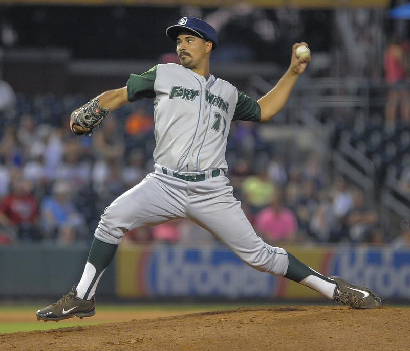
The pitcher shown above is Travis Radke of the Ft. Wayne TinCaps, a single-A team in the Padres’ system. As you can see, he wore an Alex Torres-style padded cap attachment with a Padres logo — along with some very nice stirrups — during his most recent start, which was this past Saturday. I did a little digging on Radke and learned that he had also worn the padded headgear while pitching for the Tri-Cities Dust Devils earlier this summer, plus I discovered some other intriguing uni-related tidbits about him.
I wanted to learn more, so I arranged to do a phone interview with Radke earlier this week. He turned out to be our kinda guy — very uni-minded, with a large number of visual quirks. Here’s how our conversation went:
Uni Watch: When did you start wearing the padded cap attachment, and what got you thinking about wearing it in the first place?
Travis Radke: I started wearing it this season. Once I saw Alex Torres wearing it, and knowing he was with our organization [Torres was with the Padres before being traded to the Mets ”” PL], I just wanted to be safe out there. I’ve seen a lot of line drives, and I had a head injury myself when I was younger, so it’s just not worth the risk, especially when I saw that the line drives in pro ball are a lot faster than the ones in college.
UW: So did you get the headgear during spring training, or once the season started, or what?
TR: I was interested in it last year, but it was more of a brand-new thing, and it seemed like it was more for the big leagues, from what I’d heard. But I arranged to get it about a month after spring training. I reached out to the CEO of the company [that makes the headgear] and let him know my story, let him know about my interest in the product. He got in touch with my trainers, and they put an order in.
UW: Now, you’ve already been with three different teams this season, right?
TR: That’s right. I started with Lake Elsinore, then Tri-Cities, and now Ft. Wayne.
UW: And have you worn the padding with all three teams?
TR: Only the last two. I’d only just started wearing it in extended spring training when I got called up to Elsinore, and I just didn’t feel comfortable going up there with different colors and sticking out like that.
UW: You mean because the padding was done in Padres colors?
TR: Exactly. There wasn’t time to make a separate one in Elsinore colors, which are black and red. I just wanted to go out there and have a good outing and try not to stand out in case I did bad. With Tri-Cities, it was fine, because they have the same colors as the Padres. And now that I’m with the TinCaps, I’m comfortable enough to just wear it, whether it matches or not. But they’re getting me one with the TinCaps colors and logo anyway.
UW: Before you wore it in a game, did you wear it during practice, or while warming up, or whatever, just to get used to it?
TR: Absolutely. From the day I got it, I spent about two weeks just wearing it for PFPs [pitchers fielding practice], for our throwing program, for my bullpens and sidelines. Basically anytime I was throwing a baseball. I just wanted to get used to the extra weight and make sure it didn’t mess with my balance or feel uncomfortable. When you play baseball from the time you’re four and a half years old and there’s always that same cap on your head, and then you change that to something heavier, it’s going to be an adjustment. So there was a bit of a learning curve with that.
UW: Have any of your teammates or opponents razzed you about the padding? Or, converse, have any of them indicated that they might want to try it themselves?
TR: I don’t think there’s a single one that hasn’t razzed me. In the beginning, they kind of thought it was a joke — they didn’t think I was serious about it. I’ve heard just about every joke you can imagine. But a lot of guys have also expressed interest in it. A lot of them don’t feel too comfortable with it just yet, but they’re curious to see how the technology changes in the future, so they might eventually get their feet wet and give it a try.
UW: Are you aware of anyone else in the minors who’s wearing the padding?
TR: As far as I know, Alex Torres is the only one in the majors, and I’m the only one in the minors.
UW: So you’re a pioneer.
TR [laughing]: I don’t know about that, but I guess I’m one of the first to try it out, and hopefully I won’t be the last.
UW: Alex Torres, of course, was with the Padres and was traded right at the end of spring training. Did you seek him out to discuss all of this?
TR: I never did. I always hoped I’d get the chance to do that, but with the difference in schedules between the minor league and big league camps, it never seemed to work out. But I’d love to pick his brain about it at some point in the future.
UW: I noticed that the photo of your recent TinCaps start also shows you wearing stirrups. Do you always wear them, and is that sort of your visual signature?
TR: I’ve always loved stirrups and I’ve always loved the old-school mentality of baseball, whether it’s the high pants or the oversized wool jerseys. But I’m usually more of a low stirrups guy — when I wear the higher stirrups, a lot of times they’ll slip off of my heel, which is never a good look when you’re in the middle of an inning and it’s just flappin’ in the wind. But when I got called up to the TinCaps, they were on the road, so I just had to make do with that they had, which of course is the story of the minor leagues.
UW: I was trying to learn more about you before we spoke, and I saw a photo from 2011 when you were in high school, and it showed how you marked all of your strikeouts in high school on the underside of your cap brim [click photo below to enlarge]. Can you tell me more about that?

TR: It was just a fun thing for me to do. I had a bunch of stuff written under there — my strikeouts, my no-hitters, everything from my career in high school varsity baseball. It was a way to be competitive with myself. Also, sometimes if I was struggling, even in the middle of an outing, if I was losing faith in myself and my pitches, I’d take off the cap and look down at the markings and think, “This is what you can do, this is what you’ve done, and you can do it again, right here, right now.” So it was also a motivational tool for me.
UW: Would you actually be making those notations on the cap during the game, like in the dugout between innings?
TR: No. That would look really self-centered and cocky. I usually did that after the game, or even a few days afterward.
UW: So you wore that one cap over several years?
TR: Yes.
UW: Was it pretty skanky by the end of high school?
TR: It definitely felt like it had shrunk.

UW: It looks like you’re also working on a pretty serious mustache. Is that part of your old-school approach, like the stirrups?
TR: Absolutely. Baseball’s supposed to be fun. I’ve always loved Rollie Fingers, and I’ve always thought that was a way to have fun out there on the mound, and also to have a recognizable feature for yourself and not just be Joe Shmoe out there.
UW: So is that the goal, to get the full waxed-up handlebar effect, like Rollie Fingers?
TR: I’ve waxed it up before, although not in a game. I have a feeling it’ll be gone relatively soon, though, if only because my fiancée will kill me if I keep it. We’re getting married in the fall.
———
And there you have it. From the headgear to the stirrups to the ’stache, Travis has a very high uni quotient. I should add that he’s extremely well-spoken and has a very thoughtful tone — an impressive guy. Best of luck to him in the rest of his career.
(Big thanks to reader Eric C. Leach, who first brought Radke’s headgear to my attention.)
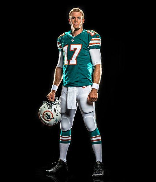
Another day, another NFL throwback: The Dolphins finally released their long-promised 1966 throwback yesterday afternoon. This design, which is part of the team’s 50th-season celebration, will be worn on Dec. 14 against the Giants. You can see a bunch of additional photos here.
Is it 100% historically accurate? No — TV numbers are in the wrong place, the sock stripes aren’t quite right, and so on. But jeez, it’s sooooo much better than the team’s standard uniform. Wish they could just go with this one full-time.
Also, note that Miami is going the extra mile by using a grey facemask for the throwback uni. That stands in contrast to the Packers, who are inexplicably keeping their green masks for their navy throwbacks — disappointing. (And yes, swapping out the mask is permitted under the NFL’s one-helmet rule, as any Bears fan could tell you.)
Is this the Bucks’ BFBS alternate? Last week we had all those low-res NBA leaks, including what appeared to be a BFBS alt for the Bucks. Now a photo has begun circulating — I believe it first appeared on Reddit, but it quickly spread to all the usual places — and it seems to confirm the earlier leak:
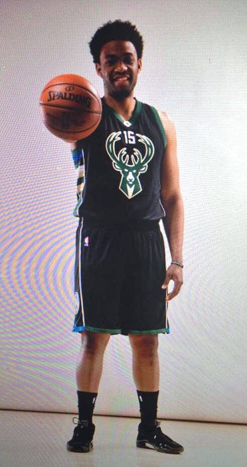
Obviously, there’s no reason for the Bucks to be wearing black. But I really like black and green together, and I like it even more with the cream trim. Not sure how they got away with making the uni number so small (I thought NBA regs required larger numerals), but it certainly makes for an interesting design. I think I like it, although this definitely falls into the “Need to see it on the court first” category.
Our own Mike Chamernik is a Bucks fan, so I asked for his take. Here it is:
I’m mixed on the Bucks’ new black uniform. It’s fine — I like the deer head logo and side panels — and used sparingly, it might be a decent look for them. But after attending the logo unveiling in Milwaukee with Paul back in April and hearing all the talk about how the team adopted cream for the Cream City and the blue for all the water that borders Wisconsin, it’s odd that the new alternate is black. It could have been a much more inspired look.
Good analysis, Mike. Thanks for providing the Bucks fan’s perspective.
The Ticker
By Mike Chamernik

Baseball News: Mets reliever Alex Torres switched his cap padding in the middle of last night’s game. The one shown on the left was wrong, because they Mets were wearing their regular blue caps with the orange “NY” logo. Someone must have noticed because he switched to the proper padding after his first inning of work. … Nationals P Doug Fister changed from No. 58 to No. 33 to accommodate newly acquired closer Jonathan Papelbon (from Andrew Cosentino). … Rappers Drake and Meek Mill have beef, as they say. Since Drake is from Toronto and Meek Mill is from Philadelphia, Drake is using Joe Carter’s World Series home run as his album art. … A Zanesville, Ohio, startup is the first company to make softballs in America in more than 30 years (from Jason Hillyer). … It’s been 100 years since the Phillies debuted what might be the baseball’s first true team logo (good stuff by Todd Radom). … David Feigenbaum makes an astute observation. Three players who wear No. 7 ”” Jose Reyes, David Murphy, and David De Jesus ”” were traded this week. “Wonder if that’s ever happened at the deadline before?” he asks. … Here’s a good piece on why managers wear baseball uniforms (from Adam Spangler). … Mets broadcaster Keith Hernandez wore an autographed Stan Musial jersey in the booth last night. … The mascot/spokesman for Jack in the Box threw out the first pitch at the Dodgers game last night, which made for an odd sight. ”¦ Down toward the bottom of this story is the news that the Scranton/Wilkes-Barre RailRiders will have a new logo for 2016 (from Brian C).

NFL News: The Saints’ season tickets show what color jersey they will wear for each home game. Counting the two preseason games, the Saints will wear white for the first five and black for the last five (from Derek Ponamsky). … An anonymous source tells us that the Packers are trying to get their “established by” date changed from 1921, when they joined the NFL, to 1919, when they were originally founded. That would move up their centennial to just a few years from now. ”¦ What’s that thing on the football in this Eagles photo? It’s apparently this gizmo, which is designed to train ball-carriers to keep a tighter grip on the ball (from Adam Brodsky).

College Football News: USC might wear an alternate jersey for a game in 2016. Six designs are being considered, including a bronze jersey-bronze helmet combination (from Phil). … Central Michigan is changing from a maroon facemask to a gold mask this season. … New uniforms for Appalachian State. More info here. … Michigan coach Jim Harbaugh says that he is thinking of giving out helmet stickers. … The 1976 Ole Miss team had front number size inconsistencies (from Forrest Phillips). ”¦ Indy Car driver Graham Rahal has a new Ohio State-themed helmet (from Andrew Lind). ”¦ Arizona State is set to unveil its new uniforms at 10am Eastern, but at least one photo is already circulating.

Hockey News: This year’s Winter Classic will be played at Gillette Stadium in Foxborough, Mass., and we already got an idea as to how the Bruins and Canadiens will look. Judging by the Canadiens’ logo, they might wear 1922-24 throwbacks. Here’s some more information on the game’s logos and branding. … New jerseys for the St. John’s IceCaps.

Soccer News: Soccer broadcasters keep very colorful and organized notes (form Andrew Rader). … SiriusXM FC is determining the best new kit of 2015 (from Jim Collier). … FC St. Pauli will have rainbow stripes on its away jersey’s sleeves. … Here’s the story behind the funky western-themed uniforms of the Caribous of Colorado, a NASL in the late 1970s (from Phil).

NBA News: New Bucks F Chris Copeland posed in a numberless jersey. … Michael Jordan lost a trademark suit with a Chinese footwear company that seems to be using his image (from Brinke).

Grab Bag: A collection of vintage women’s bowling patches is up for sale (from David Keel). … New logo for StubHub (from Phil). … The Pac-12 formed a partnership with Adidas (from Phil). … Three GP3 Series drivers explained their helmet designs (from Dane Drutis). ”¦ Fresno State and Nike are working on an ambitious new uniform program for 2016 (thanks, Phil. ”¦ Here’s the official style guide for the Commonwealth of Pennsylvania (from Brian C).
I like the Bucks alternate, save for the decision to go BFBS. If only they’d made it cream or blue, especially after making such a big deal of their significance to the city and state. At least there are no sleeves.
“We talkin’ ’bout practice.” – Allen Iverson on when the Bucks black uniform looks like it should be worn
He also said, “But yeah, at least there are no sleeves.”
Great interview.
The TinCaps are of course named for Johnny Appleseed’s supposed hat. I’d love it if they could model Radke’s new padded cap on the actual tin cap in the logo (seam down the middle, apple stem poking through, handle on the side) instead of matching the uniform cap design.
Heck, I’d be happy if the TinCaps would make their regular caps more closely resemble a tin cap. When your actual team name refers to the color of a part of your uniform, then you darn well better wear that part of the uniform in that color. Looking at you, White Sox and Red Sox!
No kidding. Considering all the other wacky promo uniforms that Fort Wayne (and every other MiLB team) uses, it’s surprising that they haven’t used a faux tin cap for an alternate.
I had no idea Connie Mack managed 50 years, until he was 87. Half a century, hard to believe.
A manager has pretty good job security when he also owns the team.
He managed for 50 years. And managed well for 30 of them, including making one of the boldest decisions in World Series history.
link
His final 20 years were pretty embarrassing, though. He’s got to be the only managerial inductee in the HoF with a sub-.500 winning percentage.
Bold, and immensely clever. That year, the Athletics and the Cubs were both runaway winners in their leagues. Such that Mack was able to approach Ehmke and clue him in to his plan. Ehmke would spend the last month or so of the season scouting their Series opponent and getting ready to face them as a shocking starter in Game 1. A clever veteran getting such an advantage…in that light, it wasn’t a surprise he’d do so well.
That’s a tad unfair. Connie Mack’s record was done more for financial necessity. Watch the segment on him in Ken Burns’ Baseball on why he favored fourth placed teams:
link
That’s… really kinda horrible. Money, money, money, profit, profit, profit. So much for “the love of the game” or whatever.
Well, when the club is your one and only source of income to put food on your table and a roof over your children’s heads, as was the case for Mack, it forces you to look at things differently than say, Gussie Busch, who could write off all his losses as advertising expenses for the brewery.
In Mack’s final 16 years as A’s manager (1935-50), his team finished dead last 10 times (and next-to-last twice more). In those 10 last-place years years they finished, on average, 10 games behind the next-to-last place team in the standings. And keep in mind, his A’s were competing in the same league as both the Washington Senators and St. Louis Browns, teams that epitomized futility.
Given that, how is the final third of Mack’s managerial career anything BUT embarrassing?
Also, those Dolphins throwbacks are awesome. And they have perhaps the most underrated feature in all of uni-dom, matching jersey and pant stripes, both with turquoise (or whatever you call that)-orange-turquoise on a white background. Even the orange logo creep looks good. Speaking aesthetically (not historically), the only thing standing between this uni and perfection is the lack of matching striping on the helmet.
Related: Did you see the hideous gold dolphin logo on link ? It’s meant to mark the 50th season of the club, but the gold-logos-means-50 thing is already being done link. And what’s the point of turning your logo gold for your 50th season if your special link has the regular logo.
The TB Dolphin helmet logo looks oddly placed to me. too far back?
I guess with so many weird holes and snaps and such it’s where it needs to be.
link
try this link. sorry.
link
I don’t think it’s too far back… but maybe the angle is off a little bit, like it’s been rotated a few degrees too much?
Travis Radke sounds like a super-cool dude.
Talk about getting it right the first time. That 1915 Phillies logo is fantastic. With only very slight tweaks, it would be the best logo in MLB right now.
Great interview with Radke, an outstanding piece. I agree he sounds Iike a really thoughtful guy.
I hope you can do a follow- up with him down the road some time to see how his career and equipment progresses.
As a Packer fan, I’ve griped about the “Est. 1921” stuff for years. The team even had it on its Web site. They recently changed their main restaurant at Lambeau from “Curly’s Pub” to “1919 Restaurant and Tap,” which shows that the team knows what it’s doing.
As with everything else wrong with the NFL, I blame Goodell and Brady.
In re: the Bucks uniform, I wondered why the base home uniform wasn’t cream, instead of white. I think that would’ve been a clean, distinct look.
Am I the only one who did a double take on the picture? Completely thought it said “fart man” and then still convinced it said “fart.” I thought the story was going to be about terrible team names or a tribute to Howard Stern.
I didn’t see that at first, but now I can’t un-see it.
What possible explanation could there possibly be for the Phillies not having that original logo as part of their identity package.
Someone is asleep at the wheel, that thing is awesome!
Lee
I don’t think the modern, colorized, angry version of that would work very well.
I didn’t know that was a rule. Too bad apparently every marketing person does.
Lee
Not joking: If I were a Phillies exec, I wouldn’t touch that 1915 logo with a 90-foot pole. It’s so much better than any element of the actual current Phillies identity. Both the primary and secondary logos are middling enough that they’d look terrible next to that 1915 logo. You either build the team’s visual identity around that 1915 logo or a slightly modernized version, or you stay well clear of it.
Re: Bucks – I agree the big buck looks fine, but, man, changing the black to blue would be a huge upgrade. Of course, a blue alt without the big buck would be even better.
Re: Central Michigan – The yellow facemask is a huge improvement. I always thought their helmets were boring, but never considered how big a difference a colored facemask could make. Not bad for a school that constantly makes awful visual choices.
Miami Dolphins unveil throwback uniforms from 1966, and inadvertently expose how awful their current look is.
That preview pic (the one where #91 is leaning back and roaring) is embarrassing, why do players do that, and photographers allow them to do that?
Anyways, nice uniforms (other than gray face-masks).
Lee
That preview pic (the one where #91 is leaning back and roaring) is embarrassing, why do players do that, and photographers allow them to do that?
I suspect that the photographers are actually encouraging them to do that.
And yes, it is very embarrassing. And depressing.
Hey Saints,
I like the idea of letting us know beforehand which Jersey you’re gonna wear. But is it THAT difficult to find a picture of Brees, et.al. in a WHITE jersey for the white jersey games?
RE: the Scranton-Wilkes-Barre RailRiders logo change. I can’t believe that what they’ve been using has gone on so long! the color scheme and both main logos (SWB, and the lightning bolt R) are straight out of harry potter, like so much so that if i were JK Rowling i would have called their attention to it with a very stern letter at the very least. i have sort of a pet peeve when it comes to copy-catting, even when it’s entirely unintentional. the washington wizards, for example set the wheels in motion for their name change not very long before the first harry potter book was released, which means they were clearly independently imagined, just coincidentally unveiled to the world at the same time. meanwhile the toronto raptors would have set the wheels of branding in motion right about the time the jurassic park the movie was released, making it highly suspect.
long story short: all three of those teams have some atoning to do for their weak branding, at least SWB is recognizing that. hope they don’t submit to the whims of brandiose, they have done some great identities for MiLB, but they are also responsible for some of the worst branding in the minor leagues and seem to have really hit a formulaic skid of late.
True. But their alternate (batting practice?) cap, with the railriding porcupine, is awesome!
link
Little guy has s mischievous look like he is doing something illicit, and getting away with it, and having fun. Not too cartoon-ish, and not to evil/threatening. Just the right balance for a good minor league logo. Should be their main one.
S-W-B? Is that how locals refer to their hometown there? I’ve never thought of it that way, it doesn’t roll off the tongue as easily as “LA” or “NYC.”
What’s changed with Packers in regards to their establishment date? I understand the 1919/1921- but they celebrated 75 years in 1993
I’m curious about that as well. I thought it was common knowledge among dedicated football fans that the Packers started in 1919 and joined what became the NFL in 1921. At what point did the NFL dig their claws in and screw everything up?
I believe the confusion is based in the fact that the original organization, formed in 1919, was the Indian Packing Company (Curly Lambeau’s employer. Due to financial difficulties they became the Green Bay Football Corporation in 1921.
I’m more curious about why they’re “trying” to get it changed.
Who’s stopping them? Is Goodell threatening to take draft picks away? Call yourself “established 1919”. There is no try.
NFL are in charge, they determin when a club was founded, its very silly.
As an ASU fan, I was worried about the switch to adidas, but they hit a home run with the new uniforms. A+
link
It appears the number was photoshopped off of Chris Copeland’s jersey. A Facebook banner showed him wearing number 14, but this number is retired for Jon McGlocklin.
Not a Dolphins fan. BUT DAMN! Those SHOULD BE their uniforms… not their current ones with the generic BLANK harbor marina logo.
Oh man those Dolphins throwbacks are a beauty. I’ve been wanting them to do this for years. Wishes do come true.
Somebody on Reddit made the new Packers throwback look much, much better:
link