Click to enlarge
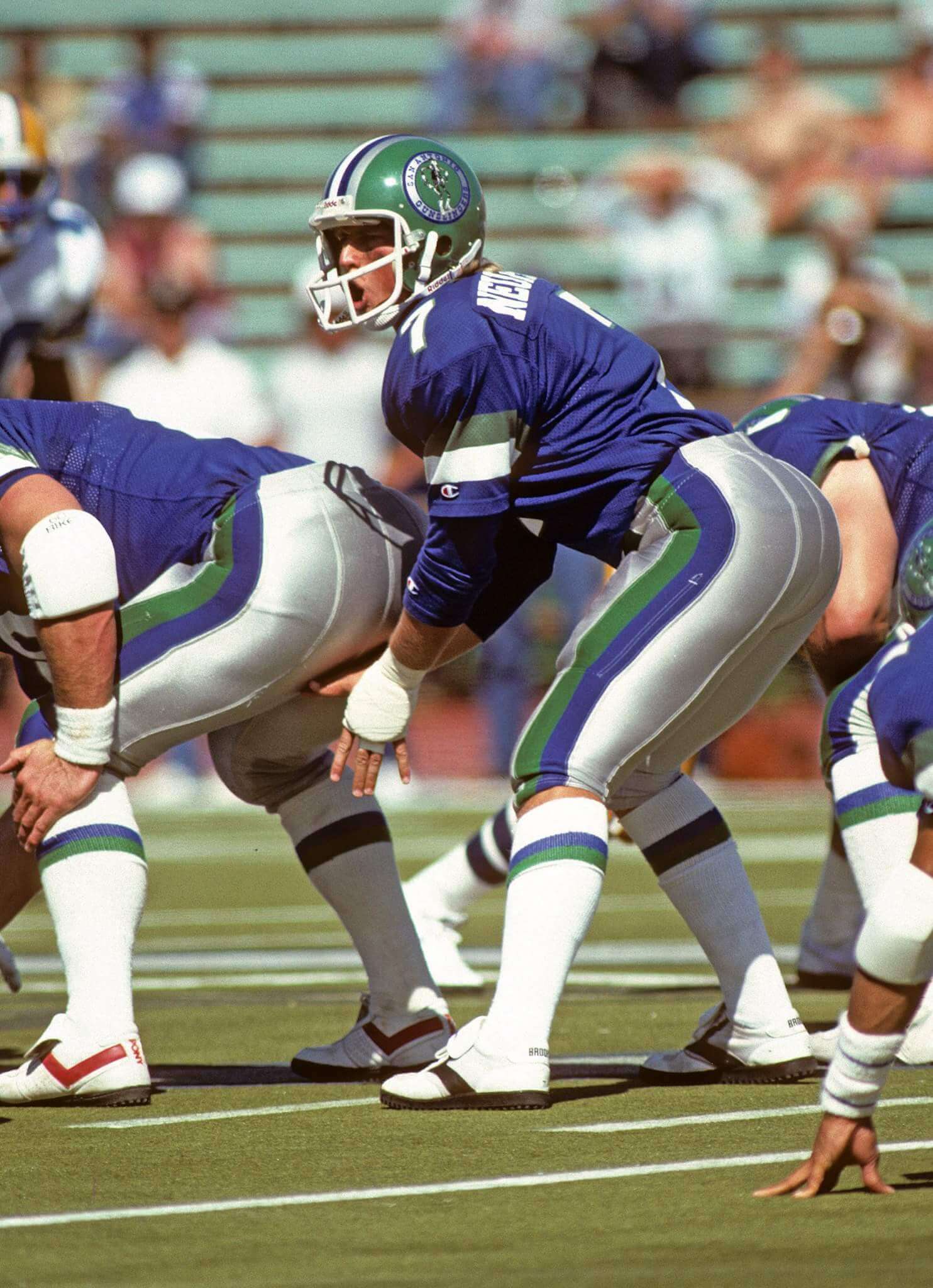
Reader Gene Sanny, who you may recall from his sensational WFL-themed electric football project, recently stumbled across Billy Schott on Facebook. Schott was the designer of the USFL’s San Antonio Gunslingers (shown above), and Gene had lots of questions for him. The result was a short but informative interview, conducted on Facebook. Here’s how it went:
Gene Sanny: Man those uniforms….. That’s where I fell in love with green and blue as a color scheme. Sadly, if the league had lasted, with today’s trends, I think we’d be looking at forest green and navy blue….. The Gunslingers did it right though
Billy Schott: Thank you, Gene. I designed those uniforms.
Gene: Billy, I’m a graphic artist, so I’d love to hear any stories you have regarding the design of the uniforms. For example, did you also design the gunslinger himself in the logo, was the color scheme your choice, did you have alternate versions that were rejected in favor of what eventually took the field, were you just contacted by the team, or did you do this directly for the USFL, and if the latter, did you do any other teams for the league? That type of stuff.
Billy: The Gunslinger was drawn by a cartoonist/artist/columnist from a local San Antonio newspaper — Bob Dale, I believe. I had a helmet decal of two crossed, smoking Colt six-shooter pistols in mind, with a small Alamo/Lone Star flag combo situated between the pistols. In the end, I had to defer to the owner, Clinton Manges, and his wishes to use a cartoon character instead.
I’m not a designer by trade. I was the team’s equipment manager, among many other titles and duties, and having the opportunity to design the uniforms for a football team was something I had looked forward to since I was a youngster.
Clinton [the owner] and I met on the color combinations and he had thrown out several ideas, mostly based on things near and dear to him. We finally decided on royal blue because it was close to the cobalt blue tile in his ranch house. He insisted that we use cobalt blue, so I had to tell him that the uniform supplier, Champion, would indeed change the royal blue just for him. We had to use their stock color of royal, but Clinton was satisfied that the “cobalt blue” the Champion rep and I showed him was “even purtier than the tile in the house…”
We tossed about other ideas for complementary colors, including various shades of gold (Clinton liked shiny gold jewelry), Texas orange (reminded Clinton of the reddish, rust-colored dirt on one of his properties in South Texas), various shades of red (I was pushing for a Texas/Lone Star look), and then came the kelly green because it reminded him of….money. Kelly green and royal blue was a favorite combo of mine simply because it was fairly rare back then on athletic uniforms. I didn’t want to replicate the Seahawks’ look, and I really liked the color-against-color striping that the Redskins had employed around that time.
On a whim, I added the silver pant and helmet stripe and Clinton went nuts over the first prototype that we modeled for him. He wanted a silver helmet initially, but when I showed him the look with the Kelly Green helmet, he just smiled and said, “I like that one the best. Go with that. That’s damn nice.”
If we had stuck around for a third season, I had ordered a white pant with the same bold striping that we would have worn with our white jerseys. For many more important reasons, I’m still sad we didn’t get to keep playing, but that white jersey and pant combo really looked sweet.
———
Cool stuff. Big thanks to Billy for sharing his story with Gene, and to Gene for sharing it with the rest of us.

Uni Watch on the air: I’ll be appearing on WDET’s Detroit Today radio show this Friday. We’ll be talking about Michigan’s new deal with Nike and about Detroit’s assorted uniforms. The segment is slated to begin at 9:40am and should last 20 minutes. You can access the streaming audio here.
Sponsor shout-out/discount: For about a year now we’ve been privileged to have American Trench socks as an advertiser on the site, which makes me particularly happy because I’m a big fan of their product line. High quality, great designs, made in America, and free shipping — a killer combo. I’m wearing a pair of their socks right now, in fact.
And now American Trench just got even better, because they’re offering a 15% discount to Uni Watch readers. The discount applies to everything on their website — not just socks, but also their namesake trenchcoat, headwear, items already on sale, the works. Just start shopping and use the code UNIWATCH at checkout. Thanks.

Baseball News: The first-ever throwback game — not just in MLB but in all of big-time pro sports — was hosted by the White Sox 25 years ago this Saturday. Todd Radom has taken a look back at that game. I’ll be marking the occasion later this week with a massive ESPN piece that will look at the best throwback uni worn by each MLB team over the years. ”¦ Bowling shirt-inspired jerseys tonight for the Florence Freedom. Further info here (from K.C. Kless). ”¦ Tris Wykes spotted an American Legion coach who was taking the pajama thing to new extremes. ”¦ Here’s a look at the Harrisburg Senators’ uniforms over the years (from Mike Wissman). ”¦ The latest hazing ritual is to send rookies out for coffee in full uniform (from @mrmichael21). ”¦ Oh baby, check out this shot of the 1977 N.L. All-Star squad. “Mercy,” says Brinke, and I have nothing to add to that. ”¦ If you make the All-Star team, you get an All-Star bag. ”¦ People think the Nats’ latest racing president looks like Paulie Walnuts from The Sopranos (from Tommy Turner). ”¦ Nike has a new line of ugly neon accented baseball cleats and they’re called — wait for it — the 2K Filth. Yes, “Filth” is now a cool term, at least according to Nike. I assume we’ll be seeing plenty of these at the MLB All-Star Game (from Thomas Fleischman). ”¦ Vida Blue really put the “ribbon” in ribbon stirrups (thanks, Phil). ”¦ The mighty Fleer Sticker Project has taken a look at the 1970 MLB All-Star Game program. Of particular interest in the info on the creation of the MLB “bannermark,” which we’ve occasionally discussed here. ”¦ Mets TV analyst Ron Darling noted last night that Giants OF Hunter Pence “has his pants above the knees, like a wide receiver.” Not bad, Ronnie. ”¦ Ticket stubs may not exist anymore, but parking stubs still do.

NFL/CFL News: Our own Phil Hecken’s latest piece for the Sporting News ranks the AFC’s uniforms. The corresponding NFC piece will be posted today. ”¦ Two Saskatchewan women with life-threatening cancers were given Saskatchewan Roughriders jerseys with pink numbers.

College and High School Football News: “BYU is doing a contest in all 50 states where they’re hiding a box of BYU swag and they give hints on where the item is hidden in each state,” says Chris Flinn. “This year’s swag includes a BYU logo pylon, signed picture, and jersey.” ”¦ Riddell is making grants available for schools in need of upgraded gear.

Hockey News: The Senators, looking ahead to 2017, have released a 25th-anniversary logo and are hinting at new uniforms (from Moe Khan). ”¦ New uniforms and logos for the Mississippi RiverKings. ”¦ Herb Brooks’s and Murray Williamson’s old U. of Minnesota jerseys were recently donated to the university. “Not sure of my favorite element,” says Dave Lundborg. “The Minnesota Centennial patch, the old-time Goldy Gopher patch, or the huge number of stitched-up tears in the sweater.” ”¦ New uniforms for the Huntsville Havoc (thanks, Phil).

College Hoops News: Here’s one writer’s pick for the ideal sneaker for every Big 10 basketball team (from Chris Flinn). ”¦ Lovelovelove what the Texas Longhorns were wearing in 1917 (big thanks to Andrew Baker).

Soccer News: New uniforms for Jagiellonia Bialystok (from Ed Å»elaski). ”¦ The U.S. men’s national team will wear white while competing for the Gold Cup. Insert obligatory “What, no neon green?” comment here. ”¦ NBA player Jrue Holiday, who’s married to USWNT player Lauren Holiday, has a good jersey-centric way of showing support for his wife (thanks, Mike). ”¦ New away kit for Vitesse Arnhem. “Normally road unis are totally different from home unis, but in this case the road uni has subtle stripes in yellow and black, just like the home unis,” says Lucien de Groot. ”¦ New logo and colors for Atlanta United FC. … The Col. Sanders statue at a KFC in Kawasaki, Japan, is wearing a Kawasaki Frontale jersey (from Yusuke Toyoda). … Also from Yusuke: 50th-anniversary jersey for Ventforet Kofu.

Grab Bag: Providence College has extended its deal with Nike. ”¦ In a related item, Gary Trbovich Jr. notes that Providence’s logo looks a lot like Bill Belichick! ”¦ Tour de France cyclists have been trying to beat the heat with water-filled tubes, ice vests, lots of fans, and something called Liquid Ice (from Sean Clancy). ”¦ Also from Sean: This is what a cyclist’s jersey looks like after a nasty spill. ”¦ Here’s a look at Nike vs. Adidas and the politics of being cool (from Gil Neumann). ”¦ NASCAR has announced its new Chase paint scheme for 2015. ”¦ The Indiana athletics department, whose contract with Adidas expires next year, is exploring options for a more lucrative deal (from Gary Moore). ”¦ Reprinted from last night’s comments: SI Kids recently invited readers to submit concepts for ugly uniforms. The results are here and here (from Tyler Haney).
Nifty info on the Gunslingers. Their look really holds up well (consistent socks even!), but the red-trimmed shoes on the center seems an indicator of bad things ahead for the USFL.
I remember thinking how the Gunslingers were let down by the helmet logo. Now I’m curious to see Billy’s crossed-guns insignia. The USFL took a back seat to nobody as far as the uniforms were concerned; the football played wasn’t half-bad, either.
Agreed… the Gunslingers had easily the worst helmet logo in the league. It would have been great for a secondary type mark or something, but was too detailed for the helmet.
Lee
It wasn’t so much that it was too detailed.. the cartoon figure was just ugly.
I think what was most refreshing about the interview was the design process, and how it wasn’t overdone. They threw around some colors, came up with a logo and it was done. I can only imagine the dozens of folks involved with uniform design today trying to decide the right shade of blue for the piping on a uniform so it will appeal to the buying public just a little bit more.
The center may be Bill Winters.
As the San Antonio USFL team operated on a shoe-string budget, he may have had to provide his own turf shoes and may have simply used those he had left over from the ’83 season, during which he played for Tampa Bay USFL…a red-accented team.
re: US Gold Cup kits
I don’t think they ever released the white/black/neon kit for the men (they showed both women’s and men’s when the blue gradient kit came out). They’re just wearing the 2014 World Cup uni with a different tournament patch.
re: Jrue Holiday
I had to chuckle at the “Husband of the year?” caption. As a Father of the Year winner several years running, I see that the bars set for both awards are laughably low. All it takes is basic competence or a moment of decency.
I think the men did wear the black/green for one game, no?
This may be a column in itself, but I noted how many WWC teams wore these weird gradient socks which morphed from one color to another.
Part of me thinks it’s because a lot of the more expensive football boots (er, soccer cleats) now have those zip-up spats that prevent water, mud, and crumb-rubber pellets from artificial grass from getting into the shoe while you’re playing. That, I think, is why the US had green as an accent color on the all-white kit. It’s pretty loud as a color, much like the team’s Nike boots.
The neon look was unveiled in late April. Since then, USMNT only played Germany and Netherlands, wearing blue both times. What’s interesting is that the link in a June tournament as well. So far, the senior women’s team is the only team to wear the white/black/neon.
But you’re right about the loud colors on today’s boots – just look at the link and you’ll see that the socks were made to match the shoes (though they match link too).
Re: Nationals President Race – are they just picking the most obscure presidents now? I always wanted them to rotate a new president in every season. Then, at some point, have a total melee with all of them on the field at once.
Well, they started with Mount Rushmore, then added a baseball fan and a future SCOTUS chief post POTUS in Taft, and then the born on the 4th of July POTUS in Coolidge for the Fourth of July. In related news, would it be too dark if on the Fourth of July race, Jefferson fell down and failed to finish? And when does Obama join the race on a future April 15?
No, what would really be dark would be if FDR ran in the race.
OMG, LOL. (I’m going to hell.)
FDR would have an unfair advantage or disadvantage, depending on whether wheelchairs are allowed.
JFK would never win because he’s too nervous.
William Henry Harrison would refuse to run on a cold, rainy day.
Bill Clinton would stop running halfway and go to McDonald’s.
there are probably a couple Presidents that would be in poor taste to do. If they were going for funny looking Presidents, I would like to see Van Buren with those mutton chops of his.
If you want presidents with great facial hair, Chester A. Arthur is your man.
Other fun presidential options:
Nixon sabotaging the others even though he’s way out in front.
James Madison at half the height of everyone else.
Ford being involved even though no one asked for him.
W stopping 3/4 of the way through and declaring “Mission Accomplished”
Coolidge is just for this year. Coincides with the Nationals partnership to promote the White House Christmas ornament, which is also celebrating the Coolidge Administration this year. I think the ornament partnership is 3 or 5 years. No word on if the Nats will roll out a new Prez each year too.
Here’s the story:
link
It’s been reported elsewhere in local media (WTOP & WAMU) that it’s a three-year deal with the White House Historical Association. Next year’s ornament will commemorate Herbert Hoover, and 2017 will feature FDR. No word what they’ll do to promote those ornaments.
And for the record, Cal looks way more like Mitt Romney than like Paulie Walnuts.
Once again, Millard Fillmore is overlooked.
Fillmore was the subject of the 1996 White House ornament, and therefore should be featured again sometimes in the early 2050s, depending on how many of our next presidents serve less than eight years:
link
plus there is a whole comic strip parodying his name.
link
Re: 1977 NL All-Stars
Love that the Pirates have two different pillbox caps represented. The black is classic, but the yellow one pops out.
American League All-Stars would consist of a bunch of white home uniforms, with the exception of the A’s, Indians and possibly Orioles. What a spiffy photo of what was, for me, baseball’s sweet spot.
Not only that, but all three Pirates in that picture are wearing a different uniform combo. Whereas the players from the other teams with multiple representatives (Phillies, Dodgers, Reds, Cubs, Astros) are dressed … wait for it … uniformly.
The 1917 White Sox logo has to be the best Sox logo of all time.
As I recall, the game was a make-up from an early season rainout, and there were no other openings for it to be played. The day after All-Star is usually dark. The Players Assn had to get involved and approve also.
Actually, there was a one-week strike at the beginning of 1990. The games got rescheduled by moving one series to the end of the season, and stuffing the other into available spots in the schedule. So the Sox-Brewers game was a single weekday afternoon that wouldn’t have been too attractive. That’s why they could turn back the clock on ticket prices, as well as uniforms.
The weirdest part of the 1977 ASG photo is that Dave Parker is dressed in all gold for the photo, but he wore a black jersey and black pants in the game. See the photos (albeit a bit blurry) below.
link
link
New MLS team Atlanta United FC? That seems rather original. What, using Thrashers would be too soon?
Maybe someone still has the rights to the Atlanta Chiefs and the Atlanta Apollos.
They thought Deportivo Real Sporting Atlanta United Wanderers Juniors FC was too wordy.
I would’ve been down with Atlanta Phoenix. And then it would’ve been great if Phoenix got an expansion team that was owned by the Italian club Atalanta.
Silverbacks was an awesome name. So were the Apollos.
The AUFC colors are a throwback to the first years of the Falcons, where there was gold in the helmet as a nod to Georgia Tech.
There should be a rule that if you’re an expansion team in a city where a previous NASL team resided you have to chose that name. We should honor OUR soccer heritage not fabricating a history based on another continent. Seattle, Portland, Vancouver, and Montreal got it right. Atlanta failed miserably with a generic name in a league with an existing “United” that has been in the league for 20 years and that actually unites the region of Virginia, DC, and Maryland. Not to mention the expected arrival of Minnesota United that unites the cities of St. Paul and Minneapolis (though I’d probably name them Twin Cities United).
Chiefs would be a great choice but starting a team with that name in 2015 may be a little dicey unless the converted the Native American imagery to a Police or Fire Chief, which has potential in a limited use. For me the debate starts and ends with “Apollos”. It has a history in the city, it’s unique, it has alliteration and is a dynamic forward name. Not to mention the possibilities of branding with “Showtime With the Apollos” and having a flashy attitude in a brand new futuristic looking stadium and connecting with Atlanta’s music stars (of which Ludacris is already involved with the team).
Yeah, but Arthur Blank would’ve had to buy the rights to the name from the Silverbacks. That wasn’t going to happen.
To be fair, Atlanta is trying to unite several states/metro areas as well, being the only team in what is colloquially referred to as “The South.”
The Facebook link doesn’t seem to be working right now but you can find the logo/colors from the AJC: link
Are they going for an AC Milan look (another Adidas team)?
link
The article itself says the jerseys will look like Milan’s.
I’m okay with this. I really liked the link.
Stripes, hoops, sashes, half-and-half color blocks, whatever. Bring it all on! I’m all for adding variety to MLS uniforms.
RE: Nationals Presidents Race
My favorite suggestion (not mine, from one the Giants beat writers) is to add Nixon and he tries to cheat and fails every time.
they should have never let Teddy win. He was the lovable loser for so long.
“… Kelly green and royal blue was a favorite combo of mine…”
It’s the best. Modest insertions of white and yellow for numerals and stripes take it to celestial level.
Am I the only one who thinks the Gunslingers’ look is awful? Nothing about it says “Southwest” to me or “San Antonio” and the helmet logo is terrible for TV. The stripes over the top of the helmet are only outdone by Buffalo’s LAST red incarnation and that one Jags Prototype that never made it. Colts, Bears, Packers, Chiefs do it right by keeping it simple and clean. For my money, the best USFL uniform is the BREAKERS.
I agree with you Randy. I think the green/blue combination is either loved or hated.
Clinton Manges was not known for paying his bills. I wish Gene would have asked Billy how much money he was owed when the franchise crashed and burned.
The Dallas Mavs have worn green & blue, are they not southwestern enough either?
Agreed. Just because a team is located in the US Southwest it shpuldn’t have to wear fast food restaurant colors.
*shouldn’t
Sad to see Providence College switch all sports to Nike. When I ran track there the team was sponsored by New Balance and I thought it was unique at that time we were on the the few teams sponsored by them and had unique uniforms instead of the generic template nike puts every team in.
Gopher logo on that hockey jersey is fantastic.
I still have the entire White Sox ‘Turn Back the Clock’ game from 1990 on VHS tape somewhere. It was a big deal. I need to dig that out.
I also remember on SportsCenter that night, ESPN running the highlight package of that game in a black and white, shaky, grainy old-time camera style. Even back then I thought that was really neat.
U.S. District Judge Gerald Bruce Lee upheld the Trademark Trial and Appeal Board’s ruling against the Washington Redskins.
link
Sincere query: why doesn’t Dan Snyder just rename the team the Washington Native Americans?
Because he is an entitled, steak-gorged, out-of-touch one-percenter living in his own bubble.
Because calling them the Native Americans would imply that they represent modern people, which they don’t. It also doesn’t roll off the tongue very well. The Redskins name is obviously based on the cowboys & indians stories that were popular at the time, and really has nothing to do with modern living people. They are to the 1930’s what the Toronto Raptors are to the 1990’s. Why people can’t seem to understand this is beyond me.
Also, trademark law needs to be reformed. The government should not be in a position of determining the offensiveness of a word, ever.
The government is not in the business of determining the offensiveness of a word. The Lanham Act denies trademark protection to marks that are “scandalous” or “disparaging.” “Offensive” has nothing to do with it. Why people can’t seem to understand this is beyond me.
The Jeff,
Your argument makes sense if you ignore everything Snyder and his PR people have said. It’s about respecting and honoring not just the Indians we killed, but also the ones who are still around today, and the organization’s gone out of its way to throw money at current (and not dead) Native American leaders.
The’s trope about “cowboys and Indians stories” is a common one, but it’s empirically false. The bulk of classic Western literature and film is about conflict among white settlers – cowboys and farmers – not between white settlers and Indians. Look at the top-grossing Westerns of 1932 or 1933, when the proudly racist Jack Kent Cooke renamed the team from Braves to Redskins: something like 9 in 10 feature no significant Indian characters. When Indians do appear as significant characters in classic Western literature and film, they’re almost always depicted in cartoonishly racist terms, often with actual redface. That is, white actors with their skin painted red, adopting obviously demeaning speech patterns and physical characteristics.
Just look at literally any scene of the classic Apache in which Burt Lancaster appears as the titular Apache Indian. Even Lancaster himself seems a bit embarrassed by the cartoonishly racist performance he’s giving. And remember, this is what Hollywood accomplished when it was trying to make Indians the sympathetic, humanized protagonists:
link
George Preston Marshall, not Jack Kent Cooke.
Because the nickname controversy is the only way for Snyder to maintain any support from the hardcore fans.
Duorf & th are right, of course, but also because Native Americans is a terrible team name. But the Washington Americans would serve much the same purpose, while also putting the hardcore of Redskins supporters who revel in the fact that the name upsets some people in a real box. It’s pretty much impossible to be against the name Americans without coming off as overtly anti-patriotic. Anyway, the Washington Americans could even adopt the headdress of the statue of Freedom atop the Capitol dome for their logo:
link
Which, superficial appearances aside, is not a Native American headdress. It’s a fictitious non-culturally-specific headdress, added at the last minute when Senator Jefferson Davis (D-MS) objected to the original sculpture’s liberty cap.
I like the idea of just calling them the Americans. They can keep their logo and everything else; it’s really just the name itself that’s the problem.
Also, the government absolutely should be determining whether words are offensive when weighing whether to grant or deny government benefits and protections to the word.
Or rather, the government should not be in the business of protecting a business’s exclusivity to a word that insults and dehumanizes a group of people and appropriate someone else’s culture.
Your first paragraph is right on.
Ive been patiently waiting for my beloved Hoosiers’ contract to end with Adidas. My fingers are crossed that we will get Nike – but would really take almost anyone other that Adidas.
Unlike most people who GET IT, I love the swoosh and want it all over my IU gear!
I fell in love with the green and blue color combo when the Portland Storm (then Thunder) used it in the WFL. It was a beautiful combination.
Anyone here about the Packers new throwbacks?
Anyone here about the Packers new alternates?
i never realized that the Gunslinger’s uni is a Redskin template. Head to to toe.
Rick Neuheisel-QB of the San Antonio Gunslingers
It’s sad that so many American soccer teams feel the need to slap an FC (or anything-C) before or after their name to give it legitimacy.