Click to enlarge
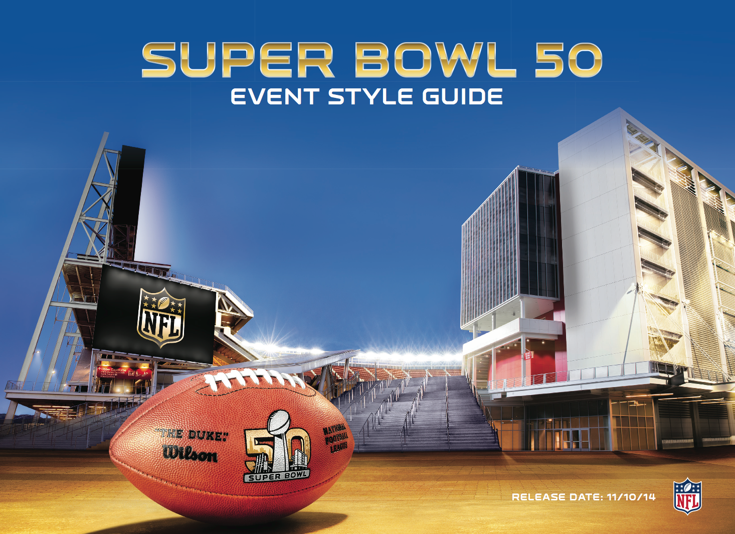
Thanks to a source who prefers to remain anonymous, I recently got my hands on the Super Bowl 50 Style Guide, which stipulates how the Super Bowl logos and such are to be used. There’s nothing earth-shattering here — no leaks of particularly sensitive information, no big scoops — but style guides are always interesting, and the guide for what should be the biggest Stupor Bowl ever is worth a closer look, if only to see how the NFL is treating the milestone edition of its marquee event.
The cover is shown above, and here’s the introduction (for everything in today’s entry, you can click to enlarge):
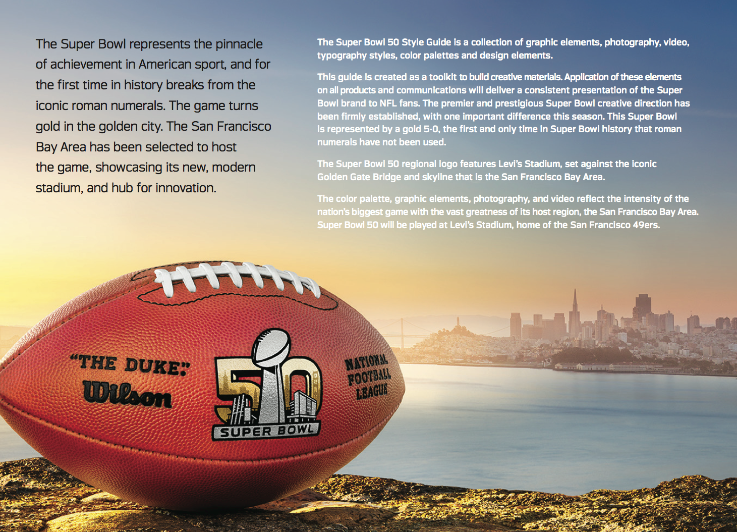
The guide is 117 pages long. Some of those pages are definitely more interesting than others, so I won’t bore you with a complete rundown. But here are some highlights broken down by section:
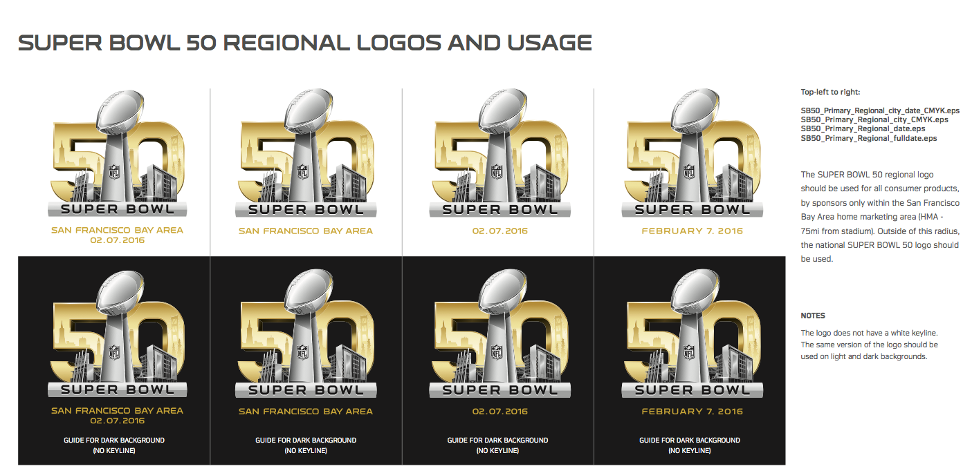
1. Logos. As you might imagine, there are many variations and treatments of the basic Super Bowl 50 logo. Here are some of them (note the typos in the headlines of the third and fourth pages below — “Pritning” instead of “Printing”!):
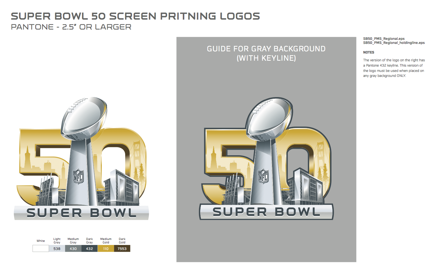

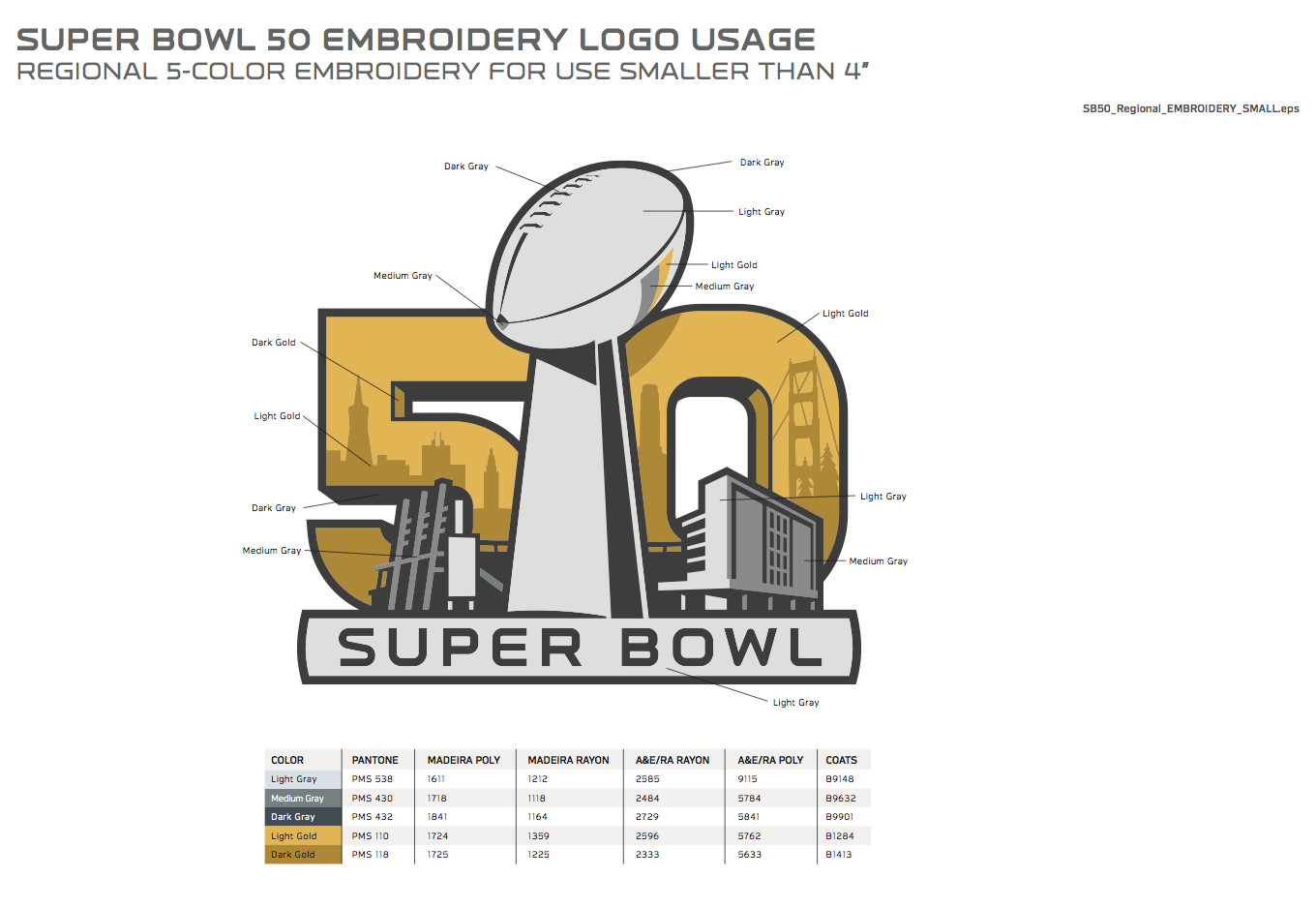
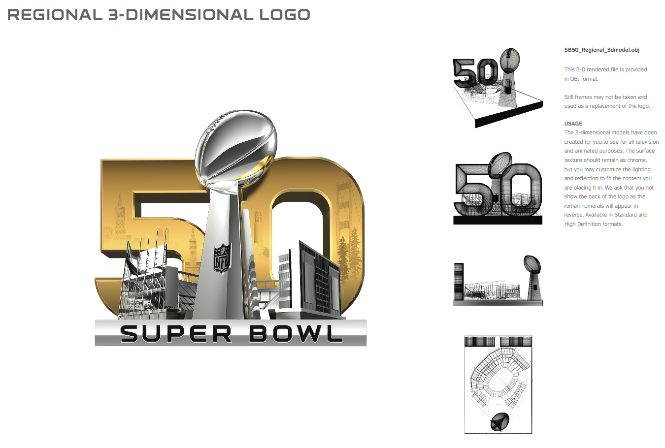
————————————
2. Acceptable and unacceptable logo use. The guide shows some examples of proper and improper deployment of the logo. Some of the improper examples are so ridiculous, it’s hard to imagine that anyone would ever think to try them, but I guess you never know. Take a look:
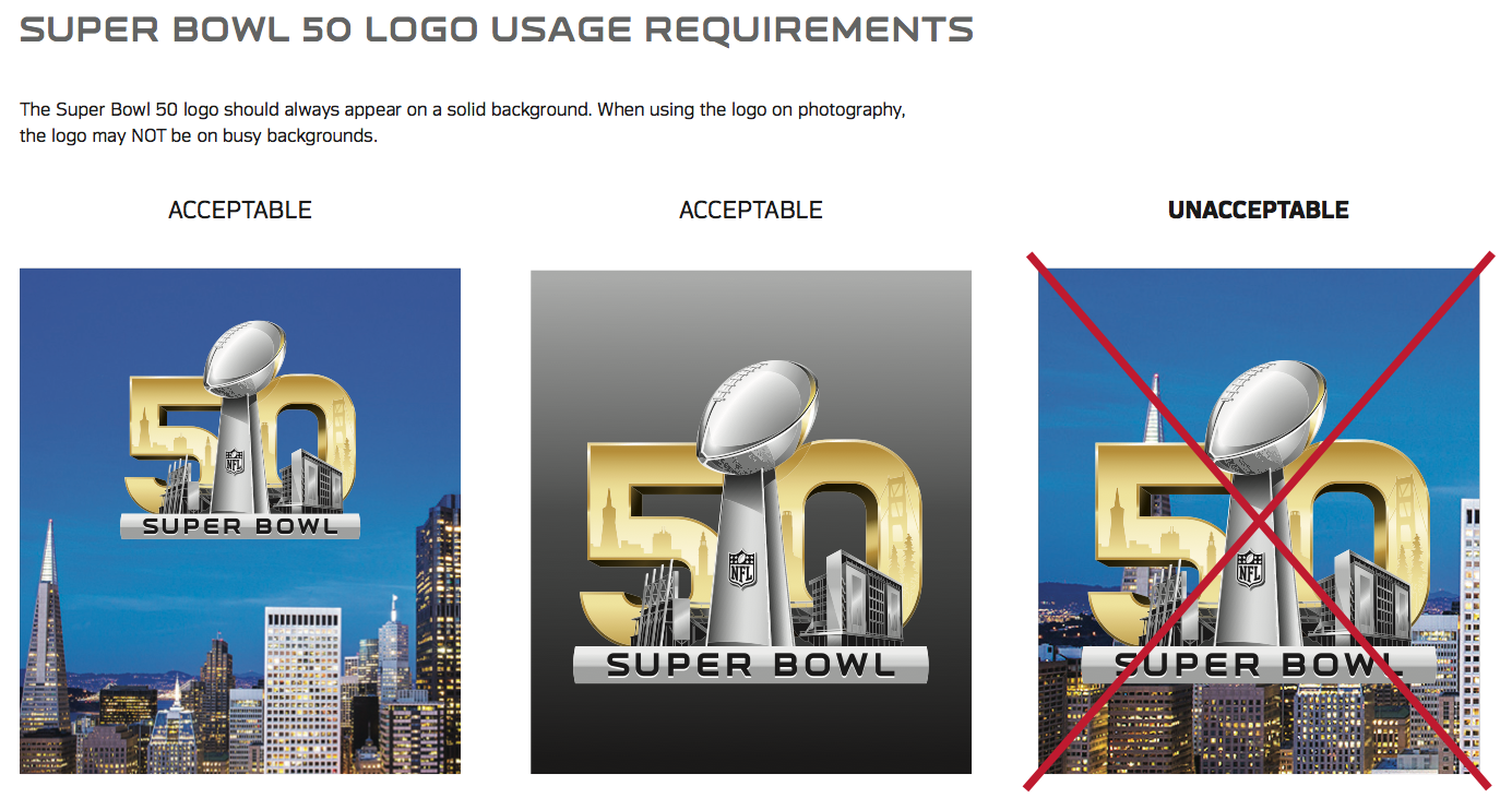
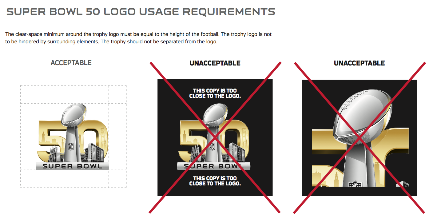
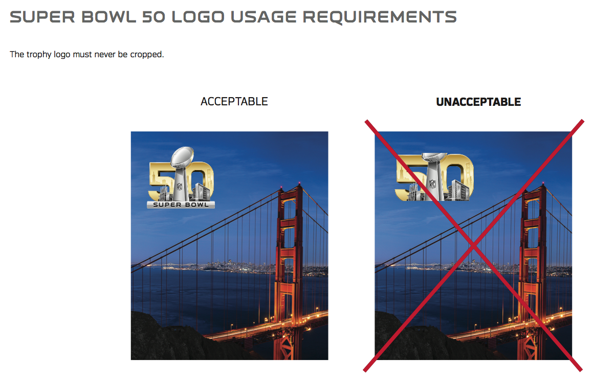
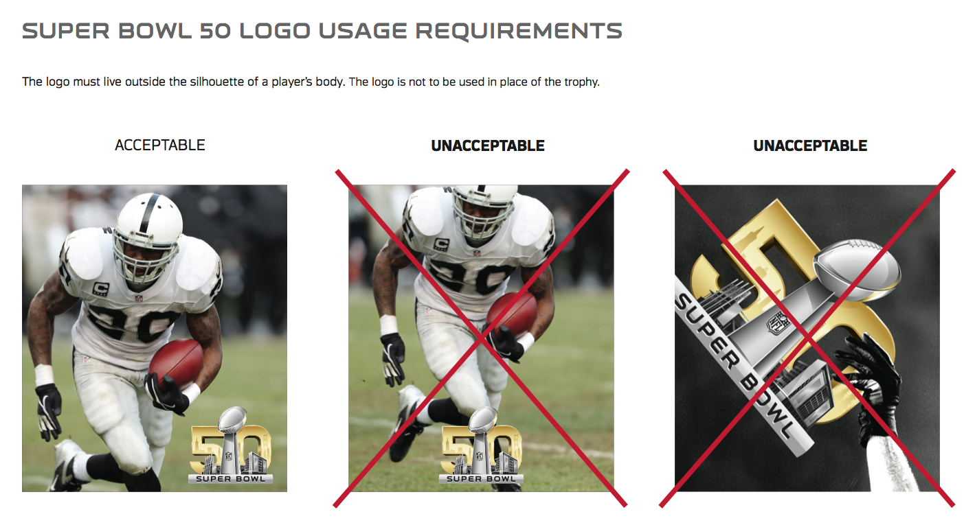
————————————
3. Photos with the Super Bowl football. The style guide offers a bunch of photos (or “assets,” as the jargon goes) for designers to use. Most of these photos include the Super Bowl 50 football in the foreground — I guess that ball really gets around. Expect to see lots of these photos being used this winter:
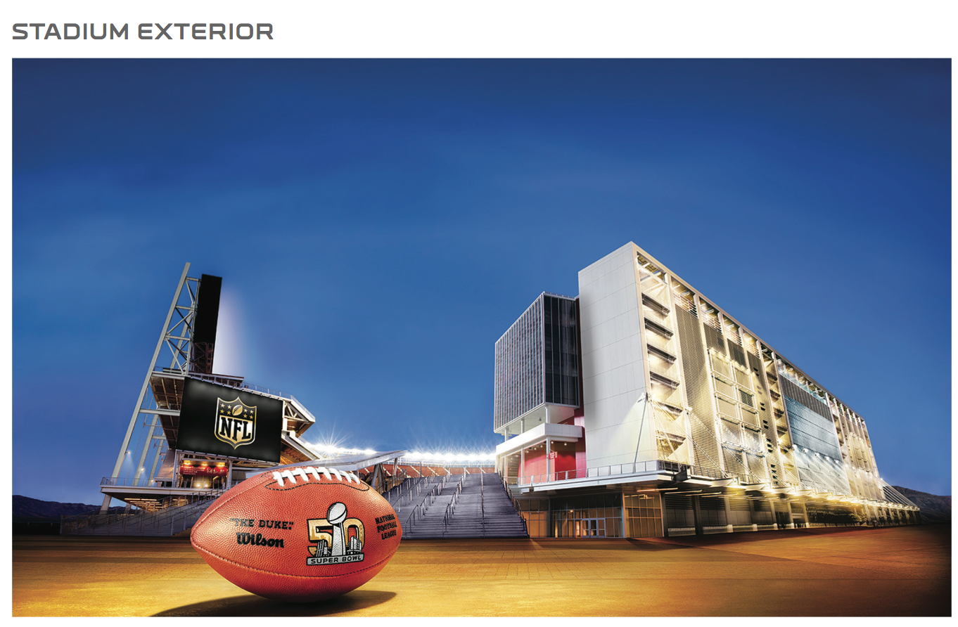
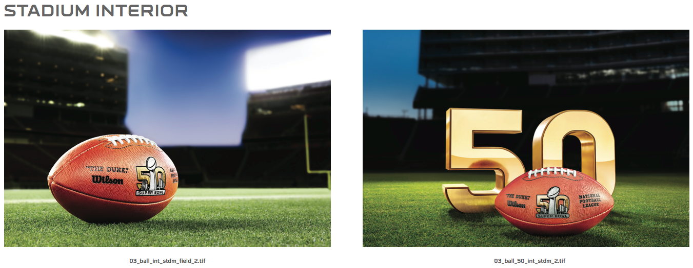
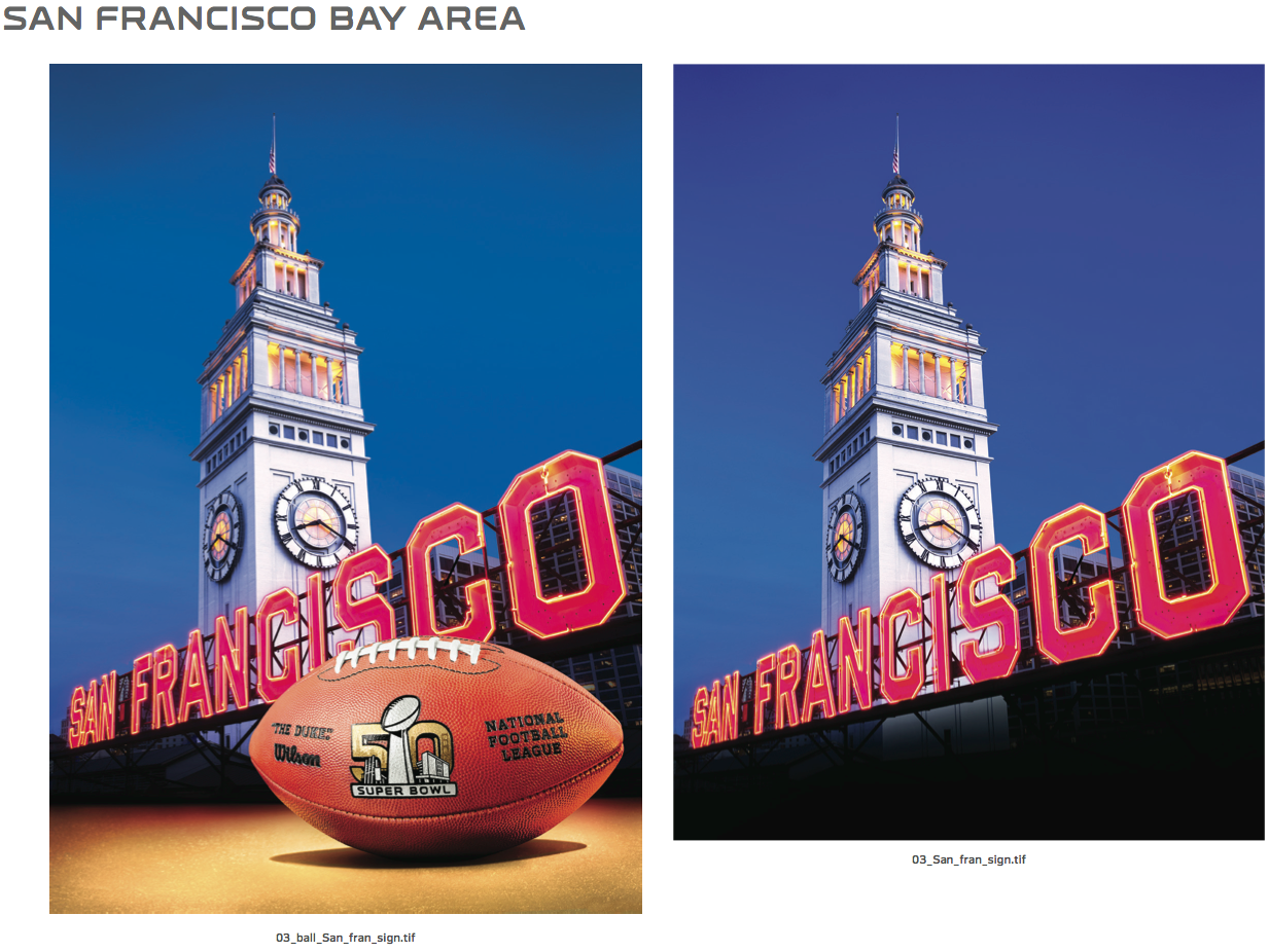
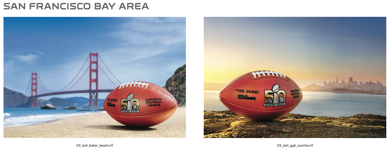
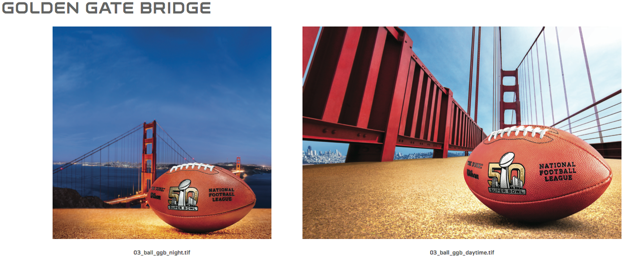
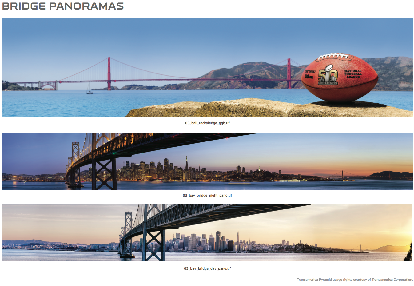
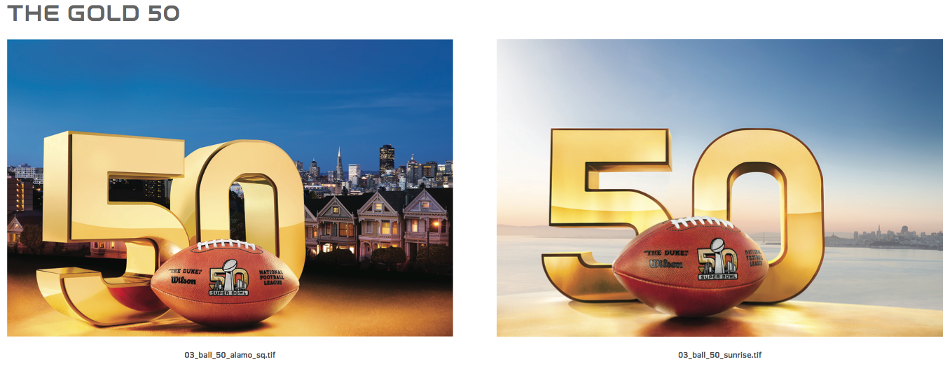
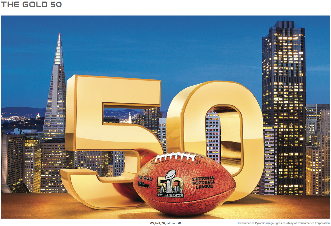
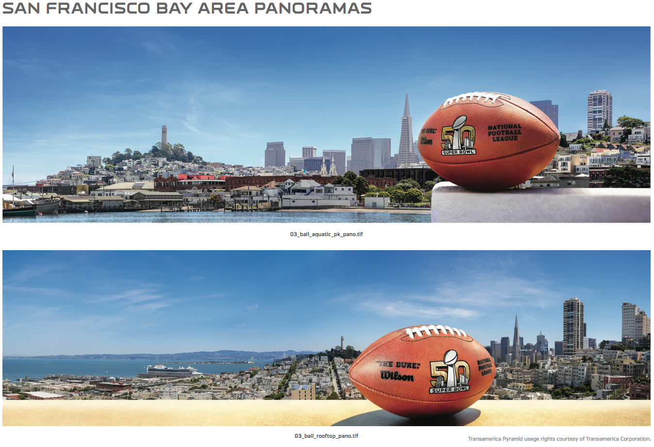
————————————
4. Colors. As with any style guide, there are specific color specs and guidelines. In this case, the NFL is paying particular attention to the right shade of Super Bowl 50 gold:
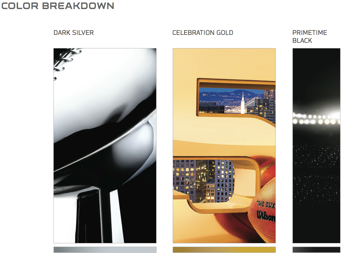
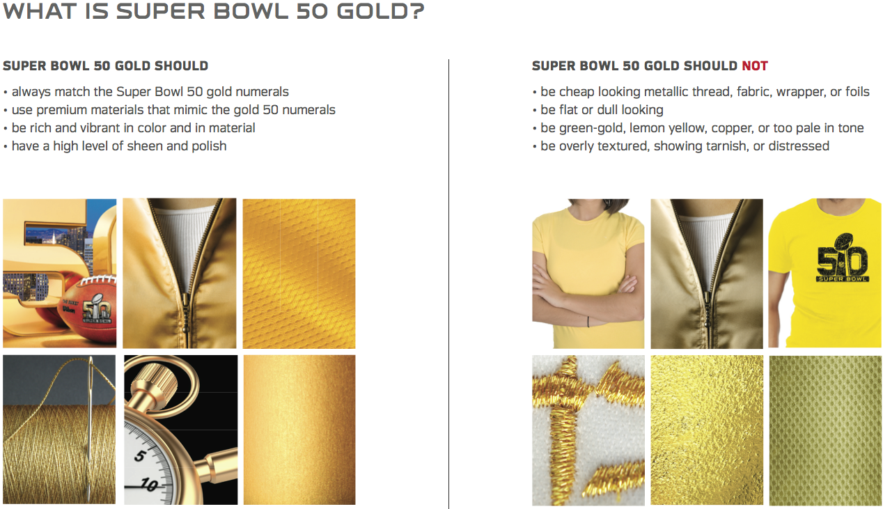
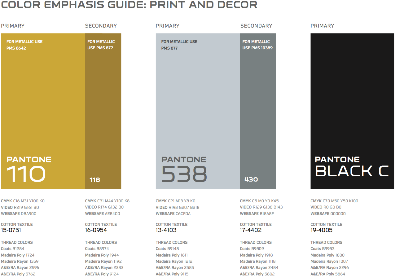
————————————
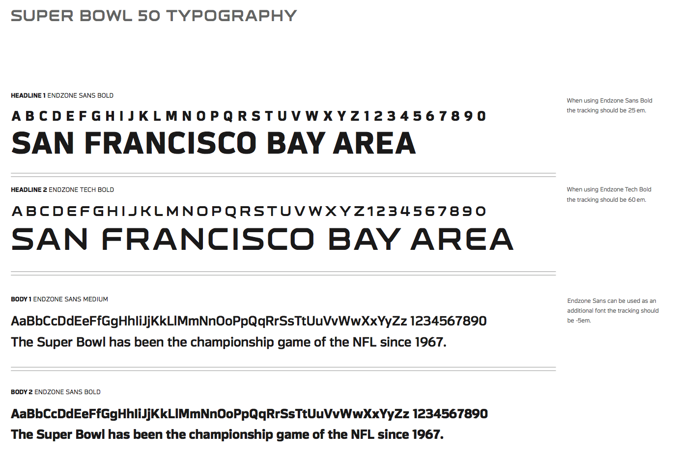
5. Typography. The game has its own typefaces, called Endzone Sans and Endzone Tech. There are also gradients and other custom type treatments:
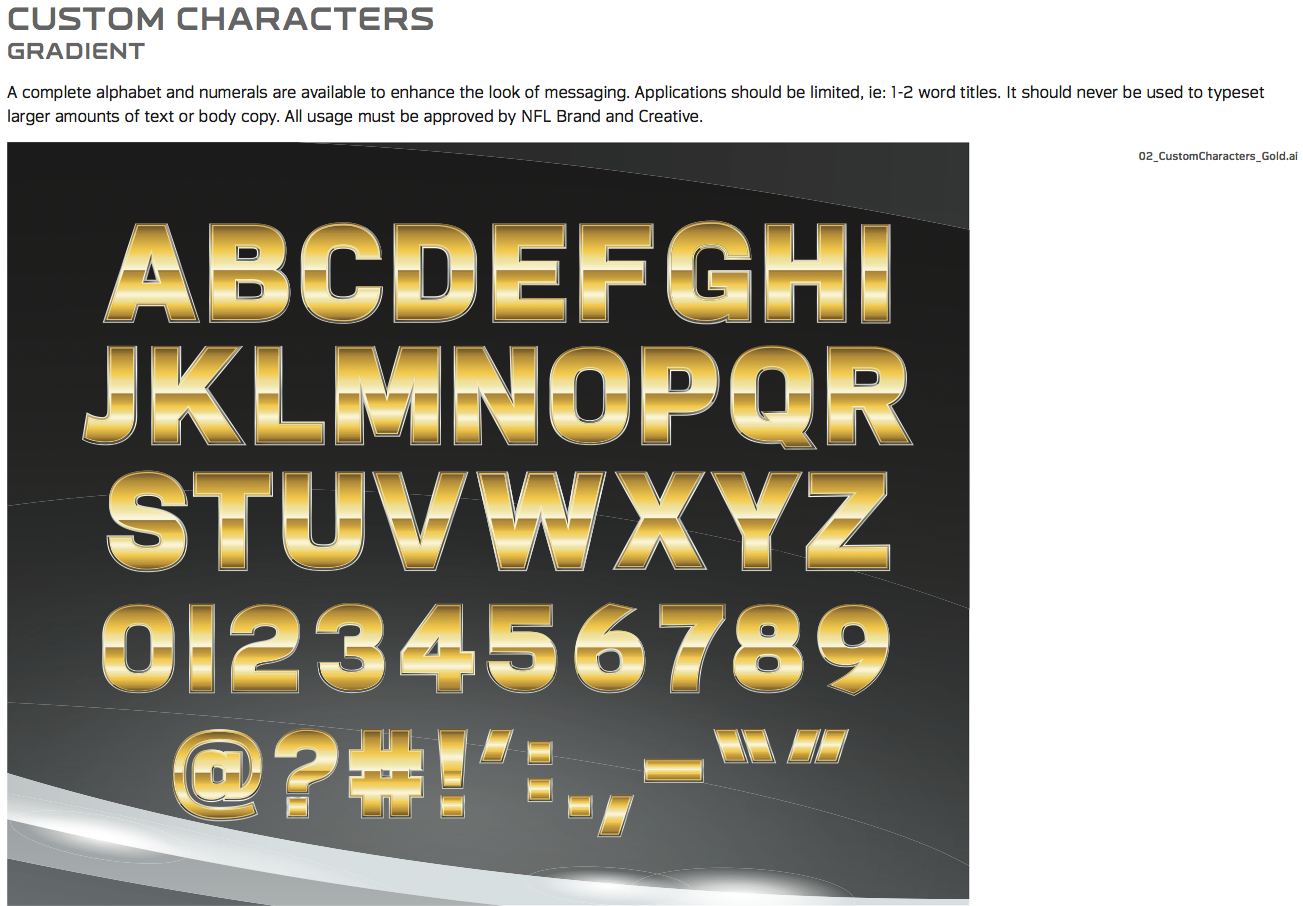
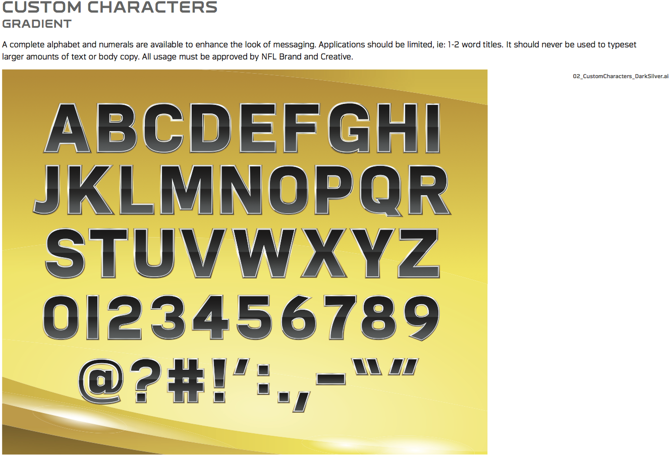
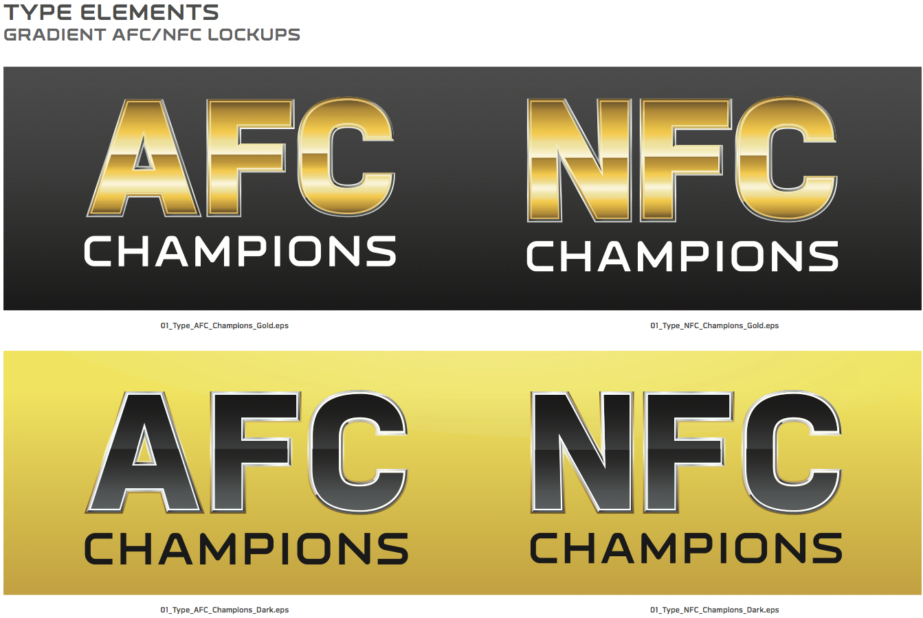
————————————
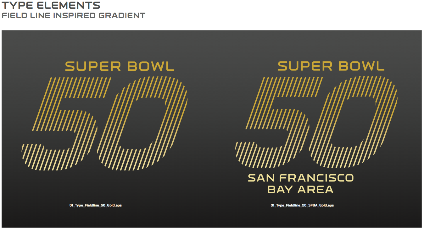
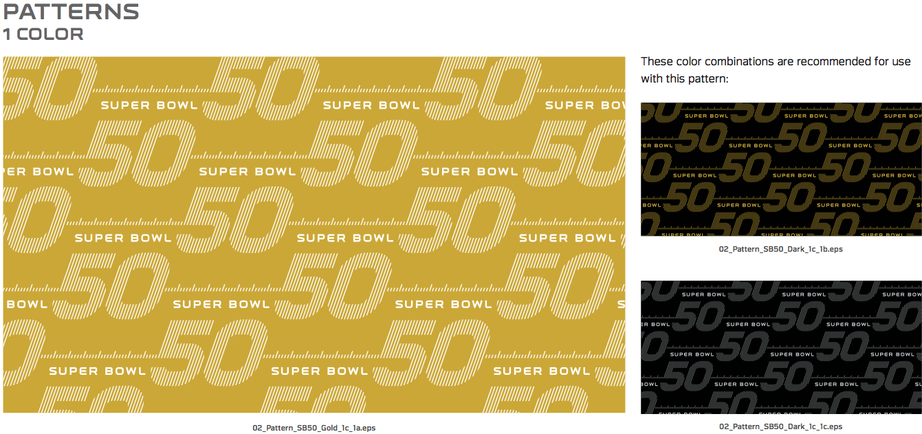
6. Line patterns. There’s a whole suite of graphics that use parallel lines (primarily to form the number 50, but also for other applications). These are called “field lines” and are presumably meant to evoke yard lines on a gridiron, but they don’t work very well — at least not for me — because the lines are too close together. There’s page after page of this stuff in the guide, but I’ll just show you a few examples:
————————————
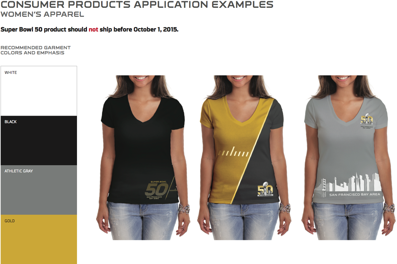
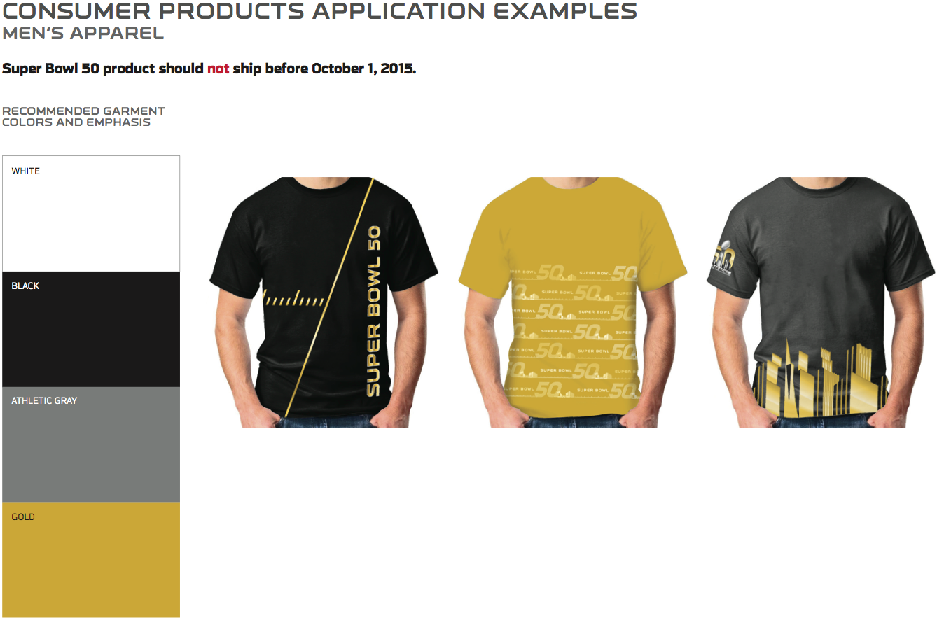
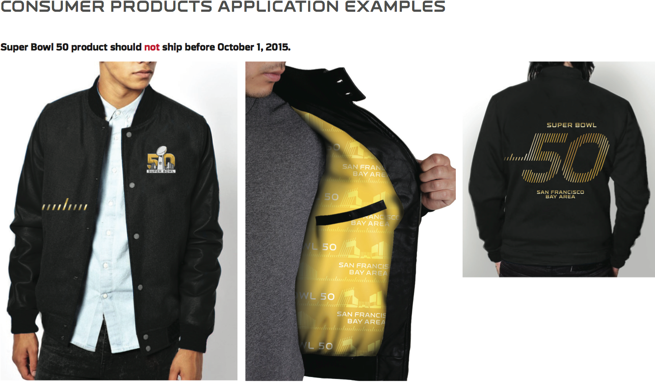
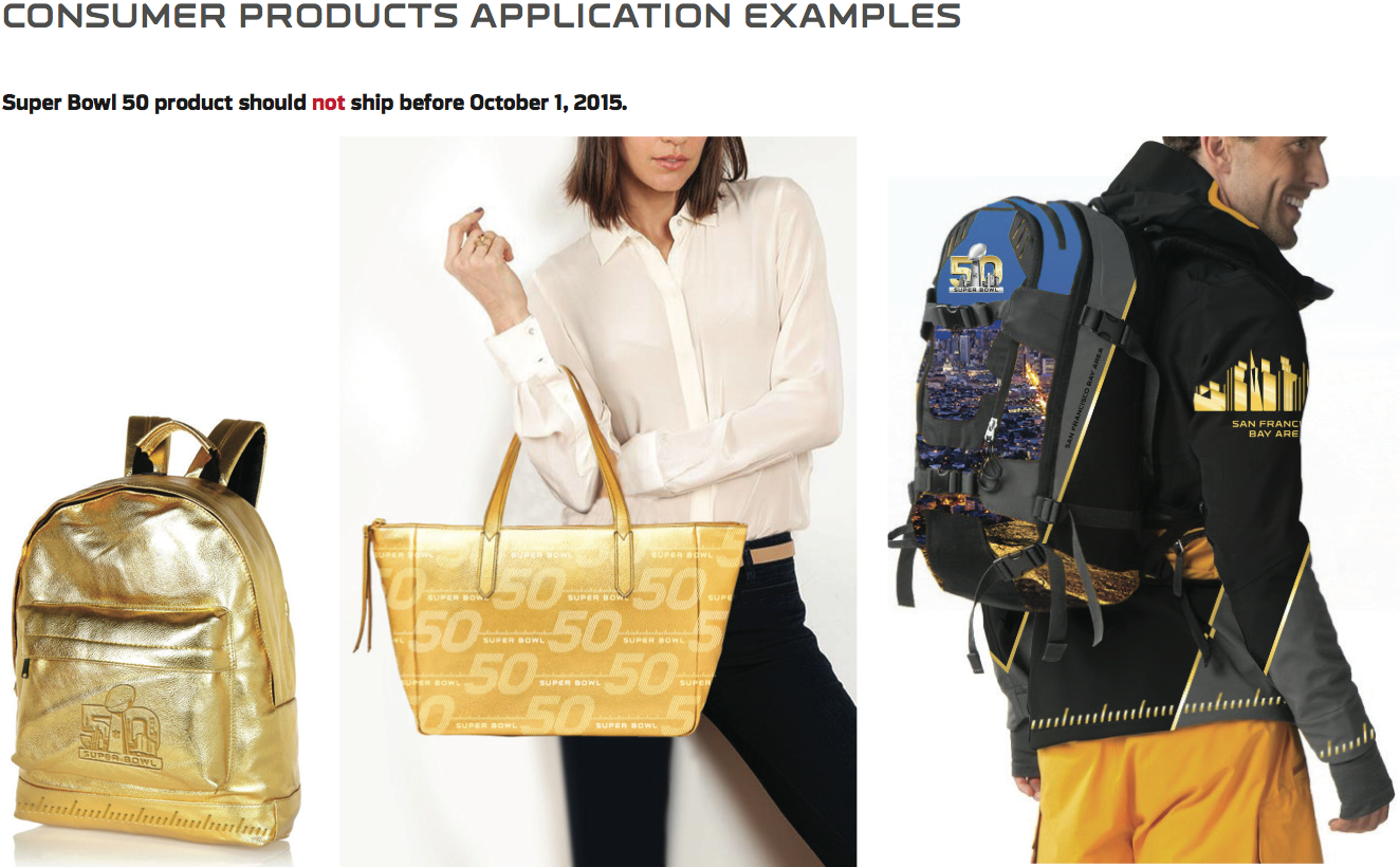
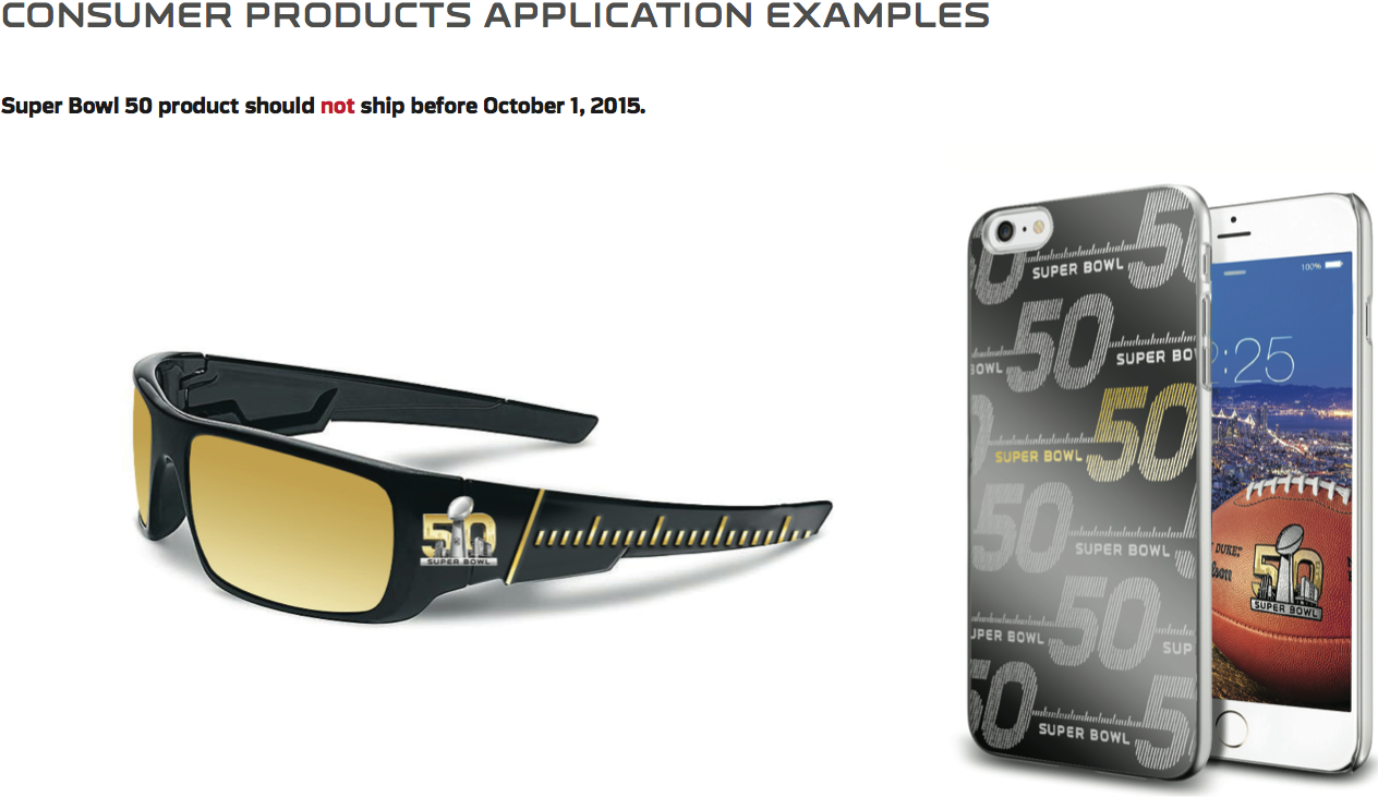
7. Merchandise applications. There are several pages’ worth of merchandise examples. It’s not clear whether these are just mock-ups to show possibilities or if they’re some of the actual products that will be sold this winter. Either way, most of them look terrible:
————————————
There’s more, but that’s plenty for today. Hope you enjoyed this sneak peek at a document most of us never get to see.
Click to enlarge
Collector’s Corner
By Brinke Guthrie
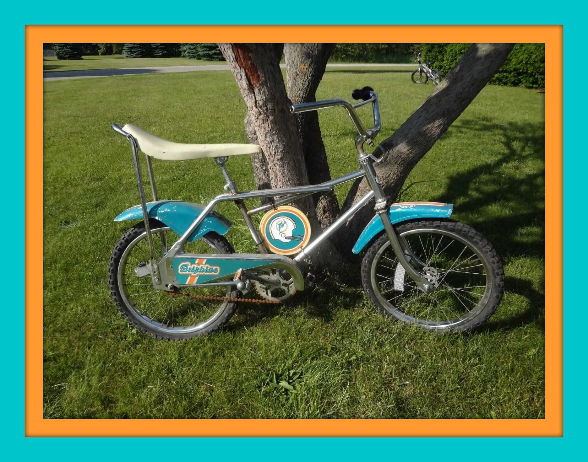
This 1970s/1980s Miami Dolphins bike from Sears needs a little TLC, but it shouldn’t be too hard to get this one back into perfect shape. Without a doubt, you’ll have the only one on the block!
Now on to the rest of this week’s picks:
• The Bird is the word with this 1970s Mark Fidrych T-shirt.
• Here we have a nice-looking Expos gear bag, with a huge “Sergaz” logo on the end. Research shows that’s a gas station chain.
• Catch the wave with this 1980s Coca-Cola promo Mets T-shirt.
• This 1970s Portland Trail Blazers basketball bank looks to be in excellent shape. The underside says WDW, the maker of all those 1970s NFL helmet banks. First basketball version I’ve ever seen.
• Staying in Rip City for a moment, check out these 1970s/1980s Champion brand Blazers shorts.
• The listing says 1960s-1970s-1980s for this Pirates bobblehead– called LOGO MAN. Sure doesn’t resemble Roberto Clemente, though.
This 1967 NFL Western Conference Autograph Book (Colts edition) originally cost all of 50 ¢. A bit pricier now. (And why were the Colts in the West?)
• Here’s a 1970s promo puck for the short-lived NHL Cleveland Barons, sponsored by WJW Radio850
• I like this 1970s/1980s NY Giants helmet patch for the obvious reason: red facemask!
• If I didn’t know better, I’d swear a local sporting goods store whipped up these Vikings T-shirts. “Kokesh Athletic” appears to be out of business, but used to operate right in the Vikes’ home base of Eden Prairie.
• Big lot of Cincinnati Bengals stickers and whatnot to be found here. The seller also has the same type assortment for the Niners.
• Interesting look to these late 1970s NFL bed sheets. None of those fonts are what the teams used in their design. A few are close, but none quite matches.
Follow Brinke on Twitter: @brinkeguthrie
Boston Beefsteak reminder: For you carnivorous folks in Beantown, the Brooklyn Beefsteak is coming to Boston this Saturday, June 20, with two seatings ”” 1pm and 5pm ”” at the Cambridge Masonic Hall in Porter Square. Further info and tickets are available here.
The Ticker
By Mike Chamernik

Baseball News: A few readers sent this in: Several players in addition to Juan Lagares (as chronicled yesterday) wear wristbands with their cartoon likeness on them. … Some minor league team out there is wearing the MLB logo as its helmet logo. Anyone know what team that is? (From Phil). … The Staten Island Yankees will wear Game of Thrones jerseys for George R.R. Martin Night (from Phil). … “I was watching the broadcast yesterday of the rain delay of the Cardinals and Royals when Ricky Horton brought up a trade that sent Pat Perry from the Cardinals to the Reds in exchange for Scott Terry,” says Brian Zilm of the 1987 swap. “The interesting part is that, one, the Cardinals assigned Terry the same number as Perry (No. 37) and two, they had him wear the same game-worn jersey as Perry but just replaced the “P” with a “T”. The two were the same size.” … The Rockies are holding a University of Nebraska Night, which includes giving away Rockies hats in Cornhusker colors (from Scott Sertich). … Vanderbilt changed unis for the continuation of its suspended College World Series game. … “During the Mets-Blue Jays game, in the top of the third inning, Keith Hernandez criticized Josh Donaldson for wearing blue and green cleats,” says Steven Horn. “He said that players should only wear equipment that matches team colors. He said Donaldson looked like ‘a member of the Wolverines and not the Blue Jays.’ Keith is definitely a Uni Watcher.” … If you watch MLB TV, then you’ve seen the 5-Hour Energy ads with Marlins’ logo-free Jose Fernandez. … Phillies C Carlos Ruiz normally wears a backwards helmet while catching, but he apparently had the bill facing forward on Sunday (from Jason Levine). … A hit-by-pitch in the Virginia-Florida game last night caused the Virginia catcher’s cheat sheet to fly out of his wristband (from John Furstenthal). ”¦ Batman-themed jerseys upcoming on June 27 for the Indianapolis Indians (from Mark Grainda). ”¦ A popular T-shirt at the College World Series features a 1970s-style White Sox motif. ”¦ White Sox C Tyler Flowers’s jersey and pants were two different shades of grey last night (from @bs_brewer).


NFL and College Football News: Here’s a 360-degree view of the Patriots’ Super Bowl ring (from Kary Klismet). … Also, here’s a history of Super Bowl rings (from Brinke). … A couple of people snuck around the nearly-demolished Candlestick Park. … Patriots RB Brandon Bolden has an odd-looking facemask (from Tyler Mason). … Rams LB James Laurinaitis had a different helmet on in practice. “Looks like a Riddell but the impact plate is unique and helmet clips aren’t oversized like usual Riddell helmets,” says Rocky De La Rosa. “New Schutt? Different brand getting in on impact plates?” … Here’s a rundown of the players who have worn No. 90 for the Cardinals (from Phil). … U.S. Bank will have the naming rights for the Vikings’ new stadium (from Braden Claassen). … And, the lettering for the Vikings’ new stadium has been made (from Mike Menner). … Calvin Johnson (and the rest of the Lions, presumably) took their video headshots while wearing a numberless jersey (from Dave Doop). ”¦ Here’s a Madden screen shot showing the gold-themed field elements for the coming season. ”¦ Here’s an article on Syracuse’s pre-Nike football uniforms.

Hockey News: Here are six jerseys that will be may be discontinued next season (from Moe Khan). … B. David Zarley wrote a nice piece for Vice on where those giant Blackhawks hockey helmets and jerseys in Chicago come from. … Here’s an article on the gear that Stanley Cup winners receive (from Mike in Toronto). … The Stanley Cup went through airport security on its trip from Toronto to Chicago. … Here’s what the NHL Draft caps look like (from Jerry Lawless). … Yesterday we found a Caps player with an odd helmet and mask. The helmet wearer is someone in the background of a 1970s hockey card of Ace Bailey, No. 9 in the foreground. Dave Holland, though, found a photo of Bailey himself wearing the helmet and mask. ”¦ We’ve seen bat knob decals in baseball. Is hockey now getting into stick knob decals? (From Chris Fraterrigo and Kevin Murphy.)

Soccer News: ESPN used a University of Georgia logo in place of the flag of Georgia, the Eurasian country (from Ben Fortney). … Real Madrid’s new shade of gray, called Silver Glory, has been revealed, as has their new typeface (from Phil). … Also, Real Madrid creatively showed their new white kit in a photo collage on Instagram (from Griffin Smith).

NBA News: Here’s a look at what the Hawks new wordmarks might look like (from Phil). … The Hornets will unveil an alternate uniform on June 25. … Phil’s latest Sporting News article looks at 10 teams that need a Nike makeover. … In 1959, a benefit game was held in Monticello, N.Y. for Maurice Stokes, the Cincinnati Royals player who suffered a severe brain injury during a game. A clip of the game exists online, and it appears the backboards have something written on them. Can anyone tell what it is? Graham Clayton thinks it could be a team nickname; my guess is a local department store. … Last week we linked to a post about 1970s NFL-themed after-shave decanters. Now the same website has done a feature on the NBA versions of that same product line.

Grab Bag: Rory McIlroy and Tiger Woods have their outfits picked out for the U.S. Open (from Phil). … Under Armour is making its move in the golf world (from Phil). … A couple of notes from the NHRA events this weekend, from David Firestone: First, an ESPN or NHRA monitor had a Raiders logo on it, and second, since the event took place in New England, the Colonial Color Guard dressed in vintage attire for the Army’s 240th birthday. … GOP staffers who attended a Hillary Clinton speech in New York were forced to turn their “Stop Hillary” shirts inside-out (from Brinke). ”¦ A cricket player in India has been fined for having too many logos on his bat. ”¦ Spotify has tweaked the shade of green on its iOS logo, much to the consternation of many Twitterers. ”¦ Motorola is marking the 60th anniversary of its logo with a logo design contest.
I don’t understand why putting the logo on top of a player’s body is an issue. Not sure why you’d even do that if it’s a picture of just one player, but if it’s an action shot with 3 or 4 players in focus… so what if one of them is partially covered? Nice of them to use a Raiders player for the example though, since there’s pretty much no chance of them actually making it to the game.
Did they white-wash Mcfadden’s helmet??
They might have… but I’ve seen a few shots of the Raiders’ road uniforms where the silver looks rather white-ish without editing. If it’s a photoshop, it was really easy to do. I kinda wish they’d darken the silver a bit to provide more contrast, but I don’t want to see them lose the shiny metallic aspect either.
Because with so much gray in the logo, its going to look cluttered if over a player?
There example does look terrible.
Lee
“Their”.
Jeez.
Lee
Boston Beefsteak – Sounds great! Open bar – in Massachusetts? Can’t remember the last time I’ve seen that!
whats weird hear for me with this style guide, is thats it not the style guide we received at my firm for use this season.
although all the information shown hear appears in the style guide we use. it seems odd that they have two style guides ( at least ) to convey the same information.
RE: Pirates bobble head….
There was a series of those made in 2007 (so this oneisn’t “vintage” in my book) and given out at the ballpark. Here are some other Pirates bobbles from that series…
link
Re: Maurice Stokes benefit b-ball game, you’re both incorrect. It’s Kutshers, a Catskills resort about an hour away from Monticello, NY, where that game was played:
link
Article on its 2013 demise:
link
No way Kutshers was an hour from Monticello – more like 20 minutes maximum. Almost all the old Catskill resorts were fairly close together.
I went to Kutsher’s Camp Anawana in the 80s. Not only did we get to go to the Stokes Game, we got to meet some of the players in the game. Another interesting thing to note, the Court that the game was played on (in 1981,82 time frame, was an old Parque floor from the Boston Garden. The three point line was taped on the floor. I cant remember if the game was played at the resort or at the sister Camp- Kutsher’s Sports Academy.
Did all the Lions slip on the same jersey for their photo shoot, or did they each have their own?
(Just thinking back to my old senior picture photo day when all the guys had to wear the same tux shirt, tie and jacket!! LOL! You youngster have no idea what I’m talking about!)
The jersey number on the Caps player wearing (what appears to be) a lacrosse helmet looks more like 19 to me. Isn’t that a “1” peeking out from the edge of his left sleeve?
Paul:
Kutsher’s is the name of the hotel the Maurice Stokes benefit game was played at.
link
See included picture from the game.
Paul
Paul O. Dillon
Attorney at Law
284 Main Street, Suite 1
P. O. Box 346
Corinth, Maine 04427-0346
V (207) 285-7100
F (207) 285-7419
link
Micah 6:8
speaking of creeping corporate branding…
Not sure if spambot or real person…
(insert fry-meme.jpg here)
Re. the Maurice Stokes benefit game: the backboard has Kutscher’s. Kutscher’s was a hotel in the Catskills that was a hotbed for basketball. Wilt Chamberlain worked there as the world’s tallest bellhop. link
Looking at the 49ers stuff on Collectors Corner, a game piece showed the 49ers franchise cost as $50 million. It’s probably 20 times that value now.
link
Here is the link to the picture I had sent to Paul. IF it does not come up Google Maurice Stokes benefit game Kutsher’s images and you can see several pictures
The helmet on James Laurenitis is a new Rawlings model
In addition to the Caps player wearing 19, Bailey was a left handed shooter
That was supposed to be in reply to Ed Hughes above. Anyway the player is possibly defenseman Jack Lynch.
As for the numberless head shots of the Lions players, I’m pretty sure all the teams in the NFL do that, not sure why. The Patriots have been doing it for years and still are this season.
link
And his stick has the last name “Lynch.”
If you look up the Capitals history, you can see that there was a Jack Lynch who played for the Caps in ’75 and wore #19.
link
I think we may have solved the mystery.
Oops. Meant to reply to the comment directly above this one.
I think we did, and at the same time!
Cool Base jerseys, especially when wet with sweat and worn over a black t-shirt, can look darker than their pants.
What I find interesting about Spotify changing its shade of green is that Kickstarter a few months back also changed their shade of green. Both companies’ old and new shades are really similar.
Kickstarter colors (new on left, old on right): link
IMO in both cases the old green was better.
Kickstarter: Downgrade. Spotify: Upgrade.
Spotify’s logo color matters to literally nobody ever. If anyone is freaking out about it on Twitter, it’s a sign that Spotify’s actual service of providing streaming music sucks, since anyone who was actually listening to and enjoying streaming music would not be freaking out about app icon colors. But for Kickstarter, the logo color is tied to numerous products launched on the site, where “Kickstarter green” is a frequent limited-edition color choice for early backers. The vivid loudness of the original Kickstarter logo color was a feature, not a bug, and one tied to the identity not only of the site itself but to the identity of numerous successful third-party applications.
Just more proof that twitter gets outraged over EVERYTHING, and thus shouldn’t be taken seriously.
#MyOutrageMatters
I didn’t see any pictures of Santa Clara in that guide.
i noticed that as well. a WHOLE LOT of san francisco propaganda for a game that is not in any way in san francisco.
i am (or perhaps soon, WAS) a lifetime niners fan, but if they can’t even own the fact that they are not in SF anymore then that’s one more penalty against them in my book. i understand that not all teams are exactly in the heart of the city they claim to be from, and nobody wants to hear about the santa clara 49ers, and calling them the san jose 49ers would be almost as duplicitous, and most football fans wouldn’t respect a team called the silicon valley 49ers (perhaps it would be more apropos to the times to change the name to the “silicon valley millennials”. it represents the current destination for the current wave of money grubbing get-rich-quick transplants to the bay area, just like the “san francisco 49ers” did for the gold rush era).
hey, no one will be romanced into attending the super bowl with a bunch of photos of generic industrial complexes, sprawling parking lots, hills upon hills of dead grass and electrical towers, dangerous and overly-complicated freeway junctions, and strip malls with an applebee’s next to a TGIFridays next to a dave n’ busters next to a red robin, but that’s what the 49ers call home now. if that isn’t good enough then maybe they should have thought a little harder before they ran for the money.
Super Bowl 50: get in the car now, because it’s going to be a traffic nightmare.
Dave,
I plan on stocking up on canned goods and barricading the doors like it was the apocalypse those two weeks.
Here are six jerseys that will be may be discontinued next season (from Moe Khan).
It’s just a site trying to sell off old stock. Most of those jerseys were discontinued prior to last season or before. The only ones shown that are actually being dropped this offseason are the ones for the Coyotes and Sabres.
Oh, yeah, and Colorado – I forgot they’re retiring the “blueberry” jersey.
The reason the Colts were in the NFL West was because they were originally the Dallas Texans, who went holsters-up. The Colts that had played in Baltimore before that were the old AAFC team which had also collapsed.
I did not know that. Interesting. Thanks.
Maybe it’s just me (it probably is), but at first glance, the number at the top of the SB logo looked like “510.”
Those 2-color screen and embroidery logos are fantastic. If the NFL were still doing event-specific, interesting Super Bowl logos, those two renderings are exactly what I’d have wanted to see. The 3-D version, presumably mainly for video applications, is a nice realization of the flatter 2-color and embroidery versions. But man, the regular highly gradated version remains a hot mess of ugliness that feels to me like it will become very dated, very quickly.
After what, six years, the new Super Bowl “identity system” has more or less accidentally produced a good Super Bowl logo. It’s just a shame that we’ll only ever see the good versions on the cheapest merchandise and golf shirts.
Luckily the Sabres have officially announced those gold jerseys were retired about a month ago….FYI
The NFL has been using Endzone Sans and Endzone Tech for a few years now, so they’re not specific to Super Bowl 50 (although Endzone Tech has been called Orbit in previous years).
Here’s a link to an NFL style guide that’s been in circulation for a few years, which contains more weights of the league fonts: link
A cricket player in India has been fined for having too many logos on his bat.
I was just watching some Indian Premier League cricket highlights last night on Youtube and noticed both teams had a player wearing a number in the 200s. I’m new to the IPL, so is this a regular thing?
On the Ace Bailey card, the “odd” helmet in question is a lacrosse helmet. It looks like an old Bachracks helmet: link
Since many Canadian hockey players played lacrosse in the summer, perhaps Bailey used his own helmet. I remember seeing then-Sabres winger Rick Dudley on “To Tell the Truth” as a lacrosse player. As young Sabres fan, I was confused as to why he wasn’t there representing Buffalo.
Kokesh Athletic was indeed a local sporting goods store, as well as a supplier to the Vikings. I wouldn’t be surprised if that shirt was team issued.
I notice none of the SB50 San Francisco shots include Alcatraz.
Is that on purpose? Hmmmm……?
Pretty sure that the Penguins jersey, that is supposed to retiring isn’t a real jersey. The rest look like alt jerseys.
What do you mean, “not real?” The other jerseys are “regular” in the rotation, i.e.: home, road, or alternate, but only that Penguins jersey is a one-off (in this case, visiting Soldier Field in Chicago in the Stadium Series).
The Pens wore that monstrosity in the 2014 Stadium Series.
The rest are all alts except the Coyotes, and they’re supposed to get a uni update this season.
It looks like that SB50 Golden Gate bridge panorama photo was taken FROM Alcatraz Island.
In the Super Bowl 3D logo page, the print on the side says not to show the logo from the rear because the “roman numerals” will appear backwards. Two issues here – 1, Roman should be capitalized. And 2, THEY ARE NOT ROMAN NUMERALS. It’s supposed to be a big deal is that they are using Arabic numerals this year.
I’ve never heard anything about the
PhoenixArizona Coyotes getting new jerseys. Is it possible that that website is trying to unload old stock of the jerseys with the wrong shoulder patch (PHX instead of AZ) stuck on them?OK, wow, how did I miss this? link updated last June 5, quotes link saying new unis coming on the 26th. Icethetics says the main logo is staying, but there will be a new look. Once again, I have no idea how I missed that.
Screen Pritning? is that an actual thing or an awesome typo?
Someone didn’t read my text very closely.
Hugh Hefner feels your pain. ;-)
Where are all the pictures of beautiful & scenic Santa Clara, the actual home of the Santa Clara 49ers?!?!
Lee
RE: The Rockies Nebraska night. Ugh, but to be fair, they are doing this for other local schools too.
link
link
Looks like there are a total of four: link
At least the other schools are from the state or the Rocky Mountain region (Wyoming). The Nebraska one just feels like… pandering.
Totally agree, and those red hats are absolutely terrible. There are tons of Nebraska alums that live in the Denver area, and they will pony up all sorts of money for crap like that, though.
I have tickets for that game already, and they are near the seats that are sold for this promotion. Not looking forward to dealing with that lot.
“There are tons of Nebraska alums that live in the Denver area, and they will pony up all sorts of money for crap like that, though.”
True story: Estes Park, Colorado, home of Rocky Mountain National Park, has a link. Until recently, link. Because what better souvenir can a Nebraskan bring back from the beautiful Rocky Mountains other than one more Big Red t-shirt to add to the collection?
Another true story: The Denver chapter of Nebraska’s alumni assocation is known as “link.” It would be more accurate to call it “Nebraska Transplants for Nebraska.”
True story: a couple of linemen from my daughter’s HS football team went on a recruiting visit to Nebraska, and on the flight home to DC they struck up a conversation with the middle-aged man wedged into the seat next to them in coach. Ends up the guy was a huge Nebraska football fan who knew all about them as potential Cornhusker recruits, even. They wound up inviting him to speak at their HS commencement, and even though the guy has a nationwide reputation stretching back several decades for never ever missing work, he actually took the day off to do so, for which he garnered a surprising amount of national media attention:
link
I guess I wouldn’t begrudge Justice Thomas a Big Red t-shirt if he was visiting Estes Park.
Totally off any topic of today but my BFBS Uni-Watch t-shirt came while I was on business travel. I get home and my wife had it on before I even got to wear it. First question she had was what does “BFBS” mean. I told her “Black For Black’s Sake” of course. She said she though it meant “Big Fucking Black Shirt”. Yes, I laughed. She is not a uni-watcher so she obviously doesn’t get it.
She said she thought it meant “Big Fucking Black Shirt”.
That is truly hilarious! Thanks for sharing.
“The Rockies are holding a University of Nebraska Night, which includes giving away Rockies hats in Cornhusker colors.”
Talk about a minor league move on the Rockies’ part! The hat giveaway is bad enough, but the promotional webpage also admonishes, “Don’t forget to wear your best Husker gear to the game…” That will make for a really great look in the stands that day, when the Rockies play the Atlanta Braves (a team who, as I’m sure we all know, wears red as one of its primary colors).
Nothing on the MLB logo batting helmet? I’d have guessed Iowa Cubs, but their current road uni doesn’t work, and anyway I’m pretty sure they now have a patch on the left sleeve at home and away. The Arizona Fall League Cubs just wear Cubs unis, so it should read Chicago across the chest. Is there any chance the photo is some sort of baseball academy with MLB sponsorship, either here or, say, in the Dominican?
Do Minor Leaguers use double flap helmets? Is this guy an anomaly?
wondering if that might help figure it out.
???
All minor leaguers are required to go double-flapped.
Possibly complex baseball in Arizona? Doesn’t look much like a minor league game.
A clip of the game exists online, and it appears the backboards have something written on them. Can anyone tell what it is?
Already answered earlier in the thread… however, a HUGE pop culture connection to Kutsher’s? BOOM!
Kutsher’s served as the inspiration for the 1987 movie Dirty Dancing.
Those Champion Blazers shorts would be early 90’s. Red on top of the logo, and the logo turned at an angle started in 90/91.
Those hockey butt ends are end caps. Many teams use them and they are for sale.
A clip of the game exists online, and it appears the backboards have something written on them. Can anyone tell what it is?
Already answered earlier in the thread… however, a HUGE pop culture connection to Kutsher’s? BOOM! Kutsher’s served as the inspiration for the 1987 movie Dirty Dancing!!!
NOBODY PUTS BABY IN THE CORNER!!!
link
That second picture is not Ace Bailey wearing the helmet….he is wearing 19
The Niners have no right to trade on SF iconography now that they’ve fully decamped an hour south and abandoned SF. They’re San Jose’s now. Why don’t they do a beautiful vista panorama of the Apple HQ or beautiful Norm Mineta International instead?
Speaking as a New Yorker who roots for a team that plays in New Jersey while wearing “ny” on its helmet, I’d say you have to get in line.