[Editor’s Note: With the Stanley Cup Finals set to begin tomorrow, Mike Chamernik is back with the final installment of his pro team fight song round-ups ”” the NHL edition. Enjoy. ”” PL]
By Mike Chamernik
Anaheim Ducks – “Rock the Pond“
Written by rock vocalist John Bisaha, “Rock the Pond” was was played before Mighty Ducks of Anaheim home game at Arrowhead Pond, starting in the team’s inaugural season.
Fun fact: “‘Rock the Pond’ was accompanied with an early ’90s CGI animation of the Ducks logo and mascot flying over a map of the United States destroying all the other NHL logos before landing at the Arrowhead Pond of Anaheim,” explains Charles Eldridge. “The song was later used over the end credits of the Disney movie “D2: The Mighty Ducks” in March of 1994 where they changed the lyrics from “The Mighty Ducks of Anaheim” to “The Mighty Ducks of America” to better fit the storyline of the film.”
Buffalo Sabres – “Sabre Dance“
Of all the songs I’ve unearthed, “Sabre Dance” is the one I’m most confident that you’ve heard before. It was made by Soviet composer Aram Khachaturian for his ballet Gayane in 1942. Fittingly, the Sabres have used it as the team’s official song since its inception in 1970.
Fun fact: The song was a hit in jukeboxes in the 1940s, has appeared in dozens of films, movies and commercials and is even popular music for figure skaters. It’s perhaps the catchiest tune of the 20th century.
Calgary Flames – “Red Hot“
Made after the 1987 season, several Flames players, including Lanny McDonald, Brett Hull and Al MacInnis, made cameos in the video for “Red Hot.” They pretended playing instruments and they lip-synced the pseudo-motivational lyrics like “You can hear the voices calling/ If the time is right for you/ You can give the second effort/ You can do what you wanna do!”
Fun fact: According to Wikipedia, the song was released on VHS in the late 1980s then largely forgotten about until 2005, when it appeared on the internet. Isn’t that just the worst? It was released long ago to a limited audience in Calgary, people found it silly and embarrassing, it went away… and now it’s doubly funnier than it was in the first place, and people all over the world have seen it.
Carolina Hurricanes – “Hurricane Warning”
Unlike the jingles, discos, marching band anthems and quickie rap songs of days past, Airiel Down’s “Hurricane Warning” is a real song with a real music video. The band is an indie rock group from Raleigh, North Carolina, and the song is played at every Hurricanes home game.
Fun fact: Parts of the music video were filmed at the Hurricanes’ PNC Arena.
Chicago Blackhawks – “Here Come The Hawks”
Written by J. Swayzee and produced by the Dick Marx Orchestra and Choir in 1968, “Here Come The Hawks” is yet another classic fight jingle, with lyrics like “Here they come movin’, weavin’, flyin’ high and throwin’ spray / Blades flashin’ sticks crashin’ tryin’ for the play.”
Fun fact: The original song sounds great, but it’s just as good when played on the organ or rendered in a video game.
Colorado Avalanche – “Avalanche“
“Avalanche” was created in 1997 by an indie rock band named the Zambonis. The group, as you may have guessed, primarily makes songs about hockey. The Zambonis summed up the mid-1990s Nordiques-to-Avalance saga in a nutshell in the first verse. Included is the charming lyric, “Jumped in the van and headed West/ Denver, Colorado hadn’t seen hockey since ’70-something as the Colorado Rockies.”
Fun fact: According to the band’s website, the Zamboni Company gave them a cease and desist about the name before working out an agreement. Maybe I’m simple-minded, but isn’t the name just free advertising for Zamboni? It’s definitely a good part of being a genericized trademark.
Dallas Stars – “Puck Off”
It’s funny how these song genres are breaking down by sport. Baseball has folksy rock. Football has marching band music. Basketball, as you will see, has rap. Hockey has metal, and the “Puck Off,” made by Pantera, is a great example. The heavy rock song is played after every Stars goal.
Fun fact: Pantera had pretty strong ties to the Stars during the team’s 1999 title season. Some players were even late to the victory parade after spending four straight days with the band, proving that adding hockey players and rockers equals a good time.
Detroit Red Wings – “Hockeytown“
The song, sung by Rainbow’s Joe Lynn Turner, was released on a Red Wings playoff CD in 1997. According to a poster on this message board, fans were able to get the CD at Little Caesar’s, which would make sense because Mike Ilitch owns both enterprises.
Fun fact: “Hockeytown” is played after goals at the Joe Louis Arena.
Hartford Whalers – “Brass Bonanza”
This is a really strong instrumental song on its own but it’s kicked up a level considering how synonymous it is with the Whalers and what it means to the fans of the now bygone team.
Fun fact: Aspiring musician Jack Say wrote the song in the mid-1970s and sold it to a record library before moving to Austria. The Whalers found the song by happenstance, and it became a hit. What became of Say? A Hartford reporter got in touch with him in 2010.
Los Angeles Kings – “We Are Los Angeles”
The LA band Goon Squad made this anthem in 2013. The song’s sound is not an accident, as it was inspired by European soccer fans’ chants and songs.
Notable lyric: “We fight!/ Fight fight fight!/ Majestic and strong/ We’ll never go down/ We’ll die with our blood on the ice!” I certainly hope it doesn’t come down to that. Come on guys, it’s just a game.
Minnesota Wild – “Minnesota Wild Anthem”
The anthem was created for the team before its inaugural 2000-01 season.
Notable lyric: Hearing lyrics like “A big blue line runs around our state/ A line that can’t be crossed/ The day they try to take this game/ Is the day the gloves come off” and considering how important hockey is to Minnesota, it’s confusing to me why the North Stars even left in the first place.
Montreal Canadiens – “MTL Stand Up“
I’m not the biggest hockey guy (I once called the crease the “goalie box” a few years ago) but I do know that the Habs are the most accomplished hockey franchise. So, it’s weird for me to associate a rap song with them. “MTL Stand Up” was made by Montreal musician Annakin Slayd before the 2011 playoffs. Dude seems to be Montreal through and through.
Notable lyric: Towards the end, Slayd says “This one’s for the greatest fans in hockey/ Just wanted to remind the haters/ ’77, ’78, ’79, ’02, ’04, ’08/ Those numbers mean anything to you Boston?” Not only did the Bruins defeat the Habs 4-3 in the first round that year, they went on to win the Stanley Cup.
New Jersey Devils – “Devils Rule“
I really debated with myself whether this lyric-light, 30 second track should make the team song cut, but I went rogue and included it. The shot of Devils fans cheering in front of a gray background reminded me of Kramers’ auditions in Seinfeld.
Fun fact: “Devils Rule” is played after goals and was made by local Jersey musician Rich Andruska before this season. A Devils’ blog took an in-depth look at the song and why it works.
New York Rangers – “Rangers Victory Song“
“Rangers Victory Song” goes all the way back to 1940, right after the Rangers won the Cup. The tune definitely sounds like it’s from the 1940s, because it sounds like a militaristic marching song. The song was also sung by national anthem singer John Amirante in 1992.
Notable lyric: “Just keep your stick on that puck/ And don’t lay down on your luck/ That’s the Rangers’ Victory Song!” I like that the lyrics even references the fact that it’s a song. Very meta.
St. Louis Blues – “St. Louis Blues“
Instead of a song based on a team, the Blues were essentially named after a song. W.C. Handy, known as the Father of Blues, composed the song in 1914, and the hockey team plays Glenn Miller’s version on the organ before games.
Fun fact: In addition to Handy and Miller, Louis Armstrong, the Dave Brubeck Quartet, Bessie Smith, Duke Ellington and Bing Crosby, Bennie Goodman, Ella Fitzgerald and Chuck Berry have also performed the song.
Toronto Maple Leafs – “Free To Be (Go Leafs Go)”
Alan Frew, the lead singer of the Ontario rock band Glass Tiger, made this song in the late 2000s. Frew sings about his home nation in the song, but the last verse is “Where the memories go on and on and on/ Oh! Oh! Oh! This is Canada’s song (Go Leafs Go)/ Oh! Oh! Oh! Where my heart belongs (Go Leafs Go).” Canada and the Maple Leafs are synonymous in some circles.
Fun fact: A few years ago the Leafs went on a losing streak when the song was played before home games. Those poor Leafs, they can never catch a break.
More on Dior: Paul here. As I’m sure most of you know by now, news began circulating on Friday night that MLB logo designer Jerry Dior had passed away. As soon as I heard, I whipped up a little testimonial that became our lede entry for Saturday.
But I wrote that piece in a hurry, fairly late at night, at the end of a long day. In the several days since then, I’ve had more time to think about Jerry and his legacy, and I’ve also been interviewed by several other media outlets that have been covering his` passing. (If you’re curious, I’m quoted in this Washington Post obituary and this segment from yesterday’s edition of NPR’s All Things Considered.) I’ve also had the opportunity to speak with Jerry’s widow, Lita Dior, and express my condolences to her. In the course of those interviews and discussions, I realized that I omitted a really important point in Saturday’s entry.
And it’s this: While I’m glad Jerry was finally recognized as the MLB logo’s designer while he was still alive to enjoy that recognition, it’s insane that he had to wait four decades for that to happen, and that the logo was unattributed for all of that time. If we care about design as much as we say we do, we need to start pushing for designers to be credited by name and stop having their work attributed their work to institutions (“Nike designed this uniform” or “The Hawks came out with a new logo”). There are human beings behind every single design we see around the uni-verse, and we should know who those people are — not just because that would be the right thing to do, but also because we’d get to learn more about how the designs were created.
Remember my recent ESPN feature about the guys who redesigned the Milwaukee Bucks? We need more situations like that, where the designers are clearly identified and allowed to discuss their creative process. If Jerry’s death brings renewed attention to his quest for long-overdue recognition for his work, and if that helps other designers gain more recognition for theirs, that would be a nice addition to his already robust legacy.
Even worse than we thought: A few weeks ago I broke the story of this year’s MLB Independence Day caps, which look more like trucker hats. Unfortunately, the Dodgers design shown at the top of that entry was the only example we had — until now. Reader Kyle Arnott spotted the Indians’ version at a Lids shop in Ohio, and it’s brutal:
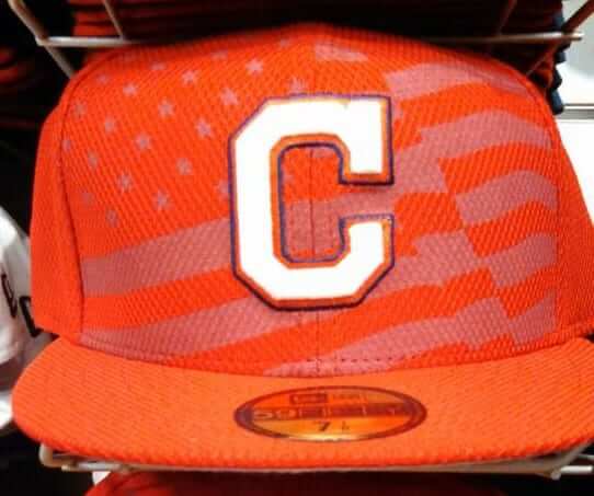
I have nothing to add here — this thing pretty well speaks for itself.
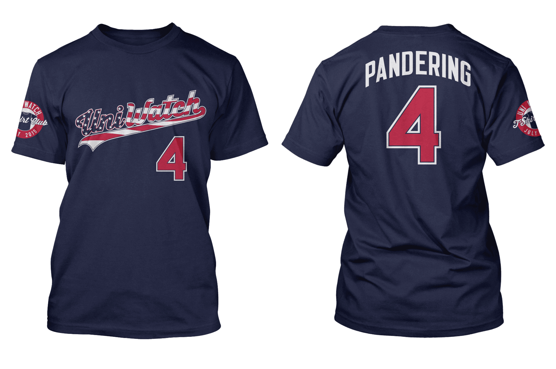
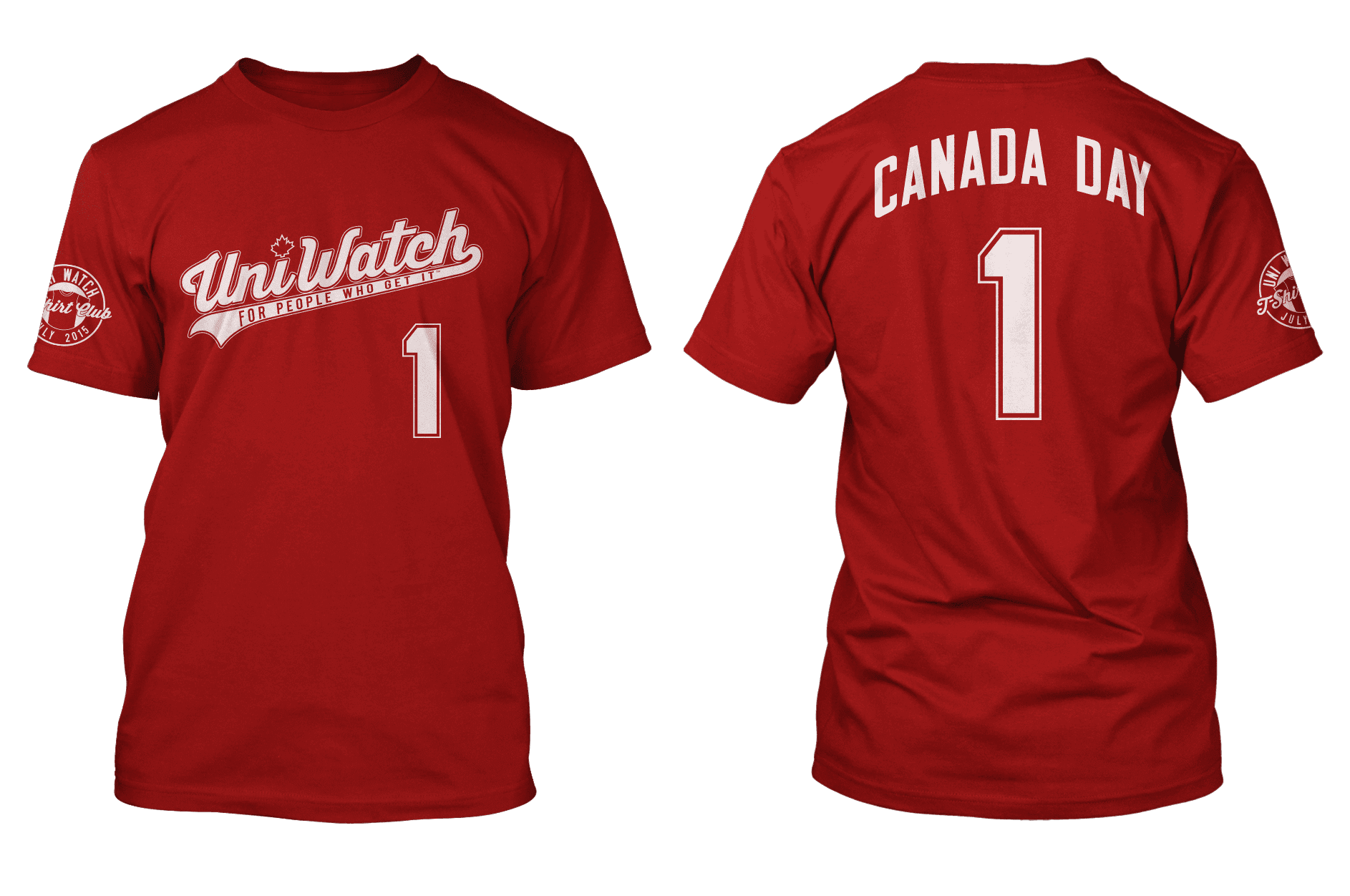
July T-Shirt Club designs NOW AVAILABLE: We’re doing an early launch the Uni Watch T-Shirt Club’s July designs, because the shirts are tied to a pair of early-July holidays and we want to make sure they ship and deliver on time.
I previewed the two shirts here on the site last week, but here they are again — one for Independence Day and one for Canada Day (click to enlarge):
Notes:
• Here are the links to order the Independence Day and Canada Day shirts.
• In case you missed it last Friday, the “Pandering” NOB is unpopular with some readers. I understand their concerns, but the design will not be changing. Instead of repeating that same debate all over again, I’ve created a FAQ-style page that addresses the most frequently expressed objections.
• If you’re doing the “Collect ’em all” thing, you only need to purchase one of these two shirts to maintain your eligibility (although you’re welcome to order both, of course). Once we finish the July campaigns, I plan to get a tally of how many “Collect ’em all”-ers we have, at which point I’ll begin making more serious plans for the year-end prize.
• Unfortunately, if you buy both shirts (or any two shirts from two separate Teespring campaigns), you do not get a discount on the shipping, because the campaigns will print and ship separately. Yes, I realize that’s ridiculous — it’s just the way Teespring works. They tell me they’re working on it, so here’s hoping they get it resolved soon, but of course that doesn’t help us for these two shirts. I’m sorry.
Collector’s Corner
By Brinke Guthrie
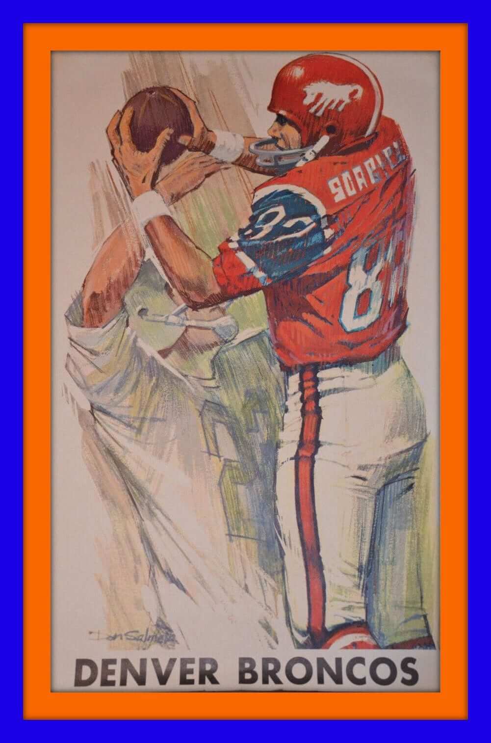
Now, how about this. We’ve got a vintage Denver Broncos poster — and it not done by Dave Boss, but by an artist named Don Salmeta! Very similar styles, wouldn’t you say?
While you’re pondering that one, here are the rest of this week’s eBay picks:
• This 1980s Winnipeg Jets “Slap Shot Hockey Stick Toothbrush” is your best shot against tooth decay! When you’re brushing, don’t get any toothpaste on your Jets cable-knit sweater!
• Check out this 1967 NFL advertising piece for Plenamins Vitamins.
• Here’s a 1950s-’60s Montreal Canadiens kids’ wool jersey/socks set.
• Here’s a rather curious NFL pennant. All it has is the NFL shield and the words, “Ask Us About…” About what?
• Look at the retro logos on this set of 1969 Riddell AFL throwback mini-helmets — including the NFL 50th-anniversary logo and the AFL 10th-anniversary logo!
• Here’s a 1980s Philadelphia Flyers sweatshirt made by Nutmeg Mills, one of my favorite brands back in the day.
• Does the design on these 1970s “NBA Athletic Shoes” look vaguely familiar?
• Back to the brown and yellow for this 1978 Padres/All-Star Game cap.
• “Dollar” is the official rental car of the NBA. Says so right on the front of this giveaway fanny pack. Looks too recent to be 1970s-ish.
• And from reader Ryan, here’s a great 1970s California Golden Seals mug!
Follow Brinke on Twitter: @brinkeguthrie
LAST CALL to make a good-looking call: Today is the final day to order the official Uni Watch smart phone case, featuring a nifty stirrup-based design created by reader Matt Beahan. Get yours here.
The Ticker
By Mike Chamernik

Baseball News: A writer came up with some theme nights for the Nationals and their affiliates (from Tommy Turner and Mike Rosenberg). … The Salem Red Sox will wear throwback Salem Avalanche unis on August 15 (from Alex). … I forget if we’ve seen this before or if this is a trend across college baseball, but Texas has a mismatched front jersey panel (from Andrew Edwards). … This is pretty cool: Lots of people walk Los Angeles’s Walk of Fame dressed as superheros. D-Backs pitcher Josh Collmenter walked the route wearing his uniform (from Chris Flinn). ”¦ Who’s that in the Denver Bears uni? None other than then-Vice President George H.W. Bush. “He got a single off of Milt
Pappas in an old-timers game,” says Tyler Kepner.

NFL News: Chargers linebackers wore shirts with “Backers” in the Chargers’ font at a recent event. … I dig this team logo that’s in JohnMark Fisher’s fantasy football league. … The ’Skins continue to remove seats from their stadium (from Tommy Turner). … Candlestick Park is almost completely destroyed (from Brinke). … As was in the Ticker on Sunday, quite a few teams wear shorts with stripes during OTAs (from Eric Wright).

Hockey News: The Coyotes will reveal new uniforms during a NHL Draft party on June 26. ”¦ Speaking of the Coyotes, the logo for a brand of vodka looks very similar to their logo (from Steve Seitz). ”¦ Here’s a good piece on how next year’s NHL All-Star logo was developed (from Conrad Burry).

Soccer News: The Russian soccer team Zenit St. Petersburg got regal for a team photo (from Mark Coale). … Yusuke Toyoda is coming in hot with the rest of these soccer notes: Costa Rica’s U23 team wore numberless practice jerseys against the Netherlands U21 team at the Toulon Tournament because they left their game jerseys at the hotel. … Sagan Tosu of the Japanese J.League has yellow alternates to match the alts of the Fukuoka SoftBank Hawks, a baseball team. … Wolfsburg wore next season’s uniform during the season-ending German Cup Final over the weekend.

NBA News: The Hawks’ new logos, which had been leaked, are now official. The team cleaned up the old Pac Man logo and there might be an inspiration behind the new phoenix-like secondary logo. They will unveil their new uniforms before the NBA Draft later this month. … Mitchell & Ness compiled a list of the best players by jersey number. Ron Artest (aka Metta World Peace) made the list four times! (From Austin Glover.) … When President Obama visited Nike’s headquarters last month, the company gave him a pair of yet-to-be-released Air Jordan shoes (from Tommy Turner). ”¦ John Diaz notes that beginning in the mid-1980s, the radial arching on Dennis Johnson’s NOBs with the Celtics began fanning out to absurd lengths. Anyone know why? Did other Celtics get a similar treatment during this period?

College Hoops News: Georgetown is letting fans design a new court for the Hoyas. “Predictably, Syracuse and Georgetown fans have turned it into an opportunity to troll each other,” says Kary Klismet. “It’s good to see that these two schools’ fan bases haven’t left shifting conference affiliations get in the way of their hatred of one another!” … The field turf at the Carrier Dome is being replaced, so the original basketball court and indoor track is exposed (thanks, Rick DiRubbo).

Grab Bag: The Salt Lake Tribune explored how sports surfaces, uniforms, and equipment are prepared across Utah (thanks, Brett Crane). … As Paul explored a few months ago, the Rolling Stones are customizing their logo for their North America tour. For their Columbus gig, the poster showed Cleveland’s Rock ‘N Roll Hall of Fame (from Jason Hillyer). … IHOP changed its logo because the old one looked like a frown (from Aaron McHargue). ”¦ Under Armour has filed trademark applications for a bunch of really embarrassing slogans (from Josh Claywell).
The links for ordering the shirts both have extraneous quotation marks at the end, just fyi.
Thanks. Fixed.
Oh man, that WaPo concept for P-Nats Magnum PI night: That right there is a polyester shirt I’d pay $200 to wear. Kudos to the writer and/or the WaPo art staff for finding the actual iconic pattern of Magnum’s red shirt.
You can buy the actual shirt for a lot less.
link
I have not-so-fond memories of squeaking and squawking my way through Sabre Dance in elementary school band class on my clarinet. Fortunately my brother soon got a cool black Fender Strat and that horn was doomed to the closet.
Just got back from New Orleans and saw James Evans on clarinet and it blew my mind, maybe I should have stuck with it.
I thought I watched enough hockey to have heard it played after a goal, but “Sabre Dance” reminds me of someone spinning plates on top of sticks.
Here in CT, “Brass Bonanza” is something that’s likely to pop up anywhere on any sportscast, or call-in radio show bumper.
No love for Boston Bruins “The Nutty”?
link
damn, I loved NHL 94 and 95. That (and having a canadian roommate in college) made me into a hockey fan. I played with Blackhawks, Bruins and Habs all the time. I still get odd looks from people in Louisiana when I watch games.
I remember loving the Sabre Dance when it came on as one of the random arena organ songs NHL 94 played between stoppages, but having no idea what it was. I asked my mom what that song was called and she looked at me like I was an alien and said “the Sabre Dance”, followed by a head shake. Come on Mom, so I wasn’t up on my Russian ballets as a 10 year old.
At the time, I was blown away by EA NHL for genesis having all those songs tied to the correct team. It’s sad that they don’t even bother achieving that level of authenticity today.
I prefer Red Wings, My Red Wings by Larry Santos: link. I can’t stand the whole Hockeytown moniker.
Ugh, the whole ‘Hockeytown’ marketing kind of made sense back in 1997. With the Red Wings being an incredible team to watch and the Tigers/Lions/Pistons floundering, it felt like Detroit had become a town for hockey.
That’s no longer the case as the tigers/lions are now just as relevant and popular to follow.
The Wings marketing team came out with that tacky 90s rock hockey anthem, and changed the 70th year anniversary center ice logo to the equally Tacky ‘HockeyTown’ logo.
Why are they still here? The song is dated, the center ice logo has BFBS written all over it with a “TO THE EXTREME!” 90’s font.
It’s a historic original six franchise. They need a rink atmosphere that matches their uniforms.
They need a rink atmosphere that matches their uniforms.
So… boring?
If the rink atmosphere matched the uniforms, it’d be more fun to watch on TV instead.
No, classic. Go back to the logo on each side of the center line, like the Canadiens.
Perhaps they’re waiting for the move to the new arena.
The WHA Cleveland Crusaders had a fight song, “We’re With You Crusaders”, which I liked. It came a little while after the awesome “C’mon Cavs” song in the mid-70’s. I think written by the same guys. I can’t find the Crusaders song on YouTube or anywhere else…”When you’re in the attack, we’re with you, and when you need a pat on the back, we’re with you. We’re with you Crusaders, you’re the best team around, don’t you let us down…”
Is it just me, or does the new IHoP logo (final two letters) look like a really happy person with a raging eye infection?
I saw it as a happy cry.
It’s just you.
Well, it’s not the first time and it won’t be the last!
On second thought, maybe it looks more like a monocle.
Or a nose, as someone else observed.
That’s the nose.
International House of Pancakes lost the plot when they got rid of the kangaroo.
link
Why would they get rid of the kangaroo?!?
Ed, you are not alone. While I do see it being a nose, it definitely looks more like a raging eye infection.
We Are Los Angeles was nearly universally hated by the fans. It was only used for one season (thankfully) and then thrown on the trash heap.
This was my first look at the Pandering t-shirt. I must’ve missed the reveal earlier (maybe when I was out of town or something).
Upon seeing it, yes, I am one who WOULD’VE bought it if had almost anything but Pandering on the back. But don’t worry. I’m a long-time reader and totally understand your choice to use that word.
As for Canada Day, I think it’s totally appropriate to use that there especially considering that these patriotic uniforms are essentially American concepts and holidays being foisted upon Canadian teams in the first place.
At the end of the t-shirt project, will you give us all a run-down on the sales totals of all of the t-shirts so we can see which were the most popular?
I agree 100%. I am kinda bummed that is says “Pandering” on the back, otherwise I was going to order it.
I get why it says it, but for such an interesting design, it feels like the “Pandering” name on the back is a giant boat anchor to the overall look.
for such an interesting design, it feels like the “Pandering” name on the back is a giant boat anchor to the overall look.
“Pandering” on the back is an integral aspect of the overall look.
In case you didn’t follow the link from the text:
link
I just realized I don’t know when the switch happened but when I was a kid in the 90’s I clearly remember my grandpa being upset at using the American flag in any way other than as a flag. I think your design is great and the statement is bold. The problem is that there is a large chunk of the country that has bit the marketing bait hook-line-and-sinker. I wouldn’t wear the shirt because I wouldn’t want to get into those arguments repeatedly.
I just realized I don’t know when the switch happened
Oh, yes you do. Let me give you a hint. I’m thinking of 2 numbers between 8 and 12.
I think the PANDERING NOB is perfect. I’m a very patriotic guy and I believe you are too Paul. This is why I have issue with the patriotic themed unis. Seems a way to sell more merchandise than it is to truly honor America. Want to wave the flag, then get a small or large one and wave away but don’t desecrate on a uniform and then attempt to sell those items. It has become all marketing and less about the nation and our emblem. I bought mine.
At the end of the t-shirt project, will you give us all a run-down on the sales totals of all of the t-shirts so we can see which were the most popular?
Sure, I guess. The only reason I hedge is that I don’t think sales figures are a particularly good barometer of quality (or of anything other than salability).
I’ll tell you this much: By far the biggest seller so far has been the Jackie Robinson design. But the sales of that one were probably skewed by the fact that I announced from the outset that I’d be donating my share of the proceeds to charity, which likely encouraged more purchases.
“… I don’t think sales figures are a particularly good barometer of quality…”
This.
With so many, many things…this.
I think I convinced myself to buy both the white and grey shirts for this reason. For Cinco De Mayo I just picked my one favorite.
I’ve been on the fence about the “Pandering” debate. I was not sure if MLB really was pandering. Yes, they are making a buck off of the flag and the military, but they could still believe in their message.
Then I saw these:
link
And now I think I’m off the fence, and agreeing that MLB is pandering.
(Side note: I also find it odd on that page that even though the products are listed in alphabetical order by geography, the Los Angeles Angels are listed first, while the Los Angeles Dodgers are between KC and Miami.)
Sorry, but that is not the Montreal Canadiens fight song.
The fight song is from the 40s or 50s. It’s called Halte-la Les Canadiens sont la.
Sorry I can’t find the link but I know it’s on YouTube.
Fun fact: it was in NHL 94 as the goal song from the Habs
link
I might not have found the official “fight” songs, but I tried to find as many songs as I could about the Big Four league’s teams. Didn’t come across Halte-la Les Canadiens sont la, but I’ll add it to the YouTube playlist.
Imagine if that Indians hat from the Lids store was Chief Wahoo…
link
It nearly was, in 2013.
Wait, so the Buffalo Sabres FIGHT song is the same one used in countless silent sketch comedy scenes?
Sure you’re not thinking of this?
link
I’m still holding out hope that the 4th of July MLB designs we’ve seen are just going to be BP caps. This hope is based on the fact that they are clearly made of the same Diamond Era fabric as the current MLB BP caps. I know that New Era wanted to switch all MLB caps over to Diamond Era a while ago though. Just please don’t let those caps actually happen in a game.
I’d like to hope so, but I’ve seen enough of the mesh fabric caps popping up in MiLB games, as well as last year’s ASG, that I assume it’s only a matter of time before that becomes the standard. Similar to the course of synthetic replacing wool over the course of several seasons, starting with special-event caps.
Personally, I’ve come to prefer the Diamond Era fabric to the current regular synthetic fabric. It has more visual texture, which is nice, and it rides lighter and cooler. And it’s just as easy to deconstruct.
I get the breathability/technical advantages of Diamond Era but those caps just don’t feel like major league caps. The synthetic New Era currently uses at least has the same look and feel as the wool did. I’m not usually a traditionalist in any sense when it comes to sports but I just can’t get behind Diamond Era. I have bought quite a few New Era products but I have never bought one made with Diamond Era and honestly if I had to choose between a cap made with Diamond Era and nothing I would probably choose nothing, as the cliché goes though “to each their own.”
I’m still holding out hope that the 4th of July MLB designs we’ve seen are just going to be BP caps.
They’re not. They’re on-field. Believe it.
The horror, the horror.
I really, really hope that the players do that trucker thing where they adjust the size a little too small and perch the hats on top of their heads.
A few years ago I purchased a vinyl 45 of “Here Come the Hawks” from eBay. I only knew I wanted a copy but when I received it, the sleeve read “Dallas Blackhawks” on the back. I know that was a minor league affiliate of Chicago in the past but the song is exactly the same. I’ll send a photo later.
I usually played as either the the Stars or the Rangers in NHL ’95 but I would occasionally play as St. Louis just for “When Saints Come Marching In”.
link
I would skate around with the puck for the first minute and not try to score so I could here Brass Bonanza whenever I played as the Whale.
As a lifelong Blues fan, I know it’s “When the Blues Go Marching In.” link
Well, I’ve never had a favorite NHL team, but now I do! Go Sabres!
(any excuse to post Dave Edmunds)
link
The Quebec Nordiques had a lot of parodie or songs back in the day. But there goal/fight song is the stuff of legends. Think a mixture of 80’s cartoon music/French Air Supply.
link
The WHL’s Spokane Chiefs play link after each home goal, which is pretty fun. Though sort of strange, too (sort of an Eastern European sound to it). I thought I once overheard it on TV at an NHL game, but I can’t be sure. Anyone know?
Man, that brings back memories of watching Chiefs games during my college years. Nice.
“Free to be” is NOT the Maple Leafs fight song and even the thought of this disgusts me. The Toronto Maple Leafs do have a song and that would be “The Maple Leaf Forever”. They have the 48th highlanders play this before every home opener and it is played by the arena organist prior to the opening light show of EVERY home game. Also, on occasion, they will bring someone out to sing the song at major team events including the last game at Maple Leaf Gardens where Anne Murray sang this song.
In addition, this song has quite a bit of historical significance as it was the unofficial Canadian national anthem prior to “Oh Canada” and the only reason it wasn’t made the official national anthem was the fact it was written about the English victory over the French and it offends many French Canadians which is another significant reason it is the Maple Leafs fight song as it has been sung to rile up Habs fans.
link this is a link for the historical aspects of the song and link here is a link to Anne Murray singing it at the closing of Maple Leaf Gardens. I also have a recording of it on my cell phone being played at a Leaf game this season as it is played prior to every game and I will try to get it online later today.
Next time these things are written, a little research would do a lot of good!
Thanks, good stuff.
Oh, I researched – just didn’t come across it.
What do they play before playoff games?
“We May Never Pass This Way Again”?
link
Can you give a more realistic hypothetical?
The pictured Indians cap doesn’t look like it’ll look that bad from a distance. The stupid flag background really isn’t going to show up and it’ll just look like the cap is kinda dirty or discolored. Granted, they’ll still look like shit on every team that doesn’t normally wear red or navy colored hats.
If the distance is from spaaaace… I concur.
But…why is it orange?
Annnnd apparently, I lack the competence to respond to The Jeff properly.
The Indians cap shown here today…why orange?
Adjust your monitor. It’s a red cap. Maybe a bit brighter than normal Indians red, but it ain’t orange.
Sorry, I am with Uni Troll on this one. The cap is orange. Did some clown think he/she was designing a cap for the Browns?
This actually reminded me of something important.
Given the significance of color in sports uniforms, the following link may be of interest to many who frequent this site.
link
(The Java versions about half-way down the page will likely work for most people.)
Yes. More a scarlet than the usual Indians red; perhaps to allow the crimson flag design in the background.
Maybe we’ll see a royal blue version with a navy flag design for teams such as the Dodgers and Cubs.
It really looks orange to me too.
The picture is orange. But that’s probably just a trick of lighting and a bad photograph. An orange flag cap for a team that wears red and navy makes like less than zero sense. A useful reminder that the color that appears in a photo is not necessarily the color of the actual thing being photographed.
So it’s basically orange for the same reason that the blue/white dress was black/gold.
Sounds reasonable. Maybe we’ll get a shot in better lighting soon.
Habs Halte-la song
link
The Maple Leaf Forever song has not been used as a fight song for the Leafs thru out their existence. Is the early 90’s the Leafs use BTO’s taking care of business.
And give me a break about the Maple Leaf forever rilling up Habs fans. Most people under 40 don’t even know that song exists.
It is a good thing that the Leafs are embracing the song again. It’s a great song.
I’ve been to a number of Habs games at Bell Centre over the years and I can’t recall hearing that song ever before during or after any game.
I could even argue Le But by Loco Locass which is the goal song is the current fight song.
The question for both songs are do we consider them Alma Maters or Fight Songs?
Alma Maters are team songs but not necessarily fight songs but are used at moments of significance ie. home openers, victory parades or celebrations (which neither team has had in a few years granted my boys have waited longer), etc.
Thoughts?
I’ve always thought it to be a victory song. An alma mater isn’t quite a victory song; it’s closer to a hymn.
It used to be their goal song and their rally song probably till the mid 90’s. Today they play the song every saturday when they have Ginnette Bibeau play the organ.
hard to decide if it’s a fight song, victory song or rally song….it is easy however to decide it’s much better than the other song
Paul, I’ve followed this site for the better part of a decade now and have contributed items from time to time and I know it’s your site and your passion and I definitely know that you’ll do what you want to do with the content, site and collective feel of everything. But I’d like to say this: when it got to the point where you were writing out a 2,400 word FAQ on rationalizing the name on a t-shirt did you ever realize that maybe you were missing the forest for the trees?
Not “rationalizing” anything. Simply providing an explainer for a topic that generated lots of misunderstanding. I could have just blown everyone off and said, “If you don’t like it, too bad, the end,” but instead I thought it would be useful to spell things out. (Admittedly, spelling things out, sometimes in excruciating detail, is a longstanding tendency of mine.) If you find some fault in that, that’s certainly your prerogative, but it’s hard to understand your reasoning. Perhaps *you* should spell out *your* position more clearly.
Paul,
I, too, have followed your site for many years and have contributed multiple times, as well. As a reader of your site, I “get” the meaning behind the “pandering” NOB, but it’s inappropriate and wrong in this context. I know you will never accept that fact and you will certainly issue a witty retort redirecting the blame, but your still wrong.
it’s inappropriate and wrong in this context.
Chris, I’m not going to say anything witty. But I am going to ask you to explain WHY you think the NOB is inappropriate and wrong. You don’t have to agree with my point of view, but at least I go to pretty significant lengths to explain the reasoning behind it. All you’ve done is make an assertion and declare it to be a “fact.” It’s hard to have a debate, or even a dialogue, under those conditions.
Also, if you haven’t read this page yet, please do so:
link
Hadn’t clicked the CotD in ages. So glad I did this morning. One of those clicks that leads you down a rabbit hole in the Web and straight to hot sauce gold!
It’s funny that Louisiana has its own section and Texas only has one (and gets lumped into “South”).
Clearly you haven’t clicked on the CotD in a while. It’s been the Hot Sauce site for a month!!
Hey Paul, howzabout a new one?
Not sure if this is poor form, but one of my favourite parts of the t-shirt project is people speculating on what the next one will be. Some months are pretty easy to predict but I can’t think of what August could possibly be.
My bet: Throwback/fauxback. 1969, with a patch based on the famous ’39 New York World’s Fair patch, only with candelas in place of the Trylon and Perisphere.
My bet is on a green shirt with a Softball or Alternate NOB. If memory serves, we’ve had home, road, bp, 42, may 5, bfbs and pandering. So… yeah, I think the alt is next. Then we just have Pop Culture Day (star wars, star trek, other popular movie, etc), Pinktober, GI Jovember and Xmas.
Close…
January – Home
February – BP
March – St. Patrick’s Day
April – 42
May – Cinco
June – BFBS
July – Pandering
Hurricanes’ Ariel Down have a video featuring Rod Brind’Amour as well.
Which songs did I miss? As I see in comments above, there were a few I just couldn’t find.
For the ones that you guys mention, I’ll add it to the YouTube playlist.
The Sabres had “we’re gonna win that cup” in the mid 70s and redone in the early 80s.
Quebec Nordiques song from the 80’s
link
btw I loved watching them play in Hartfoed…before the internet that was the only time we got to hear the Brass band Bonanza
The current Anaheim Ducks goal song is “Bro Hymn” (yes, terrible name) by Pennywise. The fans sing the Wooooaoooah Woooah Woooah Wooah” part after each goal.
link
For the B’s, “Time to Go” — Dropkick Murphys.
link
Yoi, all the yinzers must be asleep today…here’s a polka gem from back when I followed the Pens:
link
Apparently they turned it into a rock song for the new millenium:
link
I can’t think of any others, to be honest.
But I find it somewhat amusing that New Jersey native Joe Lynn Turner sings the Red Wings’ theme.
Maybe he’s just a fan of getting paid.
Looks like Peyton manning has switched helmets fro the upcoming season.
link
The Flyers play The Orange and the Black by The Boils after every home win, it’s kind of taken on the role of fight song
I had already ordered the Canada Day shirt, and just for fun, I decided to read the FAQ about the U.S. flag shirt. As I read through Paul’s comments, I thought, “You know, I feel that way, too!” Cha-ching – another shirt will soon be ordered.
Paul, I’m curious – is there a reason you don’t have the tagline in the swoosh on the U.S. shirt?
We considered using our usual “For People Who Get Itâ„¢” (it seemed even more appropriate for this shirt than for the others), but it didn’t look good from a design standpoint to have the letters overprinting the stripes. I was conflicted but ultimately decided to leave out the slogan.
Also, just for the record, the underscore on the script is a swash, not a swoosh. Details here:
link
Thanks for your support, David.
As a big Rangers fan, I enjoy the “Rangers Victory Song”…I have the instrumental on my computer and I usually play it and sing along after a big win. I had memorized the lyrics, but never actually heard it professionally sung before, and I didn’t know the tune of the opening verse (which isn’t in the instrumental part).
Two things about the song have always struck me. One is that the line “get through the enemy’s goal” sounds like it was written by someone who didn’t really know hockey. Football players try to get through a goal–hockey players try to get TO the goal (and put the puck through it, of course). The other is that the lyrics are all about exhorting the team to win, but the song is always played *after* a victory!
BTW, the onscreen lyrics in the Amirante YouTube links are filled with apostrophe catastrophes–it’s not the “Ranger’s” victory song!
My latest ESPN column (which I thought was going to be posted tomorrow, not today) is a uni-centric look at the Stanley Cup Finals:
link
I never realized Tampa Bays latest uniforms resembled the Red Wings, but sure enough, they do! I had just thought they were trying to look like the Maple Leafs with the color scheme.
“Mitchell & Ness compiled a list of the best [NBA] players by jersey number.”
That list gets a bit sparse from the upper-50s onward. (Goes out with a bang, though, with George Mikan at 99.)
More players should probably start choosing high numbers.
Just wondering…will the NBA allow players to do a Benito Santiago? Say you play for the Sixers and like the number 6. Could you wear 06?
Probably not.
Besides 00, I’ve never seen an NBA jersey with a leading zero.
I see a major problem with designers “getting credit” for their work (ala Dior)… the issue is SO MUCH WORK is farmed to the industrial manufacturer, as designer, i.e., Nike, or adidas, or Under Armour, etc. They want the credit (or at least to hush overt publicity about who did what).
Universities, for example, don’t adhere to their own brand standards, and they allow the manufacturer to dictate athletic brands. Some designers are on Nike, etc. staff. However, it’s my understanding that sometimes (often?) those manufacturers hire a freelancer to do the actual graphic design, after they’ve justified their creative strategy with what I like to refer to as “evidence of industry” (i.e., the on-site research, planning, etc.). Some of it is justified concepting, some of it is just pushing thru basic ‘top level’ ideas after visiting the site. Basic stuff that any fan would know off the top of their heads.
So, the freelancer may showcase the work for Nike in their portfolio/website, but they may never really get public credit.
What these orgs don’t often do is hire local. Horror stories abound about some Joe in New York designing the (awful) new train icon for Purdue, because someone at Nike postulated that the previous version didn’t line up centered and appeared ‘unbalanced.’
Or, someone at Nike convinces UNC to add black on all their football uniforms… only to change their mind and say Carolina Blue and white is “sacred” 5 years later.
This goes on and on, in soccer (Team USA), among many sports. Rather than hire local, they allow the manufacturer to be the design/change agent.
It would be a neat story to ferret out who’s work is actually “local.” For example, the Carolina Hurricanes’ logo was designed by an ad agency in Raleigh way back in the 90s when they changed locations/names. It’s stayed the same for nearly 20 years now.
“There are human beings behind every single design we see around the uni-verse…”
Please try to remember that the next time you’re trashing the Stars and Stripes designs.
I’m not sure why you think I haven’t remembered that. Frankly, I would love to know the human beings who are responsible for those designs. Unfortunately, MLB hasn’t seen fit to share their names with us.
Whoever they are, they should be ashamed.
Or educated, at least.
“What’s a flag code…?”
Brass Bonanza was also used by the (now defunct) Plymouth Whalers of the Ontario Hockey League (another Karmanos owned team)
I’m just really amazed with all your writing expertise and as well with all the structure on the web site. Is that this any settled design as well as did you colorize it for you all by yourself? In any event carry on fantastic top quality producing, it can be exceptional to appear a great blog site like this one today.. T'ai Chi Ch'uan (Martial Art), Chen-style T'ai Chi Ch'uan, explicación de Tai Chi, aplications of Taichi, Style, Martial Arts (Sport), Combat (Media Genre), Tai Chi, Pushing Hands, Chen Xiao Wang, Ma Hong, Chen Zhaokui, feng zhi qiang, Fighting, Estilo Chen, Fight, Taiji, Taiji Quan, Pan zhencai, Chen Fake, forma 83, defense, chen fake, Freestyle, Combat, fighting, taiji, Karate, Master, qigong, health, martai, power, Arts, Free, yang, tsao, self, kung, arts
Paul – What “horrible thing” has the American flag ever stood for?
Slavery, Jim Crow, Japanese internment camps, the Trail of Tears, and plenty of other stains on our national history.