The Rickwood Classic took place two days ago. For the uninitiated, the Classic is a Double-A baseball game that takes place each year at Birmingham’s Rickwood Field, which opened in 1910 and is America’s oldest remaining ballpark. The two teams — one of which is always the Birmingham Barons — wear throwback uniforms honoring a particular era of Birmingham baseball.
This year’s throwbacks paid homage to 1948, with the Barons wearing these uniforms:

The visiting Jacksonville Suns, meanwhile, wore mono-gold uniforms that, according to this article, were “non-vintage.” If so, that’s a pity, but they still looked pretty cool.
Uni Watch reader David Salters attended the game and took a bunch of photos, some of which I’ve gathered into this slideshow (if you can’t see the slideshow, click here):
Big thanks to David for sharing his photos. One thing he emphasized to me, by the way — and I’ve heard the same thing from everyone who’s ever attended the Rickwood Classic — is that Rickwood is a really special place that’s worth checking out. One of these years I hope to get down there for the Classic.
ESPN update: Yesterday I said I’d have a new ESPN column breaking down the uni-related aspects of the NBA Finals match-up between the Warriors and Cavaliers. That column ended up getting bumped to today and is available now for your enjoyment.
T-Shirt Club Update: In case you missed it yesterday, we’ve been planning an Independence Day theme for the Uni Watch T-Shirt Club’s July offering, and I wanted to see if there was enough interest in this Canada Day design for us to add it as an additional July option.
I’m happy to report that there was enough positive response for us to go ahead with this, so the Canada Day and Independence Day shirts will launch simultaneously next Tuesday. If you’ve been doing the “Collect ’em all” thing, you’ll only have to purchase one of these shirts in order to maintain your eligibility (although of course you’re welcome to purchase both).
But hey, I haven’t yet shown you the Independence Day shirt. Here it is (click to enlarge):
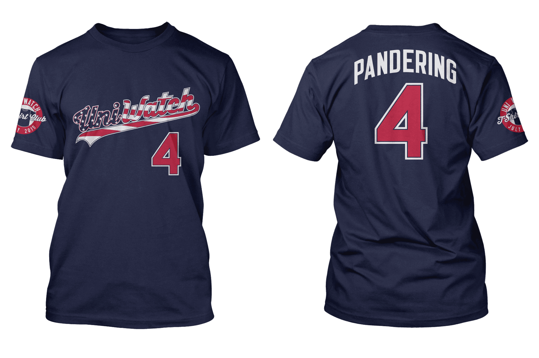
I know what you’re thinking: Why does the American shirt have a “Pandering” NOB, while the Canadian shirt has “Canada Day”? And here’s the answer: I had been planning all along — like, since last winter, when we first conceived of the T-Shirt Club project — for the July shirt to feature a stars/stripes script with a “Pandering” NOB. I’ve long referred to the MLB’s stars/stripes designs as pandering, and the negative commentary is really no different than using “BFBS” on the black shirt.
When we decided to do a Canada Day design, I got in touch with several Canadian sports fans (including SportsLogos.net founder Chris Creamer, who’s from Toronto) and learned that most Canadian teams, aside from the Blue Jays, don’t wear special uniforms for Canada Day. Moreover, Canadian teams don’t tend to wear flag-based uniforms for any occasion — Canada Day or otherwise. In short, pandering to cheap patriotism doesn’t seem to be a major characteristic of the Canadian uni-verse like it is here in the States (which perhaps isn’t surprising, since there also seems to be no Canadian analog for American culture’s “U! S! A!” self-boosterism). So there was no need to embed any commentary into the Canada Day shirt’s NOB.
Both shirts will launch next Tuesday.
Membership update: Half a dozen new designs have been added to the membership card gallery (including Alex Fabiilli’s Buffalo Bills helmet treatment, shown at left). We still need one more order to fill out this batch; once we get that order, this batch will be printed, laminated, and shipped out in short order.
As always, you can sign up for your own custom-designed membership card here, you can see all the cards we’ve designed so far here, and you can see how we make the cards here.
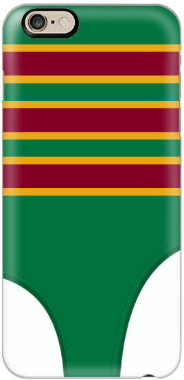
Phone case reminder: The official Uni Watch smart phone case, featuring a nifty stirrup-based design created by reader Matt Beahan, is available for five more days. You know what to do.

’Skins Watch: The Oregon Board of Education has ruled that 14 schools with Native American-based team names must choose new names by 2017. Further info (from Ron Burden). ”¦ Hurricane High School in West Virginia calls its teams the Redskins and uses a Braves-style tomahawk for good measure (from Coleman Mullins). ”¦ The school board in Madison, Wisconsin, has banned students from wearing clothing with Native American mascots (from Jake Kurtz). ”¦ An Oklahoma high school whose teams had been called the Redskins will now call its teams the Red Wolves (from Joseph Anderson).

Baseball News: Johnny Bench could hold seven baseballs in one hand, plus you have to like that T-shirt he was wearing (from Douglas Ford). ”¦ We’ve mentioned several times now that Phillies C Carlos Ruiz, who wears No. 51, has recently had “44” on his catching helmet and batting helmet. Turns out it’s a memorial for a friend of his (from Josh Claywell). ”¦ Love the vertically striped jerseys worn by the 1886 UW-Madison baseball team (from Nick Jablonski). ”¦ Here’s the promo jersey schedule for the Brazos City Bombers, a collegiate summer team. ”¦ The Yokohama DeNA Baystars unveiled their blue camo-like alt unis (from Yusuke Toyoda). ”¦ Former Yankees C Jorge Posada says he wore the same belt for his entire 17-year career (thanks, Mike). ”¦ Also from Mike: “During the Bosox/Twins game, NESN showed a video of the Metrodome’s implosion. Except that didn’t happen — the video was actually of the Kingdome.”

NFL News: I’m not sure if this is a new thing, but Cowboys rookies apparently aren’t getting stars on their helmets. That’s rookie Randy Gregory up against all-pro Tyron Smith (from Tim Perkins). ”¦ Here’s something I’d forgotten: Giants players wore yellow wristbands during the 1990 NFC title game, to show support for the first Gulf War. The Giants won that game advanced to Super Bowl XXV, where they and the Bills both wore American flag helmet decals, which I believe was the first instance of the flag appearing on NFL helmets (with thanks to Michael Kruse and J.Capace for the yellow wristband photo). ”¦ Ravens QB Joe Flacco was wearing a black practice jersey with a purple number the other day (from Mark Johnson). ”¦ Changing a flat tire on the side of the road? Tell the other drivers who you root for with these NFL team-branded emergency roadside kits (from Howie Lewis). ”¦ Washington safety Duke Ihenacho taped his cleats to make them look like Chucks the other day (from Tommy Turner). … At the NFL rookie event in L.A., a bunch of rookies’ new jerseys were displayed, but they used an old, now-outdated Browns jersey.

College Football News: Here’s one writer’s ranking of the best and worst uni combos of the Big 12. ”¦ Under Armour is making a run at the U. of Texas apparel contract (thanks, Phil).

NBA News: The new Hawks logo, which was included in the Xmas uniform leak, is getting negative reviews (from Douglas Ford). ”¦ Man, you know uni-watching has hit the mainstream when Rolling Stone, of all publications, gets into the act — although they chose to write a story about the design process behind the Bucks’ makeover, which is a topic I already covered for ESPN six weeks ago. ”¦ Ladies and gents, your NBA draft caps. ”¦ Stephen Curry’s ascent to the NBA Finals is good news for Under Armour (thanks, Brinke). ”¦ Metta World Peace is now playing in Italy, where he was recently ejected from a game. Dustin Semore watched that video and had several observations: “(1) World Peace’s NOB is ‘The Panda’s Friend.’ (2) Interesting to see the benches behind LED signs. (3) Also interesting to see the scorer’s table separated from the fans by Plexiglas. (4) We are used to seeing basketball coaches in suits and ties”¦ how about uniform-matching suits and ties? (5) The NBA trend of refs wearing super-tight jerseys extends to Italy. I do like the green/red stripes corresponding to the Italian flag, however.”

Soccer News: Sevilla broke out their 2015-16 New Balance unis for the Europa League final on Wednesday, though the coaching staff was still decked out in the current Warrior-branded gear (from Yusuke Toyoda). ”¦ Also from Yusuke: “Fascinating article about a prison soccer league in Uganda, with the teams named after European clubs and wearing donated uniforms.” ”¦ “The latest leak of Manchester United’s alternate jersey seems to show a subtle homage to the pattern on a previous jersey, from 1990-92,” says Alex Cohen. “That makes sense, because Adidas is just taking over this upcoming season, and they designed the jersey from the ’90s as well.” ”¦ Stefano Tedeschi, writing from Italy, says, “In the late ’70s and early ’90s, Puma produced soccer jerseys with the a reversed logo — the tiger was jumping from left to right. We found in several instances of this, including Austria and Kuwait (World Cup 1982), Red Star Belgrade (1990-1991), Yugoslavia (1982), and even a Japanese example (Yamaha 1982). It was also found one case in 2006 (Deportivo Tenerife). If you want, you can follow the discussion (unfortunately in Italian) on Twitter, with the hashtag #pumagate.”

Grab Bag: If you’re in the market for a new wallpaper design for your smart phone, you could do a lot worse than these NHL team patterns (from Johnny Van Cura). … Thong underwear is reportedly falling out of favor with younger women. ”¦ Check out this great sporst-centric artwork by a guy whose primary medium is felt. Great stuff! (Big thanks to John Dudzinsky.) ”¦ Was flipping through this week’s New Yorker and got a bit of a blood rush when I saw one of the cartoons includes a Brannock Device. ”¦ Bounty hunters and bail bondsmen in Minnesota can no longer wear clothing that looks like police uniforms. ”¦ Here’s a site that lets you design your own marching band uniforms (from James Gilbert). ”¦ Nike’s new line of college golf shirts features uni numbers (from Patrick Thomas). ”¦ By now you all know I love stripes, so of course I love this 1971 Helmut Newton photo of two Parisian cyclists (big thanks to @cdubs271).
Bill Parcells also refused to allow rookies to wear the star when he was Cowboys coach, saying that they had to earn the star.
The wonderful, magnificent Duane started that policy when he was Head Football Coach, and they kept it going.
Felt artist is absolutely amazing. Thanks for the link.
“so show support for the first Gulf War.” – ‘so’ should be ‘to’
“Ravens QB was wearing” – I can understand why Flacco might not want his name associated with that jersey.
Fixed.
Very minor note, but the New in New Yorker isn’t capitalized.
Fixed.
I always wondered if the English city of York had a high-brow current events, arts and humor magazine of its own.
/not really
Today’s ESPN column is up:
link
I remember during the gulf war that the yellow ribbons we saw everywhere were to support the troops, even if you didn’t support the war itself. Does anybody else remember it that way, too? I was only 13 at the time.
“…during the gulf war that the yellow ribbons we saw everywhere were to support the troops, even if you didn’t support the war itself. Does anybody else remember it that way, too?”
~~~
Absolutely. At one point my village sent around crews to put yellow ribbons on (it seemed like) EVERY single tree (from 6 foot in diameter to just a couple inches) in the village. Was actually very cool looking at the time…
Didn’t the yellow ribbons start with the Iranian hostage crisis (or, if you prefer, with Tony Orlando and Dawn)? In my town, everyone was putting ribbons around trees as a way of showing support for the hostages.
How did yellow ribbons on trees become a thing in the first place? Why yellow, and why trees?
The Library of Congress has you covered:
link
I seem to remember that during the Raiders/Eagles Super Bowl there was something done. I think that’s what the yellow stickers on the back of the helmets as seen in this picture were supposed to be.
link
to relate this to uni stuff: Arsenal are in the FA Cup final tomorrow. In previous finals they wore a yellow kit and the chant She Wore a Yellow Ribbon came from the yellow kits.
They are wearing yellow tomorrow (they wore red for last seasons final) so if you see any Arsenal supports around you’ll probably see some yellow ribbons.
link
Yeah, the yellow ribbons were everywhere, including ingenious self-bowing ribbons they distributed at my high school. My parents ran in pretty far-lefty circles, and “no blood for oil!” antiwar types were especially showy in their yellow-ribboning. Sort of a defensive display of patriotism to preempt the sort of criticism they’d received as antiwar protesters during Vietnam.
The fact that the Desert-Storm-honoring flags are still on the back of the helmets is more than a little outrageous – it’s like the phone tax levied to pay for the Spanish-American War that was only repealed in 2006. Since those Gulf War flag stickers went on the helmets, we won war, then fought and lost a second Gulf War, and we’re knee deep in a third Gulf War at the moment, Kuwait is free and Saddam has been dead for nine years now. At what point do we stop celebrating an event from 1991?
I thought the Desert Storm flag stickers went away after that conflict ended? Aren’t the current flag stickers leftovers from 9/11?
Correct.
The flags are still on college basketball jerseys from that period as well.
I bought my ticket for the 2001 Grey Cup in Montreal in July.
After the attacks of September 11, all the CFL teams had US flag stickers affixed to the back of their helmets, near the neck bottom edge. (The support and bonhomie in the crowd for Americans like me was palpable. It didn’t hurt that I could talk Expos baseball with anyone until my limited French ran out.)
I can’t for the life of me find a photo. I don’t remember which side was the stars & stripes and which was the maple leaf.
PS Canadian equivalent time: “As American as apple pie has no equivalent north of the border, so I’ve decided to make it As Canadian as possible, given the circumstances.” — Dave Foley, famed funny Canadian
I’ve liked all of the t-shirts, but this is the first one that has stirred me to searching the couch cushions for enough cash to get one. Maybe I’ll steal my kids lunch money next week.
Maybe I’ll steal my kids lunch money next week.
Nothing says patriotism like malnourished children — go for it!
Funny thing is, the UW desecration shirt is better designed than most actual sports team equivalents. Confining the stars to discrete letters, with stripes both to the right and beneath, is how it ought to be done, if you’re going to do this. Whereas MLB typically has the stars sort of randomly transition to the stripes within the lettering/logo.
Thanks for noticing, Scott. Even though I’m opposed to stars/stripes designs in general, we wanted this one to be well-executed.
RE: NBA draft caps. Are these some of the best looks yet of new wordmarks for the Nuggets (link), and (possible jersey, based on all the other examples) looks for the Raptors (link) and Bucks (link)?
If you had not told me that logo was for the Atlanta Hawks and just asked me to guess which team was going to use it, I would have said the Phoenix Suns. I’m guessing a majority would do the same.
I would’ve said the Knicks because it looks like a diaper on fire.
The school board in Madison, Wisconsin, has banned students from wearing clothing with Native American mascots
Ok, I don’t care what side of the debate you’re on, that’s absolutely bullshit.
Care to explain why you think so?
Does seem like a slippery slope. I’m not a fan of the Native American names for teams and all the imagery and culture infringement that goes along with it, however this seems like a little to much the other direction.
Their rule wouldn’t stand up to Constitutional scrutiny. Schools are public places, not private enterprises… and there is no right to be free from offense.
“Hurricane” High School has a non-storm related nickname?! How is that even possible? They’re missing out on a great opportunity.
This gets better (worse). Had to find out if there were other Hurricane high schools. Nope. It’s in the same county as a “Buffalo High School” that use the “Bisons” nickname. All sorts of zoological and zoo-logical problems with that.
Not only do they use the Braves tomahawk, Hurricane High School also uses the “Utah Utes” drum logo with an ‘H’ instead of a ‘U’: link.
What? No camouflage numbers on the pandering shirt of the month.
GI Jokevember…
Or not. We may not do a camo shirt. At the moment I’m leaning against it, but we shall see.
I’m all for a camo shirt, but only if you use WWI dazzle (link) or WWII USMC duck hunter (link) patterns.
Holy shit that Dazzle pattern…
has my vote.
Bill Belichick in that 1990 Giants picture
While the Blue Jays may be somewhat unique among Canadian teams in wearing Canada Day jerseys, I think the reason they do it is because of the rest of the league doing the July 4 thing and wanting them to have a “special” jersey/cap like everyone else. Maybe the red shirt should say Copycat on it.
Nope. Jays’ first Canada Day uniform was in 1996 — well before the other MLB teams started doing July 4th uniforms.
Heh. Fair enough. I didn’t know they’ve been doing it for that long. Feel free to delete this whole exchange.
The Blue Jays are the only major pro Canadian sports team playing in the regular season on Canada Day as well. No NHL, NFL, or NBA teams are.
They kinda own that day’s celebration because they can.
Yeah, but the CFL season starts in late June, right? They could do something for Canada Day if they wanted, but they don’t.
The CFL regular season kicks off on Canada Day every summer. Pretty sure that’s big enough event on its own. And not every team plays on Canada Day either. This year, there are no games scheduled for Canada Day.
FWIW, Vancouver Whitecaps, Toronto FC and Montreal Impact are all playing on May 30 (and Vancouver again on June 3).
You’ve likely been notified elsewhere, but a Brannock device is the gas pedal in a vehicle in the new Mad Max movie.
Having the Canadian t shirt with the number 1 is a great touch.
Thanks. We’ve tried to have the numbers make sense for each shirt — 17 for St. Paddy’s Day, 42 for the Jackie design, 5 for Cinco de Mayo, 4 for Independence Day, 1 for Canada Day, and 15 (for 2015) for the basic home/road/BFBS designs.
You think ’51’ would’ve been too mean?
I really wanted to buy the July shirt figuring it would have a 4th theme but I can’t with it having pandering on the back. I understand why it’s there and agree that so many teams do it to make money but I wish it had something else, like Happy as the NOB and 4th as the numeral, kind of like the Braves NNOB, Channel 17.
Maybe the NNOB with a number might be a theme for another month?
Figure August will have a dog theme for the Dog Days of Summer?
Labor Day for September?
Pink (breast cancer awareness) for October?
Turkeys for November? Maybe a homage to the famed WKRP episode?
Hanukkah or Christmas for December?
Maybe a football jersey style t-shirt for 2016?
I realize that the “Pandering” NOB will probably hurt sales, but that’s fine. My goal here is not to maximize the commercial success; my goal is to create a conceptually satisfying creative project, and “Pandering” fits the bill.
Also: All of the NOBs are descriptors — they explain what kind of jersey this is (Batting Practice, Home, St. Patrick’s Day, Canada Day, Pandering, BFBS, etc.). They don’t spell out a message in conjunction with the number.
Hey, you can always get the Canada Day shirt instead!
Paul, I just can’t help but think that this is one step too far. Creative project? Cool. I’m on board. But something about “Pandering” just rubs me the wrong way–and I’m even a far-left, can’t-stand-excessive-patriotism kind of guy. I -hate- the flag uniform thing. But this?
As for your comparison to the BFBS shirt: “BFBS” is funny and novel, and harmlessly pokes fun at an innocuous and stupid trend in uniform design. “Pandering” isn’t funny, and doesn’t seem to have any positive value other than making fun of something that a lot of people take very personally. Like it or not, a lot of people connect at a deep, personal level with patriotic uniforms, as they can represent things that are emotional and real–like people they love dying in battle. It’s not just a color. It’s real life. We may think it’s overboard to turn a uniform into a flag (and I agree), but the intent seems to be in the right place, reflecting something extremely personal and important to a lot of Americans.
Reading this site almost since its inception, I know you’re not going to change your mind. Heck, it seems criticism only tends to make you dig your heels in. But you do need to realize that a lot of folks are going to find this shirt in extraordinarily bad taste. You have to pick your battles, and the correct forums for your battles–and this seems unnecessary. It’s a bit angrier and more personally confrontational stand, IMO, than “I don’t like purple, we don’t do purple.” Even if we don’t like overly patriotic displays, it seems going out of our way to mock them borders on the needlessly insulting. You may not care that you’re not selling them, but I think you should care a little more about the reason why.
I absolutely love this response. You’re right, Paul won’t change his mind on this. I also think he’s not interested in maximizing profit from the t-shirt sales, as it seems he would rather maximize the effectiveness of the message (in his eyes, anyway). Nothing wrong with that, I guess– his site, his t-shirt program, he can do what he wants. But it does come as a little off-putting.
I don’t buy the t-shirts, but the ‘Pandering’ name plate is the only reason I’d buy this one.
You say “But you do need to realize that a lot of folks are going to find this shirt in extraordinarily bad taste.”
I say “Good”.
So there ya go.
Lee
Or, one might take the tack that this is one of the few American flag shirts with an ambivalent message. Nobody owns the flag, it can stand for different things.
But yeah, I can anticipate getting into it with some drunk-ass dude who thinks I’m disrespecting the flag. I don’t need that kind of trouble. Paul feels strongly about this and that’s his right.
you do need to realize that a lot of folks are going to find this shirt in extraordinarily bad taste.
That’s honestly neither here nor there.
I think stars/stripes uniforms are in extraordinarily bad taste, but that doesn’t seem to have stopped anyone from manufacturing them. My shirt is a commentary on that phenomenon. You don’t like the commentary? Then don’t buy the shirt. But I absolutely stand by the commentary 100%.
What Lee said.
Much earlier, Bando wrote:
“Like it or not, a lot of people connect at a deep, personal level with patriotic uniforms, as they can represent things that are emotional and real—like people they love dying in battle. It’s not just a color. It’s real life. We may think it’s overboard to turn a uniform into a flag (and I agree), but the intent seems to be in the right place, reflecting something extremely personal and important to a lot of Americans.”
I’d be much more sympathetic toward your argument if we weren’t already several decades into an era of wholly inappropriate use of the United States flag, in various forms, and the widespread acceptance of such practices.
There likely *are* many people who will be offended at the suggestion that flag-based clothing and sports uniforms constitute “pandering.” They’ll probably be upset about seeing these t-shirts.
But where were these offended parties when flag desecration became a common thing?
Section 176 of the Flag Code is quite clear on these points:
“(d) The flag should never be used as wearing apparel…”
“(i) The flag should never be used for advertising purposes in any manner whatsoever.”
“(j) No part of the flag should ever be used as a costume or athletic uniform.”
Why was there so little outrage over the persistent disregard for these standards all these long years? But now we’ll have outrage over a satirical criticism of the whole mess?
People aren’t offended by pandering. They’re offended when someone actually points it out.
Might it be possible to provide the social commentary that this t-shirt most assuredly cries out for with another, perhaps slightly less jarring NOB than “Pandering”? What about something like “U! S! A!” or “‘Murica” or even “#@&$ Yeah!”?
None of these choices would do anything to dull the commentary. It seems to me, however, that they might make the point in a way that provides a bit more levity and perhaps more self-parody. My fear is that “Pandering” comes across as sneering and a bit humorless.
You’re missing the point of how the NOBs work. The T-Shirt Club NOBs are descriptors — this is a home design, this is a BFBS design, this is a St. Paddy’s Day design, etc.
And this one is a pandering design. I’ve been using that term for years to describe this type of design, so there’s nothing unusual or inconsistent about it. Not your cuppa? No problem — don’t buy the shirt. But it totally fits with the T-Shirt Club program.
Paul, I hope that by responding I’m not running the risk of receiving the dreaded Let’s move on. Thanks.â„¢ (the Uni Watch equivalent of a yellow card). :) Respectfully, however, I don’t think I am missing the point about the T-shirt club NOB descriptors.
I agree that “pandering” is an accurate descriptive of “Stars and Stripes” uniform designs, and I realize it’s been a term you’ve used for some time. But that’s not the only term that’s been used to describe them here.
Certainly “flag desecration” has been a widely used term. (Although admittedly, putting that phrase as the NOB would be even more provocative than “pandering.”) And the terms I mention above also have been used as descriptors.
While Uni Watch readers’ comments section quips may account for the bulk of these terms’ use, I know we haven’t been the only ones. You yourself made a reference to Eastern Washington’s football team wearing “New U! S! A! costumes” back in the Ticker link.
In summary, I totally get that it’s your prerogative to use “pandering” as the NOB on this jersey, and I fully support the purpose of it. I would simply suggest that it’s not the ONLY term that would fit the bill, based on the commonly understood descriptors of the Uni Watch community.
I agree that “pandering” is an accurate descriptive of “Stars and Stripes” uniform designs, and I realize it’s been a term you’ve used for some time. But that’s not the only term that’s been used to describe them here.
The only two terms I considered were “Pandering” and “Flag Desecration.” The latter struck me as having too many letters and could have been misinterpreted as a call to action (i.e., “Please desecrate this flag/shirt”). “Pandering” is shorter, punchier, and embodies everything I want to say with this design, both as a descriptor and as a form of commentary.
Look, I get it: Some people either disagree with the commentary or are uncomfortable with the idea of wearing it. All of that is absolutely fine. But the commentary, as boiled down to the word “Pandering,” perfectly expresses my feelings about this issue, and as such was — and is — the right way to go, because it’s my project. As with all my other projects, including Uni Watch itself, everyone is free to get on board or not, as they see fit.
“ook, I get it: Some people either disagree with the commentary or are uncomfortable with the idea of wearing it. All of that is absolutely fine. But the commentary, as boiled down to the word “Pandering,” perfectly expresses my feelings about this issue, and as such was – and is – the right way to go, because it’s my project. As with all my other projects, including Uni Watch itself, everyone is free to get on board or not, as they see fit.”
I think we’re closer to being on the same page than not. I support the commentary, although I acknowledge a personal preference for something a bit more along the lines of parody. Those suggestions don’t resonate with your vision, and I accept that. I just wanted to make sure I wasn’t labeled as someone who doesn’t Get Itâ„¢ based on how my suggestions were categorized. :)
Good lord. The shirt works perfect for what it is and for what the project is. This isn’t Macy’s. It’s not meant to be designed solely to sell. It’s meant to reflect Paul’s view and commentary on stars and stripes unis. If yours lines up with his, then purchase a shirt.
One interesting thing I am spotting in people’s reaction to the word “pandering” on a USA themed shirt is their fear of what others may think or say. You realize that you are not obligated to explain yourself to anyone about what shirts you wear and your personal thoughts on things. It is also a commentary on how the military praise culture we have in this country today actually puts fear in people about not wanting to even be minutely misconstrued or mistaken about not being 100% patriotic or supporting the troops.
I have to agree with Chris. I can’t buy a flag desecration shirt with the word “Pandering” on the back. I understand the shirt is the irony and “Pandering” is the juxtaposition but I don’t feel like explaining that to somebody in the upper deck who’s had a few and asks me what it all means.
This is too funny. You yourself call it “a flag desecration shirt” but then you object to the word “Pandering”? You’ve already made my point for me.
As for this:
I don’t feel like explaining that to somebody in the upper deck who’s had a few and asks me what it all means.
Then don’t wear it in the upper deck. Or don’t buy it at all! Saying that the shirt is not appropriate for stadium use is not the same as saying the design is bad or ineffective.
Meh. I’ll buy one.
I’m tempted to buy one and DIY my own nameplate. That would be an interesting Uni Watch project. Either that, or I should buy one and just change my last name to Pandering.
I’m tempted to buy one and DIY my own nameplate. That would be an interesting Uni Watch project.
Agreed! Do it!!
This is killing me, because I really do like the shirt design. But I too am having issues with the “Pandering” on the back, and I just don’t know if I can buy it. I suppose since I want one from each month, and not at all having anything to do with Canada, I have to buy it, but it will be a $30 lining to my dresser drawer. Which is a shame, because I love the shirt otherwise. I know the word pandering is used all the time in relation to these style shirts, but I just don’t think I’m personally willing to make that social commentary by actually wearing it.
You’re making a social commentary just by purchasing it. I suppose if you want one without social commentary, you’re better off getting the Canada one. Really, it’s not that different from the Cinco de Mayo shirt earlier this year, except that Canadians actually care about Canada Day.
Gary, if you don’t agree with the message the shirt is sending, then by all means, don’t buy or wear it. There’ll be plenty of other designs that will be much more straightforward — you’ll probably like those more.
It’s interesting that your defense of the shirt boils down to “don’t like it, don’t buy it.” Can’t say I expected more.
No, you are mistaken. My defense of the shirt (which you can find in several other comments) is that the shirt offers a critique of, and commentary on, the stars/stripes jersey phenomenon, and is consistent with what I’ve always said and written about that phenomenon. I stand behind that commentary 100%.
I can understand that even people who agree with that commentary might not want to *wear* the shirt. And that’s fine — they don’t have to.
Its not that I even disagree with the message. I really dislike the use of our flag by a multi billion dollar industry to sell a product. Like the others, there’s just bound to be a brusque conversation with someone who misunderstands the intent. I’ll still buy it, because I want one from each month. This is just going to make for more “interesting” conversations, thats all.
This is just going to make for more “interesting” conversations, thats all.
And what exactly is wrong with that? The shirt is already generating interesting conversations here (no quotes needed around “interesting”), all of which strikes me as a good thing. And the shirt hasn’t even launched yet!
What you’re really saying is that some people, possibly including you, might end up thinking and talking about some serious ideas. Oh, the horror.
I think it would work better, and be more consistent with the other NOBs, if it said PANDER, not the gerund form.
That, or embrace the pander with a YOO ESS AYY NOB.
I think it would work better, and be more consistent with the other NOBs, if it said PANDER, not the gerund form.
Disagree. “Home” is for the home shirt; “BFBS” is for the BFBS shirt; “Pandering” is for the pandering shirt.
“Pander” would be for the pander shirt — which doesn’t make sense.
You actually could do the same thing with FLAG as the NOB. It gets the point across and also perfectly describes the shirt/jersey that it is mimicking.
I strongly disagree. “Flag” would be a neutral descriptor with no commentary, like if we had used “BLACK” instead of “BFBS.” Given my well-established position on stars/stripes jerseys, “Pandering” was — and is — the right move.
If it said “PANDER”. maybe people would mistake it for a NickNOB for Pablo Sandoval. ‘Gee Fellers, That Pander sure can play a mean 3rd base”
Panders are endangered.
link
Maybe this could be the theme for next years T-Shirt Club?
A big ol’ “BOOOOO!” to Michael Cunningham, the author of the article re: the Atlanta Hawks new logo, for his diss-full comment “Chris Creamer of sportslogos.net, which apparently is a thing, …”
IMHO, the logo isn’t as bad as he and his readers seem to think. The “flame” forms an A and also a hawk’s head in the negative space. It’s bold. It’s identifiable from a distance. It will work in black & white and in color. It’s not the greatest logo out there, but certainly not terrible.
Mike Cunningham made himself look very small with his subtle dig on Creamer’s site and work. I wonder if he’d marginalize the work of editors who offer honest insight and critical reviews at privately managed fashion-related websites, too?
I actually had a back-and-forth yesterday with Cunningham about this. I told him his dis of Chris and his site was condescending and unprofessional, and pointed out that if he thinks sports logos are important enough to write about (which he apparently does), then he shouldn’t belittle those who specialize in it.
He refused to budge and said he was just being playful. Asshole.
Playful, my ass. In addition to being a jerk, he’s a liar.
In the same vein as the Metrodome implosion video:
A few years ago, the Philadelphia Eagles were running a commercial called “Heart”, about the heart and soul of the city and Eagles fans. At the :11 mark of the spot, a vintage shot of The Vet appears. Except it’s not the Vet – it’s clearly RFK Stadium, as evident by the wave-like roofline. Amazed that this got all the way through production and onto the air, I contacted several sources associated with the Eagles to clue them in to their gaffe. I never got a reply from any of them. I guess they were too embarrassed.
Link to the video:
link
Give Mr. Lukas credit, he is not short on chutzpah. For years and years he has made it his mission to let us know how tacky it is to have flag-based designs. Flag desecration he calls it. But of course, all that goes out the window when there is some coin to be made. The hypocrisy is staggering.
He can convince himself that it’s ironic, he is quite adept at tying himself in intellectual knots when explaining his anti-American and anti-military views while at the same time insisting he is neither anti-American nor anti-military. And he can convince himself that “BFBS” has just as much of a negative connotation as “Pandering.” how coincidental that the most negative and controversial NOB was saved for the good ol’ USA. The Mexicans and Canadians got simple descriptors, but no, we can’t have that for “Murica! She’s an evil wench.
He can also convince himself and many of the readers that this t-shirt thing is an “art project” just like the website is an “art project”. I don’t know, maybe it’s just me, but with the myriad banner ads, sponsors, and the pop ups that open when i open literally any link on this site, and now with all the merch that is up for sale this doesn’t seem like much of an art project, but more of a “brand” and “business”. you can literally now buy stickers, phone cases, patches, t-shirts, copyright infringement t-shirts(Meats), a “membership”, and on and on. there isn’t a single post on the site now where some merch isn’t being sold. nothing wrong with any of this by the way. what’s wrong and unseemly is that Mr. Lukas continues with his charade of “art project” and his continued criticism of merchandising and marketing in sports when he is an avid participant in the same.
Mr. Lukas just know that you are not fooling anyone except maybe yourself and your some of your most die-hard readers/followers.
I won’t get into all of your diatribe (tell me again, why do you even come to the site if you’re so appalled?), but to accuse Paul of being anti-American. Well thats just bullshit of the most ignorant degree.
Lee
Jimmies status = Rustled
The self-congratulatory and resentful tone of this piece is very well-honed, if I do say so. I bet I know who your favorite cable news host is…. :)
What a dick move paul. F@ing commy. One shirt i was gonna get cuz i love usa and you pander to f@ing canada and sh@it on usa. Werent worried about sales, arent you donating it charity. Gfy uniwatch.
I’m not buying for one minute that this is a legit post. The misspellings and over-the-top jingoism are half-assed attempts at misdirection by someone who is trolling those who question the approach of July’s shirt.
I don’t know, it’s a pretty tame comment by Yahoo News standards.
One great thing about the Rickwood thing was that they actually got the umps button down shirts and bow ties for the occasion.
I was looking very forward to the July T-shirt and was going to purchase it,but with “pandering” on the back there is no way I will but it. I understand what Paul is doing but its also Americas Birthday. Maybe next year.
This is another great point. While we can argue about the absurdity of conflating Memorial Day and Veteran’s Day, or turning September 11th each year into a flagfest, July 4th is pretty universally accepted as a catch-all for everything America. There’s -nothing- controversial about it. We know what happened on the 4th, and celebrate our independence accordingly. So if you’re going to make a point about “pandering,” why choose July 4th when in comparison it’s just about the least-pandering of them all?
Because when sports teams put the flag on their uniforms, they’re not expressing authentic patriotism. They’re pandering to public expectations. Patriotism means “love of country.” That’s an emotion, and corporate entities don’t have emotions. People have emotions. You and I might love our country, but the corporate entity that is the New York Yankees doesn’t. It can’t. When a pro sports team wears the flag, it’s not expressing patriotism. It’s trying to sell us merchandise. At best, it is trying to coopt our individual feelings of patriotism and tap into that emotion and redirect some of our love of country to a sports team. I’m pretty much OK with that, but let’s not confuse your actual patriotism and mine with corporate pandering to us.
The issue isn’t with Independence Day itself. It is with using the day as an excuse to sell hats and shirts with flag based designs. Usually very poorly executed designs…There really is no need…
And having anything other than ‘Pandering’ on the back would completely undermine the entire point of the shirt.
Ding-ding-ding — we have a winner. Someone who Gets Itâ„¢.
You don’t have to agree with the commentary. But given my position on this stuff, there’s really no other way for me to do a stars/stripes shirt — it HAS to have “Pandering,” because that’s what I think these jerseys represent. You can disagree with the point, but my point has always been consistent, and it remains so here.
July 4th is pretty universally accepted as a catch-all for everything America. There’s -nothing- controversial about it.
MLB uses the holiday as an excuse to pander to cheap patriotism, to sell merch, and to promote their veterans charity (even though Independence Day has nothing to do with veterans), all of which seems pretty controversial to me. That’s what this shirt is commenting on.
If you think stars/stripes jerseys are a-ok, then fine. But I don’t, and this shirt reflects my position on that topic.
I understand what Paul is doing but its also Americas Birthday.
True. If only MLB didn’t cheapen that birthday by trotting out cheap appeals to rah-rah patriotism each year. Then there’d be no reason for me to have a shirt with “Pandering” on the back.
This is like when people complain that there’s “political content” here on the site. As I always explain, wrapping yourself in the flag, repeatedly glorifying the military, etc., are inherently political acts. When I critique these programs, I’m not injecting politics into the uni-verse — I”m simply responding to the political gestures made by the teams, leagues, and manufacturers.
So some of you may think this shirt is making a statement. And yeah, it is, but it’s really a counter-statement to the nonsense being peddled by MLB.
It’s a shame that the Jacksonville Suns wore mono-gold for the Rickwood Classic. I remember who featured their sublimated flannel pattern on the ticker a while ago. I did a little searching and found it being used in a game this year. Here’s the link: link.
Though the gold look good, the grays would have looked a lot better, especially since Jacksonville was the road team.
The comments that say “I like the design but the ‘PANDERING’ thing bothers me” remind me of people who like the first two lines of CCR’s “Fortunate Son” but find the rest of the song off-putting.
Well put.
Good art/design/etc. *should* make people think, make people feel conflicted, make people uncomfortable. I’d never go so far as to call myself an artist, but if this shirt is having that effect on people, then it’s already a success — and it hasn’t even launched yet.
Re: “Fortunate Son”, a few years back there was an ad campaign on television that used that song (I think it was clothing, but don’t exactly recall). The theme of the ad was sort of an all-American yee-haa, etc. All I could think of whenever I saw the ad was, “don’t they understand what the song is really about?” I assume they did because the only lyrics you hear are the first two lines ending with “ooh the red, white and blue…” I had the same issue with the “this is our country” truck ads which seemed to miss the actual point of the song they were using.
There was a Wrangler jeans commercial from 2002 (which is probably why I can’t find it on YouTube) that inspired this comment. But yeah, it was just the first two lines and a lot of flag waving.
Not new… see “Born in the USA” being used to promote positive American ideals… missing the point of the song quite a bit.
I was kind of hoping for “FLAG DESECRATION” (same number of letters as “BATTING PRACTICE,” as it happens).
I don’t have a problem with “PANDERING”, but I’m not sure I like it either. I’m not sure it’s the best word to use. “Pandering” basically means catering to the weaknesses or vices of others. So, OK, yes, that may be what MLB and other leagues are doing with the stars-and-stripes, rah-rah, America-F***-Yeah designs, but do we really want to call attention to the idea that jingoistic patriotism, no matter how false, cynical or childish it may (or may not) be, constitutes a weakness or a vice?
Is a 4th-of-July stars-and-stripes jersey any more or less “pandering” than, e.g., a green St. Patrick’s Day jersey? Is the latter any more or less cynical? I don’t mean these as rhetorical questions.
I don’t know; maybe I’m over-thinking it.
Where is Tulsa Union High School with Redskins? Won a state girls soccer championship a couple weeks back, also clones Miami Hurricanes logo…
link
What if we don’t want “Pandering” on the back of the shirt?
Don’t buy it, or if you do, put tape over it, add your own nameplate, etc. I think Paul said that’s the NOB it will have, no ifs, ands or buts.
I honestly don’t understand this question.
This is the design. If you don’t like the NOB (or the front script, or the navy base color, or the sleeve patch), then I guess that means it’s not for you. The same could be said for every other shirt we’ve done.
In addition the the outdated Browns style in that photo of the NFL rookie jerseys, they also used the Titans columbia blue jersey (which looks white in the flash), though the navy is back to being their regular home uniform.
I have to go now (seeing a pair of gallery shows in Manhattan). Have fun debating the shirt, and I’ll see everyone next week.
Pander, according to dictionary.com, means “to cater to or profit from the weaknesses or vices of others.”
Seen on Uni Watch today:
*Link to “25 Celebrities with Seriously Hot Daughters.”
*Link to “Lindsay Lohan Lists 36 of the Celebrities She Had Sex With.”
*Link to “13 Tactics to Make Him Fall in Love with You.”
*Link with picture of attractive woman in a short dress and spike heels grocery shopping at Wal-Mart.
*Link with picture of attractive woman dressed provocatively in Miami Heat outfit.
*Link with picture of Kim Kardashian in skin-tight dress.
*Link with picture of attractive woman displaying her booty in skin-tight jeans walking toward blue sports car.
*Link with picture of attractive woman sitting in red sports car.
*Link with picture of attractive woman in skin-tight yoga pants pulling her sweatshirt tight down around her abdomen.
*Link to casino website.
To be clear, I have zero moral issues with ANYTHING on this list or with Paul making money from adding these items to his site.
I do find it amusing that we hear so much about pandering from one of the finest panderers any of us have ever come in contact with. I also find it funny that a guy who gripes about “GI Joke” and “flag-desecration” shirts and the profiteering off of expensive gear nearly every day is now selling “flag-desecration” shirts. I can only assume, since Paul uses the term “flag-desecration shirts,” that Paul believes he is desecrating the flag for profit by selling these shirts, and that he’s totally OK with that.
Either way, Paul. Great content, as always. It’s why I keep coming back despite the fact that I disagree with so many of the ideas you promote.
That’s a lot of smut. Why did I get different ads?
Yea, I don’t see any of that either.
I think the ad network tailors spam based on browser activity and searches.
Mine’s mostly sketchy nutritional supplement and insurance scams, today I’m seeing something way nor vulgar: Cleveland Browns Fanfest. Talk about lowest common denominator.
When you get pinched — I mean, IF you get pinched for an insurance scam, will they let you read Uni Watch in the big house?
Perhaps, but this is a company machine, so there’s no smut in this browser history, I assure you.
“*Link with picture of attractive woman in a short dress and spike heels grocery shopping at Wal-Mart.”
I’m unfamiliar with such a thing, but you might be interested in the following…
link
I grew up getting season tickets to Barons game at Rickwood. The park remains dear to me. My dad took me to my first game there opening night 1981. This years uniforms were my favorite since the Barons wore solid gold Birmingham A’s uniforms a few years back. Birmingham isn’t the city it was 25 years ago. its a great sports town with a vibrant food scene-well-worth the trip.
I fully support Paul’s wishes to make the July shirt say pandering even if I don’t like it. It is his site and his shirt club. I am going to collect them all so I am just choosing to get the Canada Day shirt. Like stated above no different from the cinco de mayo shirt.
Everyone who “was gonna buy a shirt but won’t because my name is on the back” is full of crap. Why don’t you all buy membership cards with that design instead?
Whoah…first Orange Grimace, and now Pandering!
This place is getting classy.
Didn’t know if you had seen, but tacked on the end of the article is each SEC school wearing a blue dot for prostrate cancer awareness.
Should have added
link
I always thought the Puma logo was a puma.